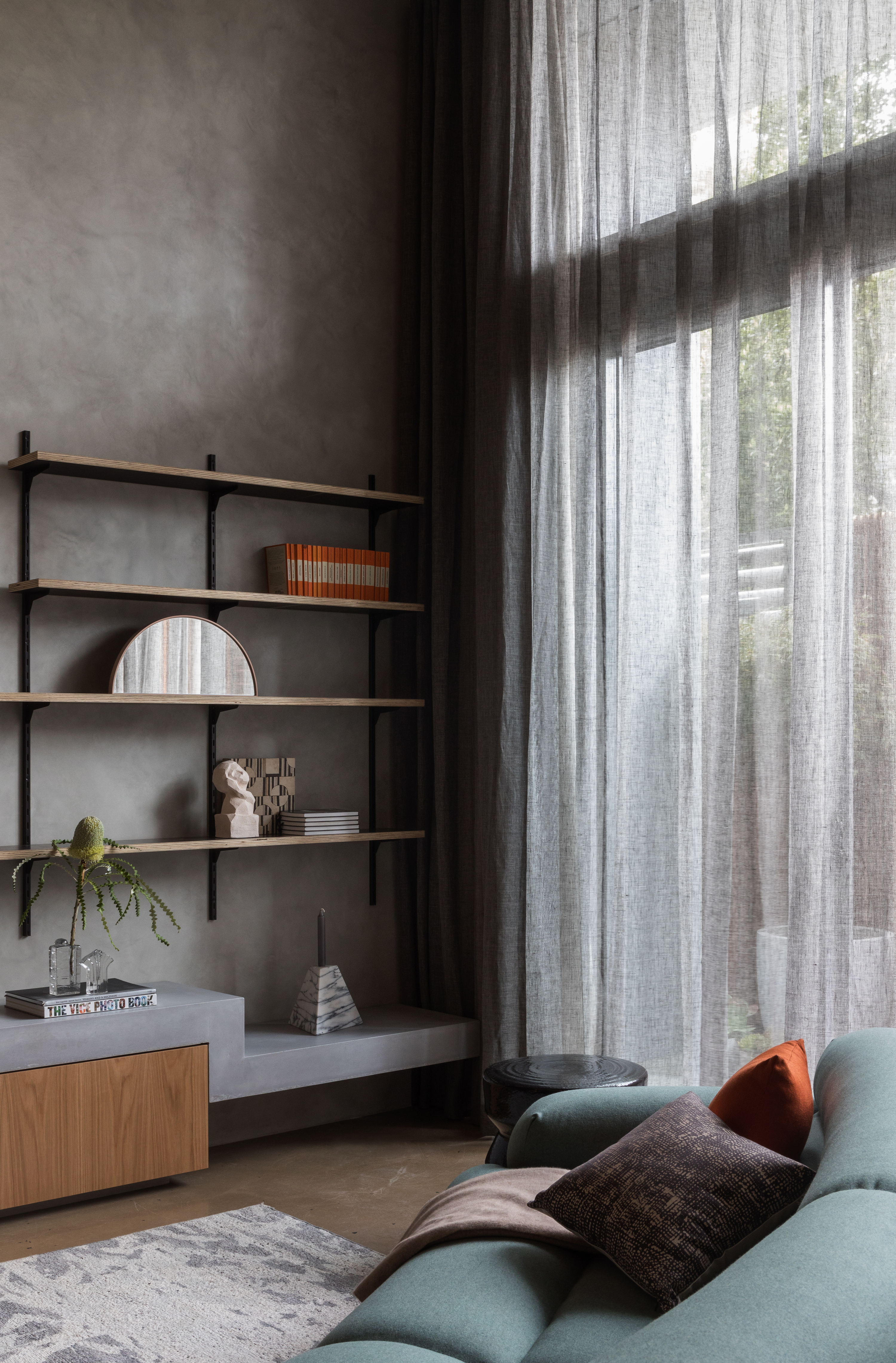
Much like pure white, dark gray — sitting on the other end of the spectrum — is a easy-to-use neutral. But unlike white, this tone delivers on the drama. Dark gray is a great choice to add contrast to a color scheme, and stop it looking too flat. It's timeless, too — it can endure a revolving door of trends in color.
If you're looking to redesign your spaces and are looking for a more on-trend color scheme, then these colors that go with gray, in its darkest iterations, could be the best bet.
What colors go with dark gray?
Dark gray is a color that goes with light gray, black, green, blue, or yellow, and pretty much every other color on the spectrum.
One thing to keep in mind is that grays also change in different lights, so before choosing a tone to pair with gray, do test the two color swatches to see how they look throughout the day, and under different illuminations.
1. Olive green
Our editors like dark gray as a color that goes with olive green, and the two make for a fresh and serene color palette. Paint colors aside, an olive green chair, a lamp or even tiling against a gray backdrop can feel charming, and refreshing.
"I've officially converted from sage to olive green," shares Lilith Hudson, trends editor at Livingetc.com. "It feels far more sophisticated than its more delicate counterpart, plus it pairs with more colors. For example, I'd never attempt to pair sage with gray for fear of washing either shade out, but the darker undertones of olive pair so well with gray, whether that's a soft tone or a dark slate gray. Olive green walls with gray accents in your decor can work wonders, but they work just as well and vice versa. Gray and olive stripes are a sight to behold, too. Think curtains, throws, or rugs."
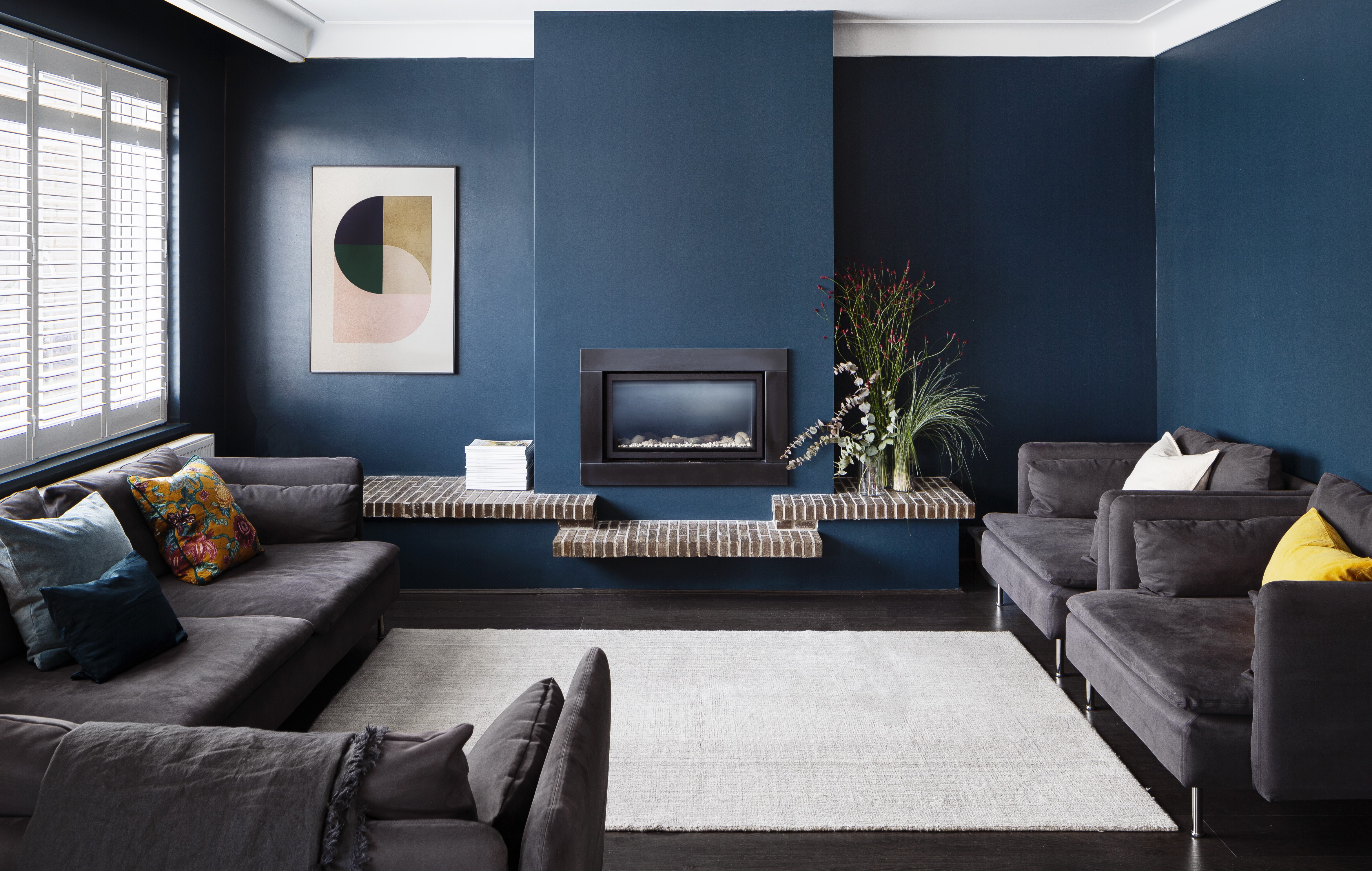
2. Dark blue

Gray is a color that goes with blue, and for a visually sumptuous pairing, choose a deeper tone of both, like in this example by Amos Goldreich Architecture. The two colors offset each other, creating a striking look.
Two dark colors like charcoal gray and dark blue can make a space feel more closed in, so to make this versatile pairing effective, you need to consider the lighting in the room.
"Navy and black can sometimes make awkward bedfellows, and classic fashion rules usually make you choose between the two when putting together an outfit," says Hugh Metcalf, an Editor at Livingetc.com. "In interiors, it can work, but toning down black to a darker, charcoal gray is an easier combination to pull off. You could use a brighter contrast to add a pop to this scheme, but because dark blue and dark gray are such similar tones, you could go all in on them together for a style of color drenching that feels moody and modern."
3. White

Decorating with neutrals is perhaps the easiest way to use dark gray. While people tend to lean towards black and white, there are several neutral colors that go with dark gray like white, cream or beige for an equally striking but warmer monotone scheme. "This combination is not only timeless but also helps to brighten a room, making it appear larger and more open," says interior designer Nishtha Vashist. "It offers a neutral backdrop that works with various decorating styles and color accents."
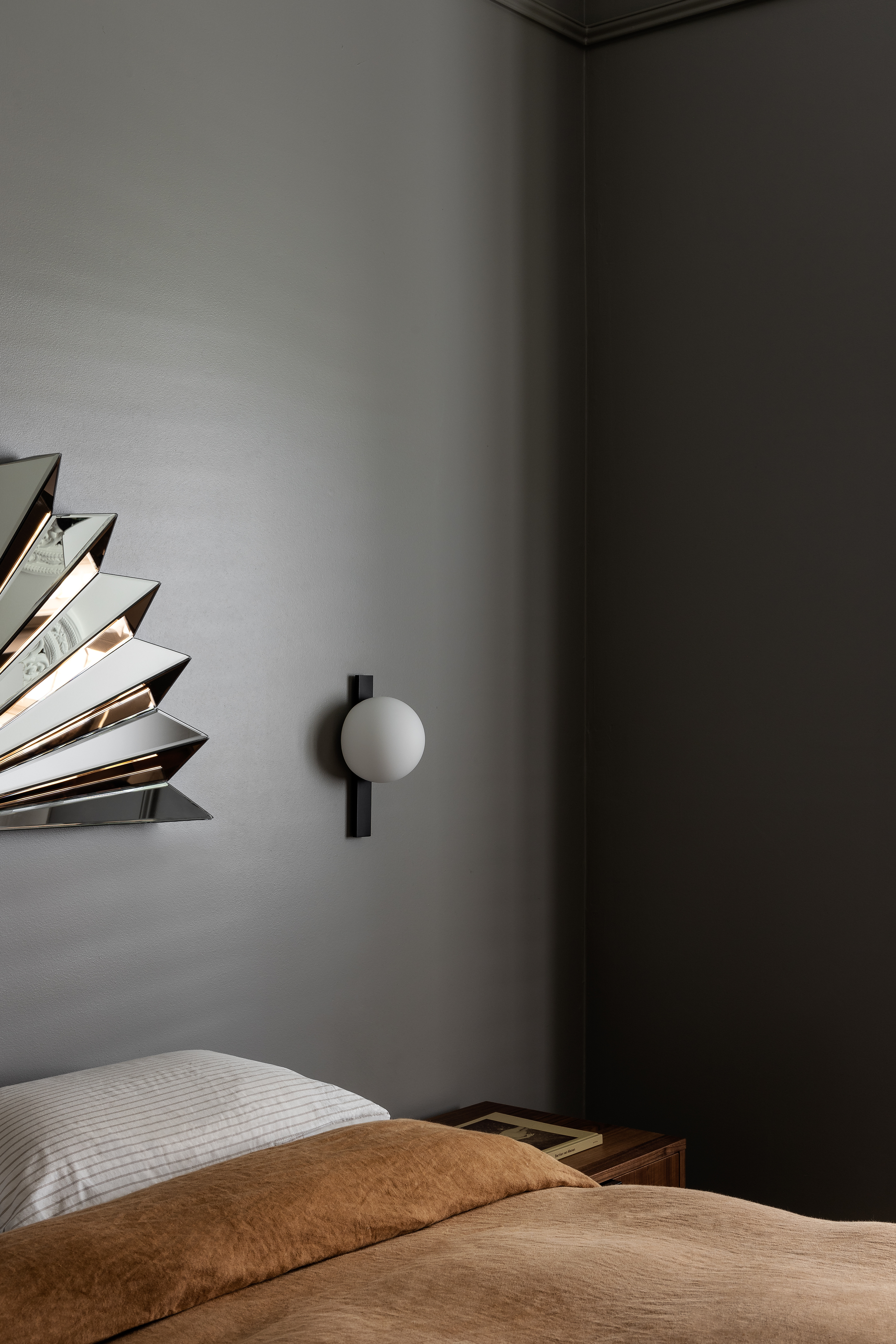
4. Light gray

Tone on tone will give your scheme depth, and so using the light and dark incarnations of the same tone will add layering and even coziness to the room. This is the perfect recipe for a calm yet moody gray bedroom.
One thing to watch out for while using two shades of gray is that the scheme could feel slightly one-dimensional. Mix in different textures into the room to elevate it — think limewash paints, a glossy finish, chunky, knitted blankets, and more.
"A neutral array of grays, that vary in texture, in addition to a carefully selected material palette help to achieve a luxurious feel that the client desired," shares Amos Goldreich, founder of Amos Goldreich Architecture.
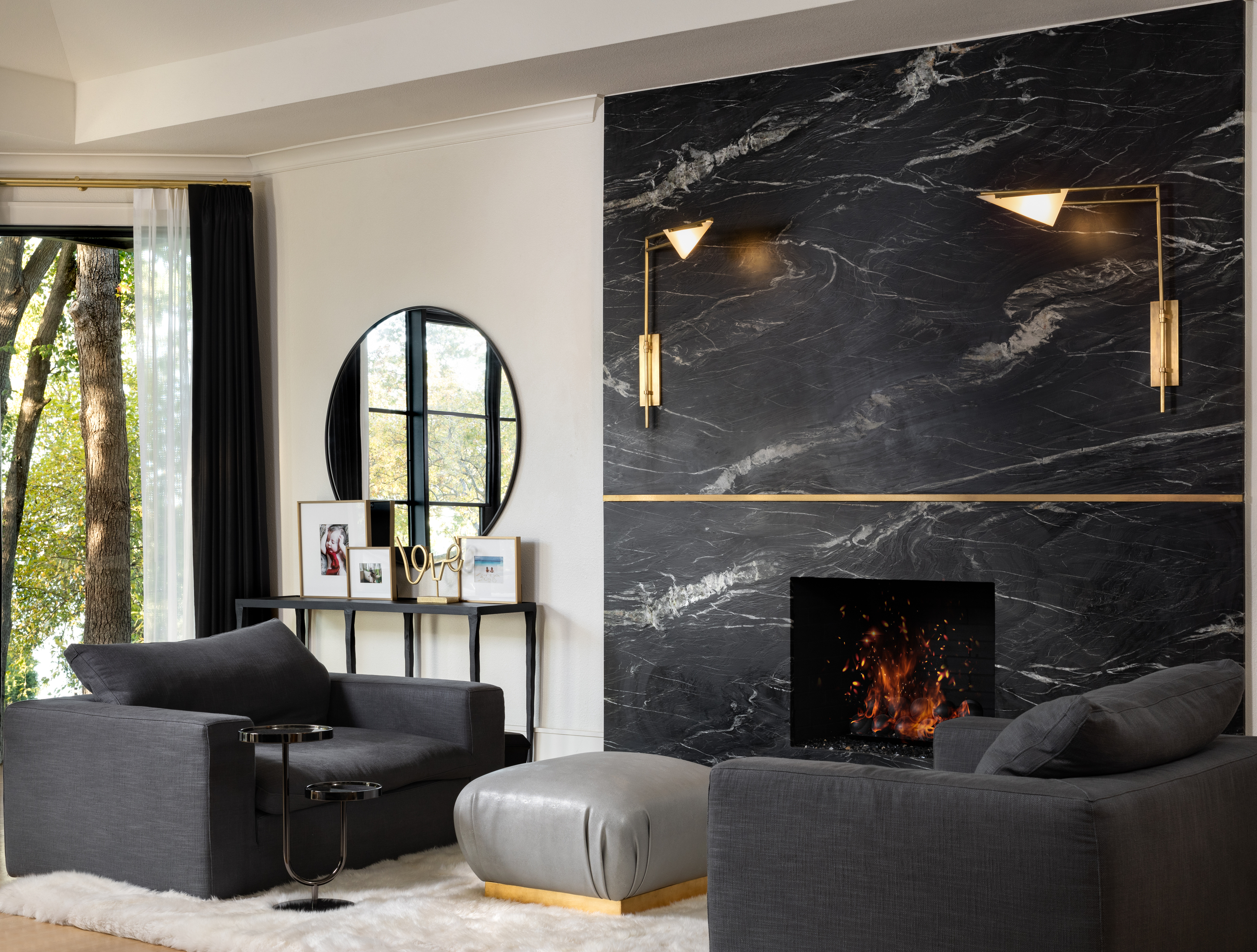
5. Gold
Wondering what colors go with dark gray other than the usual ones on the color wheel? Consider gold. Yes, dark gray is a wonderful color that goes with gold, and creates a contrast that isn't too stark. Case in point: gold and dark gray.
Of course, we don't mean accent walls painted in gold but adding gold elements like lamps, decoratives, and vases against a gray backdrop can look rich. Even gold leafing is an option! "When using gold leaf, the most important aspects are application and a well thought out plan," advises Donna DuFresne, founder of Donna DuFresne Interior Design. "If done well, gold leaf can bring a sophisticated touch to a space, but if done poorly, it can easily become a bit gaudy."
6. Pink
While gray and pink isn't always considered the most sophisticated pairing, deeper tones of both and strategic ways of pairing them can make the combo feel more modern.
A moody pink with brown or gray undertones will pair particularly well with a charcoal gray, and give the interior a rooted feel. Plus many colors go with pink and can help create a wonderful palette. Consider bringing in reclaimed or walnut-wood finishes to further warm up this subtle color duo.
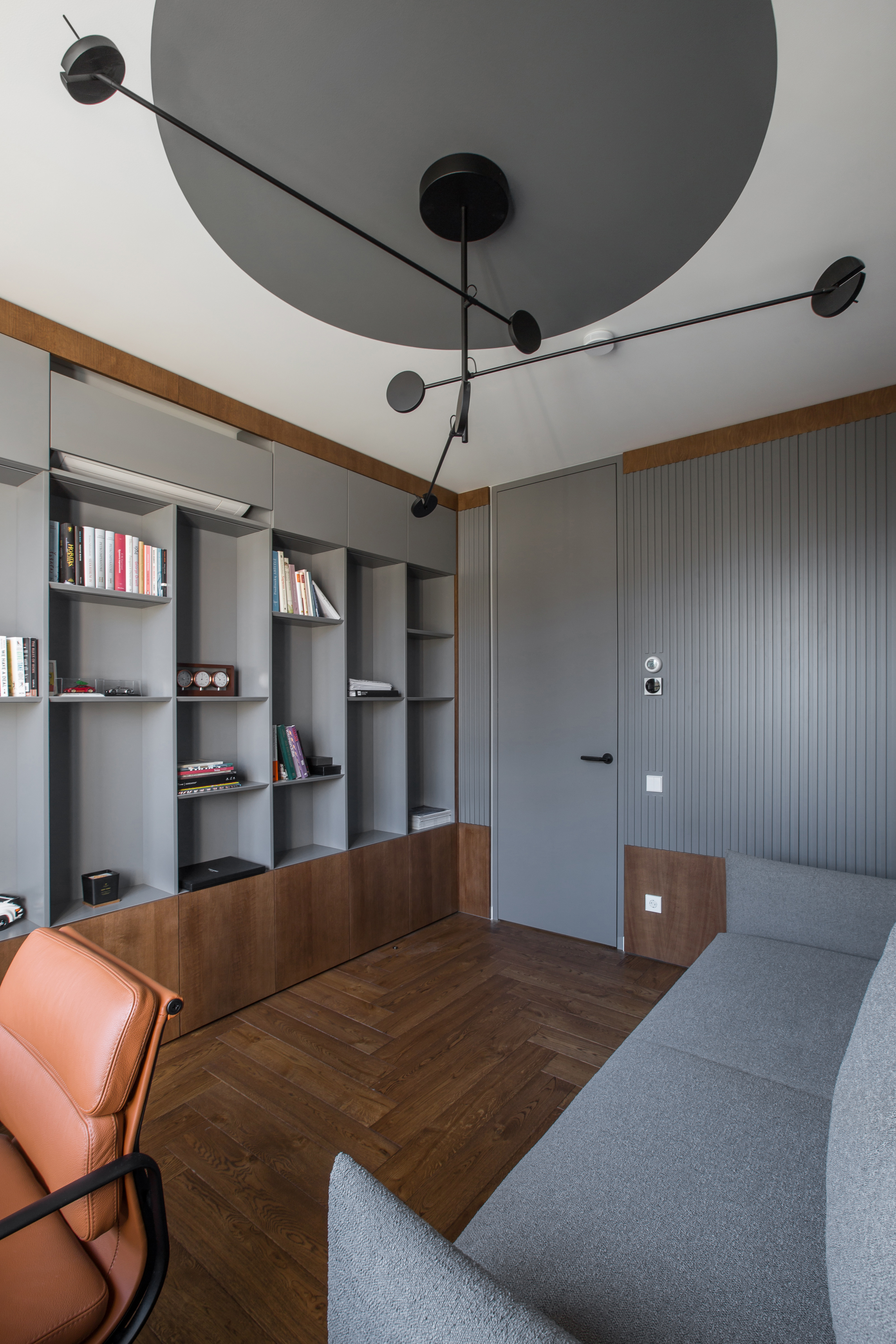
"There are so many colors that go with dark gray but pink is the most charming combo — and in small narrow rooms this pairing works great," says Sophie Dries, founder of Sophie Dries Architect. "This 'piece boite' room, painted from floor to ceiling is a great example. The graphite gray valchromat cabinetry contrasts well with concrete for an eye-catching interior."
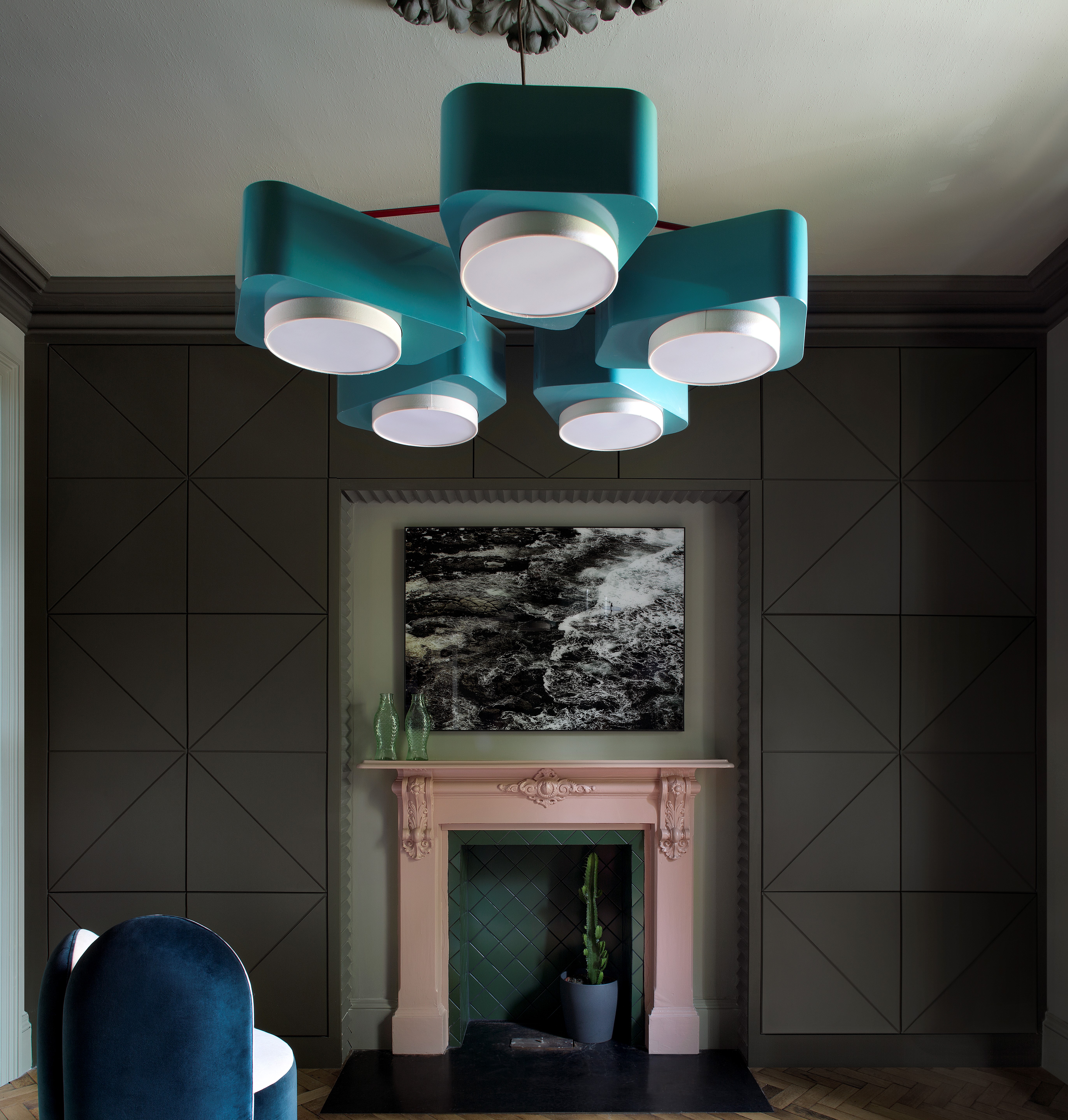
7. Teal
Many colors go with teal, and a dark gray is a winning combination. It can make a room feel calm and coordinated, but also full of detail, texture, and warmth.
"If the room is dark and it’s a calculated decision to embrace its lack of light, then paint it a dark tone," says Amy Krane, architectural color consultant and founder of Amy Krane Color. "I endorse this approach on occasion. I’d add a lot of other colors to the decor to keep it lively. A large room with dark gray walls and matching dark gray trim can look great as long as you've got a lot of light. Smaller rooms painted dark can feel cave-like but can also feel like a jewel box. How you perceive it is more about you. I wouldn't paint those ceilings the same dark color in a small room either. It could become oppressive."
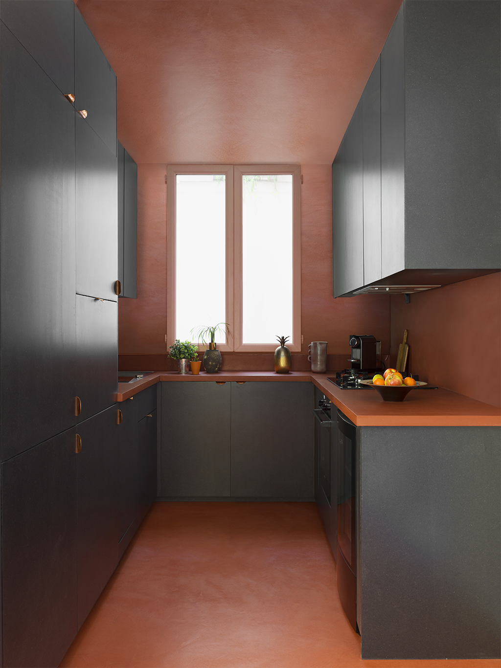
8. Brown
Individually, gray and brown make an appearance in interiors, but did you know that a combination of the two can create balance, earthiness, and a feeling of rest? The two deep tones have an inherent feeling of coziness, and create nature-inspired visuals. You can use brown in paints, furniture or decoratives in case you worry the scheme may look too rustic.
"Fortunately, brown furniture is versatile and can be paired with many wall colors, in particular earthy tones and neutrals," advises says Juliette Thomas, founder & director of Juliettes Interiors. "Using these color combinations will create a well-balanced, cohesive, and timeless look."
Also, many colors go with brown, allowing you to add in a third tone.
9. Turquoise
What colors go with dark gray to create the cheeriest interior? Turquoise of course! The combo evokes Caribbean water and Tiffany boxes visuals. It is at once soothing, yet effortlessly stylish. A mixture of light blue and green, it makes for a wonderful contrast to darker, grounded hues.
“If you want to create a dynamic feel in your home, then pairing hues of dark gray and turquoise will do just that," says Faiza Saquib, advice and gardens editor at Livingetc.com. "But remember, it’s about balance, creatively and cohesion when bringing these colors together. Think about drawing in some bright accents with these colors to bring a burst of energy into your home. For example, if you have a turquoise accent chair, you can throw on some yellow cushions to break away the colors, that will match perfectly with your delicately placed gray marble side table. And for those dramatic kitchen backsplash ideas, add a gray backsplash — and paint your cabinets and drawers to perfection in a fine turquoise color that will add a sense of allure and beauty to your home."
This is one of the standout colors that go with dark gray as the tone comes in a nearly infinite range of hues, and can can easily pair with a dark gray or a miid-tone gray for the best, pick-me-up palette, especially effective in a living room color scheme.
10. Yellow

Many colors go with yellow, and a great companion to the hue is dark gray. The former being a color of sunshine, sustenance and rejuvenation can add a slice of cheerfulness to a gray room that may sometimes seem too somber. If drenching entire rooms in yellow may seem a bit much, consider adding splashes of yellow through paint, furniture, artwork, and accessories, with a lovely gray as a backdrop to pull a mature scheme together.
"When painting your walls gray be sure to pay attention to how warm or cool the shade of gray is, as you'll want contrast in the room to play against the other elements," says Liz Goldberg, founder of CAROLYNLEONA.
11. Cream
"The more light-colored components in the room (and the higher the ceiling) the more the dark gray won’t make you feel like the walls are closing in on you," says Amy. "I would steer away from the dark ceiling too unless you're decorating a restaurant or a bar. But if you want a light ceiling stay clear of bright white as the contrast will be too much. Tone that white down somewhat or choose another lighter color, or, trending now, wallpaper."
For the perfect light and dark, yin and yan scheme, cream and dark gray are a great pairing. Both the tones aren't on the extreme ends of the color scheme, which means that, unlike a pure white and black combo which could look clinical, a cream and a gray can make a room seem warmer and more welcoming.
To add more life to a gray and cream living room or bedroom, consider adding a third hue to bring in a slice of drama. Most tones from the color wheel would work since both cream and gray are essentially neutrals.
12. Tan
Amongst the colors that go with dark gray is tan as the combination opens up many design opportunities and moods — for one, it can make an interior appear warmer on the coldest days. The tone has an inherent texture and form to it and can look lovely with a deep, soulful tone like dark gray.
Great colors that go with tan are gold and brown, close companions to the tones, and perfect suspects for layering. You may want to go with a softer gray to make a room feel airy. If you're choosing this palette for a small room, consider a white ceiling so the overall vibe isn't too overwhelming.
"A well-balanced color palette tends to mix light and dark shades to give it complexity and depth," says Emma Breislin, interiors editor at Livingetc.com. "Pairing taupe or tan, and dark gray works particularly well, as the former is a blend of brown and gray undertones, meaning the shades sit harmoniously together. In a living room, for example, a taupe-colored wall styled with a mix of light and dark gray furnishings will be easy on the eye, with no harsh contrasts, making the space feel more cozy, soft, and layered."
13. Red
Want to add some drama to your interiors or even exteriors? Choose colors that go with red, like dark gray, so you have the perfect sober and surprising tones together, creating a wonderful balance.
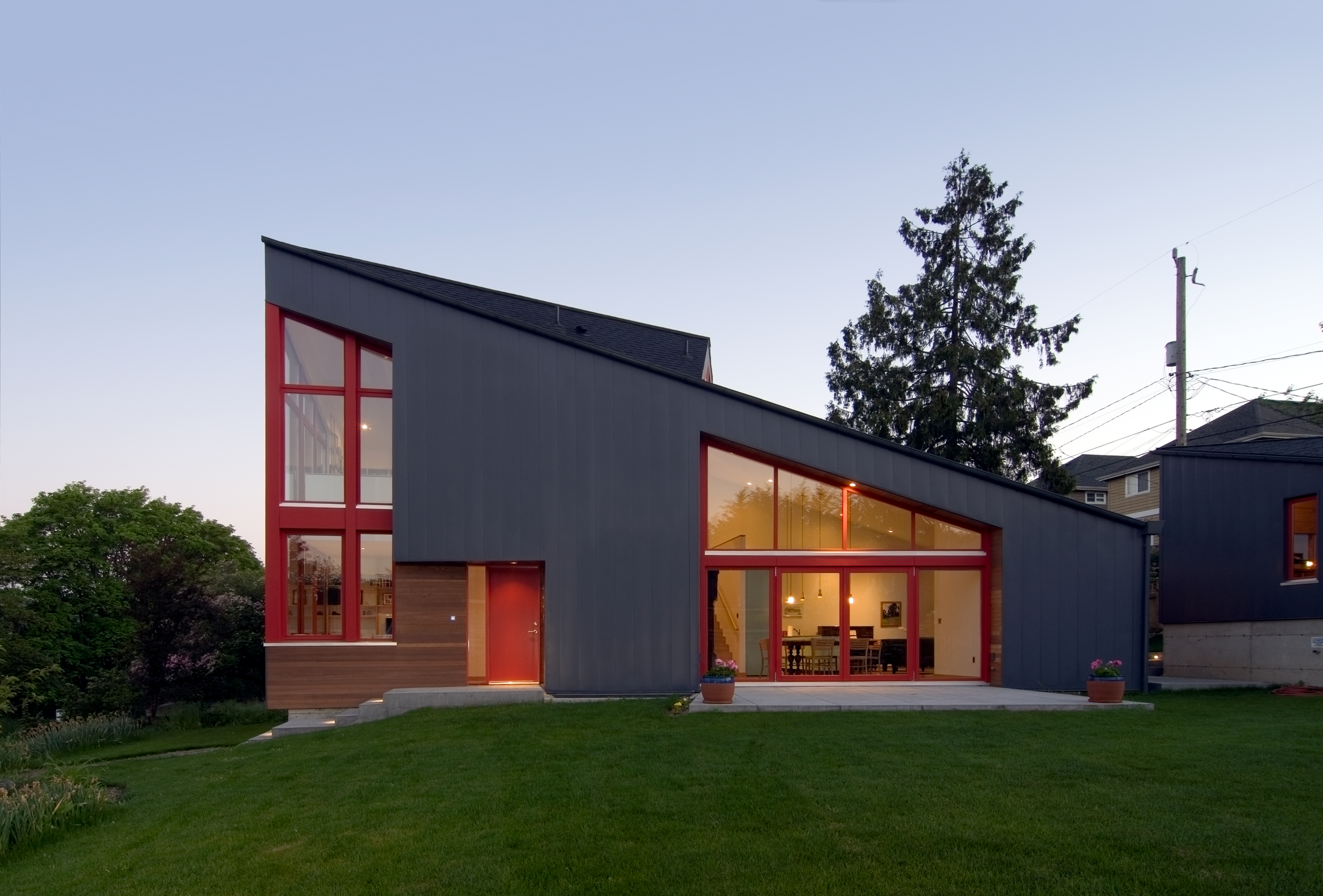
The architecture of this modern home is a great example of how arresting this color palette can be. "We chose the metal siding body color first: it needed to be neutral and mute to serve as a background for the garden," says Daniel Stettler, lead designer of Stettler Design. "Initially, we conceived of all of the windows as being a natural wood finish as a continuation of the wood siding infill, which was a soft complement to the dark gray. But the frequent maintenance on naturally finished wood windows in our climate proved too much, so we settled on a warm, wood-like red, which gave the landscape a dramatic pop of color."
What colors go well with charcoal gray?
Generally, cooler tones like icy blues, emerald green, and indigo look great with charcoal gray. These look dramatic and make the maximum impact. While this color combo is effective when used in paints, it can also look good in soft furnishings and decorative elements.
what color goes with dark gray the best?
There isn't just one winning combination with dark gray — a whole spectrum of colors can go with this tone. Think dark green, dark blue, black, or teal for a moody scheme. But if you want to add brightness to the interiors, choose tones like white, cream, beige, tan, or light gray.