A neutral color scheme is among the most timeless, creating a calming space that aligns with many interior design styles, from traditional to modern. However, when decorating with neutral colors, it's important to carefully consider your decor choices to ensure your room doesn't end up feeling flat or even uninspired.
To steer you in the right direction, we consulted a range of interior designers and paint color specialists who shared their top color rules to use when decorating with neutrals. From choosing the right neutral paint to adding texture and contrast to the overall scheme through decor, these color rules ensure neutral rooms feel far from boring, but balanced, soothing, and timeless.
'Incredibly versatile, neutral hues have endless potential to transform a home,' says Hannah Yeo, senior manager of color marketing at Benjamin Moore. 'Their true beauty lies in the rich array of undertones they offer. By embracing these undertones, you can highlight the subtle nuances of each color and create a layered effect and effortless harmony.'
1. Choose warm neutral paint colors
‘Neutral does not have to mean bland and the use of stone shades in an interior is not about a return to beige or greige, but a way of using warmer, natural shades in the home to create schemes with longevity,' says Ruth Mottershead, Creative Director at Little Greene.
Below, Ruth shares some of the best warm neutral paints to decorate with for a calming yet inviting color scheme:
'Consider Travertine on walls, paired with the lighter Stock on ceilings, or three-quarters of the way up the wall to open up the space and give the illusion of height. The warmth of natural stone hues feels incredibly soothing and works wonderfully with the addition of bare wood finishes, touches of rattan, and unglazed ceramics.
'Perfect for use in ‘all-over’ schemes in both contemporary and traditional settings, these delightful neutral hues work really well in a color-drenched room as an alternative to white or grey.'
2. Add interest through texture
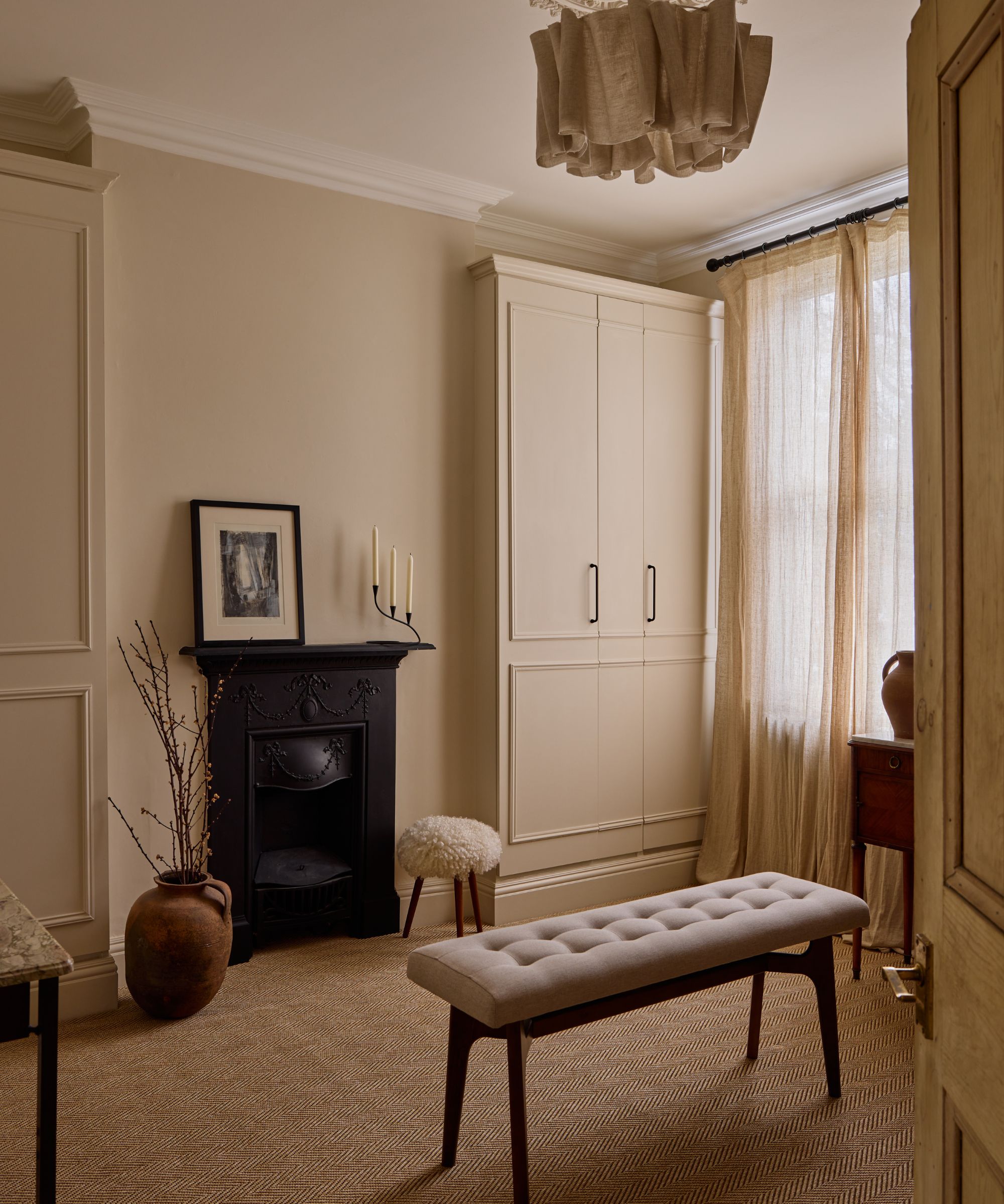
When decorating with a restrained neutral color palette, it's important to add depth and interest through texture. Whether through soft furnishings that help create a cozy space or natural materials such as solid wood, layers of texture can serve as a point of interest in your neutral room.
'I suggest combining a combination of woods and ceramics for the harder surfaces, then softening with a variety of soft furnishings and textiles,' advises interior designer Jenny Luck. 'Natural earthy materials will bring warmth to a neutral calming space.'
Christine Carney, Blackberry Farm Design's Director of Design also suggests using lots of textures in a neutral scheme, adding: 'Layering multiple textures and various materials is the easiest way to make a neutral room feel more interesting and alive. For instance, combining a nubby boucle with a luscious velvet with a shining wool sateen with dry linen with a... it can go on and on. The same with harder materials – the texture of wood grain combined with the sparkle of a glass sculpture and the shimmer of a metal accessory. All these things add up – so even though the space may be very neutral in color, there is still a lot to take in.'
3. Incorporate playful shapes

Similarly to adding rich textures to enhance a neutral scheme, you can also experiment with adding various shapes through decor, as Tash Bradley, color psychologist and Director of Interior Design at Lick explains below:
'Play around with shapes. Create visual interest with curved sofas, roughly textured organic wooden tables, wiggly lines on cupboards, scalloped pillows, and even artwork. If you're working with a flat wall surface, try mimicking traditional architectural features such as wall paneling, picture rails, or dado rails. By adding a three-dimensional element to your white wall, you add depth and visual interest to an otherwise flat surface.'
4. Disrupt the scheme with something unexpected
Sometimes neutral rooms can fail to boast design appeal with well-matched colors throughout, but adding something more unexpected can be just what's needed to create personality.
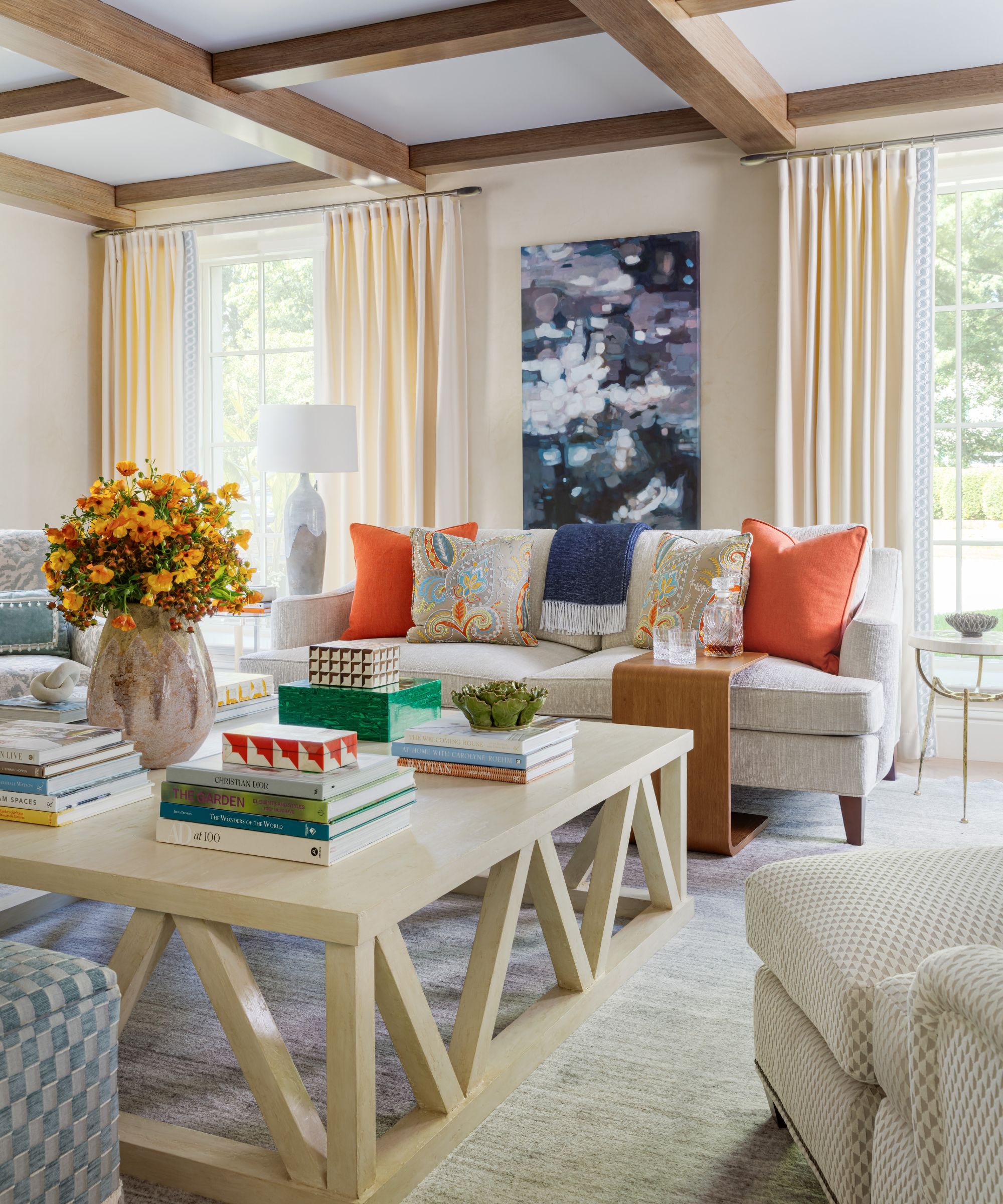
For example, interior designer Betsy Wentz added bright red pillows to this neutral living room, creating a playful pop of color amid the neutral tones. She explains:
'I like to enhance a neutral space with a few bold, eye-catching pieces like a cool light fixture or a statement piece of art. From there, I build out the room's personality by layering in textures, patterns, and colors through furniture and accessories.'
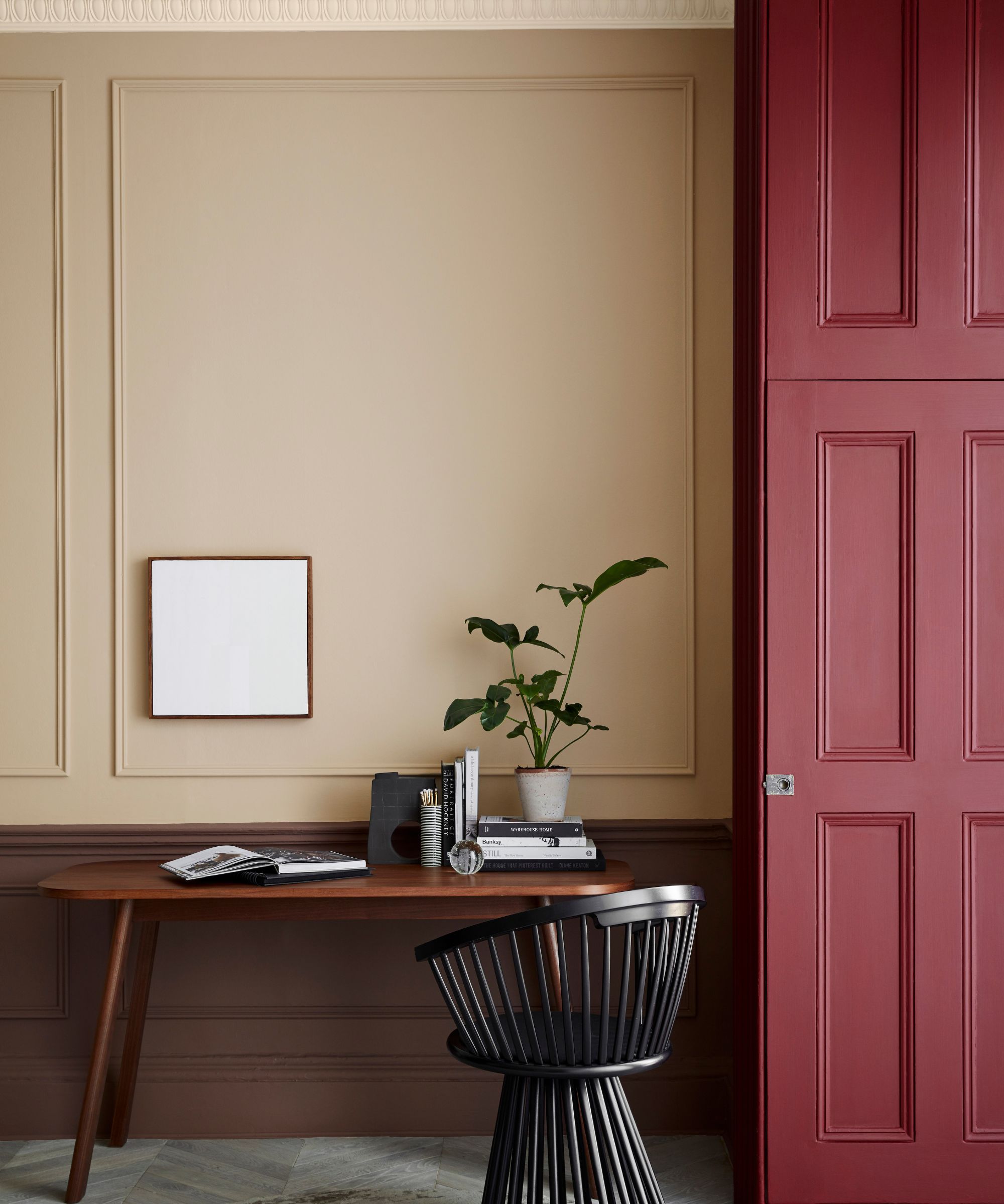
Tash Bradley agrees with this approach, adding: 'You can still bring bursts of color into your home without compromising your neutral color scheme. If you love neutrals, try introducing brighter colors in small doses as accents by painting a console, door frame, or the inside of a cabinet for a lovely surprise whenever you open it.'
5. Think beyond classic neutral hues
When choosing your neutral paint colors, think beyond classic hues such as warm whites or beige. Designers are championing a range of soft colors, from plaster pinks to mellow greens, dubbed new neutrals that form the base of a scheme.
'It’s important to note that neutrals do not just come in white and you can bring uplifting colors into your home that still feel and look neutral,' explains Tash Bradley. 'Other neutrals include colors such as light pinks like Pink 01, light greens like Green 01 or Green 09, earthy browns like Brown 02, and stone and sandy colors like Taupe 03.'
When using these new neutrals, consider color drenching for an on-trend look. While accent colors can feel dated, a singular-color approach feels more immersive and cohesive. 'Color drenching a neutral space can be visually stunning, especially if you play with the sheen to add dimension to the space,' explains Ashley McCollum, color expert, Glidden brand. 'Think higher sheen on a ceiling and moldings, highest sheen on trim, and lowest sheen on your main walls.'
From choosing the right neutral paint to layering in textures and a pop of bold color to add depth, these color rules are bound to add excitement to your neutral room, allowing you to benefit from its calming qualities without lacking interest.