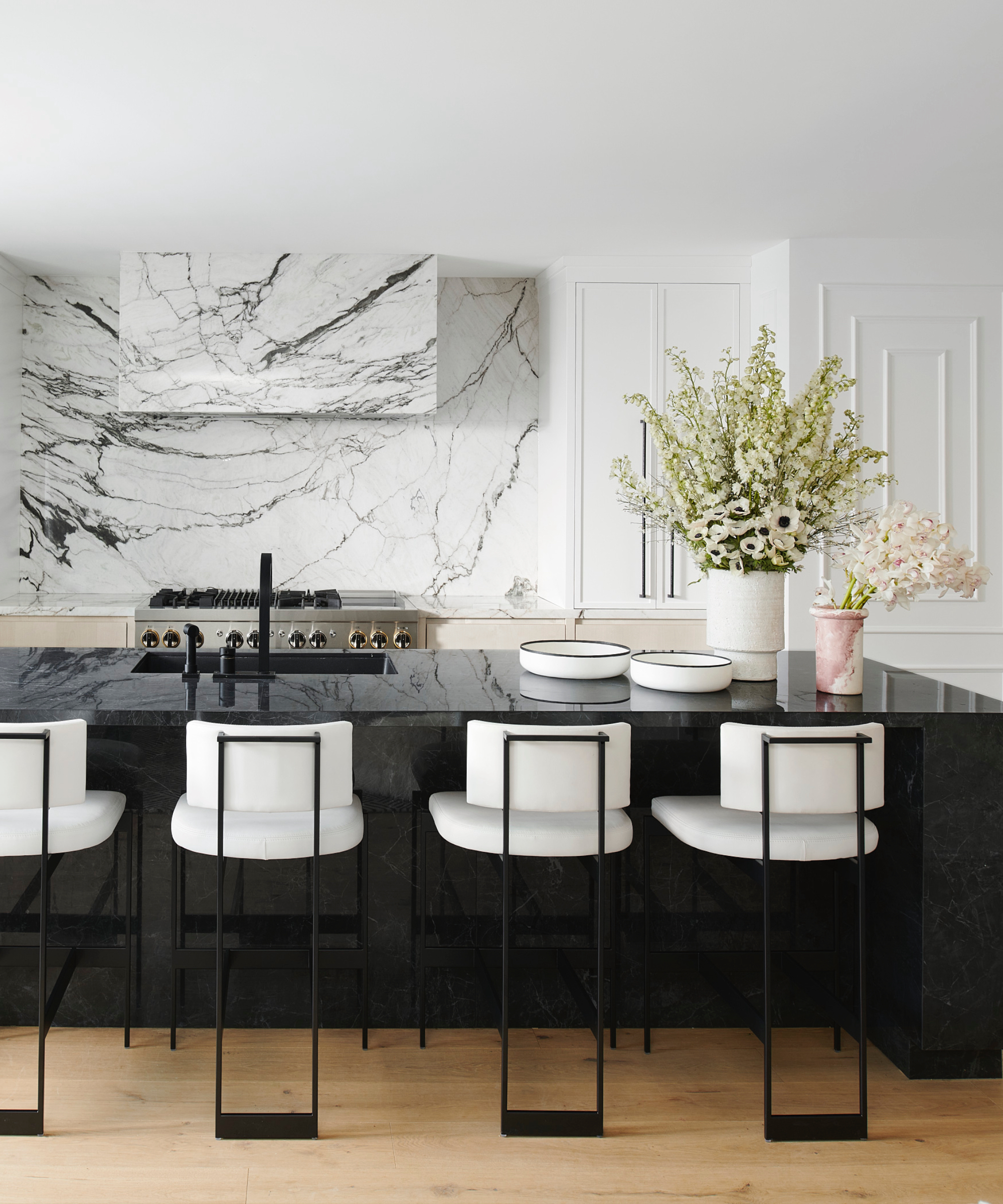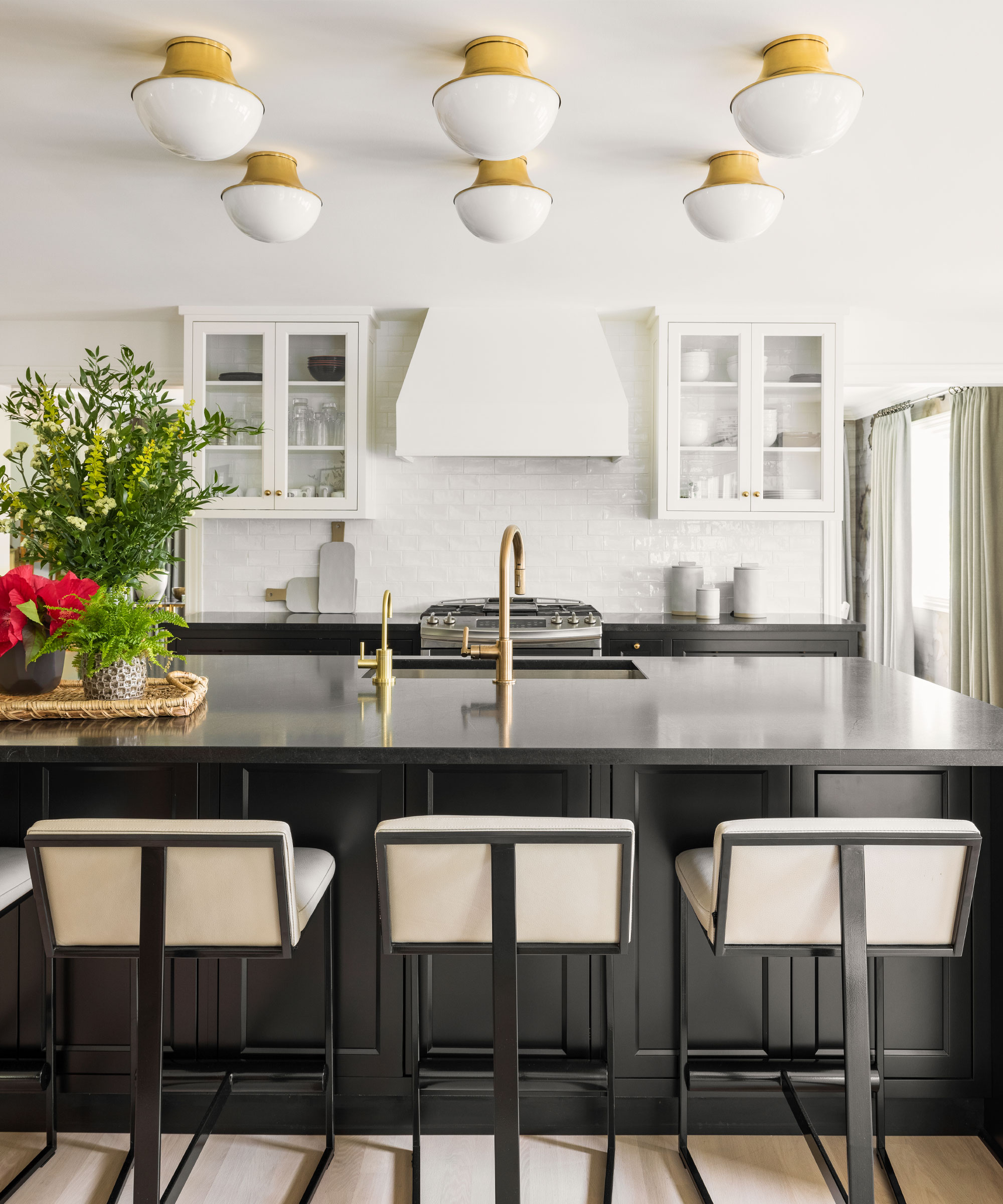
Coco Gauff may be used to setting a precedent on the court, but the tennis pro's home is just as inspiring – especially when it comes to utilizing a classic color palette. In her Delray Beach kitchen, Gauff makes a case for the most versatile (yet powerful) color combination of all: black and white – and designers and estate agents alike can't deny its eternal charm.
Gauff's black-and-white kitchen comprises dark-hued countertops and painted cabinets that juxtapose the lighter walls (the latter of which also plays host to a small gallery wall that brings personality to the space). Like all of us, Gauff is no stranger to sampling pasta straight from the pan – something we, too, are guilty of, no matter our kitchen's color palette. 'As an athlete, pasta is a staple in my diet as it provides the balanced nutrition and functional fuel I need on and off the court,' she says.
Cooking habits aside, we can learn a lot from Gauff's decorating choices. The color combination is classic, but because it is so relied on, it can be hard to ensure black-and-white kitchens feel exciting. This is why incorporating different textures and introducing elements (like Gauff's gallery wall and indoor plants) can go a long way.
'When it comes to the heart of the home, the kitchen, picking the right color scheme can truly make all the difference,' comments Rachel Stringer, a real estate agent at Raleigh Realty. 'In my years as a real estate agent, I’ve seen trends come and go, but one look that always stays in style is the classic black-and-white kitchen. There’s just something about this combo that’s both timeless and incredibly versatile. It perfectly balances elegance and simplicity, making it a great choice for any home.'
However, as mentioned, in all its versatility, this palette risks feeling uninteresting. This is where we can learn from Gauff. Firstly, she combines different textures, most specifically through her black marble countertops (and kitchen island, seen in the backdrop of the last photo on the carousel) and dark wooden cabinets. We can also achieve varying textures through our hardware.
'I had a client who was hesitant about choosing a black-and-white kitchen because they thought it might look too stark or cold. We talked about how adding different textures and materials can bring warmth and character. For example, pairing glossy white cabinets with matte black hardware or a marble countertop can break up the monotony and add a touch of luxury,' Stringer says.
'Using natural elements like wooden accents or a colorful backsplash can soften the overall look and create a welcoming atmosphere.'

Accessories can also make an impact. On the last slide, we see Gauff has made the ultimate statement with a contemporary red, gold, and black chandelier, something that hasn't gone unnoticed by Stringer.
'I can’t stress enough the importance of lighting in a black-and-white kitchen. Good lighting enhances the contrast and makes the space feel more inviting,' she says. Chandelier aside, she recommends under-cabinet lighting to highlight our countertops. 'These small touches can make a big difference and elevate the overall look,' she says.
'Plus, a black-and-white kitchen offers endless opportunities for personalization. You can switch up accessories like rugs, towels, and even small appliances to keep the space feeling fresh and updated without needing a complete overhaul. It’s like having a little black dress in your wardrobe; you can dress it up or down depending on the occasion.'
For a Gauff-inspired starting point, these accessories will add a sense of interest to any-hued kitchen.

Lois Riley, a designer at Mowlem & Co, agrees. While it's hard to know exactly how big Gauff's space is, Riley adds that the palette is powerful in small kitchens before re-emphasizing the importance of varying textures and accessories.
“A black and white palette works really well in the kitchen. It has a timeless appeal and lends a chic, high-contrast sense of definition. It’s great for smaller spaces as they aren’t overwhelmed with any one color or tone and can be softened by the addition of wood finishes on the floor and on other furniture and accessories,' she comments.
'If using the colors in the block, it is better to have the black sections lower to ground the scheme and the white sections above.' We're taking this trick no matter the size of the space we're working with.


.jpg?w=600)


