
Claude's impressive Artifact feature just got a massive upgrade, becoming easier to share with other users and even people without a Claude account.
Artifacts were introduced alongside Claude 3.5 Sonnet, allowing users to interact with code, vector graphics and other content created by the chatbot. Each one can also be re-used as a way to enhance a project without having to copy and paste the entire output into a new message.
With the latest update to Artifacts, Anthropic finally added one of the most requested features, giving users the ability to share an Artifact.
There are some limitations to Artifacts, including limited access to third-party modules and APIs, as well as a fairly restrictive word count, meaning there is a code/functionality limit. But it is still an exciting development worth playing with.
If you want to create entire web applications from nothing but a text prompt, I suggest checking out Websim.
What are Claude Artifacts?
Artifacts made with Claude can now be published and shared.You can also remix Artifacts shared by others. 🎨 https://t.co/AjARvS0TDo pic.twitter.com/d7D0n96tfrJuly 9, 2024
A simple but impressive idea — ssentially, Artifacts are wrappers that allow Claude to offer a piece of code, a piece of text or any other form of content including vector graphics in a way that the user can play with, share or save without getting lost in a conversation's maelstrom.
Sharing is the latest addition and what is more impressive than simply being able to share the Artifact is the remix feature. This allows users to iterate on and improve any Artifact built by any other user. You can even use it to enhance an Artifact of your own.
It's such an impressive concept that other AI tools have started to copy it, including Poe, the Quora-backed AI chatbot aggregator, where you can now use a similar concept across multiple language models.
Putting it to the test
I've come up with seven share-worthy ideas and refined each one of them across multiple prompts to get a working and usable Artifact. This was harder than I originally expected, as it took several attempts to get it working properly.
I have also asked in each instance for Claude to create a prompt that sums up everything that was created up to the point I clicked Publish on the Artifact. This is so that you can try each one individually for yourself from scratch not just from remixing the Artifact.
If you do opt to Remix, it will share the Artifact with a new instance of Claude and include instructions to offer three ways it could be improved. If you just want to use each Artifact, you don’t need a Claude account.
1. Personal budget planner
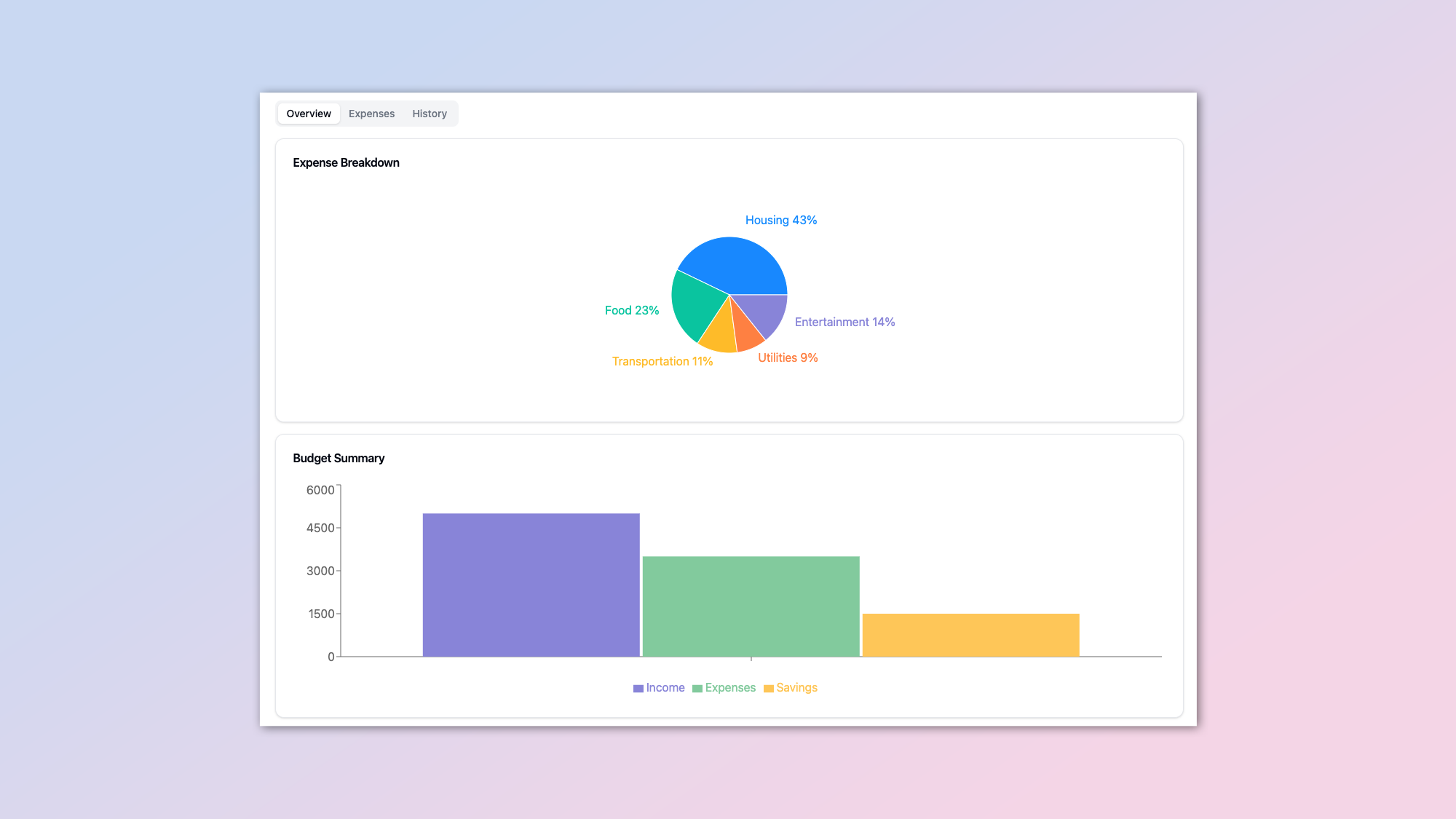
In theory one of the easiest things to make using an Artifact is a simple budget planner. However, what I found in the process of putting this together is that you've got to be very specific with Claude as to what you want it to do.
For example, if you want it to be able to track different types of expenses, you need to clarify that, as it will default to just a general expenses column. I think what I've pulled together is quite an effective simple tool.
Create a React component for a comprehensive Personal Budget Planner dashboard. The dashboard should include features for inputting and displaying income, expenses, and savings. Implement a tabbed interface with three main sections: an overview showing expense breakdown and budget summary with charts, an expenses management tab for adding and removing expense categories, and a history tab displaying budget trends over time. Include interactive elements like editable fields for income and expenses, and dynamic updates of savings and financial health indicators. Use charts (pie chart for expense breakdown, bar chart for budget summary, and line chart for historical data) to visualize the data. Incorporate a financial health indicator that changes based on the savings rate. Ensure the design is responsive and user-friendly, with clear labeling and intuitive controls. Use components from a UI library like shadcn/ui for consistent styling, and implement data visualization using a library like recharts. The component should update all calculations and visualizations in real-time as the user interacts with it.Obviously, you can adjust this in any way you like. You could ask it to remove certain features, add specific categories or just simplify it into two columns and a button.
To make any changes, Just click on Remix, and you can change it in any way that suits your needs — all you have to do is tell Claude what you want changed.
2. Fitness Dashboard app
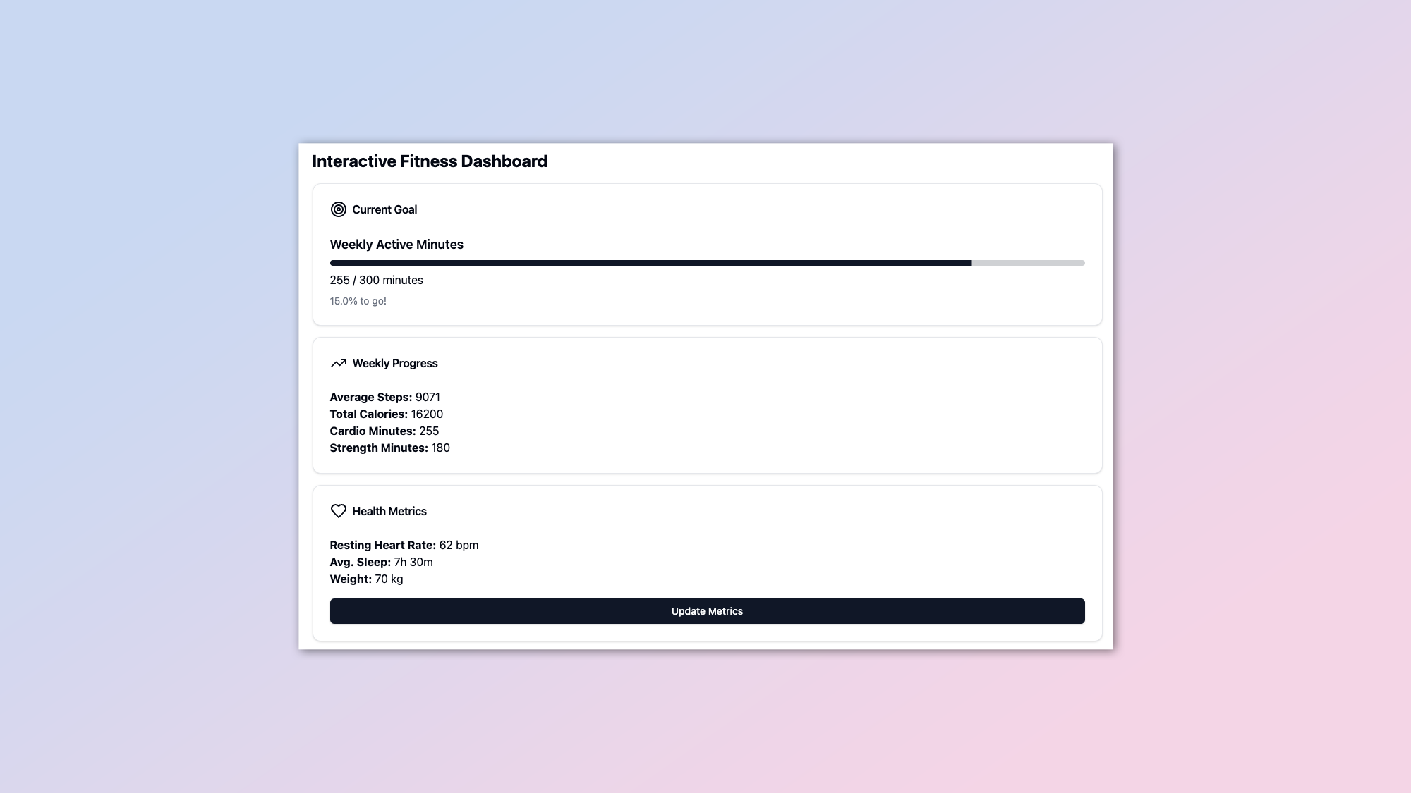
Next up, a simple personal fitness tracker. Originally I was going to try and create some sort of challenge system where you could input the times or the steps for different users on any given day but that didn't work due to the limitations of an Artifact.
Instead, I created a personal fitness dashboard with step counts and heart rate. I've reached the limit of what is possible within a single prompt. So some of the buttons don't work, but the core functionality is there.
Develop a comprehensive Fitness Dashboard React component that helps users track and visualize their fitness progress. Include modules for tracking daily step count, workout duration, calorie burn, and water intake. Implement a weight tracker with a graph showing trends over time. Add a workout log feature where users can record different types of exercises (e.g., cardio, strength training, flexibility) with duration and intensity. Create a meal planner and calorie counter, allowing users to log their daily food intake. Include a goal-setting feature for various fitness metrics (e.g., target weight, daily step goal, workout frequency). Implement a sleep tracker that records duration and quality of sleep. Add a motivational feature that provides daily fitness tips or challenges. Create an analytics section that shows weekly and monthly progress summaries. Design an intuitive and visually appealing UI with charts and graphs to display data. Implement a simple user profile system to personalize the dashboard. Optimize the code for efficiency and compactness while maintaining readability. Ensure the component works within the Artifact constraints, using only React and basic UI components without external libraries. Include helpful comments explaining key aspects of the code for easy understanding and modification.While there isn't much scope to specifically improve or enhance what's already there, what you could do is have it swap out different features after clicking Remix.
So for example, you might decide that instead of tracking steps, you want to track lengths in the pool or reps. Just ask Claude to make those changes and then update the Artifact. If you come up with something compelling, I'd love to see it.
3. Recipe Roulette app
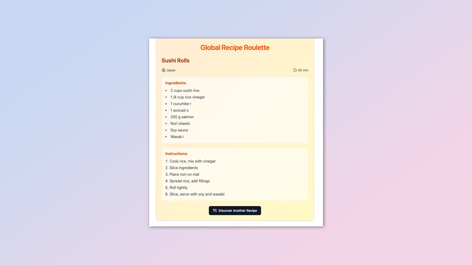
Now that we know where all our money's going and that we've got an idea of how much exercise we're doing, it's time for food. In this one, I had to get quite creative with the prompt in order to fit more than a couple of recipes into the Artifact.
I told Claude not to make the code pretty or human-readable, which means it was able to include more code in a smaller file. As a result, we've got am Artifact that can deliver a dozen or so different recipes available at the touch of a button.
Create an interactive Recipe Roulette React component that allows users to discover random recipes. Include at least 10 diverse recipes from different cuisines, each with a name, origin, cooking time, ingredients list, and step-by-step instructions. Use a compressed data structure to store recipe information efficiently. Implement a function to display a random recipe when requested. Add features for users to customize the recipe, such as adjusting serving sizes or ingredient quantities. Include a simple rating system for recipes. Make the UI attractive and user-friendly, with a clean layout and appealing color scheme. Optimize the code for compactness while maintaining readability. Ensure the component works within the constraints of an Artifact, using only React and basic UI components without external libraries. Add comments explaining key parts of the code for easy understanding and modification.Claude, like most of the larger large language models, is exceptionally good at recipes. If you don't want a general recipe roulette app like the one I've created here, you could ask Claude to swap out the recipes and put in drinks or sauces or even turn it into an activity app. You could even have it come up with a dozen random activities instead of food or drink.
4. Pixel animator
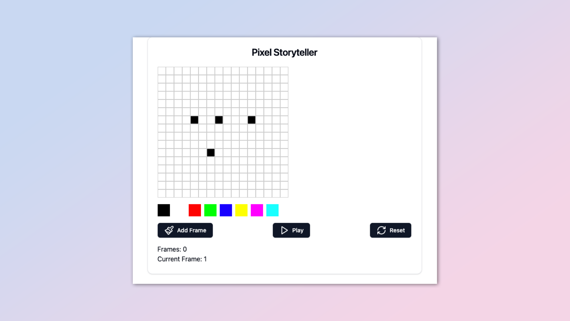
Time for a bit of fun — this one took me by surprise because I did not think it would work as well as it did. The idea is to create a simple animation tool.
This is a glorified stop-motion animator. Add a new frame and a new pixel or two over say 20-30 frames and you've got a few seconds of motion.
I thought it would work, but that it would be janky. However, it is significantly better than I was expecting. It's a simple pixel animation tool.
Design an interactive Pixel Storyteller React component that allows users to create simple pixel art animations. Implement a grid-based canvas (at least 16x16) where users can paint pixels with a selection of colors (minimum 8 colors). Include tools for drawing, erasing, and filling areas. Add functionality to create multiple frames for animation, with options to add, delete, and reorder frames. Implement a preview mode that plays the animation in a loop. Include features like copy/paste of frame content, mirror/flip tools, and basic shape drawing (line, rectangle, circle). Create a simple UI for selecting colors, tools, and managing frames. Add the ability to adjust animation speed. Implement a basic save/load feature using compressed string representations of the pixel art and animation data. Optimize the code for efficiency and compactness while maintaining readability. Ensure the component works within the constraints of an Artifact, using only React and basic UI components without external libraries. Add helpful comments to explain key parts of the code for easy understanding and modification by others.Not entirely sure how you'd improve on this one, but what you could do is ask for a wider range of colors. You could even have it create stamps or shapes that you could drop onto the board. Other options include different canvas sizes or setting the frames per second for the final animation. Save options won't work in an Artifact.
5. A moment of calm
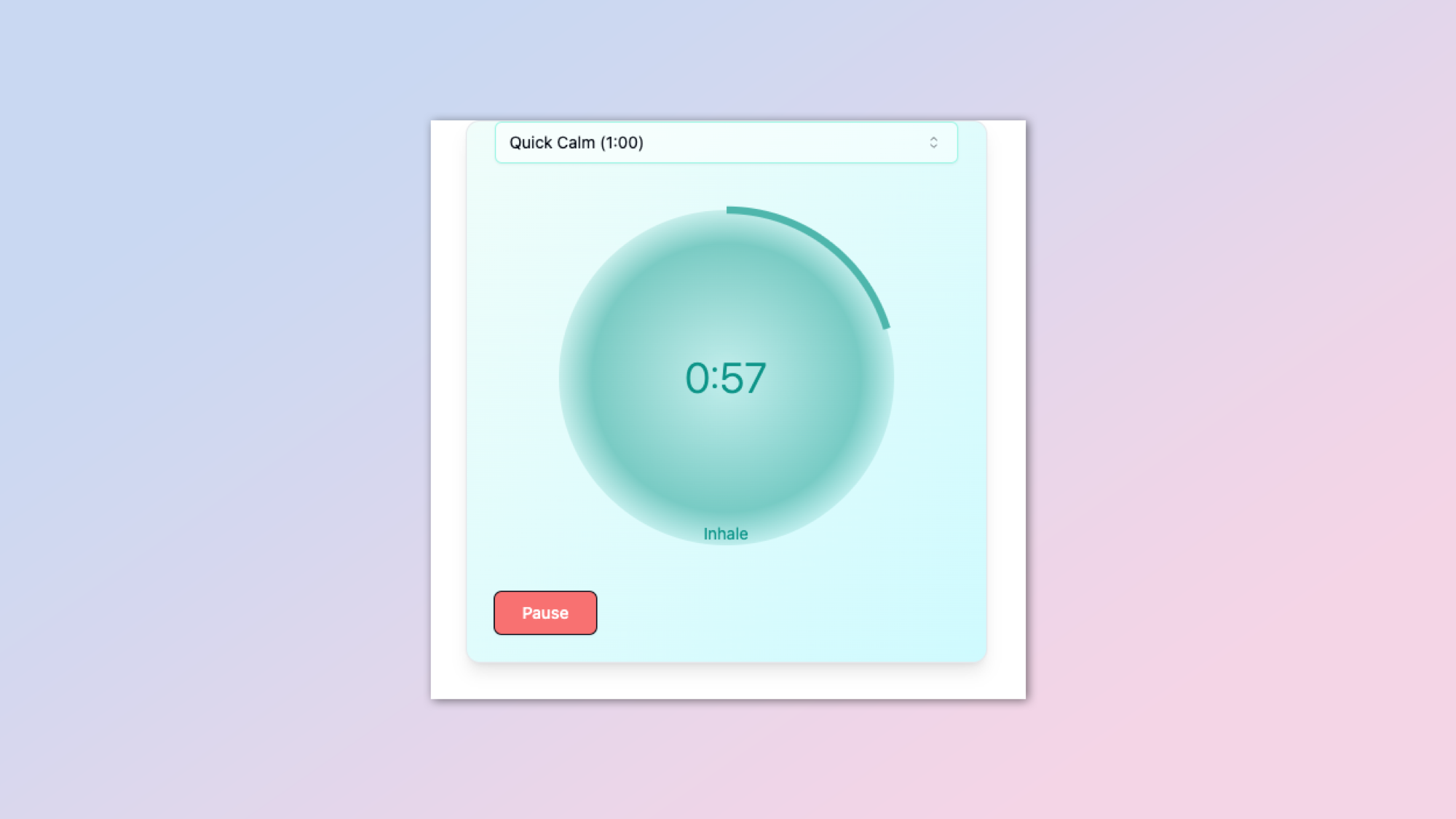
Now that we've got healthy, had some food and played around a bit it's time for some relaxation. This one is a simple breathing tool. Breathe in, breathe out, feel better. It doesn't do much more than that, and it's a really simple calming interface.
Although it wasn't that calming the first time I asked Claude to create it. I had to push it to be more imaginative and describe the UI I was after.
Develop a Mindful Moments React component for guided breathing and relaxation exercises. Include multiple breathing patterns (e.g., 4-7-8, box breathing, equal breathing) that users can choose from. Implement a visually appealing animated guide for each breathing exercise, using SVG or CSS animations. Add a timer feature allowing users to set custom durations for their sessions. Include background ambient sounds or calming music that users can toggle on/off. Implement a simple mood tracker that allows users to record their mood before and after each session. Add a daily streak counter to encourage regular use. Create a clean, minimalist UI with a soothing color scheme that adjusts based on the time of day. Include a simple statistics view showing usage patterns and mood changes over time. Optimize the code for efficiency and compactness while maintaining readability. Ensure the component works within the Artifact constraints, using only React and basic UI components without external libraries. Add helpful comments explaining key aspects of the code for easy understanding and modification.There's quite a lot you could do to improve this one, as it's an incredibly simple app.
For example, you could add different visualization techniques using animations or vector graphics. You could have Claude create a wider range of lengths and durations and even have some positive messages flagged up while you're going through the process of breathing in and breathing out.
Remember though, you can't use sound or other features like that within an Artifact due to the limitations of the ecosystem.
6. Zen garden simulator
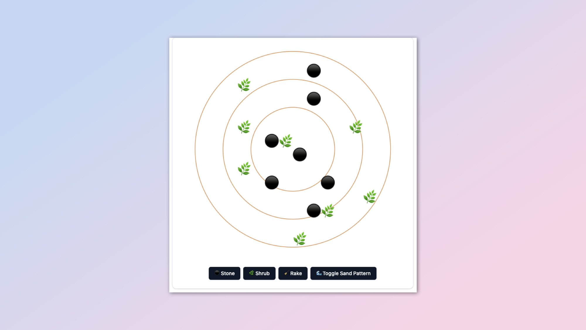
Keeping with the relaxation for a little while, let's have a Zen Garden. It's a simple simulator for a traditional Zen Garden where you make something really beautiful and intricate and then sweep it all away. It works, it's not perfect. There's probably a lot you could do to improve it if you were more into Zen Gardens than I am.
Create an interactive Zen Garden Designer React component that allows users to design their own digital zen garden. Implement a grid-based layout (at least 16x16) where users can place various elements such as rocks, plants, lanterns, and sand patterns. Include at least 6 different elements with distinct visual representations using SVG. Add functionality to rotate and scale placed elements. Implement a sand raking tool that allows users to create different patterns in the sand (e.g., straight lines, circles, wavy patterns). Include an undo/redo feature for design actions. Add a simple save/load system using compressed string representations of the garden layout. Create an aesthetically pleasing UI with a soothing color palette and smooth interactions. Implement a day/night cycle feature that changes the garden's appearance. Add ambient sound options (e.g., water, wind chimes) that users can toggle. Optimize the code for efficiency and compactness while ensuring readability. Ensure the component works within the Artifact constraints, using only React and basic UI components without external libraries. Include helpful comments explaining key parts of the code.
One potential idea for improvement is enhancing the raking effect, maybe making it so you manually have to swipe over the game board to remove the objects that you've created or add additional patterns in the raking process. However, to do this, you will likely have to remove some of the other features as you will come up against that message limit.
7. Language flashcards
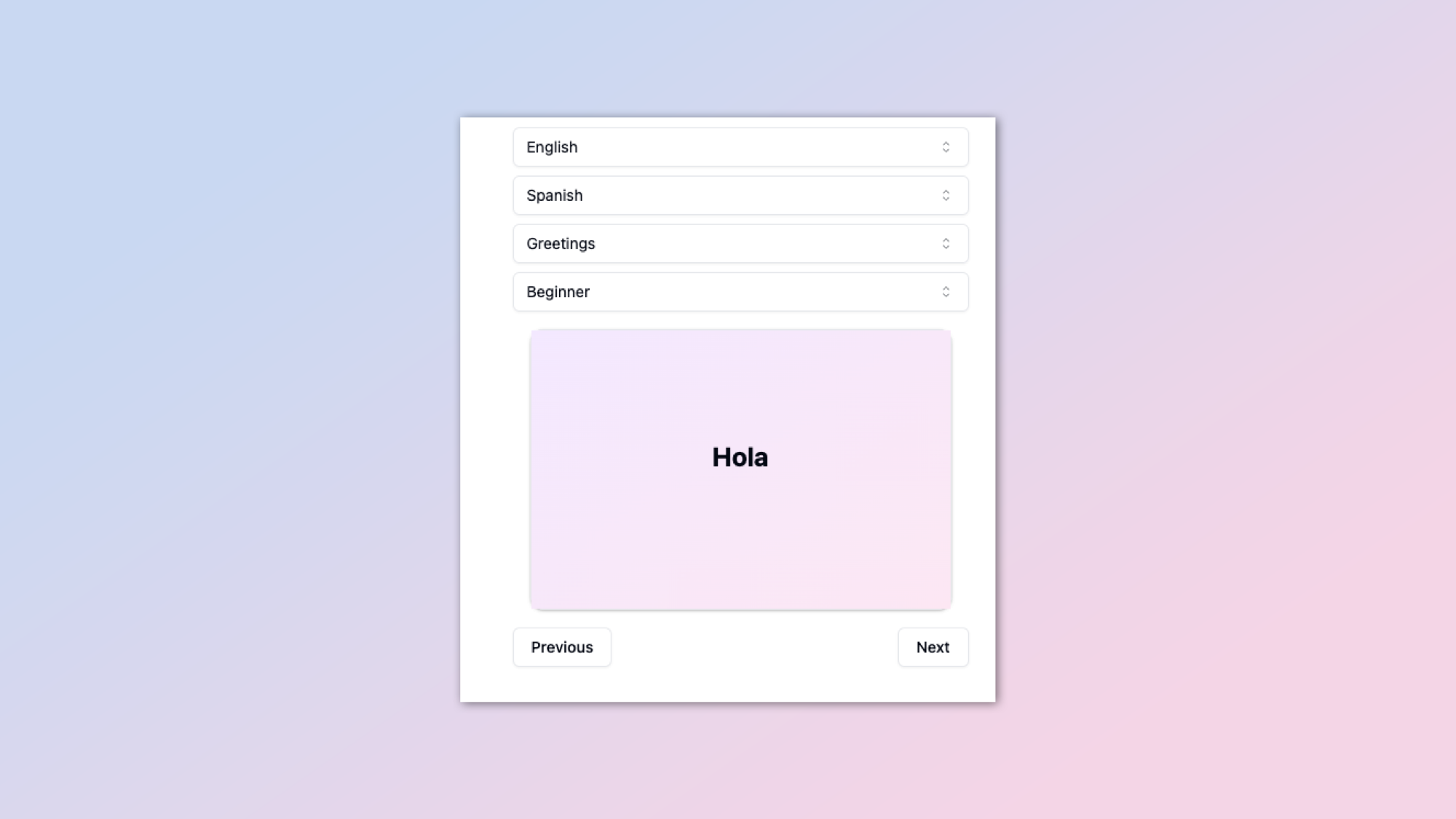
Finally, now that you've got yourself into a state of Zen, let's learn a new language.
Well, not really. You're not going to learn much more than some basic phrases that you might use in a coffee shop. But then I did French for five years of school and that's pretty much all I remember.
This one will offer up a series of simple flashcards with keywords in five different languages. And you can jump between them.
Create an interactive Language Learning Flashcards React component. Include support for at least 5 languages (e.g., English, Spanish, French, German, Italian) with the ability to easily add more. Implement a flashcard system with front (question) and back (answer) sides, allowing users to flip cards with a smooth animation. Include categories for vocabulary (e.g., greetings, food, travel, business) and difficulty levels (beginner, intermediate, advanced). Add a spaced repetition algorithm to optimize learning (e.g., a simplified version of the SuperMemo-2 algorithm). Implement a study mode where users can rate their familiarity with each card, affecting its future appearance frequency. Add a quiz mode that randomly tests users on their learned vocabulary. Include a progress tracking feature showing mastery levels for different categories and overall language proficiency. Create an intuitive UI with easy navigation between languages, categories, and modes. Implement a simple system for users to add custom flashcards. Optimize the code for efficiency and compactness while maintaining readability. Ensure the component works within the Artifact constraints, using only React and basic UI components without external libraries. Add helpful comments explaining key parts of the code for easy understanding and modification.This could be a really fun one to improve. All I would do is pick a single language rather than five and ask it to go into more detail.
You could even have it turn from flashcards into a conversation where you can talk to it. Although to be honest, if that's how you want to use AI, I would just talk to Claude because it's a great conversationalist and can do so in multiple languages.
Final thoughts
Artifacts are a powerful new feature, but there are clear limitations. The biggest of which is the message limit, where you basically have to be able to get the entire contents of the code for the Artifact within a single prompt.
The message character limit is definitely something Anthropic need to work on if they want them to become a useful and usable tool outside of Claude.
If you enjoyed any of these Artifacts please feel free to Remix them, change them, or even create entirely new ones of your own and share them. Tag me in if you post them to X or drop me an email, I'd love to check them out.


