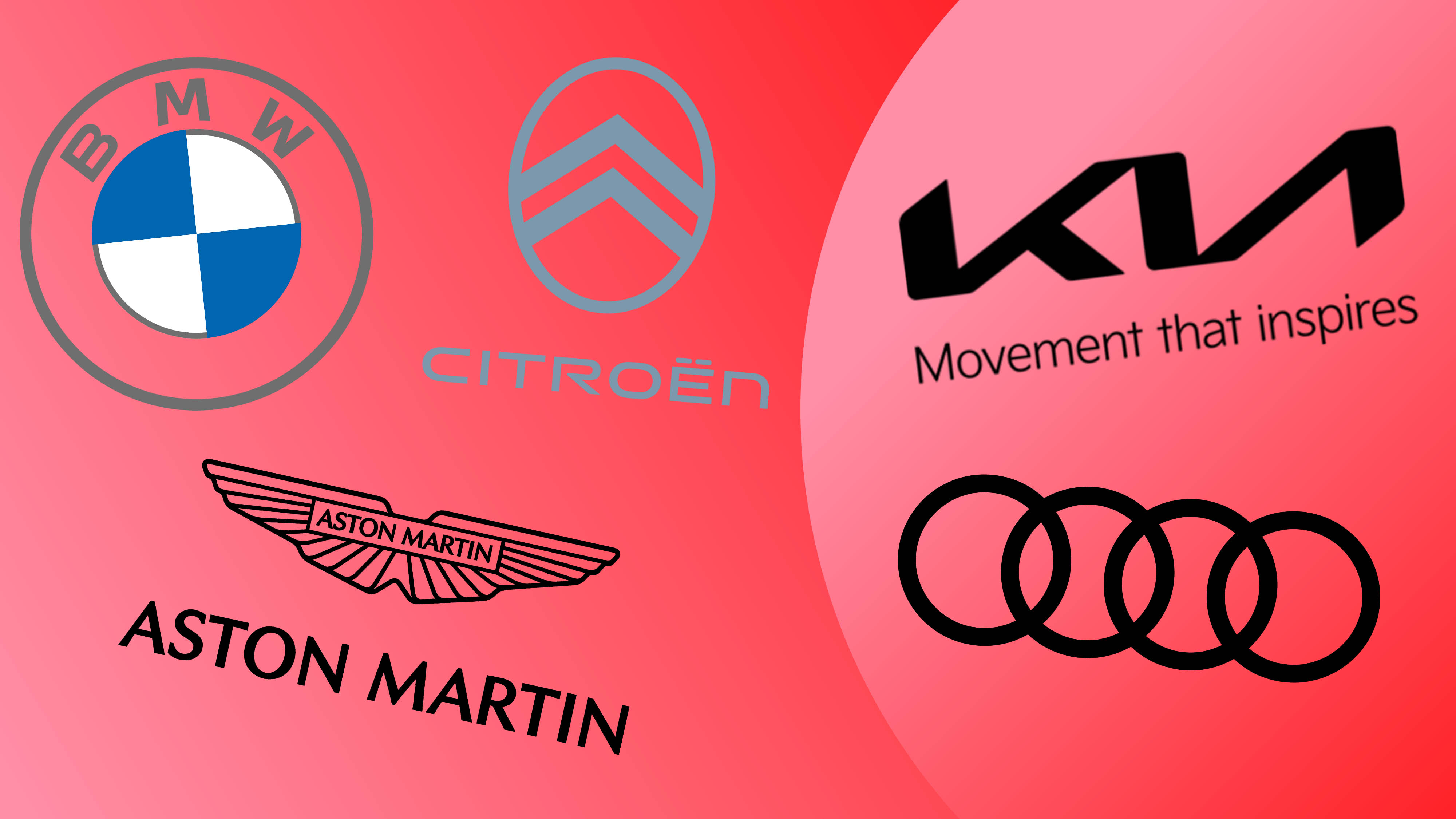
Car logo rebrands have come in thick and fast over the last couple of years with almost every major manufacturer jumping on the flat design trend. In almost every case, the car logos were made simpler and flatter for a more modern look, but also to make them easier to render in smaller digital applications.
When the main application of a car logo was the badge on the front of the vehicle, 3D designs with bevels, shadows and fussy details worked fine. That's not so much the case when car manufacturers now have apps and in-audio media systems that require the use of the logo. But recent car logo rebrands have not always been received the way they companies might have hoped. While some manage to modernise while maintaining brand heritage, others are illegible or just plain ugly.
For more design tips, see our piece on how to design a logo and our picks of the best logos of all time. In the meantime, here are five designs that show the good, the bad and the ugly or car logo rebrands.
01. The good: Peter Saville's Aston Martin logo
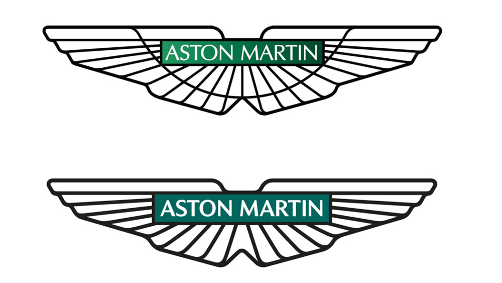
The new Aston Martin logo proves that sometimes a subtle change is all that's needed. Peter Saville, famous for his work for the Hacienda and Factory Records, followed the trend towards simplification but without sacrificing the brand's heritage. He replaced the gradient background with a solid racing green and ditched the fussy semi-circular line on the wings. It seems so simple, but it works perfectly. No shocks, no confusion. Many people might not even notice the change, but the new design provides the versatility and more modern look that the brand wanted.
02. The good: Citroen's retro-modern logo
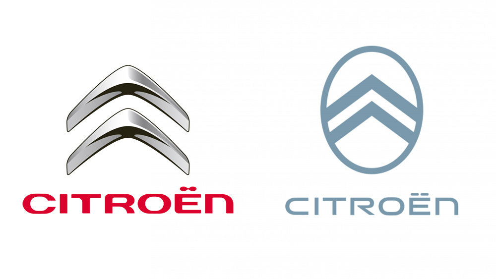
The new Citroen logo is an apparent contradiction. It manages to simultaneously look more modern and more traditional than the design it replaced. That's because the French carmaker went full circle, or full oval, if you will. It travelled a century back in time to revisit its original 1919 logo design, but added a few tweaks and a more modern colour palette. The result is a logo that's simpler and flatter but also more in keeping with the brand's heritage. Sometimes, you have to go backwards to go forwards (just not when you're behind the wheel).
03. The good: the transparent BMW logo
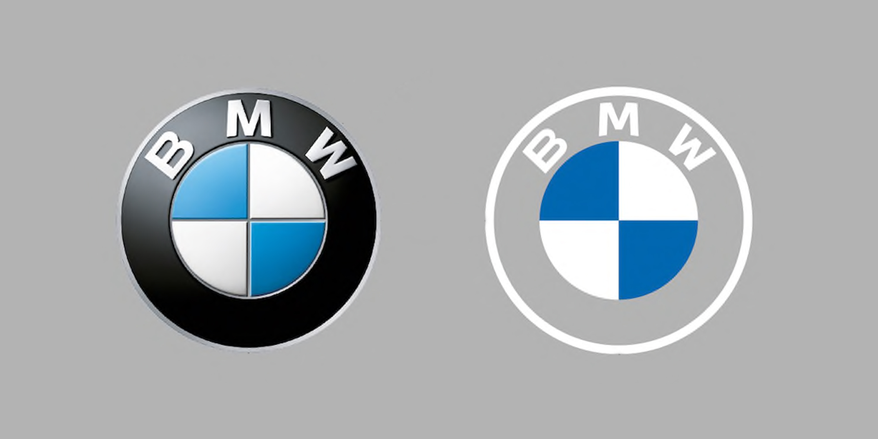
Going further back, BMW was one of the first car makers to simplify its logo. Unveiled in March 2020, the new BMW logo is a transparent, flat reimagining of the previously metallic emblem. The black outer ring was made transparent, and 3D effects were removed. It's minimal, but it retains the white and blue colours of the company's home state of Bavaria. There was initially some scepticism among drivers, but the design's proven to work well in physical applications as well as digital.
04. The bad: the new Kia logo
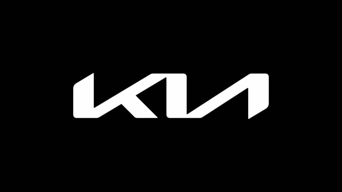
Yes, we know. We can't stop complaining about the new Kia logo. But just look at it. Sure, the previous Kia logo was terribly chintzy, but at least it was legible. Revealed in a ridiculous blaze of fireworks and drones, the new design is sleeker and racier with its sawtooth wave, but that comes at the price of comprehension. There's even evidence from Google search results of a surge in people looking up "KN" cars since the new logo was released.
05. The ugly: Audi's 'cheap' logo redesign

Audi already had one of the simplest car logos, and one of the easiest to draw from memory, but it's joined the flat design party too. The car brand dropped the shiny bevelled design for an even more "restrained, pure, and clean" design. But while the four rings themselves are "almost identical" geometrically, motorists weren't impressed. "It really does look cheap," one person commented on the Audi Reddit page. "Looks just pasted on, as an afterthought." "What a disappointment. One of the things I liked about Audi is that they still used physical badges that you can feel and run your hand across," another driver complained.