If there's one thing we know about rebrands, it's that many consumers hate change. From the biggest branding evolutions to the tiniest logo tweaks, when a change comes there's guaranteed to be some strong opinions alongside it, and bank Capital One is no stranger, becoming the latest victim of scathing branding backlash.
Debuting a new app icon, Capital One's controversial new logo tweak didn't go unnoticed by eagle-eyed users. Soon the redesign sparked a frenzy of backlash, receiving a host of logo design comparisons from commercial airlines to Star Trek. While it's high praise to be compared to one of sci-fi's best logos of all time, I'm not convinced it was the aesthetic intention for a clean-cut banking brand like Capital One.
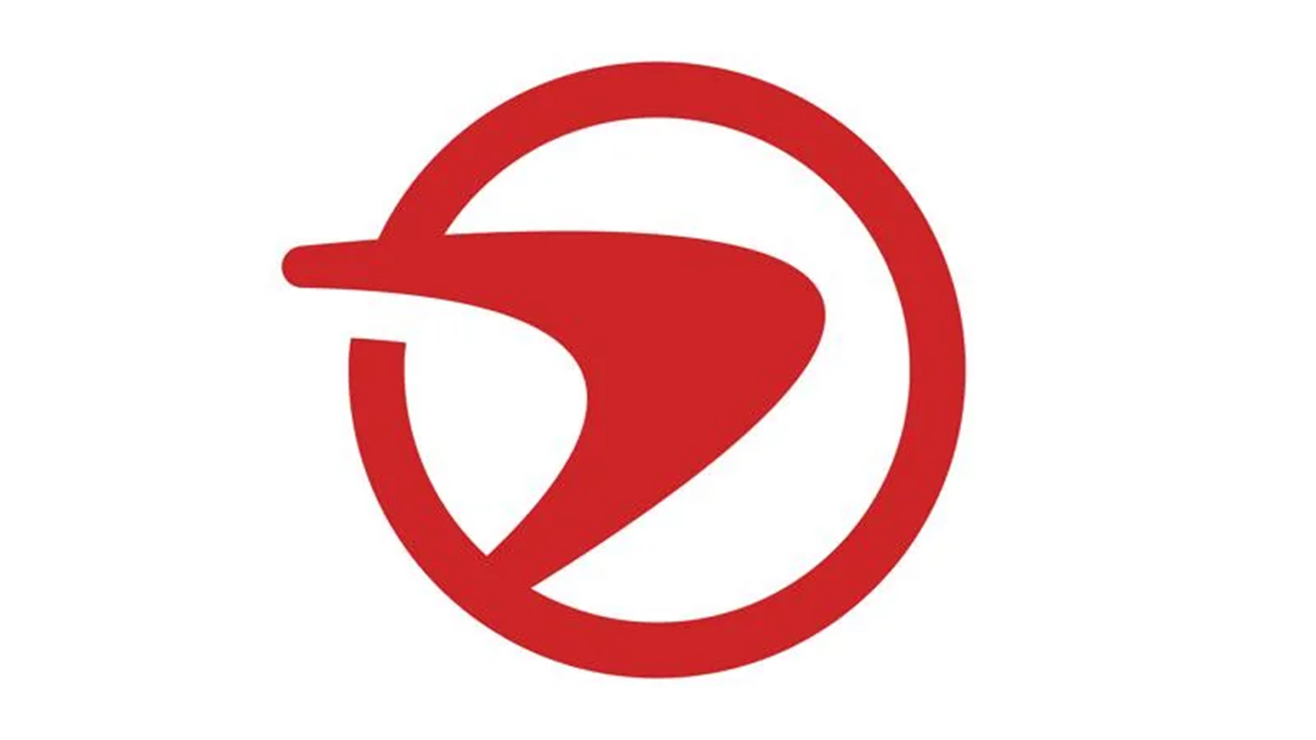
New logo? from r/CapitalOne_
The old Capital One app icon was fairly unassuming, featuring a close-up curved red arrow on a white background – pretty conventional stuff for a corporate logo. The new design follows the same beats as the old design, zooming out to showcase the arrow, now encased in a circle frame. Tonally it gives the logo a more naive feel that users quickly criticised, with many taking to Reddit to share their strong opinions.
On the r/CapitalOne_ subreddit, many shared the sentiment that the design resembled an "airline logo", with one user commenting "Seriously couldn't find the app at first this morning because my brain registered it as a Turkish Airline app." Others made more out-of-this-world comparisons, with one user suggesting its resemblance to the retro-style Pizza Planet logo from Toy Story. "Star Trek has entered the chat..." another added. One thing's for certain, the new design proved unpopular with a vocal majority, with one Redditor commenting, "The first thing I thought of is what in the Hunger Games of banking is this s**t", while others called it "weird", "ugly" and peculiarly "Nike.... on a Frisbee."

As we saw with the recent controversial Jaguar rebrand, branding evolutions big or small will likely always be subject to criticism. The best rebrands of all time were born out of bravery – a desire to take a risk and redefine a brand – yet striking the balance of heritage and contemporary design momentum is (evidently) no easy task. Capital One's logo tweak is yet another cautionary tale to learn from in the long list of branding controversies and will undoubtedly not be the last.