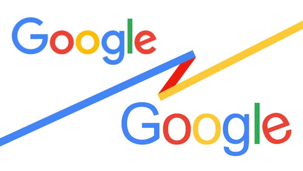
Google has been changing its app logos so frequently in recent years, that it's understandable that people are on alert for signs of tweaks to its primary identity too. This week, it seemed that an update had been spotted when screen captures emerged showing a design with taller, thinner and less rounded letters.
But while we've come to expect new logo designs from Google on an almost weekly basis, that's not the new Google logo that people have found. It turns out that there's another explanation for what people are seeing (see our Google logo history to see how the design has evolved over the years).
Search Engine Roundtable reported that German SEO expert Christian Kunz had written a blog post about the apparent new Google logo after it was found at the top of Google search results by Marco Look. There was speculation that the design was being tested in preparation for a rollout as the first update of the brand's main logo since 2015.
But things immediately sounded suspicious with that suggestion that Google was testing a new logo. Since when does Google test its logo designs in public? This isn't Elon Musk's X.
The Google news site 9to5Google investigated the matter and found that the 'new Google logo' is merely a font-rendered version of the logo that appears in place of the usual image file if you change the user agent on your browser to 'Googlebot', Google's web crawler for search indexing.
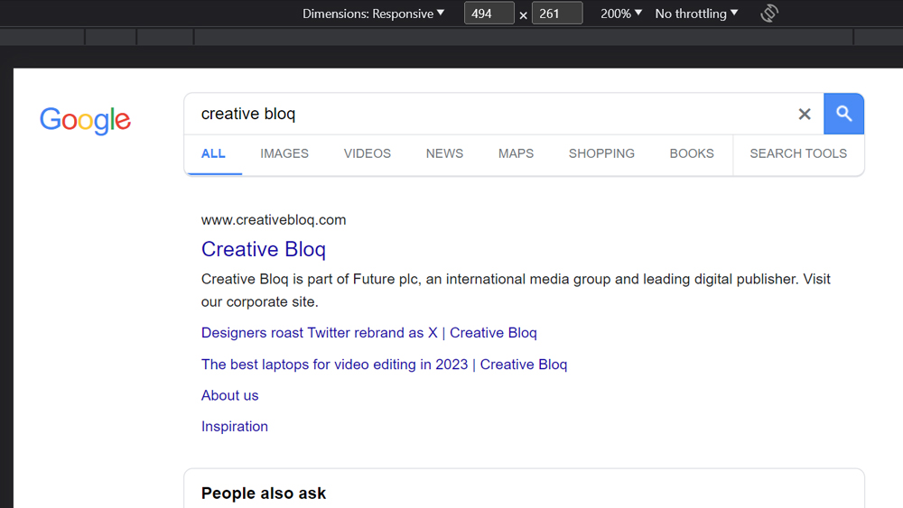
Creative Bloq has replicated the process and can confirm that switching to this user agent changes the logo from an image to a text version using the Futura font. In the event that you don't have Futura installed, it will show the text in Arial instead. Thus, it's not a new Google logo design but merely the current logo rendered in a specific font (to check for yourself, hit right-click and 'Inspect' in Google Chrome, select More tools > Network conditions, uncheck 'use browser default' and select 'Googlebot' from the list of options.
Of course, Google has rolled out plenty of new logo designs in recent months, including for Find My Device. Its approach has come in for quite a bit of criticism for making the icons look too similar and thus more difficult to find on a phone. Most of them use the same Google colours, the new Google Play Books logo being a rare exception.