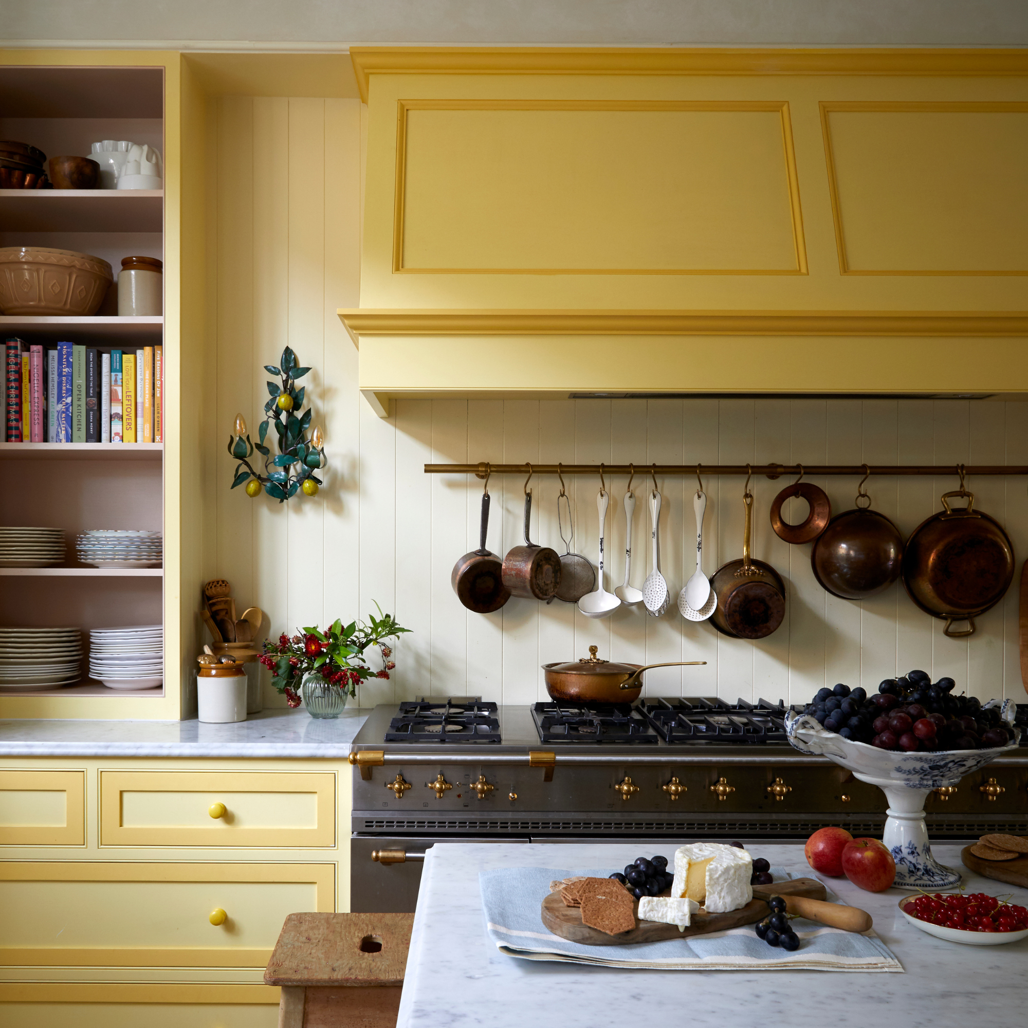
Unless you’ve been living under a rock, then you’ll already be aware of the butter-yellow trend which is sweeping both the interiors and fashion world. A gorgeous rich hue, it’s easy to see why this shade is so popular - but paint experts say these are the three colours you should never pair with butter yellow.
Butter yellow is the paint trend we’ve been melting for since it first appeared in 2024. It first sprang up on runways last year, before filtering into kitchen colour trends and then when Timothée Chalamet wore the now infamous butter yellow Givenchy Oscar’s suit, it’s become the 'it' colour of 2025 in fashion and interiors.
Within your home, butter yellow has surged in popularity due to its ability to warm and brighten a space.
But if you’re looking to introduce this joyous shade into your home, paint experts say these are the three colours you should never pair with butter yellow.
1. Cool-toned grey
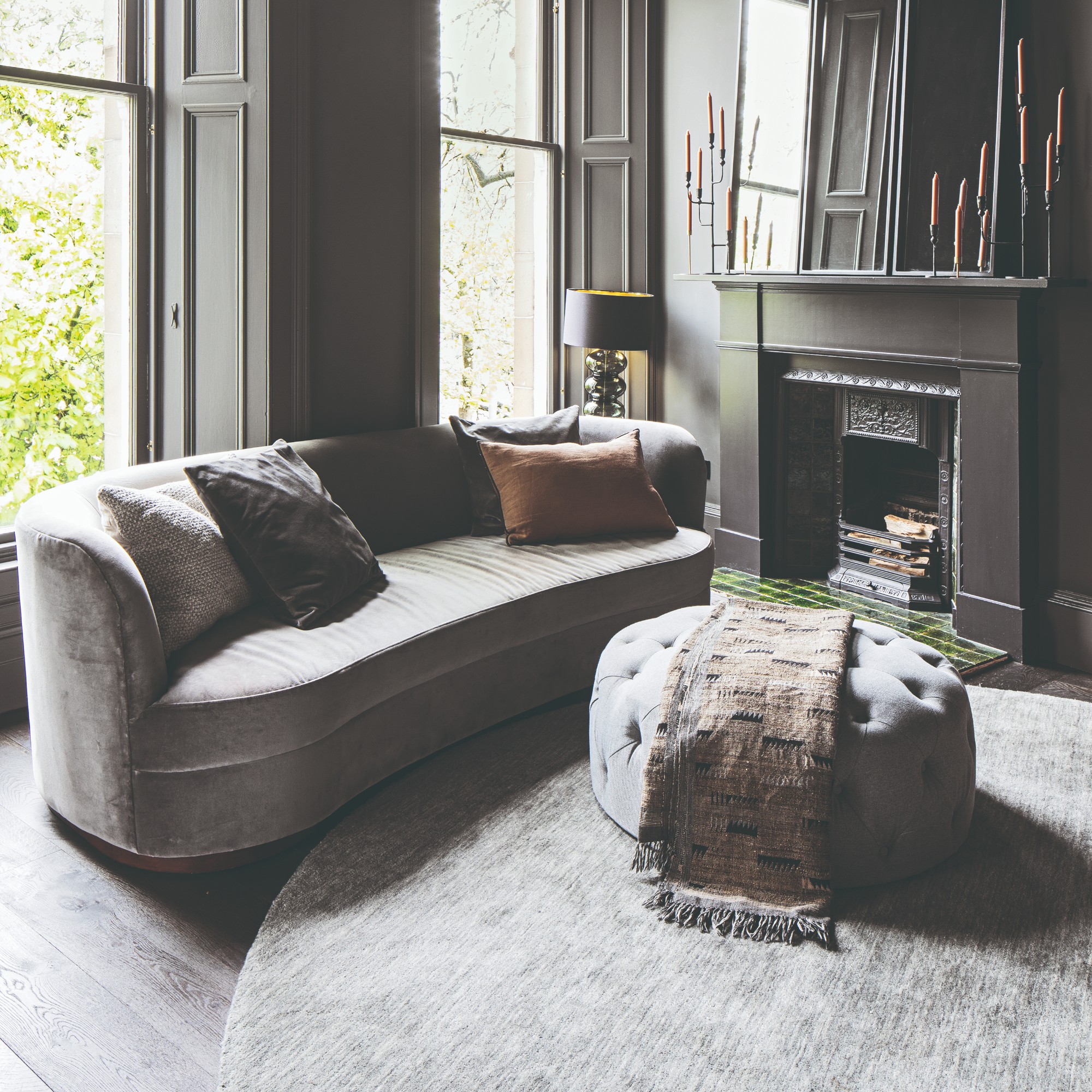
While there are plenty of grey living room ideas, you should steer clear of using them within proximity of butter yellow. This is largely because cool-tone greys will wash out the vibrancy of your butter yellows.
‘The contrast between these colours is too harsh, and butter yellow can be overwhelmed and visually dampened, creating an unflattering and unharmonious aesthetic,’ explains Paulina Wojas, Interior Designer at Stunning Chairs.
Grey’s with cool undertones in particular will make your room feel cold when paired with butter yellow. Instead choose shades with warmer undertones.
2. Neon's and highly-saturated colours
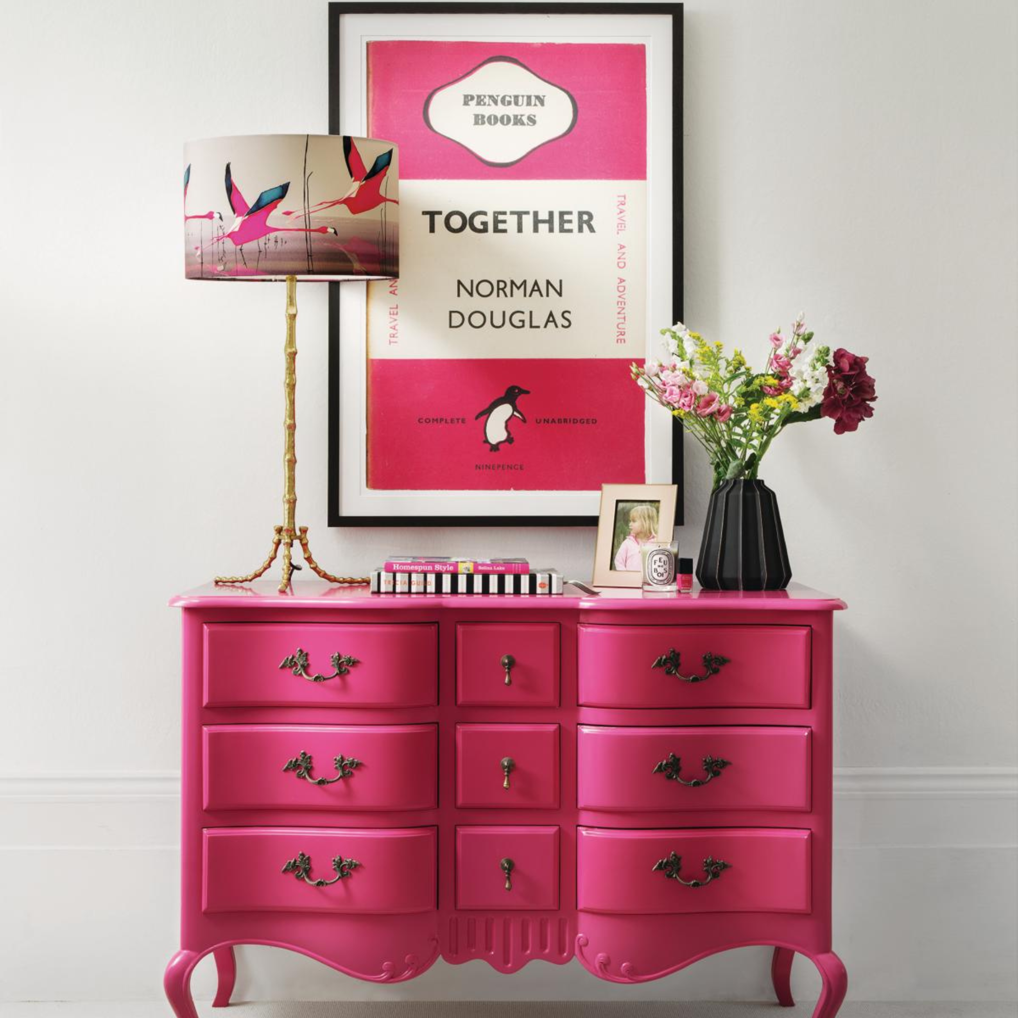
‘The colours to avoid pairing butter yellow with would be neon or highly saturated colours such as bright greens, electric blues or hot pinks. These tones can overwhelm the subtle warmth of butter yellow, creating a really jarring contrast,’ says Anna Hill, Brand Director and Colour Consultant at Fenwick & Tilbrook.
While butter yellow is certainly a statement shade, you still want to avoid overpowering it. Neon and butter yellow compete for attention which can result in a look that is too busy and unbalanced.
3. Browns
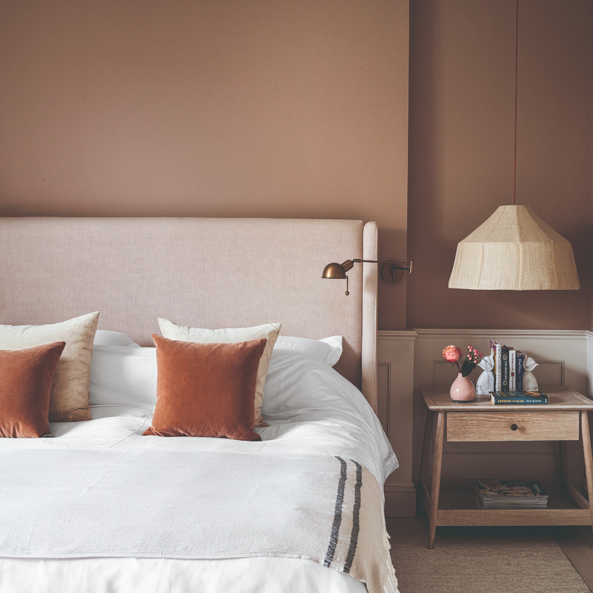
Mocha mousse may be Pantone’s colour of the year but you should steer clear of using it with butter yellow.
‘Dark muted browns can dull the vibrancy of buttery yellow, making it appear more washed out instead of the soft, warm shade people love. Instead of complimenting its cosy nature, these tones can drain its warmth and make the space feel heavy,’ says Michael Rolland, Managing Director at The Paint Shed.
Browns and butter yellow are two of the biggest colour trends on this year’s colour palette - but if you want to embrace them you’ll have to pick one or the other unfortunately.
Shop the trend
Mushroom lamps are the lighting trend that won't quit and paired with soft butter yellow, the result is stunning.
Soft furnishings are a great way to embrace the trend if you don't want to make any big changes.
This cheerful yellow will make a room feel like it is full of sunshine. It's warm and welcoming - exactly what the trend aims to achieve.
When paired with the right colours, butter yellow is perfect for creating a warm and welcoming space. But do you think there are any other shades we should avoid?