The New York Times says you can’t escape it. It’s become somewhat of a political symbol, woven into Vice President Kamala Harris’ Presidential campaign, and is also the star of the most culturally relevant album of the summer, if not the year. No, it’s not some hot-shot public figure or a new form of social media. It’s a color: “Brat Green.”
Thanks to British pop star Charli XCX’s album cover for Brat, which features the electric green hue (and hence its name), the controversial color trend has infiltrated the zeitgeist, and it looks like it’s here to stay.
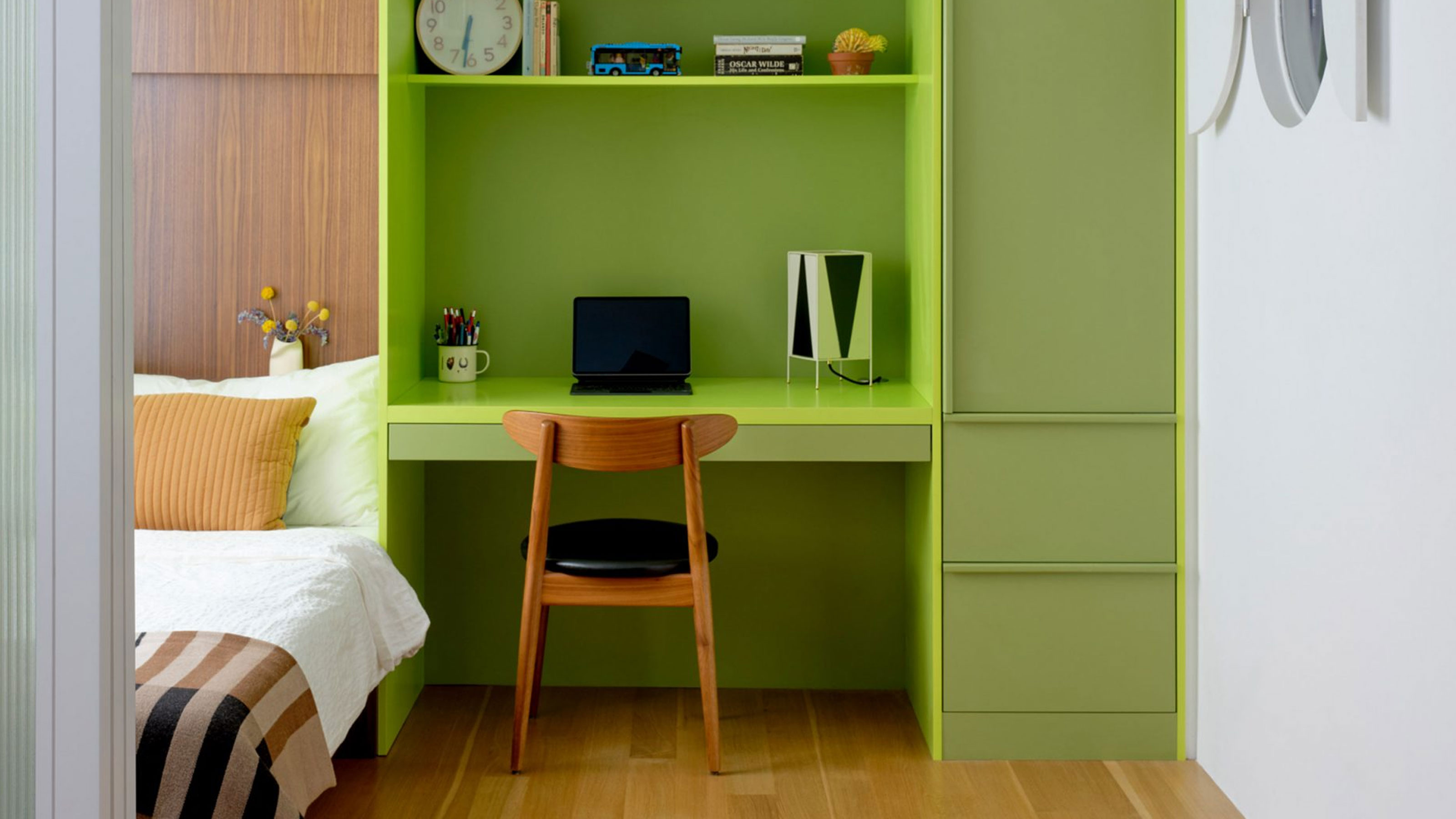
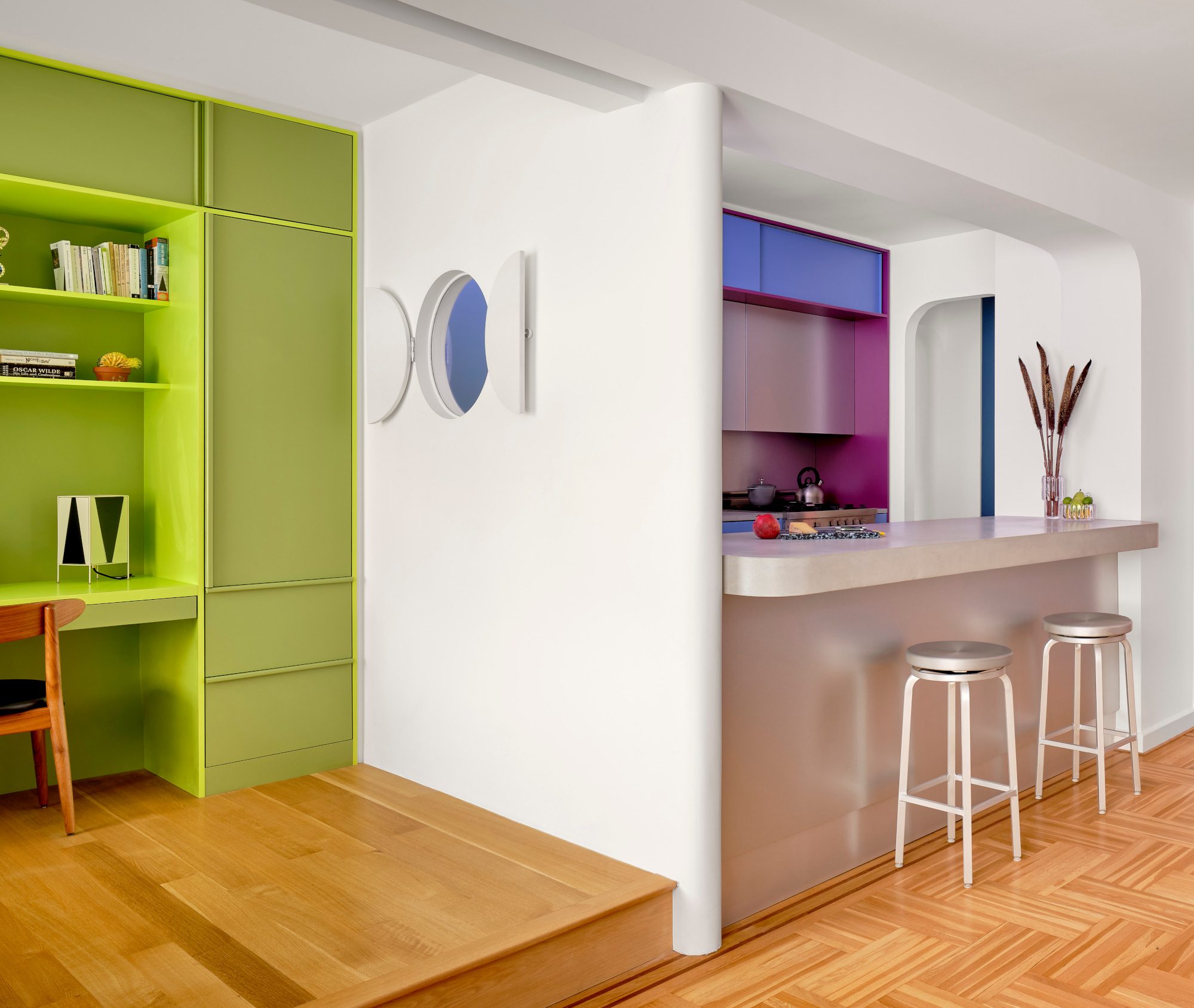
According to multidisciplinary designer Leah Ring at Another Human, who is known for her masterful use of color, Brat Green is forever. “I think the shade can be slightly modified to lean a bit more classic or moody,” she says, “but the hue is a beautiful one that bold designers have been using for ages.”
“I personally always try to get electric/lime/slime green into every project if I can help it!” she continues. “I think it brings a sense of joy and irreverence to a space,” responding to the energy of the music in a fun and exciting way.
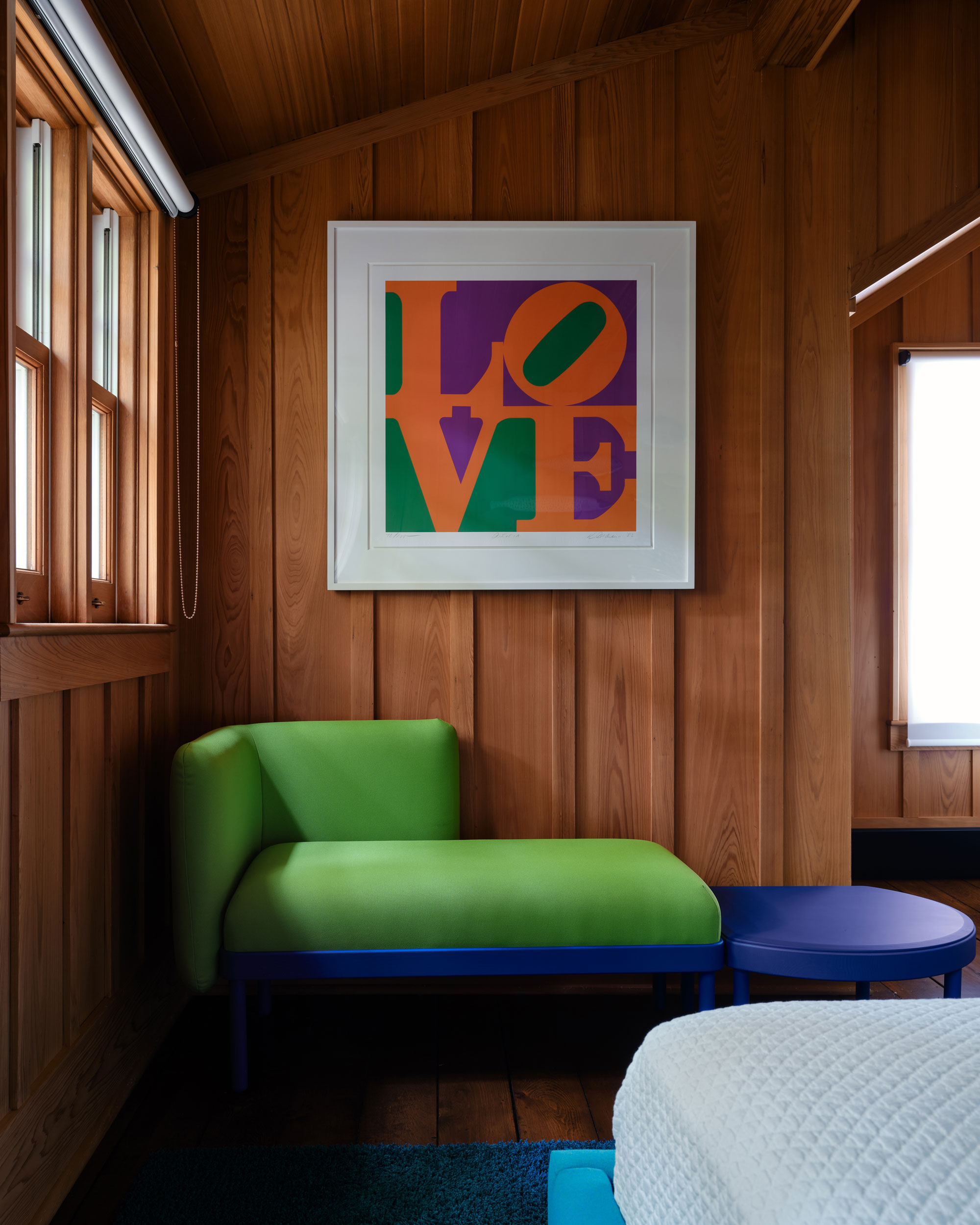
So why is it controversial? Well, some say it’s objectively ugly, even Charli herself in interviews. It’s true that Brat Green isn't a color you tend to see in homes that often, but perhaps it’s just the shock to the system we need to finally live a little.
Is it welcoming? Not really. Is it cool? According to Charli herself, nope — the hue isn’t that either. But is it, bratty? Definitely. Kind of sour, kind of abrasive. It's the personification of a tantrum mixed with lemon-lime juice, under the lights of an EDM club set (which is, believe it or not, the desired vibe here).
So what on earth is it doing in our homes? To be fair, the color is quite literally everywhere. It’s so repulsive, so ugly, so unapologetically uncool, that somehow it’s having a paradoxical effect.
“I think it brings a slightly ’70s, retro feeling to a space, but its brightness is also very joyous and uplifting,” says co-founder and creative director Natalie Ebel of luxury paint brand Backdrop, who sells a similar hue called “Pretty Ugly.” Natalie admits the color is not for everyone, but for those daring enough to embrace it, she suggests using it as an accent. “Try it on one wall or an area of a room to add a dose of fun and brightness. We’ve even seen it used on furniture and for kitchen cabinets.”
Leah Ring has actually done just that in her own home. But “If you don't want to commit to, say, Brat Green kitchen cabinets (like I did in my house),” she quips, “you can work in the color through smaller pieces — a great vase, table lamp, perhaps a runner or a throw pillow.” Leah adds, “As with any super bright colors, it's all about balancing them in a space. Think about the overall color palette and saturation, and balance one strong color with others so that no single color is overwhelming to the eye.”
Part-time political symbol, part-time party playground, love it or hate it, the future is looking pretty Brat. Will I be painting my kitchen cabinets Brat Green, too? Probably not — but I do enjoy a little lime.
Price: $12.95, Was: $16.24
If you're just dipping your toes into this trend, this small green table lamp is a fantastic choice. And by small, I mean mini — just 10.5” tall. Perfect for nightstands or compact desks. Note that you’ll need chandelier-type bulbs, which aren’t terribly common but can easily be added to your Walmart shopping basket.
Price: $83, Was: $110
This tubular velvet cushion is just the right size and shape to replace your old lumbar pillow, offering novel texture, color, and shape all at once. A unique touch for this very unique hue. Consider pairing it with silvery chrome accents or a bright pop of pink for contrast.
Price: $48
This Murano glass figure may not be an apple, but hey, a lime looks close enough! This exquisitely crafted lime adds a fun touch to a kitchen counter, desk, bookshelf, or credenza — a slightly more sophisticated take on the hue, like if Brat Green grew up and went to college.
Price: $295
Because your mixed nuts deserve nothing less. This neon green nut bowl by Alexandra Von Furstenberg might just be the brattiest Brat home accessory I’ve ever seen. Its acrylic construction adds an eye-catching, modern brightness to any room. Also available in a larger size for the ultimate Charlie lover.
Price: $80
When I began putting together this list, one of the first items that came to mind was this coffee table book highlighting the artistic genius of the late, great Virgil Abloh, bound in a slime-green hardcover. It's a playful pop for a coffee table or credenza and a fun flip-through if you’re a fan of his work.
Price: $124.99, Was: $166.99
You may have seen irregular, organic-look mirrors similar to this before. Asymmetry is a standout trend poised to linger past this year and beyond. Paired with Brat Green, it’s a sign of the times. A cultural artifact, if you will.
Price: $40, Was: $50
Brat Green takes on an almost Victorian look (arguably the actual origin of this color) in this elegant stemware duo. Notice those delightful little bubbles and imperfections on its surface — small details that only real hand-blown glass can provide. Perfect for a Brat dinner party or cocktail gathering.
Price: $95
You might think this Brat Green vase is made of glass, but it's actually a soft resin. Personally, I'm a huge fan of its quirky, slightly surrealist flair. If you’re already diving into Brat Green, why not go all the way?
Price: $5,000
This deco motif vintage Turkish rug shows just how elevated Brat Green can be with its expert pairings of pink, red, and yellow. Hailing from the mid-20th century, it also illustrates that despite the hue’s recent virality, it’s been around longer than you think. This green rug looks best with sleek, modern furniture (bonus points if it's lacquered).
Price: $160
Call it deconstructed Brat Green. This dappled green and yellow polished plate separates the components of the neon hue in an artistic way that’s highly accessible for a tabletop. It layers easily atop plain white plate sets or other pre-existing tableware. But if you really want to commit, pair it with the champagne glasses I mentioned earlier.
Price: $91.99, Was: $105.99
Yes, it’s pretty neon. Out of all the items in this edit, this one might be the easiest to despise. But hear me out: it’s all about the styling. To make this work, you need to commit. Think multiple Brat Green accents or similarly neon pieces (like candlestick holders and bowls) to create a focal point. Then, let it be. Make this monochromatic neon setup the star of an otherwise neutral room.
Price: $162.99, Was: $271
Rounding off this list is something more digestible. Here, only the upholstered seat boasts the chartreuse hue. These small, stackable accent chairs are perfect for tiny spaces (I envision them at a petite bistro table). The addition of fiberglass-reinforced polypropylene provides flexibility, comfort, and a slightly mid-century look that’s too playful and charming to resist.