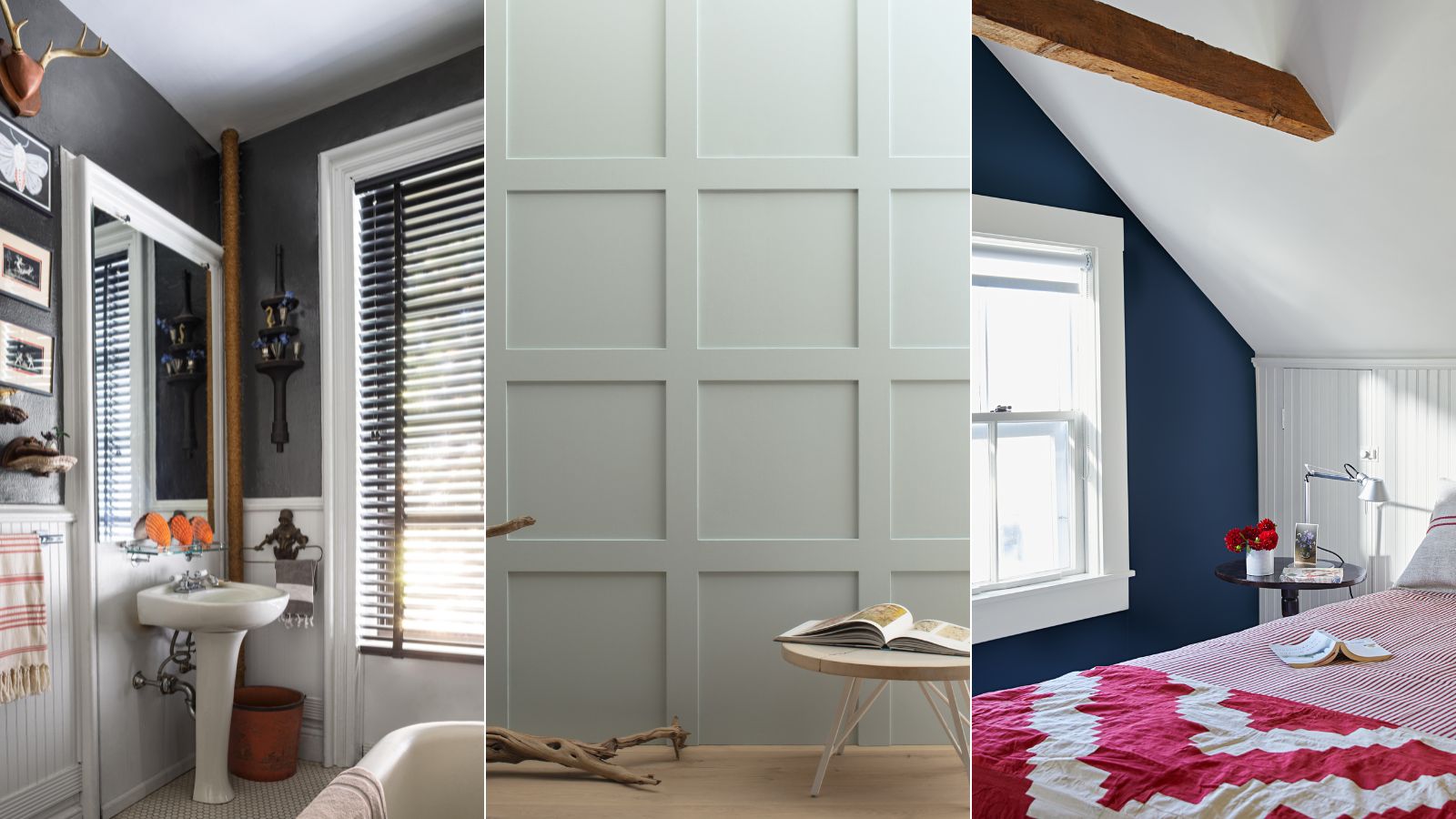
From the sophisticated Hale Navy to the more tranquil Revere Pewter, Benjamin Moore's most popular shades have become staples within designers' and homeowners' color palettes. And if you're a coveted fan of these well-known hues, you may be looking to make some subtle switches to mix things up a bit.
If so, you're in luck, since Benjamin Moore recently shared four of its lesser-known paint colors to try out, serving us similar substitutes to some of its most popular paint colors.
Whether your room color ideas reflect a moody vibe with dark paints or a timeless feel with light and airy hues, these under-discovered paint colors cater to many interior design styles. Read on to learn all you need to know about them before incorporating them into your 2025 paint ideas.
Cheyenne Green 1502
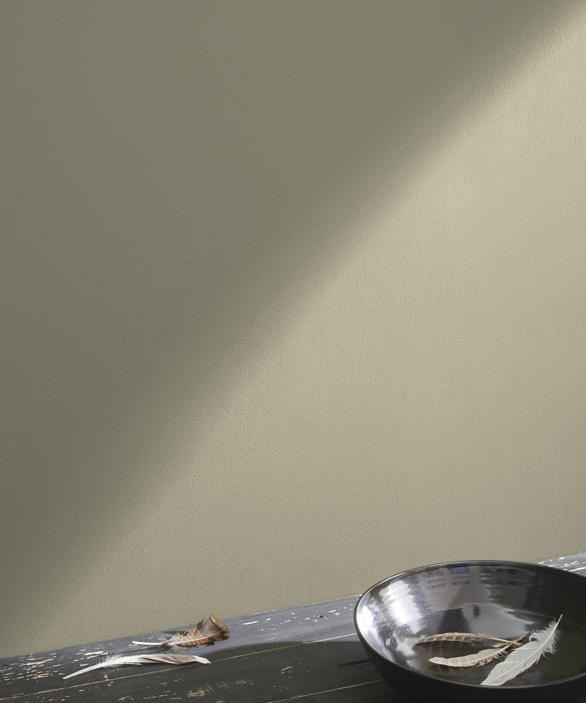
If you're a fan of decorating with Benjamin Moore's Revere Pewter, a balanced neutral paint, then consider the richer and warmer tones of Cheyenne Green, a soothing gray-green paint.
'Revere Pewter HC-172 is an iconic Benjamin Moore color and go-to neutral, but if you are looking for something a bit darker with a touch more color, Cheyenne Green 1502 is a great option to consider,' suggests Arianna Barone, Color Marketing Manager at Benjamin Moore. 'A cozy mid-tone hue, this versatile neutral has just the right amount of green to bring warm and cozy vibes to a space.'
'This adaptable color can be styled more earthy and organic when paired with natural fibers and warm oatmeal colors like Fog Mist OC-31 or Jute AF-80. Or it can take on more of a modern touch when used on the trim or cabinets and paired with a soft off-white wall color like Swiss Coffee OC-45,' says Arianna.
Deep Royal 2061-10
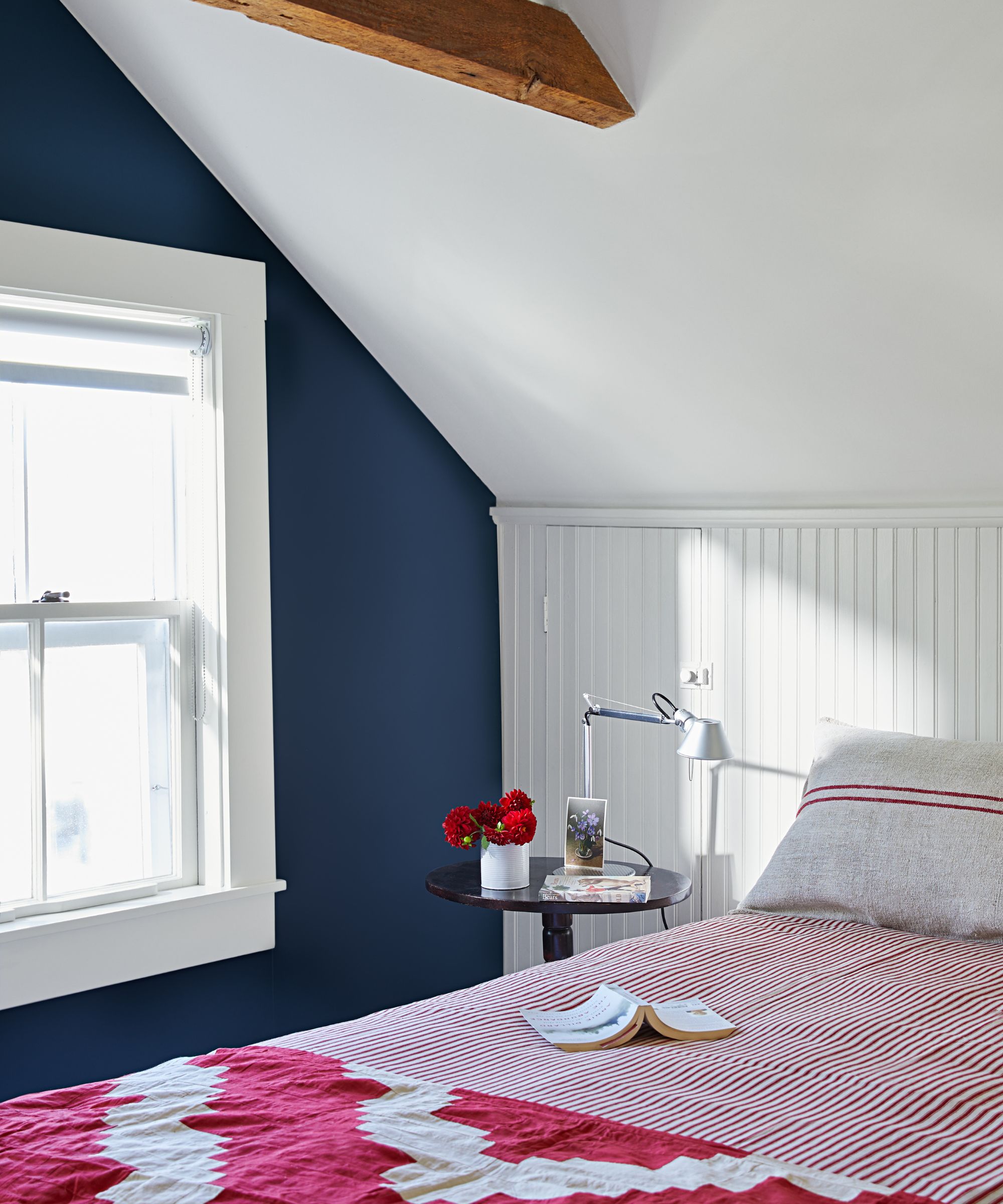
Benjamin Moore's Hale Navy is an iconic paint color that interior designers consistently recommend. A classic navy blue, Hale Navy feels sophisticated and timeless, but for 2025, there's a new blue paint to have on your radar: Deep Royal 2061-10, as explained by Arianna below:
'This dark navy hue has just the right amount of blue without being too saturated. Bring in warm cognac leathers for a sophisticated and classic look, or create more of a coastal vibe by pairing it with cool off-whites, like White Wisp OC-54, and touches of red.
'Look to this bold hue when you want a navy with a strong dose of blue. For a subtler navy with more gray, the timeless Hale Navy HC-154 is a can’t-go-wrong choice.'
Tranquility AF-490
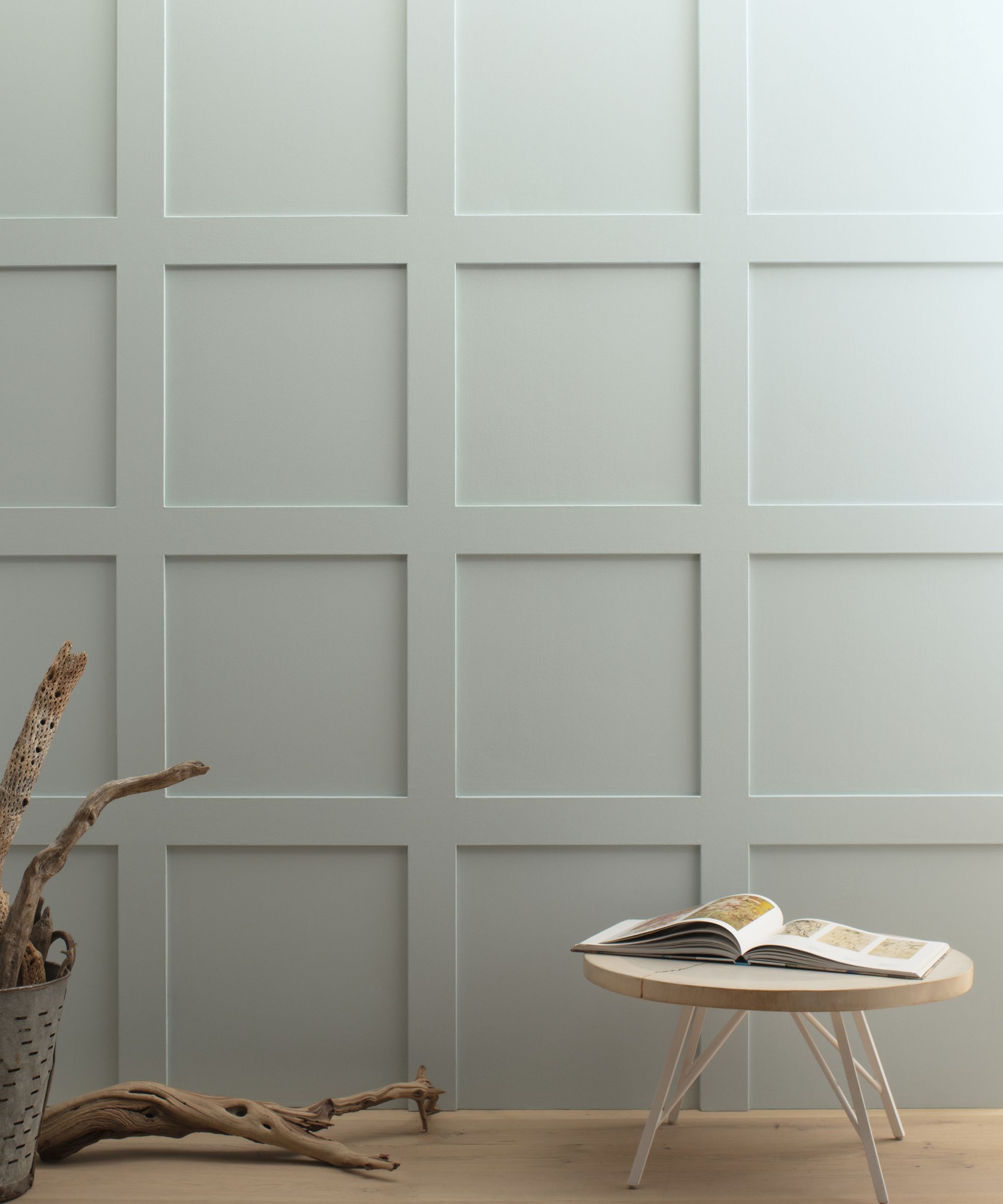
Benjamin Moore's Gray Owl is a cool-toned light gray paint that makes for a versatile neutral. However, Tranquility AF-490 can offer more interest and warmth. A blend of sage green and gray, Tranquility feels balanced and liveable without leaning warm or cool, as Arianna explains below:
'This soothing sage brings calm and ease to any space. Lean into its tranquil notes by pairing it with soft off-whites, like Seapearl OC-19, and chunky knits. Or, bring out its gray undertone by layering in more saturated greens like Lush AF-475. Try this easygoing hue when you are looking for a color with the versatility of Gray Owl OC-52 but a more present touch of green.'
Stormy Sky 1616
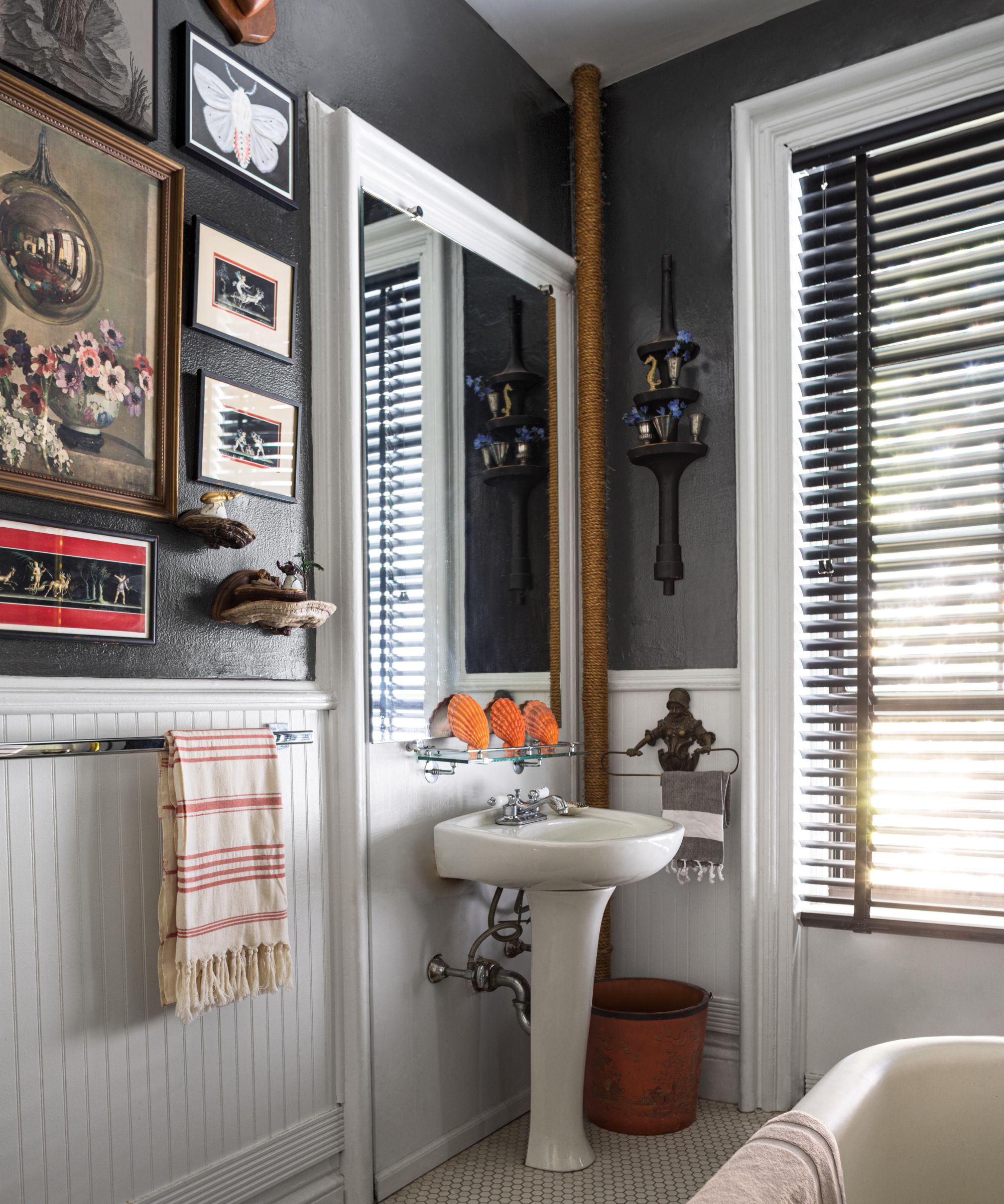
Lastly, if you're looking to incorporate moody tones into your home, consider reaching for Benjamin Moore's Stormy Sky, a charcoal paint. Similar to the more popular Iron Mountain, Stormy Sky is lighter in tone making it feel less intense while offering a cooler feel.
'With a subtle touch of blue, this mid-tone charcoal brings depth and intrigue to a design,' Arianna says of Stormy Sky. 'Pair it with inky indigos and soft velvets for a moody look. Alternatively, you can bring in lighter colors, like Horizon OC-53 or Wind’s Breath OC-24, and soft textures for added contrast and levity. When compared to Iron Mountain 2134-30, Stormy Sky 1616 is slightly lighter and cooler. Both colors are great options when looking for a versatile charcoal hue.'
Whether you want to create a light and airy scheme with the gentle Tranquility AF-490 or go for something much richer with Stormy Sky 1616, these paint colors make a refreshing change to Benjamin Moore's most popular shades.