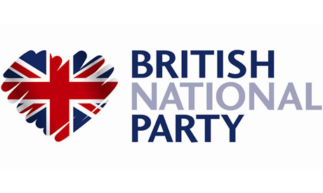
The motif is supposed to be a patriotic heart, but its sketchy lines could equally resemble the outlines of a coiled snake on a slope or a partially rubbed windscreen.
The British National party has circulated its latest logo around the media in a determined attempt to present a new image.
Any stylistic similarity with the rough shading displayed in the Conservatives' green and blue tree symbol is entirely "unintentional", a BNP spokesman insisted.
The new logo has been in use since March, but the changeover has not been widely noticed. "It has come to our attention that some media outlets and publications are still using our old logo (BNP with union flag infill)," the party's national nominating officer, Clive Jefferson, complained in a letter to newspaper editors.
As well as suffering a near-wipeout at this month's council elections – losing 11 seats and winning only two – the BNP has been hit by internal divisions and debts. In the past, the party has been highly litigious, involving itself in lawsuits with the Equality and Human Rights commission.
Asked why the image has changed, the BNP spokesman said: "Parties need a makeover once in a while. Labour and the Tories change their logos. The new one looks better. It also has better kind of aesthetic image."
Confusingly, the email link – offering any recipient the opportunity to unsubscribe – shows the party's leader, Nick Griffin, smiling next to a picture of the outdated BNP logo. No subliminal message intended there, obviously.