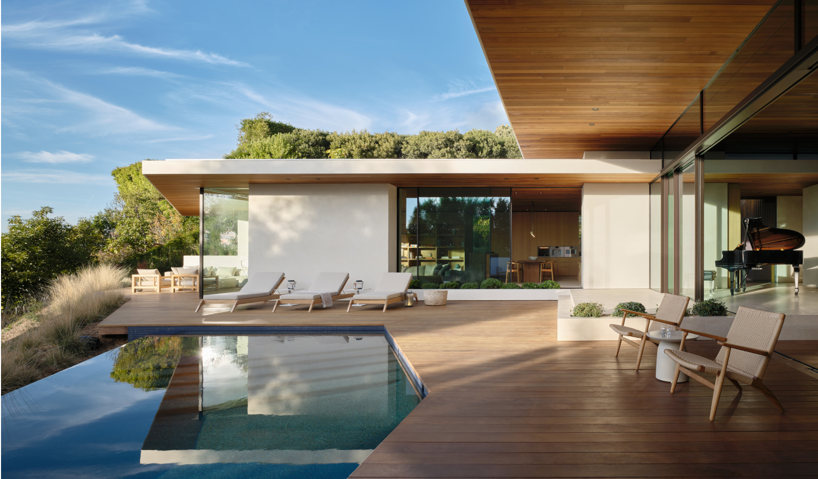
Carla Ridge is a new Beverly Hills home designed by Montalba Architects – a residence designed using modernist architecture nods transported to the 21st century while making the most of the site's expansive views of its green hillside, valley, and the city beyond. Designed in a single level that culminates in a generous terrace and pool deck, the house is both modern and of its place, defined by clean geometries, a low-slung volume, and pronounced roof overhangs that gently shelter the interior.

Beverly Hills welcomes Carla Ridge by Montalba Architects
The commission came via a direct recommendation from a repeat client, from the studio's growing roaster of residential work. The new client, a Japanese woman, now living in Los Angeles, was after a retreat – a home that celebrates 'peacefulness and recovery'. The architects also sought to integrate the dwelling into the California climate and natural environment as much as possible.
The practice's founder, David Montalba, recalls: 'The client and I really connected over our shared captivation with the site. We wanted to capture the spirit of the place, and its unique position on the hills overlooking the western edge of the Los Angeles Mountains.'
Of course, it wasn't a project without its challenges, as the architect continues: 'The neighbourhood itself is highly regulated when it comes to design with no structure allowed over 14 feet and many restraints to setbacks and site conditions. We wanted to maintain expansions of space on the site while creating variations in the transitions between rooms. We introduced a series of internal and external garden courtyards that infuse the home with natural light and a unique landscape element corresponding to the adjacent programme.'
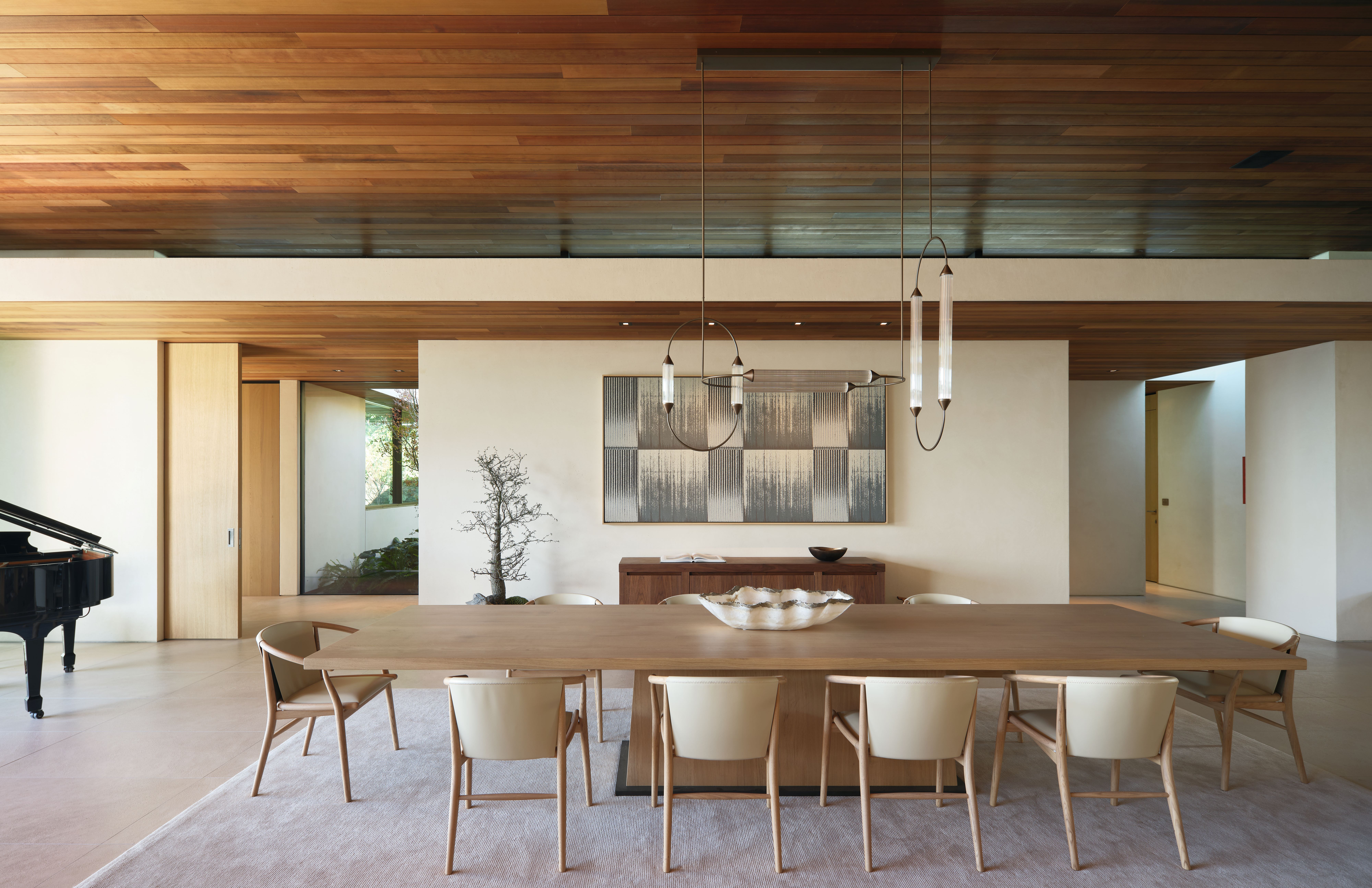
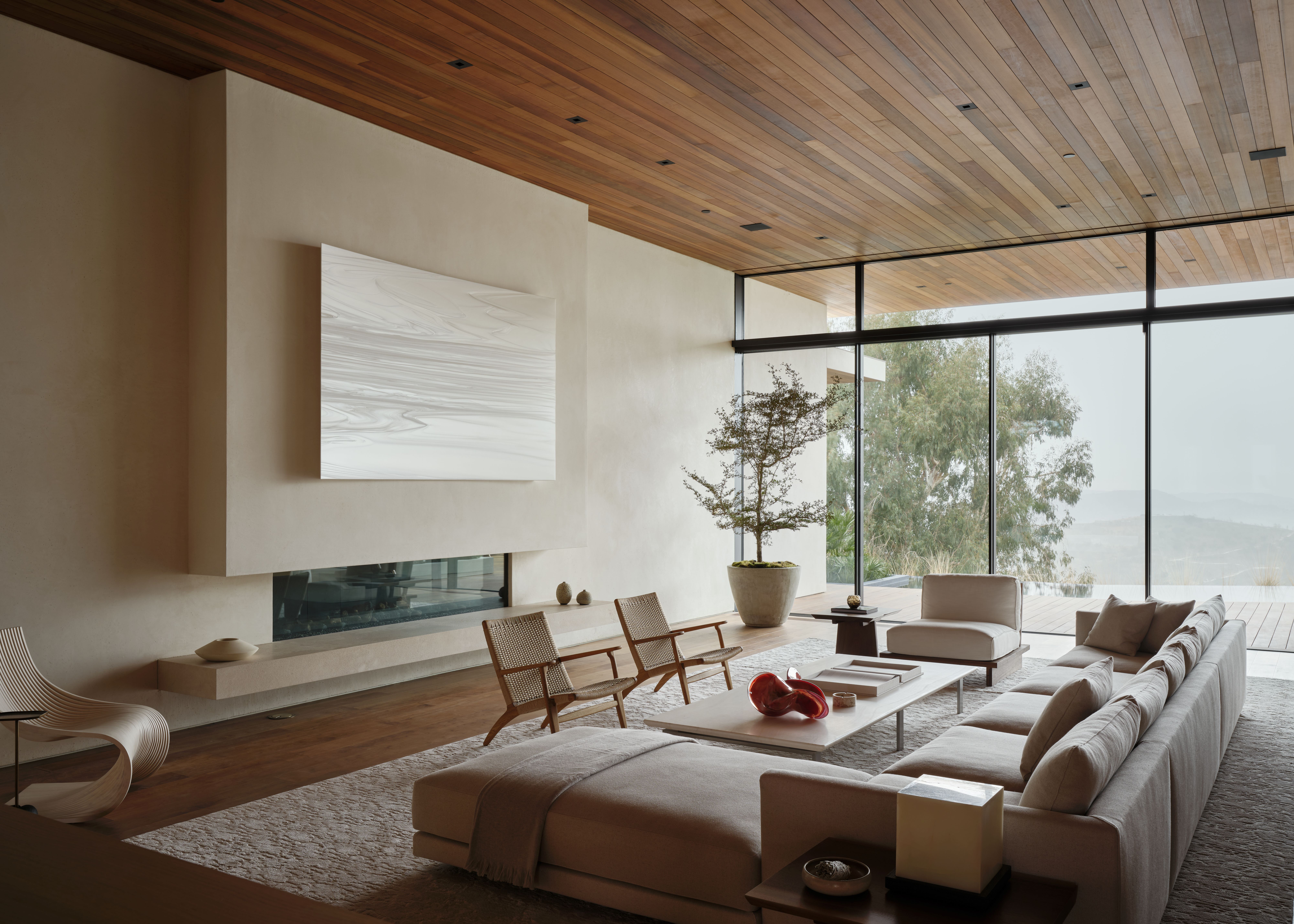
'To compound the ceiling limitations the great majority of the utilities, duct, piping etc. are subterranean rather than in the ceiling/roof allowing us to take full advantage of the 14 feet throughout the home. The great room, living room, and primary bedroom floor levels are sunken, while all additional spaces within the home are elevated by a foot with 13-foot ceilings.'
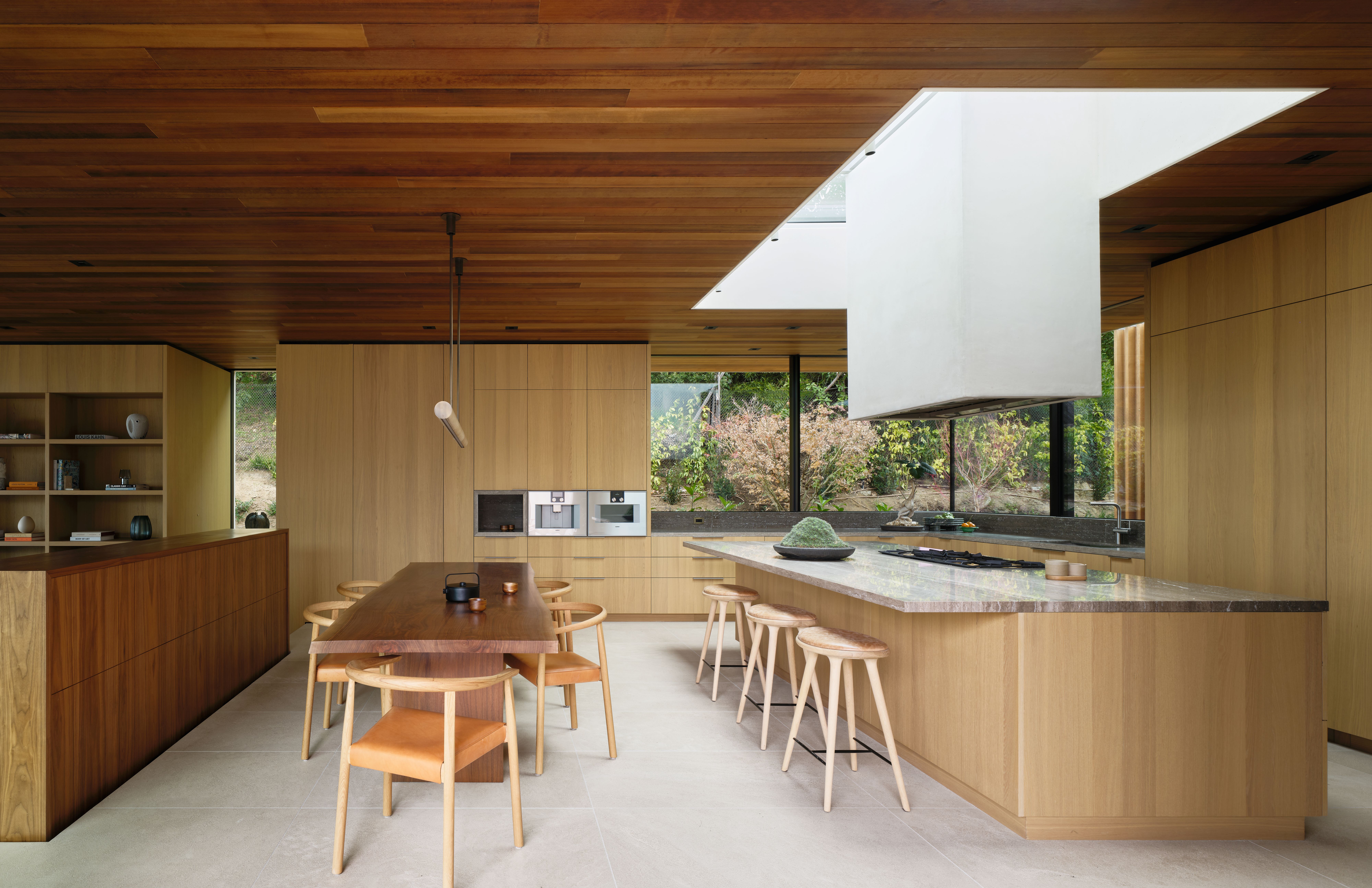
Spatially, beyond that, the answer in crafting the perfect home for their client lay in 'the concept of procession' the architect explained. Guiding the user through a series of spaces, and making 'unperceived but deliberate design choices,' was critical in carving the experience. Playing with scale, light, vistas and walkways was key in that approach - which balances moments of 'compression' with expansive views, spatial openness and flow.
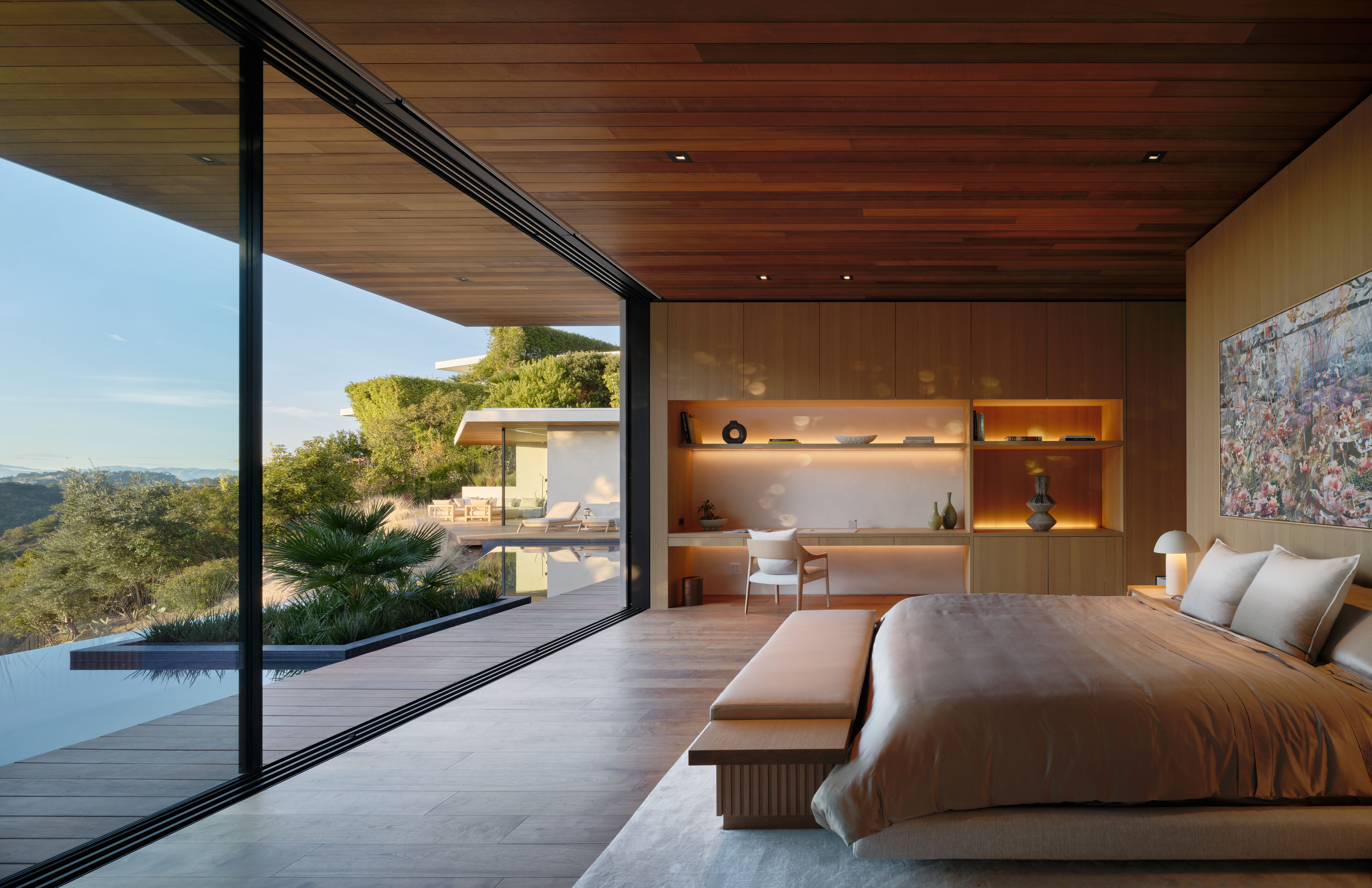
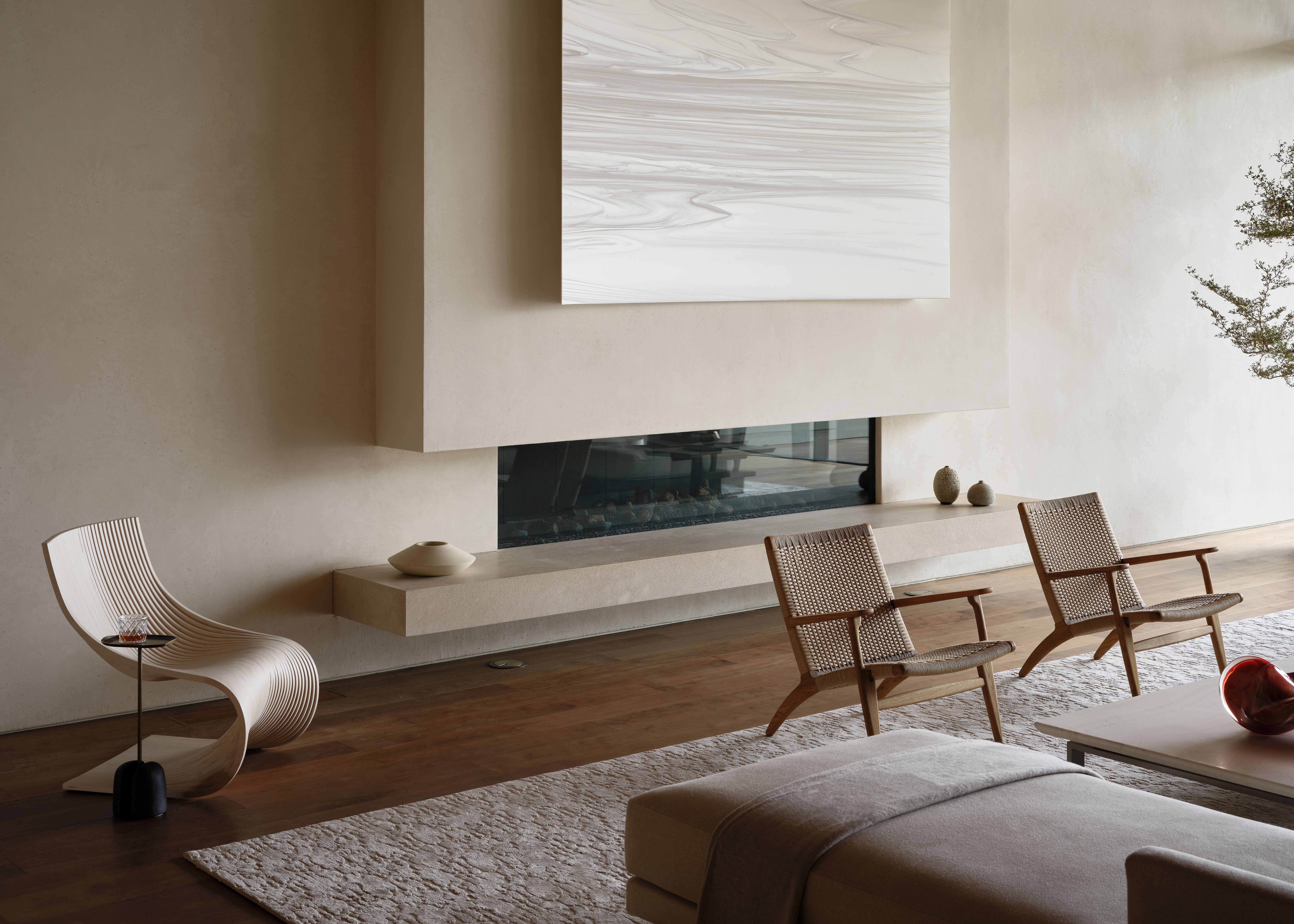
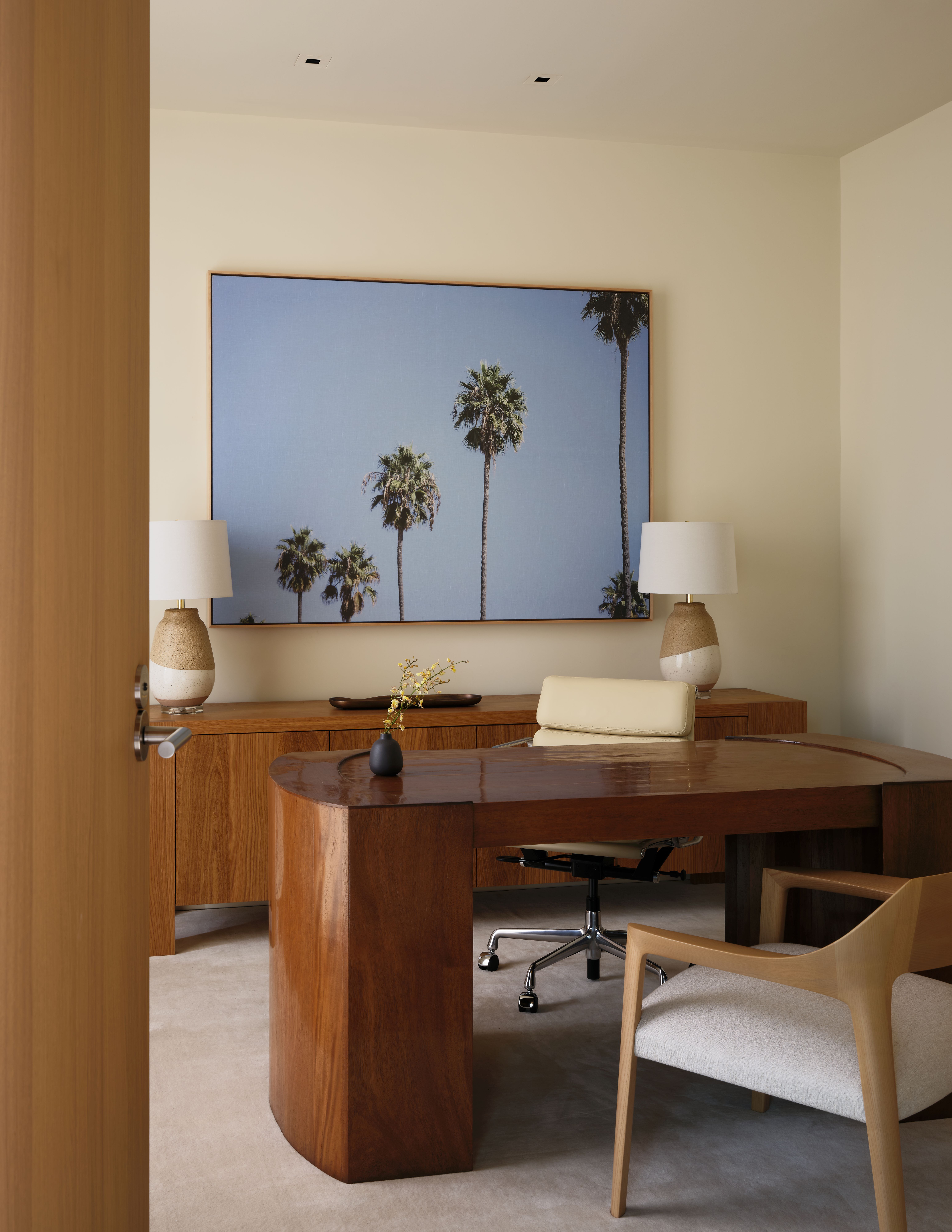
While clever volumetric planning was required, the studio also used interior design gestures to support their approach. The aim was to blend softness with harder surfaces, and mix textures in order to make sure that this is a building that feels layered, like a home, and caters to many needs.
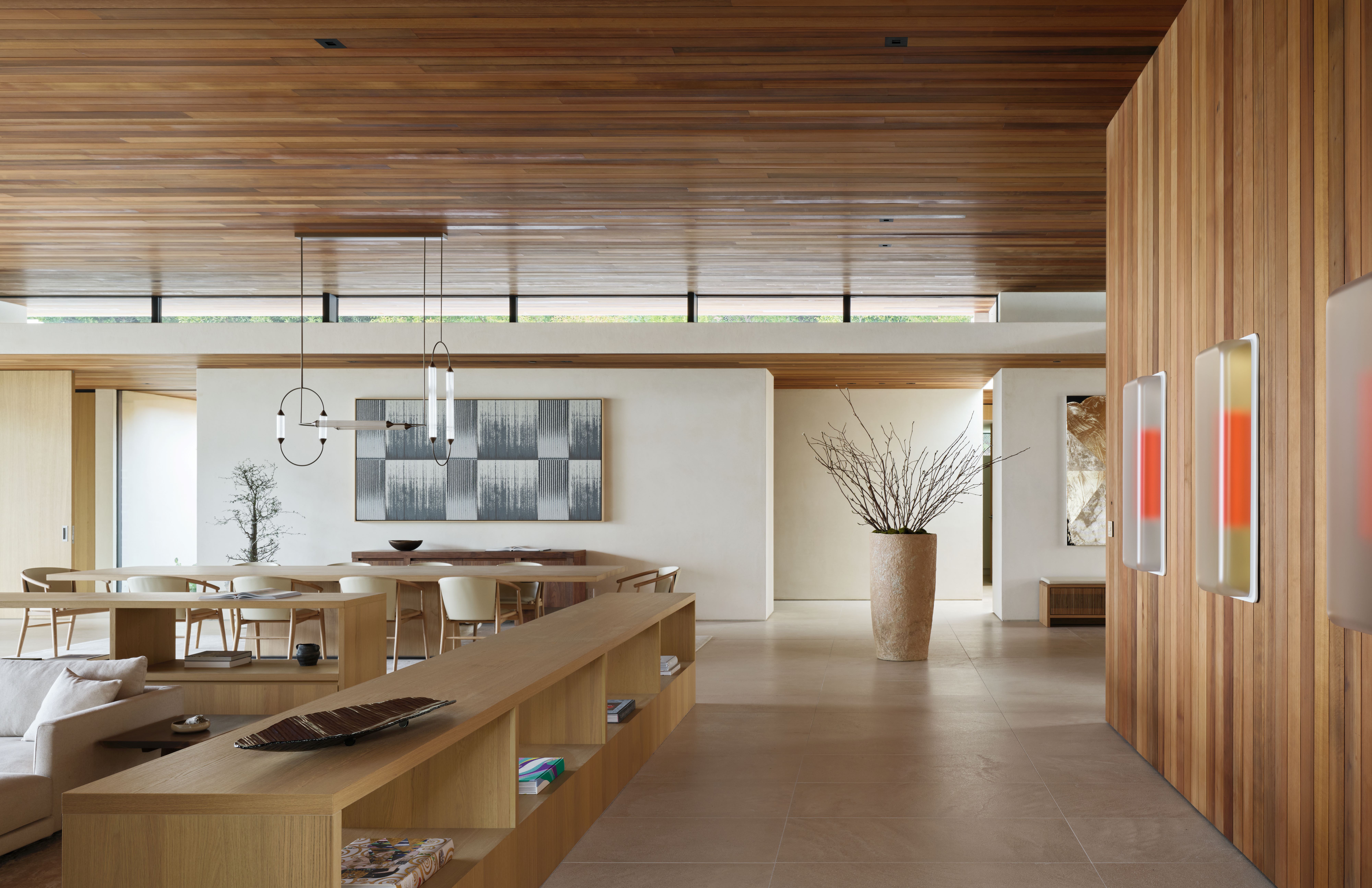
Montalba concluded: 'I think as with many of our homes there can be a rather hard-edged modernism to the spaces and we often find it important to balance these with warmer materials, landscape, and furnishings. We were also inspired by organic materials and texture, wanting the feel of the home and its materials to have unpolished elements which we implemented with a unique rough-hewn plaster finish on the walls and a brushed limestone finish on the flooring throughout the home.'
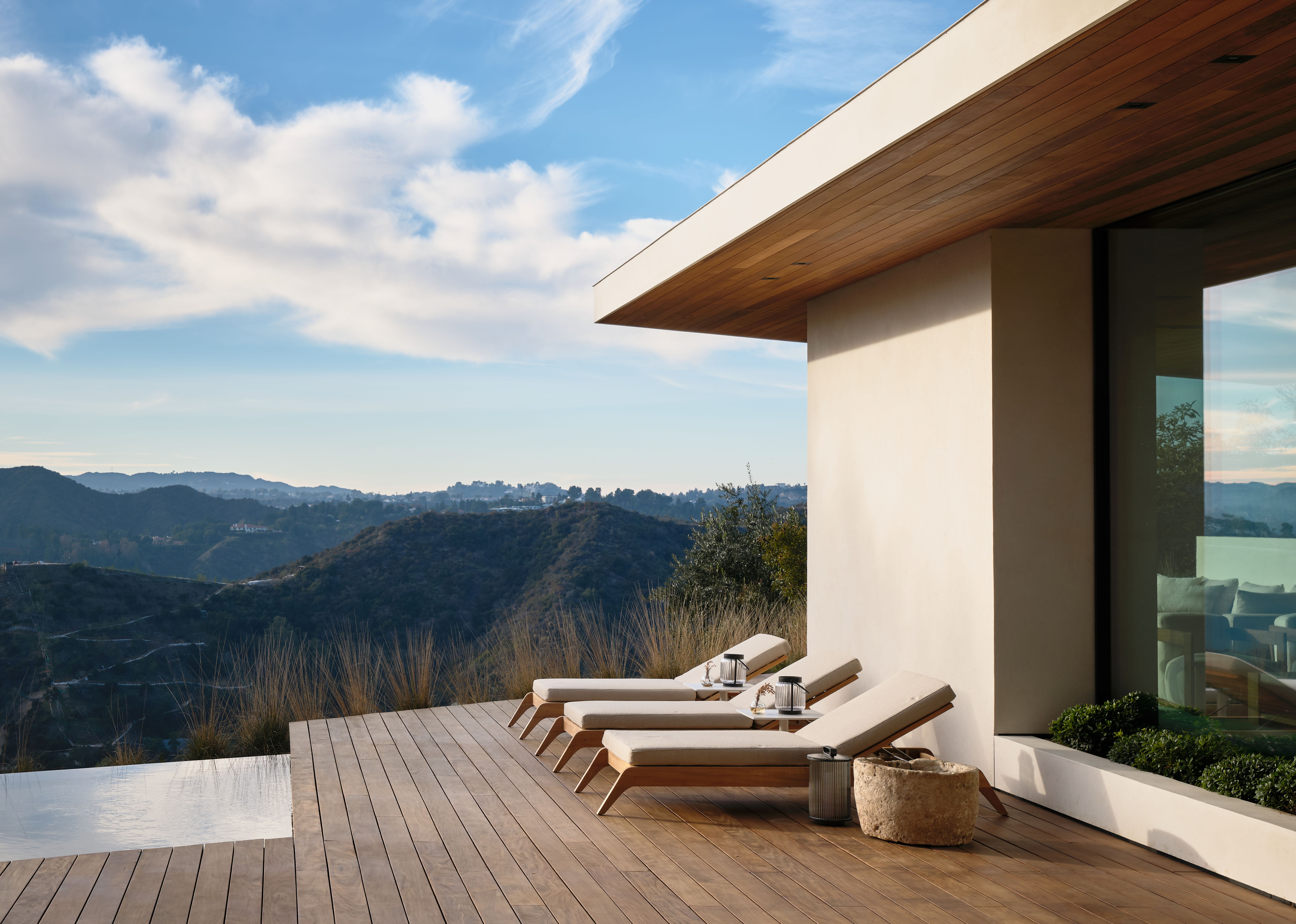
'The craftsmanship of the home alongside the simplicity of space is reflected through framed views and details. Some choices were self-referential, like our desire to combine architecture, interiors and landscape into a singular experience. For the home, the design began with three courtyards and the home’s interaction with each. From there we complimented the courtyards with custom millwork and furniture that matched the Japanese influence of the home.'

.jpg?w=600)


