
By now, we are all familiar with Bookshelf Wealth – a styling trend that stormed our social media feeds nearly a year ago and shows no signs of slowing down.
Need proof? Check out Bette Midler's living room in her Fifth Avenue penthouse, as seen on photographer Evan Joseph's Instagram page. The Hocus Pocus and The First Wives Club star's space features floor-to-ceiling windows, a plush, pink sofa, printed armchairs, wall artwork, and most notably, a stunning, white, L-shaped bookcase in the corner of the room. Her arrangement is a masterclass in how to style a bookcase with a lasting impact.
The eye is drawn to the shelves, which house multi-colored books which are subtly organized by color family, with rainbow books on the upper shelves, and neutral books on the lower shelves. This light method of color coordination proves that the strategy is just as impactful as it's ever been.
According to experts, organizing books by color is one of the most impactful ways to style a bookshelf, as the arrangement immediately draws the eye to the area.
'Bookshelves are more than a place to stash your books—they’re a reflection of who you are,' says Katie Gutierrez, principal interior designer at Errez Design. 'Color coordination takes them from utilitarian to unforgettable. Arranging books by hue creates a rhythm, a visual story that draws you in. It’s not just neat; it’s art with an emotional weight. The colors soothe, energize, or intrigue, turning your shelf into something far greater than the sum of its parts.'
While some may find color coordination polarizing, especially as it is prevalent on digital mood boards, Gutierrez says that being intentional (and experimental with palettes) can take this styling approach to the next level.
'The design trend exploded with social media, sure, but it sticks because it works,' she says. 'Start with a spectrum – reds to violets– layer in neutral tones for balance, and let gradients within each color group do the heavy lifting. The key is restraint. Add a plant, a memento, or a bold bookend to keep it human. Done right, a color-coordinated shelf isn’t just organized; it’s alive.'
Alternatively, Midler's shelves, with their mixed and matched books that are only vaguely color coordinated, give an effortless feel to the space while still possessing some eye-catching organization.

Sturdy and versatile, this wood case is a booklover's home essential.

The shelving possibilities are endless with this gorgeous, acorn-finished wall unit.
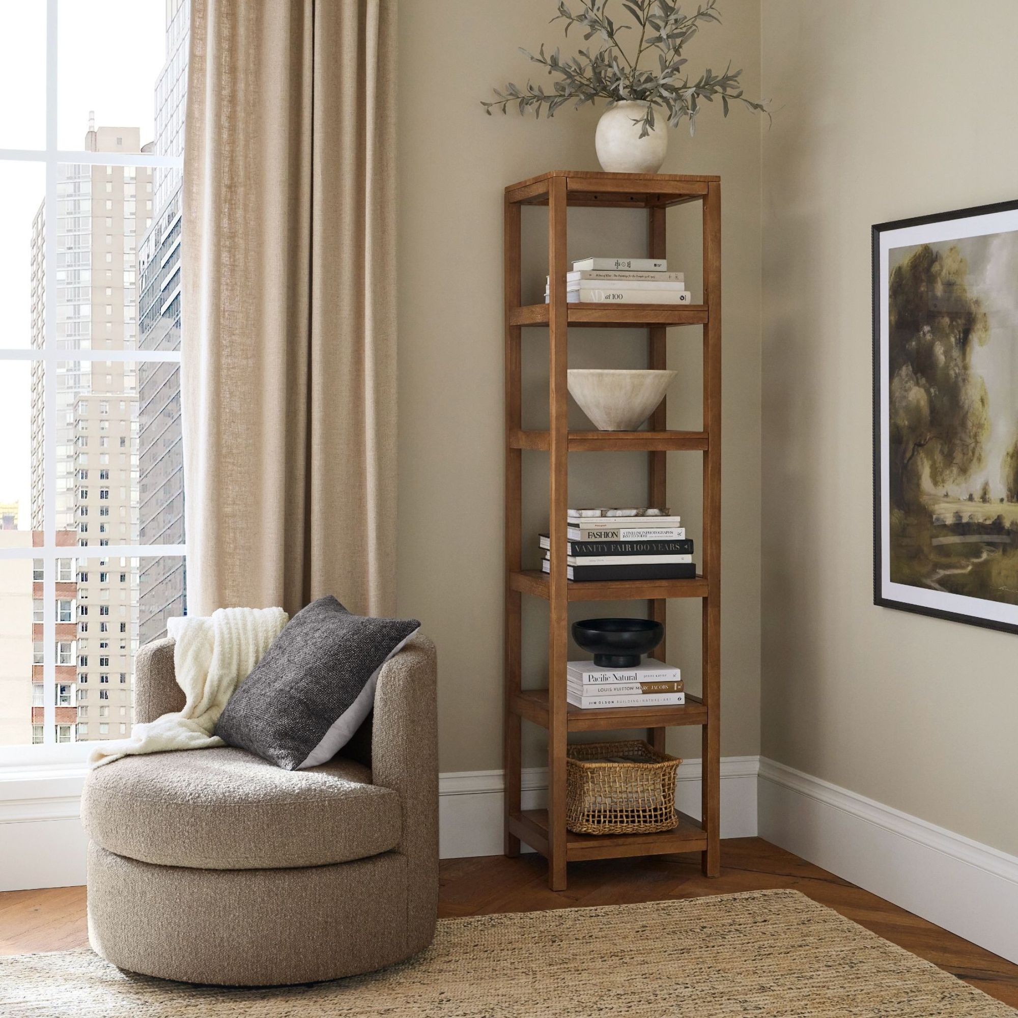
Mango wood and ample height make this an effortless piece to display books and miscellaneous items in.
Try placing spines out for an unexpected touch to your bookshelf, as well as a neutral addition to a rainbow shelf. Alternatively, experiment with bookends for an extra textural point of interest.
