
Benny Blanco's recent engagement with Selena Gomez has seen the record producer at the front of every news outlet – but what about the home behind the headlines? Thankfully for us, it's a designer-lover dream.
The product of Blanco's creative lead (in collaboration with Rachel Leigh Ward and Dana M. Vitrano of BonVivant Interiors), his LA abode defines eclecticism in every sense of the word.
The maximalist home is a celebration of 'curated chaos.' a design trend that encourages us to get playful with contrasting patterns and mismatched furniture – while keeping our spaces tasteful. Inevitably, striking a balance can be tricky, but Blanco's living room is a masterclass in making it look effortless.
In this space (which, with the addition of a large stereo and sound system, appears to double as a music room), Blanco has layered an ornate rug with a green botanical sofa – two clashing patterns that unconventionally work in harmony. It's no surprise, then, that designers swear by a similar pattern-clashing method.
'One of the best places to start when bringing color and pattern into the home is with a floor covering, setting the tone and anchoring the rest of the space. A beautiful rug can give you a palette or a sounding board for the rest of the room,' comments designer Matthew Williamson.
'You could pick out specific colors from the weave and take them onto the walls, into the soft furnishings, and even up onto the ceiling for a dramatic look. You could also experiment with pattern, pairing a leopard print rug with a striking floral wallpaper or sofa.'
Shop the look
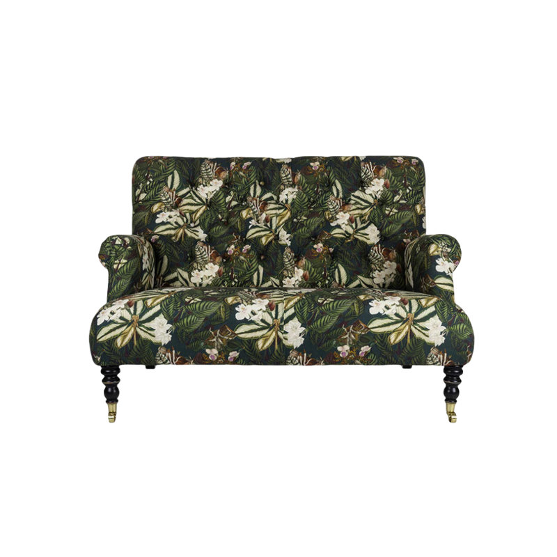
Made of high quality fabric, this sofa offers the Benny Blanco look with quality that's designed to last. Alongside its botanical print, its functionality is also something to note. It has a high density sponge filling, making it soft and comfortable for sitting.
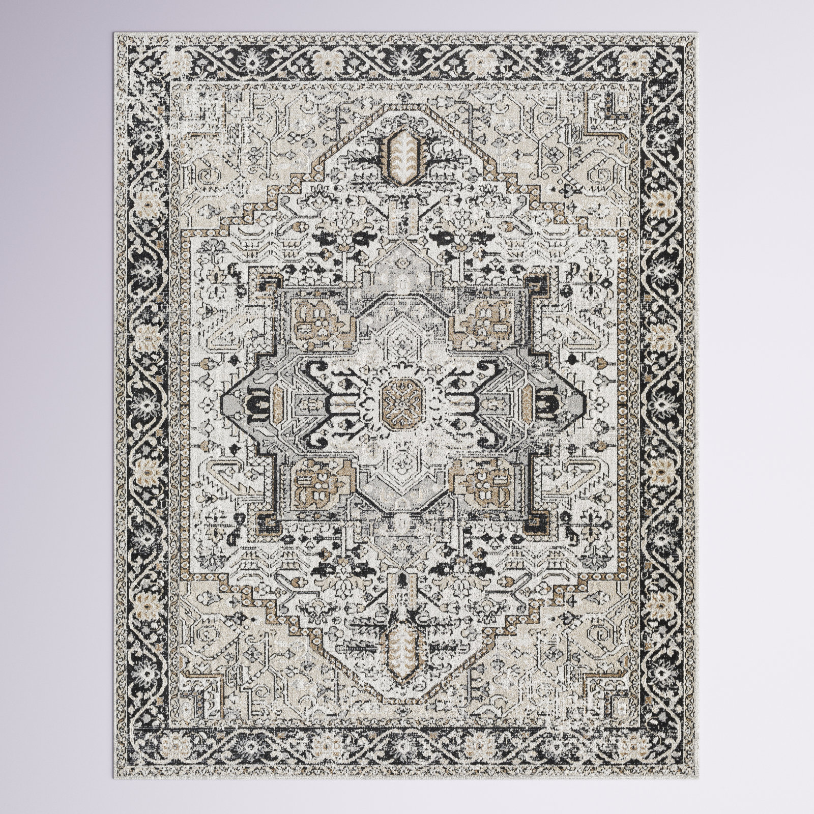
The only thing better than a Blanco-inspired piece is one that's significantly reduced, as is the case with this area rug. The black and taupe patterned colorway is a similar match to the one he uses to anchor his space (and set a base for the rest of his furniture).
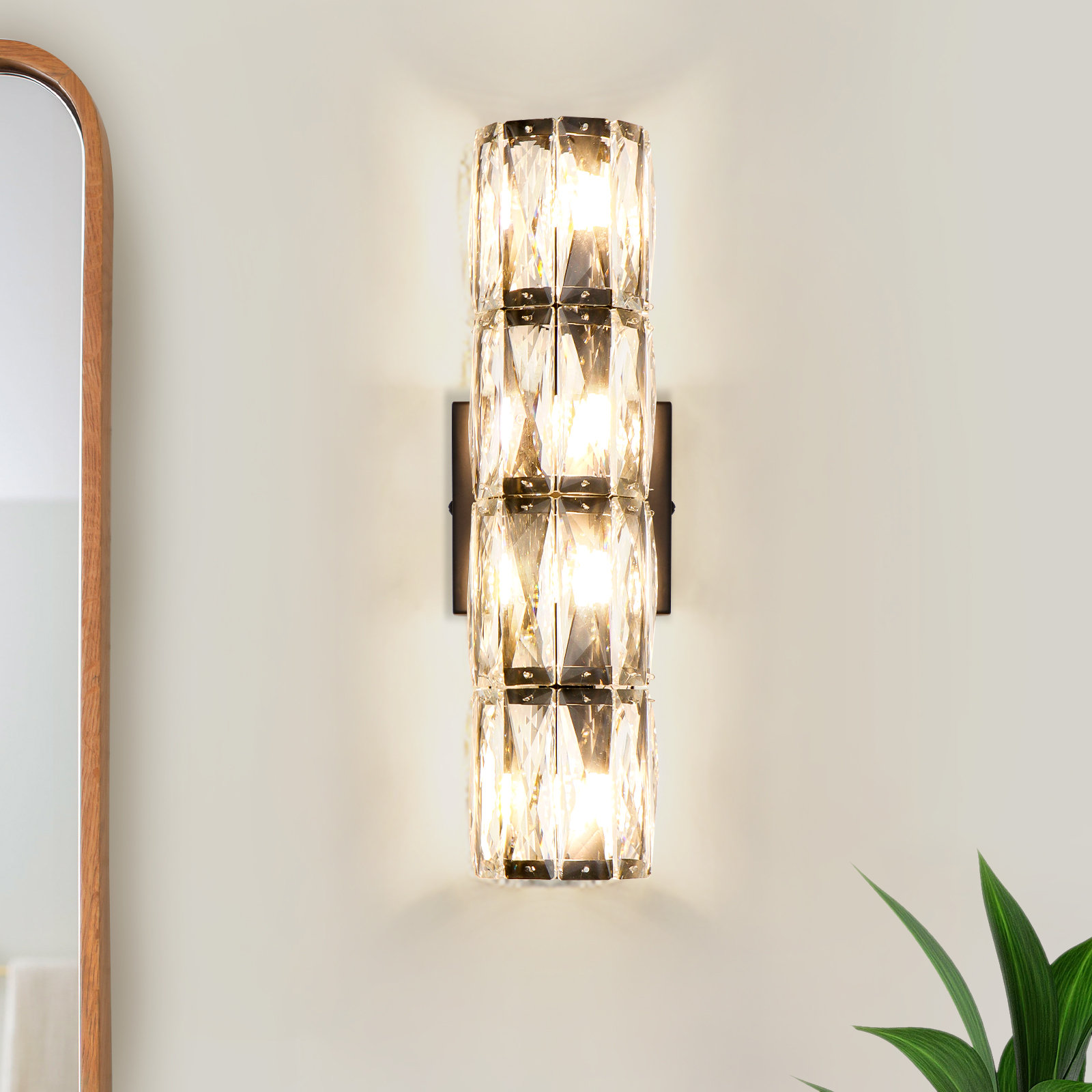
The best way to complement any patterned soft furniture is with a glamorous wall sconce similar to the one seen on Blanco's wall. We love this alternative from Wayfair – featuring hand-cut, ground, and polished K9 crystals, creating a dazzling display of elegance.
Blanco's layered patterns have an almost retro feel, but according to Paul Fleming, the managing director of Fleming & Howland, an eclectic space (such as this) is shaping how we decorate contemporary homes.
According to research by Pinterest, an increasing number of consumers are looking to combine great quality and quirky pieces of furniture with a modern way of living that works for them. Searches on the platform for ‘eclectic interior design vintage’ have surged by 850% year on year, while searches for inspiration on how to style ‘maximalist decor vintage’ are also up by 350%.
'Where some see garish, others see bold. Where some see bland, others see understated. There is no monopoly on beauty. For us, beauty is found in the obsessive pursuit of elegance in shape and form,' Fleming comments.
According to Fleming, clashing patterns, just as Blanco has done, is an impactful way to tap into this 'curated chaos' look. And following suit is easier than you might initally expect.
'Committing to clashing patterns can be a scary thought, but this design choice is one most favored by maximalists. The biggest thing to remember is that everything can be neutral if you let it be,' he says.
'The scale of the pattern is something to keep in mind when choosing which ones to use. Try to ensure that one pattern is bigger and more complex and the other more simpler or much smaller, as this will make pairing them much easier. For example, a busy floral will work well with a clean stripe, while a botanic-style pattern can easily be paired with a polka dot or spotty print.'
'Opposites attract when it comes to clashing prints and colors, so turn to the trusty color wheel for advice if stuck on which colors should (or shouldn’t) be paired together. Or, throw out the rule book and do what you want!'

