Decorating with blue is a timeless choice – a paint color interior designers regularly turn to when creating classic color schemes. While there are endless stylish blue paints out there, one that's caught our attention recently is Benjamin Moore's Van Deusen Blue.
Described as a 'foundational' blue, Van Deusen Blue is a need-to-know-about shade if you're looking for something timeless yet with more depth and interest than neutrals.
Here, we explore all there is to know about this Benjamin Moore blue paint, including expert-suggested decorating tips for using it throughout the home.
What color is Van Deusen Blue?
'Van Deusen Blue is a foundational blue that fits easily into both traditional and modern spaces,' explains Helen Shaw, Director of Marketing (International) at Benjamin Moore. 'It has distinct tones yet an overall understated quality making it a perfect mid-blue to live with every day.'
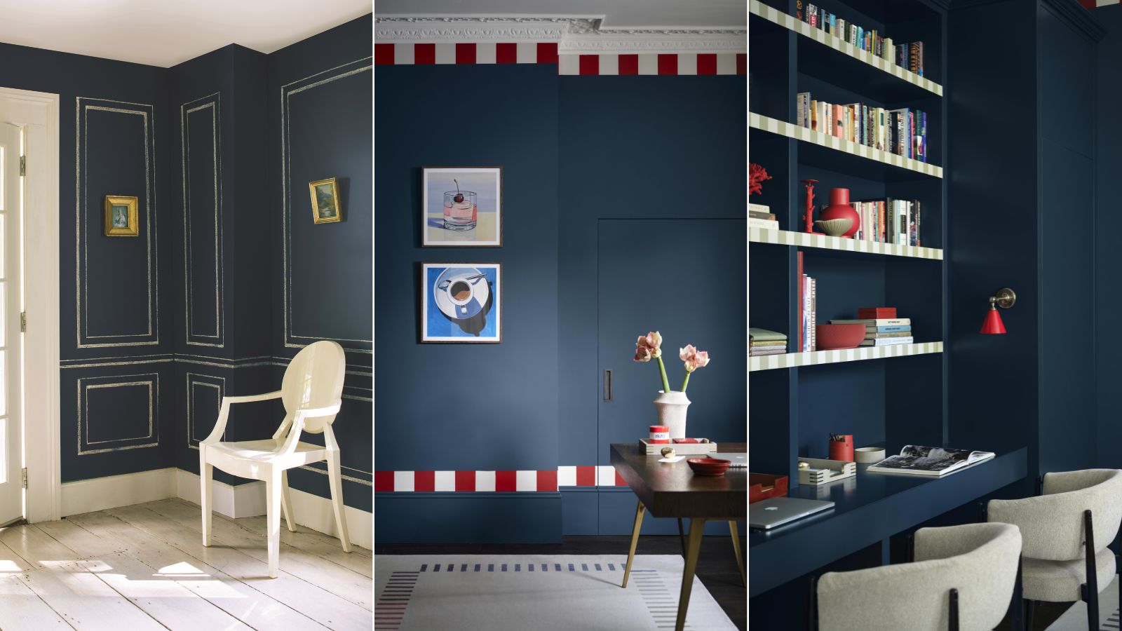
Decorating with blue on the walls has seen plenty of popularity in recent years, and while the deepest and darkest navy blue paints can appear incredibly moody and dramatic – which may be the aim for certain spaces – Van Deusen Blue isn't quite so bold. As Helen explains, it's a mid-tone that feels liveable in many rooms.
How to decorate with this mid-blue paint

When decorating with this blue paint, it works especially well as the dominant color in a room, teamed with light neutral paints as accent colors to provide balance. When doing so, the trick to achieving a cohesive look is to choose neutrals with the right undertones. Since Van Deusen Blue is a cool color, you'll want to reach for those with matching cool undertones, as Helen suggests below:
'Pair with accents of cool white with undertones of blue or gray such as White Ice or Mirage White to create a crisp and clean look, a great choice for contemporary spaces.'
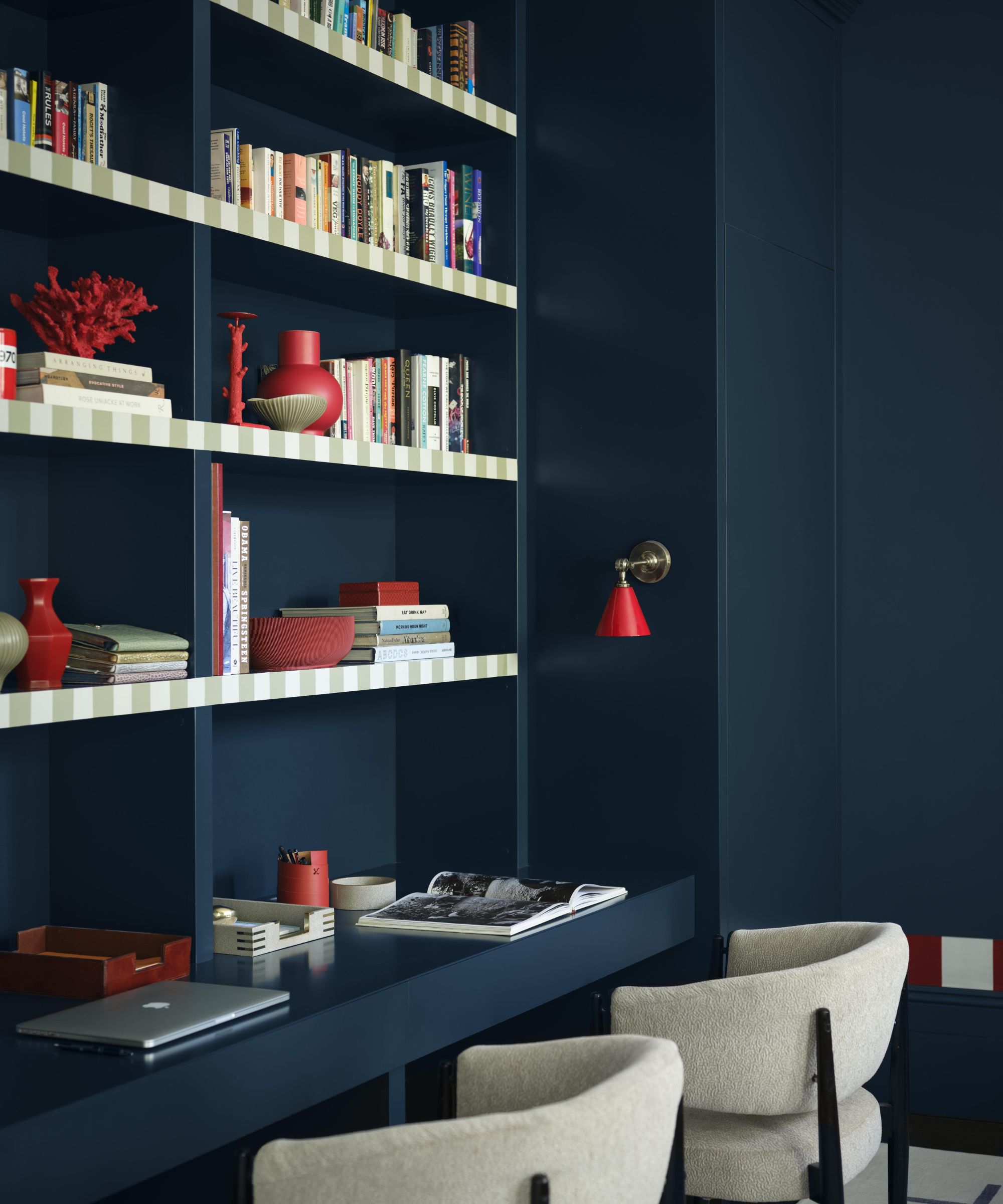
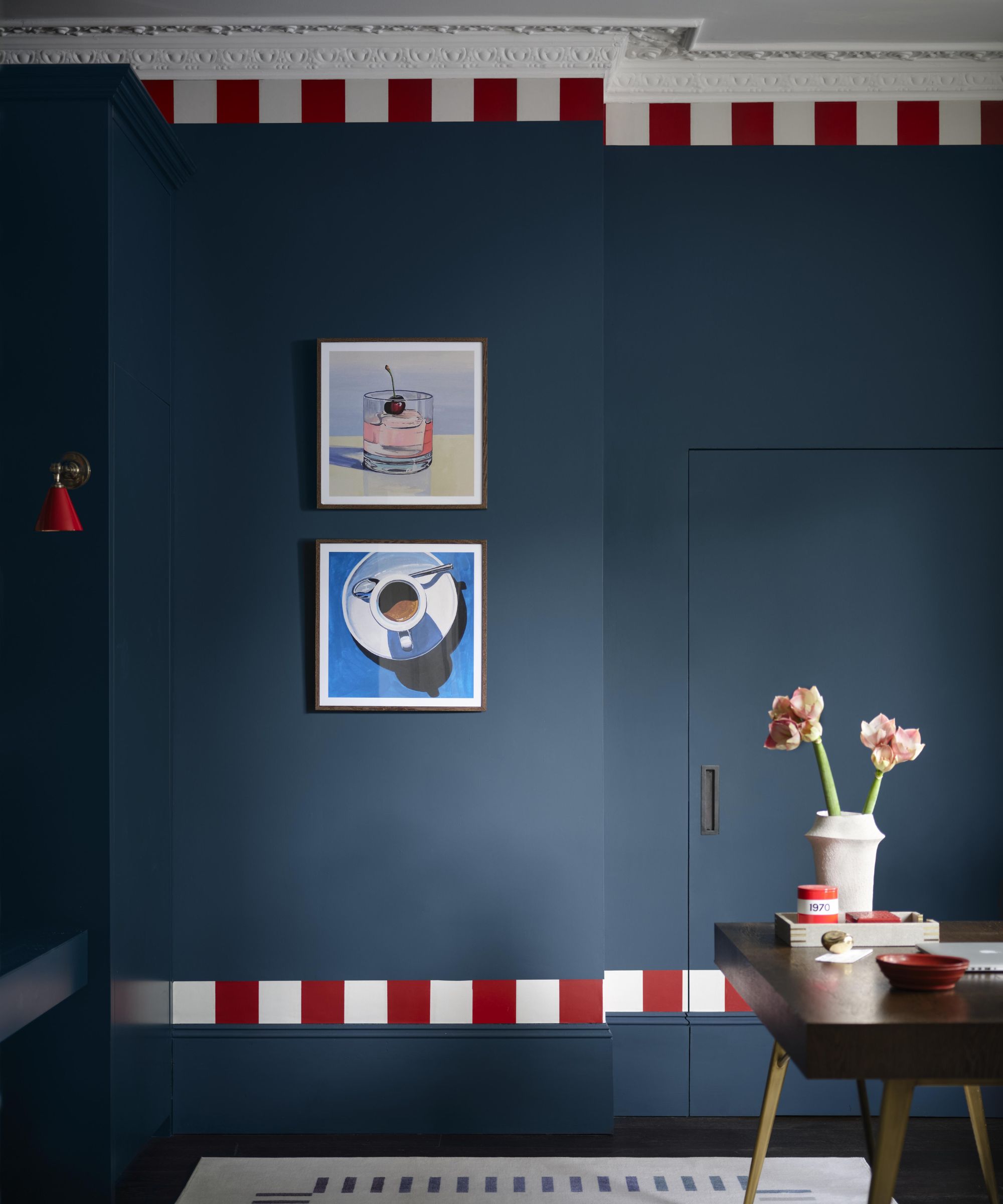
That said, for a bolder and on-trend look, embrace color drenching when decorating with Van Deusen Blue. Using the color liberally throughout a room including the ceiling and woodwork in addition to the walls will result in a cocooning, relaxing space that avoids harsh contrasts. Helen shares that this is an especially effective paint trend for cozy rooms:
'Alternatively, painting an intimate space such as a dining room or living room from floor to ceiling in this rich hue can look particularly striking for an all-encompassing feel.'
It's also important to consider your paint finishes and lighting ideas when color-drenching with this mid-blue to create the right ambiance, suggests Helen: 'Consider a higher finish, like semi-gloss or high-gloss, to bring reflection and dimension. Then play with light sources such as material shades and dimmer switches for the ultimate cozy ambiance.'
Van Deusen Blue is a mid-tone blue paint that's versatile and timeless to use in many homes across various decorating styles.
If you're looking for a timeless and versatile blue paint for your color scheme, we'd recommend trying out Van Deusen Blue. Whether you use it teamed with lighter neutrals for a balanced look or use it boldly with color drenching, this blue lends itself to many rooms and interior design styles.