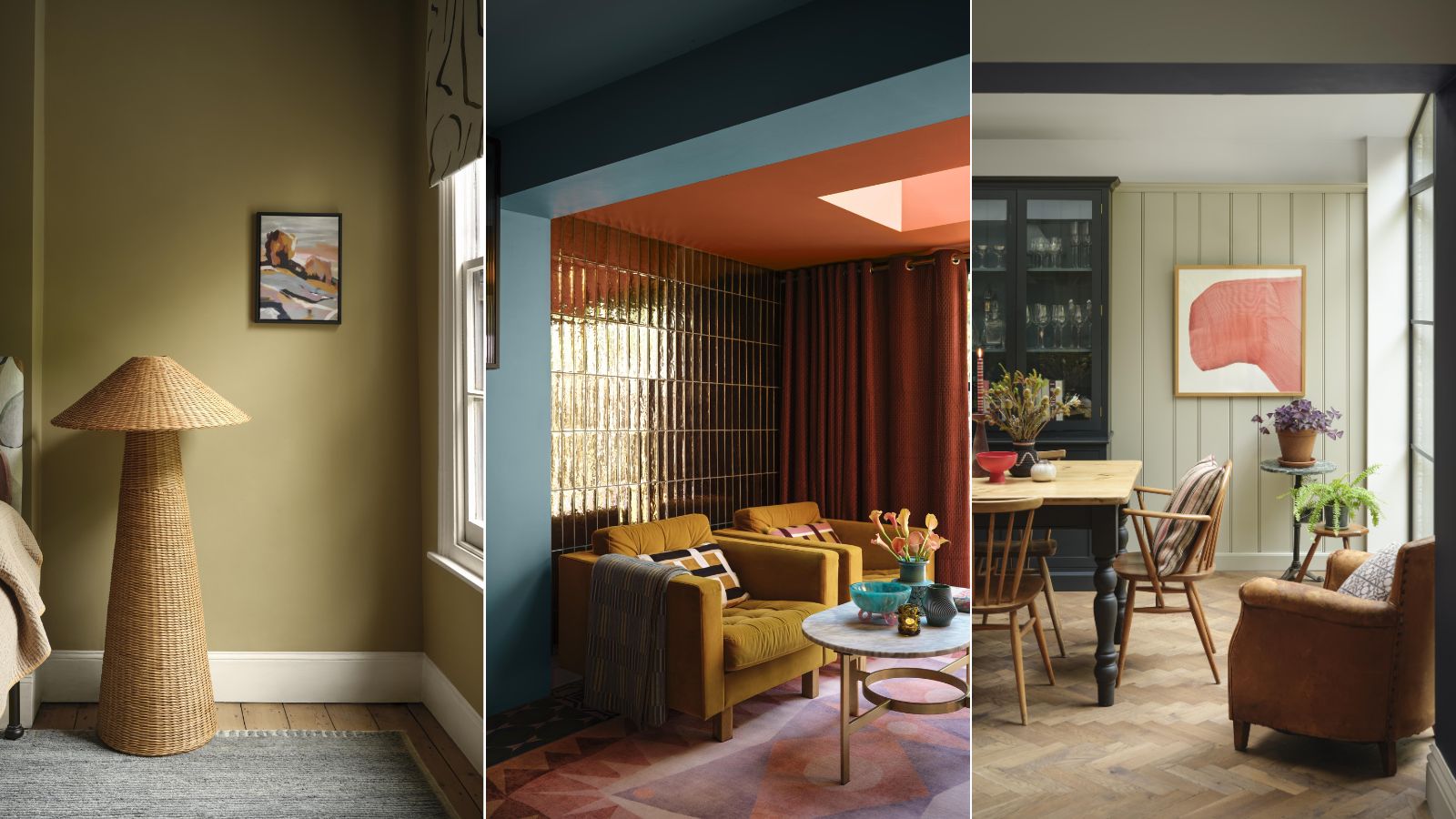
As we edge closer to fall, it's the perfect time to consider refreshing your room colors to have your home feeling cozy and stylish for the winter months. And what better way to do so than through new paint ideas?
For fall 2024, Benjamin Moore has unveiled a brand new lookbook, filled with its top paint trends for the months ahead. From warm neutrals that will fill your home with warmth, to deep and dark shades; unexpected color combinations; or a more playful take on wall decor, there's something here for all tastes and decorating styles.
Here, we've rounded up the top paint ideas to give you plenty of inspiration for fall decor in the way of paint colors.
Benjamin Moore AW24 lookbook
Spanning nine different color trends, we've included expert advice from Benjamin Moore's Marketing Director and color specialist Helen Shaw, to give you plenty of top tips to recreate these looks in your own space.
1. Unexpected red
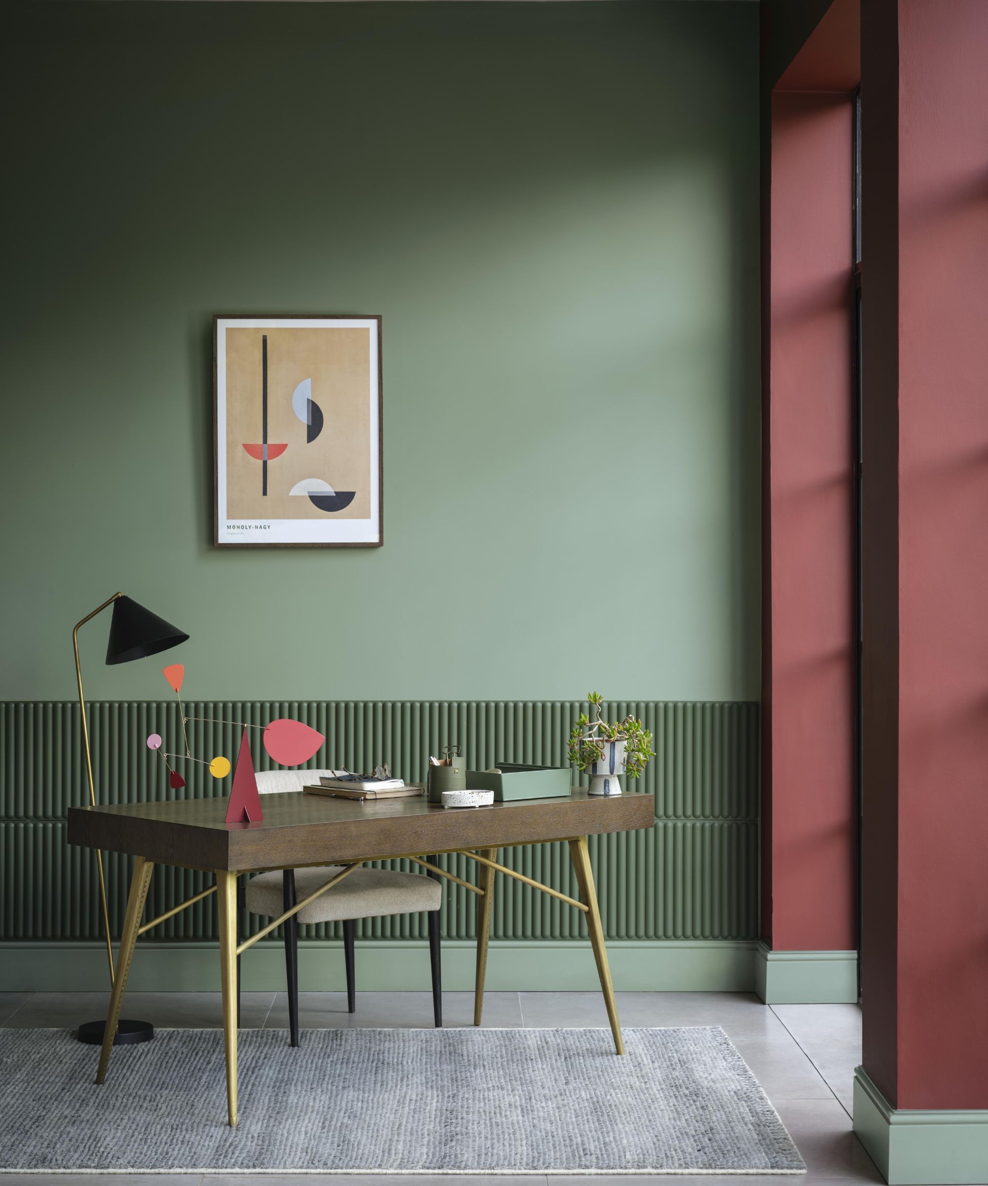
At the beginning of the year, the unexpected red theory took the interior design world by storm, with homeowners and designers alike embracing decorating with red for its supposed ability to enhance the visual appeal of a room. According to Benjamin Moore, this trend will remain a key player as we transition into the winter months, with deep wine red hues a failsafe way to add drama and sophistication to the home.
'A scarlet pop where it’s least expected is an age-old secret among designers and creatives,' says Helen. 'From pillar box to burgundy, a dash of this bold tone via artwork, furniture, or the inside of a painted window frame results in a scheme that’s both grounding and dynamic.'
Add an on-trend splash of red with this warm-toned paint color that doesn't appear too vibrant.
2. Warm neutrals
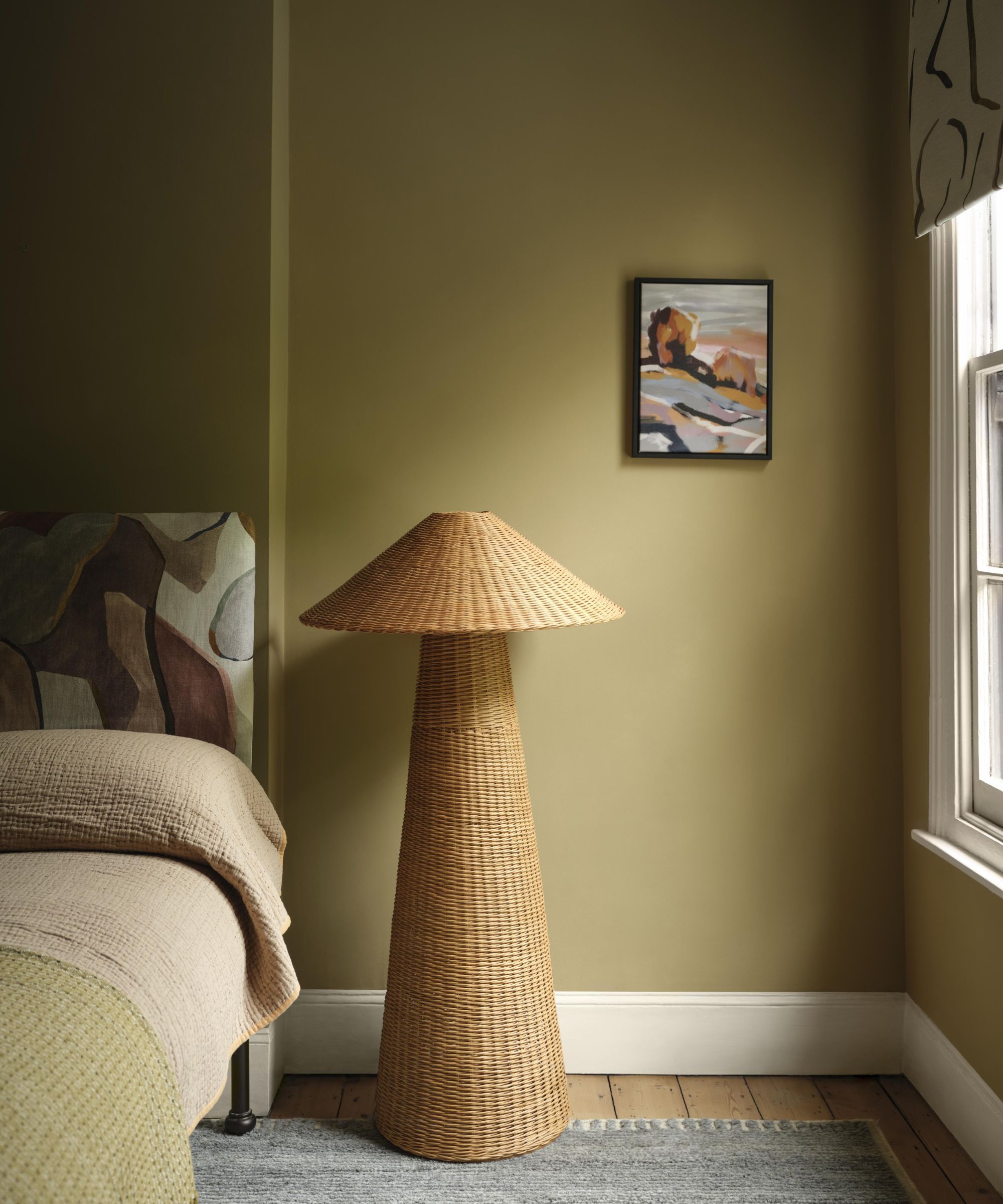
'Traditionally, autumn and winter are the seasons in which we retreat and reboot,' says Helen. 'For us at Benjamin Moore, that means turning inwards to the comfort of the home and rebalancing via warm yet serene tones.'
'Summerdale Gold HC-17, our Color Spotlight, seems to me especially apt because its sandy tone is both confident and calming, perhaps the very definition of a ‘new neutral’ – where depth, texture, and materiality combine to create schemes that are earthy yet energetic. This is a color that pairs beautifully with tactile materials, from wicker to appliqué, while acting as a relaxed foil to abstract patterns, painterly finishes, and rich autumnal hues.'
In this relaxing bedroom, Summerdale Gold is paired with Creamy White OC-7 on the woodwork, creating a cohesive yet pared-back scheme that will transition well beyond fall.
This honey-colored paint is a refreshing take on neutrals such as beige while still feeling calming.
3. Color couples
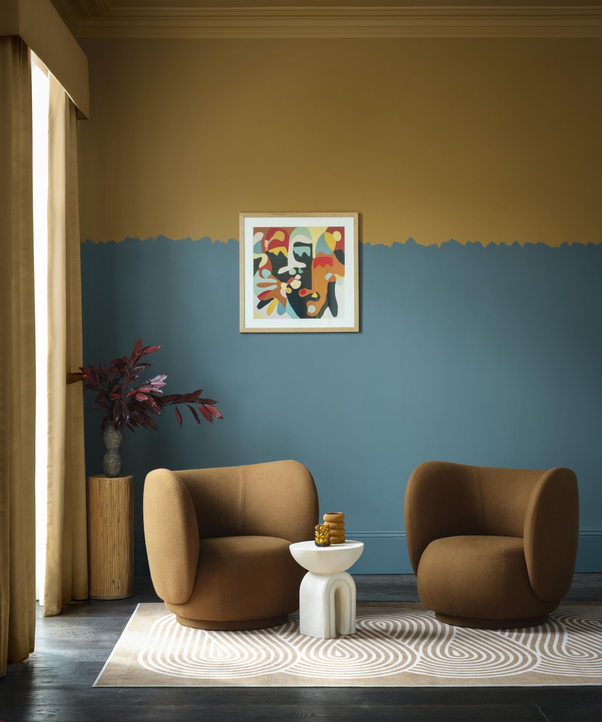
Color combinations for rooms are always an important part of the decorating process, but for 2024, Benjamin Moore is putting a new twist on the way we introduce two colors, as seen in this living room, with Bella Blue 720 paired beside Golden Retriever 2165-30. 'For a softening and playful transition, swap a conventional straight-lined border for an imperfect, rough bleed – an ideal way to add edge and texture,' explains Helen.
'Used across all surfaces including the ceiling, and foregoing harsh white contrasts, these ready-made palettes ensure you can transform your space with confidence while creating a more immersive and soulful experience.'
A teal blue with a subtle hint of gray, Bella Blue is a great way to venture into the world of color this fall.
4. Tonal colors
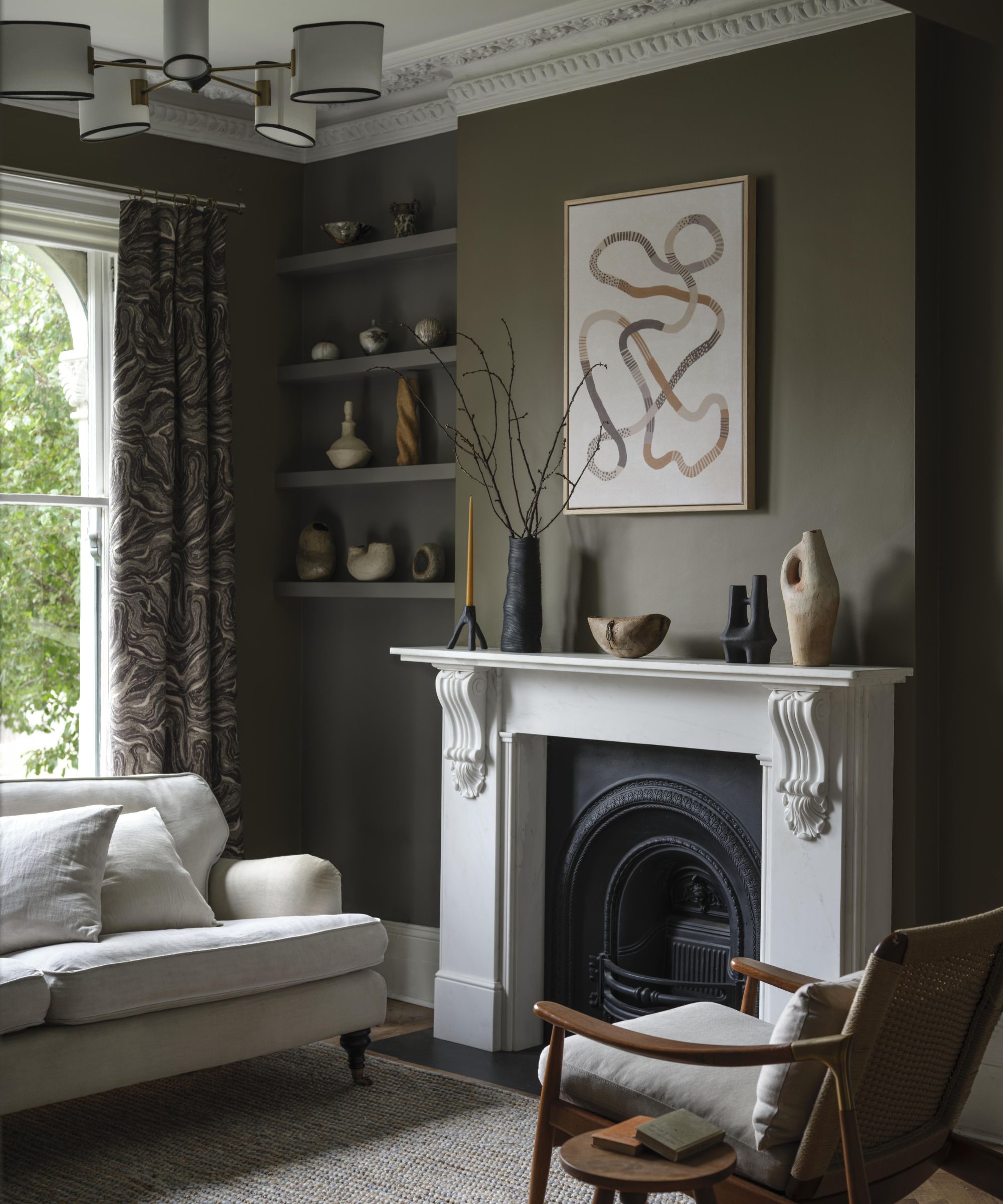
While color-drenching ideas have been, and remain to be, one of the most on-trend ways to decorate throughout 2024, Benjamin Moore is stepping away from one-tone schemes and suggesting the use of varied hues within one cohesive palette to highlight standout features in a room.
'Highlighting a key focal point such as a chimney breast by painting it in a different tonal color is a clever way of visually framing a favorite artwork,' explains Helen. 'Using a deep shade as an anchor is especially effective when highlighting natural materials such as collections of terracotta, plaster, and handmade ceramics.'
In this living room, Mortar CC-574 and Metropolis CC-546 are used on the walls, while Seapearl OC-19 is used on the fireplace.
If you're looking for a crisp white paint for your interior spaces, Seapearl is a fail-safe choice thanks to its cool undertones.
5. Graphic paintwork
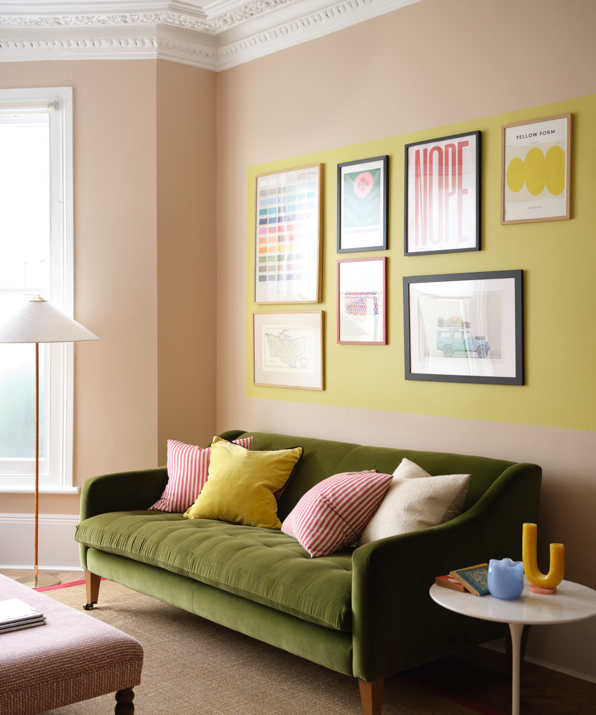
Looking to get more creative with your paint ideas this fall? Benjamin Moore champions an experimental approach by painting graphical details onto the walls in a tonal color scheme, as seen in this colorful living room with Terra Bella AF-195 and Yellow Tone 370.
'Use a tonal color box to define a salon-style hang of artwork and bring a generous, graphic feel to a scheme,' adds Helen. 'Knocked-back tones like oyster pinks and soft yellows keep the look relaxed. Hand-drawn squiggles can provide a playful counterpoint to the formality of cornicing as well as naturally drawing the eye upwards and elongating a room’s proportions.'
Terra Bella is an uplifting warm neutral, perfect for creating a happy feel throughout the home.
6. Dark warm tones in north-facing rooms
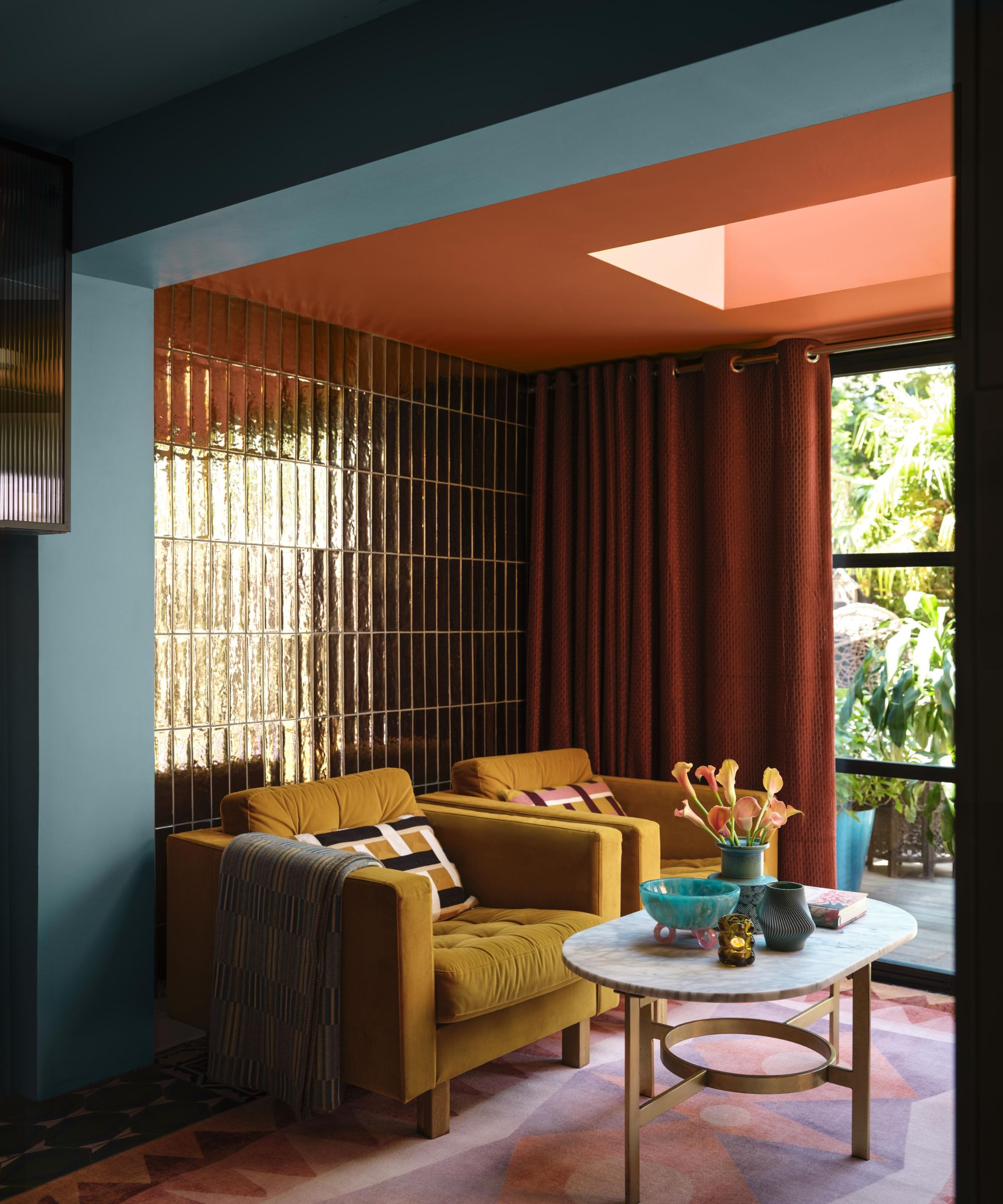
If there's one color rule to remember this fall, it's that small, low-light rooms should lean into a moody look rather than attempt to be made brighter. According to Benjamin Moore, warm-toned, dark hues will create the ultimate cozy space that is perfectly placed for the winter months in north-facing rooms.
'Rich tones, sumptuous textures, and a dose of retro glamour inject darker rooms with winter welcome,' says Helen. 'To combat the season’s cool light, opt for a selection of mustards, terracottas, and rusts, whose warm undertones add instant coziness.'
'An unexpected note of warm-based blue at a scheme’s entry point enhances the effect, while metallic tile finishes help bounce around light.'
A paint color that feels instantly autumnal, Pilgrimage Foliage is incredibly warming and moody.
7. Paint effects to recede architectural details
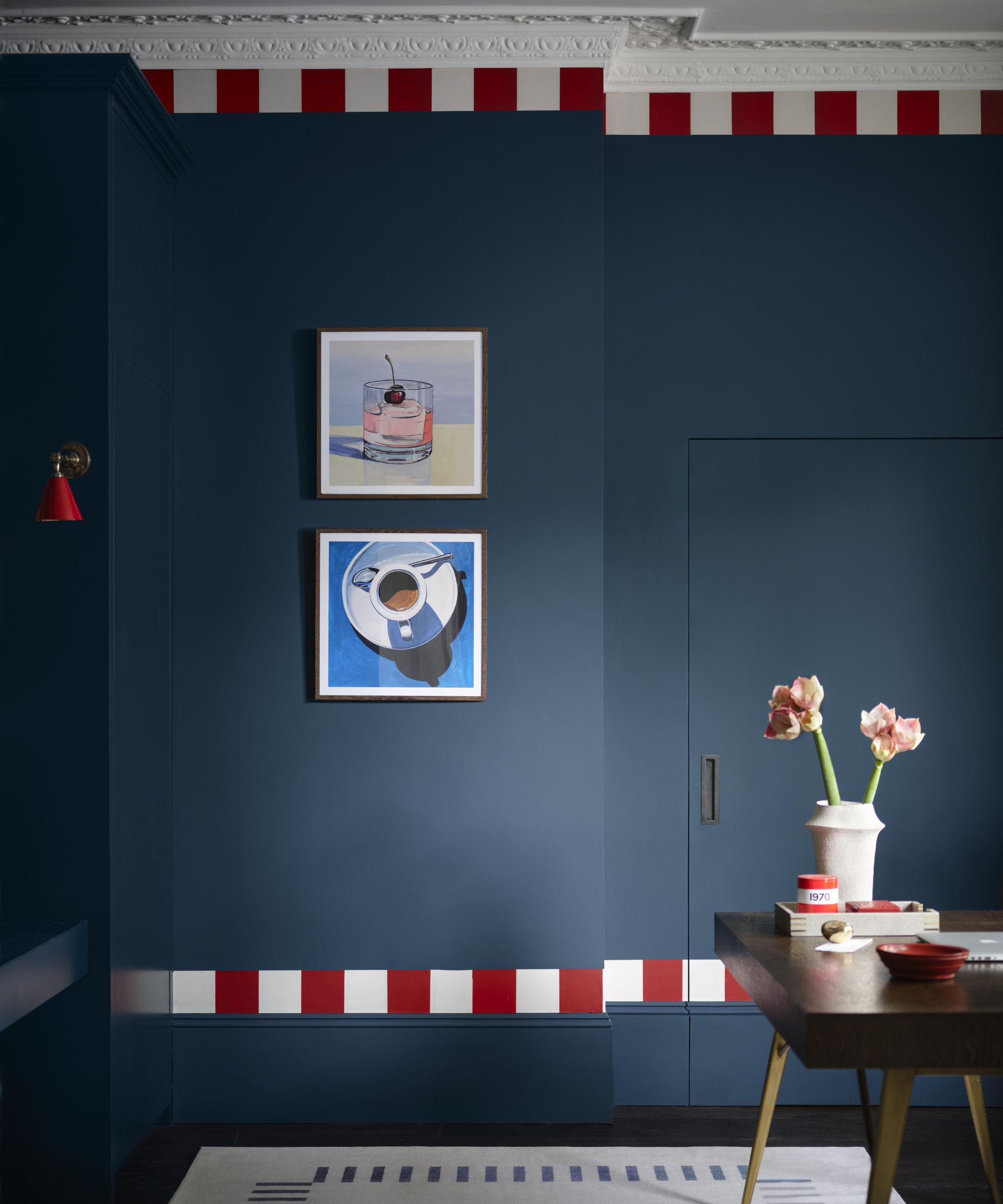
In this home office, a bold and playful take on color is embraced with a red and white border along the existing architectural details and woodwork. Although unexpected, these small but impactful details are a great way to add interest to your home this fall, while allowing details to recede.
'Use clever painted effects to let architectural details recede, such as seamlessly color-matching doors to walls, and running a playful border across top and bottom for total integration,' adds Helen.
'Introducing considered color pops, such as adding a pillar box red wall light to a midnight blue wall, has an instantly smartening effect – like adding a statement jewel to a streamlined outfit.'
Use Van Deusen Blue across all four walls to create a timeless space, whether in the bedroom or living room.
8. Deep greens for Christmas
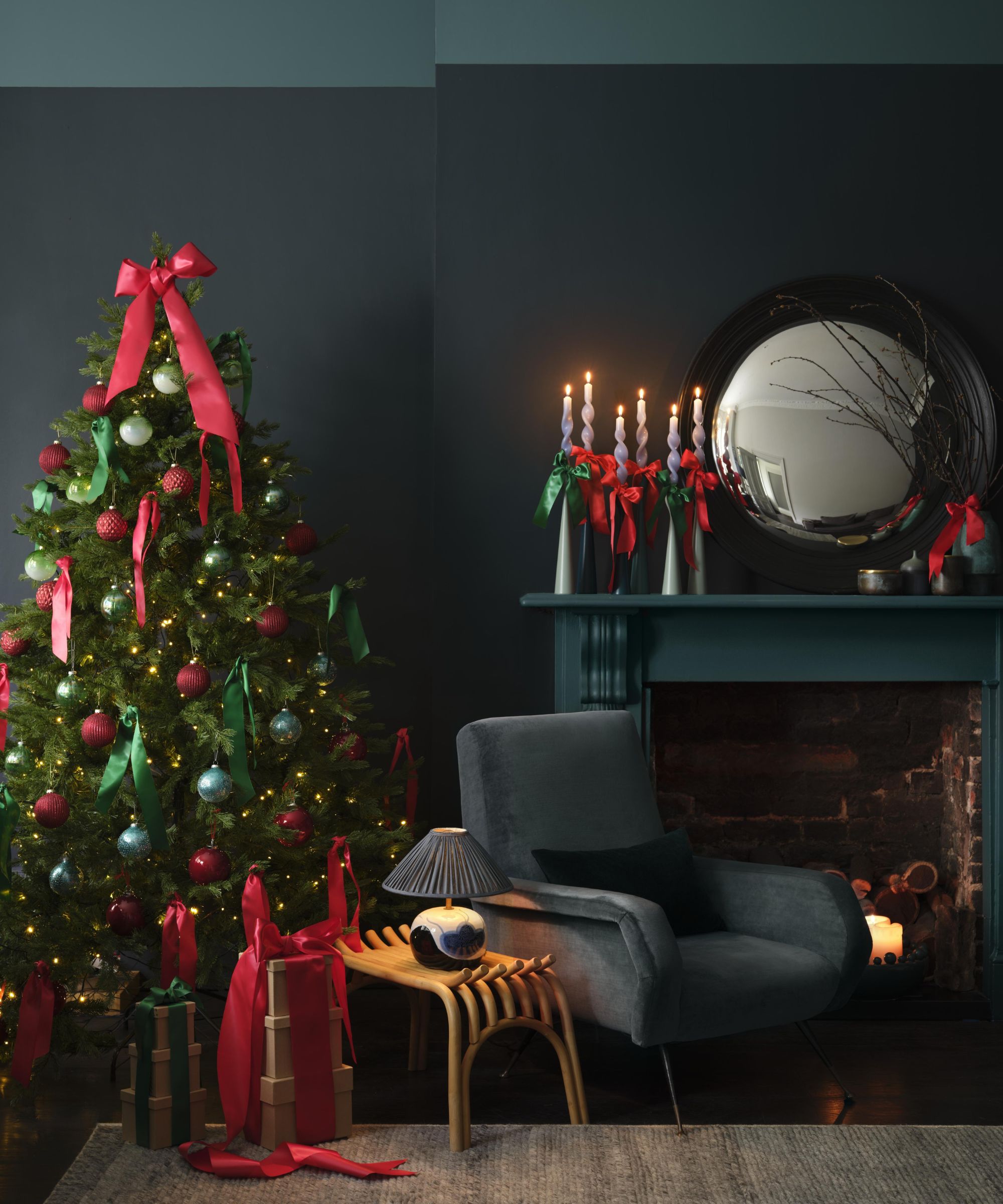
While the festive period is still months away, Benjamin Moore is steering us in the right direction with the most on-trend color pairings for Christmas 2024.
In this living room, a dark color palette is enhanced with the tonal hues of Polished Slate 713 and Stonecutter 2135-20, using the fireplace as an opportunity to tie together the colors on the walls.
'Painting a fire surround in the same color as the wall’s upper border produces a striking, softly cohesive look,' says Helen. 'Accentuate the graphic element with a tree adorned with baubles, plus bows tied smartly on the diagonal.'
Decorate with Polished Slate this fall to create a calming yet slightly moody feel in your space.
9. Statement doorways
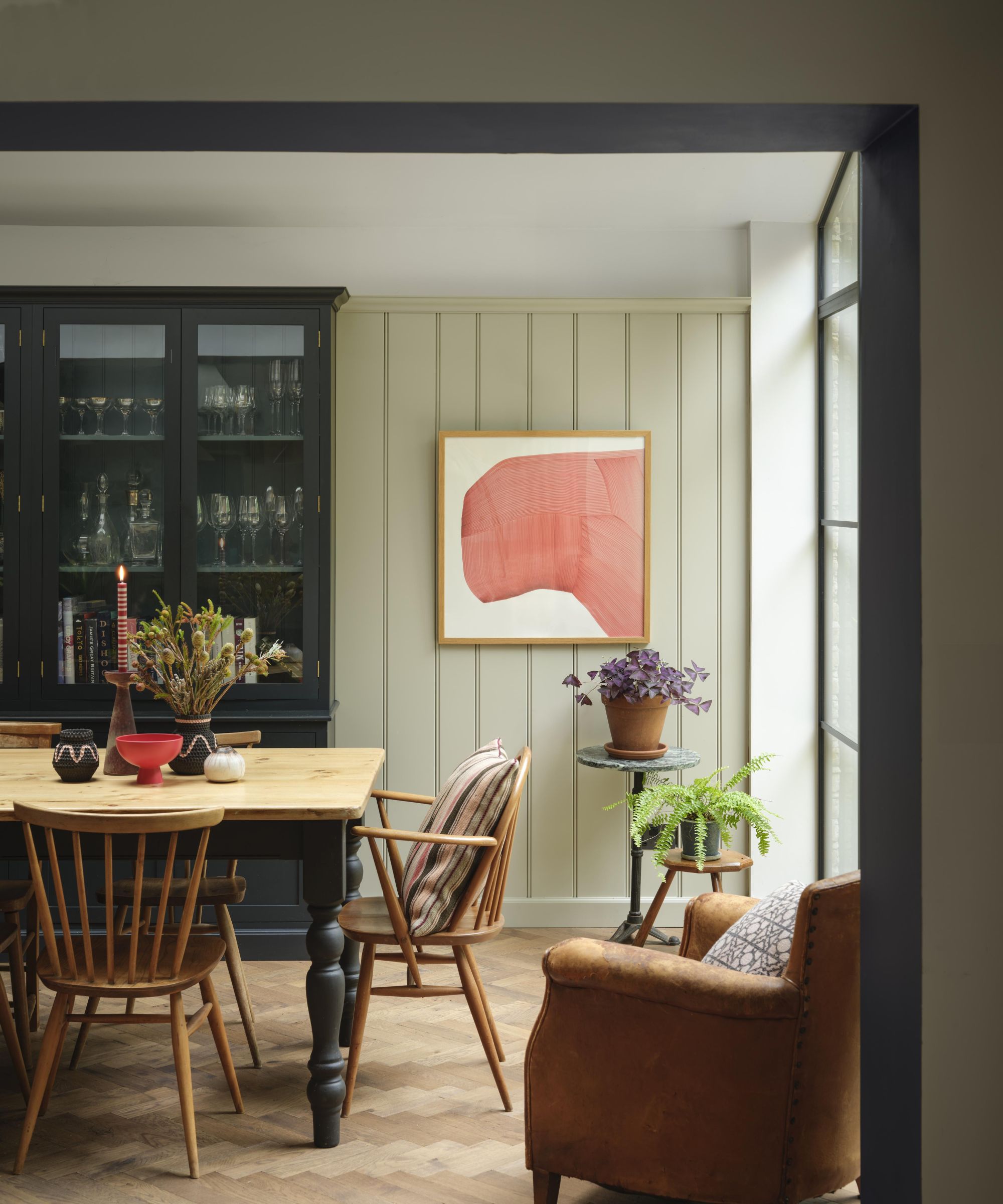
'From period entryways to quotidian structural elements like load-bearing openings, portals offer plenty of opportunities to get creative,' says Helen.
'Painting the underside of an entryway in a contrasting tone adds definition, elegantly framing the vista from one room to another as well as producing an anchoring effect that is both cosseting and autumnal.'
In this dining room, the soft green hues of Celery Salt OC-136 are contrasted with the charcoal black Witching Hour 2120-30 used on the doorframe, adding design interest to a space that generally isn't paid so much attention to.
If you want to go dark with your paint colors, opt for Witching Hour, a charcoal black that will make a statement.
Whether you want to keep your color schemes neutral and timeless this fall or want to venture out and embrace more unexpected paint trends, these ideas will ensure a stylish look. Just remember to try out new paint colors through swatches before going all in, as colors look different depending on a room's lighting conditions.


