When decorating with paint and color, there's a wide range of traditional 'rules' that can be difficult to veer away from. From keeping the ceiling white to only using light colors in small rooms, you're not alone if you have ingrained ideas about how to – or how not to – decorate with paint.
But for Sharon Grech, color expert at Benjamin Moore, these are often misconceptions that can be debunked. Taking to Instagram, Benjamin Moore shared a video in which Sharon talks through three of the biggest paint myths and shares her advice on what to do instead.
Below, we've rounded up each of Sharon's color decorating rules to ignore. If you're in need of some expert guidance with your paint ideas to ensure a cohesive yet exciting space, Sharon's tips will help you along the way.
1. Ceilings should be painted white
The first decorating myth that Sharon addresses is the assumption that ceilings and trim should be painted white. 'Well, although white is not a bad choice, it’s just not always the most harmonious one,' begins Sharon.
'It’s actually really important that you think about all the other elements in the space and make sure that your ceiling and trim connect with all of those. Some of the most interesting rooms that I have seen treat the ceiling and the trim as decorative details. So you can really add contrast or drama or even just something a little playful and unexpected,' she adds.
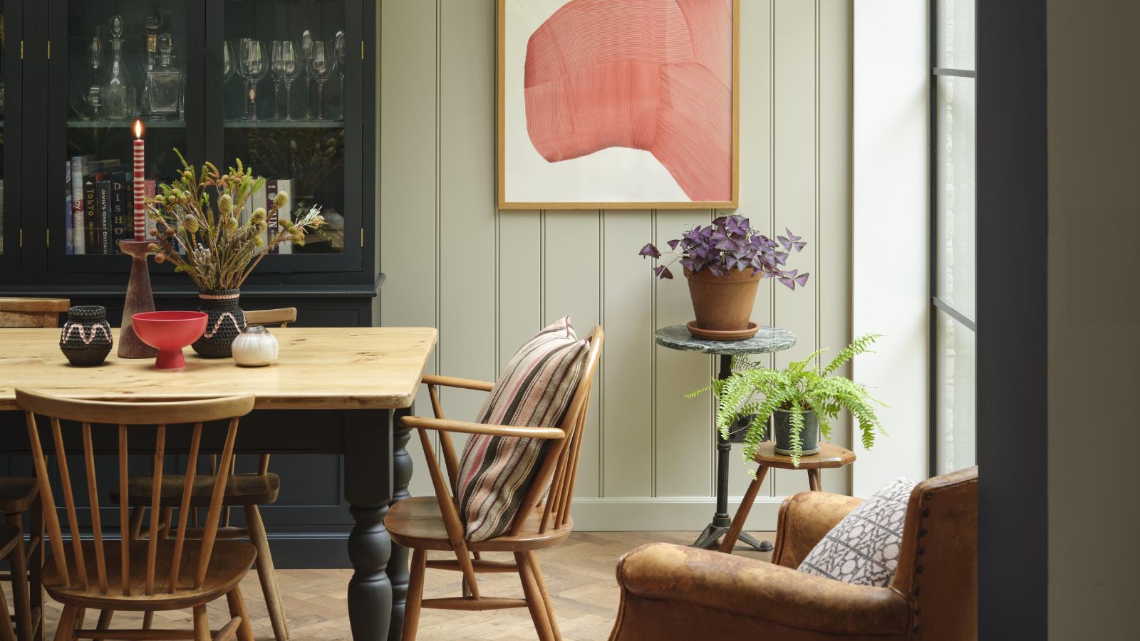
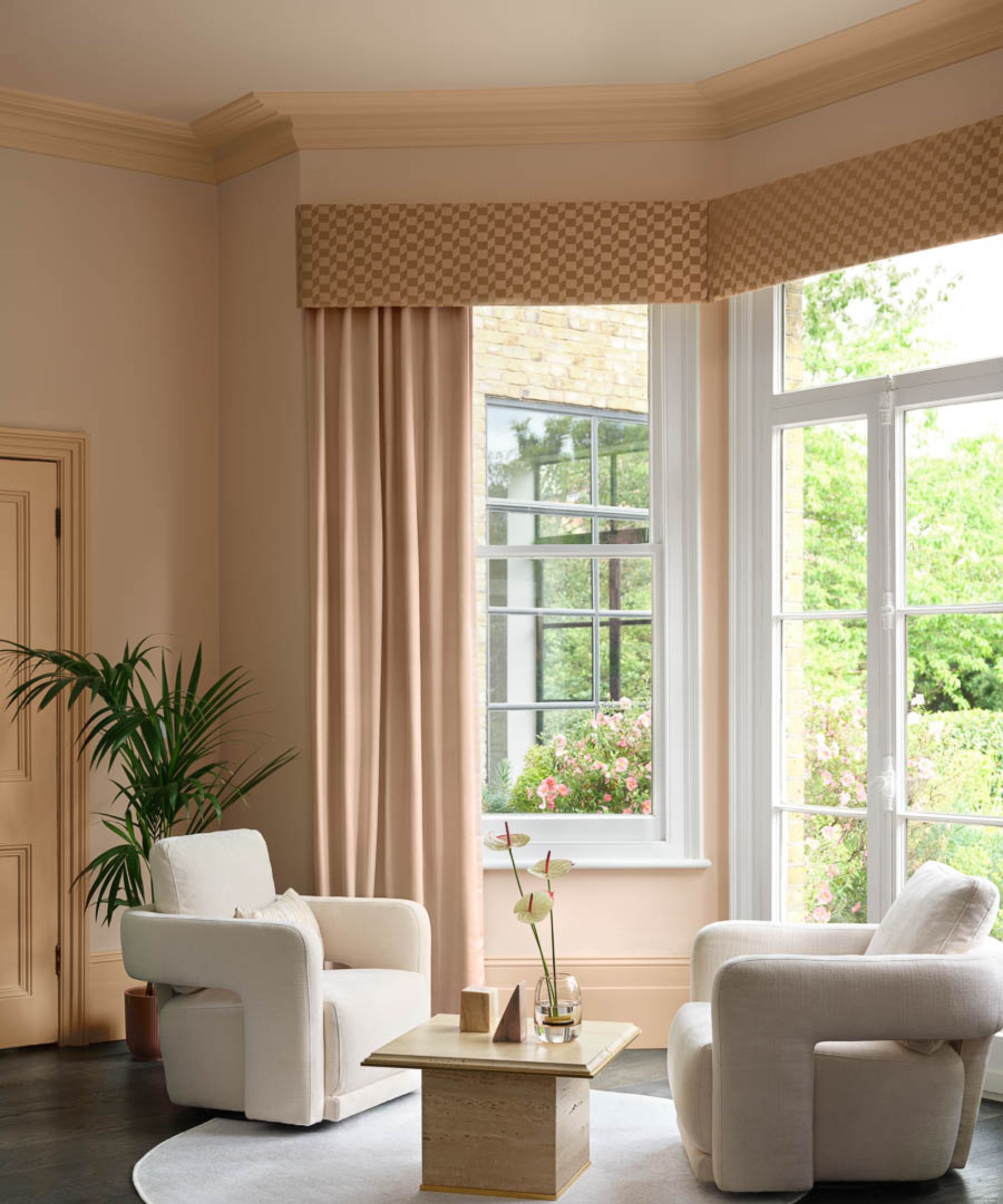
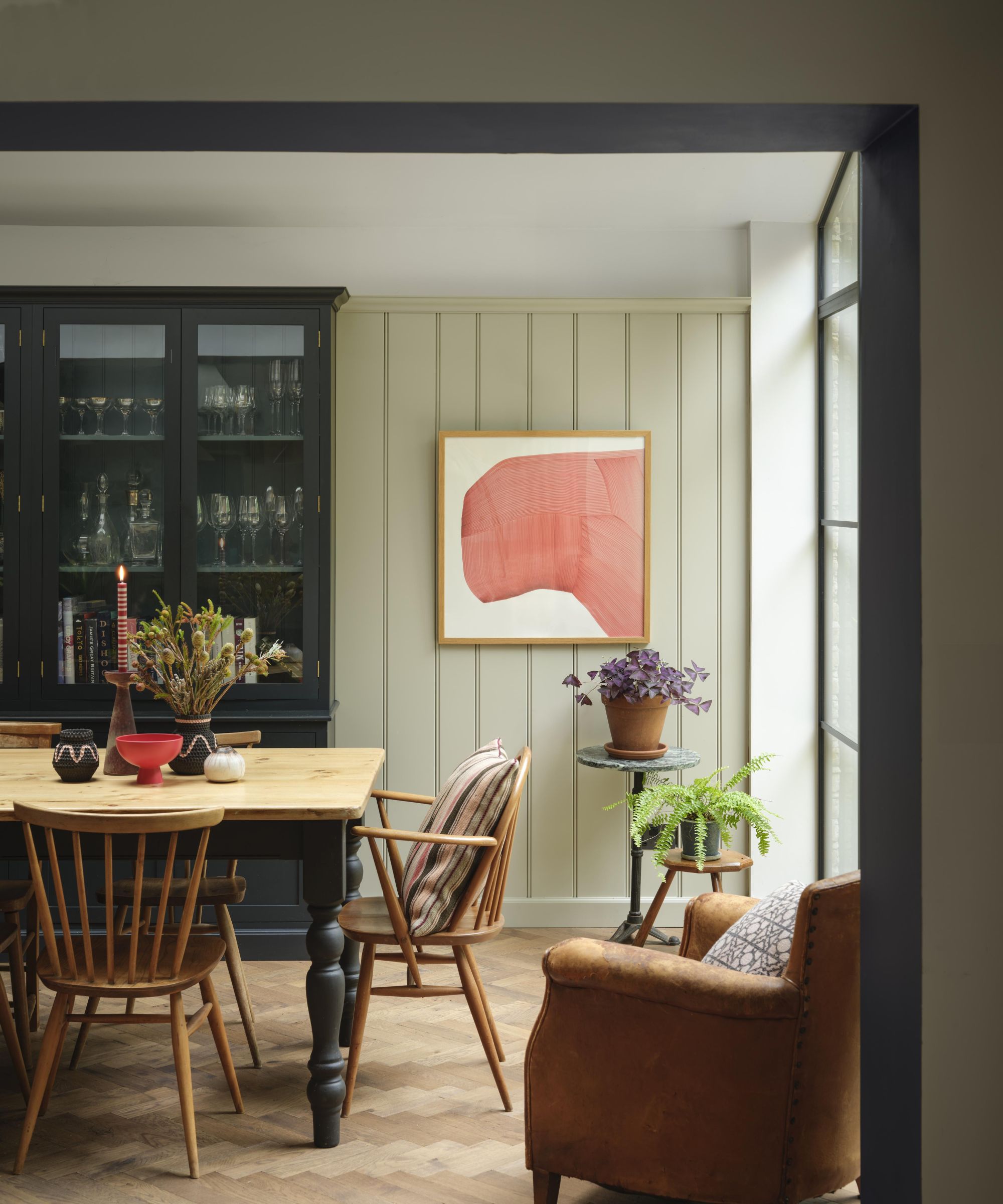
As demonstrated in this calming living room decorated with Benjamin Moore's Indian Summer and Light Salmon, sometimes continuing the wall colors onto the ceiling feels much softer and cohesive. If white had been used on the ceiling, it would have caused a harsh visual break against the warm neutral paints – causing a disjointed feel.
2. Each room should include the same color
When choosing a color scheme for a whole home, it can be tricky to know how much crossover there should be between each room, with Sharon listing, 'I have to use one color throughout my home to create color harmony' as a common misconception.
'The key is to create harmony between all of the elements in all of the rooms. So, the flooring, the countertops, the cabinets, all of the furnishings. Think of these all as having a color and then being sure that through the sight lines, where you see these, you repeat some of those colors throughout,' explains Sharon.
As Sharon implies, you can embrace a creative approach to your room color ideas. So long as the design elements between each room speak to one another in some way, your home can feel cohesive even with a wider palette of colors.
3. Small rooms should be painted white
Sharon's third and final color misconception is: 'I have to paint my small room white in order to make it feel larger.'
'The best tip to make a small room feel larger is really to invest in great lighting that fills all the shadows in the corners and to minimize the contrast of everything that’s in the space,' Sharon explains. 'While white does reflect light well around the room with great lighting, many other colors can feel expansive, especially if you have minimal contrast between the walls and all the other elements in the room.'
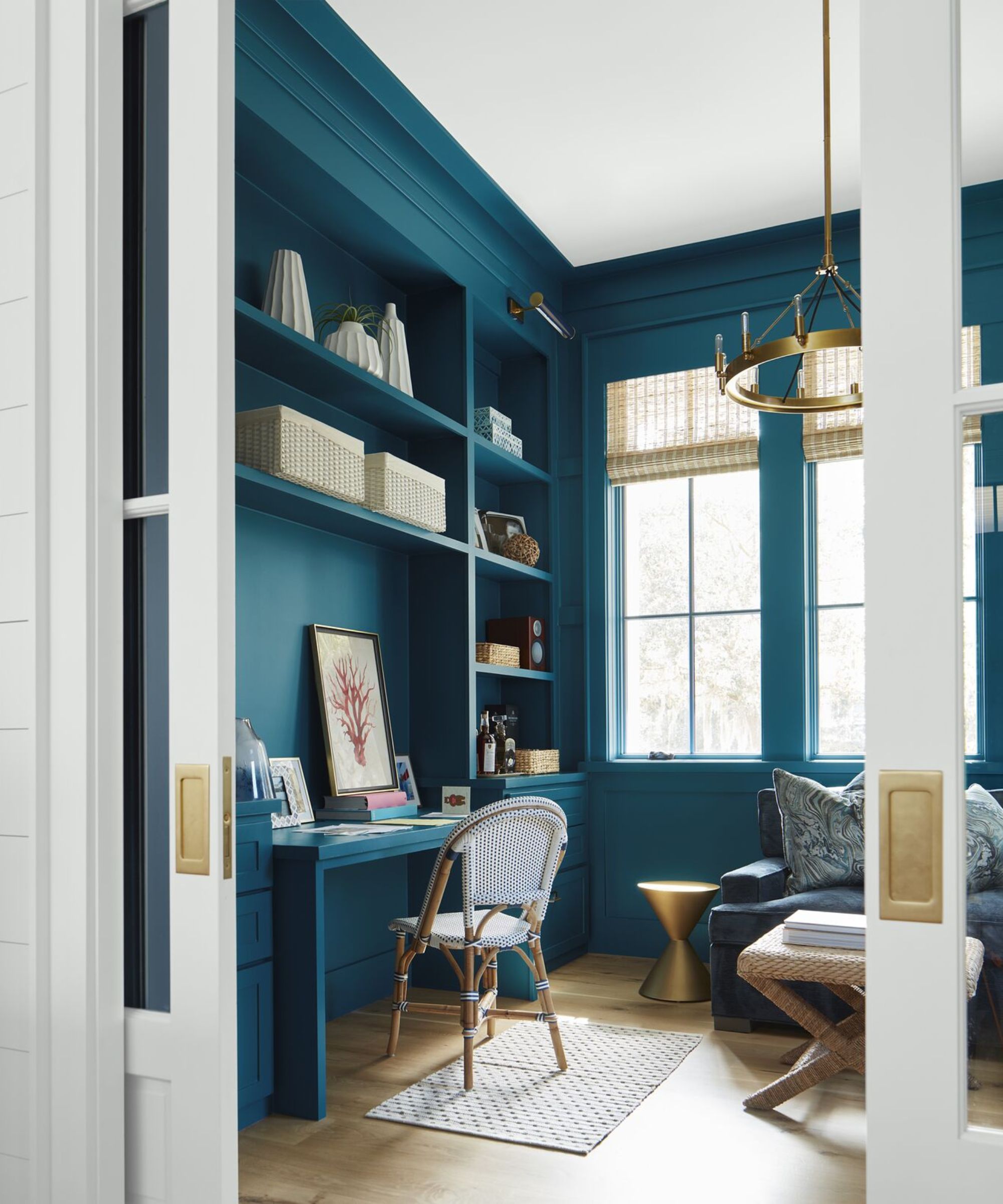
Take inspiration from this colorful home office with Benjamin Moore's Slate Teal on the walls, a rich blue-green, showing that a bold color can be one of the best choices in small rooms.
Have you followed any of these color rules before? If so, consider veering away from them next time you decorate with paint. While certain color rules can be useful, Sharon proves that there are alternative ways of decorating that can add much more interest to your home.