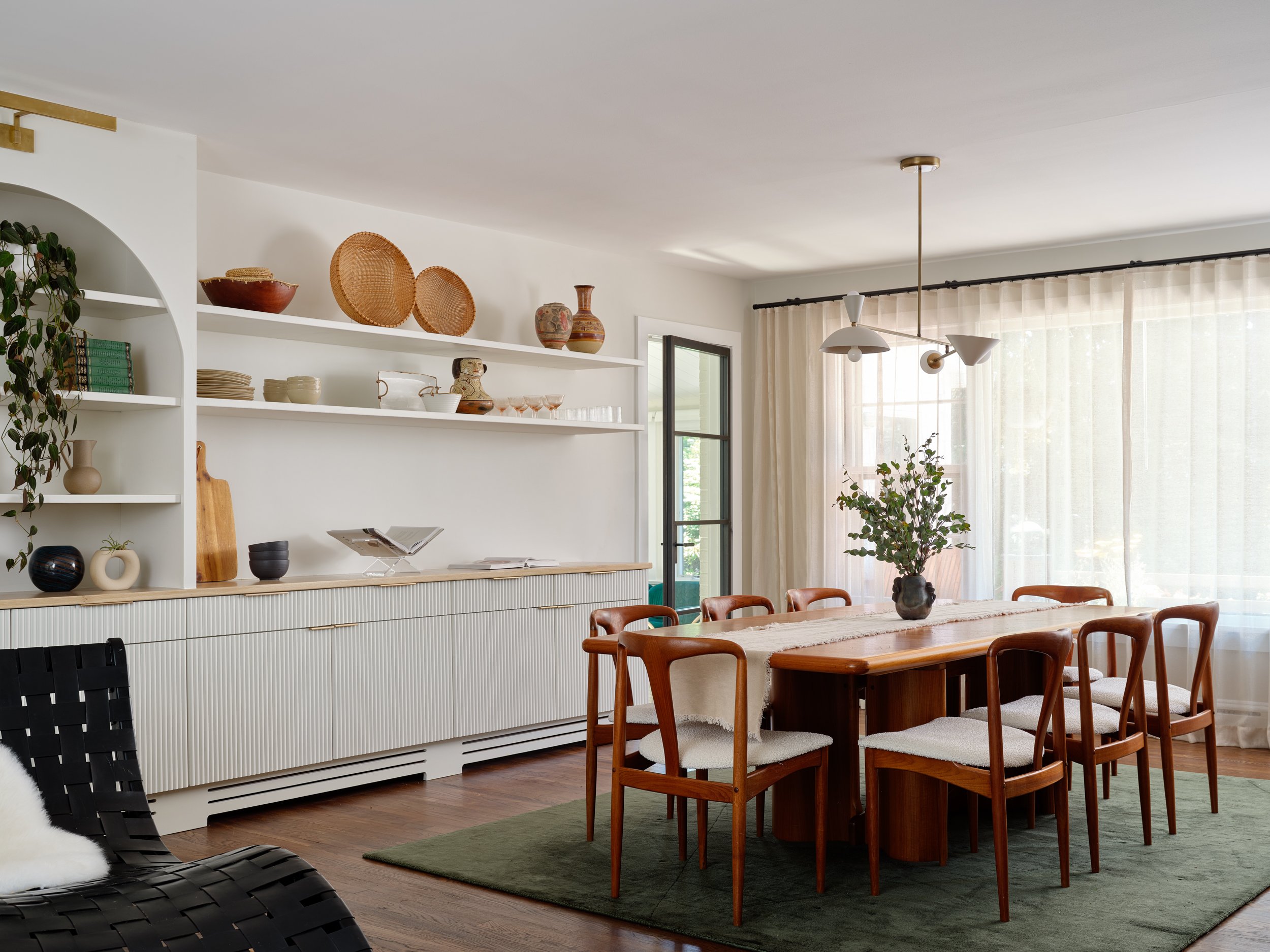
There's a strong case to be made for open floor plans — the added advantages are more light, expanded square footage, and better circulation, just to start with. This was the idea behind the complete renovation of a mid-century ranch-style home in New York by designer Amy Courtney. This home, originally built in 1954, needed a modern update, so the designer combined contemporary furniture, accessories, and colors, to make the property feel new and exciting.
The kitchen and dining room, in particular, needed a transformation. With a previously closed floor plan, the designer decided to bring down walls and allow for a more versatile and flowing space. "The goal was to create a space that feels timeless and deeply personal, reflecting both the home's history and the unique needs of its current owners," shares Amy.
The project took about two years to complete, and the result is a home that is as functional as it is aesthetically pleasing. Intrigued? Take a look at this 400-square-foot dining rom and kitchen makeover.
BEFORE: Dining
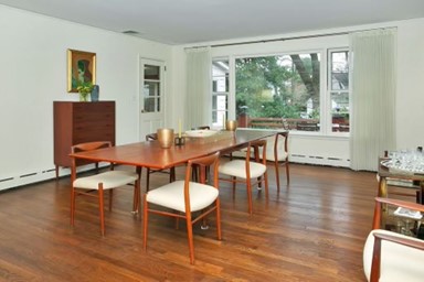
The original dining room felt dated and lacked character. "It had no built-in storage or overhead lighting," shares Amy Courtney, founder of Amy Courtney Design. The idea was to make it more usable with the right storage and to transform it into a better entertaining space, with comfortable furniture, lighting, and a charming color scheme.
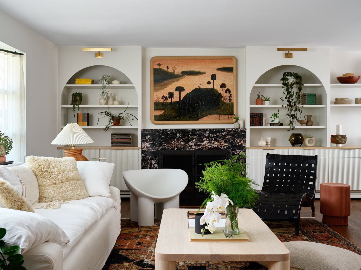
Since this room was going to be an extension of the living room, it also needed to have continuity in its design and look.
AFTER: Dining
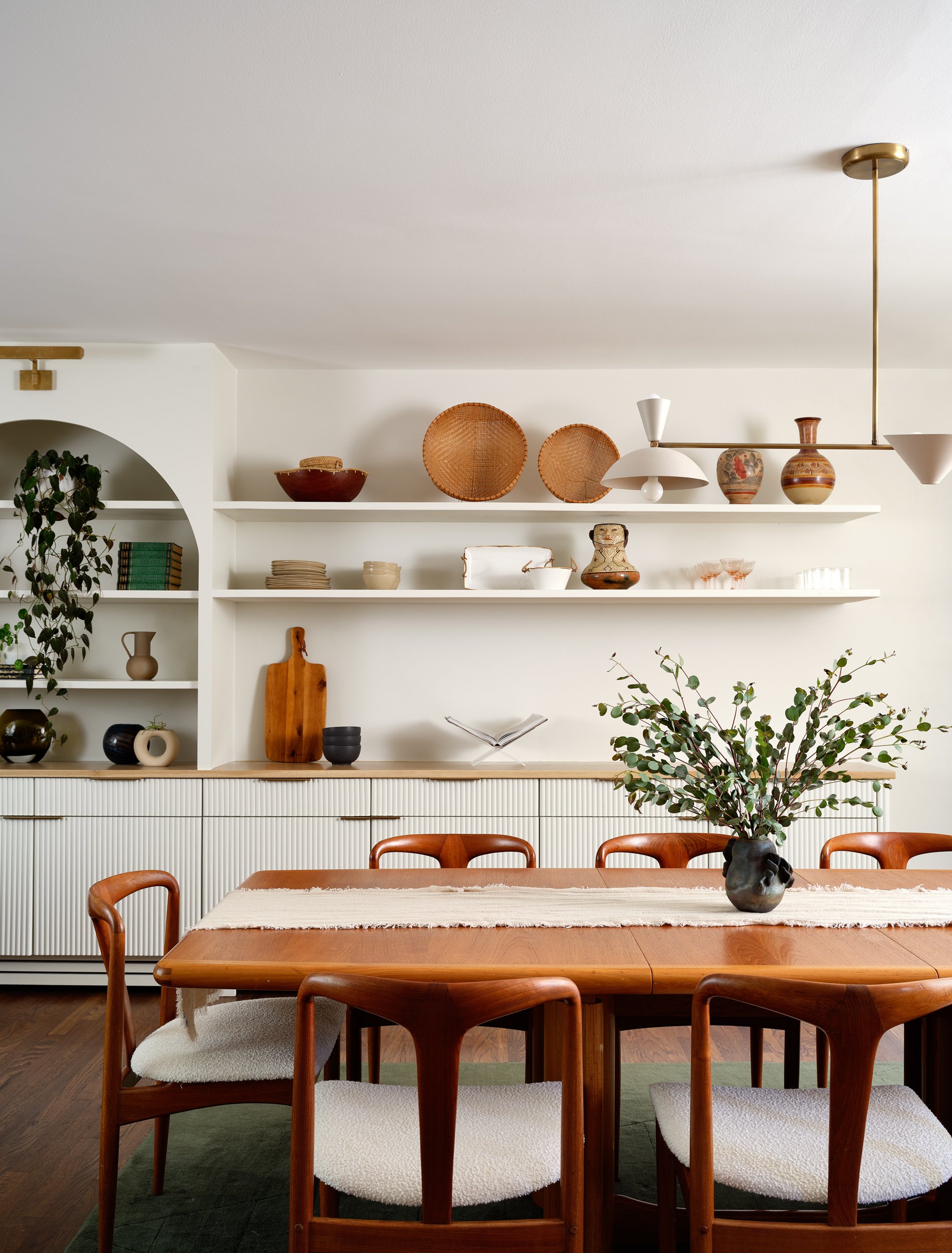
As a way to connect the small dining room with the living room, "we decided to extend the millwork from the living room here, incorporating a built-in sideboard that provides ample storage for serveware, kids' crafts, linens, and entertaining decor," avers Amy.
The idea behind extending the millwork was also to improve the flow between the adjoining spaces. "To give each room its character while maintaining cohesion, we changed the upper portion of the dining room millwork to floating shelves," adds Amy. "This approach allowed for a thoughtfully designed and intentional look across both spaces. The millwork was crafted by our contractor, Miguel Hernandez from HB Construction of Westchester."

As for the furniture, the designer sourced from a vintage seller in Denmark through 1stDibs, and reupholstered the chairs in white bouclé to give them a fresh, updated look. For the dining room lighting, "we selected a versatile lighting fixture that offers both uplighting and downlighting, providing task and ambient lighting with a modern design," says Amy.
The rug adds a touch of color to the space and also anchors the dining seating.
"In keeping with the mid-century modern aesthetic, the dining rug features earthy tones and offers a color-block look," avers Amy. "It’s crafted from bamboo silk, a luxurious alternative to traditional silk that’s more durable. With proper care and cleaning, bamboo silk rugs can last for years while maintaining their beauty."
BEFORE: Kitchen
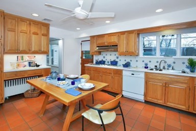
As per the original plans, the kitchen was closed off from the dining room with just a small doorway, making both spaces feel disconnected. "With small children and a love for casual entertaining, the closed-concept layout simply wasn't practical," says Amy.
The rooms also needed better circulation and light. "To achieve a more open concept look, we removed the wall that divided the two rooms, creating a spacious and inviting modern kitchen and dining that works perfectly for both family life and hosting guests," says Amy.
AFTER: Kitchen
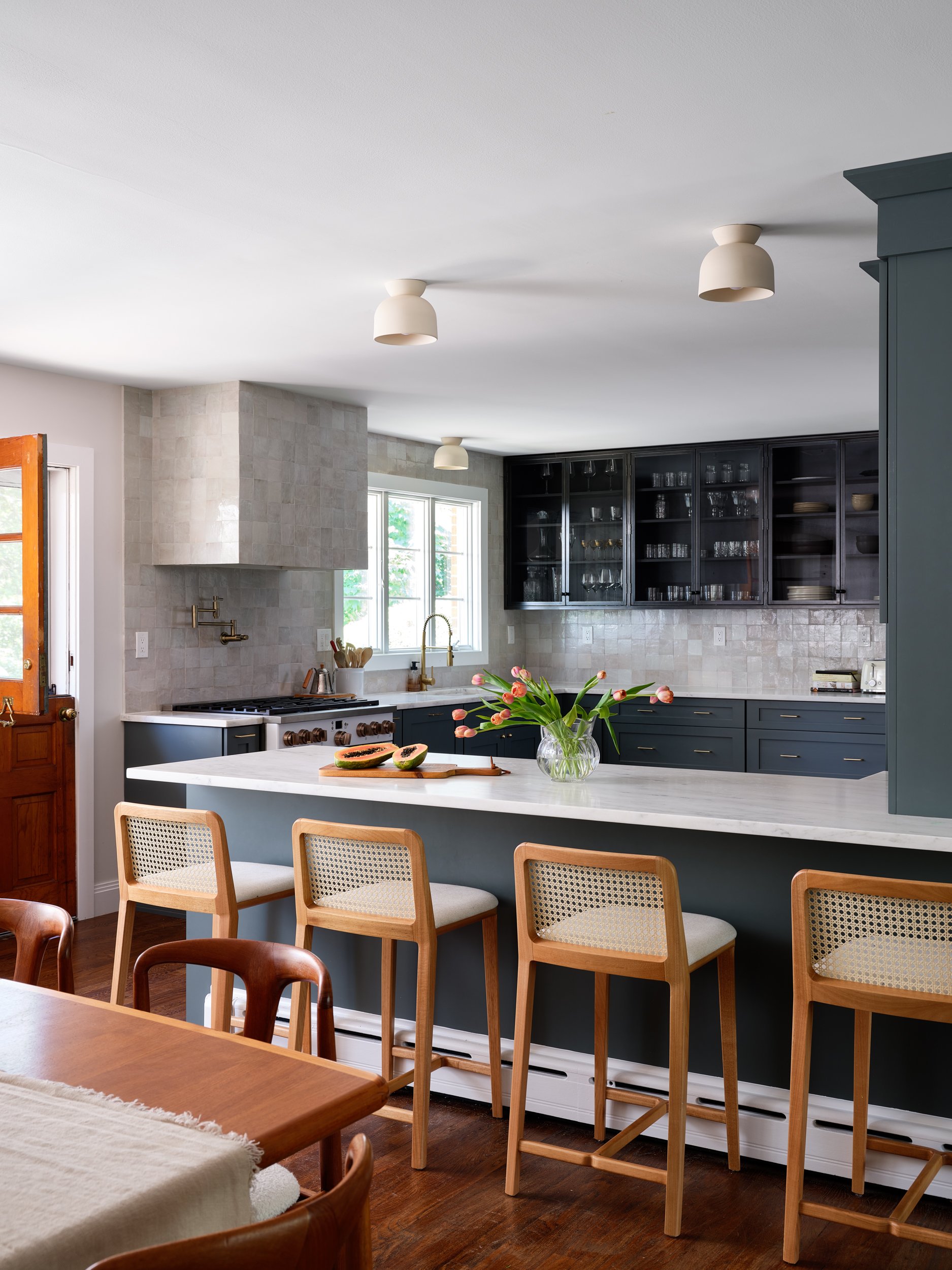
The idea behind the new kitchen's design was to have a practical, casual yet well-curated space that works for everyday meals.
"We designed a kitchen breakfast bar/peninsula where the old wall once stood, offering a cozy spot for quick bites while also adding valuable counter space," shares Amy. "Throughout the renovation, we were mindful of keeping the project manageable. By leaving the gas stove and sink in their original locations, we avoided major plumbing work, focusing instead on maximizing functionality and enhancing the aesthetic appeal of the space."
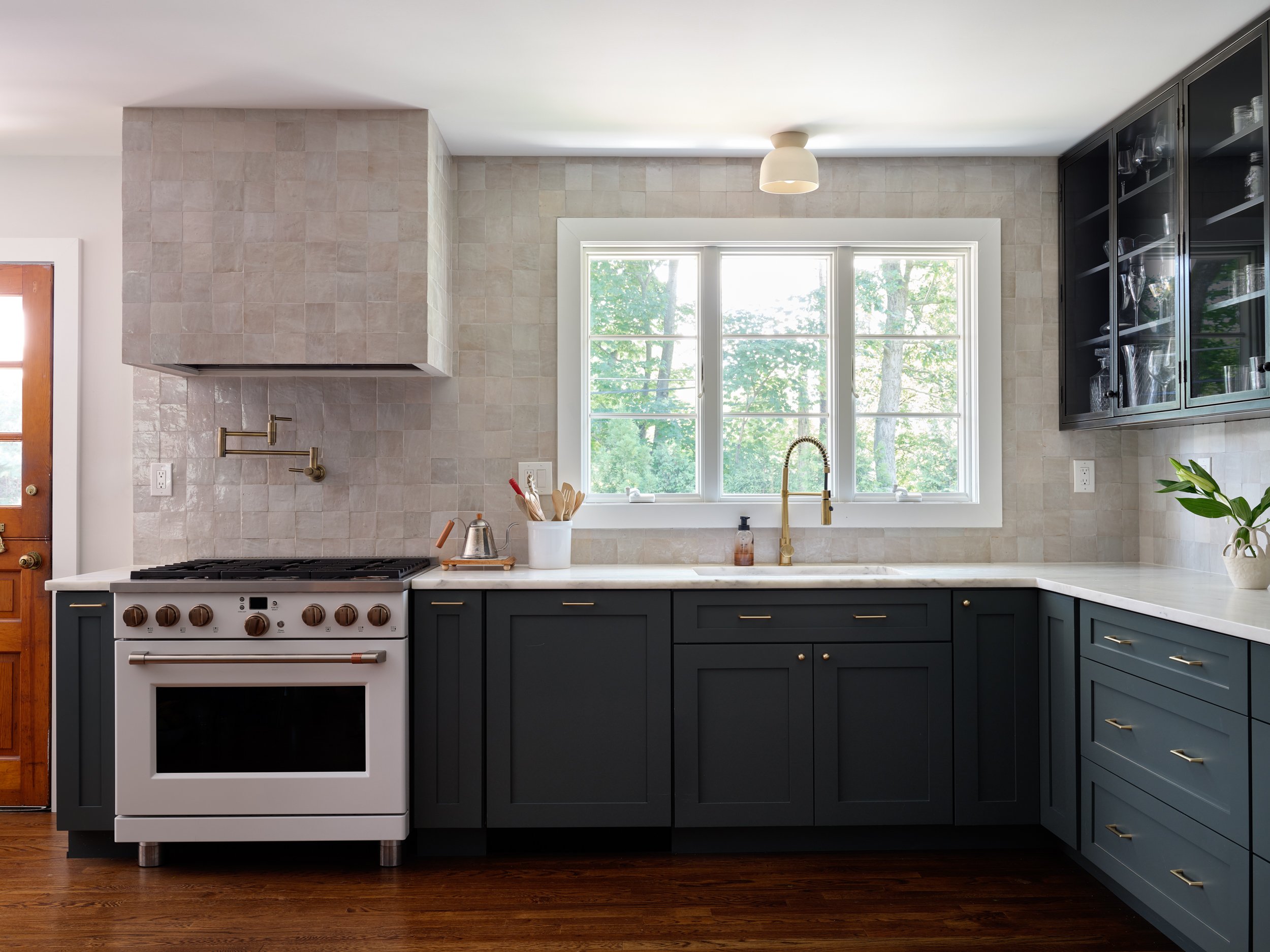
For the kitchen tiles, the designer wanted something distinctive. "We selected handmade Zellige tiles from Zia Tile," says Amy. "The natural variations in their semi-translucent glaze, layered over a warm terracotta base, created a beautifully subtle yet textured pattern that added a unique, artisanal touch to the space."
As for the kitchen storage, the design is an open and closed one; closed for things that should be kept out of sight while allowing handy, everyday tools to be accessible in the open storages. "Our friend and master craftsman, Emmanual Delalain, custom-built hand-rolled steel cabinets with glass fronts for decorative storage, while Omega cabinets provided the more utilitarian storage," shares Amy. "To maximize functionality, we opted for drawers instead of doors for most of the lower cabinets, making it easier to access snacks, pantry items, and pots and pans. We also added full-height cabinets along the fridge wall for additional pantry storage, a cookbook compartment at the peninsula, and pull-out drawers for spices and cutting boards on either side of the range. All the appliances were paneled to maintain a clean, seamless look."
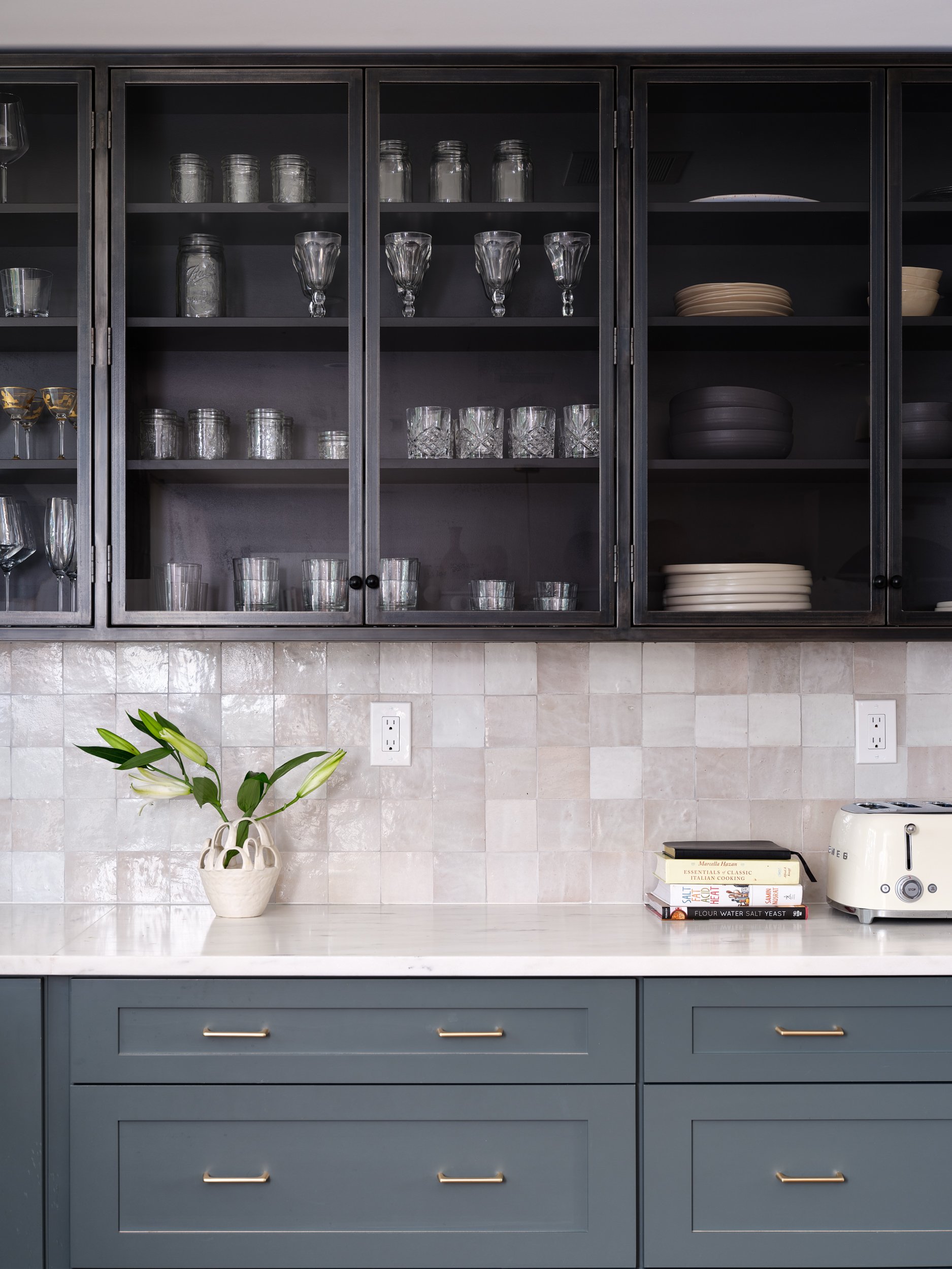
With regards to the kitchen color, a smart blue-green tone was chosen to add a calming vibe to the this space, and even the rest of the room. The designer collaborated with Jilco in Westchester to source cabinetry and found Omega to be the ideal choice. She says: "Their impressive selection of colors allowed us to find a near-perfect match for our inspiration, Benjamin Moore’s Knoxville Gray — a captivating blue-green shade infused with a rich undertone of gray. This hue brought the exact balance of sophistication and depth we envisioned for the kitchen."
The breakfast chairs were added to make quick meals and even casual chats easy. "We sourced from them 1stDibs — they're designed by a Brazilian artisan," says Amy. "They were chosen for their ability to complement the wood tones in the dining room, offering a cohesive look without feeling overly coordinated."
The reno and new design elements have given the kitchen and dining a fresh lease of life along with a touch of subtle luxury. The storage has injected a big dose of practicality and the flow between spaces ensures that the home is airy and well-lit always.


