If you live in Manhattan, space, height, and natural light are invaluable commodities. The glitz and glamour of NYC don't always translate to the interiors of these oft-cramped apartments, but designers at PJCArchitecture changed all of that in this Park Avenue duplex.
A complete gut renovation transformed this 1400-square-foot apartment into a stylish modern home that masters the transitional trend. Tasked with retrofitting the dim and outdated 1960s-era envelope, the team opened the floor plan to maximize natural light and introduced classic Victorian features such as herringbone floors, crown moldings, and wainscoting. Completed in collaboration with Cortlandt Contracting Corporation and Brittany Marom Interior Design, the newly remodelled home now has the contemporary Parisian-chic aesthetic the homeowners dreamed of.
'The clients are a young couple who wanted to give their new apartment a fresh look with better-organized spaces for flow that suited their active lifestyle,' says Philip J. Consalvo of PJCArchitecture. 'It was important to them that we connected the north and south ends to bring more natural light into the space, which originally felt dark and outdated.' We take a closer look inside so you can marvel at this impressive transformation from dated apartment to lavish period home.
Entryway
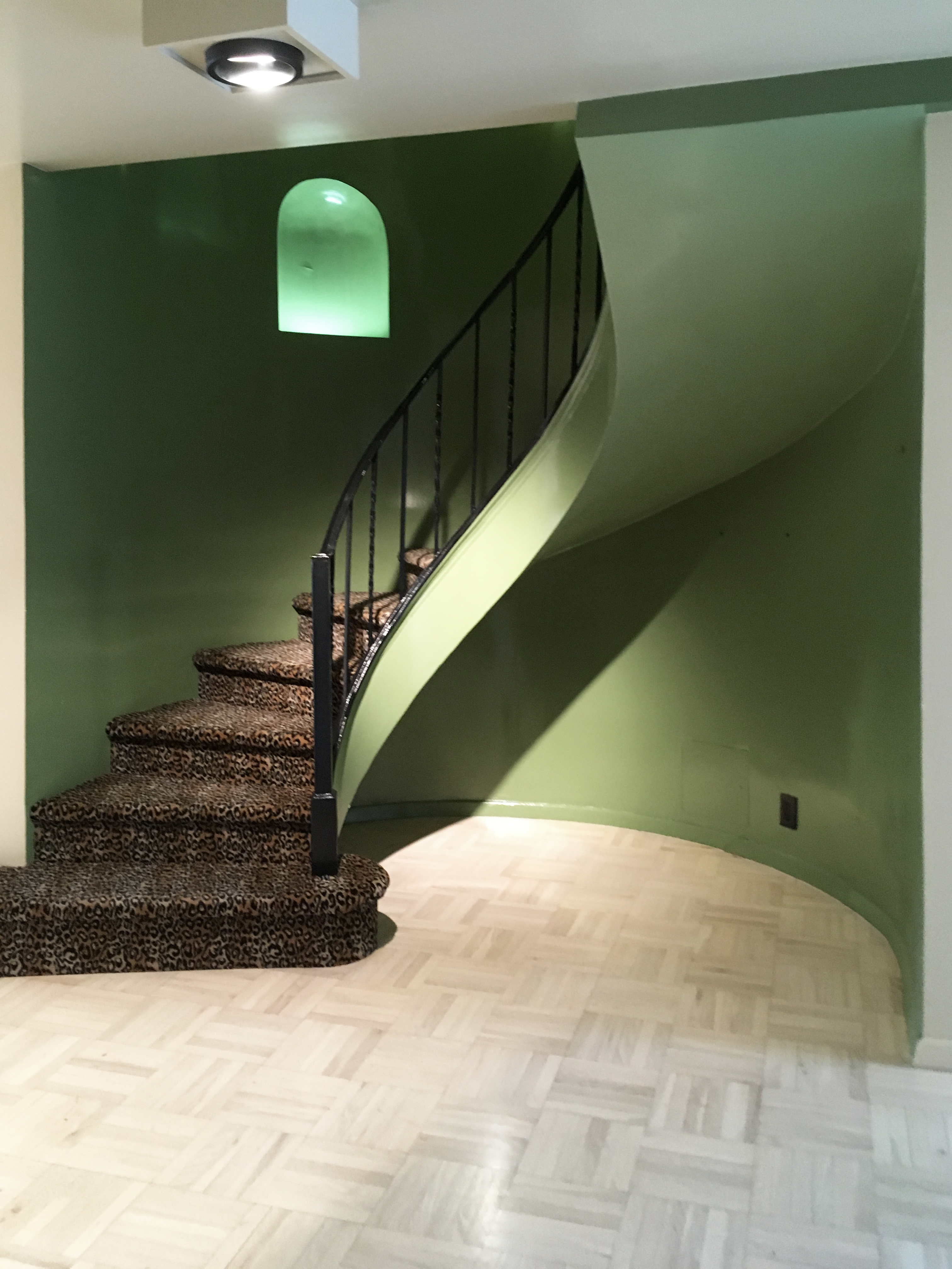
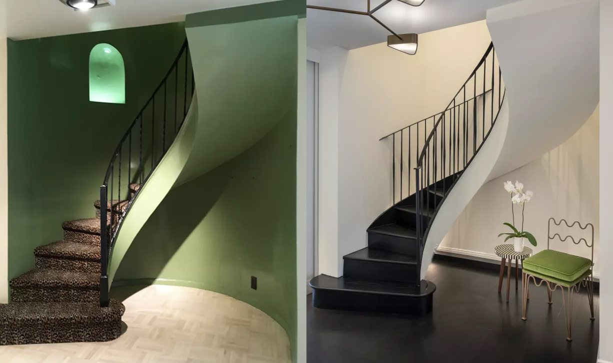
The original interior boasted an impressive entryway, but the styling transported you back to the 1970s. The green shade on the curved stairwell was a garish way to greet guests, made worse by the leopard print carpeting. PJCArchitecture was keen to enhance the foyer by widening the hallway and creating space for a bench and staging area.
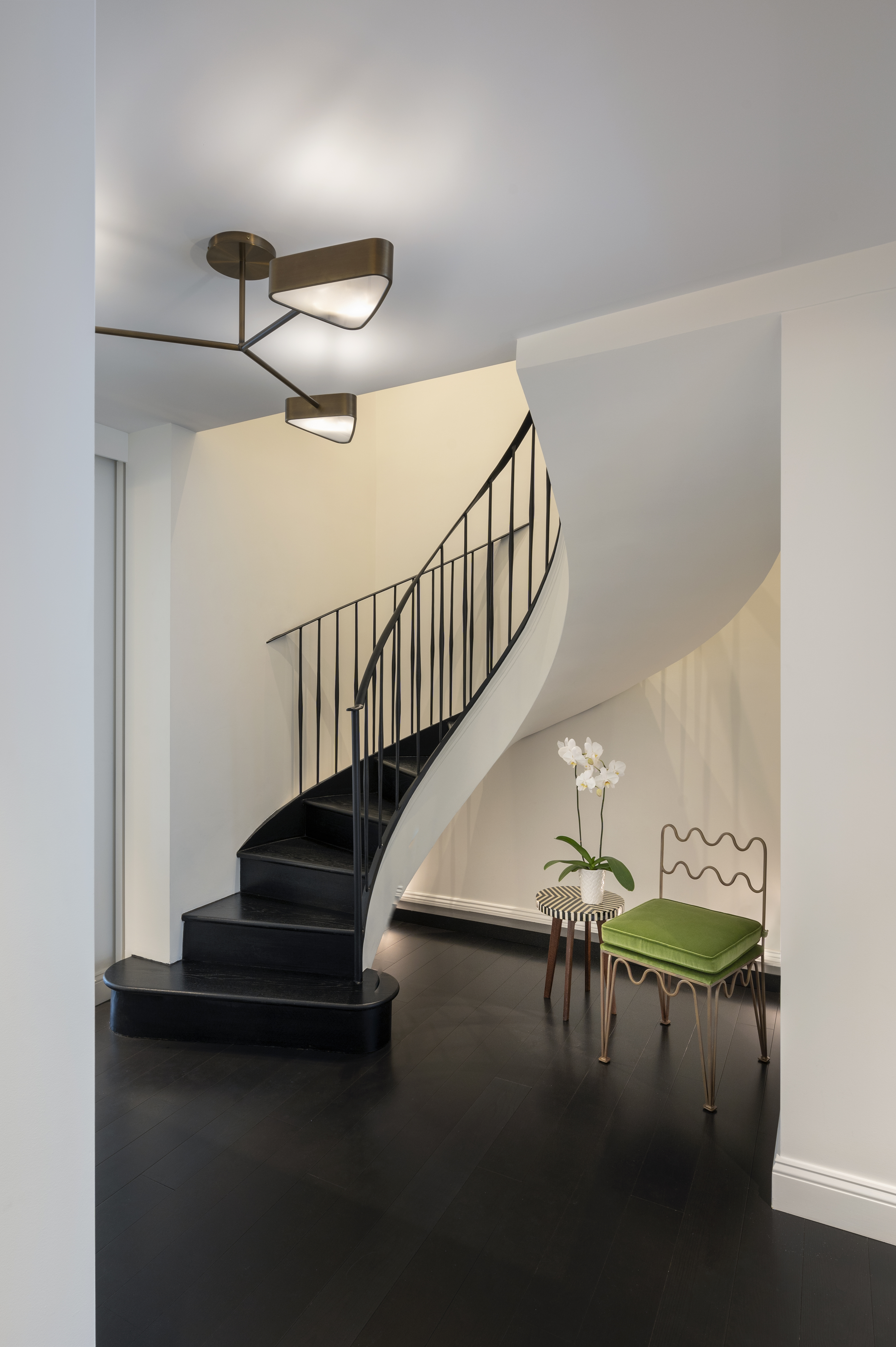
The formerly dark space, constricted by the surrounding curved walls, has now been completely transformed. Removal of the curved walls allows light to come through and thanks to the more minimal metal railing, the staircase now appears to float upwards, offering a distinct sculptural feature to welcome you to the home.
The spiraling staircase has also been backlit to emphasize the curved lines and shadows for a monochrome scheme. 'Artificial floor-mounted up-lights and ceiling downlights wash the entire double-height space to brighten the entry and welcome you into the apartment,' says Philip of PJC Architecture. 'In collaboration with Brittany Marom, we selected the color palette of light-colored walls against the dark wood staircase as this contrast adds to the architecture and enhances the concept of the floating staircase.'
Kitchen diner
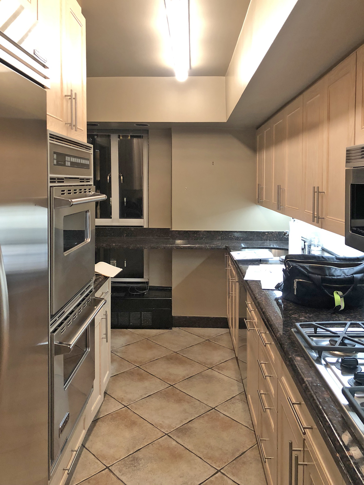
On the first level lies the kitchen. It's hard to imagine how this original pokey floor plan made for a functional space. Not only was it narrow, but the low ceiling felt oppressive, made worse by the dark bar countertop that cut across the slim window, minimizing the natural light.
'The clients are avid cooks, but the original kitchen was too narrow and tight to be functional,' says Philip. 'They also wanted the new kitchen to remain separate from, but thoughtfully connected to, the adjacent dining space.'
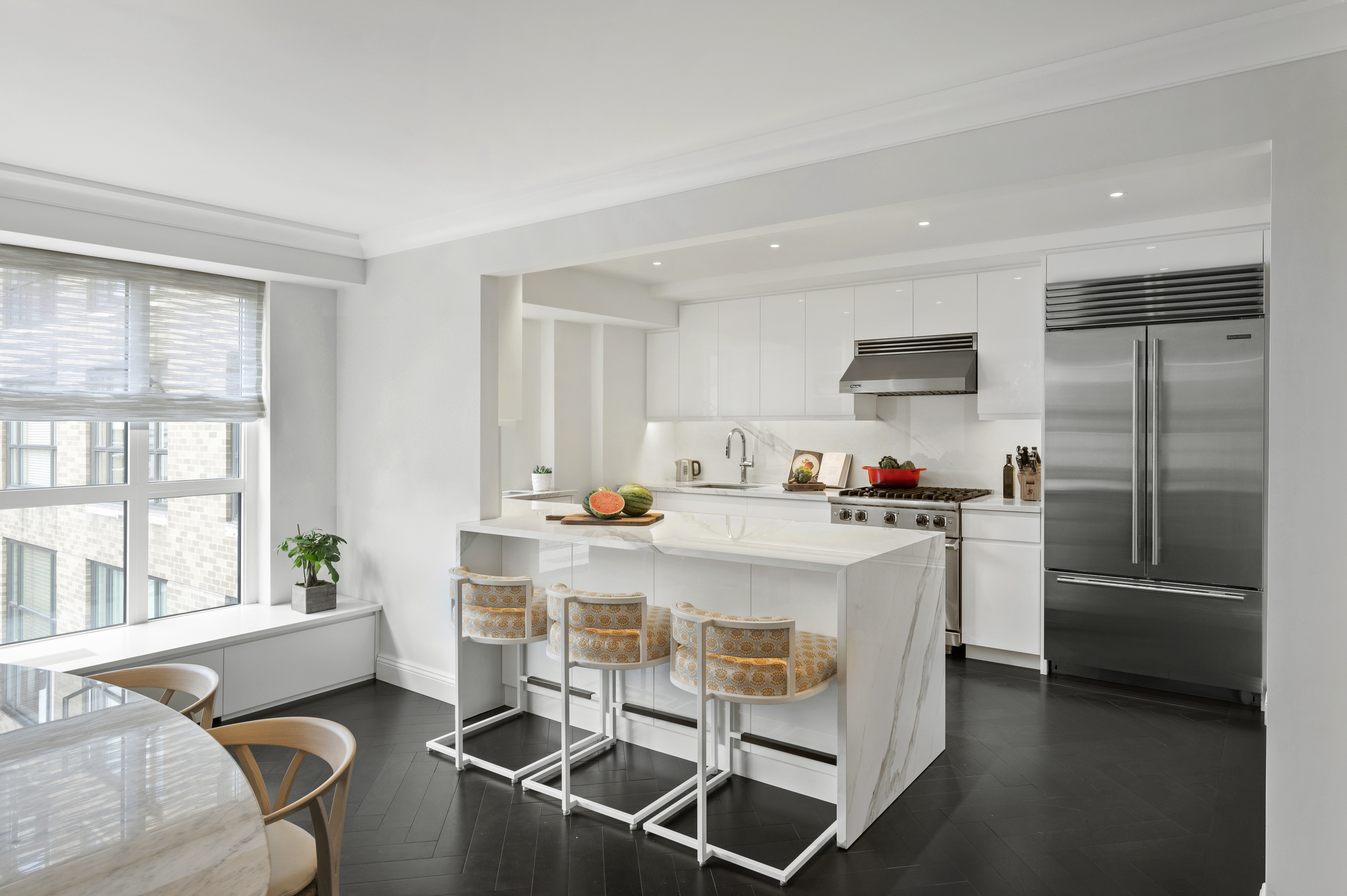
Now, the space has been made into an open-concept kitchen diner. By widening openings between the north and south wings of the home, the team was able to bring more light into this core part of the apartment.
'To create a wider and more spacious kitchen, we opened the wall and rebuilt a portion of it just one foot into the dining room,' says Philip. 'It’s surprising how just one foot made an impressive difference in the kitchen without significantly impacting the dining room.' As Philip notes, opening most of that wall was crucial to help bring light in from the dining room windows.
'The addition of the white glossy cabinetry, countertops and backsplash, as well as raising the ceiling, helped reflect light to make the space even airier and brighter,' adds Philip.
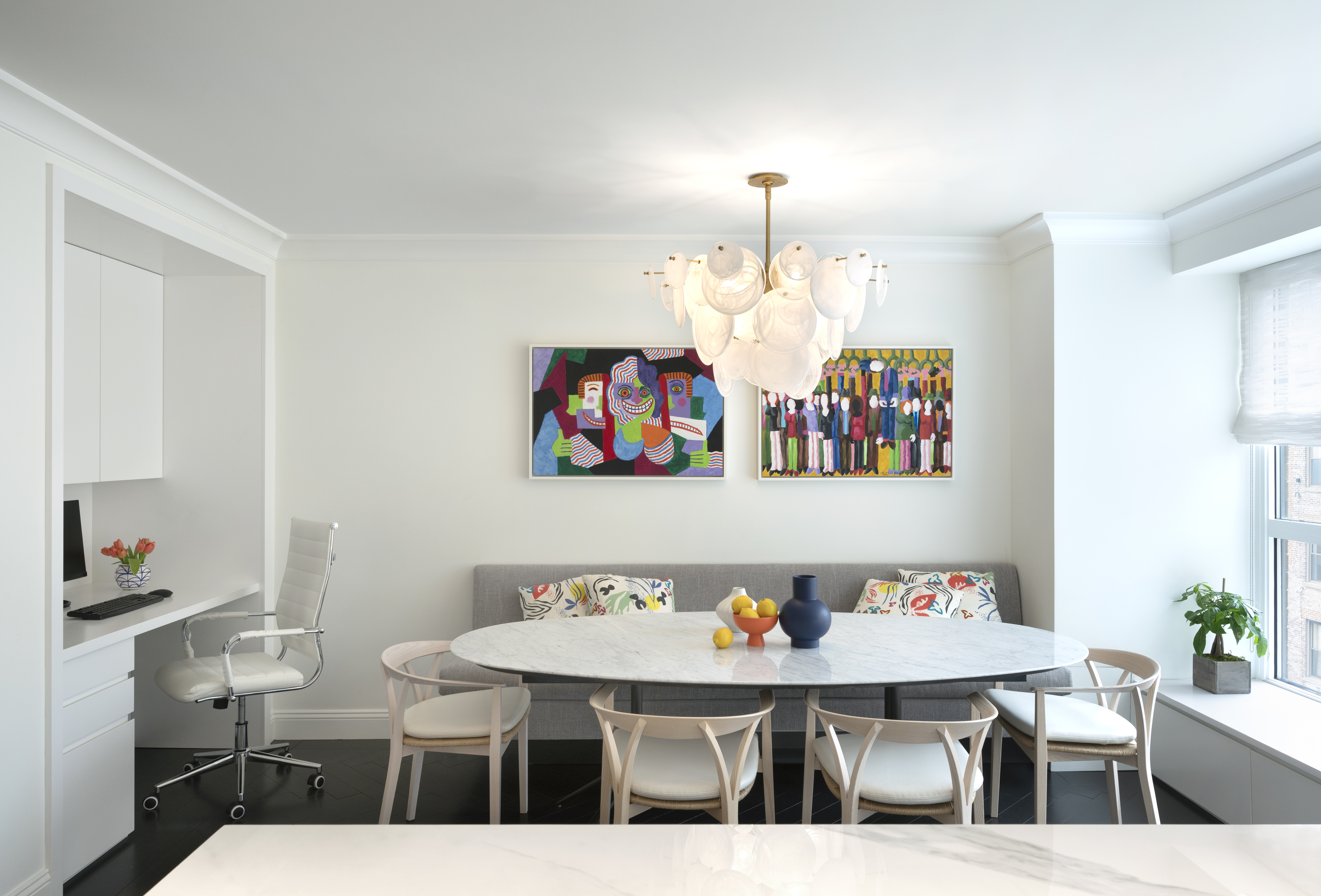
Challenged by low structural members and building restrictions, PJCArchitecture used recessed lights with shallow housings in order to raise ceilings in areas like the kitchen, creating a more spacious feel. In the dining room however, the larger space allowed for a more statement lighting idea, the white chandelier and metallic gold fittings creating a luxe look. Meanwhile, the custom kitchen cabinetry and built-in desk space in the dining area show the lengths the designers have gone to maximize every inch of functional space.
Living room

The original living room was a dim, lackluster space that certainly didn't feel as though you'd just stepped off Park Avenue. It lacked any real character despite the impressive vantage point.
'At the onset of the job, the clients shared images of the aesthetic they were aiming for, which they referred to as ‘Parisian contemporary,’ but the original 1960s apartment had little architectural character to it,' says Juliana Sorzano, project manager at PJCArchitects.
She adds: 'The living room had a large footprint that felt like a plain box, so we started adding layers of architectural elements with cabinets and a fireplace to provide a focal point in the room and an axis around which the furniture could be organized.'

Since the renovation, the bright and airy living space now features a custom bar with metallic finishes, built-in alcove bookshelves, and a sliding wall to enclose the television while not in use. The architects also incorporated a new faux fireplace for a traditional feel which serves as the central axis of the room.
'Retrofitting a modern design within a 1960s building was challenging due in part to the concrete floor/ceiling slabs and low structural members that constricted the overall height,' says Juliana. 'The original ceilings were dropped very low, but we were able to raise ceilings by using ultra-shallow recessed lights where downlights were needed. We also left soffits open and exposed beams to keep the ceilings higher where possible.'
Most striking of all is the decorative molding detail that turn this lacklustre space into an airy period-style property. Crown moldings, baseboards, panelling, the firesurround, and herringbone dark wood flooring all imitate Victorian architecture, culminating in a transitional style when styled alongside the contemporary furniture. Retrofitting them in this way, introducing traditional features into an urban high-rise apartment, is the opposite approach to what we're used to seeing in renovations, but the result looks authentic.
'Another element that helps achieve the ‘period’ aesthetic is being able to hide the TV when not in use,' says Juliana. 'We used the dead space behind the new fireplace to add a sliding portion of the bookshelf that reveals a concealed wall-mounted TV.'
Get the look
For a traditional feel in your living room, get yourself some candlesticks and line them on your mantel. The matte black finish of this set from Threshold at Target help to create a more contemporary feel, while the warm glow of a candle will instantly create a traditional cozy feel.
This brass effect sconce picture light from Amazon brings a classic look to your living room with its single swing arm. The LED dimmer lets you soften the light in the evenings while the 90° swivel head allows you to swing the bulb up or down depending on where you want the light focus to be.
No cozy living room is complete with soft textiles, and these throw pillows from Target are perfect for the job. The woven plaid design add texture and comfort to your seating ensemble and help to bridge the gap between contemporary and traditional.
Primary bathroom
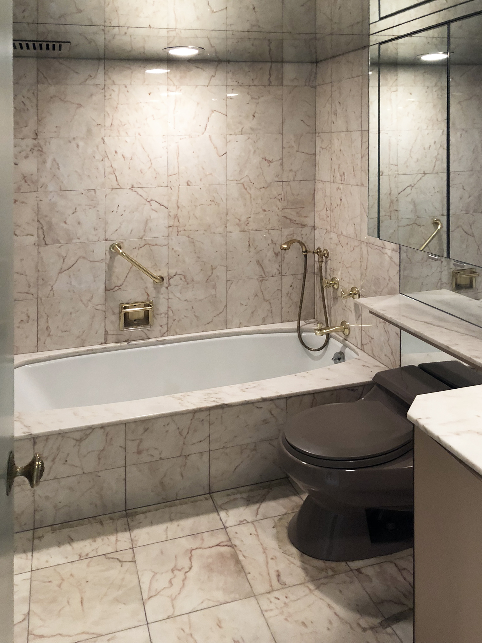
Prior to the renovation, the primary bathroom was decked out with dated tiles and a built-in bathtub. Alongside the dark toilet, the low ceiling, and the lack of natural lighting, they made the space seem especially dark and enclosed.

The transformed modern bathroom has a far fresher feel than before. The white color scheme with large marble slabs instantly brightens the room as do the sconces flanking the mirror, helping to make this small space seem bigger.
'With the building’s approval, we were able to expand it into the adjacent hallway which allowed us to rearrange the layout and give it a proper and luxurious "primary bathroom" feel,' says Philip. 'We were also able to raise the ceiling by incorporating "ultra-shallow" recessed lights.'
In another modernization, the bathtub was replaced by a shower. 'Lately, we’ve been seeing that clients are looking for at least one bathtub, so when the apartment has a secondary bathroom where a tub can be kept, the primary bathrooms are almost always walk-in showers,' Philip notes.
Bedroom
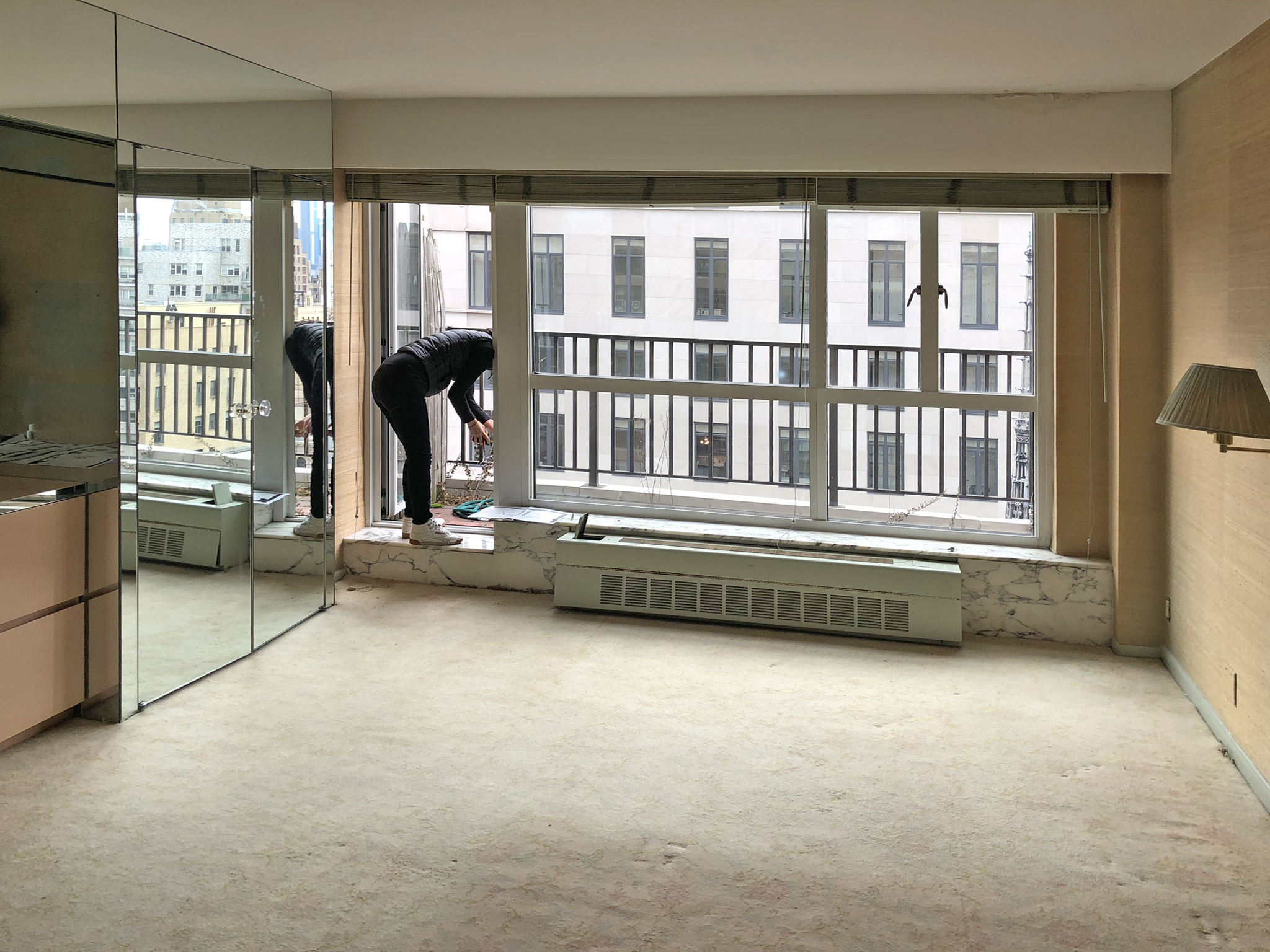
On entering the original bedroom, it was instantly clear that the space wasn't used to its potential despite the bespoke closet. The low ceilings and carpeted flooring made the space feel oppressive rather than cozy, and the walls were crying out for a lick of fresh paint.

Fresh white walls now make the bedroom feel bright and airy, and the bedroom boasts an exterior balcony, ensuite bathroom, and two walk-in closets. This sanctuary space feels serene and calming, offering respite from that busy skyline beyond the window.
'We removed the existing built-ins and kept the primary bedroom minimal with decorative elements for a design that feels airy and fresh,' says Juliana. 'This space does not compete with the skyline but instead frames it with clean lines around the window and the new radiator cover. There are no added distractions that take away from the peaceful balcony adjacent to the bedroom, and the view of the neighboring church steeple enhances the Parisian contemporary feel.'
Secondary bathroom
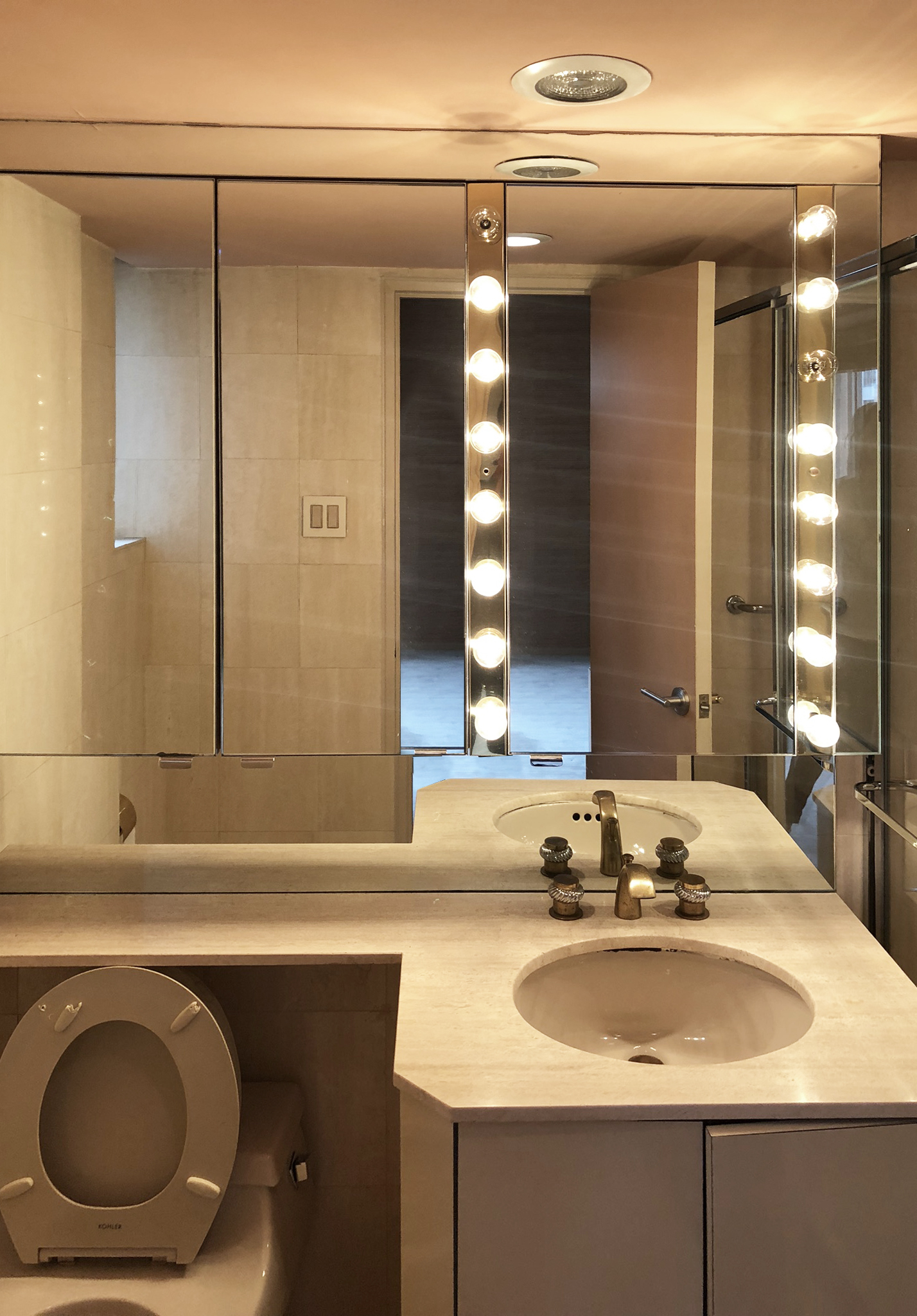
The secondary bathroom continued the dark, lacklustre theme seen throughout the home before the renovation. Even with the large mirror and the bulb lighting, it was the sort of dim, enclosed space you don't want to spend more time in than needed.
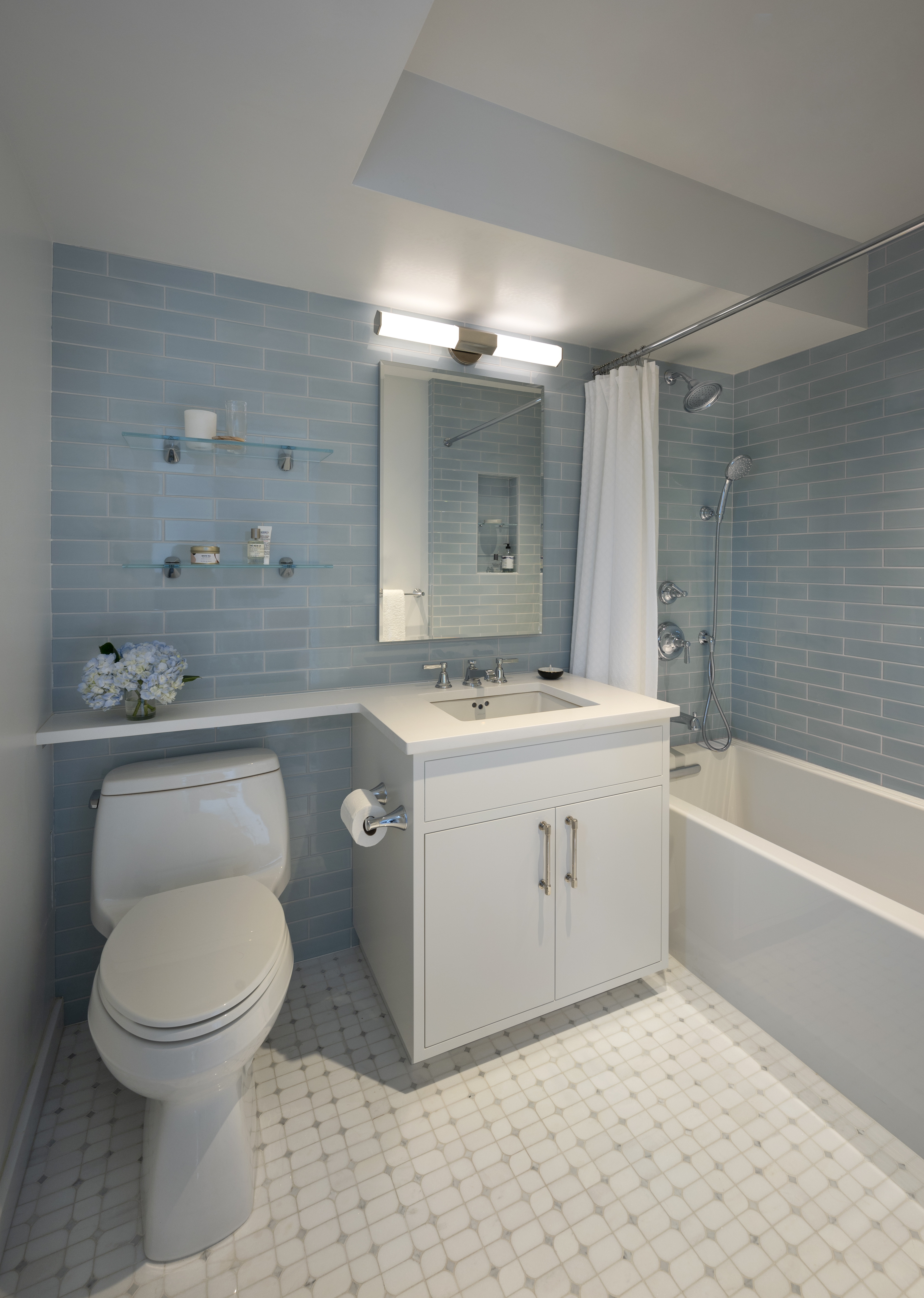
Now though, the space has a spa bathroom feel. Blue subway tiles, white cabinetry, and floating glass shelves all help to maximize the space and create a calming feel fit for some well-earned self-care. It demonstrates the importance of prioritizing luxury in our own homes, producing proud spaces we never get tired of seeing.


