A beer and cider festival has found itself having to defend its new logo this week, amid claims that the 'nostalgic' new design resurrects sexist beer advertising tropes. While the best logos often turn heads, this one seems to be raising eyebrows too.
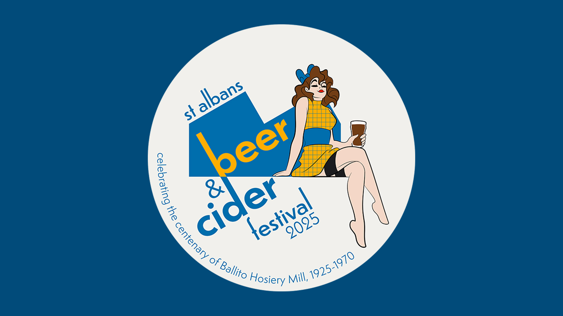
The design for St Albans Beer and Cider Festival 2025 features a woman in lipstick, a short dress and stockings enjoying a pint of ale. Some feel the image is unnecessarily sexualised – but the festival itself claims there's a reason for the look.
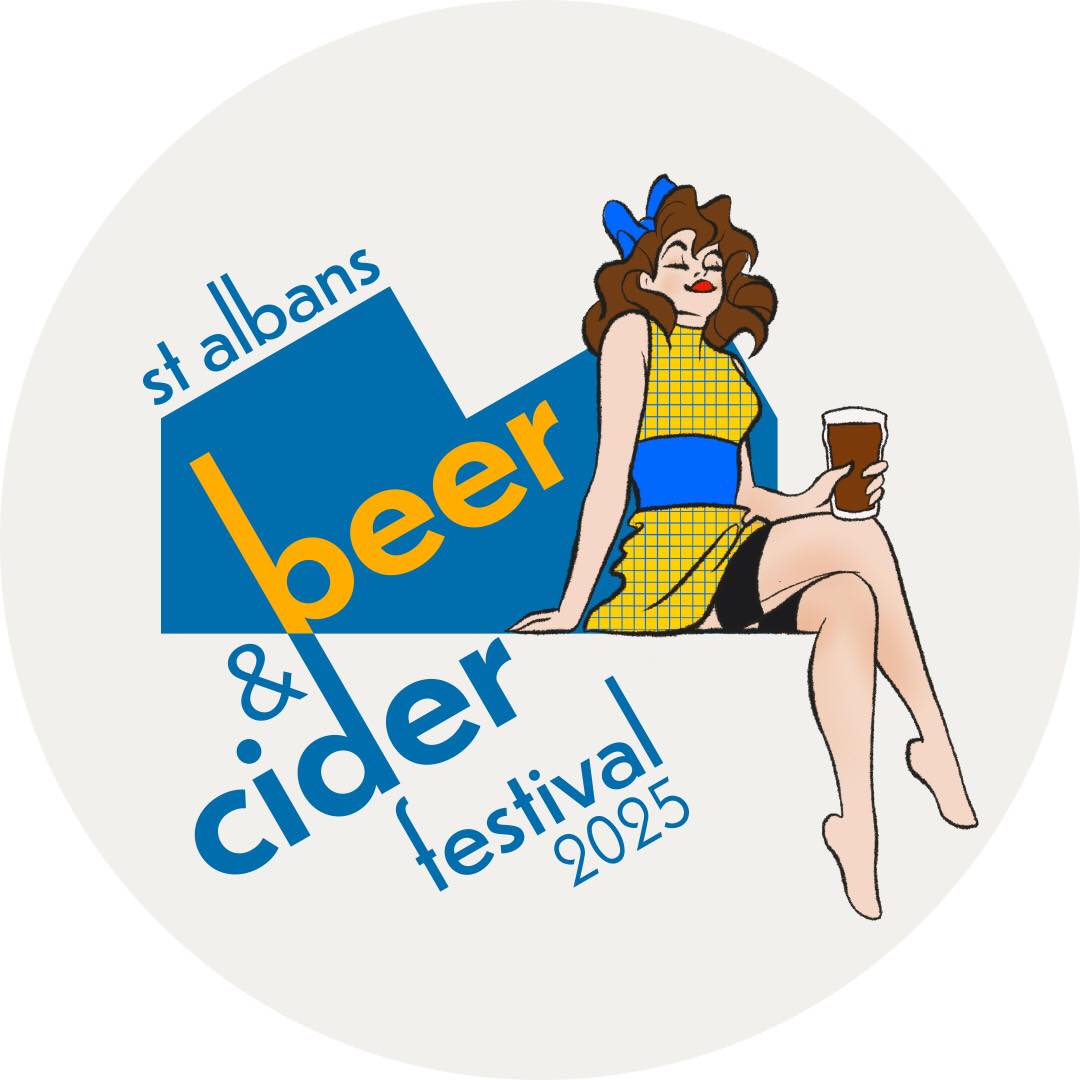
"It's 2025 not 1975!" One Facebook user commented when the festival unveiled the logo, while another added, “Nostalgia as a justification for a return to sexism in advertising? I don’t think so.” Another users chimed in, "I think that the organisers of what is normally an excellent beer festival have done themselves no favours in selecting this abomination of a logo."
But according to The Drinks Business, Emily Ryans, sponsorship manager at St Albans Beer & Cider Festival, explained the reasoning behind the design in a statement: “Rather than adopting soulless corporate branding, we instead choose to highlight a different piece of local history each year, and on this occasion are marking the centenary of Ballito Hosiery Mill. In doing so, we’ve been inspired by Ballito’s 1950s advertising, exhibited by St Albans Museum.”
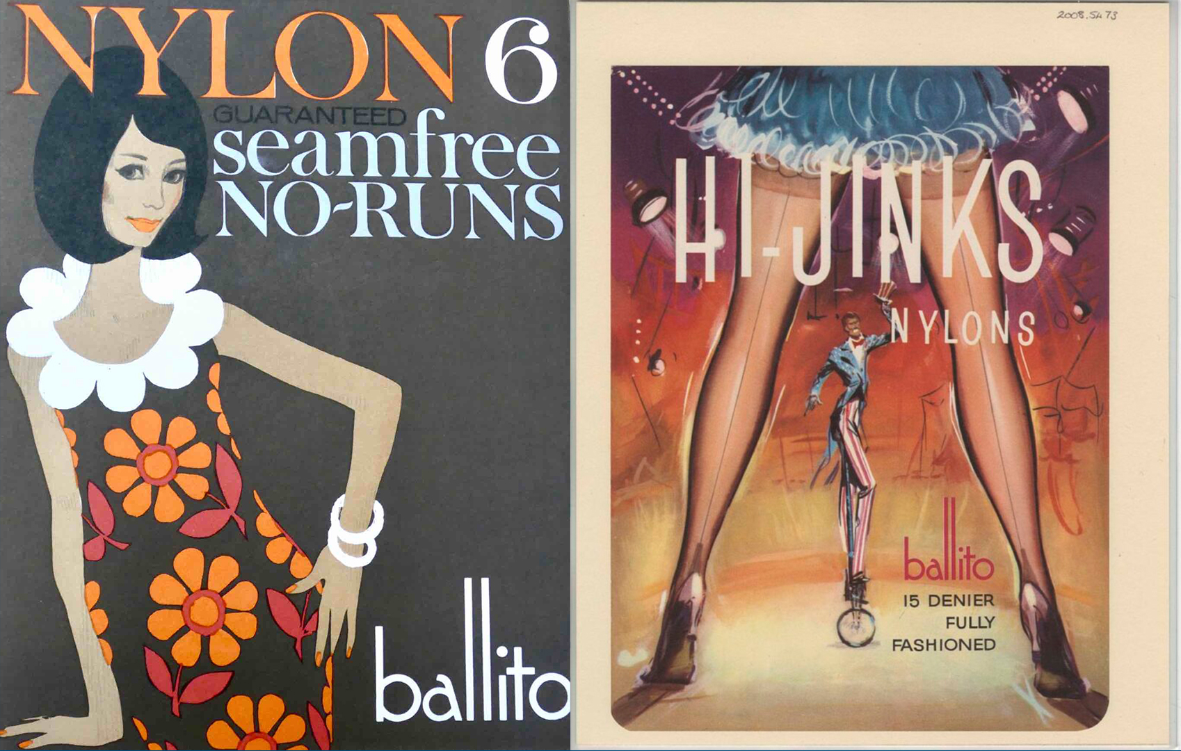
The festival has since tweaked the logo to add a new line of text: 'Celebrating the centenary of Ballito Hosiery Mill, 1925-1970.
And judging by the comments, the updated version is being much more warmly received. "A great decision. Now a terrific celebration of a St Albans manufacturer without giving an opportunity to misinterpret," one user comments, while another adds, "Love this! Its so important to celebrate our history as we embrace new residents to the city."
From AI bias to design's gender problem, the question of sexism in design has been gaining traction in recent months. But at least in the case of the St Albans Beer & Cider Festival logo, there's a historical rationale behind the backwards-looking design.

