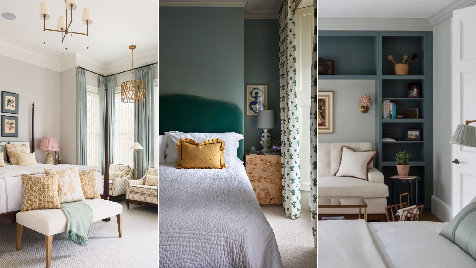
A crucial step in any bedroom design is making sure to avoid making bedroom layout mistakes. Now we appreciate this isn't as much fun as picking out your bedroom color scheme or shopping for furniture, but before you nail all of that you have to first establish what space you're working with.
Despite your best efforts, common layout mistakes can inadvertently shrink the sense of space in your bedroom, turning what should be a restful retreat into a cluttered and chaotic mess.
While we all tend to stick to fairly fixed bedroom layout ideas, whether we have large or small bedrooms, the problems some furniture arranging mistakes cause are universal. But what are the most common bedroom layout errors and how can we avoid them?
The good news is that even the smallest changes can make a significant difference. Here, we speak to interior designers to help walk you through the top missteps we're all making, how to avoid them, and crucially – what to do instead.
9 Common Bedroom Layout Mistakes – And How To Fix Them
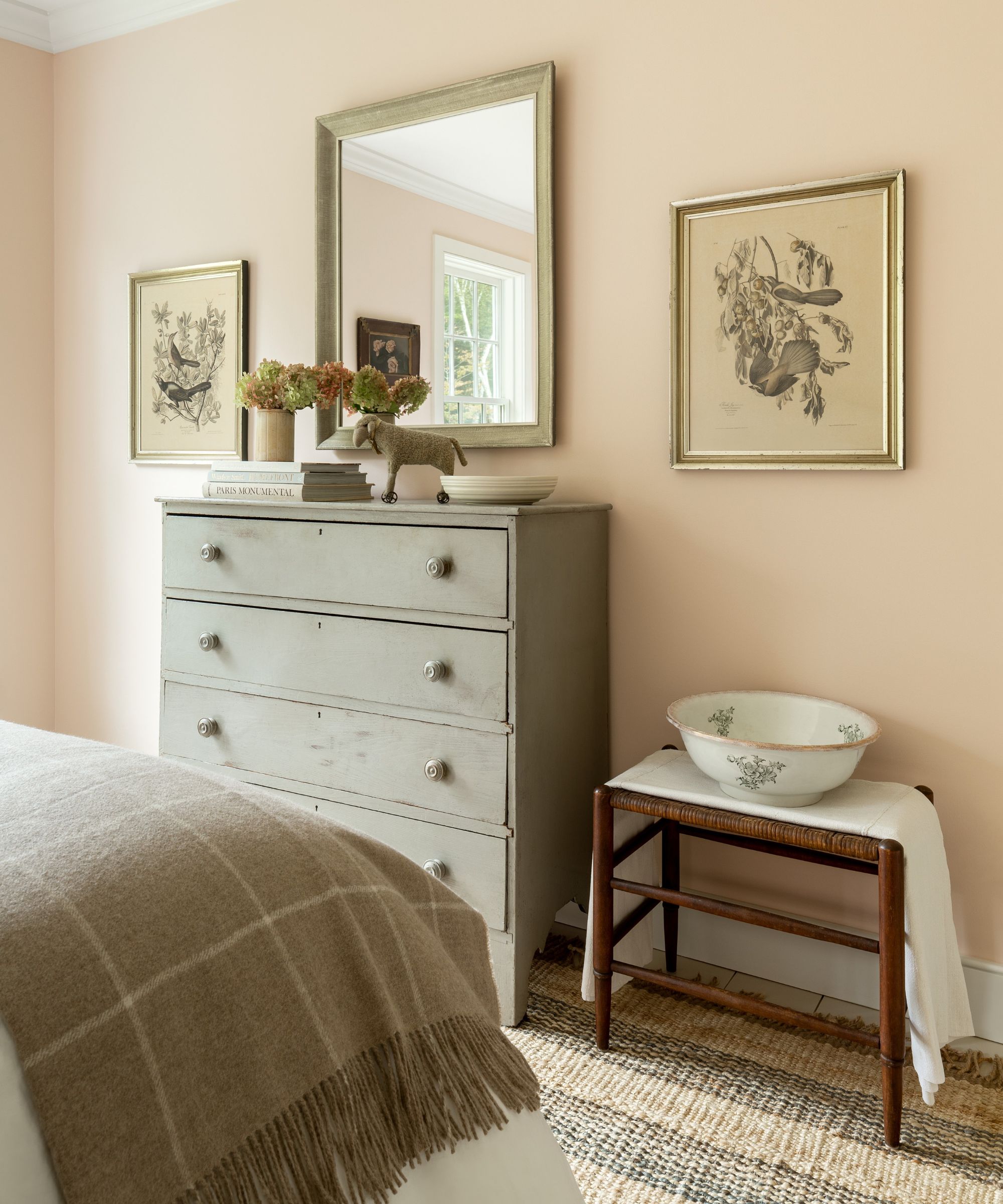
To help you avoid falling into these common traps, we're exploring nine common bedroom layout mistakes – plus practical tips on how to avoid them.
A quick rework of your bedroom ideas this weekend could be all you need to transform your space for the better.
1. Not considering the placement of the bed first
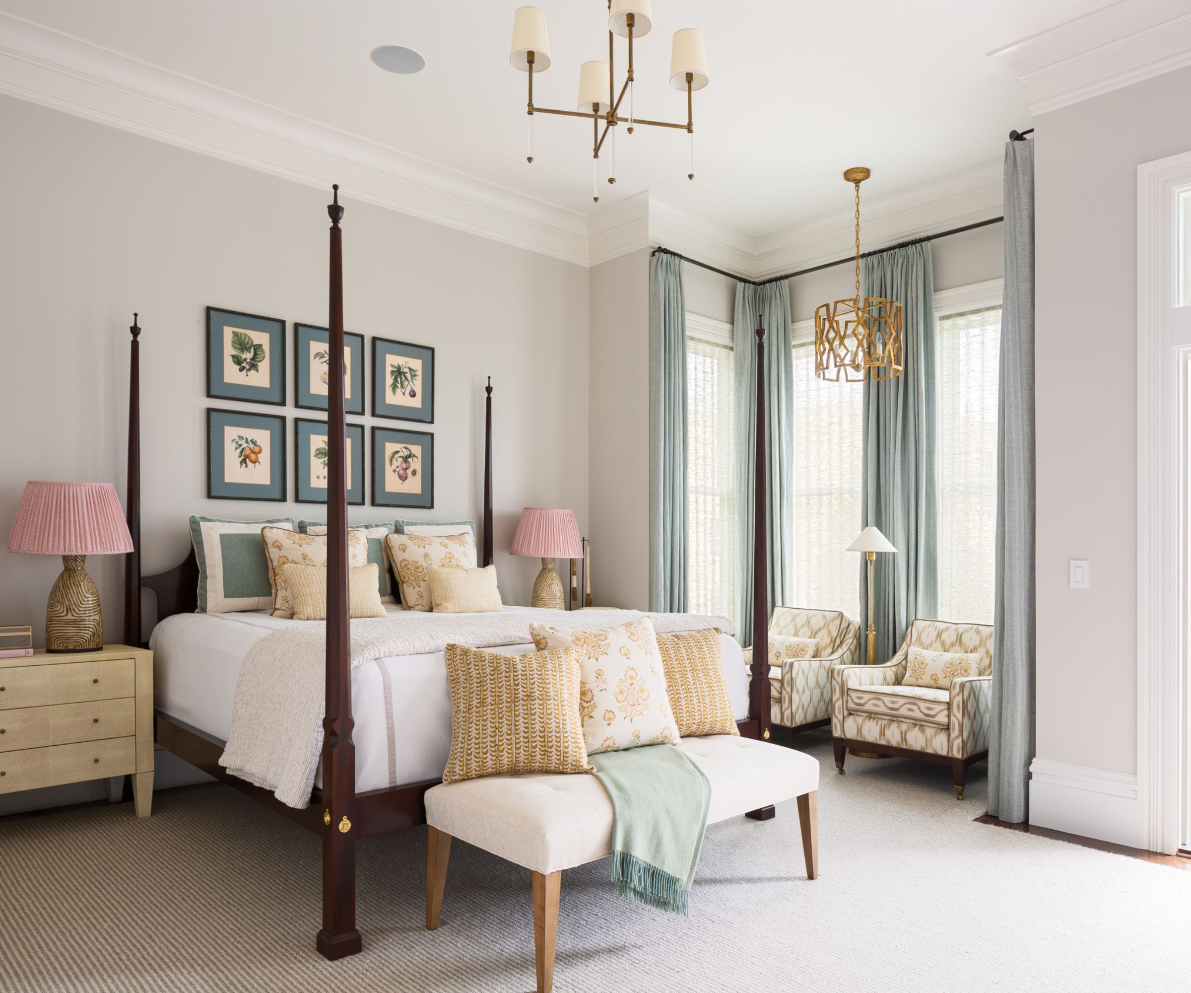
The bed is undeniably the focal point of the bedroom, and its placement can make or break the room’s layout and overall feel. One of the most common bedroom layout mistakes people make is not considering the placement of the bed as the first priority when designing their bedroom.
'The most important aspect in a bedroom design is the placement of the bed,' says interior designer Kathy Kuo. 'You want the bed placed with ample room to maneuver around on either side and it's nice to be able to fully see the bedroom door, as well as at least one window from the bed.'
The bed is the largest piece of furniture in the bedroom, and its position sets the tone for the entire space. Getting this wrong can lead to a cramped, awkward room that's difficult to navigate. 'When decorating a room, it can be easy to get caught up in shifting different pieces around to get a unique look, but it would be a mistake to not firmly keep the bed's placement on the top of the priority list for a bedroom design,' she adds.
'Another thing to consider with beds is the actual orientation within the room,' suggests Kristina Khersonsky of STUDIO KEETA. 'If room layout allows, avoid placing the bed adjacent to the entry because that forces you to walk directly into the side of the bed. In Feng Shui, this is a no-no because it invites a rush of energy from the room's entry point directly to a person’s head sleeping in the bed.'
2. Having a too big bed for the space
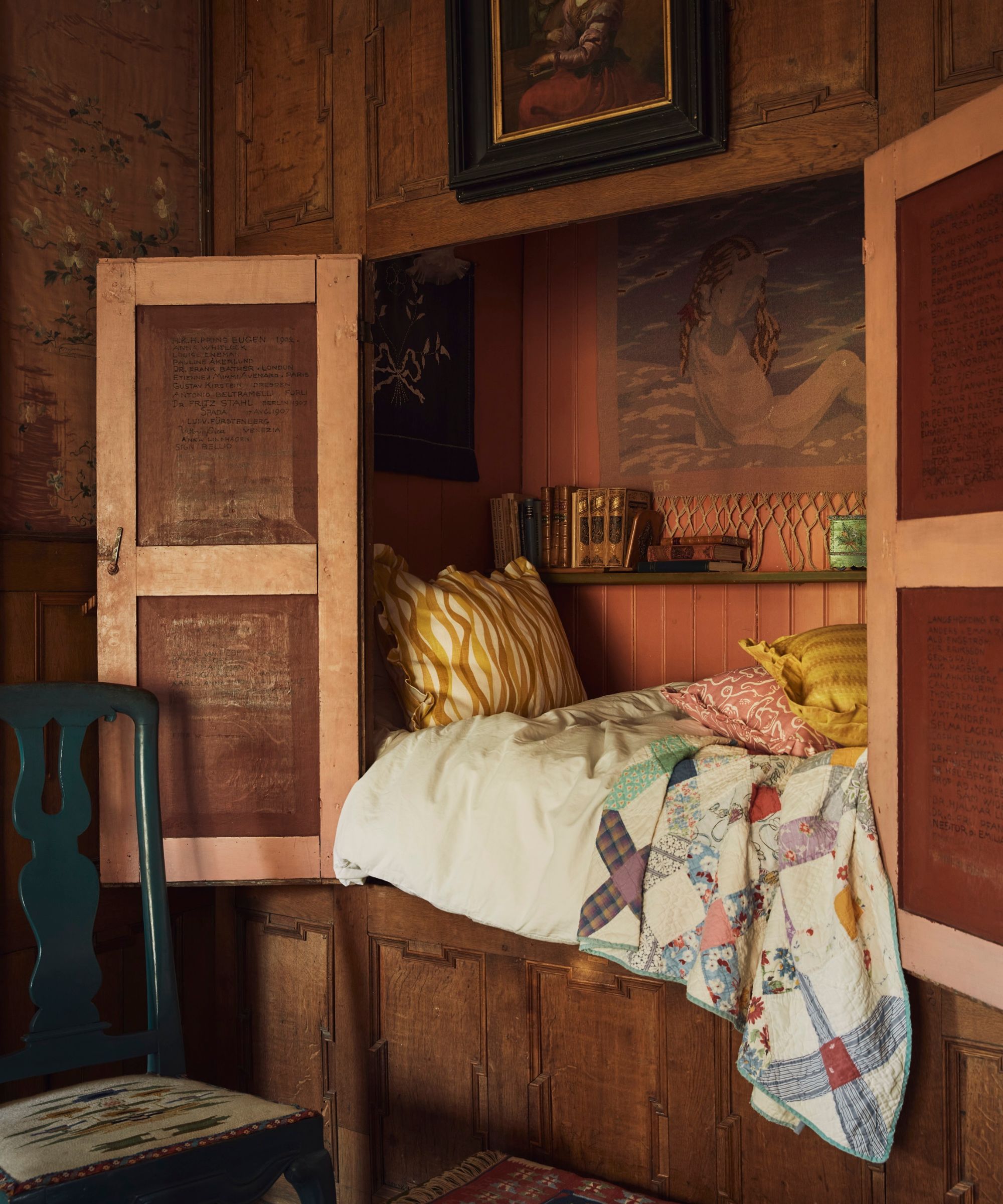
While a king-size bed may seem like the ultimate luxury, it can quickly overwhelm a room if the space isn’t large enough to accommodate it comfortably. A bed that’s too big for the space can dominate the room, leaving little room for other essential furniture and creating a claustrophobic atmosphere.
'Usually, we advise for a larger bed, but sometimes the square footage just doesn’t allow for it,' adds Kristina. 'If your bedroom leans on the smaller side, opt for a queen-sized bed over a King. Allowing space around the bed frame and breathing room will benefit you and give you mobility space whilst not overcrowding the room.' A bed that fits well within the space will make the room feel more open and balanced.
Bedroom furniture should always be scaled to the size of the room, and to one another, recommends Susie Atkinson, founder of Studio Atkinson.
‘It is always important to consider the size of a bedroom when choosing furniture. It should align so that the chosen pieces don’t either look enormous in a small bedroom or minute in a huge bedroom. A bed that’s too high for the room can make the space feel smaller, lowering the bed can give the illusion of more space, for example.'
3. Trying to include too much furniture
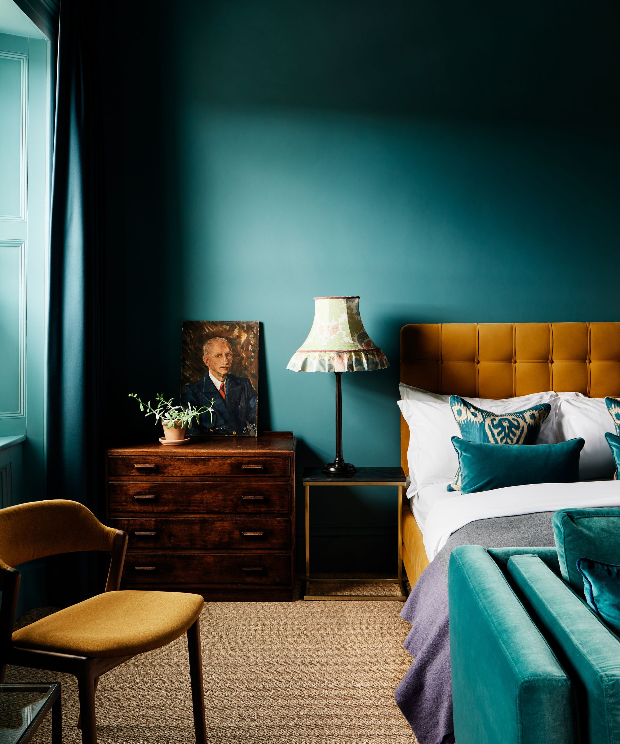
Overloading your bedroom with furniture is a common bedroom layout mistake that can make even the most spacious rooms feel cramped and cluttered. Less is more when it comes to bedroom furniture. A cluttered room can feel chaotic and overwhelming, so it's important to be thoughtful with your furniture selection and placement.
Given that bedrooms usually include a bed, side tables, and clothes storage – along with space to get ready including mirrors and maybe even a dressing table – it can be easy to over-stuff them.
‘In small bedroom layouts, rethink what you might consider a traditional bedroom layout and instead consider how to make best use of the space you have,’ advises Katie Lion, senior interior designer at Kitesgrove. ‘In general, the more furniture you try to include, the smaller and more cluttered your bedroom will feel, so invest in built-in storage, and incorporate multi-functional furniture where you can.’ Negative space is crucial for a room to breathe and feel spacious.
Adding too much furniture can also disrupt traffic flow, preventing seamless transitions from one room to another. If you have to move a chair to access your closet or to open your bedroom door, then you have overfilled the room. As a general rule, a walkway should be at least two feet wide to accommodate moving around the space, making a bed, and getting ready.
‘A rounded back bedroom chair takes up less volume visually, and can fit snugly in a corner,’ adds Susie Atkinson of Studio Atkinson, opening up opportunities for additional bedroom seating even in a smaller space.
4. Or maybe you're under-furnishing
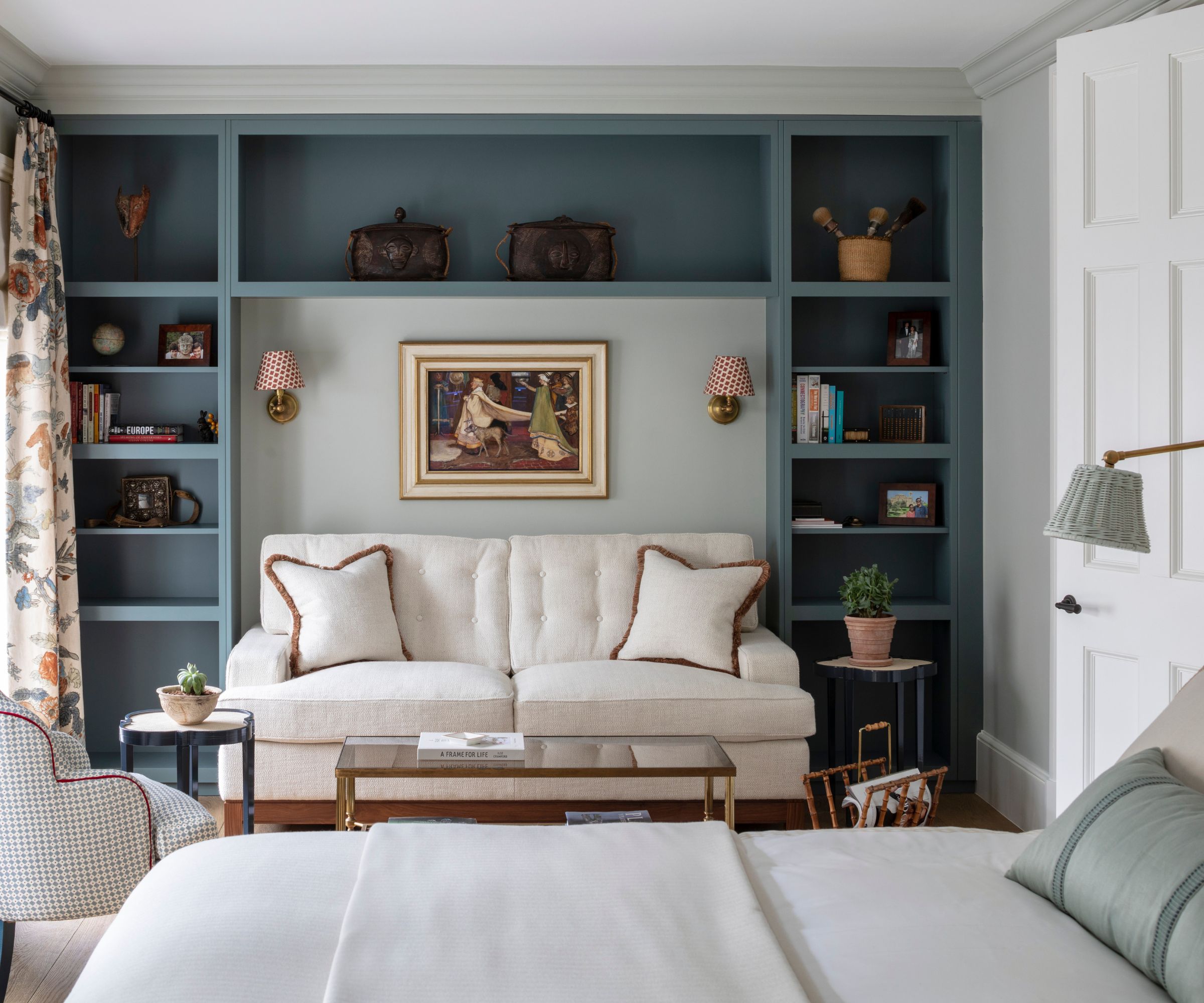
While overcrowding a bedroom with furniture can make it feel cluttered, under-furnishing can leave the space feeling sparse, uninviting, and unfinished.
Under-furnishing a large bedroom may leave too much space between pieces making everything feel disconnected. So for a larger space, consider filling the room with additional functional furniture such as larger built-in units for expansive clothes storage, or adding a separate seating area to provide an additional resting spot that isn't the bed.
'We love to introduce four poster beds into our schemes,' says Camilla Clarke, creative director at Albion Nord. Larger beds like this help to fill both floor space and vertical height in rooms with tall ceilings.
'We also use a lot of half testers above the bed to add that extra layer of softness to a bedroom instead of it being a blank wall behind the bed. Although sometimes seen as traditional, four-poster beds can be very contemporary, looking elegant, and making a statement in both new and old spaces.'
5. Not utilizing niches and alcoves to best effect
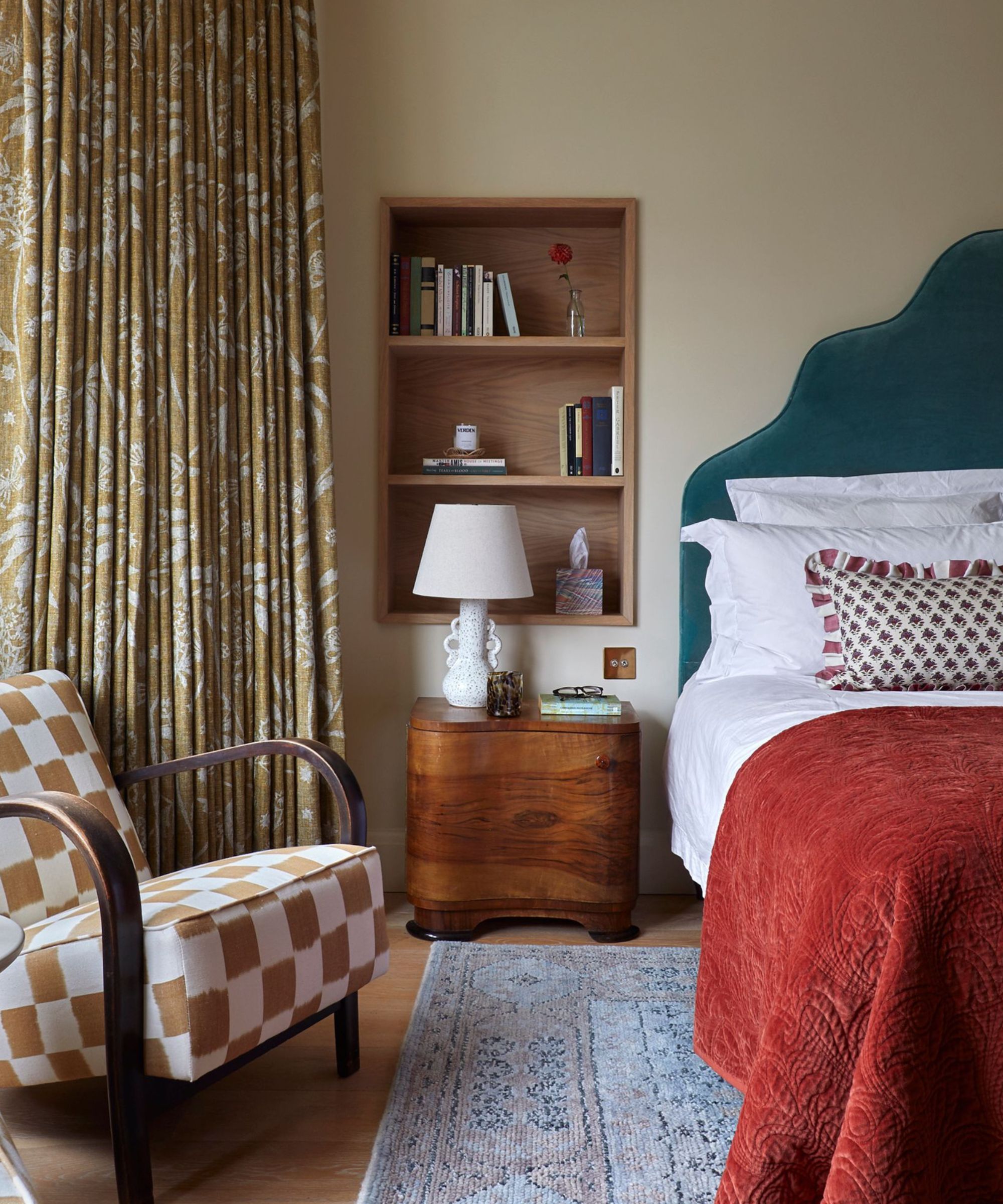
Not every bedroom is a perfect square or rectangle. If you're working with a unique layout, make the most of that to create storage opportunities rather than working against it.
Niches and alcoves are design gifts. They offer a chance to create special moments within a room, adding character and practical value. These spaces can be great for creating extra bedroom storage, as designer, Brigitta Spinocchia Freund explains.
‘Including storage under the bed or fitted closets for bedroom alcove ideas, made seamless by matching the wall finish to the outer doors, offers a more effective way to make use of dead space,’ Alternatively, alcoves can be fitted with custom cabinetry or drawers, offering discreet storage solutions that keep clutter at bay.
6. Failing to work with windows and natural light
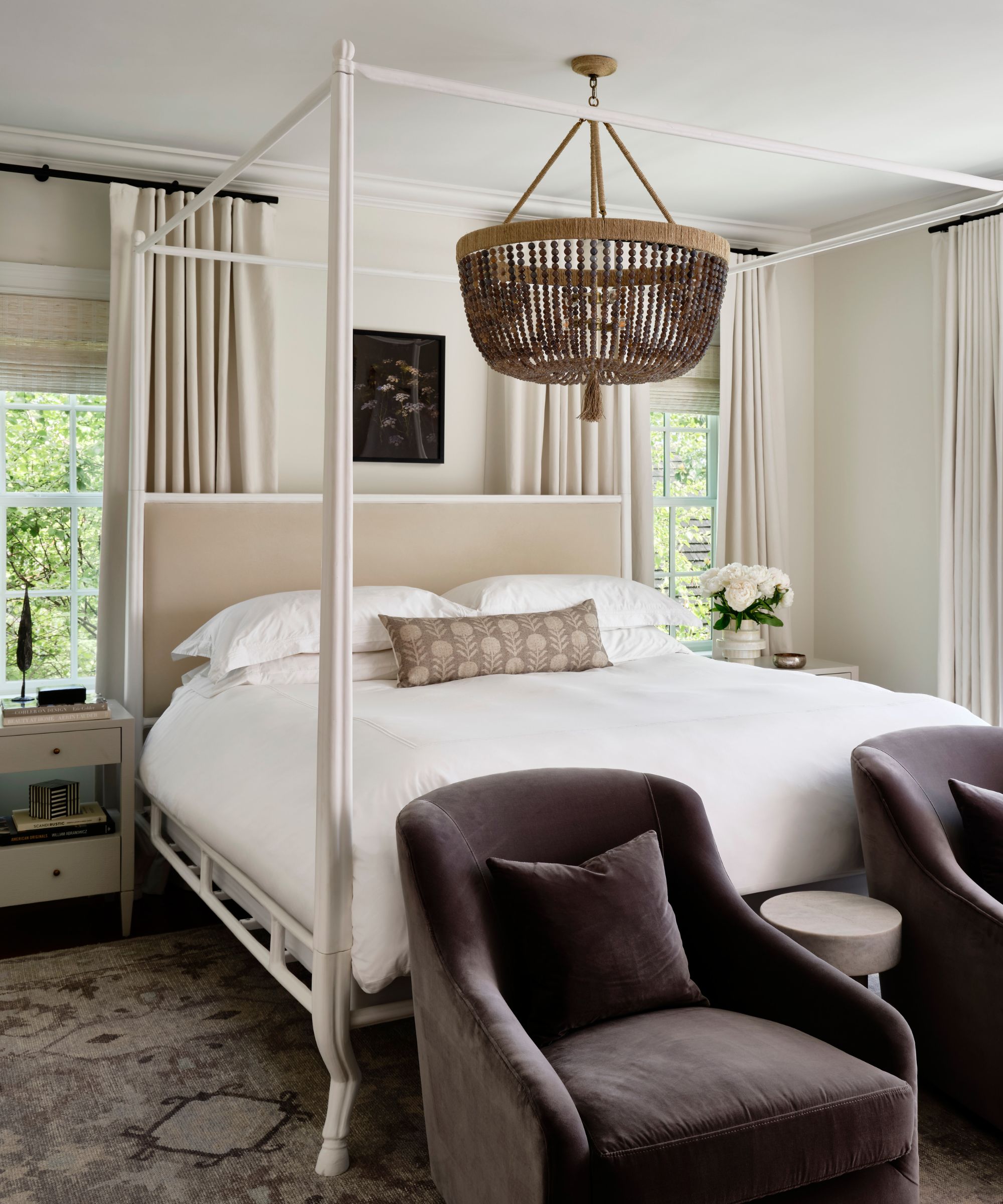
Windows and natural light are among the most valuable features in any bedroom, yet many people fail to maximize their potential.
'I like to have a bed facing a window,' says Susie Atkinson. 'This helps provide a really good view from the bed and allows more natural light to flood in.' Properly harnessing natural light can make a room feel larger, more open, and more inviting.
One commonbedroom layout mistake is blocking windows with furniture, heavy curtains, or blinds. Positioning the bed or other large pieces of furniture directly in front of a window can obstruct the flow of light and diminish the room's brightness. If placing the bed opposite the window is not possible, then using a bed with a lower headboard beneath the window can help with the flow around the room, but you may need to create a new focal point on the opposite wall for the bed to look out over.
'Avoid cutting off any windows if possible,' suggests Kristina Khersonsky. 'This can be a bit tricky if you’re dealing with a smaller space but consider using the windows to your advantage to help you anchor where furniture is laid. And don’t forget bedroom window treatments! An adorned window can help create a cozy and relaxing feeling in a bedroom and make it feel complete.'
7. Not leaving enough space for lighting
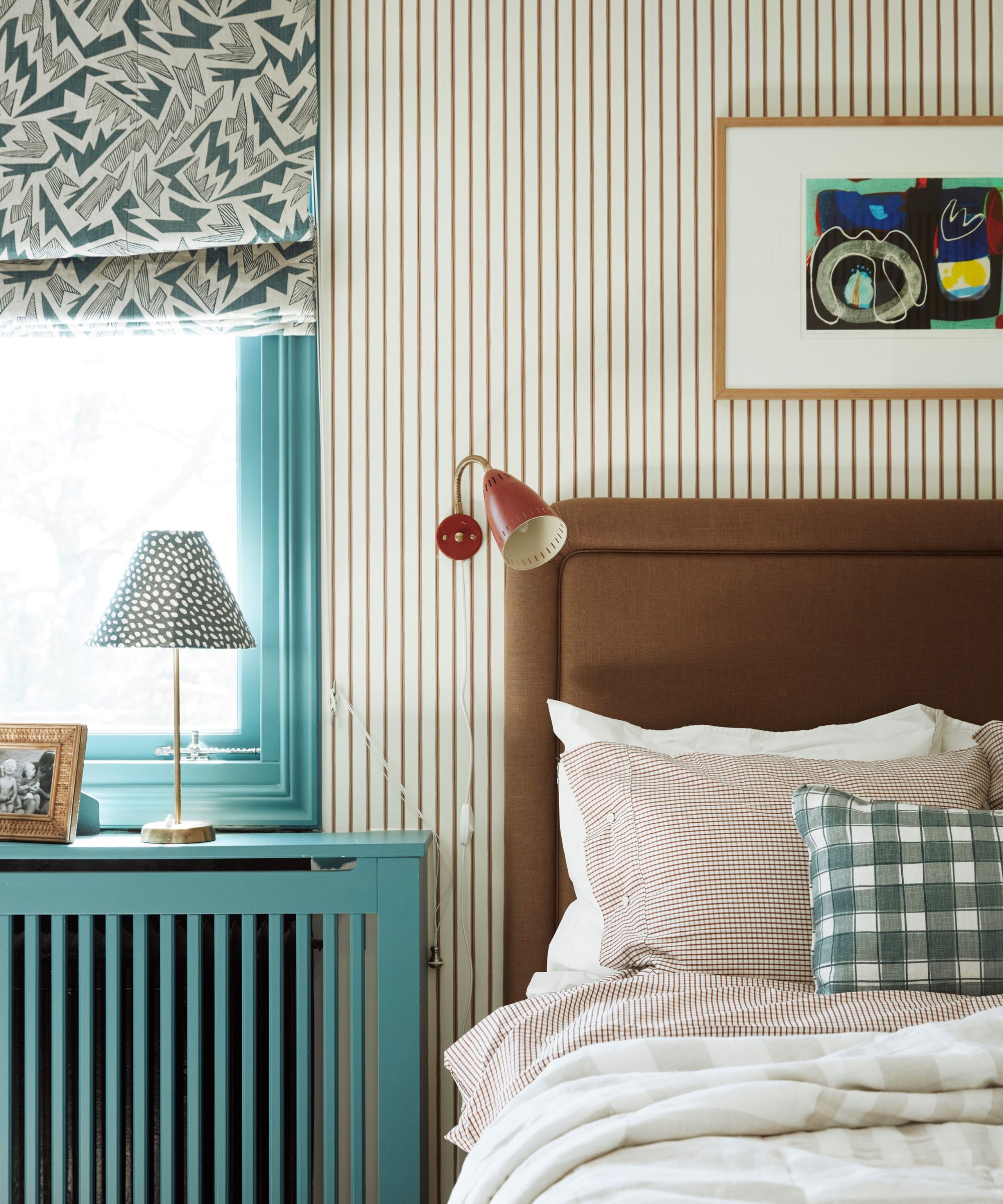
Another common mistake is bedroom lighting. If you have lots of tall furniture blocking walls, expansive wall decor, or have a small footprint, then you may be inhibiting proper bedroom lighting.
Proper lighting is essential for creating a functional and inviting bedroom, yet it’s often an afterthought in the design process. Failing to leave enough space for lighting can result in a room that feels dim and unwelcoming.
Bedroom lighting mistakes such as neglecting to layer lighting, or skipping out on key lighting fixtures can all make even the best bedroom layout look or feel impractical. ‘Bedrooms, especially, need ambient lighting throughout to make them feel glowy and cozy,’ says interior designer Heidi Caillier. ‘Lamps are crucial in all bedroom layouts, and the shades provide for a soft muted light that feels nice in a bedroom.’
‘Always allow for warm-up lighting, reading lighting, and good mirror lighting for makeup,’ adds Brigitta Spinocchia Freund. ‘A common mistake is having incorrect overhead lighting that creates glare, not allocating reading lighting in correct locations, and not having enough settings on lighting to create different scenes throughout the day.’
Consider removing a piece of wall art in favor of a sculptural wall lamp, or using space in a corner or beside the bed to add in a standing floor lamp to help in layering.
8. Forgetting closet storage
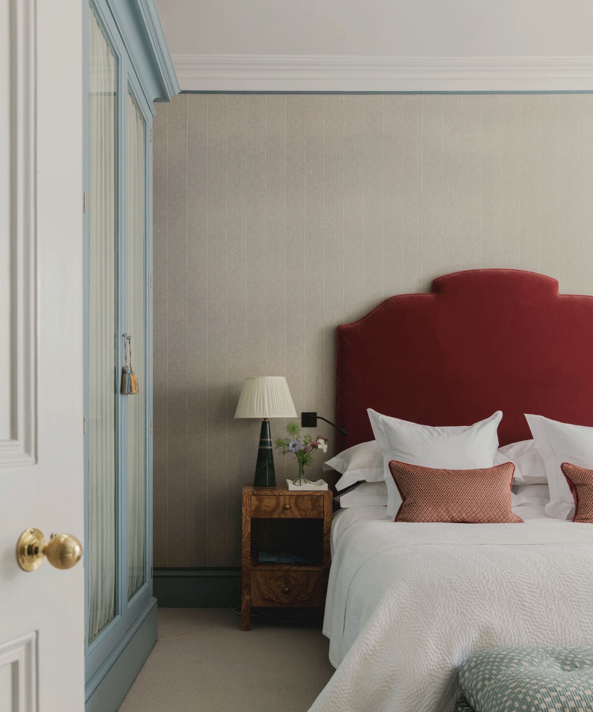
While it can be tempting to guess how much clothes storage you need when designing a bedroom, it's easy to misjudge and end up with less space than you really need. It's always preferable to have a surplus of bedroom storage to grow into than too little.
Without adequate storage solutions, bedrooms can quickly become cluttered, detracting from their comfort and aesthetic appeal.
'Not only a practical addition, but the installation of fitted furniture will also help to instantly refresh a home's aesthetic,' says the director at bespoke furniture specialists Neatsmith, Philipp Nagel. 'The format that a closet takes will be equally as important as the style and finish of the design.'
9. Selecting disproportionate rug sizes

Rugs play a vital role in bedroom design, providing comfort underfoot and anchoring the room's overall aesthetic. However, a bedroom rug that's too small or too large can throw off the entire layout.
'I always suggest selecting rugs that are proportionate to the size of each room,' says Jean Liu of Jean Liu Designs. 'It involves finding a harmony between revealing a sufficient portion of the floor (particularly if it boasts a beautiful hardwood), considering the presence of floor vents and either working around them or accommodating them, and deciding if seams are necessary for your rug and if they are, strategically determining their placement.'
A rug that's too small can look like an afterthought and fail to connect the furniture piece. Ideally, a bedroom rug should extend at least a couple of feet beyond the edges of the bed to create a cohesive look. For a queen or king-sized bed, a rug that measures 8x10 feet or larger usually works best, providing ample coverage and balance.
Interior designer, Heidi Caillier suggests ‘An ill-sized rug or bed that is too large for the room can disrupt a space too.’ Ensure that the rug leaves some floor space visible around the perimeter of the room to create a balanced and open feel.
FAQs
What should you not do in a bedroom layout?
Poor positioning of the bed is possibly the worst bedroom layout mistake you can make. A double bed should be accessible from both sides to be practical, and you should ideally never place the bed so that the foot of it faces the door (known as the 'death position'), according to Feng Shui bedroom layout priniciples.
For more bedroom layout tips, we explore Feng Shui bedroom layout ideas in our dedicated piece; guaranteed to create a rejuvenating space.


