Beautiful Science at the British Library – in pictures
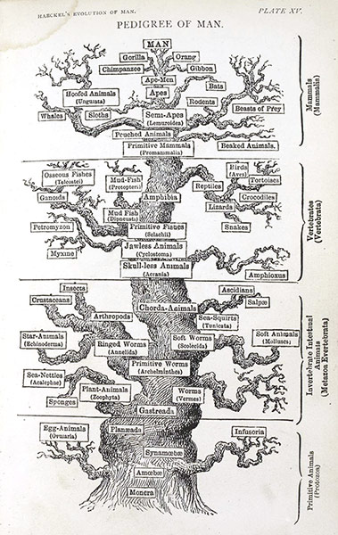
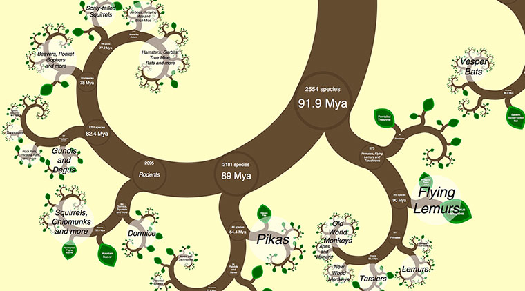
Great Chain of Being (Utriusque Cosmi Majoris Scilicet et Minoris ... by Robert Fludd; Frankfurt, 1617). The ‘Great Chain of Being’ is an ancient Greek concept that classifies life on Earth into a hierarchical order with respect to the rest of the universe. In this diagram, which is the oldest exhibit in the exhibition, the chain starts with Sophia, goddess of wisdom, and extends downwards to animals, plants and mineralsPhotograph: 14075/Beautiful Science/British LibraryThe Pedigree of Man (The Evolution of Man by Ernst Haeckel; London, 1879). Ernst Haeckel was inspired by the ideas of Charles Darwin and drew trees that organised all life on EarthPhotograph: Beautiful Science/British LibraryOne Zoom Tree (James Rosindell, Imperial College London, 2012) This interactive graphic allows viewers to explore the evolutionary relationships between tens of thousands of mammals, birds, reptiles and amphibians. It uses a branch of mathematics known as fractal geometry to create an attractive visualisation that can be explored by zooming in, to get ever more detail. The data includes audio from the British Library’s wildlife sound collectionsPhotograph: Beautiful Science/British Library
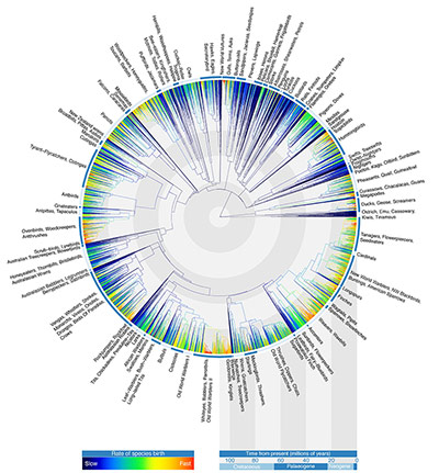
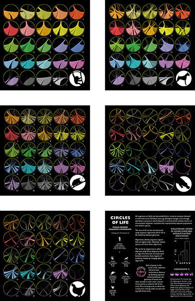
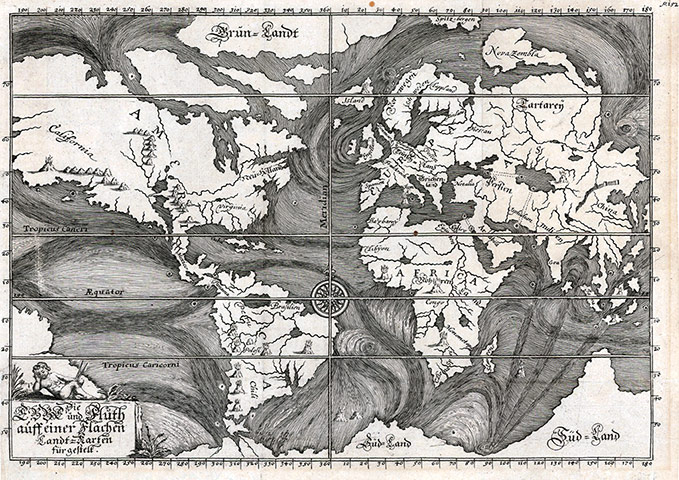
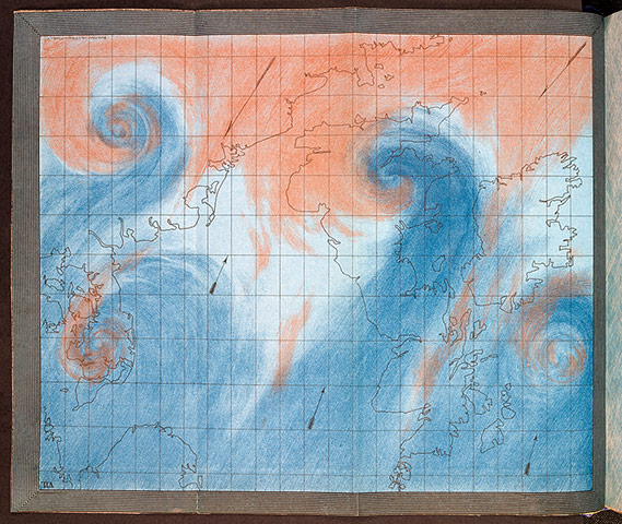
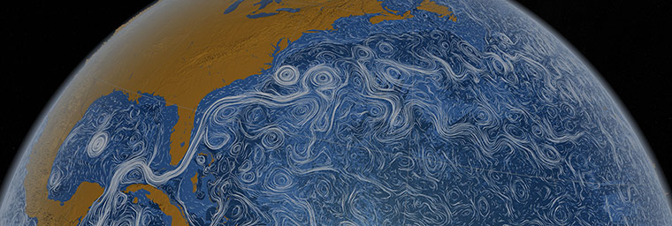
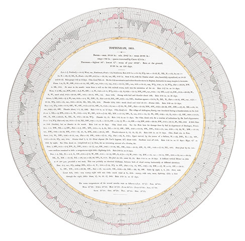
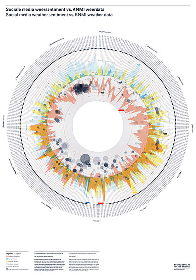
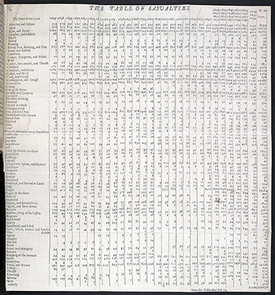
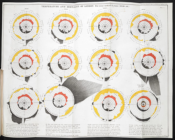
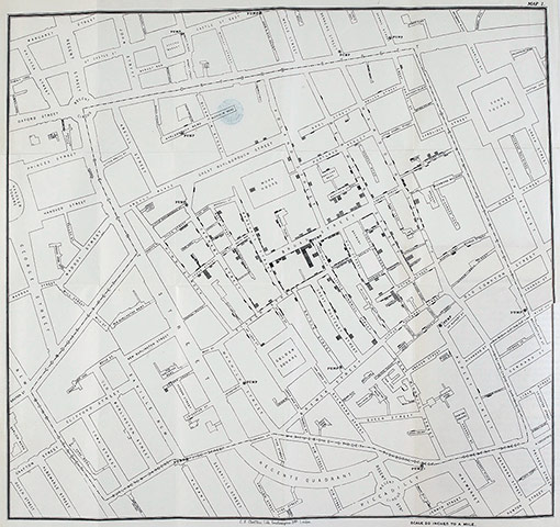
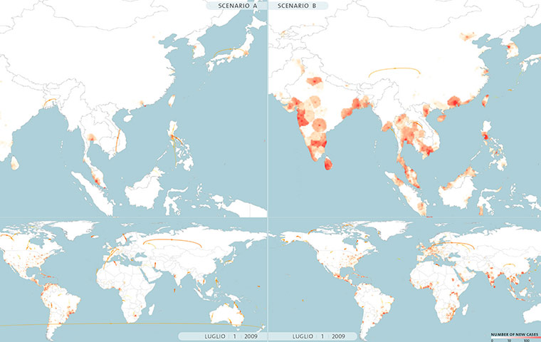
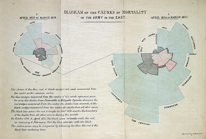
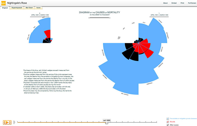
Avian Tree of Life (Gavin Thomas, Walter Jetz, Jeff Joy, Arne Mooers, Klass Hartmann, 2012). First published in the journal Nature, this diagram depicts the evolutionary relationships of all 9,993 living species of birds, illustrating when they diverged. Although modern birds first evolved some 145m to 66m years ago, this diagram reveals that they began to diversify exceptionally rapidly about 50m years ago, when there was an explosion of diversification among the songbirds, waterfowl, gulls and woodpeckersPhotograph: Beautiful Science/British LibraryCircles of Life (Martin Krzywinski, 2014). Specially commissioned for Beautiful Science, these striking ‘Circos’ illustrate the genetic similarities between humans and five other animals: chimpanzee, dog, opossum, platypus and chickenPhotograph: Beautiful Science/British LibraryEarly Ocean Currents (Die Ebbe und Fluth auff einer Flachen Landt-Karten fürgestelt, by Eberhard Werner Happel. Ulm, 1685). This map illustrates ocean currents as understood at the end of the 17th century, based on the observations of explorers and mariners. Though necessarily conjectural, it highlights the remarkable effort made by early cartographers to make sense of an accumulation of data from such reports without the visualisation tools we have todayPhotograph: Beautiful Science/British LibraryAir Currents over the British Isles (The Weather Book: A Manual of Practical Meteorology by Robert FitzRoy; London, 1863). Best known as the captain of HMS Beagle on which Charles Darwin sailed, Robert FitzRoy is also widely considered to be the grandfather of the modern weather service. This illustration shows how storms and cyclones develop on the border between warm tropical and cold polar air masses and looks remarkably like a modern satellite imagePhotograph: Beautiful Science/British LibraryPerpetual Ocean (Nasa/Goddard Space Flight Center Scientific Visualization Studio, 2011). This striking animation visualises the flow of ocean surface currents from June 2005 to December 2007Photograph: NASA/Beautiful Science/British LibraryBarometrographia: Twenty Years' Variation of the Barometer in the Climate of Britain… by Luke Howard; London, 1847). Luke Howard’s daily barometric pressure readings are among the earliest consistent scientific observations recorded. In Barometrographia, he noted down the atmospheric pressure readings from 1815 to 1834 at his homes in Tottenham, London, and Ackworth, Yorkshire, alongside accounts of the weatherPhotograph: Beautiful Science/British LibraryWeather Sentiment vs. Reality (CLEVER°FRANKE). This chart compares the actual weather during 2011 with more than 700,000 'sentiment-analysed' social media messages about the weatherPhotograph: Beautiful Science/British LibraryBills of Mortality (Natural and Political Observations on the Bills of Mortality by John Graunt; London, 1662). From 1603, London parish clerks collected health-related population data in order to monitor plague deaths, publishing the London Bills of Mortality on a weekly basis. John Graunt amalgamated 50 years of information from the bills, producing the first known tables of public health dataPhotograph: Beautiful Science/British LibraryTemperature and Mortality of London (Report on the Mortality of Cholera in England, 1848-1849 by William Farr; London, 1852). In these diagrams, epidemiologist and statistician William Farr plotted cycles of temperature and cholera deaths for 1840-50. He notes that the circular form and colours make ‘the diagram represent the facts in a striking manner to the eye’. At the time, Farr believed that cholera, now known to be caused by waterborne bacteria, was spread by miasma or ‘bad air’ rising from the Thames. Although this hypothesis was incorrect, Farr left an important legacy. He set up the first national system for collecting statistics, advocated a data-driven approach to public health, and utilised innovative graphic methods to communicate that dataPhotograph: Beautiful Science/British LibraryStreet map of cholera deaths in Soho in 1853 from John Snow's On the Mode of Communication of Cholera. Snow's 'ghost map' shows deaths from cholera around Broad Street between 19 August and 30 September 1854. Snow simplified the street layout, highlighting the 13 water pumps serving the area and representing each death as a black bar. His map demonstrates how cholera was spreading, not by a 'miasma' rising from the Thames, but in water contaminated by human wastePhotograph: Beautiful Science/British LibraryEpidemic Planet (GLEAMviz Team, 2013). This interactive graphic is based on the Global Epidemic and Mobility model, which researchers used to forecast the 2009 pandemic influenza outbreak. A touchscreen is used to visualise different epidemic scenarios and the potential impact of anticontagion measuresPhotograph: Beautiful Science/British LibraryDiagram of the Causes of Mortality in the Army in the East (Notes on Matters, Affecting the Health, Efficiency and Hospital Administration of the British Army by Florence Nightingale; London, 1858). In her seminal ‘rose diagram’, Nightingale demonstrated that far more soldiers died from preventable epidemic diseases (blue) than from wounds inflicted on the battlefield (red) or other causes (black) during the Crimean War (1853-56)Photograph: 14075/Beautiful Science/British LibraryNightingale’s Rose (David Spiegelhalter, Mike Pearson, Ian Short; 2011). Cambridge University statistician Spiegelhalter and his colleagues animated the 'rose' from Nightingale’s rose diagram, as well as picturing the data as a bar chart and icon diagram. This shows not only the lasting relevance of the diagram as a visual icon, but also demonstrates how data can be pictured in different waysPhotograph: Beautiful Science/British Library
Sign up to read this article
Read news from 100’s of titles, curated specifically for you.