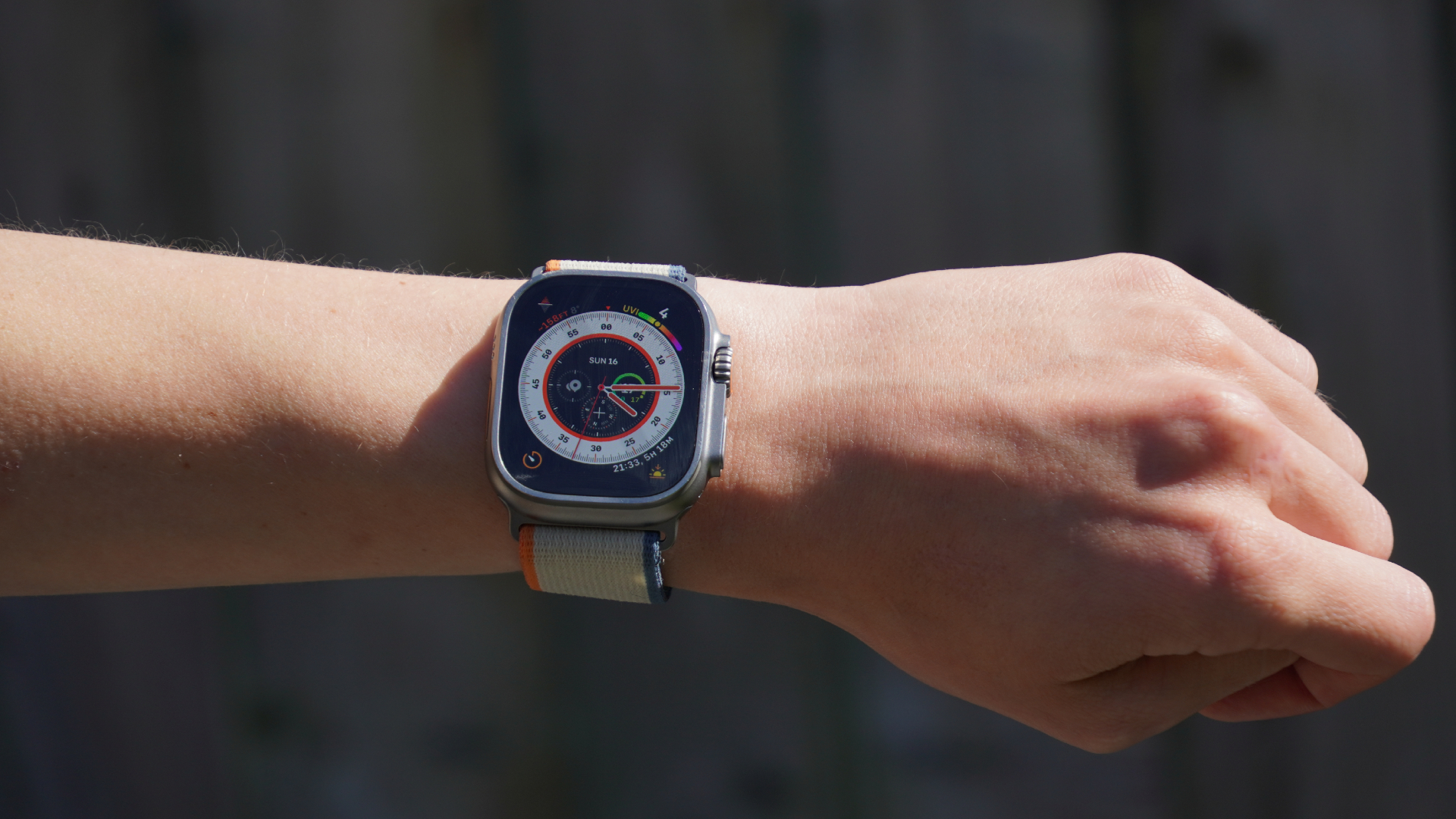
Smartwatches are uniquely complex products to test. Unlike tires, wheels or other components - where the considerations entirely revolve around ‘how much better does this make my riding?’ - with a smartwatch, you also have the more general question of whether, all things considered, this is the best product you could be wearing on your wrist?
Most of the smartwatches we test come from sports tech companies. The onus on these models is to prove themselves more useful and feature-packed than the smartwatches produced by smartphone manufacturers - which have the upper hand in terms of seamless integration into everyday life.
In this review, though, the boot is on the other foot. We have the Apple Watch Ultra 2 and its slick operating system, a hallmark of the Silicon Valley giant. The question is, has Apple packed it with enough cycling-specific functionality to compete with Garmin and the like?
There is a lot to get into. My aim for this review is to explain what the Apple Watch Ultra 2 can do as a sports watch, as well as the day-to-day. In my conclusion, I want to provide a clear framework to help you decide whether, on the whole, the Ultra 2 provides the right balance and right features for you. Could get by with something cheaper? Or, do you need a more cycling-specific watch?
But before that, let’s take a run through the specs and how the Ultra 2 stacks up against its main competitors.
Apple Watch Ultra 2: construction
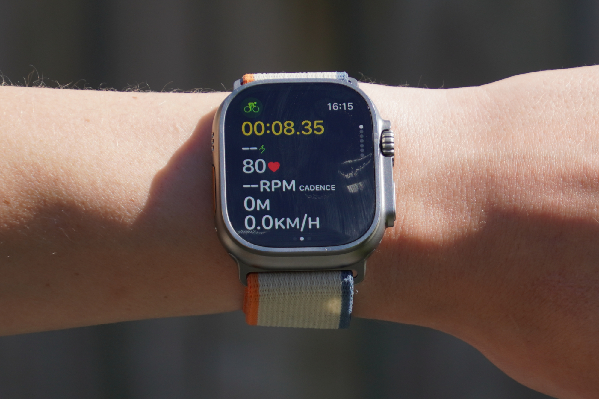
First, this watch combines a touchscreen with buttons - as well incorporating ‘gestures’, which allow you to control the watch without even touching it. Pretty neat. Garmin has touchscreen functionality from its Forerunner 165 model up these days (£249.99), but Apple's is particularly responsive and easy to use.
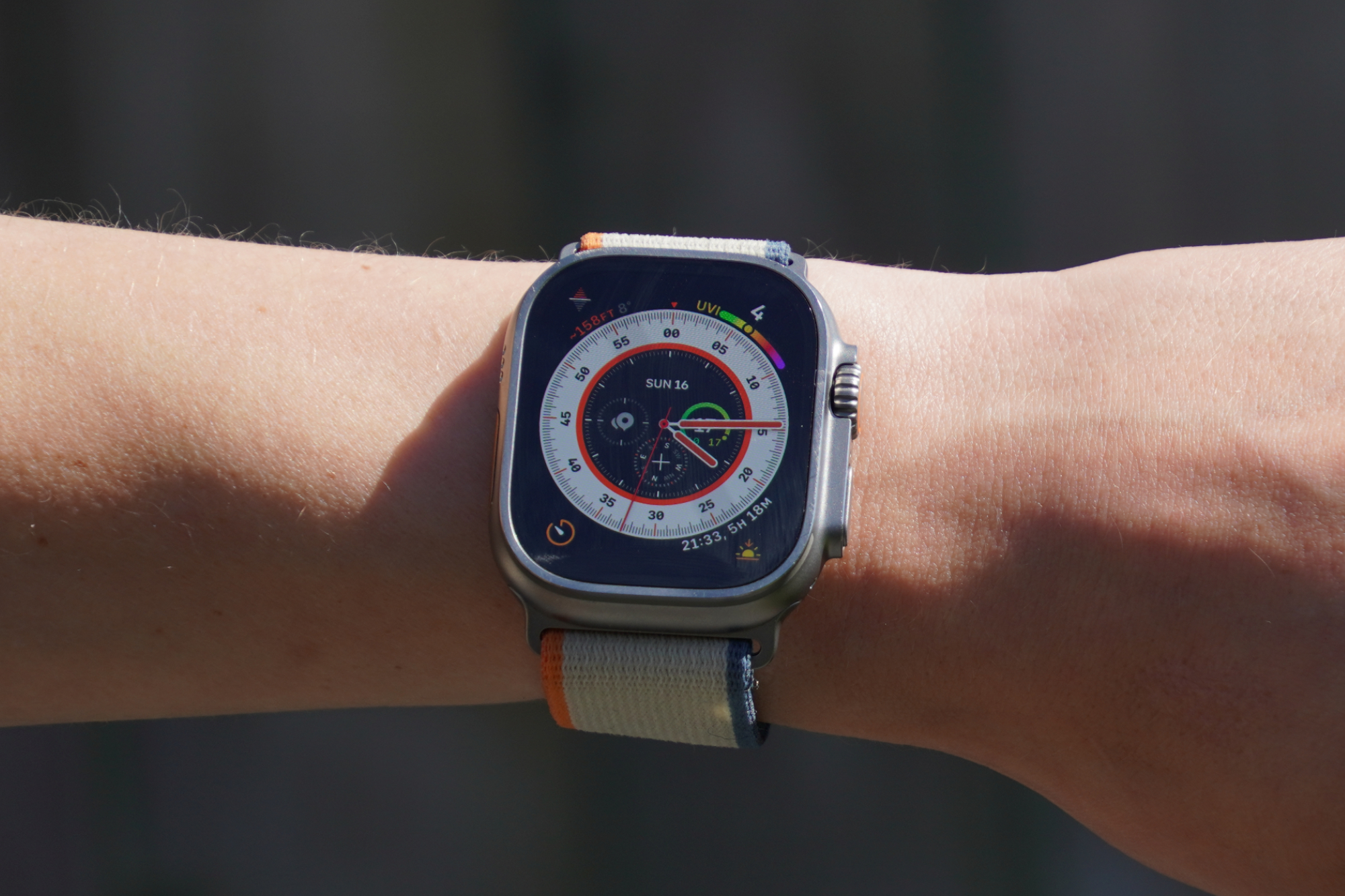
The Apple Watch Ultra 2 is also very customizable in terms of its display. It can display a huge range of data very clearly and with lots of integration in terms of alerts, notifications and control of your smartphone. Brightness ranges from 3,000 nits right down to a single nit.
The Apple Watch Ultra 2 is also rated for scuba diving down to 40m, but unless you're a diver this is a pretty moot point - essentially all sport smartwatches you’re likely to consider are waterproof enough for general swimming, and so have you covered for Tri.
In addition to its crash detection, (which Garmin also boasts), the Apple Watch Ultra 2 has a siren which can be heard up to 180 meters away, to help alert others in the event of a mishap or misfortune.
Its GPS is dual frequency, which Apple claims is the most accurate GPS in a sports watch in a dense urban environment, though we've been impressed with the accuracy of recent Garmin watches too.
Battery life is 36 hours, which is enough that sleep tracking isn’t a logistical difficulty - generally you just need to find the time to pop it on the charger for 30 mins at some point throughout the day. Apple claims that you can get up to 17hrs of workout use in low power mode, making the Ultra 2 a viable option for tracking an all day epic.
However, compared with some of its competitors, those stats are modest. With some, you can go a whole week without charging, whilst still recording activities everyday. Of course, those watches don’t have the same close OS integration with your smartphone, and they don’t have such a bright and information dense display.
To hang on the functionality beyond sports for a little longer, although you can see notifications from your phone on Garmin devices, the Apple Watch Ultra 2 allows you to easily respond to messages right from the watch face thanks to the responsive touch screen. You can even answer calls.
The maps are topographic, but you can’t upload and follow a route directly on it the way you can with a Garmin watch. If you integrate a fair bit of running into your cross training, this may be a deal breaker, but for cycling, following a route on your watch is simply a bit of a faff - some form of head up display, whether a bike computer or phone, is a much better choice.
Like Garmins, the ECG app tracks your heartbeat and can detect a heart attack. It does sleep tracking, is said to track your blood oxygen, and claims to track your temperature - which not many smartwatches do.
The Apple Watch Series 9, at £399 is the main alternative to the Apple Watch Ultra 2 (£799). The £400 mark is where many smartwatches sit. The main differences between the Series 9 and the Ultra 2 is that the Ultra 2 is has a brighter screen (3,000 vs 2,000 nits), it’s more waterproof (100m water resistance vs 50m water resistant), it has a siren (vs no siren), its GPS is more accurate (Precision dual frequency GPS vs GPS), and its battery life is longer (up to 36 hours normal use and 72 hours in low power mode vs up to 18 in normal use and up to 36 in low power mode).
But enough of these tech specs, let’s get on to the functionality, what it’s like in use and what that OS system has to offer.
Power, heart rate and connectivity
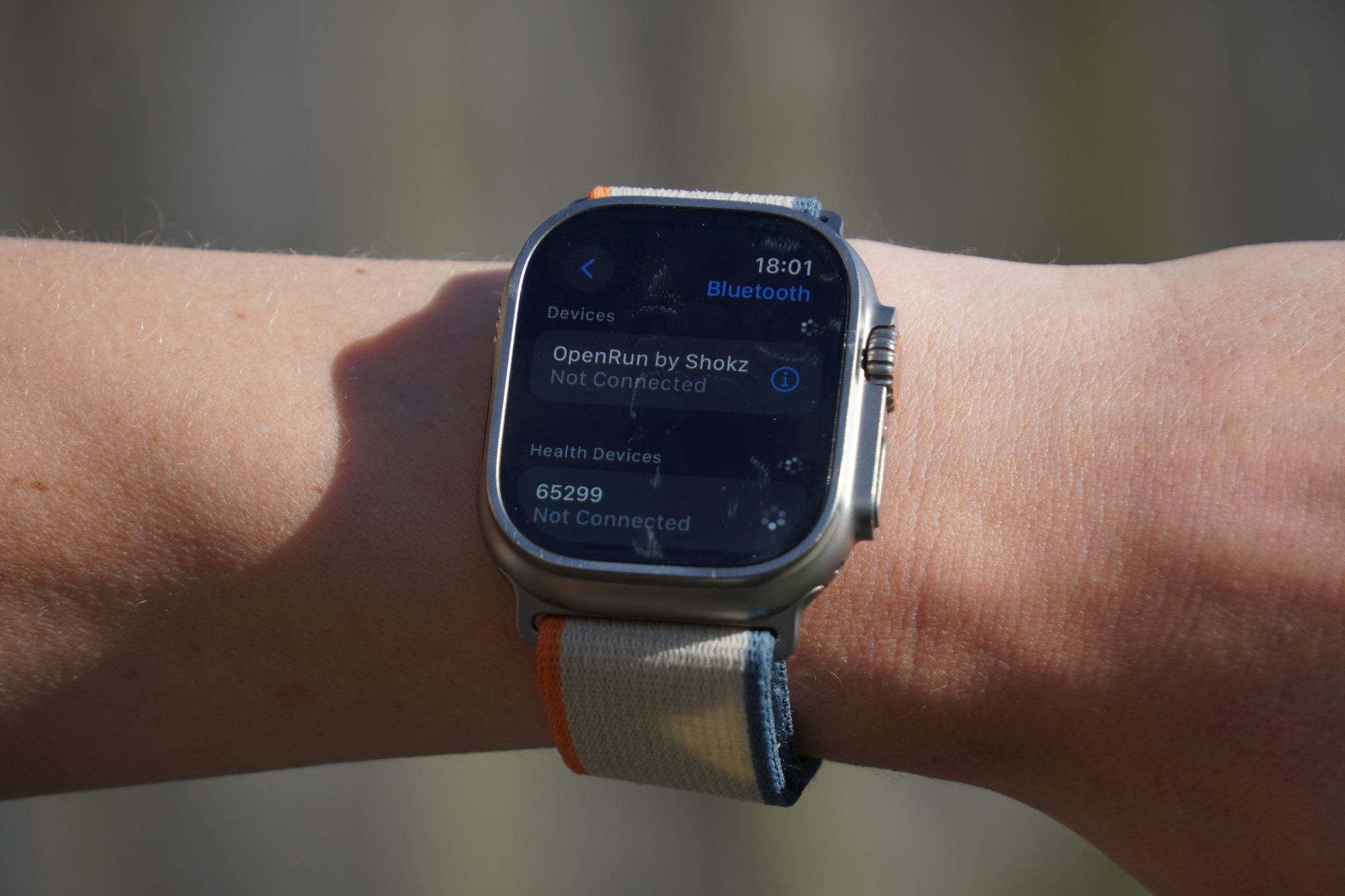
Apple has added the capability to connect its sports-focused smartwatch to power meters via Bluetooth, giving riders the opportunity to follow power-based workouts and record your power output for a ride. I found it was quick and easy to find my 4iiii power meter and ‘calibrate’ (zero offset) it. And since connecting up, I haven’t experienced any issues with the power readings dropping out.
After you’ve completed an FTP test on Zwift or another platform, the Ultra 2 lets you manually add a custom FTP figure. You can pick your preferred cycling training zone system (5 - 8 zone models), and you’re also able to adjust the lower and upper limits of each zone. So there’s lots of scope for individualisation for the more serious riders who know their numbers.
If you don’t fancy doing another FTP test to re-benchmark your fitness, Apple also has its automatic FTP that gives an estimated functional threshold power after around five high-intensity rides with your power meter connected.
The Ultra 2 also has an optical heart rate sensor. Heart rate training zones are automatically calculated, but Apple also gives the option to manually adjust them.
I wore a Garmin HRM Pro Plus chest strap and recorded the data with my bike computer to compare the accuracy of the optical heart rate monitor of the Apple watch. Wrist-based sensors are notoriously less accurate than chest straps, so I was very impressed just how close the Ultra 2 got to the Garmin HRM. They both clocked the same average heart rate of 132 BPM over an hour’s ride and were within one BPM for my max heart rate (171 for the Ultra 2 and 172 for the Garmin HMR).
Looking more granularly at the data, although the shape of the graphs looked very similar - no big sudden jumps or periods of flatlining at a particular heart rate - when I really zoomed in, I could see that the Apple Watch Ultra 2 was a little more ‘blocky’ in the way my heart rate rose and fell. The Garmin HRM trace, in comparison, was about as smooth as it could possibly be. So the heart rate data isn’t quite on the same level, but it is very, very close - and I can’t imagine needing my HR data any more granular than the Ultra 2 provides.
Workout app and data screens
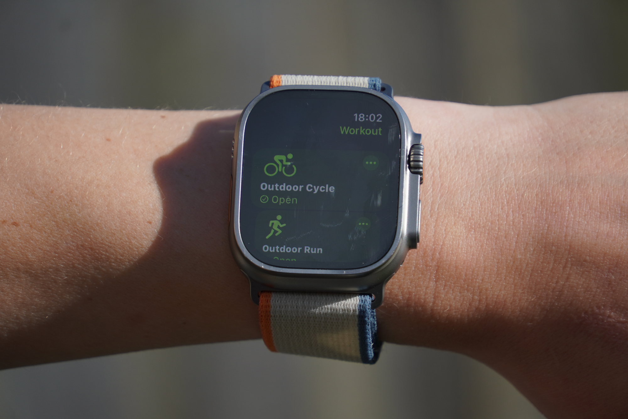
Beginning a workout on the Ultra 2 is easy to do. Simply click the button on the left and you’re presented with a list of different activity types. There are options to select ‘outdoor bike ride’ or ‘indoor cycle’, as well as a huge range of other sports - from running to skating to Tai Chi.
If you simply want to get riding and record your activity, then click ‘open’ and you’ll be counted down to begin; 3, 2, 1… and you’re off. Simple.
There’s a range of settings you can easily adjust, such as toggling the auto-pause to on or off. For training and general rides, I quite like having it on so my average speed and power numbers don’t take a hit at the traffic lights. But on all-day and multi-day bikepacking rides, I do prefer having the clock always ticking - it doesn’t matter how hard you pedal hard when you’re on the bike, if you spend hours stationary at the cafes, your daily average will be taking a hit!
It’s possible to change the metrics in the first two data screens (unless you’re following a structured workout), and you can also add other screens - including an elevation chart, for example. These can all be reordered by preference.
Creating a custom structured workout
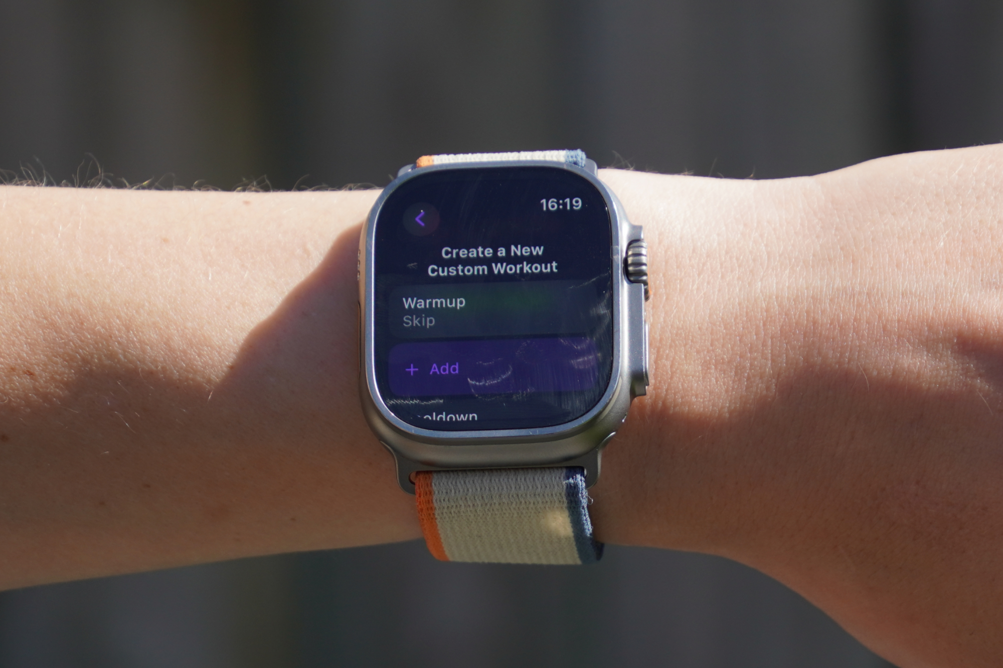
I’ll begin by caveating this section with the point that the fundamental mechanics of following a workout on a smartwatch aren’t great. The screens are small to start with - then there’s the fact that the watch screen faces away from you when holding the hoods or the drops.
This is true for all smartwatches - it’s not particular to the Apple Watch Ultra 2 at all. Still, with that being said, I’ll explain how structured workouts do work on the watch (and how these integrate with the iPhone, which is the more useful part of the package in this context).
Starting at the beginning, it’s worth noting that the Ultra 2 can record heart rate and power output directly onto the device. It’s also possible to follow structured workouts with intervals at different intensity levels set by either heart rate or cycling zones. If you wish, you can also create custom workouts right there on the Ultra 2 itself.
To get to the builder you have to click the three dots in the top right corner of the activity type in the workout app. If you scroll to the bottom you can click ‘create workout’, then click ‘custom’, then ‘add’, and finally ‘work’ to make your first effort. Next you can select the duration of the interval (either time or distance based), and then add an alert (which can be either speed, cadence, heart rate or power based).
For power based alerts, you can pick a specific power target or a zone. For heart rate, it's only zone based - which makes sense. Then you can add in recovery, or repeats of specific blocks. All in all, the in-built workout builder has lots of scope for creating a highly customized session. It doesn’t take too long, thanks to the ability to repeat blocks, and the user interface is impressively intuitive - simple and easy to use, particularly considering the size of the screen you’re working with. The only thing the workout builder is really missing is the ability to create blocks which gradually ramp up or decrease your power target throughout the interval, as you can in TrainingPeaks or Zwift.
Following a custom workout on the watch
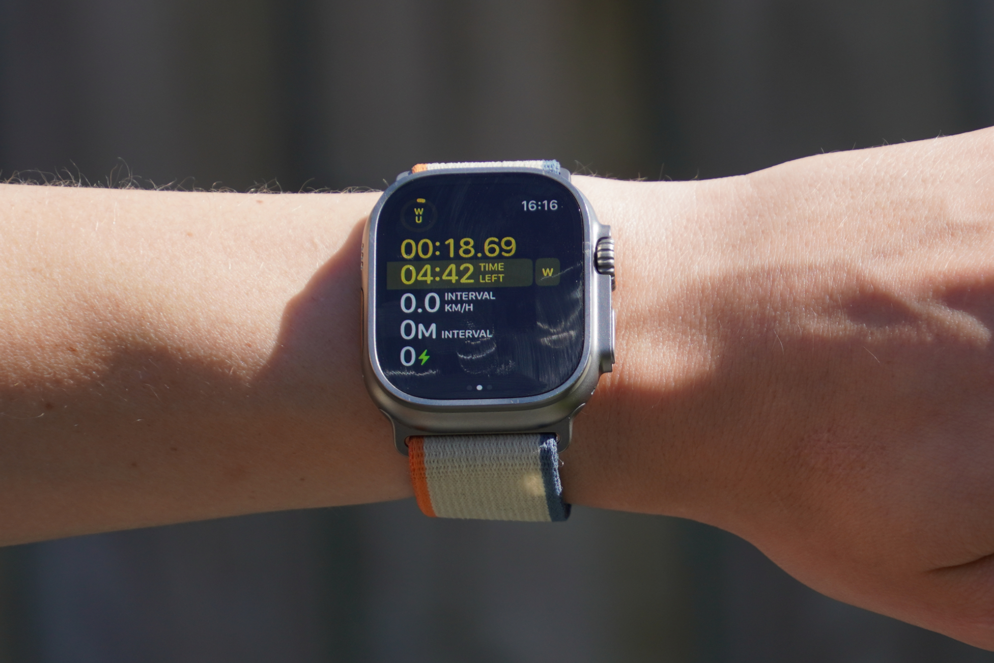
There are some really good aspects of the Ultra 2’s structured workouts, but there are some pitfalls in the user interface - as well as some practical issues that are general to all smartwatches. As a result, this hasn’t been a feature that I’ve found myself using often.
When it’s time for an interval, the Ultra 2 vibrates on your wrist. This appears helpful, because it should mean that you don’t have to keep glancing to see if you should be changing up your pace. However, in practice, I found that the buzz is too soft and is easily missed amidst the other vibrations coming up through the bars when riding - even on relatively smooth roads and with generously low tire pressures.
At the same time that the watch buzzes you, a notification screen pops up alerting you to the new interval. However, the sizing of the text for the interval power or heart rate target is very small on the screen. Frustratingly, there are other, less useful, data fields which are much larger - such the label ‘work’, reminding you the purpose of this interval is not recovery (which you would have thought could be easily inferred from the power target itself). Also, the distance of your previous interval pops up by default (which I can only really see being useful for cycling if you were doing sprints on a flat road or in post-ride analysis).
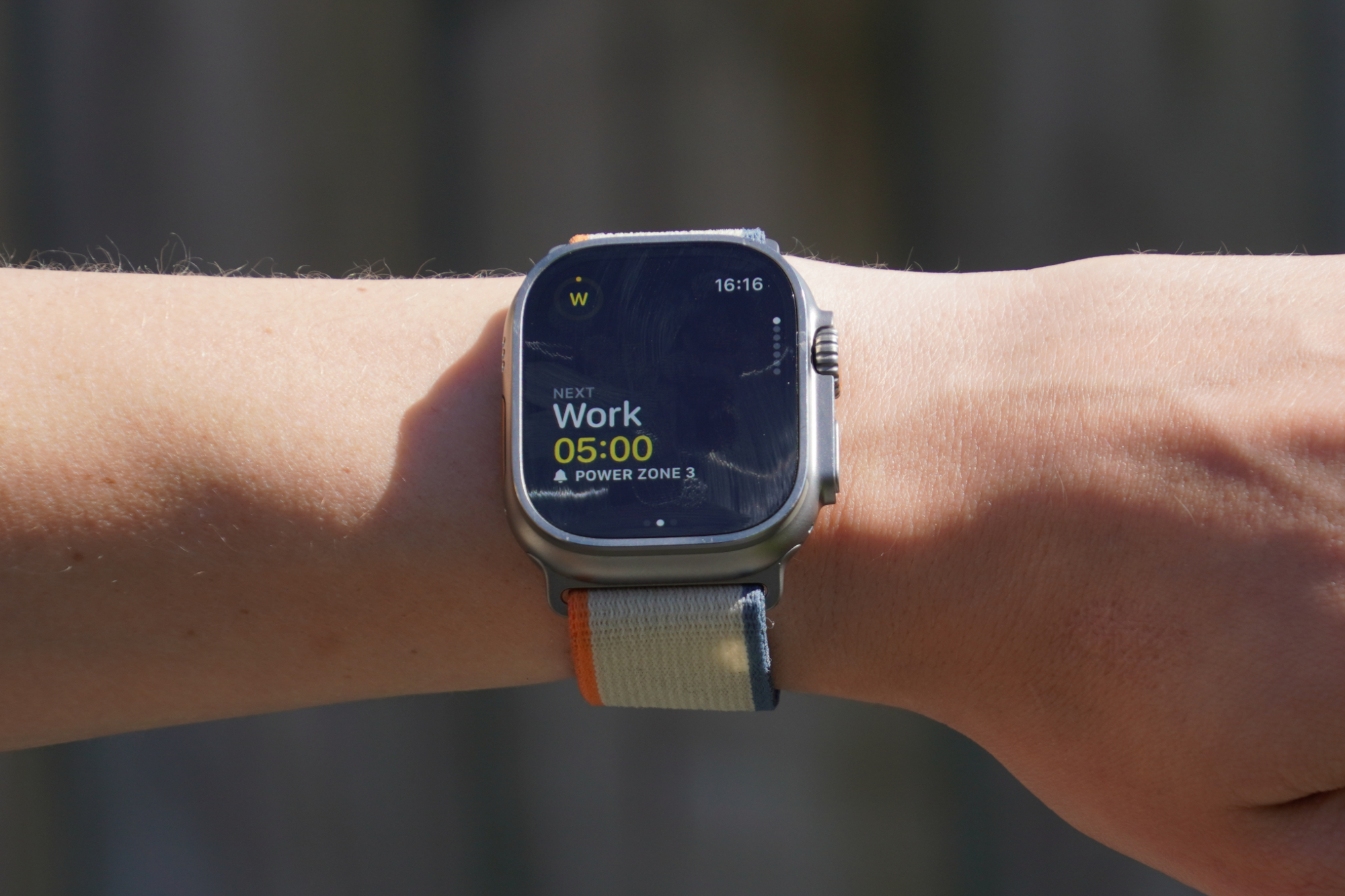
If you’re doing shorter intervals of up to 30 seconds, it's frustrating that the notification screen (which tells you what the interval is) hangs about for around eight seconds. In this view, you can’t see what your power output is and so you have no idea if you’re riding at the correct intensity. It’s possible to tap the screen to remove the notification, but it’s frustrating having to do this at the same time as ramping up your speed - as a shorter interval is usually one that has a higher power target!
Another complaint is that, after the initial notification screen pops up, there are no other reminders or data fields telling you what your target power (or heart rate, etc.) is for that interval - which is especially frustrating for longer intervals. Additionally, the first workout screen on the watch doesn’t provide all the data you’re likely to want, and there doesn’t seem to be a way of customizing this view.
Depending on the interval target and duration chosen, the screen will show total ride time, time or distance left of interval, interval, interval average speed, interval distance or time, heart rate or power reading. What it is missing is showing you how your current output compares to your target - which is key for successfully following a workout.
But now for the positives. In addition to an interval distance (or time remaining data field) on the first workout screen, in the top left corner of every data screen is a circular counter which visually indicates how long you’ve been doing the interval compared to how long you have left. This is quick and easy to see and understand.
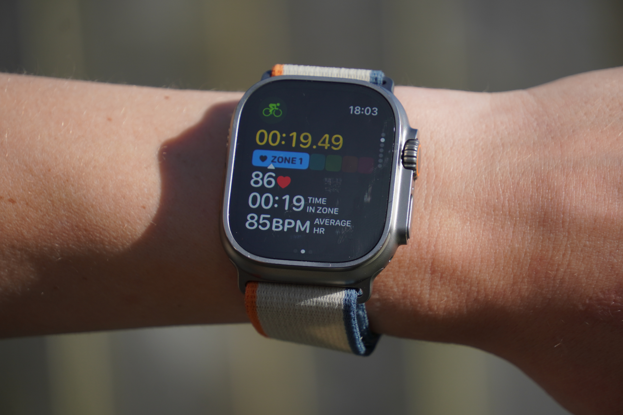
There are other specific data screens for heart rate and power. On each of these screens you can see a brightly coloured bar which changes color depending on what zone you’re riding in. This makes it quick and easy to see if you’re riding in the right zone.
iPhone mirroring
If you’re determined to only have one device, and you’re leaning towards the Apple Watch Ultra 2 because of its excellent everyday functionality (which I discuss later on), then it’s quite useful that you can somewhat ‘turn’ your iPhone into a cycling computer by mirroring the Ultra 2’s data screens and mounting it on your handlebars. The benefit of doing this is that you’ll be able to read your metrics on a larger scale, which is particularly useful if you are following a structured workout on the road and need to stay within your prescribed zones.
Once you’ve started the cycling workout on the watch, it automatically appears as a live activity on the iPhone lock screen. If you tap this your metrics are blown up to the full iPhone screen size.
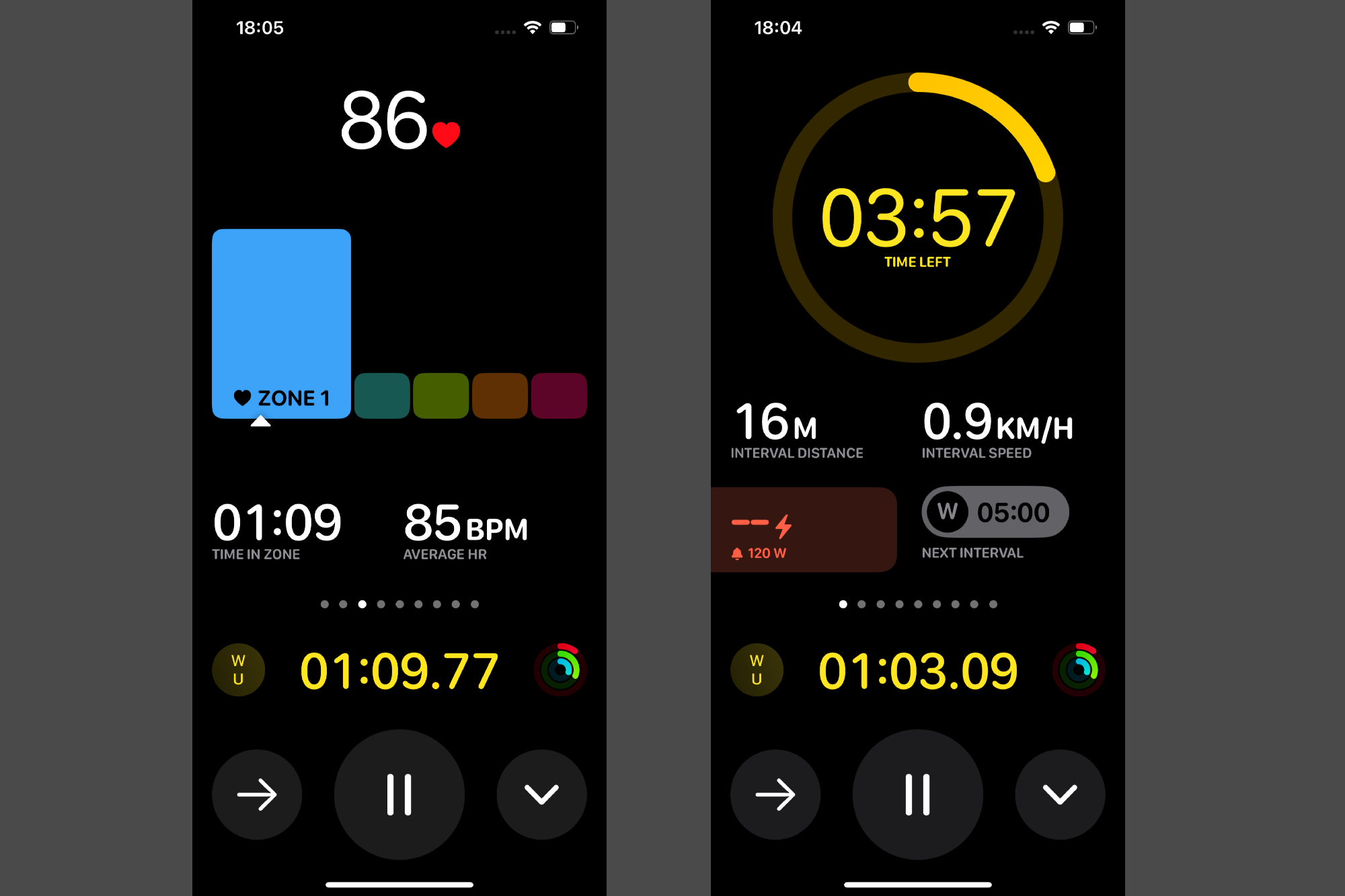
I would argue that Apple’s choice to use the term ‘Mirroring’ to describe this is somewhat of a misnomer. On the iPhone, the data fields are much richer than on the Ultra 2, which is a positive. The interval target box lights up green or red, depending on whether you're meeting the target or not, and you’re also given a heads up about your next interval.
Structured workouts on the Ultra 2 have been designed to work in conjunction with your phone, which is a much better way of following a workout, in my opinion. It’s a lot easier to glance at a screen in the middle of your bars while keeping an eye on the road, than it is to tilt your wrist to the right angle and look down to one side.
Third party cycling apps
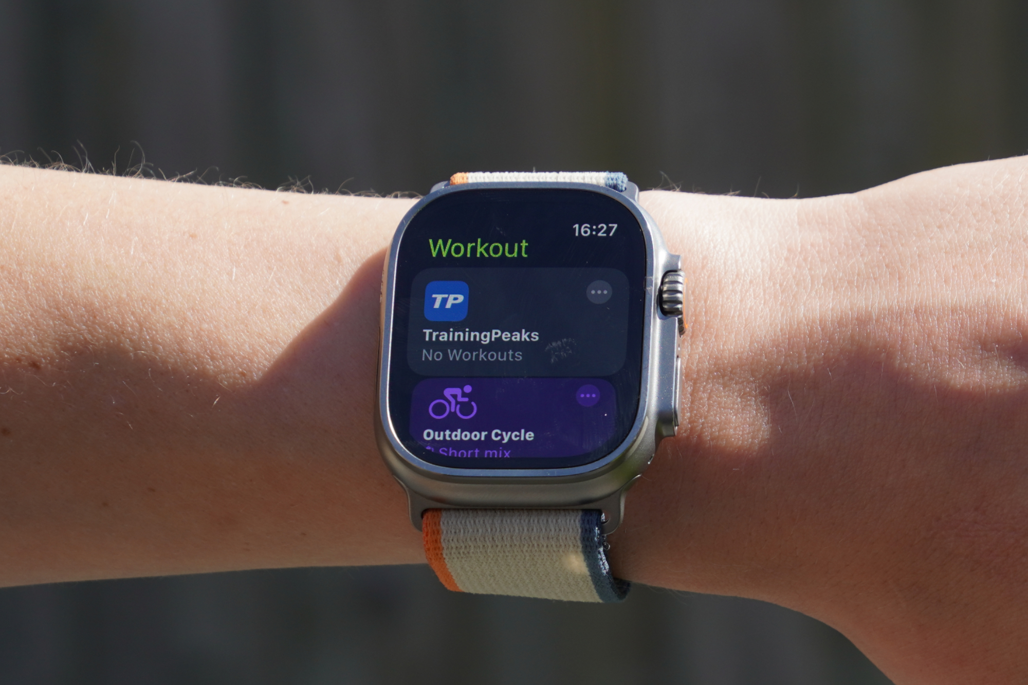
Apple doesn’t have any pre-made structured workouts to follow already on the Ultra 2, but it is possible to connect third party apps including TrainingPeaks, and either share workouts from the TrainingPeaks library, or push custom-made workouts made on TrainingPeaks to the Ultra 2. If the TrainingPeaks workouts are in the calendar view on the training platform, then you can also see what date you’re scheduled to complete the workout on the Ultra 2 when you’re selecting your workout. It’s handy being able to easily find the session you had planned.
Completed workouts can also be pushed to third party fitness-monitoring apps, including Strava as well as TrainingPeaks. As an aside, it is possible to download the Strava app to the smartwatch, but this only allows you to record activities - Strava’s routes and mapping are currently not supported on the Ultra 2.
Music
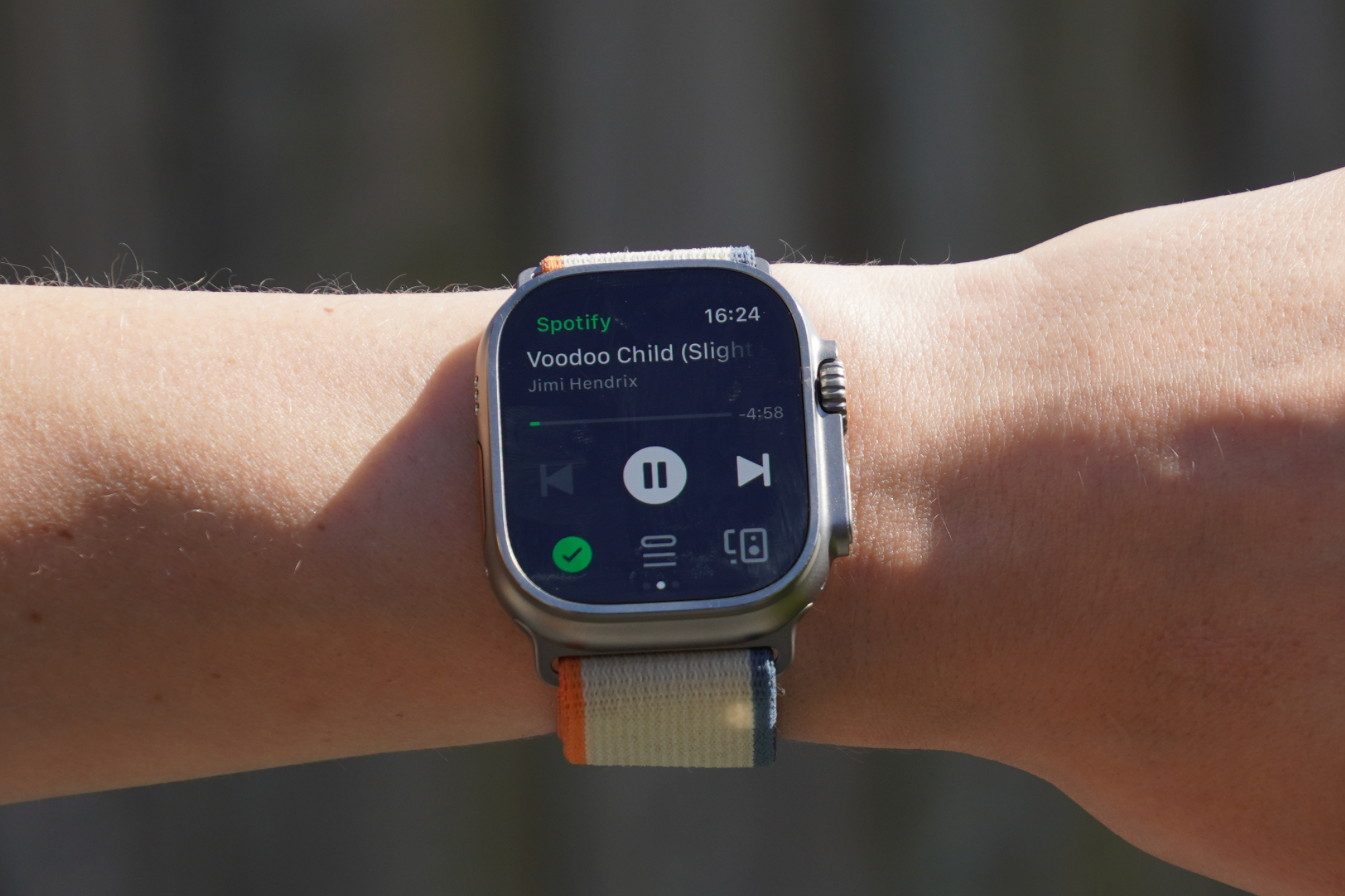
Listening to music while I’m cycling or running is something that I like to do, and it’s useful that the Ultra 2 supports apps including Spotify. It took me a little while to understand how to listen to music on the Spotify app (with my free account) through my bone conduction headphones and be able to control the music from the watch - it wasn’t the most intuitive to set up.
I first paired my Bluetooth headphones with the watch. However, I couldn’t see the option for my headphones on the app’s ‘play on a device’ watch screen. I could only see my iPhone. I then realized you have to connect your headphones to your iPhone instead, then on the Spotify app on your phone you can select to play the music through your connected headphones. Turning back to the watch, if you keep your iPhone as the device you’re playing the music from, then it’ll come through your Bluetooth headphones and you can control the music from your wrist.
Spotify says that, with a paid-for account, you can listen directly from your watch online and offline. I don’t have a Premium subscription of Spotify myself and so I wasn’t able to test this, but it is something l have to consider doing when I next go up to mid-Wales riding the Trans-Cambrian Way or other routes in that region, as mobile data signal was very sparse!
Day to day functionality and staying connected
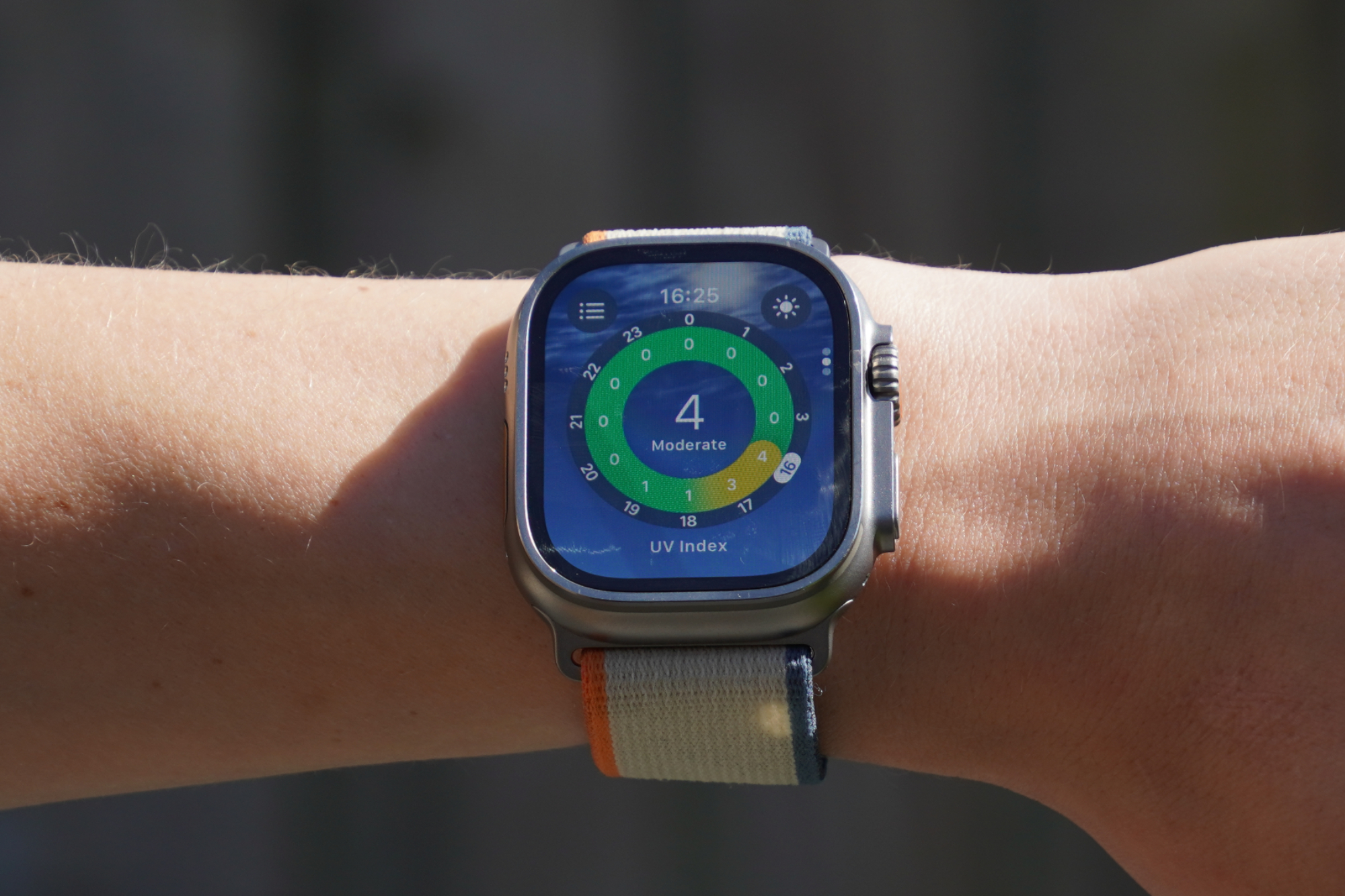
There are an incredible number of other apps on the Ultra 2 that make everyday life easier.
For example, the Camera Remote app on the Ultra 2 is useful for taking a photo or video using the iPhone’s camera from a distance. It has a three-second delay before the shot is taken, and you can also view the photo on the watch - it’s small but you can see if anyone’s blinked for example, which is pretty handy!
Naturally, alerts about upcoming events in your calendar appear on the watch, as well as messages and emails. Making purchases using Apple Pay on the Ultra 2 is also very convenient. All you have to do is simply double click the bottom left button and hover your wrist after the contactless card reader. It’ll beep to let you know that the payment is successful.
I have also found that Apple has adapted its iPhone apps nicely to the smaller smartwatch screen size, too: they’re detailed without being overcrowded. For example, the weather app gives you the temperature breakdown for each hour as well as the current temperature, and the high and low for the day on the one screen. Tap the screen and you’ll then see the precipitation breakdown by hour, and tap again, you’ll now see the wind speed - lots of really handy information in an accessible format.
One aspect which makes some of these apps even better is that they can also be controlled by Apple’s ‘double tap’ technology, which I will come onto now…
Double tap
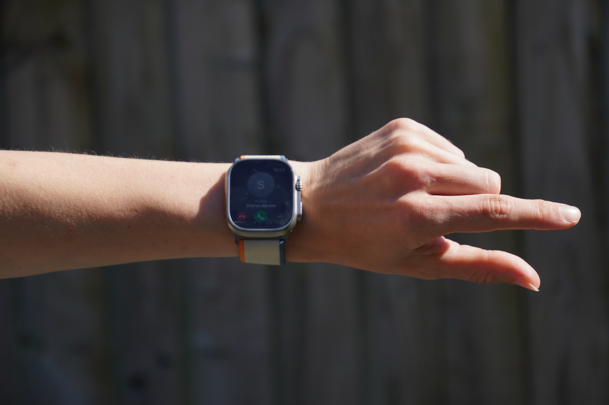
In addition to the three side buttons and the touchscreen, Apple has added another way to perform certain actions on the watch when you don’t have your other hand free - which I have found useful while cycling.
For example, if someone sends you a WhatsApp message while you are on a bike ride, you can tap your index finger and thumb together twice to select ‘reply’. Apple has the microphone running automatically and so you can speak directly into the watch to dictate the message, which will be sent in a text format (rather than a voice message). You can check how Apple has transcribed your voice recording on your watch screen so you can see that it is all correct before ‘double tapping’ your fingers again to send off the text message sent.
It’s easy to bring your wrist close to your face and speak into the watch. I found that the microphone does a good job at picking up your voice and understanding what you are saying while riding.There is only one word which has been incorrectly transcribed for me so far and that’s “albeit” - very impressive. If your message isn’t quite right, though, you can stop by the side of the road, delete the incorrect characters and switch to the keyboard to finish your message off.
You can use the double tap functionality for other day-to-day tasks, too. For answering or ending an incoming phone calls. For pausing and resuming a timer, as well as stopping it when it goes off. The same goes for alarms, but it’ll only snooze these. Taking a photo in the Camera Remote app - and many more besides, but these are the ones I’ve found myself using time and again.
Safety features
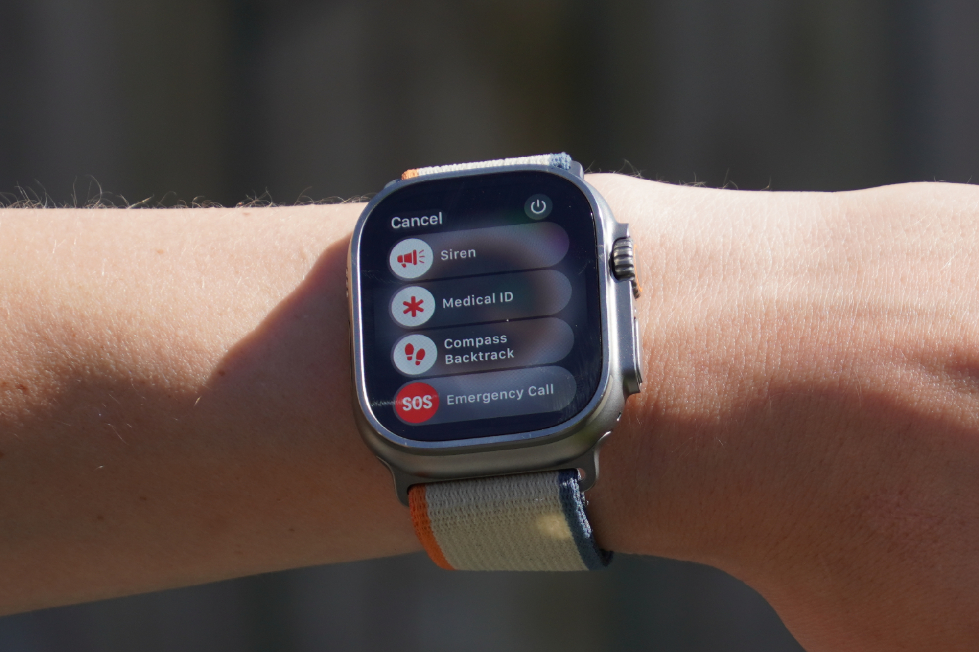
Apple has built in some safety features which are useful if you’re riding outside by yourself or in remote locations. I’ve not needed to use any (thankfully!), but here’s how it works and how to set it up.
Firstly, you can fill out your Medical ID, which allows you to add personal information about any medical conditions you have - allergies, blood type and more. This can be viewed on Ultra 2 by holding down the left button and then swiping right on the Medical ID. If the worst does happen, hopefully you’ll be able to at least hold down that button so that the person who’s found you will be able to access your details - or if they have an Apple watch themselves, they’ll know how to access it.
Apples says that the watch can detect if “you take a hard fall and don’t seem to move”, and it’ll call 999, share your location and notify your emergency contacts.
From the screen that’s accessed by holding down the left hand button, you can also turn on the 86-decibel siren which plays a continuous high-pitch sound that can be heard up to 180 meters away (according to Apple). And you’ll also be able to call emergency services yourself.
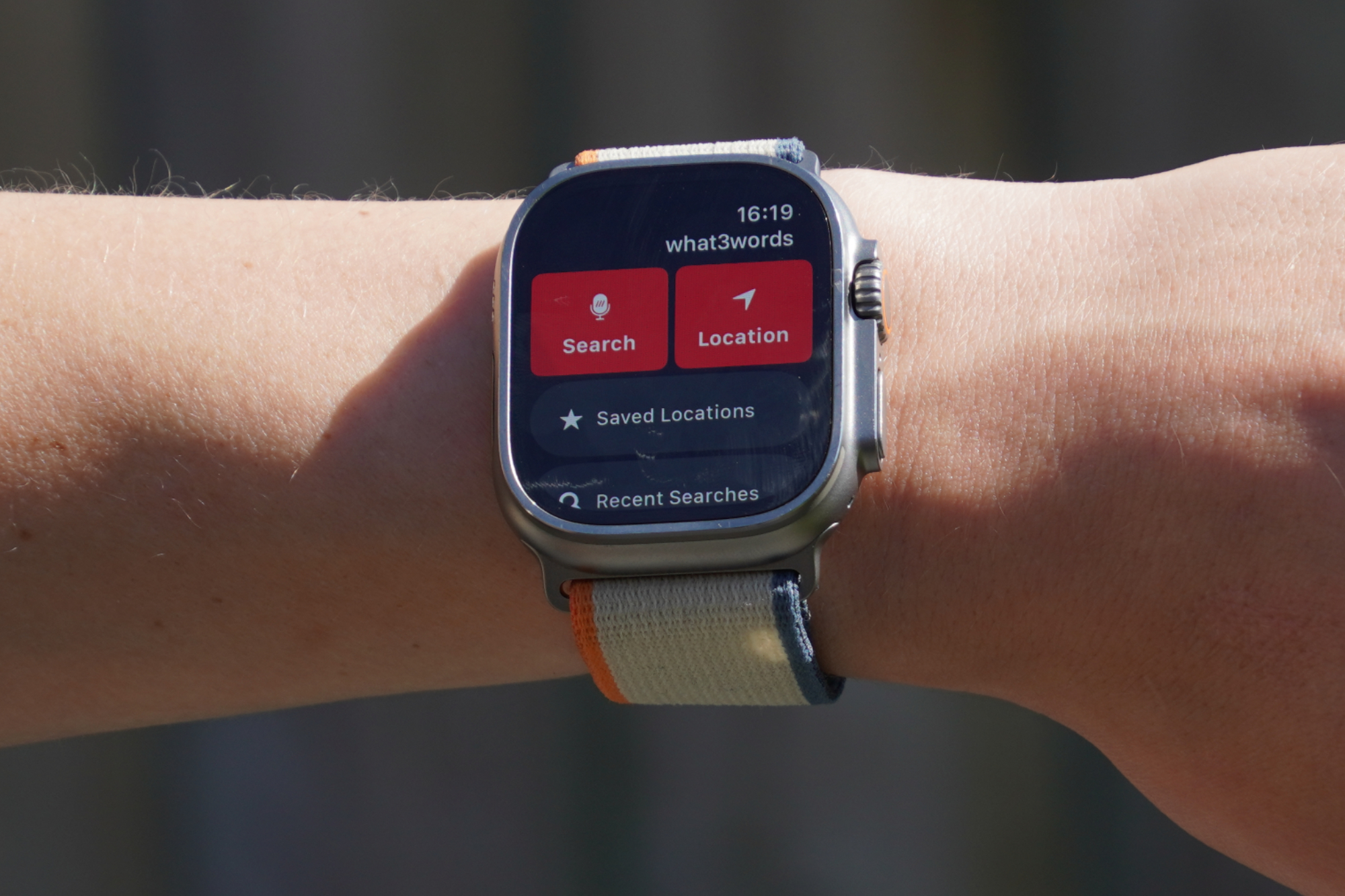
what3words can also be installed on the Ultra 2, which is useful for being able to accurately give your location details to emergency services, or to friends for arranging where to regroup on a bike ride or trail run.
There’s also the Find People app which allows you to share your location to friends or family, via their phone number or email address. You can choose to share this for one hour, until the end of the day, or indefinitely.
Mapping
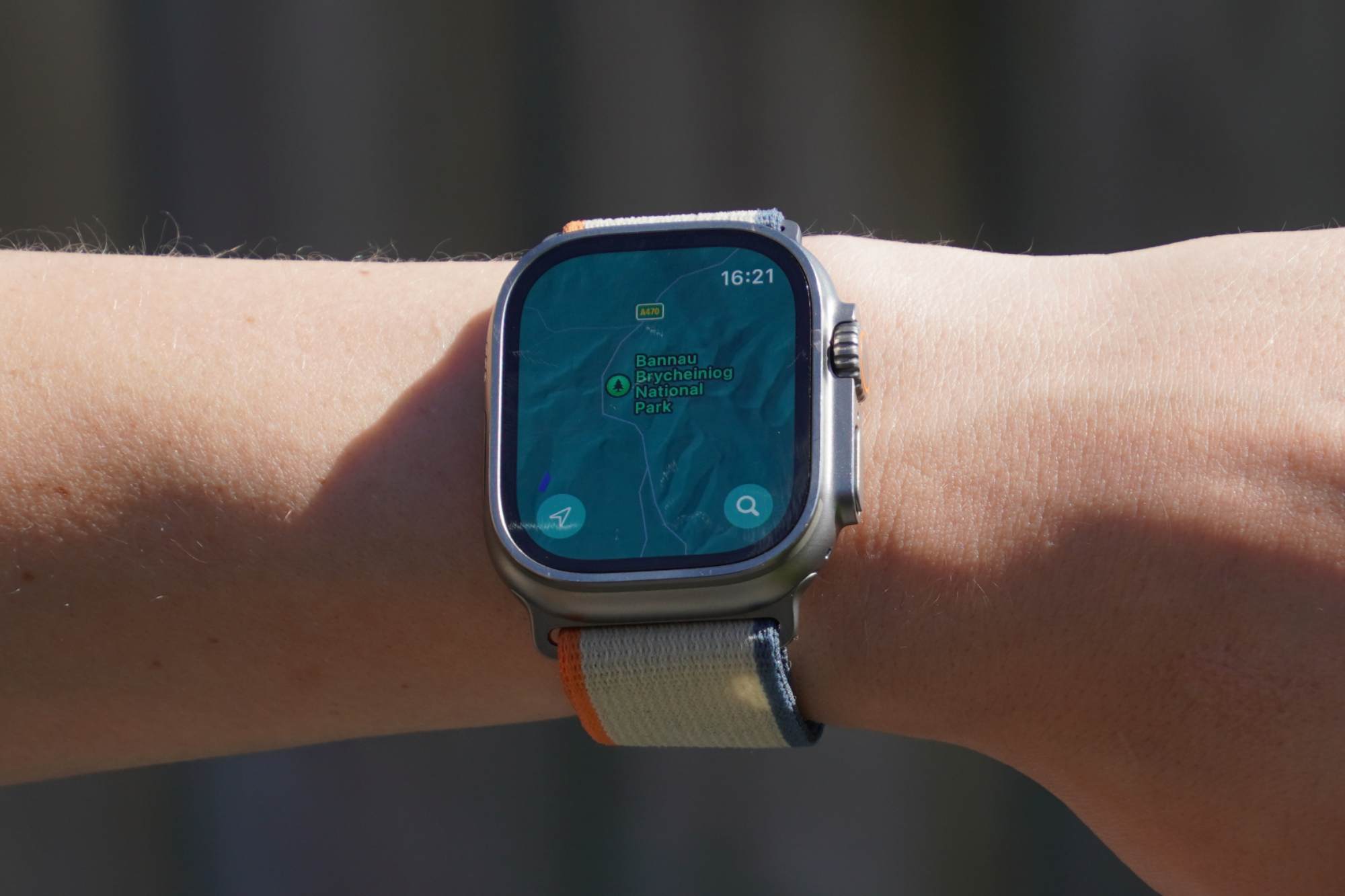
The Ultra 2 doesn’t have built-in maps, but you can download offline maps to your iPhone, which the watch can then access.
If you know exactly where your destination is, you can pan the map and long hold on the spot where you’d like to drop a pin. Helpfully, the side dial allows you to quickly zoom in and out of the map, so it's easy to pan and pick a destination that’s far away - while also allowing you to be accurate when it comes to zooming in on the specific place you want to go.
Finding nearby places of interest is another useful feature. Apple gives you the option to select petrol, diner, fast food, cornershop, supermarket, hotel or other categories. When viewing cafes or restaurants you can see the Tripadvisor rating and other details, such as the opening hours are also displayed.
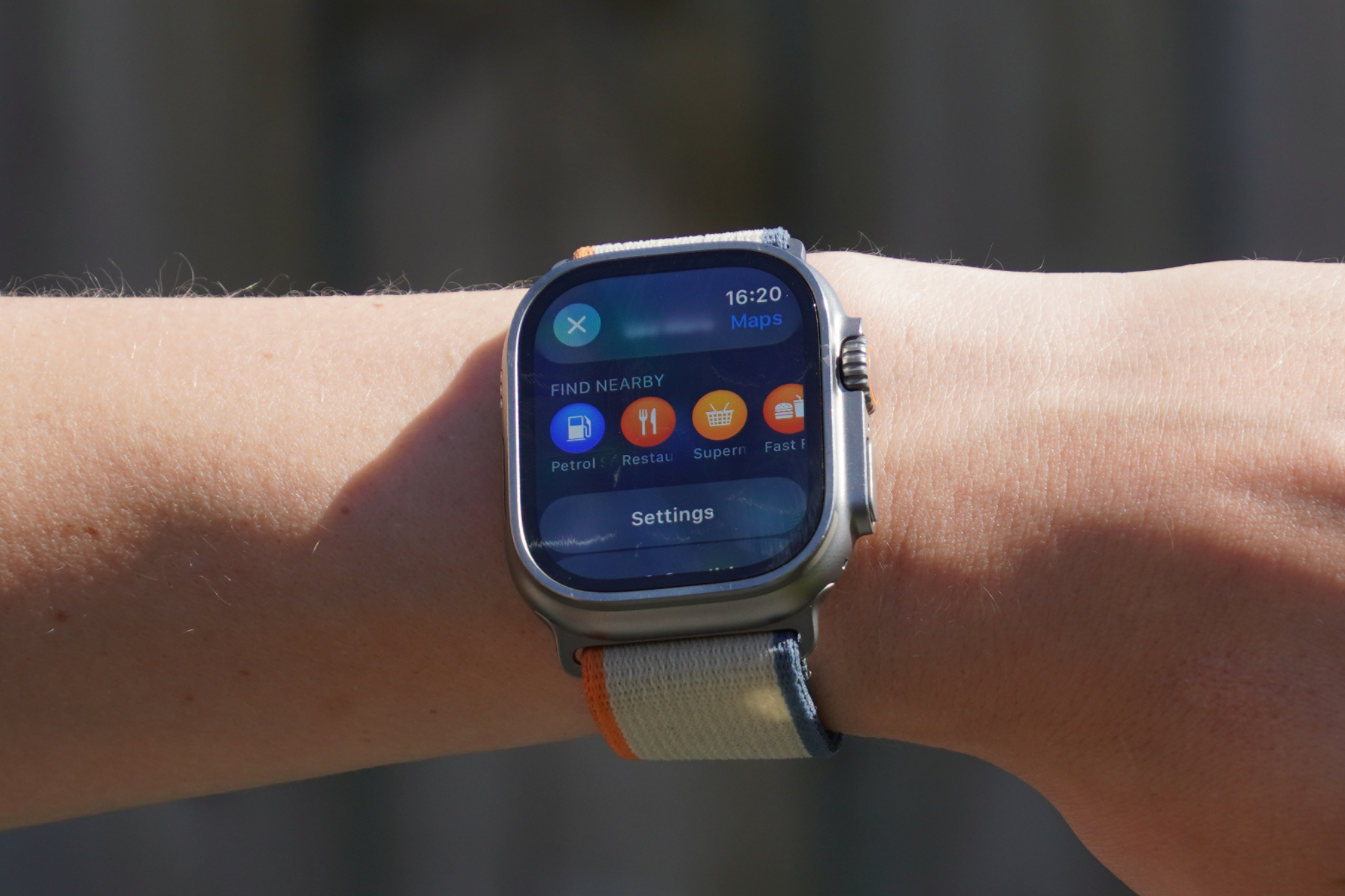
Once you’ve decided on your destination you have the option to choose between driving, walking, public transport or cycling directions. For each mode of transport you’re given the estimated duration for the journey. If you select the bicycle emoji, you can also toggle on and off avoid ‘hills’ and avoid ‘busy roads’. However, while I can select the bicycle emoji, in practice it doesn’t actually give me the option for cycling directions. For context, I live in the greater Cardiff area - this might be different where you live.
All in all, it’s useful for impromptu directions to places of interest via walking and car (and perhaps bikes?), but it’s not great for following a set GPX route or course.
Value and conclusion
At £799, this is a pricey piece of kit, up there with the top end Garmin Watches. Although all these smart watches have so many features and nuances, I think there are three key decision factors which will point you in the right direction.
First: how important is battery life to you? Although the Ultra has the best of all Apple’s watches, it needs to be charged every other day - whereas other smartwatches can last a week or more. I don’t mind incorporating this into my routine, and I’m not doing such remote and intense multi-day ultras that I’m bumping up against the hard limit in the activities I have planned.
Second: how important is mapping to you? In the context of riding, I’m not a huge fan of smartwatch navigation, so the limitations in this department of the Ultra 2 aren’t a massive issue for me. I do appreciate maps on my wrist for hiking and running - if I did a little more of these, then this would get closer to being a deal breaker.
Third: how important is the Apple ecosystem to you? I think this is the main point. Unless you have really specific and unwavering demands regarding the battery life or maps, the seamless integration with the iPhone and excellent user interface is something that all other smartwatches just can’t compete with. And Apple’s backed this up with the hardware - the GPS is highly accurate, the watch can connect with power meters and heart rate monitors, it’s waterproof to depths you’re unlikely to fathom. In almost all instances, it goes toe-to-toe in terms of functionality - and then there’s Apple’s unique selling points on top.
I would caveat all this with the point that it’s possible to get a non-Apple smartphone and smartwatch with topographic base maps for less than the price of the Ultra 2 alone.
But if you’ve already got an iPhone and you’re wondering what to put on your wrist, in the vast majority of cases I would recommend the Ultra 2.


