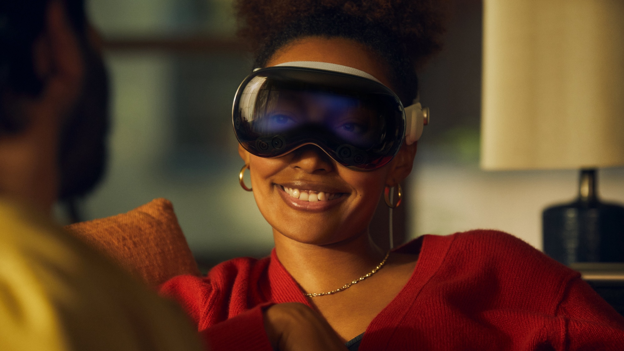
The Apple Vision Pro is just around the corner, and we got our next batch of hands-on impressions from across the industry. So, the question is obvious: What did they love and hate about the $3,500 headset?
While the general sentiment is positive towards the capabilities and experience while using the Vision Pro, there are some hiccups that you probably predicted from the get-go — they virtual keyboard is cumbersome, the Eyesight display is a little weird, and that extra weight can make it uncomfortable.
But instead of banging on about it, let’s get into what we learnt from this new batch of impressions.
The ups
1. Immersive video is…well…immersive
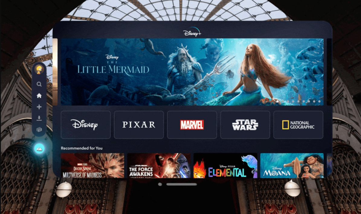
For the Vision Pro’s launch, Apple is going hard on the unique experiences unlocked with the headset — one big one is the immersive video. We’ve already reported on what Disney+ is bringing to the table in terms of spatial experiences and 3D movies, and we got confirmation that these are, indeed, awesome.
First, the spatial videos and panoramic videos look “convincing” according to Victoria Song at The Verge, but there were some VR queasiness issues when it came to bumpy, fast moving video.
And second, the Disney+ app (currently in beta) is mightily impressive. Dana Wollman at Engadget described it as being “like playing a video game,” where you select your immersive outdoor environment in which to view your movie of choice. Cherlynn Low even got to live out her Marvel fangirl fantasy by seeking easter eggs around the Avengers Tower environment.
2. It’s a big step forward from Meta Quest 3
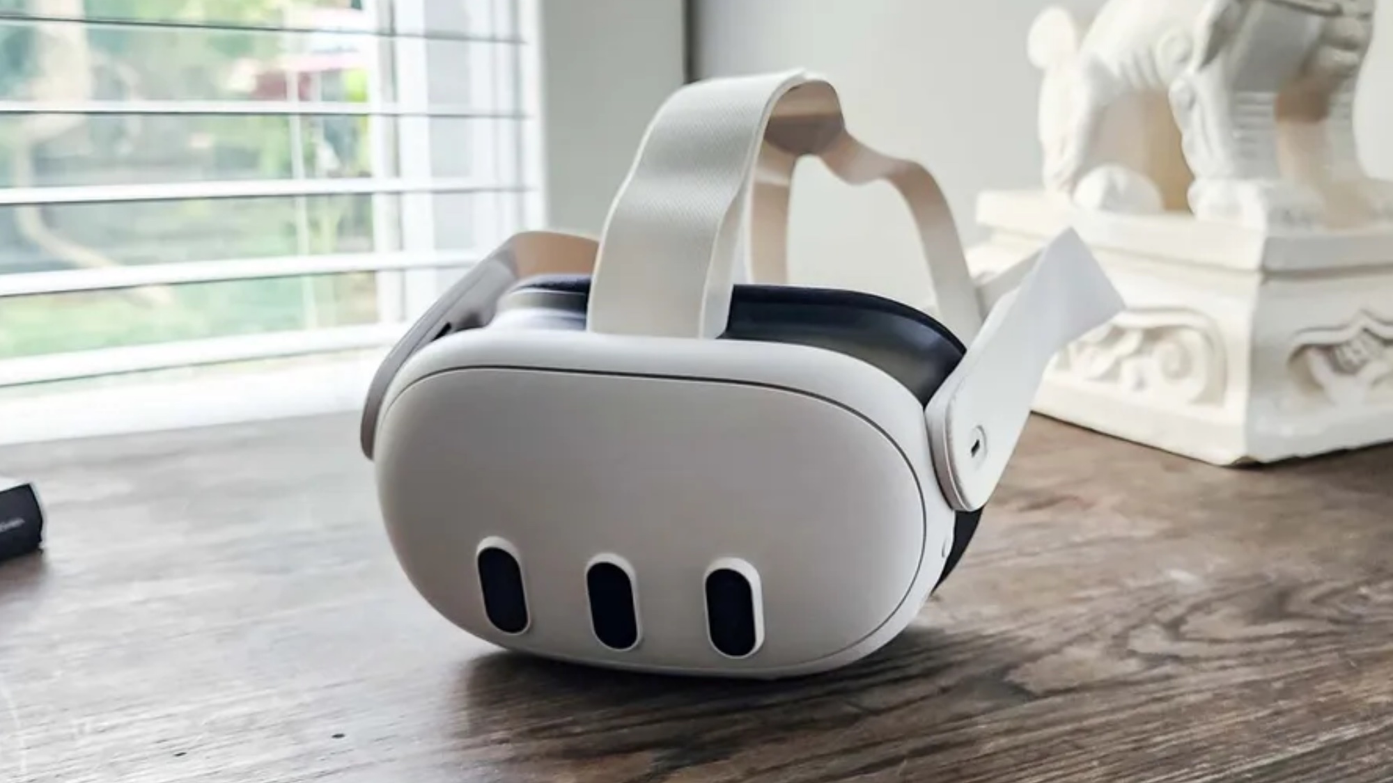
A key concern on the lips of many potential headset buyers has been how much better the Vision Pro is when compared to the likes of Meta Quest 3, and whether it’s worth that huge level of additional investment.
While that second question is impossible to answer right now until we fully review the device for ourselves, all signs point to a huge improvement in both the tracking and general experience. “I don't know what frame rate they are grabbing video at, but it feels real,” Geoff Keighley commented on X.
On top of that, Engadget’s Low called it “far and away the best, and easily the most thought-out” MR headset experience. Make no mistake about it, that premium price is getting you leveled-up hardware and software.
3. Tracking makes gaming feel great
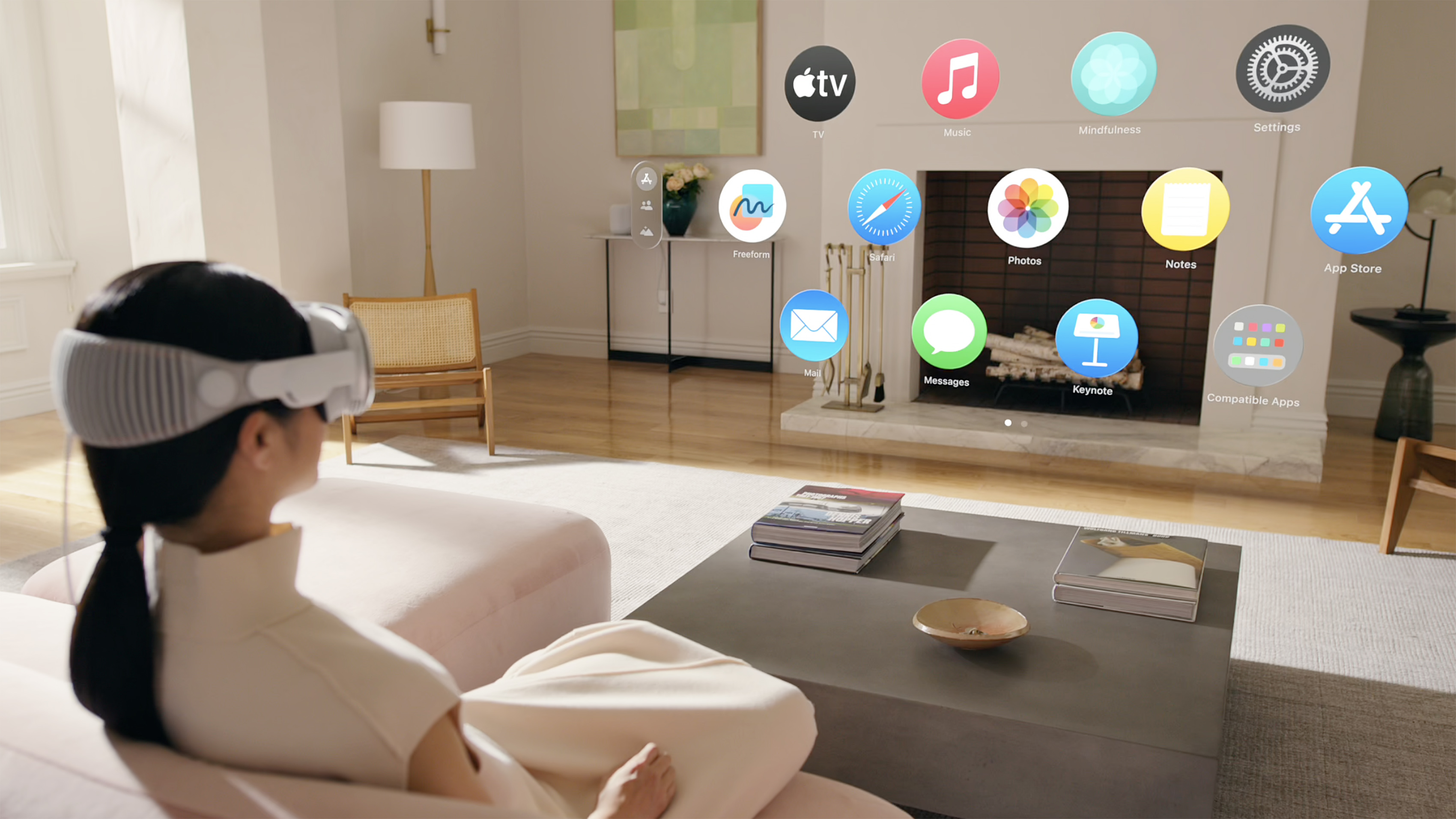
Low called the eye- and hand-tracking systems “impressively accurate,” which is probably a given with the 12 cameras and five sensors on here. But the end result when paired with software is a slick UI that means you just look at what you want to select and pinching it (or double pinching for additional options).
But its applications in gaming are what seem to be most exciting to me. Keighley himself talks highly about how enjoyable something as small as Fruit Ninja is — carving through all the apples with your hands like the true sensei you are. Imagine what happens when this is applied to more complex titles.
The downs
1. It can get uncomfortable
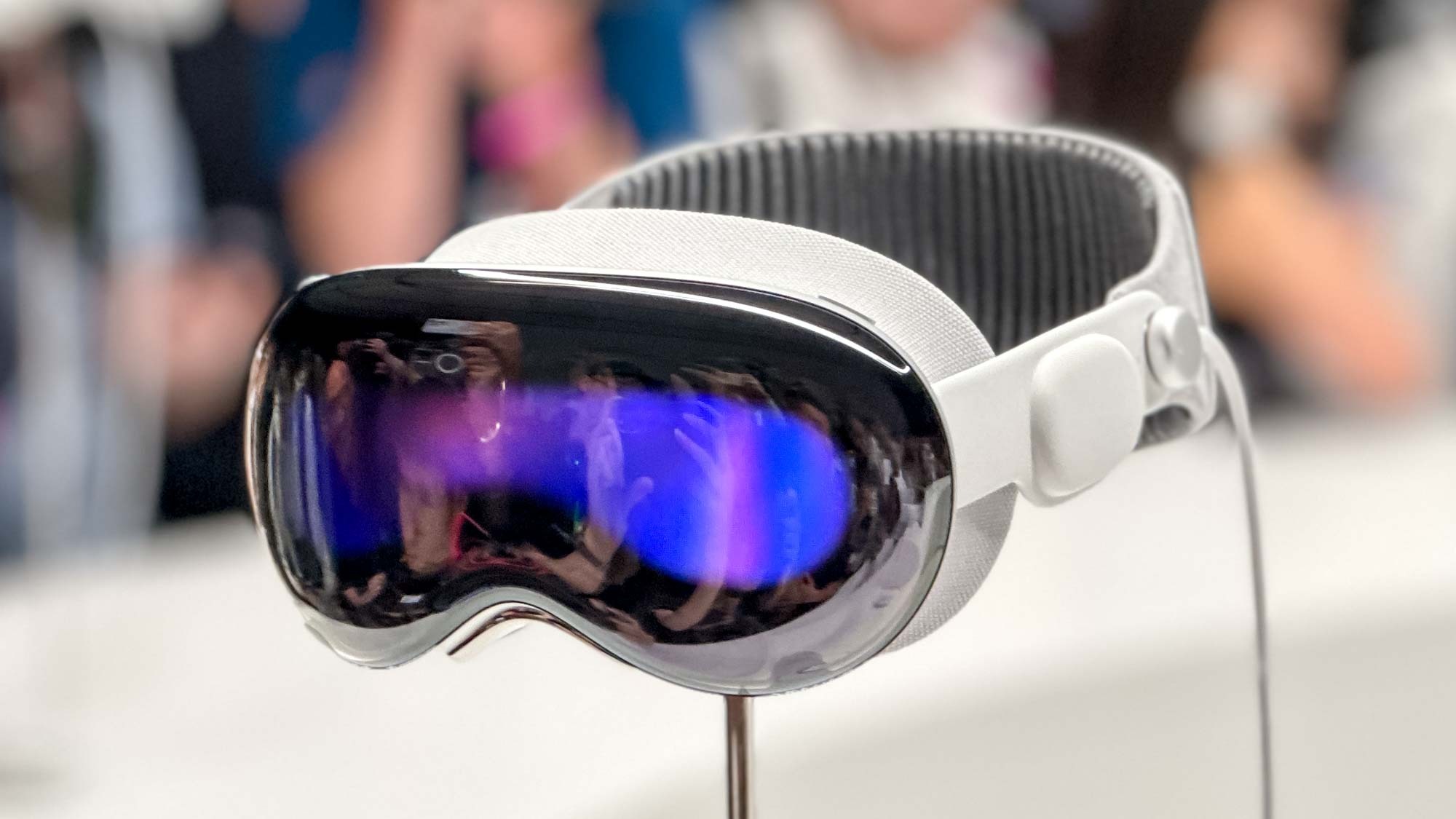
This was my main worry about the headset, and it looks like it could be somewhat proven right. The premium combination of metal and glass to construct this device makes it look supremely luxurious, but in use, it makes for a weighty, uncomfortable experience.
Low was “weighed down by the device” after 15 minutes — this echoed the thoughts of a lot of other first impressions — and it was followed by being in pain five minutes after that.
That optional Dual Loop head strap that adds an additional strip of fabric over the top of her head distributed the weight and minimized this impact. While this additional accessory does look a little more clunky than the single chunk of fabric around the back of the head, it seems like a requirement for long-term use.
2. Virtual keyboard is a dud

Earlier this week, Bloomberg’s Mark Gurman called the Vision Pro’s virtual keyboard a “complete write-off” in VisionOS 1.0, and this seemingly cumbersome experience became more apparent in various hands-on write-ups.
“The floating keyboard here clearly needs improvement,” Wollman said. Song expressed that the keyboard does work, “but clunkily.” The magical in-air typing is a ways off, based on the opinions of those who tried it.
Luckily, Apple has thought of this with a couple of workarounds. As Low says, using your eyes to look at the keys and tap your fingers together is optimal for short phrases, or if you’re writing something longer, you can turn to dictation or pair a Bluetooth keyboard.
But in its current form, this Minority Report-esque future of typing on a virtual QWERTY in thin air could do with some work.
3. EyeSight is “a bit goofy”
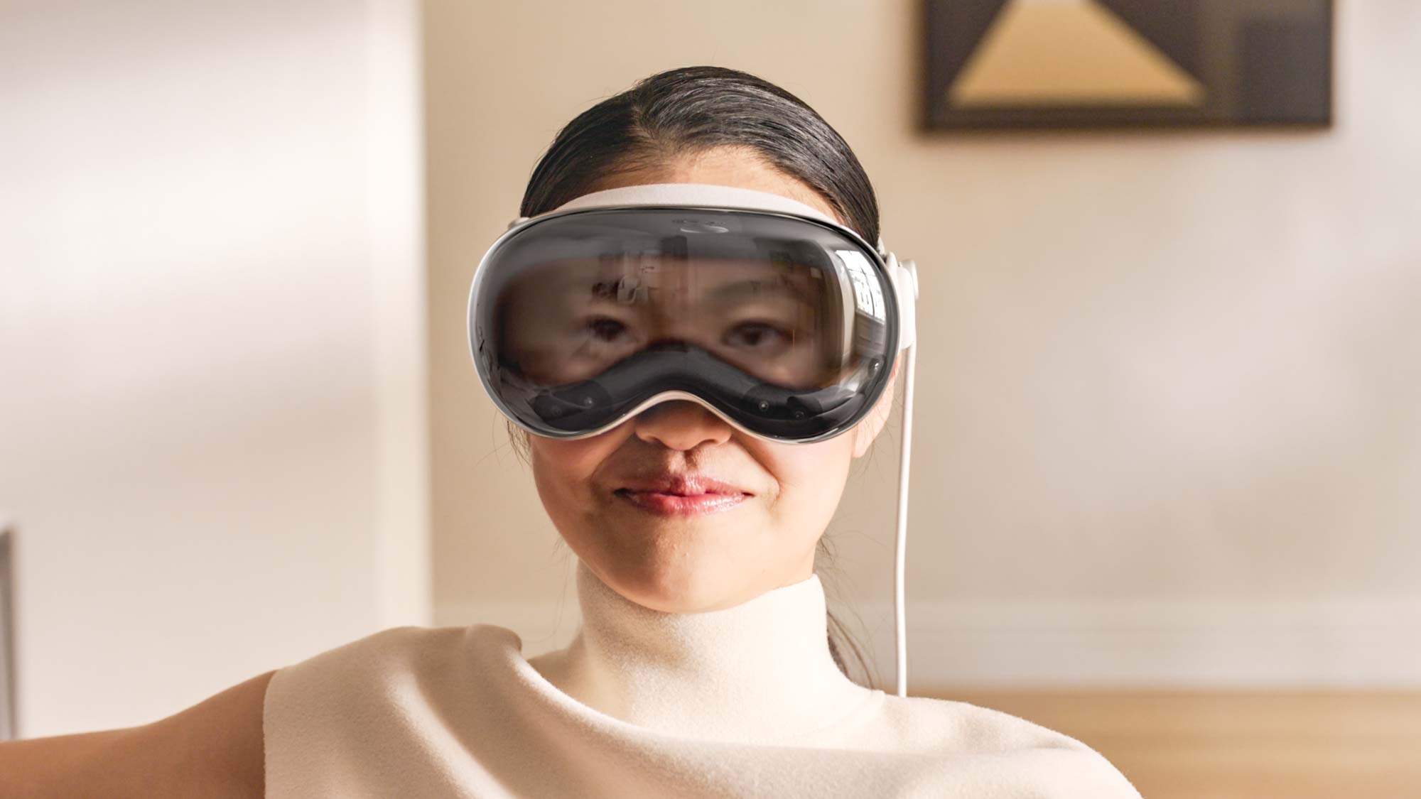
I’ll be honest — the first time I saw eyes appear on the outward-facing display, I was a little freaked out. However, it’s progressively looking like this isn’t just a “me” problem anymore, as Song from The Verge spoke about her time using it.
The application of it can be useful, by giving an indication of whether the user is busy in an app with a slight bluish hue over the eyes, or a full opaque color if you’re fully immersed in the headset. But that doesn’t get away from the fact that it’s going to take some getting used to.
“It’s strange to wear the headset and not actually know what’s happening on that front display — to not really have a sense of your appearance,” Song commented.


