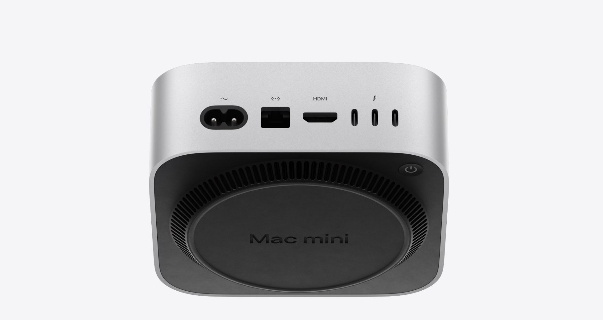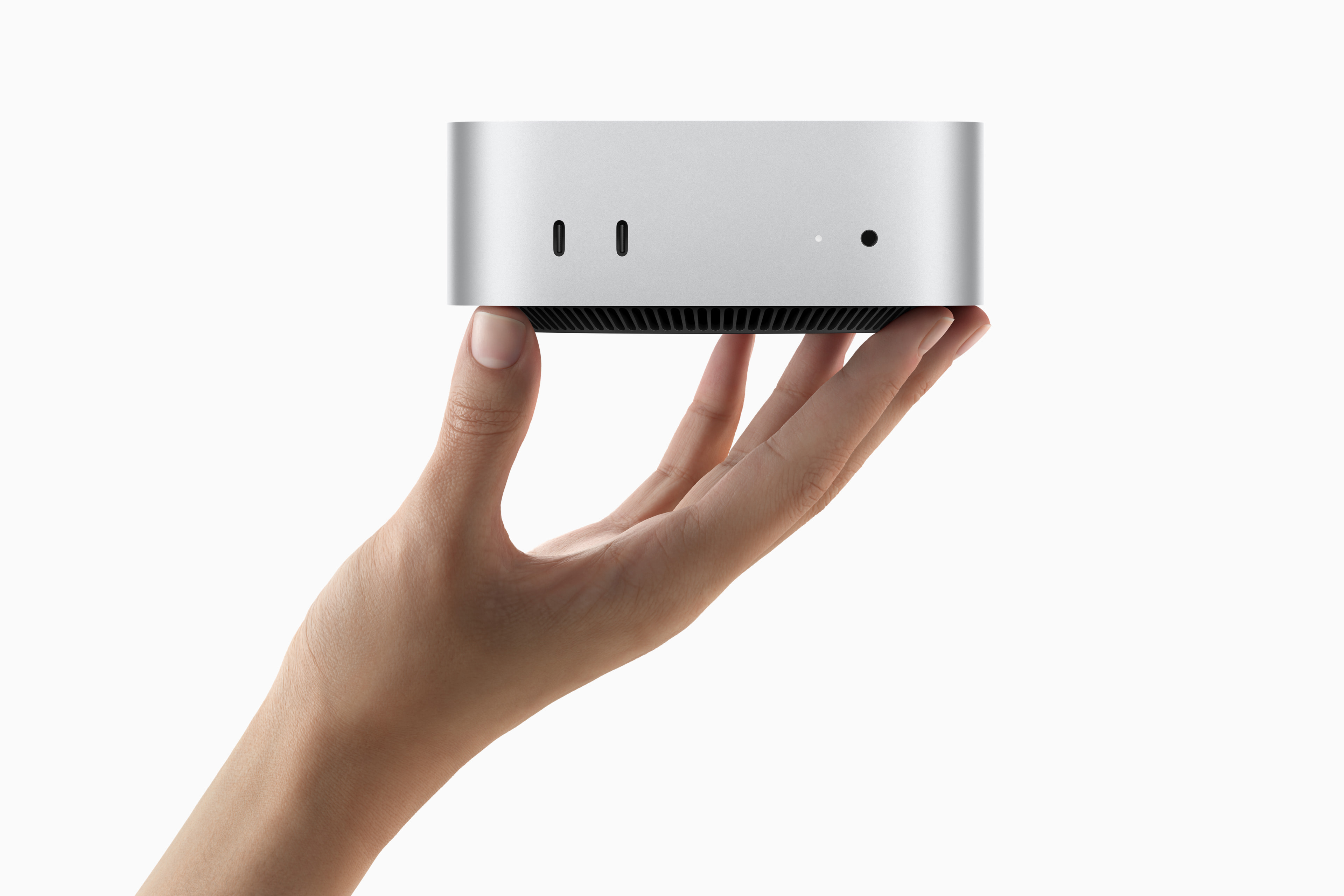
Let me get this out of the way: the new Mac mini looks great.
Not only did Apple manage to shrink down its newest mini iteration to a case that's just 5 x 5 inches, but it also vastly boosted its performance thanks to its M4 chip. The result is a tiny, portable desktop that should be a beast for creative apps and general AI. It's everything you want in a next-gen device — smaller, more powerful, and very competitively priced at $599.
With all of that out of the way, I'd like to say one other thing: Apple's new Mac mini, which debuted on Tuesday, is incredibly triggering.
Where the Magic happens
Before I tell you why the M4 Mac mini is triggering people, I need to tell you about a different device: the Magic Mouse.
Apple's Magic Mouse is generally unoffensive: It has a sleek Apple design, it's ergonomic, and responsive, and works well with compatible Apple products. I say "generally" here because the Magic Mouse comes with one thing that drives people absolutely nuts — I'm talking about the charging port.
For the uninitiated, Apple's Magic Mouse (controversially) features a charging port on the bottom of the mouse. The reason why that design choice is controversial is because — in order to top up the mouse's battery — you have to flip it over, rendering it unusable for the duration of charging.
Good News: Magic Mouse FINALLY has USB CBad News: STILL charges like this pic.twitter.com/eqoQEIN5ltOctober 28, 2024
Whether that design choice is actually a huge issue is arguable — you don't have to charge your mouse often enough for it to be a dealbreaker — but the fact that the port exists where it does is still enough for people to lose their minds over.
To make matters worse, Apple recently updated its Magic Mouse, and I'll give you one guess what it did with its controversially situated charging port. If you guessed "kept it right where it was," congratulations — you're paying attention.
So, what in the world does any of this have to do with Apple's (by all means enticing) new Mac mini?
Not again...
If you're triggered by the Magic Mouse, I have some bad news; the Mac mini borrows elements of its most controversial design choice.
While not quite as inconvenient as the Magic Mouse's bottom-oriented charging port, this year's Mac mini slapped its power button on (drum roll) the bottom. As you might've already imagined, people are, um... not pleased.
You’ve got to be kidding me. The power button is ON THE BOTTOM of the new M4 Mac Mini. So in order to power the computer on, you have to lift it or tip it forward. That is the dumbest design EVER. Who approved that? pic.twitter.com/wRWhUNc65sOctober 29, 2024
On one hand, I get it. Putting the power button on the bottom might be inconvenient — if you need to use the hard power-off option it is clunky to pick up the entire machine, especially if you have cables hooked in and if your Mac is running hot.
On the other hand (and I can feel the angry replies on X just typing this) does it really matter that much? How often are you realistically going to use the power button in the first place? Is it really that much of a nuisance to pick up the very small machine if you do need it?
(Sidenote: the M4 Mac mini doesn't sit completely flat, meaning there's room for your finger to dive underneath and press the button)
Also, if I'm being honest, putting the power button on the bottom genuinely makes the Mac mini look sleek and minimal from the top — that's to say, it fits Apple's design language and probably appeals to the people who usually enjoy Apple products.

As to why it's not on the side or the back, I don't have the answer to that. Presumably — between thermals and ports — there was no room to fit it in. Again, I don't have definitive evidence proving that's why the power button is on the bottom, but I wouldn't be surprised if there is an engineering reason.
Even with a reason, it appears anyone prone to being triggered by a bottom-mounted power button is already decidedly peeved, and the outrage faucet is on.
Maybe there are more people who love using their physical power button to turn their machine off and on — and to those people I give my sincere condolences. But to everyone else, I've got just one thing to say.


