Google loves a logo redesign, and now it's the turn of Android. But in something of a surprise move, the mobile operating system's new look turns its back on two major trends in logo design – and even on Google's own recent approach.
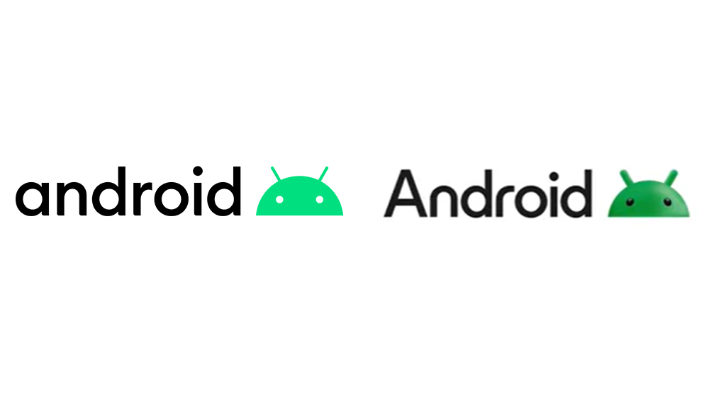
Firstly, Android's getting a pointy uppercase A. And even more surprisingly, it's going against the flat design trend, making the robot head 3D (see our guide to how to design a logo for tips for your own work).
Google's continuing with its controversial logo redesigns for its app icons, which now all look the same thanks to the application of the Google colours. But the new Android logo is a very different story. So far it's only appeared in the brand's adverts on YouTube and in presentations, but we assume the new design will be rolling out on boot screens with the launch of Android 14 in a couple of months.
On the one hand, it's got a pointy uppercase A, eschewing Google's penchant for rounded design. But at the same time, the ‘n’ and ‘r’ are now rounded again like they were from 2014 to 2019). And while the app icons have been following the flat design trend, the Android robot is going 3D.
The move would seem to signal more than just a newfound respect for grammar. Rather, it seems to say something about how Google wants the mobile operating system to be seen. Lowercase letters are often used to try to make a brand feel approachable and friendly. Uppercase feels more conservative, but also more authoritative and enduring. Android seems to want the best of both worlds, with super-rounded letters led by an enormous pointy A towering way above them. It shouldn't work, but it does, presenting a mature but modern and expressive brand.
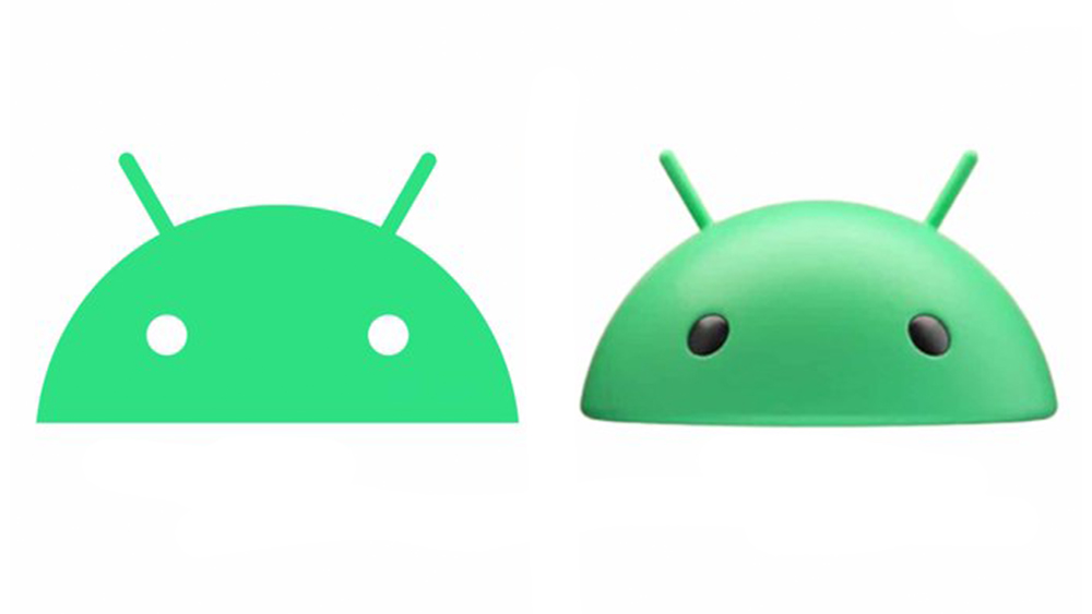
Alongside Android with an 'A', the robot head mark is also getting updated with a new 3D design (hallelujah!). Other than standing out from the mass of flat designs out there, there may be a couple of reasons for the change.
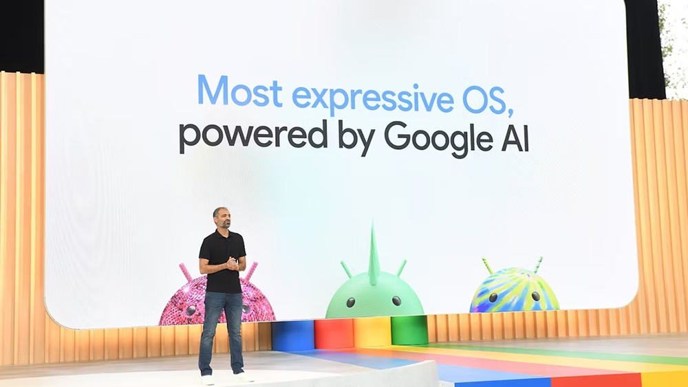
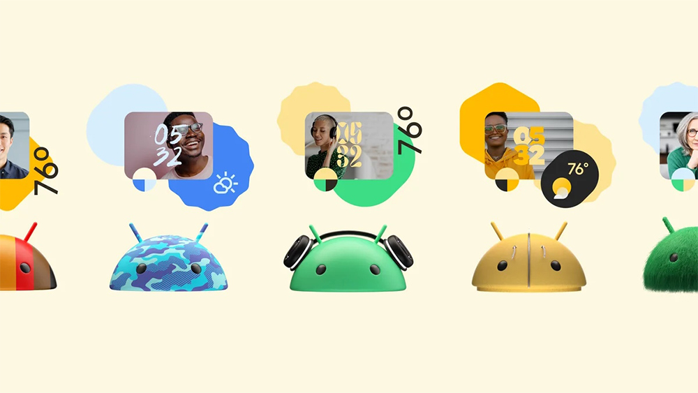
The 3D design could allow the robot to take on different personalities for different applications. We already saw something of this at Google I/O 2023, when Google billed Android as the world's "most expressive OS" by dressing up robot in a range of designs, from tyres to a disco ball. At the time, we thought those were a one-off, but the new logo could allow them to become a regular resource, allowing Google to regularly change the robot to communicate different Android tools or features.
Another possible rationale for the 3D logo design could be the anticipated rise of VR/XR. Google is working with Samsung and Qualcomm on an XR project that's led to speculation that we may see a new Samsung VR headset packing Google software, potentially as a more affordable contender to Apple Vision Pro. In the meantime, here's how Android got its name (if you've ever wondered).