What you need to know
- Android 15 already revamped the volume UI, but Android 16 might take it further with thinner sliders and clearer handles.
- The new design follows Material Design principles, with a vertical bar showing the volume.
- The slider is more angular now, with a solid handle line for better clarity, replacing the old rounded bubbles.
The Android 16 beta is expected to arrive in the next few months, and Google appears to be cooking up a few changes, including a fresh volume control design.
Android 15 already gave your phone’s volume UI a makeover, but Mishaal Rahman from Android Authority found even more tweaks in the Android 16 developer preview 2.
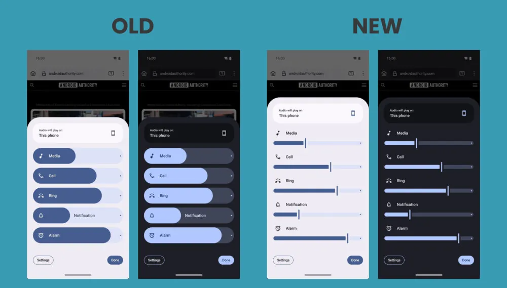
The new interface hints that Google might be ditching the pill-shaped volume sliders from Android 15. Instead, we could see thinner sliders with clear handles.
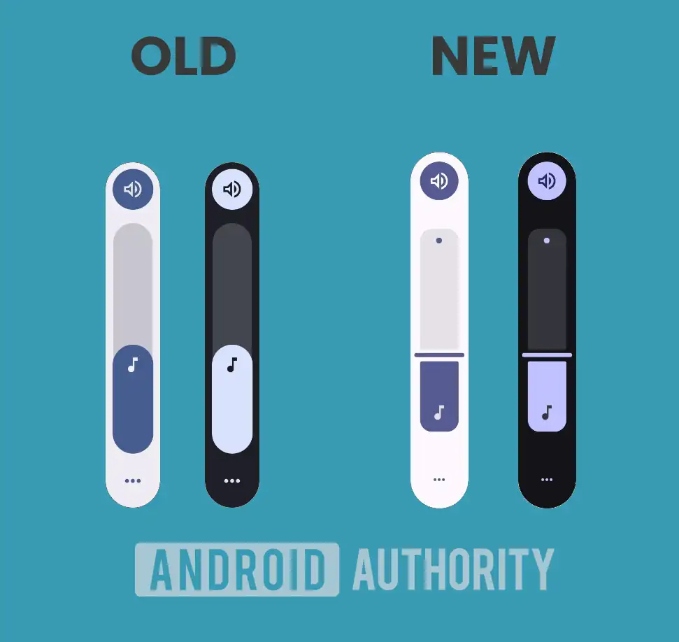
It is much more in line with modern Material Design principles. Google is aiming for a cleaner look, where a vertical bar shows the slider’s position, with one side darkened and the other left blank. A small dot at one end of the slider marks the max value.
Unsurprisingly, Rahman’s visuals reflect just that, showing a more angular volume slider design. The new sliders end with a solid handle line, making it much clearer where the volume is set. This is a big upgrade from the old rounded bubbles, which could make it hard to tell the exact volume level.


This new volume slider design will show up in several places. You’ll see it in the horizontal volume pop-up menu and in the quick-access slider that pops up when you press the physical volume buttons.
There are also some shifts in how UI elements are placed. The music note icon, which used to move with the volume level, now stays fixed at the bottom of the slider. Meanwhile, the three-dot icon for the overflow volume panel looks a bit smaller than before.
As for when we might expect the volume UI change, it is still up in the air. It’s just been spotted in Developer Preview 2, so it could either get more tweaks and show up in the next preview, be added to the final release after more testing, or even get scrapped entirely.
This kind of uncertainty is pretty common early in Android’s development, since Google often experiments with UI ideas that don’t always make it to the final version. So, while the new slider looks promising, its future is still not guaranteed.


