What you need to know
- Android 15 may introduce a significant overhaul for the volume control panel, enhancing both its appearance and functionality.
- The latest developer preview showcases a redesigned volume panel with prominent pill-shaped sliders, visual indicators for volume levels, and streamlined functionality for muting streams.
- Animated adjustments to the text on the sliders add a visually appealing touch to the volume control interface.
Google has been tweaking Android's Material You design across different parts of the interface. With Android 15 coming up, the search giant might introduce a big makeover for the volume control panel, both in looks and functionality.
The old volume panel definitely needs a facelift. Currently, it has five skinny sliders for media, calls, rings, notifications, and alarms, plus buttons to dive into the sound settings or just get rid of the panel altogether. And if there's something playing, you also get a switcher to change where the sound comes out.
It's handy, no doubt, but it's been pretty much the same over the past few years. According to Mishaal Rahman at Android Authority, the volume panel in Android 15 might finally get a new look and some extra tricks up its sleeve.
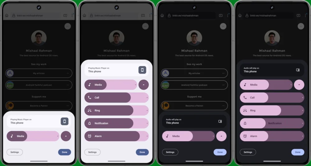
A few screenshots from the Android 15 Developer Preview 2 release show off a fresh volume panel with big, pill-shaped sliders. Plus, there's a noticeable dot showing the maximum volume, and you can quickly mute a stream by tapping its icon.

Android 15 DP2 also ditched the "Sound & vibration" header from the panel. Instead, it shows a media output switcher that stays put. Rahman points out that this is different from Android 14, where you'd only see the output switcher below the media volume slider if there was something playing in the background.
Android Authority posted a video showing neat animations for these new sliders. As you adjust the volume, the text on those pill-shaped sliders adjusts too, making sure you always see what you're adjusting.
Besides those changes, the new design also lets you shrink it down or hide it altogether using an arrow next to the media volume slider. Rahman mentions that if there's media playing, you'll only see the media slider, but when there's nothing playing, all five controls will pop up.
Rahman also mentions spotting some cool features like "noise control" and spatial audio in this revamped volume panel, but he couldn't quite get them up and running. We'll likely get a better picture of what to expect from Android 15 when the first beta starts to roll out.


