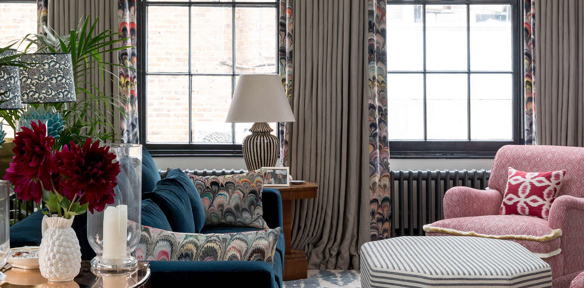
If you love pattern, you'll love this emerging curtain trend. If you hate pattern you'll also love this emerging curtain trend. As someone who has plain white curtains surrounding every window in my home, the thought of adding any kind of pattern into my window treatments has always been a no-go. I was always of the mindset curtains are just there for when privacy and sleep are needed. They should go unnoticed, and not draw any light or attention away from the windows.
However, I have slowly noticed the interior design trend for pattern seeping into my rooms. Just in really small amounts – pillows, throws, prints, my love of all things plain and neutral is slowly changing. So when I came across this curtain trend, I was on board. Curtains with borders and edging are the perfect balance – you get a dose of pattern and color, but it's not as bold or dominant as a patterned curtain.
I spoke with designers who have embraced this traditional curtain idea, and found out how they are such a simple way to add just a touch of character to any room and any style.
What are the on trend ways to do a curtain border?

Honestly, there's just something about the word border that I don't vibe with. Border to me just sounds fussy, like when I think 'curtain border' I don't think of all the fabulous designer-approved examples you see here. I think frills and Bullion fringing, which while maybe fit with all the different Grandmother aesthetics that are still flying about, but if you are after a sleek and simple way to add a dose of pattern and interest to your room, they don't really fit the bill.
So, as designers are doing, I am giving traditional borders a rebrand and going to go with 'curtain edges' to describe this new curtain trend. It far better describes the trend for adding a hit of colors, patterns, or shapes at the edges of curtains to create just a touch of interest without committing to anything too bold.
'Although I love pattern, sometimes a full patterned curtain isn’t right for a certain room, or scheme,' says designer Kate Guinness, who often uses curtain design with bolder edges in her projects. 'Adding a border to curtains or blinds can be a lovely way to add interest, turning a plain window treatment into something much more interesting. A bottom edge border can also really ground curtains. Using contrasting fabric for the lining can make curtains a feature from the outside as well as the inside of a building.'
Let's take a look at some examples...
1. Edge a simple curtain with interesting shapes

This is my personal favorite way to do the curtain edges trend. As a fan of minimalism in interior design I am always looking for ways to bring in textures and shapes to a room that will add interest but won't overwhelm or encroach on the fairly neutral color scheme. The wavy decor trend has been ideal for doing just that, and adding a curvy edge and a pop of color to a curtain is a really simple way to give a neutral fabric a unique twist.
The bold red edging used in this living room, designed by Arent & Pyke adds the perfect amount of detail. Despite the bursts of red throughout the room, the space still feels very neutral and calming and it's actually the sculptural shapes that are more of a feature than those deep red accents. Note that there's barely a straight lines in this room, so the waved edges work perfectly, mirroring the silhouettes of the furniture.
2. Pick up pattern from elsewhere in the room
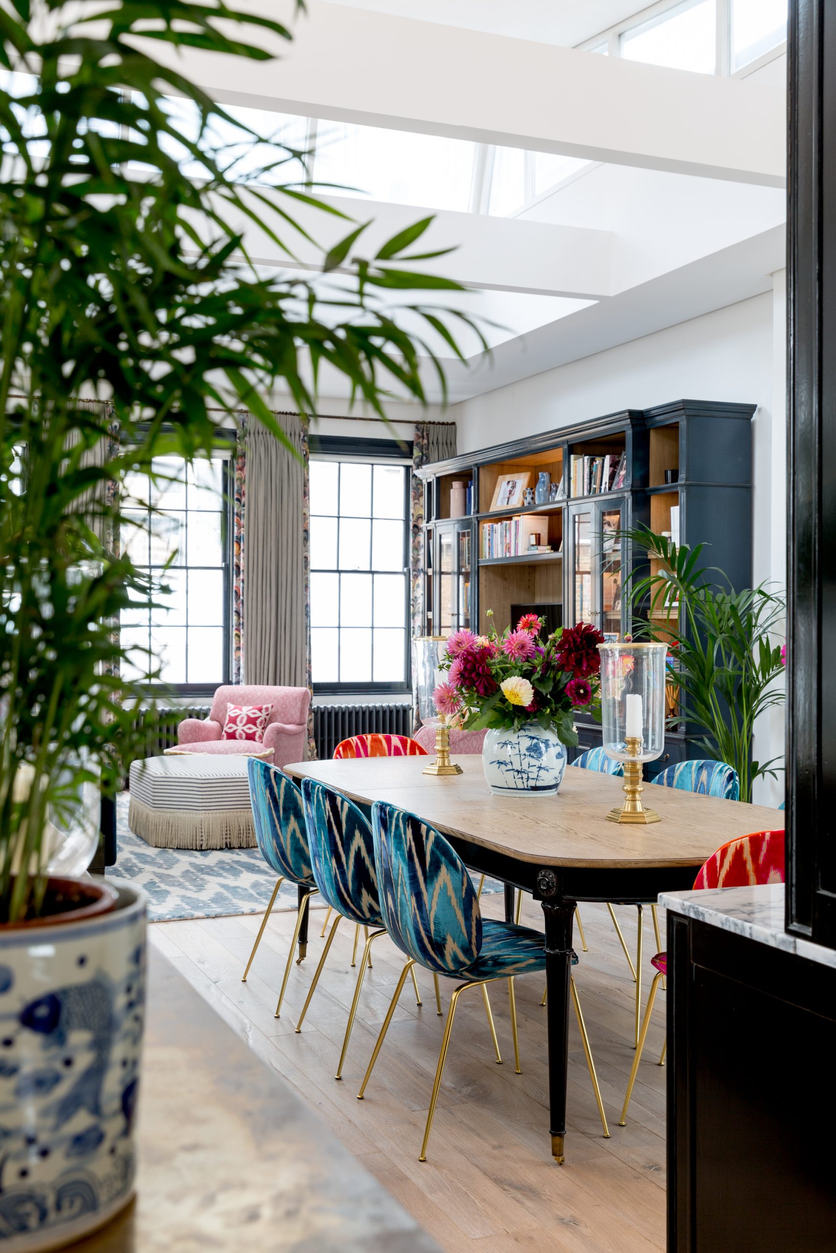
The best curtain colors tend to be blocks, on the whole, and patterned curtains are always to be approached with slight caution. Although usually seen as an accessory in a room rather than a dominant piece like a sofa or a headboard, they actually take up just as much visual space, if not more. So if you are going to go for a bold pattern on your curtains, be prepared for them to be a big focus of the room.
What curtain edges allow for is that dose of pattern, that added interest, but in a way that's not going to take over the whole space. Case in point this living room designed by Barlow & Barlow. Those glorious large windows deserve to let in as much light as possible, so a lighter shade for the curtains makes sense. Plus, there's plenty of color and pattern going on elsewhere in the room, a bold print on the window treatments might risk becoming too maximalist. So an edged curtain, that picks up on one of the dominant prints used elsewhere still leans into the playfulness of the room but doesn't become a focal point.
‘Edged curtains are an ideal starting point for playing around with color in a room. If you're hesitant when it comes to color, a subtle curtain border is a great way to elevate the edges of the room without having to commit to anything too bold. Choose a color palette that will complement the color used elsewhere in the room - as this really helps to tie the space together,' says Lucy Barlow, co-founder of Barlow & Barlow.
'We love using long and heavy curtains to really elevate a room and make it feel a little luxurious. When working with a fairly neutral background, patterned curtains can totally transform a space adding extra oomph and playfulness.'
3. Make fringing sophisticated
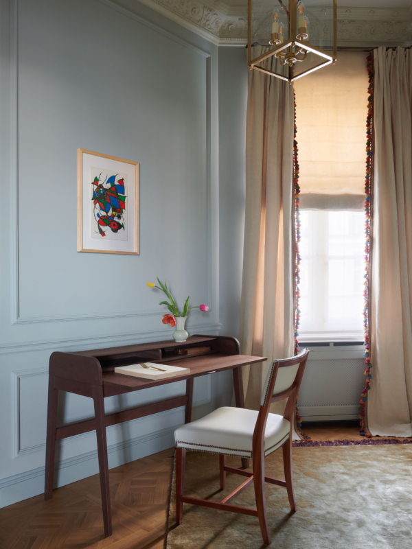
I know I shunned fringe-edged curtains earlier, but this super sleek, calming home office does make a real case for fringe-edged curtains. They work in this space, they look cool in this space. The simplicity of the rest of the room, with the icy blue walls and Mid-century modern furniture, means there's visually room for a hint of color and texture.
'I love adding all kinds of trimmings to curtain edges such as tapes, fringes and patterned fabrics all work beautifully,' says designer Marta Chrapka. 'They can give the curtains a noble heaviness, French style, and interior variety. Sometimes, however, you can exaggerate and if we want the effect not to be literally eighteenth-century, it's best to use a smooth fabric. So here we used my favorite Dolino Pierre Frey linen and choose colors and a vibrant fringe to contrast the simplicity of the curtain fabric.'
For a subtler take on the look, match the decorative edging to the shade of the curtain so it blends in, giving you the texture but not that high contrast of colors.
4. Enhance a window and frame the views
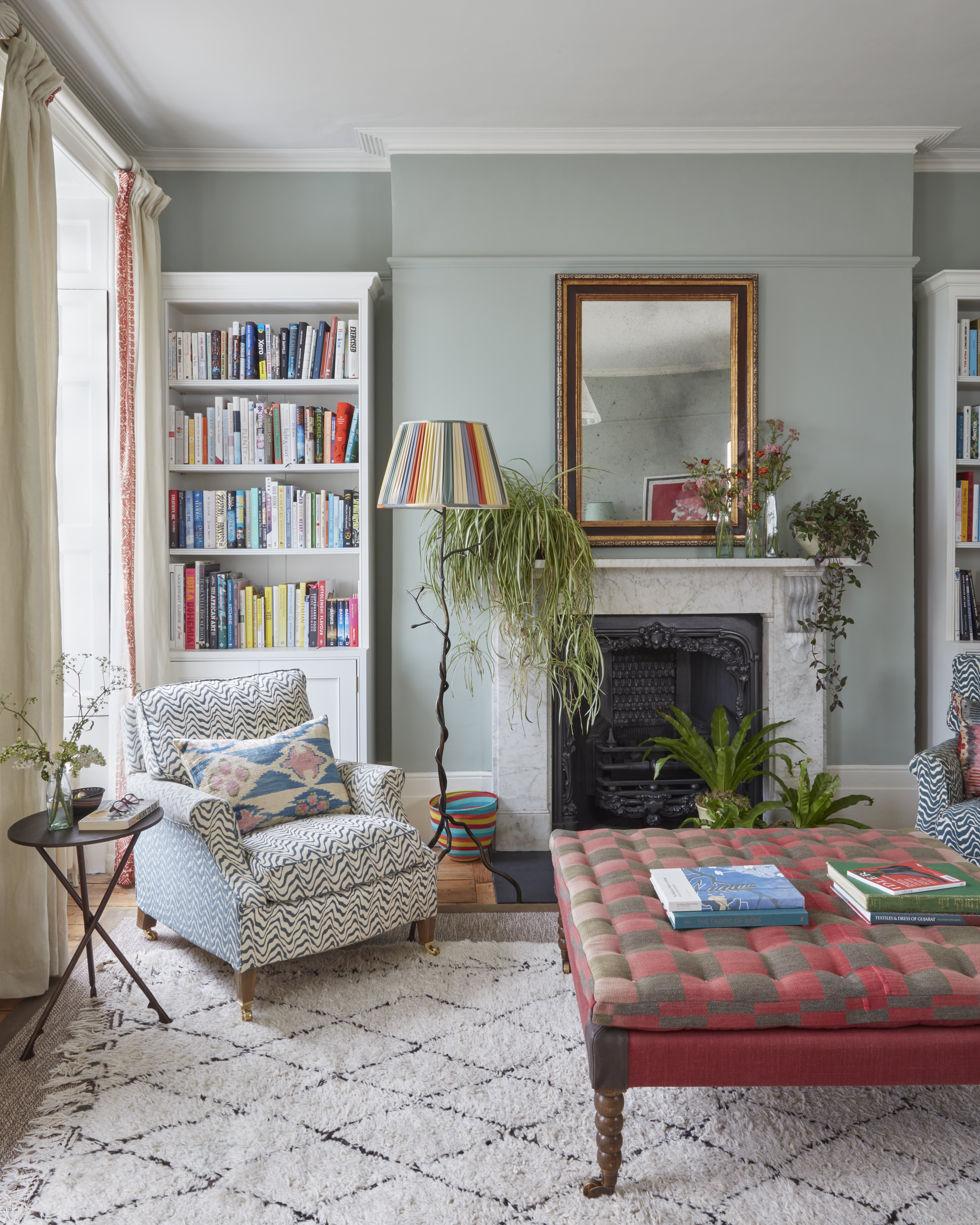
A contrasting curtain edge will highlight a window, far more so than an all-over print, as your eye will be drawn to the drapes rather than the window itself. If you have been blessed with particularly beautiful large windows or a lovely view, curtains with bolder edges will help make them more of a feature of the room.
'The windows in this property have a beautiful view that we really wanted to remain the focus, and the room gets the most wonderful light. We wanted curtains that would feel cozy in the winter but that would let light through in the summer whilst offering some shade from the sun. We’ve used Guy Goodfellow’s "Piedmont Print" which we were able to custom print with just one stripe on the leading edge border of the curtains,' explains designer Kate Guinness.
Edging your curtains with a contrasting print or color can also help to make the windows look larger. The edges of the drapes mirror the edges of the windows, so if you take them floor to ceiling, even if the window within isn't as large, the curtains can create the allusion they are far bigger.
5. Inject just the right amount of detail
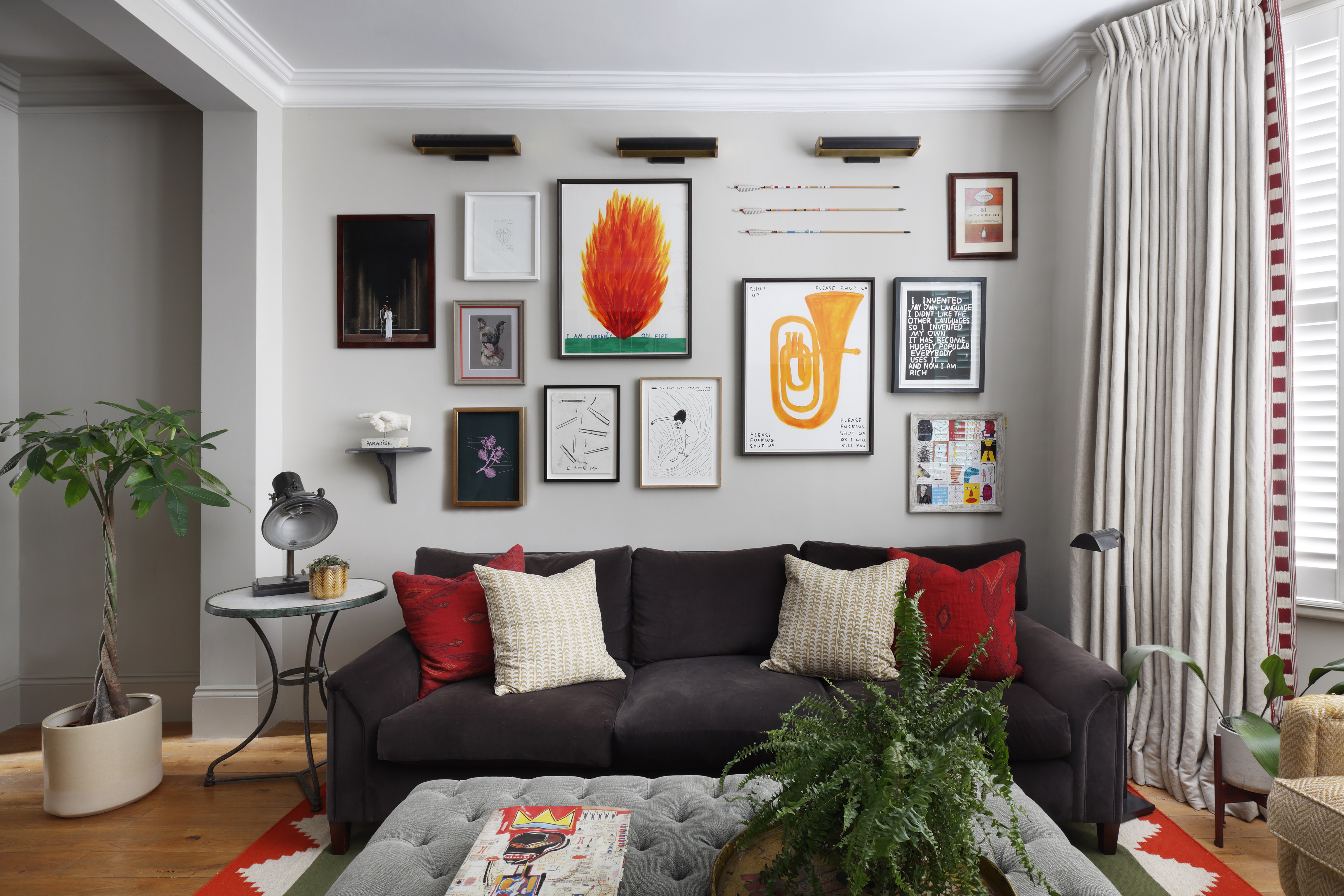
In a space that's already got quite a lot going on on the walls, introducing heavily patterned drapes can make the space feel too busy and claustrophobic. But you don't want the window treatment to stand out as being the only bland addition to the room, so here curtain edges come into their own – fitting in with the vibrancy of the room but not adding too much competiting pattern.
'We designed this space for a fun and vibrant couple with a deep interest in art. We aimed to inject a pop of color without overwhelming the space with patterns,' explains Tom Cox founder of Ham Interiors. 'To achieve this, we incorporated sections of the "Lost and Found" fabric from Christopher Farr, one of our personal favorites, as a border for the leading edge.'
'The large bay windows in the room were a focal point, located near a striking arrangement of art pieces. Therefore, we opted for a simpler curtain design with a border. This choice allowed us to maintain a sense of playfulness while ensuring that the curtains didn't distract from or overpower the other elements in the room. By keeping the curtains subtle and harmonious, we achieved a balanced and cohesive aesthetic,' he adds.
The three best curtain borders to buy now
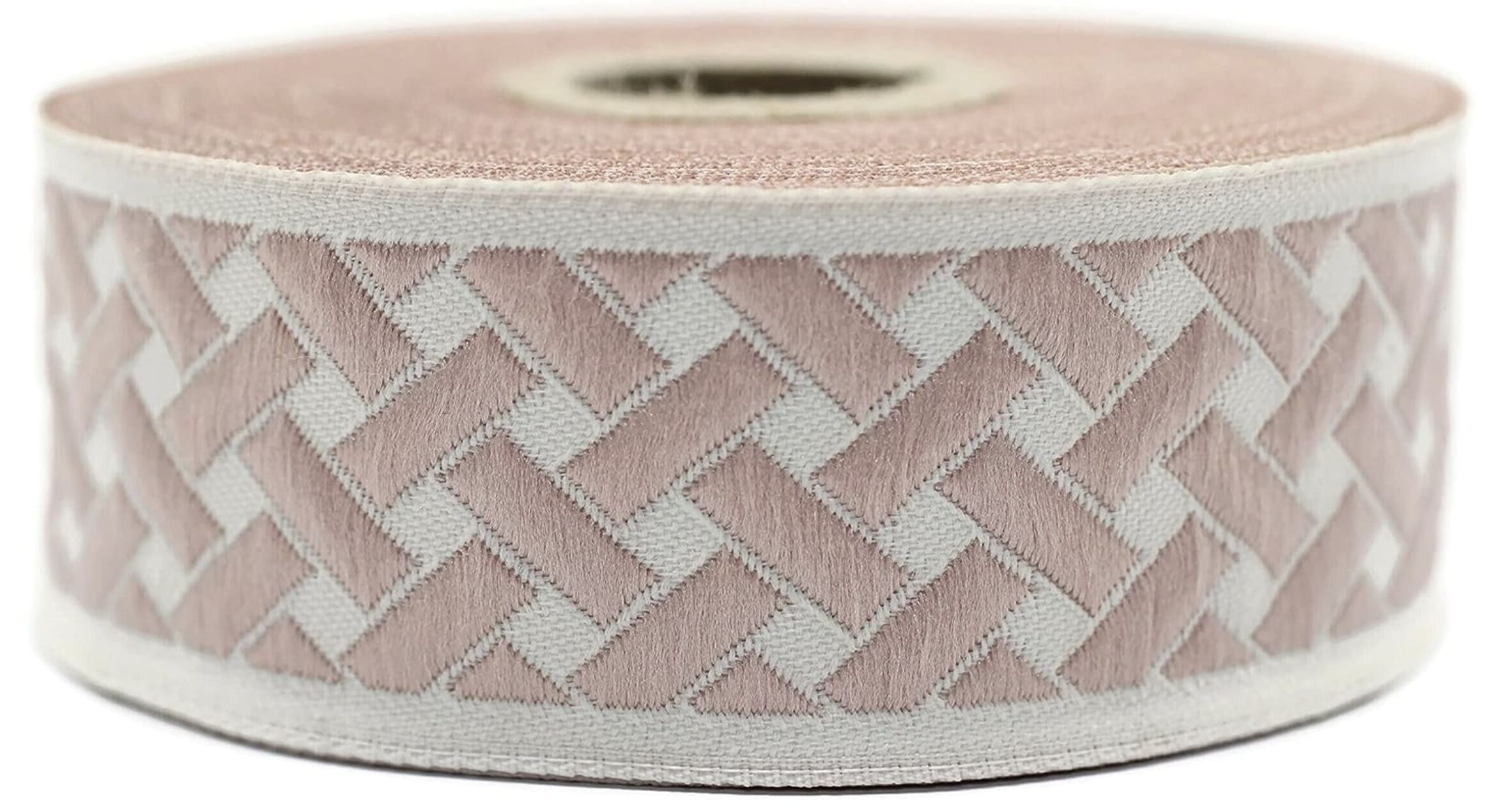
Price: $23.90 for 11 yards
Works with: bold colors, soft greens


