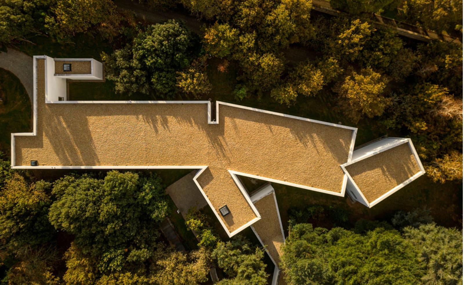
Álvaro Siza’s original museum design for Serralves Museum of Contemporary Art in Porto was completed in 1999 – a low-slung, whitewashed modernist architecture building sitting on the grounds of Parque de Serralves. Now, neatly dovetailing with it is a new addition to the complex, also designed by Siza. Welcome to The Álvaro Siza Wing, which has just opened to the public.
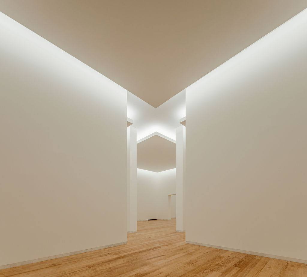
Step inside the elegant Álvaro Siza Wing
In terms of spatial and material qualities, the relationship between the new wing and the original gallery is so finely balanced that it would be easy to agree with the museum director, Phillipe Vergne, who lightheartedly said that Siza ‘had this extension planned from the very beginning’.
In reality, if anything, the addition is a result of organic growth rather than planned development. The brief was for a design that increased the space available for exhibiting works from the permanent collection and added more archival space for Serralves’ growing collection of artworks.
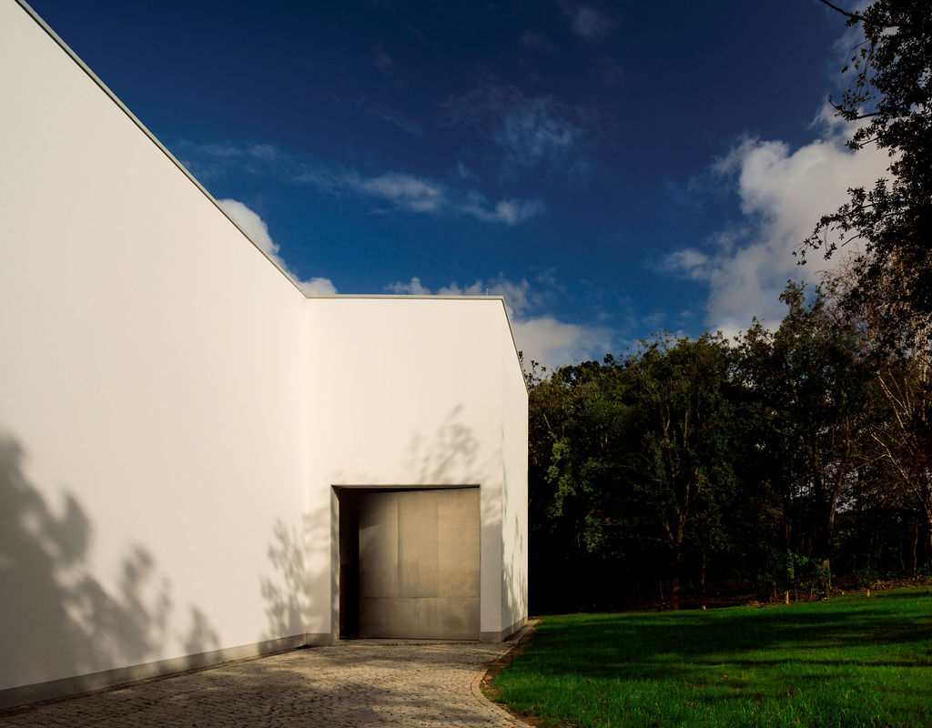
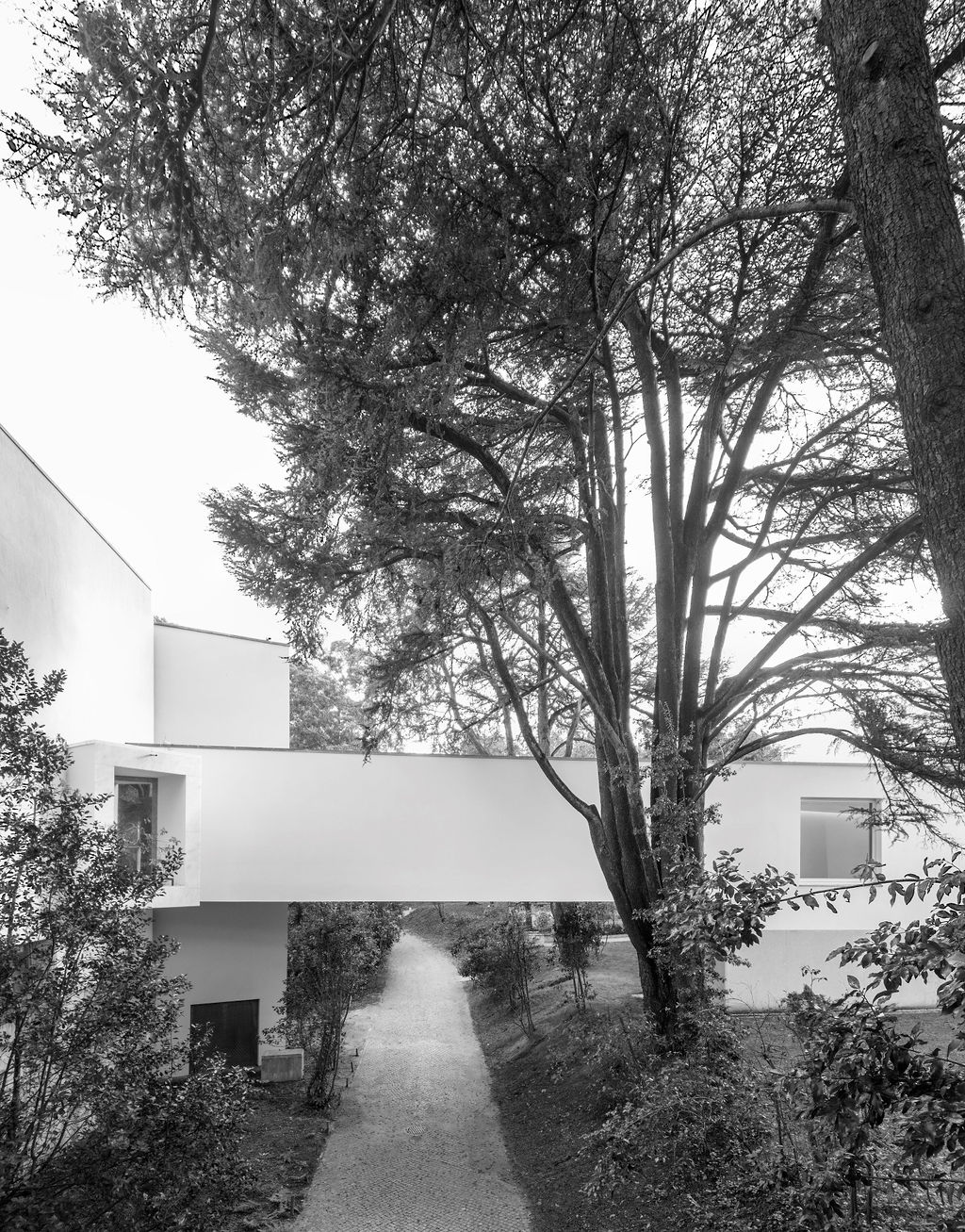
Access to the new wing is via the main gallery and an elevated walkway bridging a path that encircles the park below. This walkway features a subtle nod to the tension Siza creates at the main gallery entrance. The main entry from the street ramps down, squeezes between a guard’s post and opens into the brightly lit lobby. Similarly controlling the flow of movement, the new wing welcomes visitors through tapering walls that terminate in the double height void of the new wing’s first gallery space.
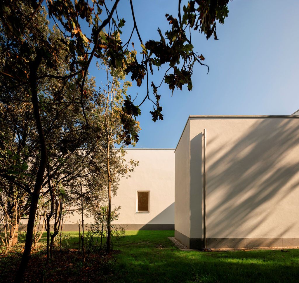
Elsewhere, other motifs show that the earlier work was firmly in Siza’s mind when designing the new wing. For example, just as in the original design, the undulation in ceiling levels allows for softer artificial lighting in each gallery; the surrounding greenery is celebrated everywhere through a series of picture windows that selectively frame the outdoors; and marble inlays embellish circulation spaces and accentuate the joints between wall and floor.
At the same time, the new wing has the feeling of an intimate antechamber lined with cabinets and articles as opposed to the expansive ‘publicness’ of the main building. This compression of scale is keenly felt; the movement of the eye is tightly controlled as opposed to the 1999 design where the visitor's gaze can roam freely from an object to a distant aperture and an even more distant sky.
In line with this intimate and inward design language, the ceiling plane of the new wing, while possessing its own interest, doesn't feature the punch-cut skylights that bring gentle washes of daylight into the central galleries of Serralves’ north and south wings.
The artworks on display as part of the initial exhibition, 'Improbable Anagrams', fit well within the cellular rooms-cum-cabinets of the new wing. The works of renowned artist Paula Rego sit alongside the refracted light projections of Gusmão and Paiva.
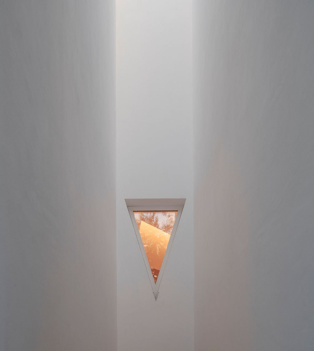
According to Vergne, the rotation of works from within the Serralves collection is likely to be on a six-to-eight-month cycle, meaning the curatorial team is already planning future installations around their significant collection. Whatever follows, the gallery spaces themselves allow the curators to establish pronounced dialogues between pieces that are brought together by glimpsed views: through gaps in partitions and triangular apertures.
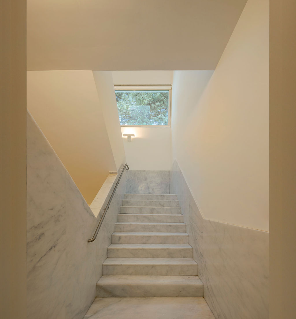
The ground floor is more open than the first floor of the new wing, free of the latter's cruciform partitions in plan, and is preceded by a lofty, marble-lined stair alcove. The lower level will be mainly given over to architectural exhibitions: with 'C.A.S.A., Coleção Álvaro Siza, Arquivo' being the opening show. A dense arrangement of Siza’s models and drawings, taken from his archive, as well as material owned by the Serralves Foundation, puts the viewer inside the architect's studio, wholly consumed by its architecture.
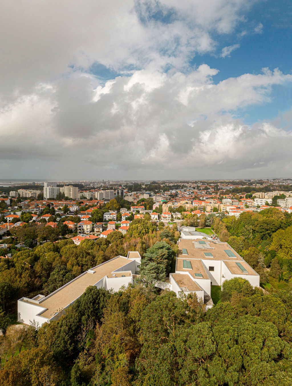
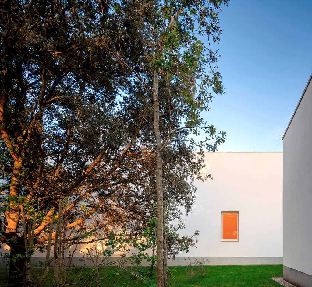
Slipping out of one of the side doors in the secondary staircase, you emerge directly into the gardens, a tranquil setting of cedar, stone pine and chestnut trees gently swaying in the breeze. The scale of Parque de Serralves gives context to the domestic intimacy of the gallery spaces. Borrowing language from C.A.S.A., if the Serralves Museum is a ‘House of Culture’, then The Álvaro Siza Wing is the perfect annexe, tacitly separate but part of the larger whole, to be frequented to explore ideas in quietude.
