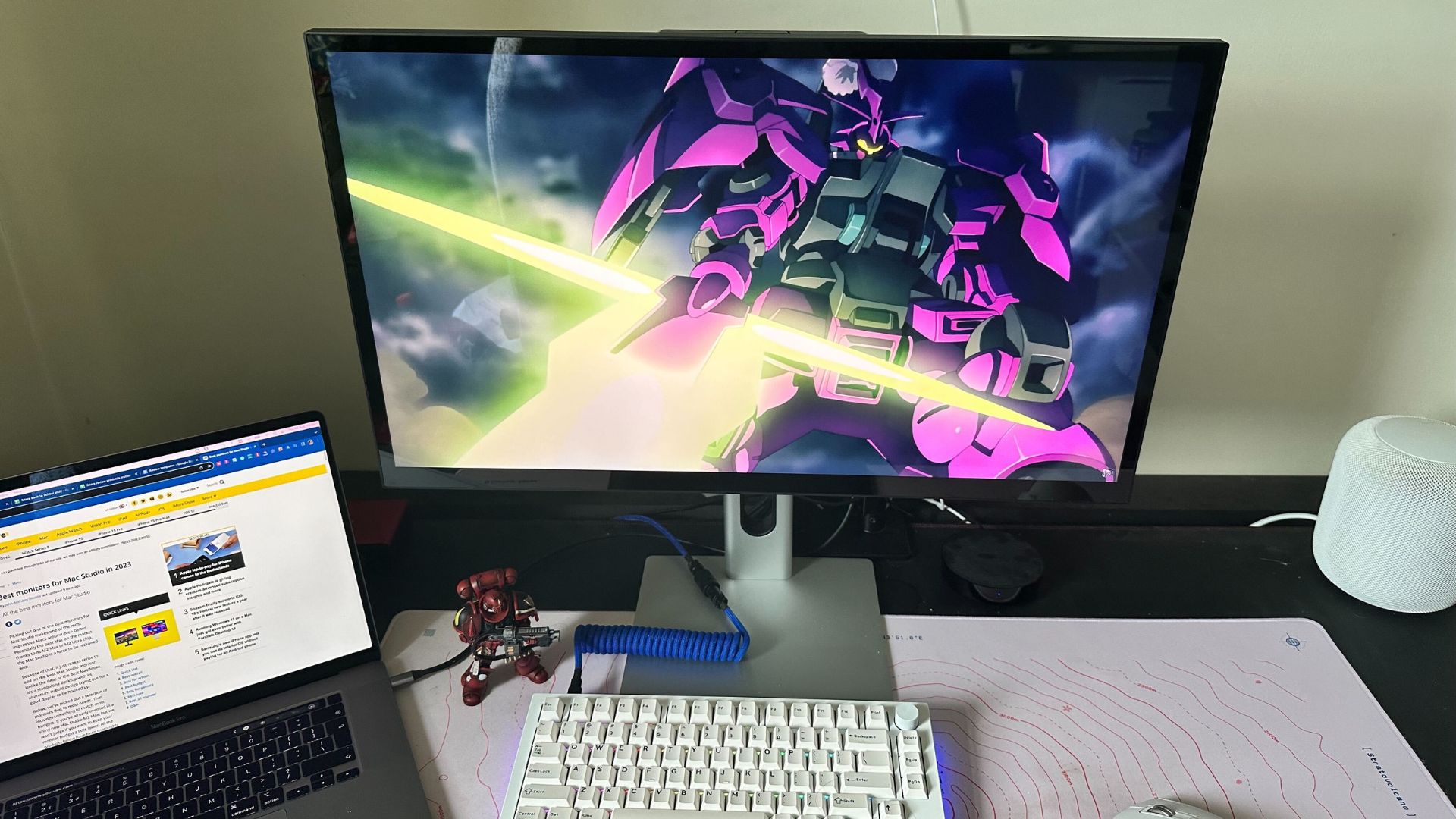
Excellent monitors for creators aren’t hard to come by these days, with loads of great options for those looking for a clear, sharp, and color-accurate display. For one, there’s the Apple Studio display, the monitor that everyone making monitors for Mac looks to supersede — a 27-inch 5K panel that’s covered in glass and aluminum.
The Alogic Clarity Pro touch is designed to give the kind of performance for a fraction of the cost (or at least a couple of fractions). But how good is this new competitor, and what more does it bring to the table?
Alogic Clarity Pro Touch: Price and availability
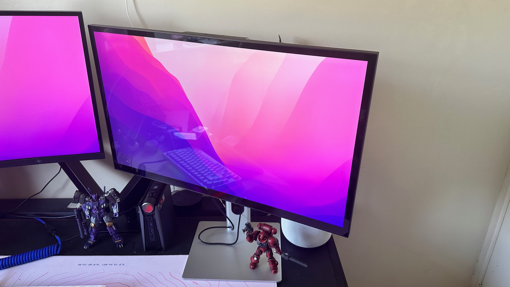
The Clarity Pro touch is available for $999 — not a small amount of money, but when you consider the competition and the price they sell for, it feels a lot more reasonable. There are other options too, and we reckon the real sweet spot is the base model Clarity. That monitor costs $699, and while there’s no touch screen or pop-up video camera, it has the same excellent panel as this display for almost a grand less than the Apple Studio display.
You can find the display sold almost everywhere, including the Alogic website, and, as always, on Amazon. It is a very popular product, so stock is sometimes a little all over the place, but when they’re in stock they’re easy to get a hold of.
Alogic Clarity Pro Touch: Display quality
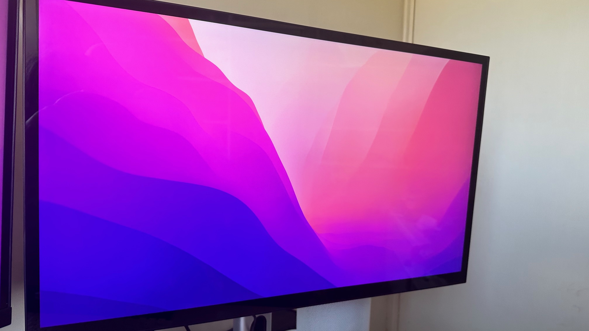
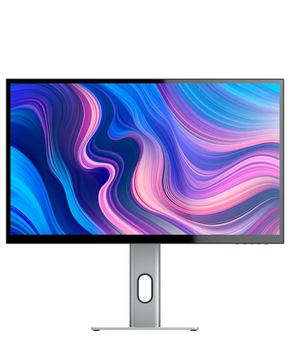
The most important part of any monitor is the display. In this case, the display is a 27-inch glossy 4K touch panel with HDR support, and it looks lovely.
The colors are clear and bright, and where it is supported by the device it is plugged into, HDR is nice and bright too. Alas, we are not equipped with fancy color monitoring tech, but to our eyes the monitor would be perfect if you’re looking for a monitor for some content creation.
Of course, it’s worth dealing with the elephant in the Apple Studio Display room here — while Apple’s display is 5K, this display is 4K. The Apple Studio display is designed to scale better with the proportions of MacOS, doubling 4K resolution while the proportions of all UI elements remain the same. For some, this is going to be really important and the extra sharpness could well factor in as well. For most people, however, 4K is going to be just fine.
Contrast is good, although thanks to the display tech blacks can be a little light when surrounded or filled with bright objects. It's nothing massive, and you can use the on-screen menu to calibrate it so that it’s spot-on for you, but I noticed it during my testing.
Alogic Clarity Pro touch: Touchscreen
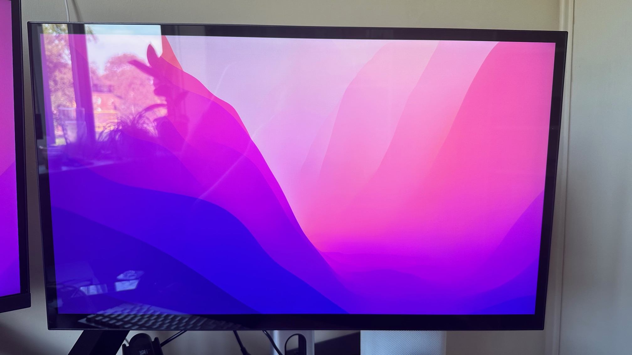
The biggest thing that sets this monitor apart from anything else, including the Apple Studio Display, is that it’s a touch screen. If you plug in with the Thunderbolt connector on the back instead of the HDMI or DisplayPort, you’ll be able to poke and prod your way around MacOS. You’ll need to install some drivers from the Alogic website to make it work best, but once it works, it works a treat.
The only thing that I noticed is that I don’t use it — I never found myself scrolling around or prodding different options with my finger when my mouse is nearby. For artists, and other creators with purpose-built monitor arms, it's going to be a lot more useful, but for fairly normal computer tasks it’s not going to be all that useful. It is a neat party trick, however.
Alogic Clarity Pro Touch: Build and features
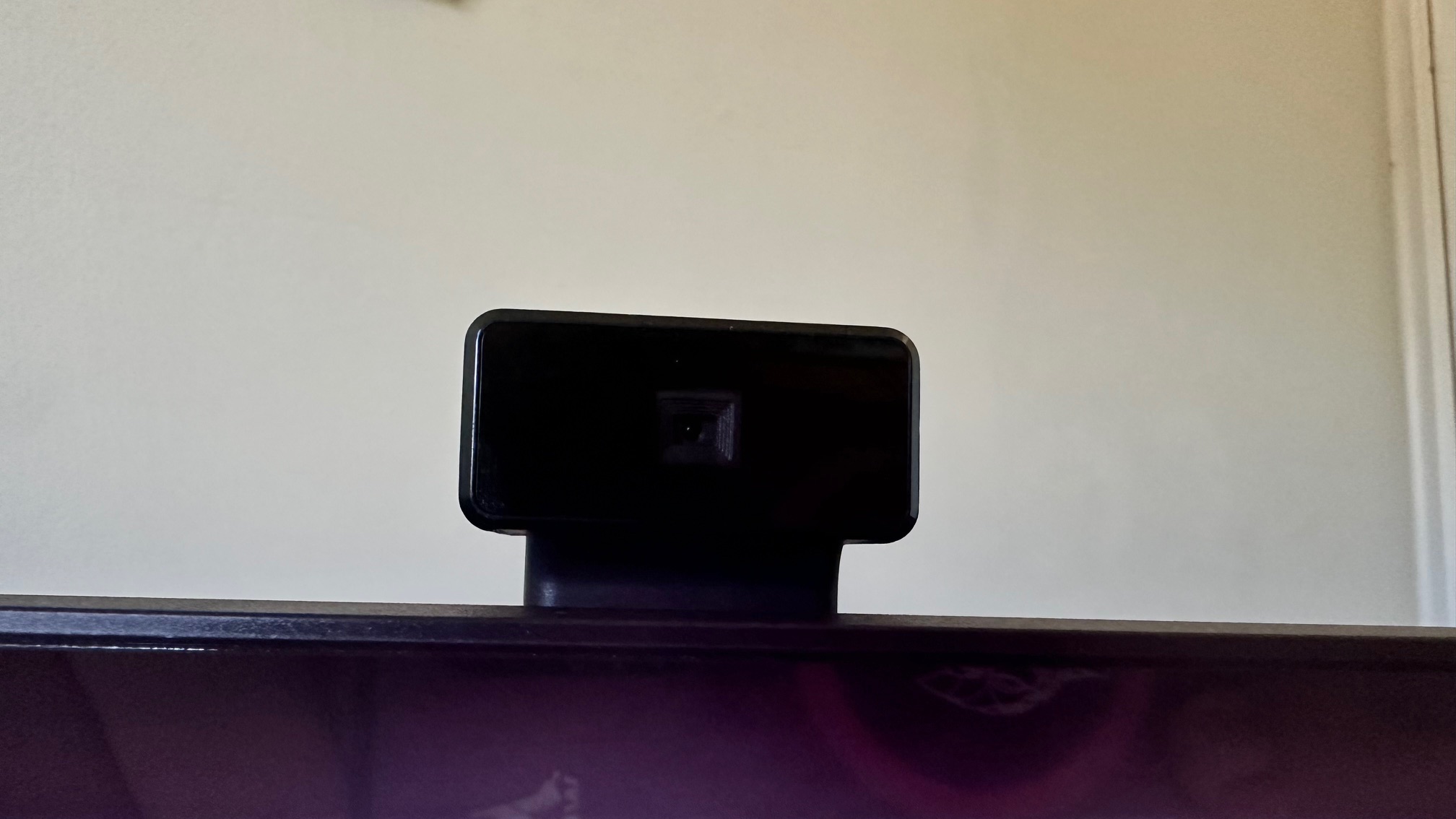
Also making the monitor stand out is the webcam that can poke out of the top — It’s a cool hidden thing that I really appreciate. It allows for a clean-looking desktop most of the time, only emerging when you need it. The camera itself is a decent enough 8MP 4K camera, and no one in your video calls is going to complain of iffy image quality. It’s a bit noisy as it rises from within the monitor however, with some loud motors to propel it upward.
There’s also a built-in dock and hub, powered by the USB-C Thunderbolt connection to your Mac. It works well, with two USB A ports, and a 3.5mm audio jack. You can also connect over HMDI 2.1 or DisplayPort 1.4, but then you won’t get the touchscreen.
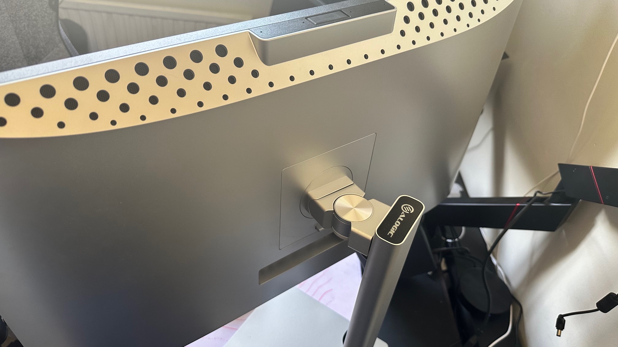
The stand of the monitor is nice too, made of metal and very heavy-duty feeling. There are loads of adjustments to the monitor, with height adjustment, directional swivel, and monitor rotation for all the portrait monitor people. It's a solid well-made stand.
The monitor itself, while not cheap feeling, doesn’t quite match up with the stand. Its silver outer shell is made of plastic, and it gets pretty hot while in use. It’s not a deal breaker, and for the price, it still feels fine — but you get the feeling it could have felt better.
Finally, while there are speakers in the monitor, you shouldn’t use them. They suck. Most monitor speakers do to be fair, and these don’t stand out as sucking more, but they are bad speakers. Just get some cheap headphones or a pair of desktop monitors — you’ll be doing yourself a favor.
Alogic Clarity Pro Touch: Competition
There are loads of monitors in this bracket going up against the Clarity Pro touch — but the most notable is, of course, the Apple Studio Display. It's a might monitor too, and if you've got the cash, it's a great option. If you can't afford the Apple, however, then this monitor is also a great option — especially if you go for the base model.
Alogic Clarity Pro Touch: Should you buy it?
You should buy this if:
- You want a well-priced professional-grade monitor
- You want a touchscreen for Mac
- You don’t want to spend over $1000
You shouldn’t buy this if:
- You have no need for a touchscreen
- You want good speakers
Alogic Clarity Pro Touch: Verdict
The Alogic Clarity Pro touch is an excellent monitor with some great features. The screen looks great, with bright, clear colors and solid HDR support. The monitor does feel a little bit on the plastic side but given the price its no great complaint. Honestly though? Unless you need the webcam and the touchscreen, just go for the Alogic Clarity rather the Pro or the Pro touch — same great screen, but an incredible price to match.
Miracle monitor?
The Alogic Pro touch is a fabulous Apple Studio Display alternative, and coming in at a $500 deficit, it’s well worth taking a whirl with. If you really want to save though, opt for the non-pro, non-touch monitor — the display is the same, but costs almost a grand less than the Studio display.


