According to Apple, 5K is the optimum way to view the content that you create on a Mac. To that end, the Apple Studio display is a 27-inch 5K giant made out of aluminum and glass. Aiming to take your eyes off the Apple prize, premium accessory maker Alogic released the Clarity Pro Touch monitor series last year, with touch screen and webcam options built in — at drastically lower prices than the otherwise expensive Apple options.
Sure, it isn’t 5K, but the 4K panel is nonetheless an excellent display for anyone looking for an incredible Mac experience and one of our favorite monitors of the year. Now, Alogic has done something that Apple has yet to do with its cheaper monitor: Make it bigger.
The Clarity Max Touch (nice naming convention there) is a 32-inch variant of the Clarity Pro and touch models, packing in similar specs with a whole new screen size. If you’ve been looking at the Clarity Pro Touch for some time but want something bigger, then this might just be the big Apple Studio display alternative you’ve been waiting for.
Alogic Clarity Max Touch: Price and availability
First, we’ll need to go over the options that you can get with the monitor, and tell you how much each one costs. First, at the bottom of the pile, is the Clarity Max. This model comes equipped with a 32–inch 4K display and a built-in dock with 65W power delivery. That’ll set you back $999/£999 — an excellent price, and if you don’t need a webcam or a touch screen, then this is the option you should go for.
Second up is the Clarity Max Pro, which adds in an 8MP webcam for those all-important modern-day work-life video calls. That hikes the price up to $1199, which is an expensive webcam. It does rise out of the monitor though, which is a cool party trick.
Finally, the Clarity Max Touch adds another $200 to the price and brings a touch panel to the 32-inch 4K display. It is a very nice addition, but it’ll be up to the end user to decide whether it's worth it.
You can grab a Clarity Max monitor directly from Alogic currently, although the Clarity 27-inch series all became available on Amazon very quickly after release, so expect that with the new models as well.
Alogic Clarity Max Touch: Build
Just like the Clarity series that came before it, the build is excellent. While not metal like the Apple displays, the silver plastic on the rear of the monitor is solid, premium feeling, and suits the idea of ‘creative work space’ well. I like the cooling vents on the back which echo the design of the Apple monitors, and I appreciate that this isn’t just another ‘black monitor that blends into your desk.’
The sides of the monitor are black and also made of plastic, but again feel sturdy. As for the glass panel on the front, it’s a wonderful, clear piece of glass, with very little space between the display and the glass surface above. There is going to be a little more space there than there might be on a non-touch model, but it doesn’t make a difference to color reproduction or clarity of image.
The stand is also excellent, and very similar to that found on the Clarity 27-inch series. It’s mostly metal with a plastic covering, and clicking the monitor into place is an absolute doddle. Adjusting that stand is super easy as well, with very little effort required to angle the monitor just right. One thing to be aware of, however, is that the base place takes up a hefty amount of space — while that makes it super solid in place, it also makes it slightly unwieldy on some smaller surfaces.
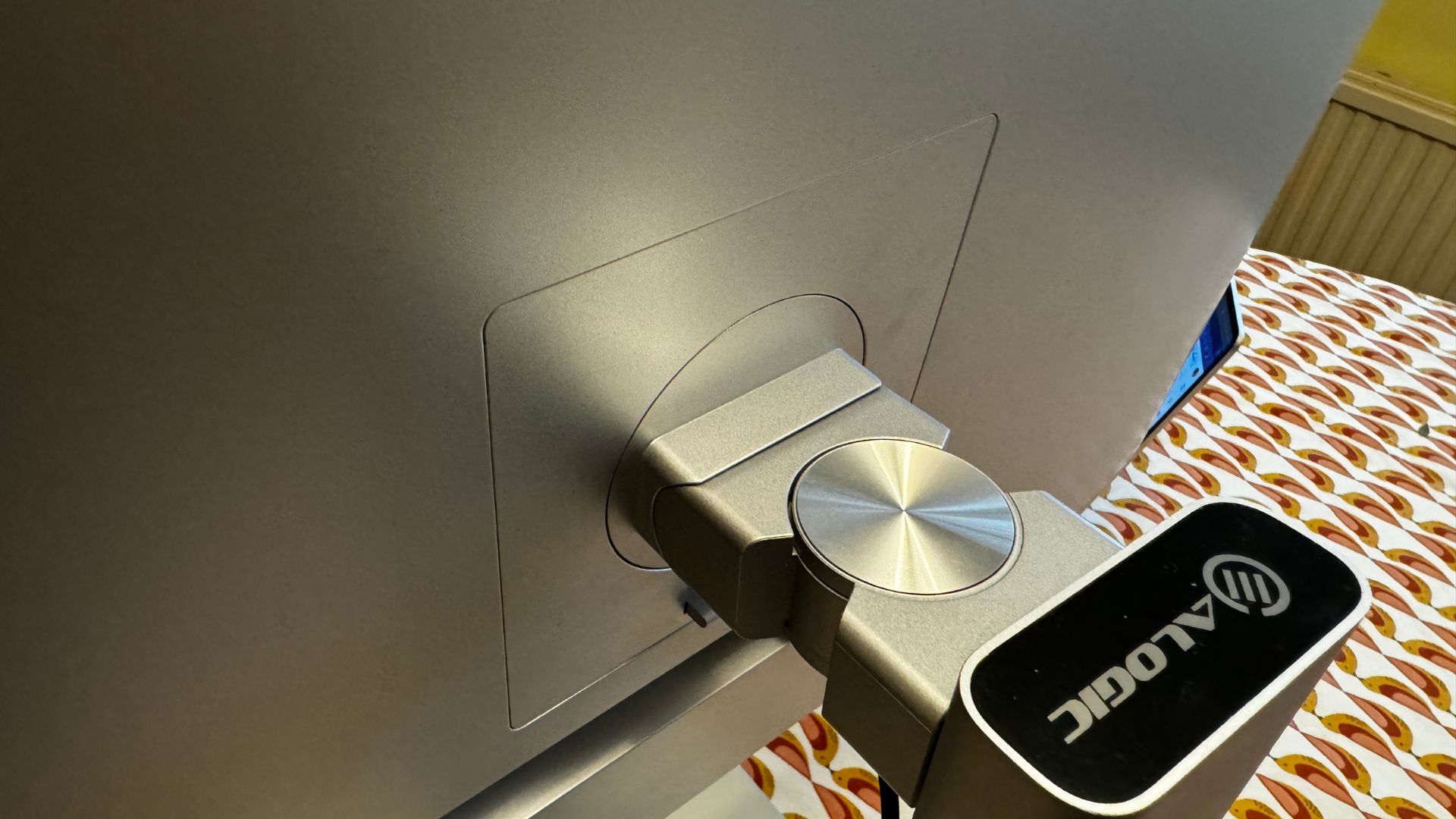
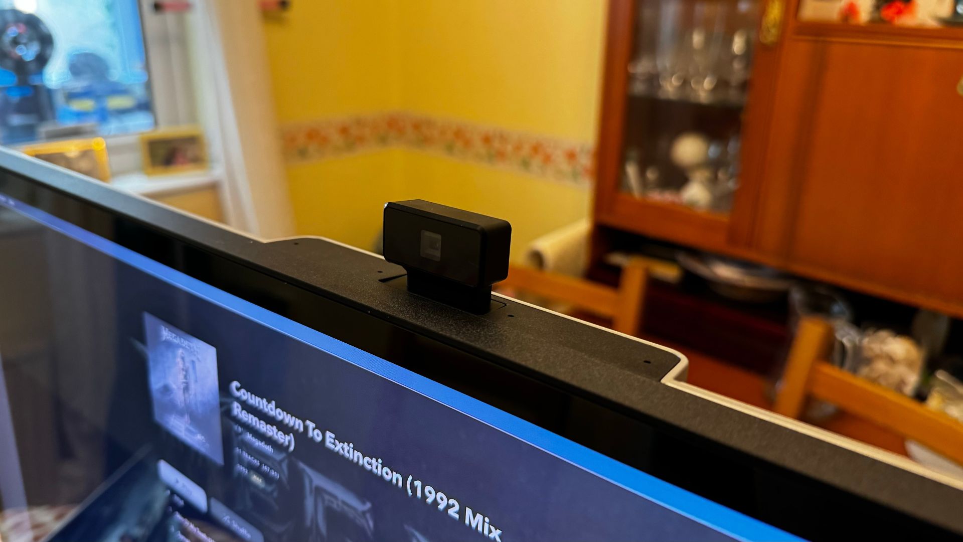
There is only one place that I might be a little concerned about — and that is the pop-up webcam. At the moment, the webcam doesn’t seem to want to go down, and I’m concerned about the longevity of the mechanism. The webcam on the 27-inch Clarity Pro Touch that I use has started whirring more heavily through use, so I’m hoping this one stays quieter over the course of its life. Out of the box, it is quiet, however, and I’ve reached out to Alogic to see if the camera sticking around when it’s no longer needed is deliberate or a software bug.
Alogic Clarity Max Touch: Features
The Alogic Clarity Max Touch is packed to the brim with some extremely useful features. Starting at that aforementioned webcam — it's another great piece of monitor-bound optics. Image quality is good, and it’s easy to make sure that you’re directly in the eyeline of the camera thanks to a little scroll wheel in the back which adjusts the height of the camera slightly. It pops up when you need it, and descends when it’s not needed anymore. (At least it should — mine sticks around when it’s no longer needed).
The touchscreen is another great feature, albeit one you have to spend a lot more of your money on than you do for the standard model. It’s a reactive screen, accurate, and easy to use — if you use the UPDD software that you can find on the Alogic website. That makes the touchscreen function how would normally expect a touchscreen to work, unlike some that feel like giant trackpads with a screen behind them. I like it — but as with the previous model, I’m not sure I’ll use it much. For those looking for a great way to pan around a project in an app like Adobe Premiere, however, it’s a great addition to the dish.
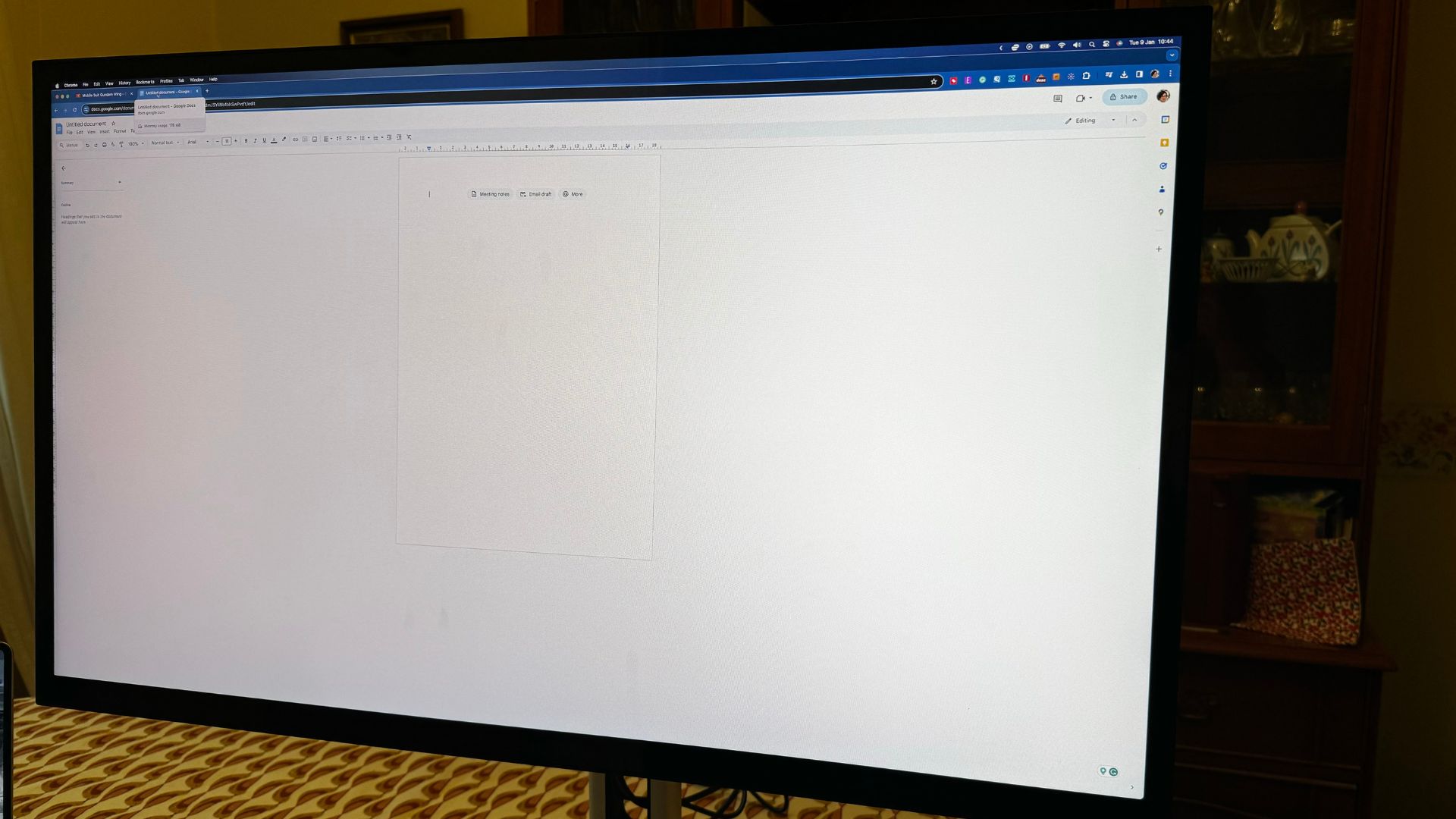
Interestingly, however, I found the touch screen most useful for browsing the OSD when playing with the settings. I didn’t have to muck about with tiny buttons on the bottom, trying to remember which one does what — I just tapped the options on the screen, and the things that I wanted to happen just kind of happened. It’s great, and in a way makes the touch screen a more interesting proposition than it might have already been.
The common feature among all the different options is the dock at the back of the monitor, where you’ll find a couple of USB ports and a USB-C 65W power port to charge your MacBook while it's plugged in. That port carries a display signal as well, so you’ll only need one cable plugged in for the whole thing to work as a unit. You can use the HDMI ports and Display port as well to daisy chain everything together, keeping everything clean and wire-free, which is always a bonus, and the USB ports on the back are great for peripherals like keyboards, mice, and even extra storage. I had no problem with the ports, and the USB-C input worked the moment I plugged my MacBook Pro in.
Alogic Clarity Max Touch: Display quality
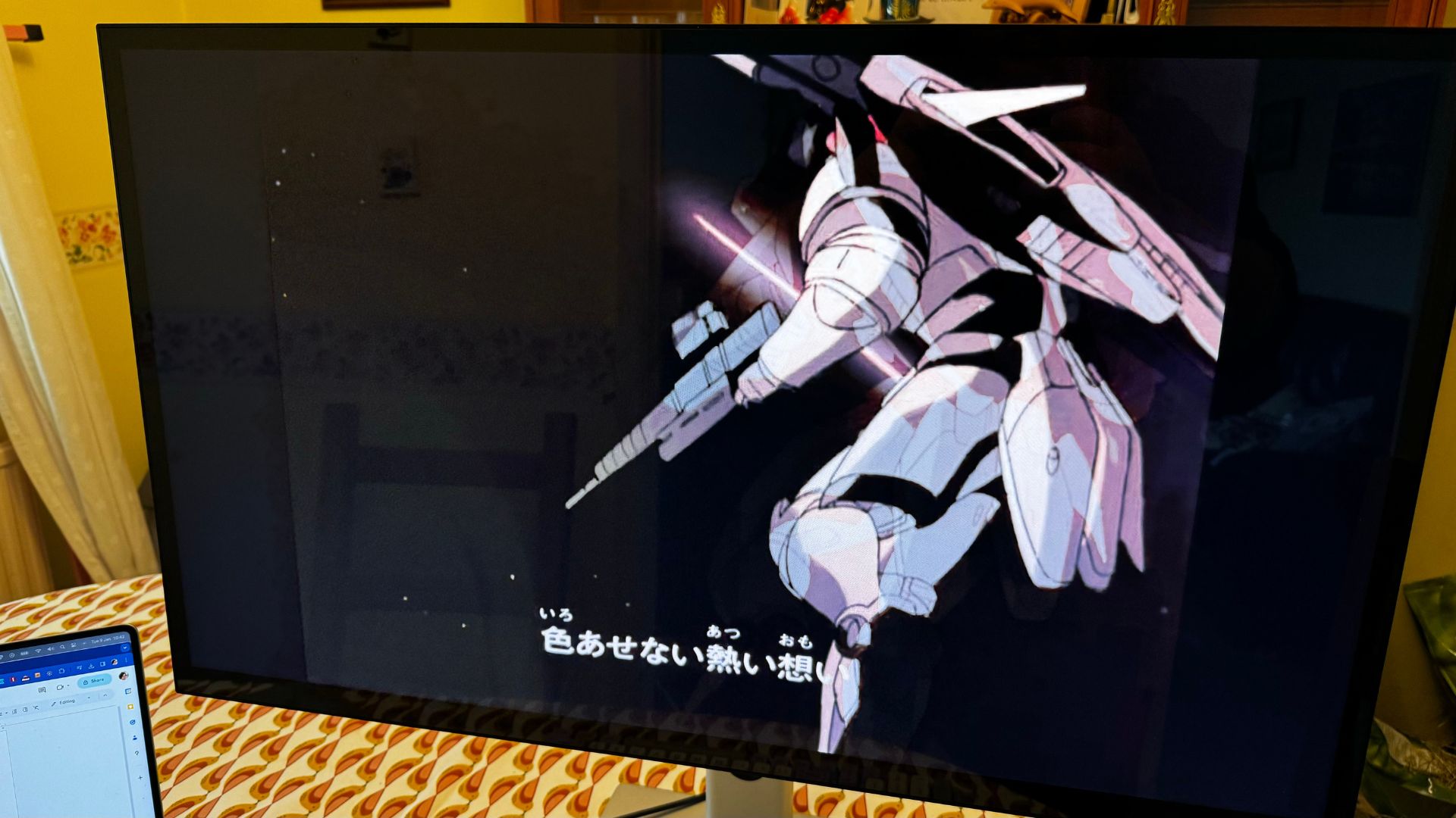
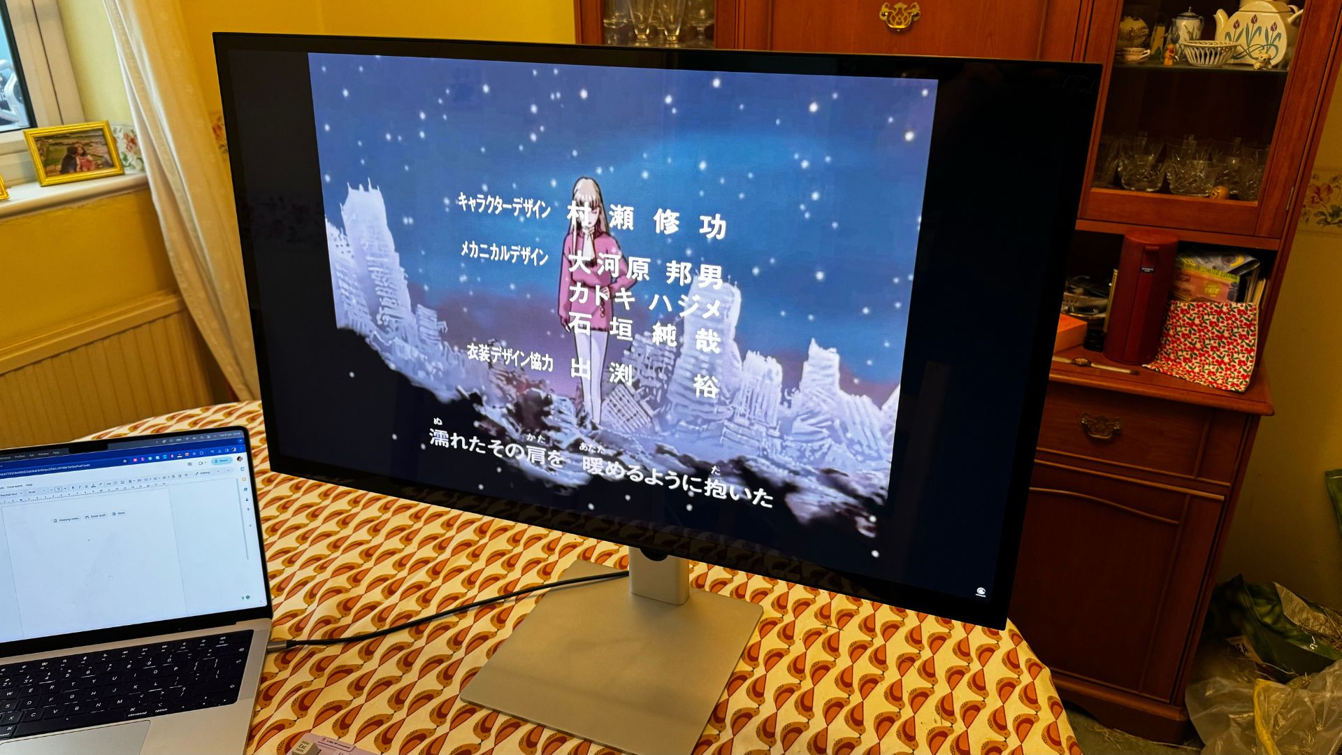
The display on the 27-inch Clarity monitors was excellent, and this is no different — it’s just bigger. That means great color reproduction and clarity beyond most other monitors at this price point.
HDR support is a nice addition and looks great when properly dialed in. It’s a great display and matches up very well if you’re looking for a monitor that’s great for creative use without spending several thousand dollars on something from the likes of LG or Apple.
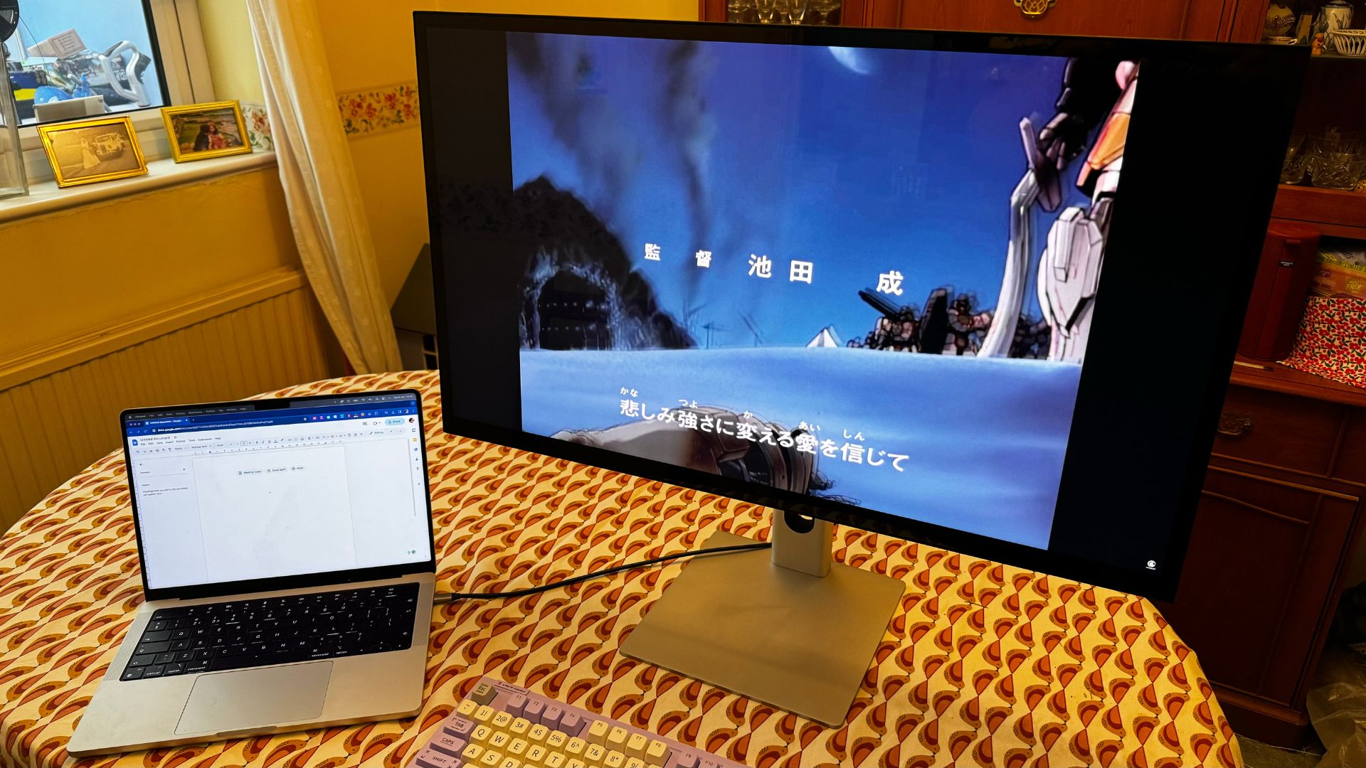
The size here is the main boon — and only once you’ve used a 32-inch monitor do you come to realize how nice it is to have loads of extra screen real estate. It’s good for media consumption as well, making all your favorite movies and TV shows look incredible. The only thing that it’s not quite as good for is gaming. Its 60Hz refresh rate is good and makes browsing your Mac smooth and buttery, but for gamers, it might not be quite enough. Something worth keeping in mind.
One last thing about the display on the front — Alogic calls it ‘edge to edge’. It’s, like, not. The bezels are hefty, leaving a large amount of dead space around the screen — I love the way the front looks, I don’t mind the bezels, but don’t call them small. They’re not, and they’re certainly not ‘edge to edge’ slim.
Alogic Clarity Max Touch: Competition
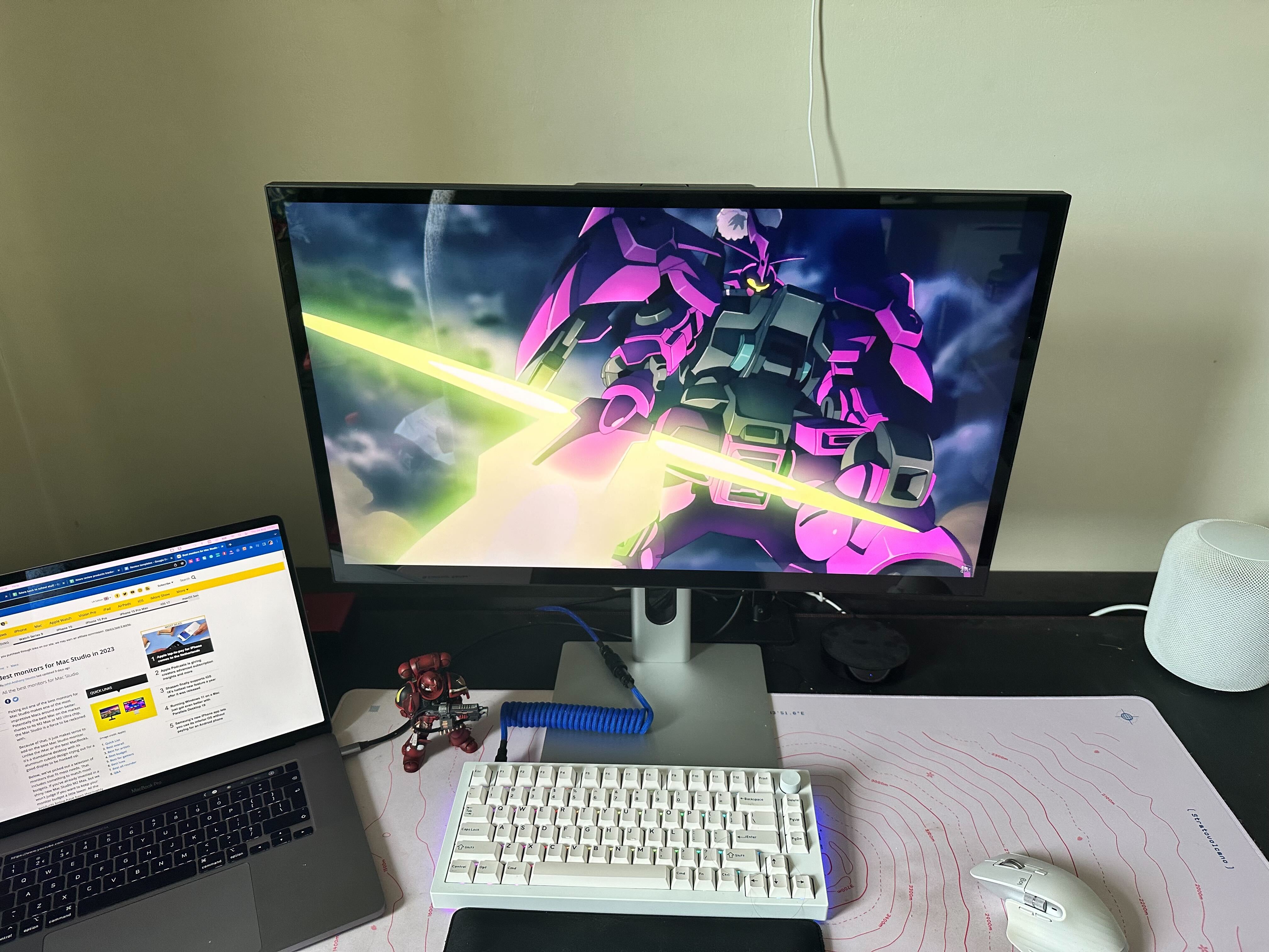
It’s not really competing with the Alogic Clarity 27-inch monitors, but it’s an addition to the line that sits in a slightly different market space. Arguably, it’s not entirely a competitor to the Apple Studio display, given how much bigger it is, but you’ll still likely be looking at the two side by side.
There are other 32-inch creative monitors out there, such as the BenQ PD3220U, a large, colorful monitor that comes in at a similar price. It doesn’t have the useful dock, however, or the option of a touchscreen. There are Dell options at a similar price and spec, but again, missing that touchscreen. If you want a large touchscreen, this is one of your only options — buyers looking for a non-touchscreen model, however, are spoilt for choice. The Clarity Max should be one of those at the top of your list.
Alogic Clarity Max Touch: Should you buy one?
You should buy this if…
- You want a big touchscreen
- 4K is the only way to go for you
- You don’t want to spend as much as an Apple monitor
You shouldn’t buy this if…
- You don’t have the space for a 32-inch monitor
- You don’t need a touchscreen (Buy the non-touch version and save money!)
- You want something with 5K resolution
Alogic Clarity Max Touch: Verdict
The Alogic Clarity Max Touch is an excellent monitor. It looks amazing, the screen is fabulous, and its extra features make it well worth looking at when you compare it to other options out there.
Until we learn more about the camera being stuck in its up position, however, it will lose half a star — with any luck, yours won’t have the issue, but mine did, and I must score accordingly.
Overall, however, I really like the Clarity Max Touch, and if you’re looking for a large 4K monitor with some extra quality-of-life improvements then this might be just what you’re looking for.


