Any creative with a Creative Cloud subscription will be pleased to know that they can get immediate access to Adobe Portfolio for no extra charge. This website builder is specifically tailored towards creating online portfolios rather than building websites with multiple different features, such as shops and forms. Adobe portfolio is therefore really just a simple extension of your work. It takes it off your device and presents it to the world in a beautiful way.
Adobe Portfolio is incredibly easy to use, with clear workflows and icons to guide you through the process of creating a portfolio. The downside to only being a portfolio builder and being so simple is that it really lacks any advanced features that really let you create a more substantial online presence. One of the biggest limitations is that it is not possible to change the layouts of the templates.

Adobe Portfolio: Who is it for?
Adobe Portfolio is a part of the Adobe Creative Suite that offers the ability to create an online portfolio. This website builder is ideal for any creative who has already hitched their cart to Adobe and its subscription package. This has the added benefit of not having to pay any additional fees for the luxury of an online presence.
Adobe's offering is a very simple portfolio builder and really lacks the wider tools to take a photography business to the level of selling prints. Creatives who are happy creating a simple set of web pages that showcase their work will be pleased with the easy workflow and hassle-free templates. More serious artists wanting to more extensively customize the look of their website will need to look elsewhere.

Adobe Portfolio: Price
Adobe Portfolio is included with any Creative Cloud subscription. If you don't have this subscription, then you won't be able to access this builder, and I'd say it's not worth the subscription fee to get the benefits of only Adobe Portfolio.
If you don't have an Adobe subscription, then the Adobe Photography plan starts from $9.99 / £9.99 per month (when you sign up for an annual contract) and gives you access to Adobe PhotoShop, Adobe Lightroom CC, Adobe Lightroom Classic, as well as online access to Adobe Express.
Adobe Portfolio: Key Features
All of Adobe Portfolio's features center around the presentation of media, including photos and videos. Adobe has worked hard to integrate both Lightroom and Behance into the feature set of Adobe Portfolio.
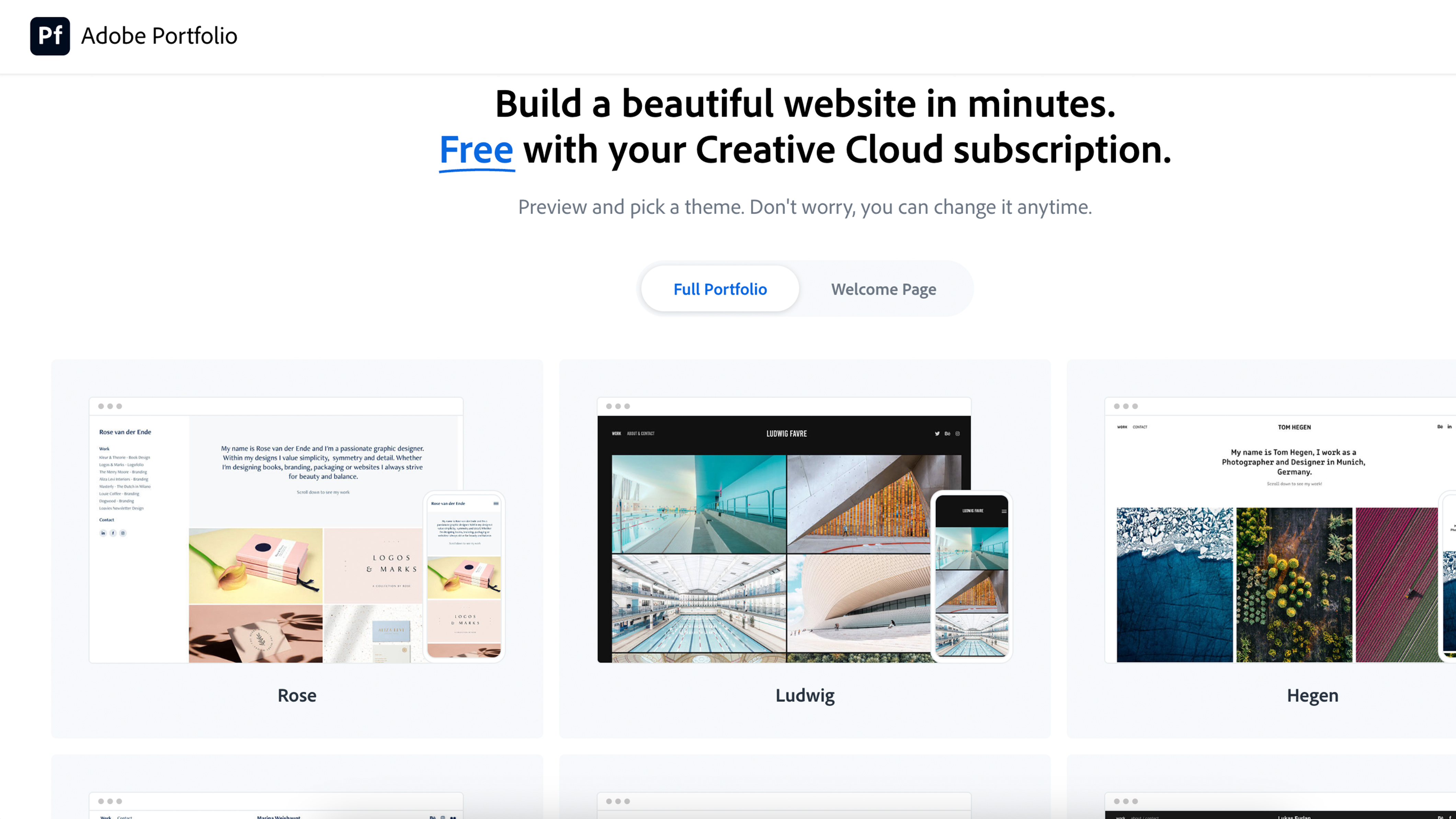
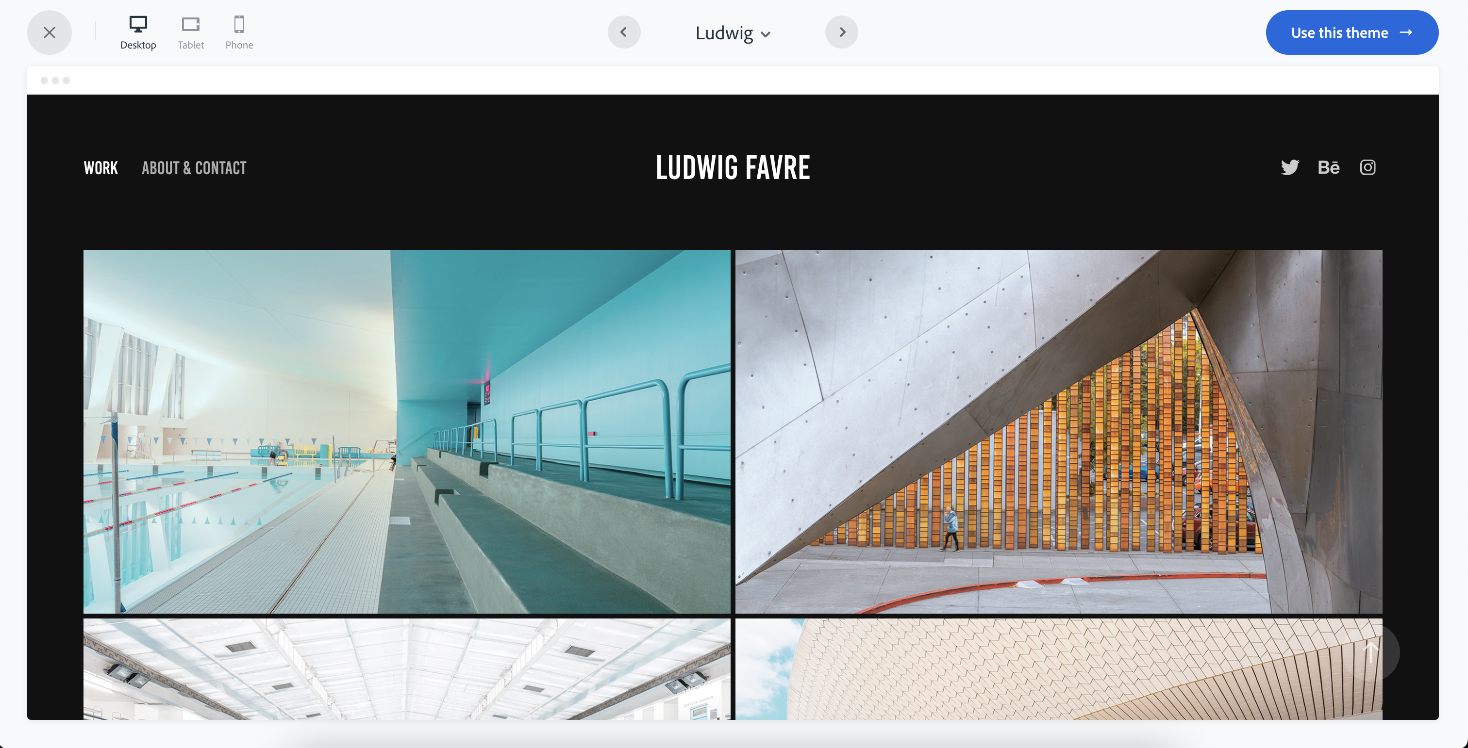
Layouts and responsive design - Adobe Portfolio includes a range of different themes for showcasing your work. If you begin with one but then change your mind, don't worry; it's incredibly easy to swap between them. Unfortunately, what isn't possible is the customization of these themes. The rigid nature of the workflow means you're pretty much stuck with however that theme dictates what your portfolio will look like.
Responsive - As with most website builders, Adobe Portfolio produces a completely responsive design. This means that whatever platform or device your viewers are looking at your website on, it'll adjust accordingly. This is ideal for viewing larger portfolios on mobile devices that would be cumbersome to navigate around unless presented appropriately for that type of device.
Sync with your Behance projects - Behance is an Adobe platform for showcasing creative work. In essence, Behance does almost everything Adobe Portfolio can do, with the addition of being able to socially connect with others and discover new artists. When you choose to sync your portfolio projects with your Behance profile, millions of viewers can discover and interact with your work.

Adobe Portfolio: Design & Ease of Use
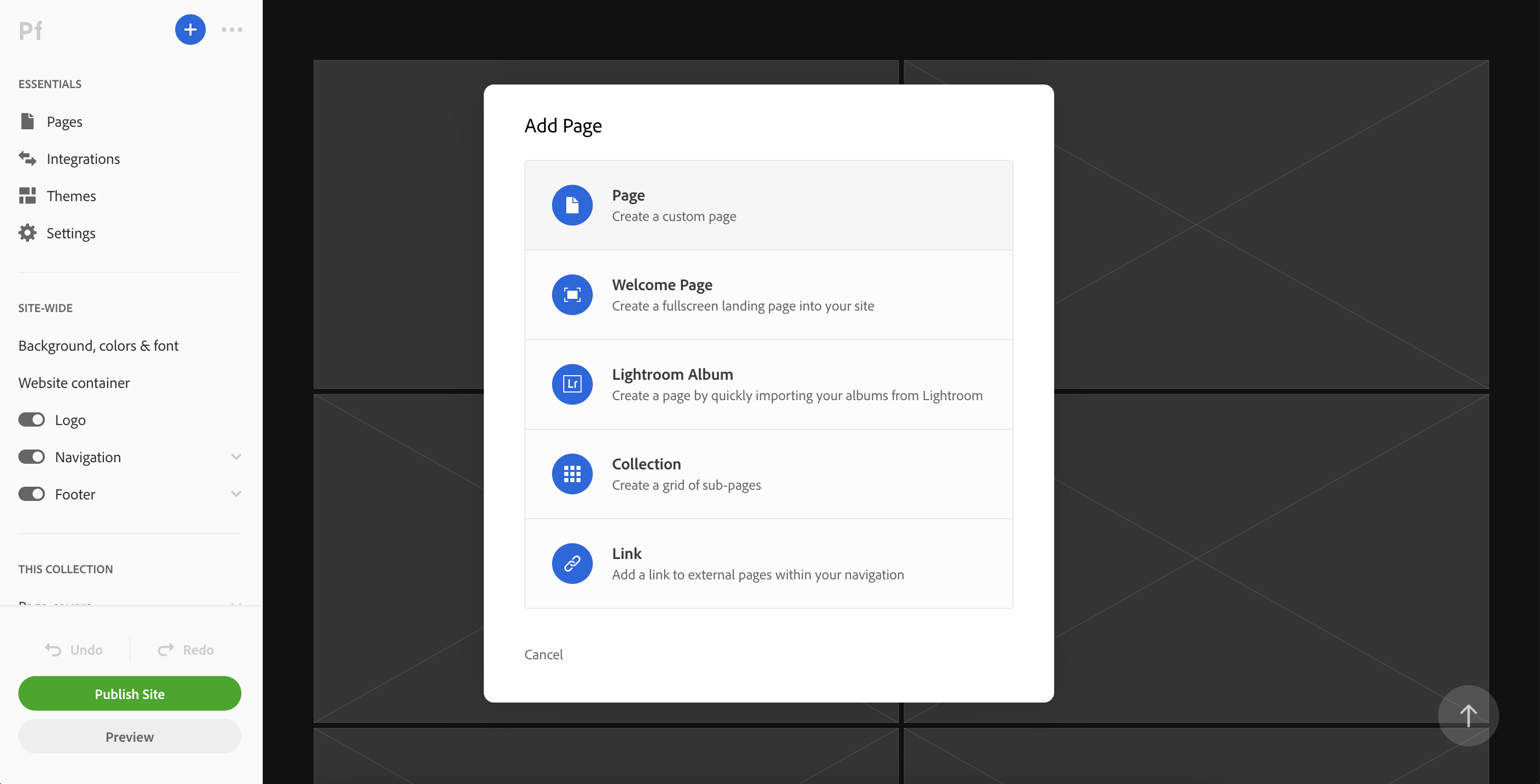
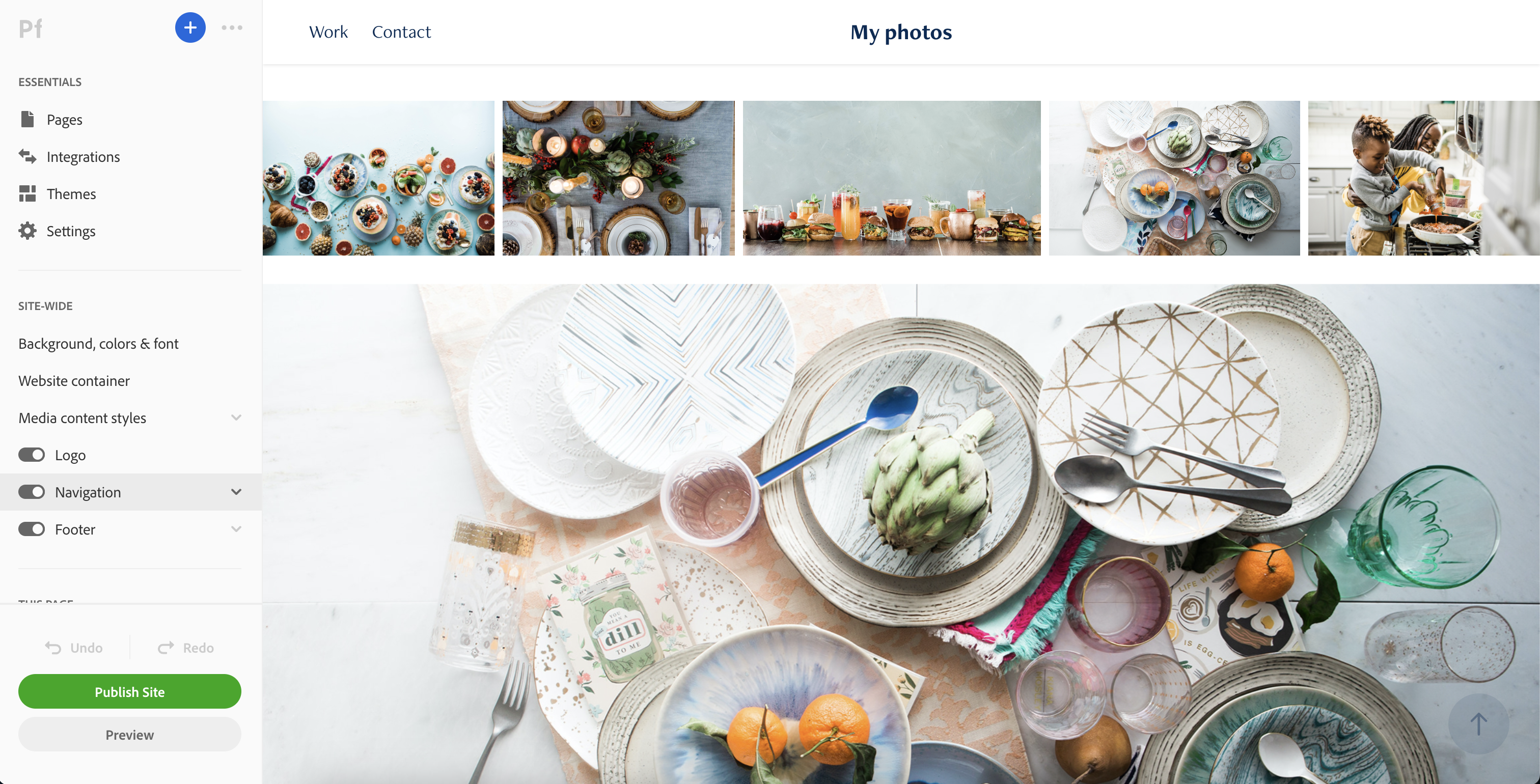
Adobe Portfolio centers around your portfolio, so all the tools and blocks are customized with that in mind. I found it relatively easy to navigate around the interface with a simple tools and properties bar located on the left-hand side. Because Adobe Portfolio has such a limited number of features, there aren't really many tools to display. This has the added benefit of resulting in a very clean and uncluttered interface.
Once I created a page and populated it with media, I quickly became frustrated with the layout tools available. Rather than preset layouts that would quickly and easily determine the location of my images relative to each other, I was presented with photo grid tools that were limited to dictating the number of images per row. This lack of presents made it very difficult for me to get the look I wanted.
When inserting specific images, rather than using the photo grid, it is possible to change the size of the images using a simple slider icon. This was fine, but in no way makes up for how easy it is to create galleries on the likes of Editor X and Squarespace.
There are much easier website builders and portfolio builders on the market, and I would think twice before choosing this one on the merits of how easy it is to use.


Adobe Portfolio: Results
The final results of my creative portfolio with Adobe Builder were satisfactory but in no way filled my heart with joy. The limitations of themes and gallery layouts meant that it was almost impossible to inject my style and creativity into the final output. As a result, I didn't really have the enthusiasm to want to share my resulting portfolio with anyone.

Adobe Portfolio Alternatives
Format and SmugMug are probably the most direct competitors for Adobe Portfolio although those options offer more considerable features beyond simply displaying a portfolio of work. Creatives who want to go beyond that will need to look at the likes of Squarespace and Weebly.


