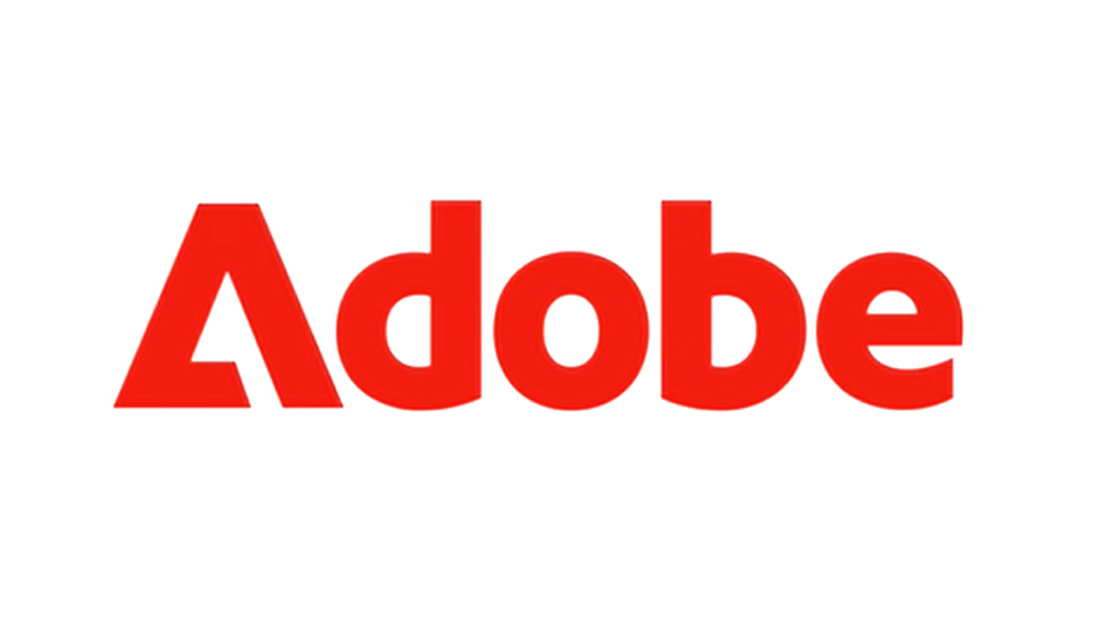
With Adobe's many announcements recently, we were so blown away by the advances in its AI tools to notice another novelty. But in the videos promoting the new text-to-image features from Adobe Firefly, the company behind Photoshop and Illustrator has quietly started using a new version of its logo.
Appearing in logo animations in recent videos, the new application reverses the colours of the main Adobe logo and uses the graphic mark to replace the A in the company name, effectively creating a new Adobe wordmark. It looks bold and distinct, and it's perfectly legible and recognisable. In fact, the move seems like such an obvious design decision, we're wondering what took Adobe so long (see our guide Adobe Creative Cloud discounts if you need to get access to the company's tools).
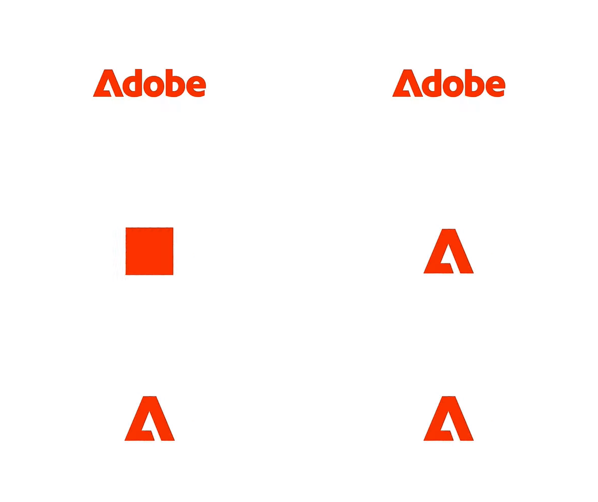
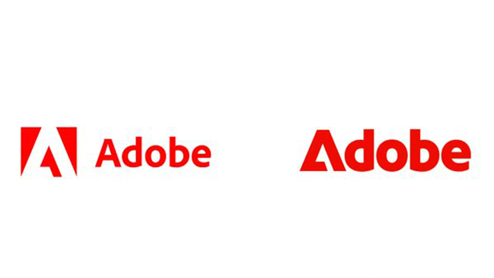
So this isn't exactly a new Adobe logo. The existing corporate emblem (the white triangle on red followed by Adobe written out in Adobe Clean) remains the official design. But the creative software giant has realised that since the graphic mark is obviously an A, it's not really necessary to use both the mark and 'Adobe' written out in full.
The new application features a new heavier typeface to match the weight of the graphic mark. This allows the triangle to serve as the 'A' in the wordmark. The result is a bolder more modern-looking design that leaves the official Adobe logo looking rather gaunt in comparison.
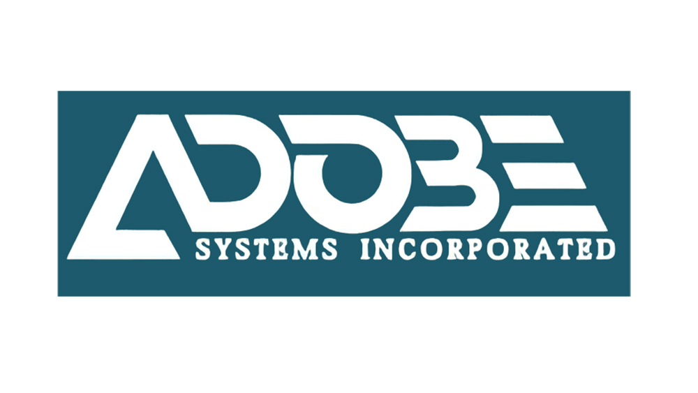
The application actually harks back to the original Adobe logo, which was designed by co-founder John Warnock's wife Marva for Adobe's launch back in 1982. That white-on-teal design features the stylised open triangle A that we know, but it was connected to the D. The current logo with red and white colours was introduced in 1990 and has remained largely the same, although the font was changed from Myriad and the text from black to red. Perhaps it's about time that it got an update, and this application is a super simple but effective way to do that.
The mark can continue to be used alone for small uses and combined with 'dobe' when the name of the brand needs to be written out. It's such an obvious change that it feels like this could have been the Adobe logo all along. While Adobe's still using its old design as its main logo for now, the new wordmark application would seem to leave it a little obsolete.
Need access to Adobe's tech? See the best current prices on Creative Cloud below or learn all about Adobe Firefly Generative Fill in Photoshop.


