Nailing a neutral scheme, especially with the wealth of neutral living room ideas available, is surprisingly harder than it looks. Finding that balance between creating a calm and relaxed space, without looking too clinical can be tricky, but when it's done right the results can be breathtaking.
This home in southwest London is an excellent example of a successful whole home scheme, carrying the neutral look from room to room effortlessly.
After spending three years in Sydney, this young family moved from Australia to London. They loved everything about their new neighbourhood, the green spaces and easy access to the city. But soon, with another baby on the way, they were keen to upscale to a larger family home and were keen to stay in the same area.
They discovered this property one street up from their house, and despite it being out of their budget, they went to view it and were smitten, so they made an offer and it was eventually accepted.
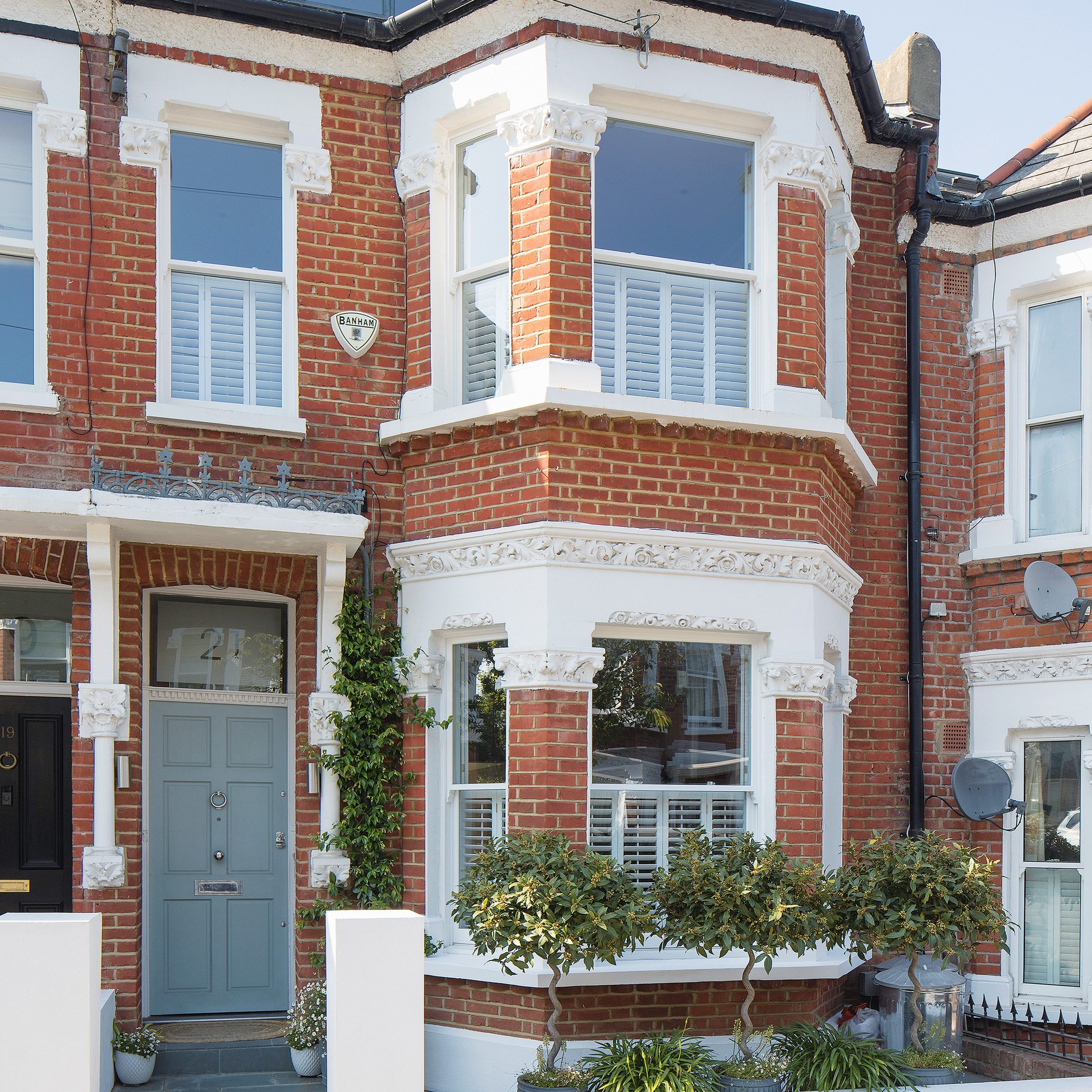
After moving in, the family set to work to make the house their home. Despite the changes that the previous owner had already made to open up the house to create more space, the existing layout wasn’t working for them.
'A bright and airy home that would evolve with us as a young family was key, recalls the homeowner. 'We removed a chimney stack from the roof down to the kitchen to give us more floor space, and floor-to-ceiling sliding doors and an oriel window were added for a better connection to the garden.'
Interior door frames were moved or raised to improve the flow of light and skylights were added. They knocked through from the main bedroom into the small room next door to create an en-suite bathroom, then turned an old bathroom into a new nursery. 'Plenty of storage ideas were important,' she explains, 'so joinery was worked into every room.’
'Renovating a property is such an emotional rollercoaster!' recalls the owner. 'On the one hand it was wonderful seeing our vision come to life but then on the other, inevitable hold-ups impacted progress. Even small delays led to costs escalating. My parents were wonderful and let us live with them for the first eight months, but it was also quite difficult at times.’
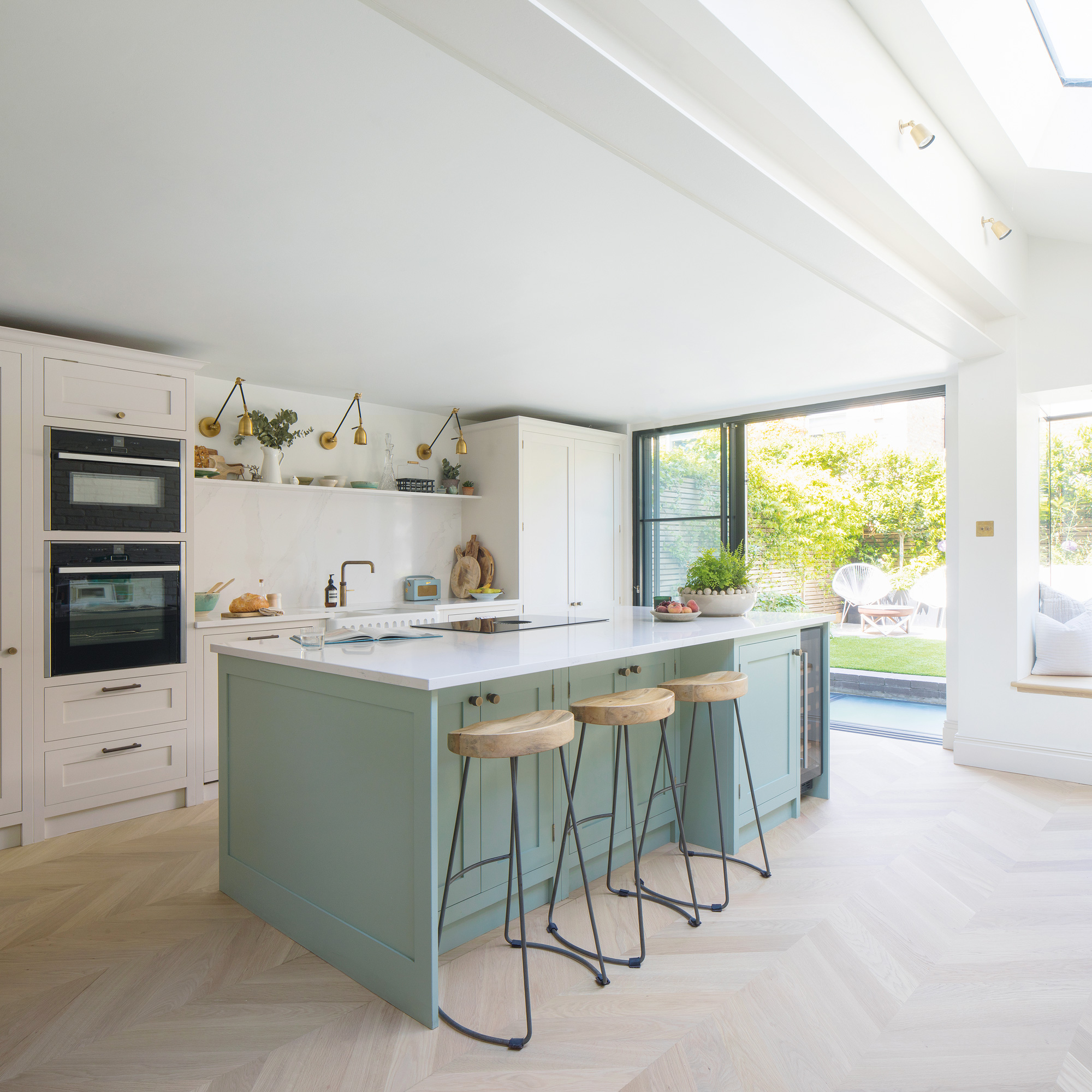
The bright and airy kitchen

‘I didn’t want anything faddy,' explained the owner, 'so I blended contemporary-style lighting and brassware with traditional Shaker kitchen cabinetry for a timeless look that would evolve with us as a family.’
The kitchen island is highlighted as a focal point because the owners painted it a different colour to the other kitchen cabinets.
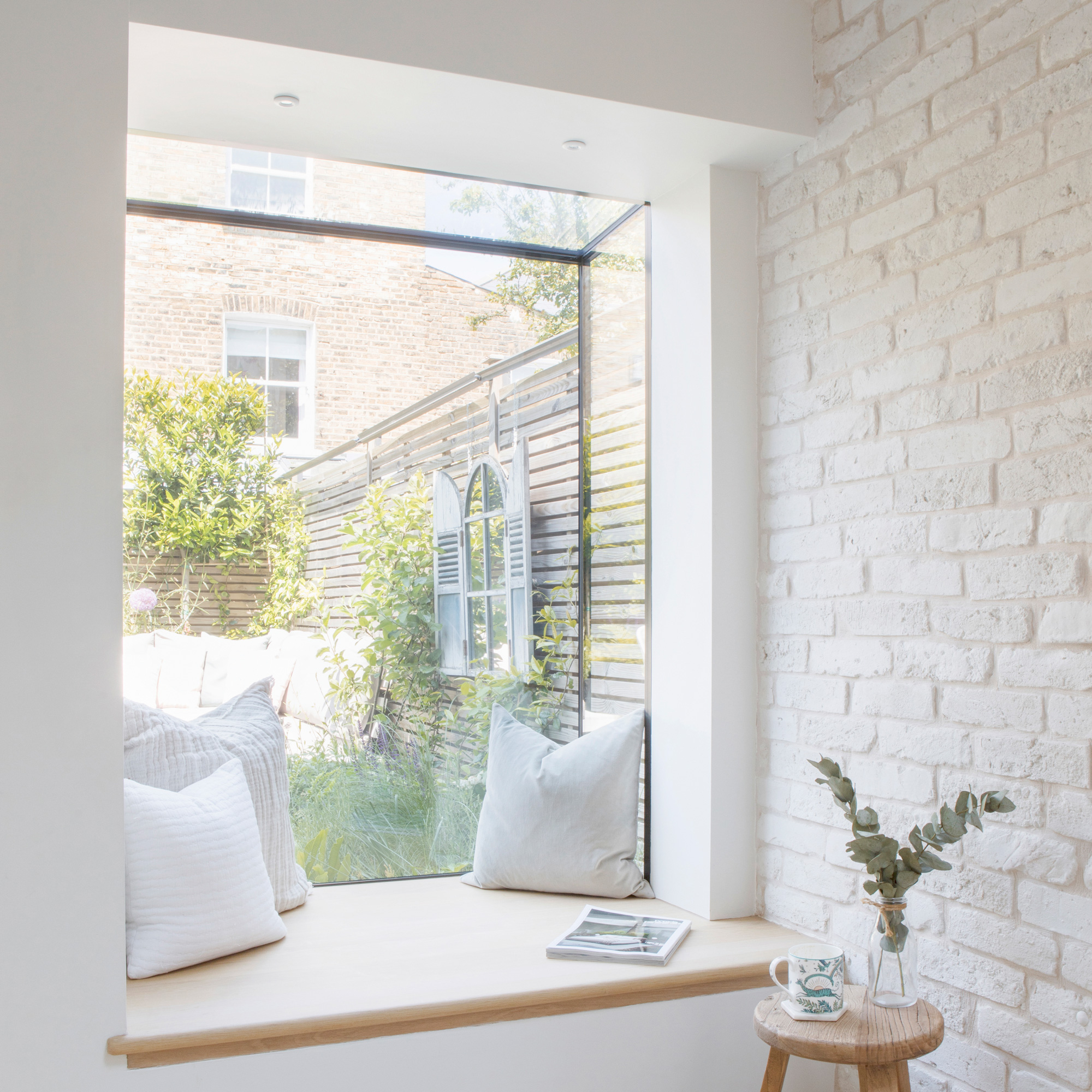
The owners installed an oriel window in the kitchen overlooking the garden to give the room a better connection to the outdoor space.
'A great spot to enjoy a cup of tea,' she explains, 'the oriel window has transformed an unused corner of the kitchen, while the seat conceals practical storage.’
The wall adjacent to the oriel window is covered in brick slips. These add both texture and character without the mess of exposing the brickwork.
The open plan dining area
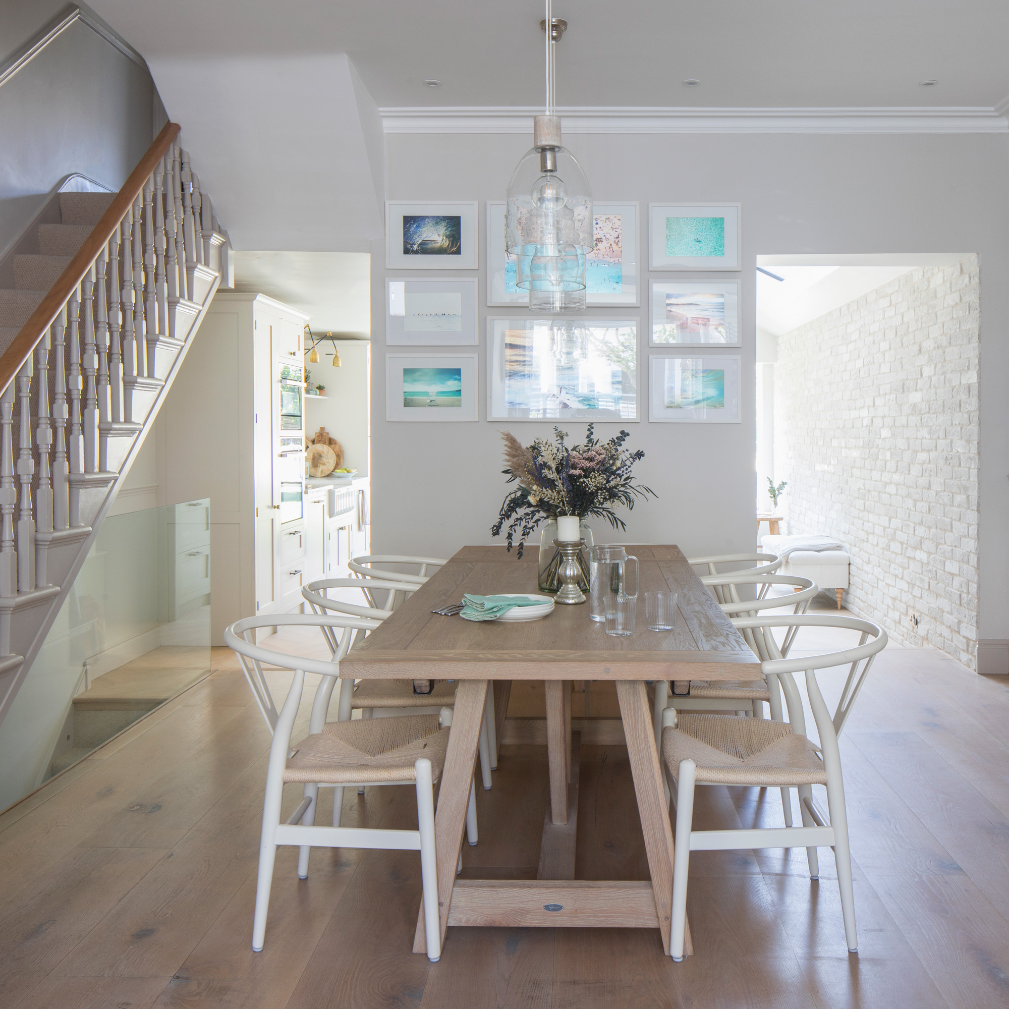
'We like having this space separate from the kitchen,' she explains, 'as any mess is kept out of sight, while the two openings ensure the interior flows really well.’
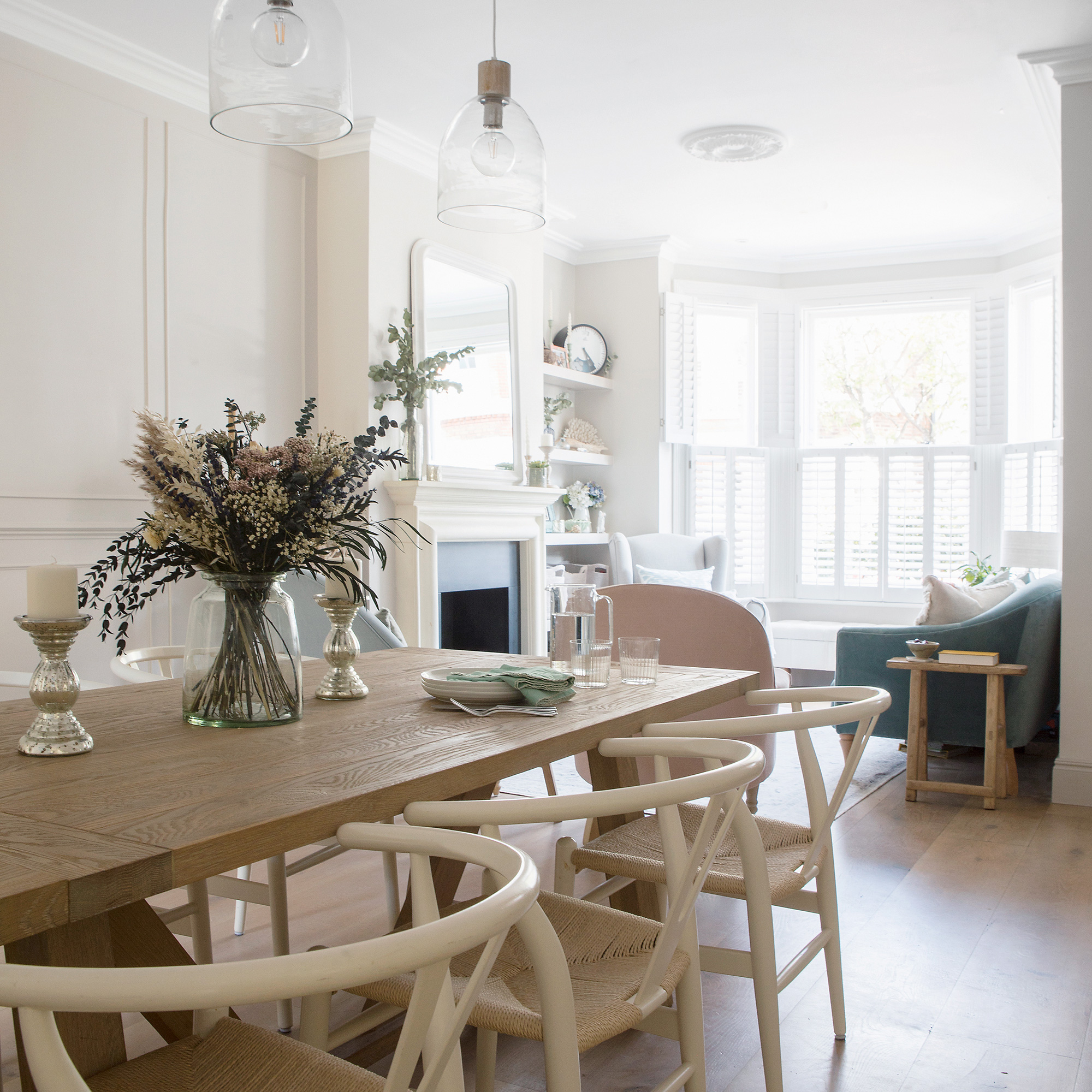
The dining room lighting over the table helps define the eating zone in the open-plan space, while running the same flooring throughout the dining and living space creates a smart and cohesive feel.
The open plan living area
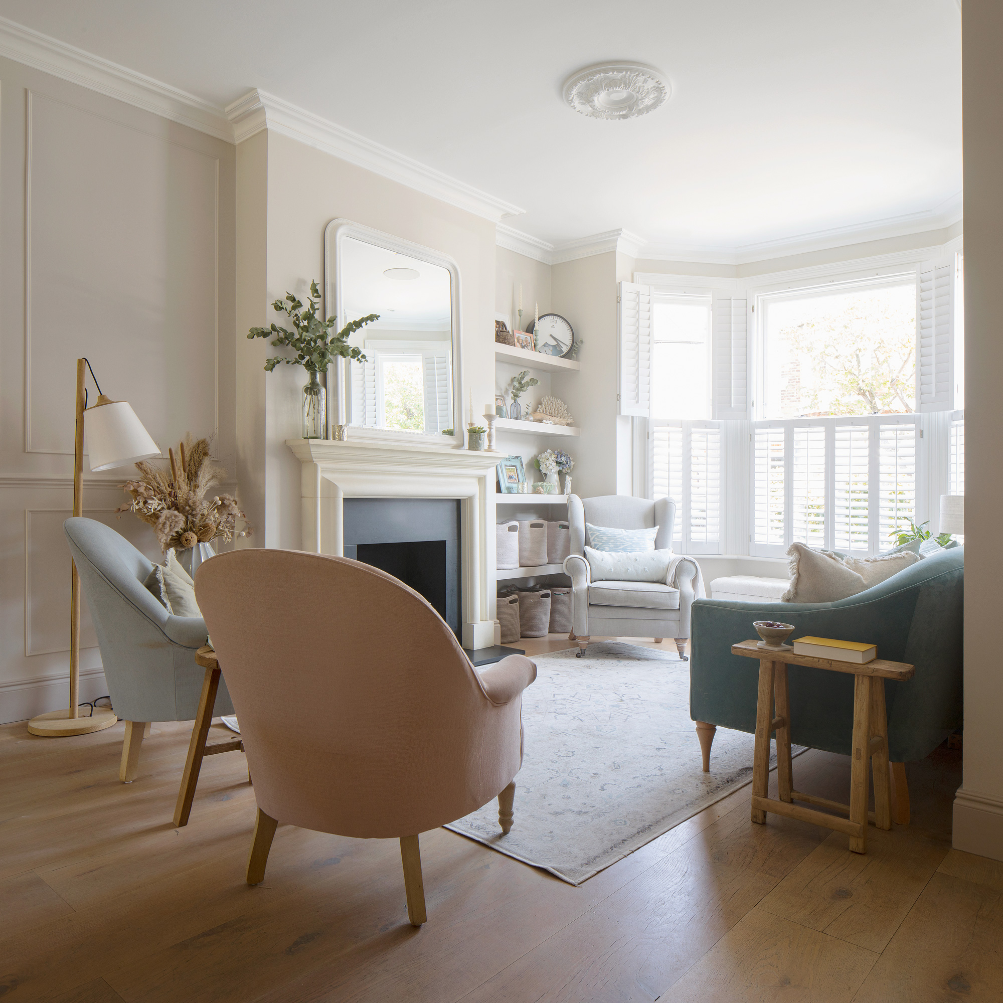
The living area combines upholstered seating in a variety of pale shades, against a pale background. 'We decided not to have a coffee table,' she says, 'so the children have more space to play.' Here, clever toy storage ideas are essential. 'Toys are stowed in the baskets on the shelves, while the soft washable rug is very practical.'
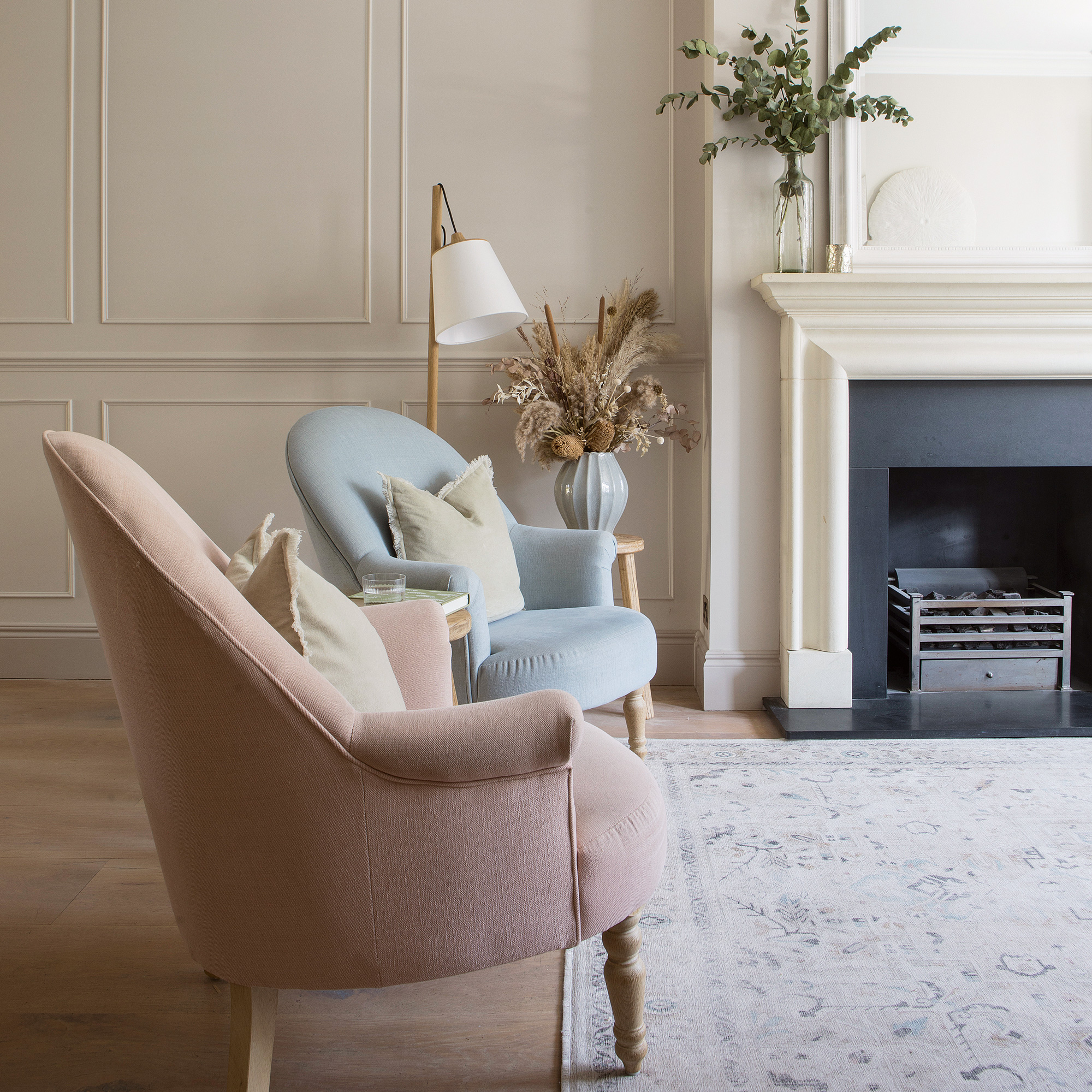
'The neutral scheme ensures a calm feel,' adds the owner, 'while beading on plain walls brings in more character.'
The serene main bedroom
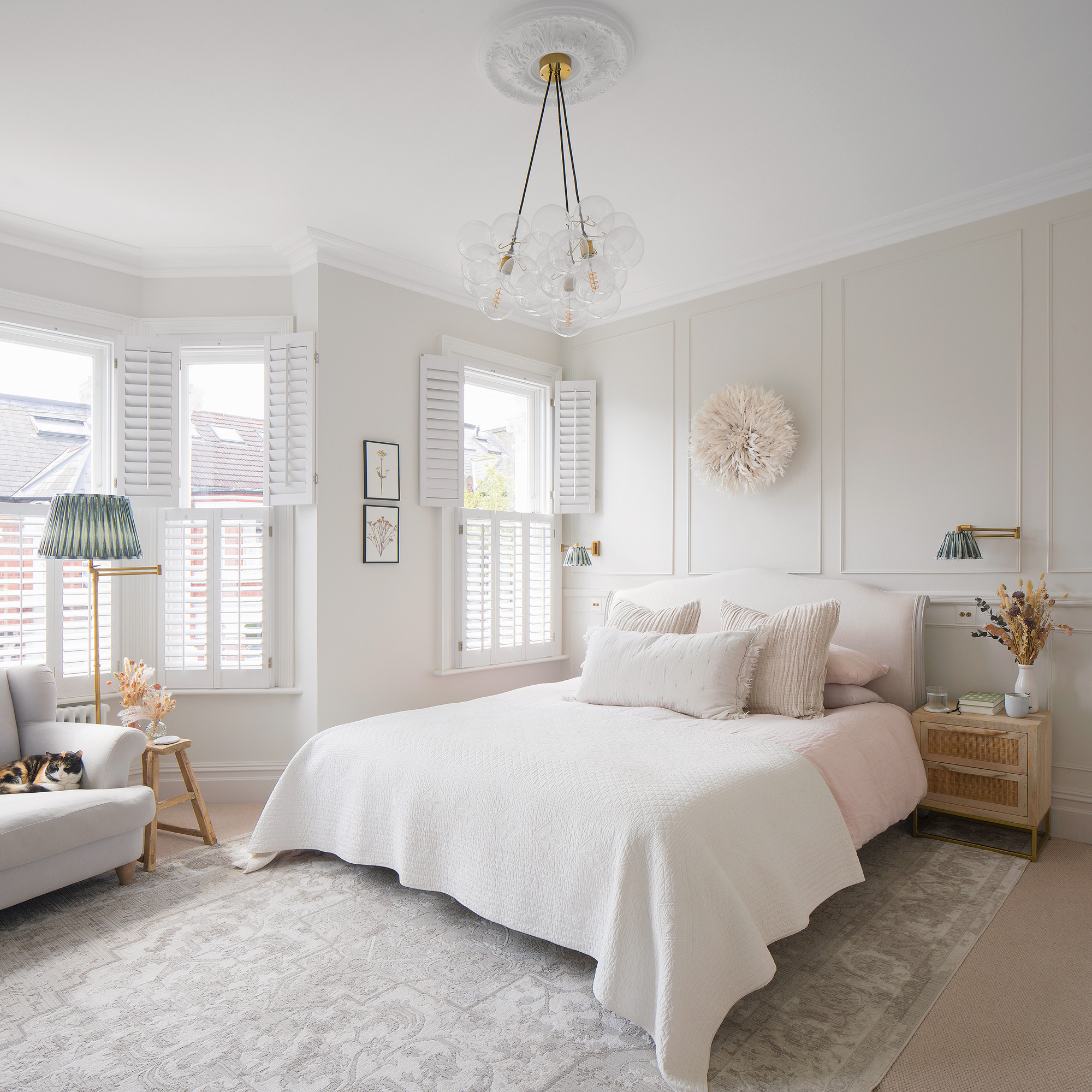
The main bedroom is a masterclass in neutral bedroom ideas, combining a variety of textures in pale shades. ‘We were keen to highlight the high ceilings and original features. We exposed the chimney breast and added back in a Victorian fireplace to create a focal point.’
Storage isn't an issue here either with everything kept behind closed doors in fitted bespoke cupboards. Set back into the alcoves, this ensures they don’t take up too much floor space.
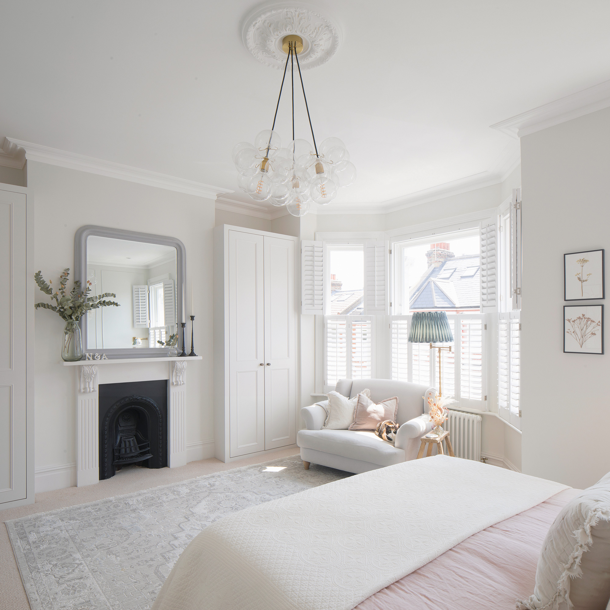
‘This room is a calm and serene retreat,' explains the owner, 'with a south-facing aspect, and it's the only room to still have the original cornicing and ceiling rose.'
The daughter's beautiful bedroom
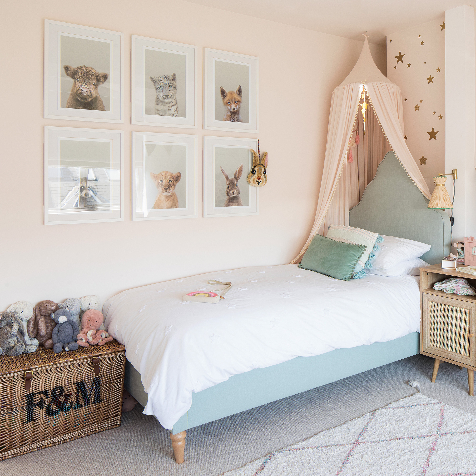
The couple balanced their daughter's love of hot pinks and sparkles with a scheme that works with the rest of the house by using softer pinks. There's plenty of storage with large baskets, and the bed is topped with a dreamy canopy.
The kids' fun, yet practical bathroom
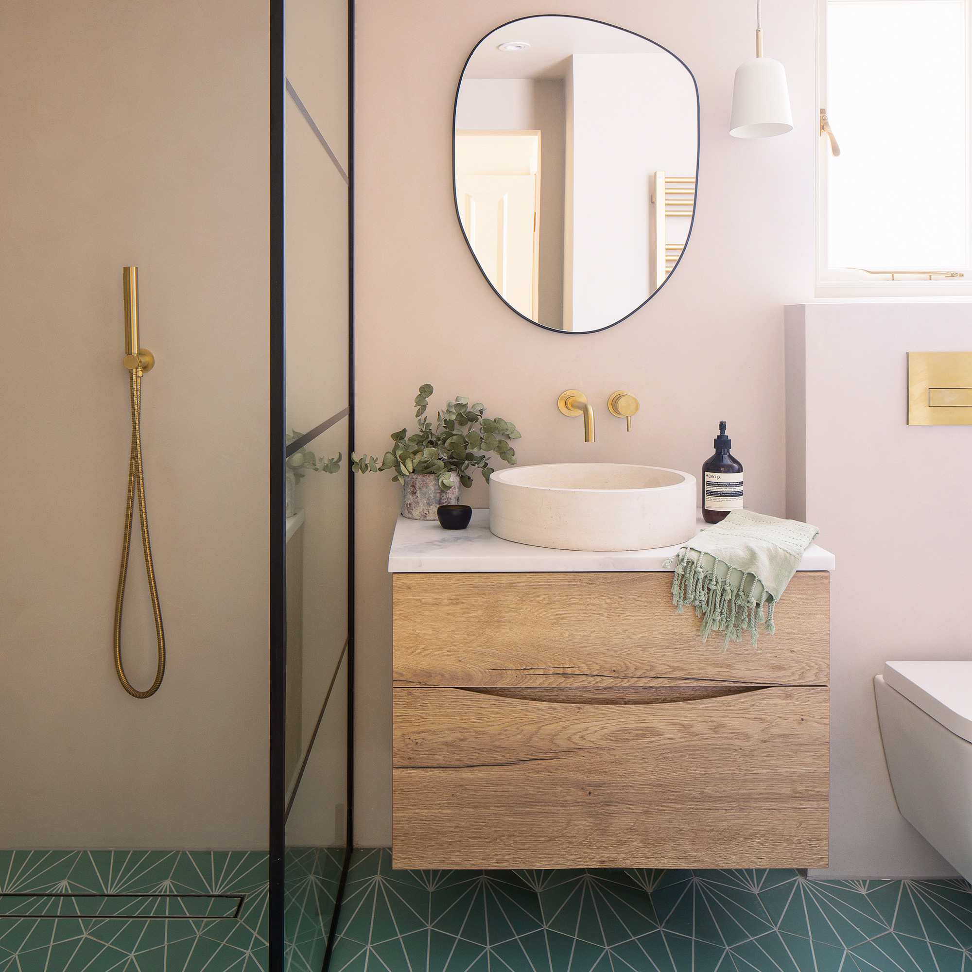
The kids' bathroom is fun yet practical. It features plenty of floor space, a bath and a walk-in shower. ‘It’s an enjoyable space,' she says, bathtimes are lots of fun!’
‘Our home is everything we could have hoped for and more - we genuinely feel that we’ve created an oasis of calm. There’s an abundance of natural light and the space flows cohesively. The ground floor works particularly well for us as a family; we feel connected, even if we are in separate areas. We have created a light and airy, clutter-free, peaceful home, stripped back and perfectly designed for our family.’
Focus on Microcement
The bathrooms in this home have all been finished with microcement. The owner chose it because it's both aesthetically pleasing and practical.
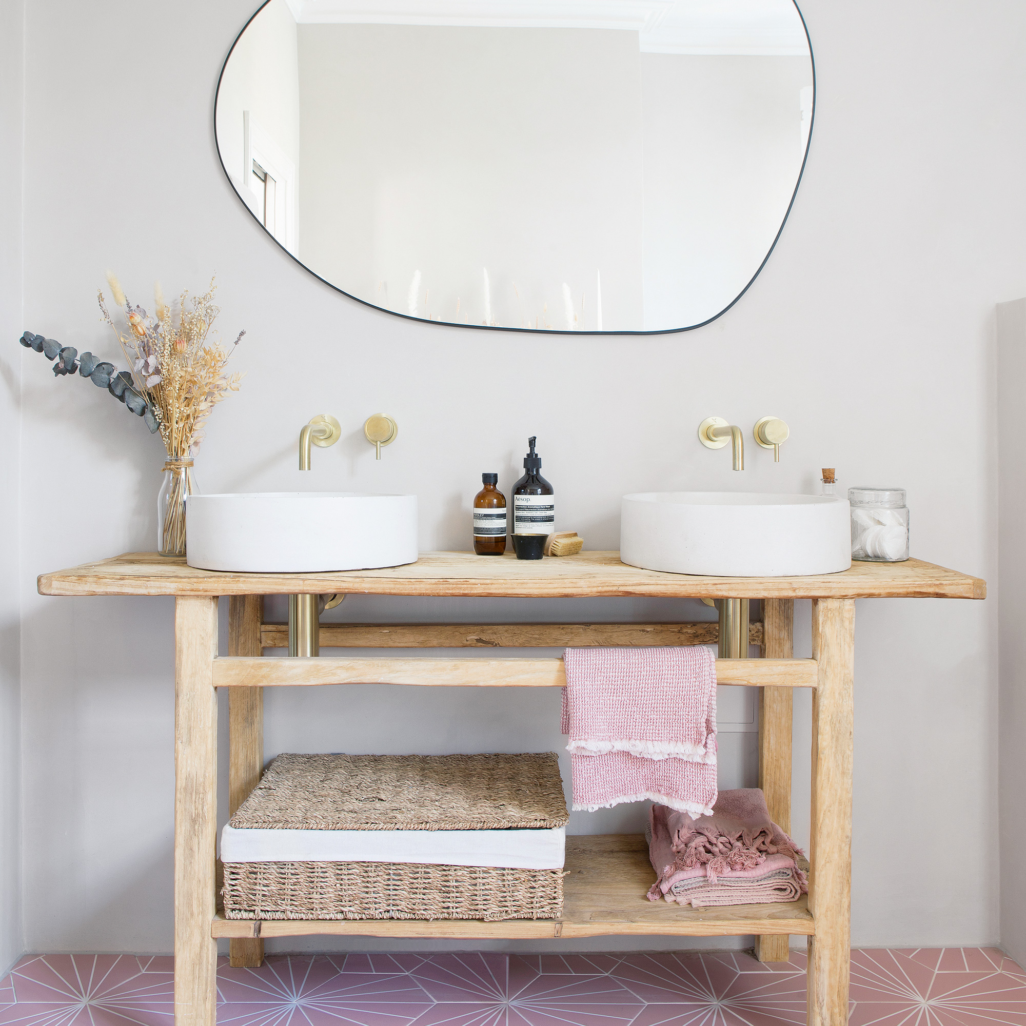
- WHAT IS IT? Microcement is a modern alternative to polished concrete – a resilient and versatile medium that is both stylish and practical. It has become popular recently among interior designers, architects and people who want to create a concrete look without using traditional building methods.
- THE BENEFITS It is made from a mix of common cement and a special resin that is applied in thin layers, then sealed with a polyurethane coating. Microcement can be applied horizontally and vertically to almost any surface, and the colour and finish can be customised to suit your décor with each application. Its biggest attribute is that it doesn’t require expansion joints like polished concrete, so the finish is completely seamless.
- MAINTENANCE Microcement is a great choice for kitchens, bathrooms and wet rooms as the polyurethane coating is watertight, slip-resistant and easily cleanable. It also acts as a protective layer for the microcement.


