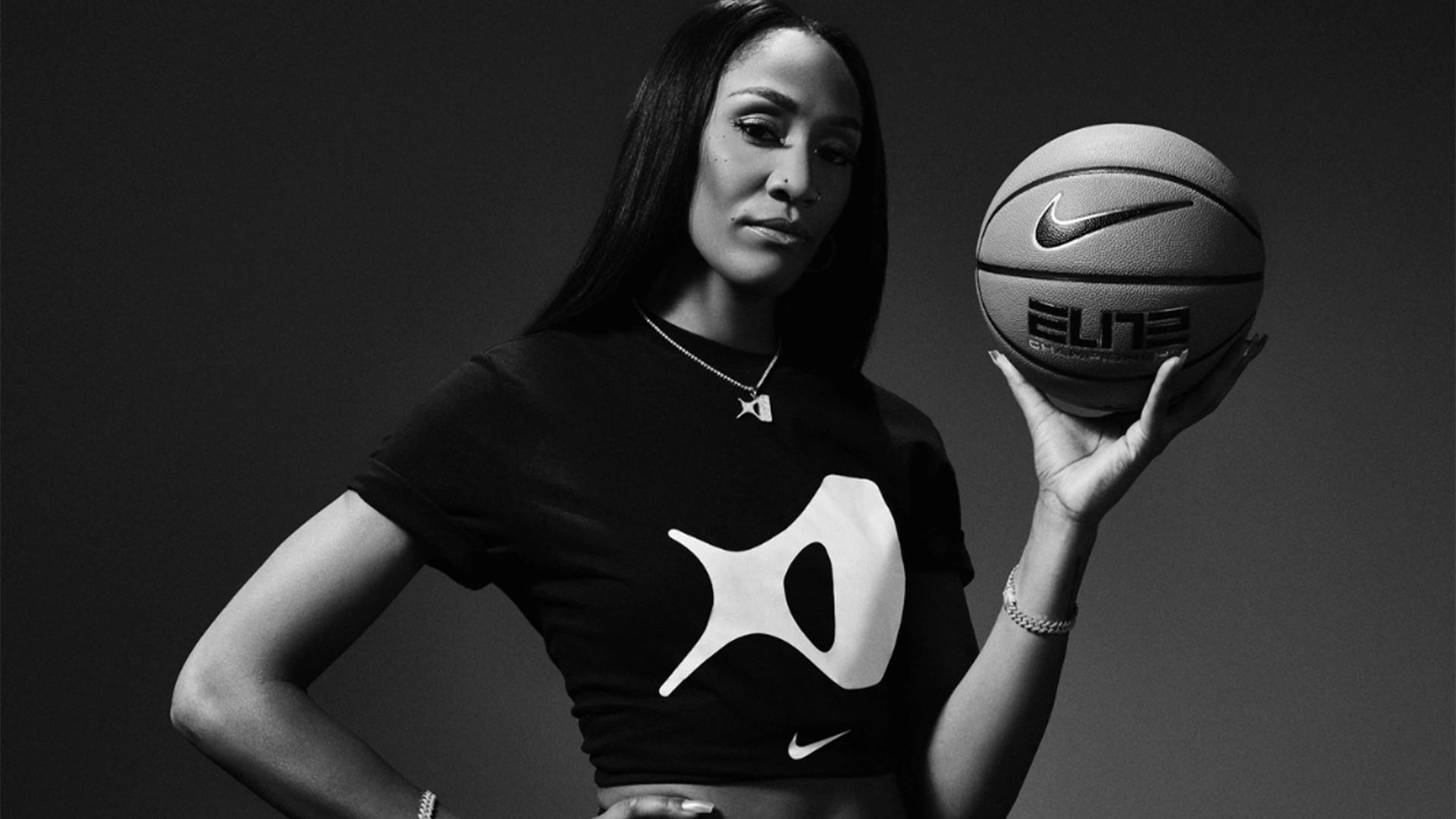
Sports brand Nike has an impressive array of legendary logos – from the iconic swoosh to the Air Jordan Jumpman. So it's no surprise that when a new design drops, fans can be a little opinionated (to say the least). Predictably fans didn’t hold their reservations after WNBA star A'ja Wilson dropped her brand-new Nike logo, but I have to admit I disagree with the backlash.
With iconic sports star collaborations such as Serena Williams and Tiger Woods already under its belt, Nike's latest logo has to stand out against a sea of past designs. With a distinct abstract feel, A'ja's logo embodies contemporary design, daring to challenge the conventions of sports logos for the better.
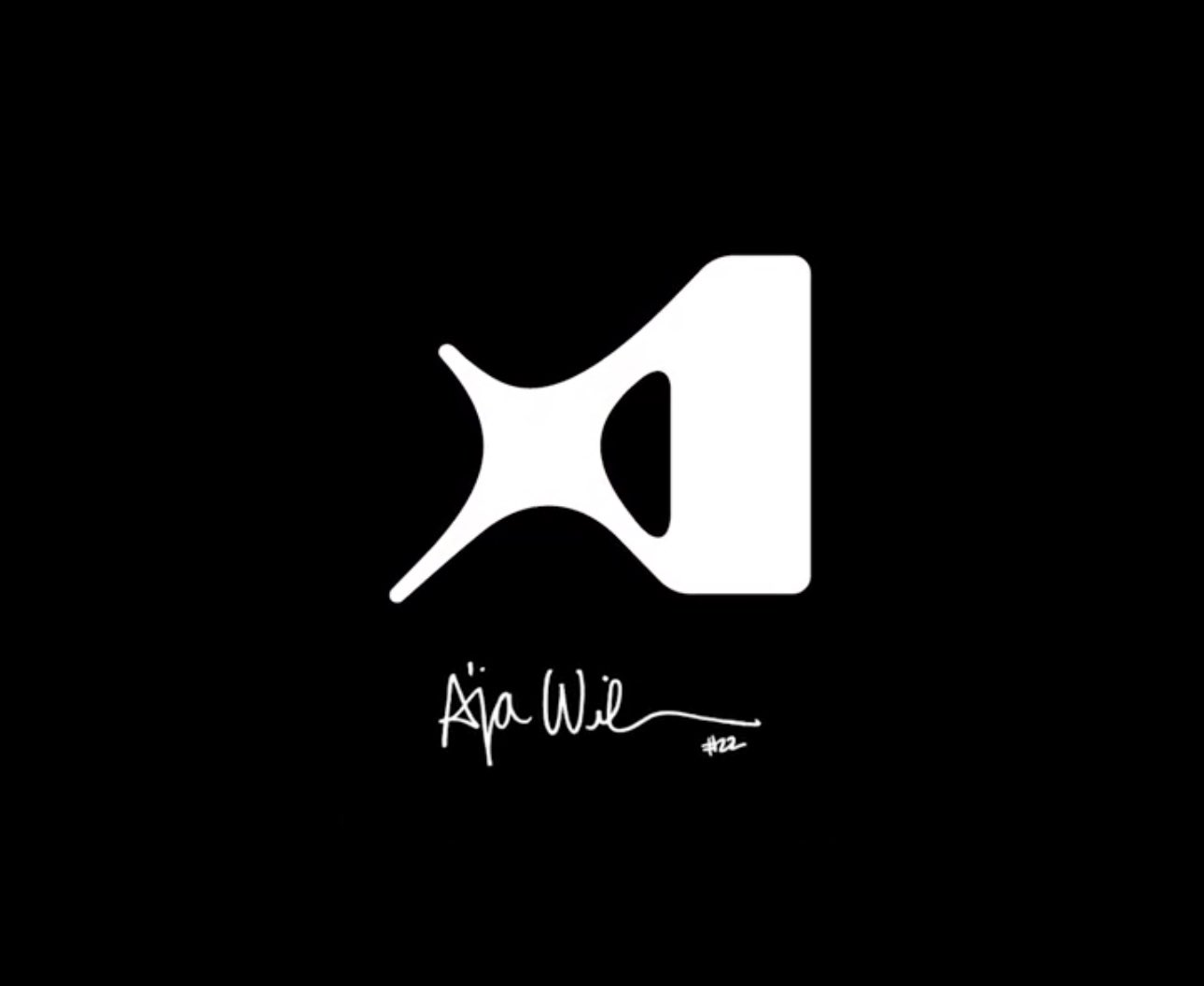
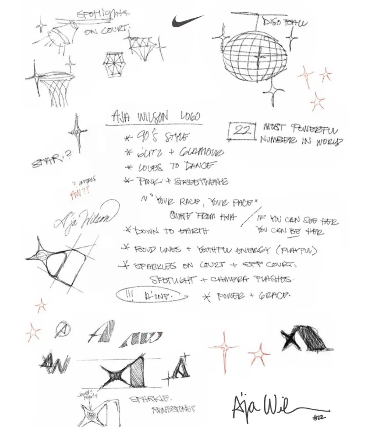
A'ja Wilson's logo (referred to as the 'A') is a culmination of her personality and style, taking design cues from her shining career and playful spirit. The essence of the design is inspired by the star shape that A'ja draws in her signature, also referencing her self-proclaimed "diamond in the rough" identity. Official Nike sketches reveal the original design aimed to capture a "90's style" with "round lines + youthful energy" – motifs that radiate through the final logo design.
Despite some scathing fan reactions saying "Nike did A’ja Wilson dirty with this logo" and one Reddit user claiming it resembled a "sideways snail", I think that fans are being a little too harsh on the logo. It embodies every design cue that A'ja intended while feeling modern, fresh and unique against Nike's other famous logos (the last thing we need is a soulless Jumpman copy). From a design perspective, it's distinct, stylish and scalable, with the potential to be recognisable across a range of products – a new classic in the making.
For more Nike news, check out the out-of-this-world Wemby logo that had fans amazed and confused. If you're after more design inspiration, check out the new National Football Museum logo that's brilliantly simple.