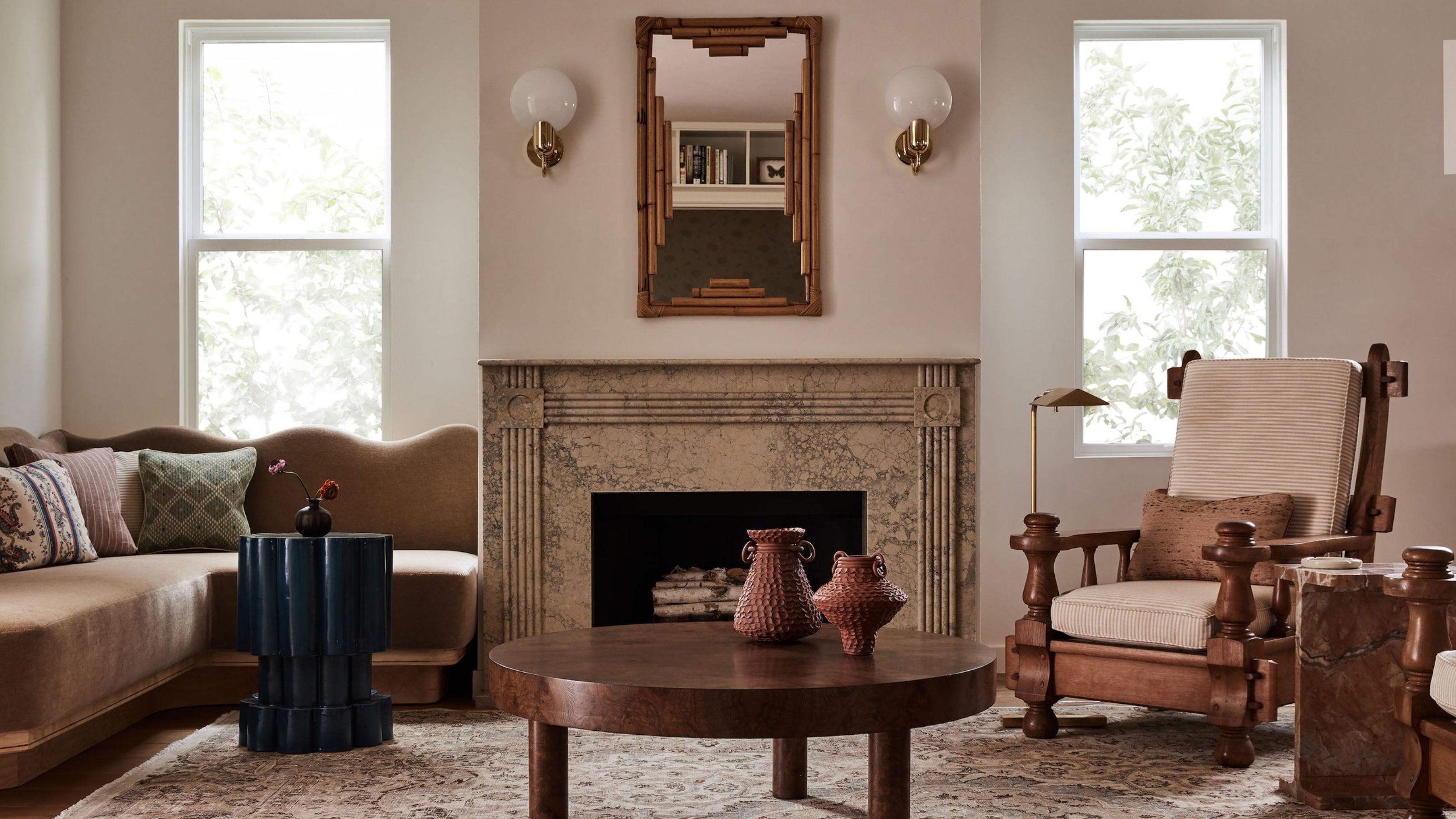
Crema Marfil stone, unlacquered brass, lime-washed wall, a walnut dining table with lathe-turned legs. Texture, pattern and a general sense of play ooze from every corner of this cozy yet modern home in Los Angeles' Mar Vista neighborhood.
But it wasn't always this way — far from it. Interior designer Stefani Stein first stepped through its doors while the now-owners were still considering whether it was worth buying. 'It was rather disjointed with clashing colors and dated materials,' she says. But it was also the perfect blank canvas.
Having just made the move across the country from Vermont, the young family were looking for a home that felt at the same time sunny yet calm; one that embraced their new chic coastal locale while still honoring their East Coast roots.
'A great interior scheme needs a bit of tension,' says Stefani, explaining how the final design manages to marry the modern interior design of California's cool with all the cozy comforts that a classic New England style affords.
'I played with textiles, weaving patterns and motifs that were reminiscent of their time in Vermont, but with a more coastal and California-inspired palette,' she adds. 'This hybrid of elegance and charm, rustic and refined, current and classic, was the thematic unification from space to space.'
Below, she takes us on a tour.
THE KITCHEN
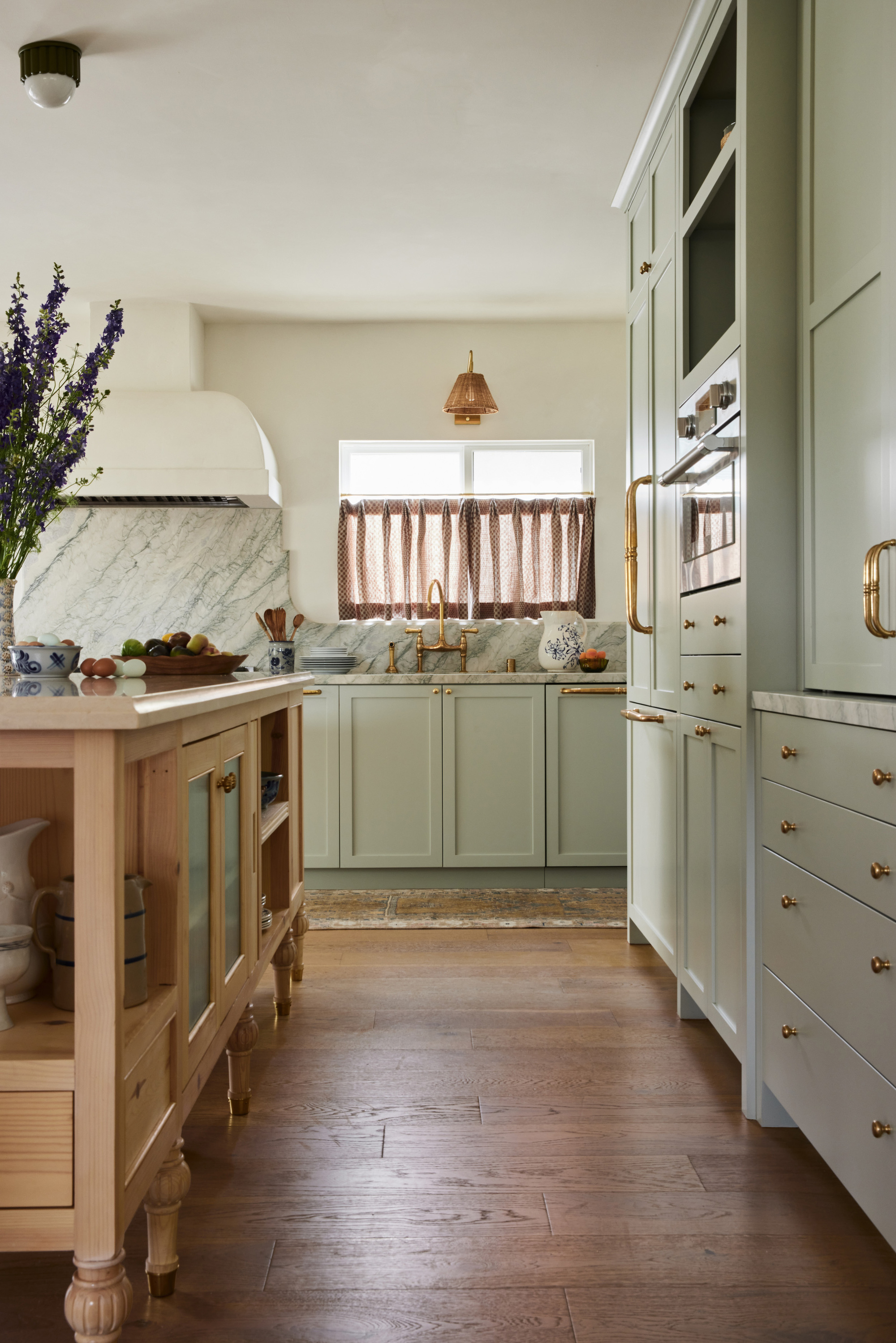
The kitchen was where the design dance began. 'I found an exquisite Cipollino Tirreno marble, which I knew had to take center-stage in the kitchen,' says Stefani. 'The other materials and colors fell into place from there.'
First impressions of the space is that it feels incredibly homey; as if a fresh batch of cookies are due from the oven any second. But it's also sophisticated. From the feathery veins of the marble, with its subtle flecks of sage green, gray and gold, Stefani pulled an entire palette together. It's a sage green kitchen that is full of charm.
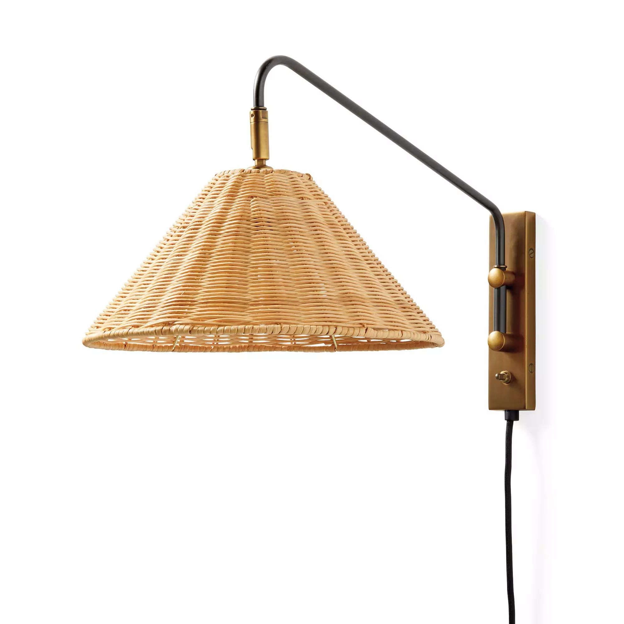
Price: $278
Was: $348
Finishes: Brass, White
There's the understated kitchen cabinet color, the bold hardware choices and the unlacquered brass bridge faucet from Perrin & Rowe. But the details don't stop there. Deftly tiptoeing that delicate line between cluttered and curated, the space is filled with so many little magic moments. Notice the wicker wall sconce, the hand-blocked linen cafe curtains, and the turned kitchen island legs.
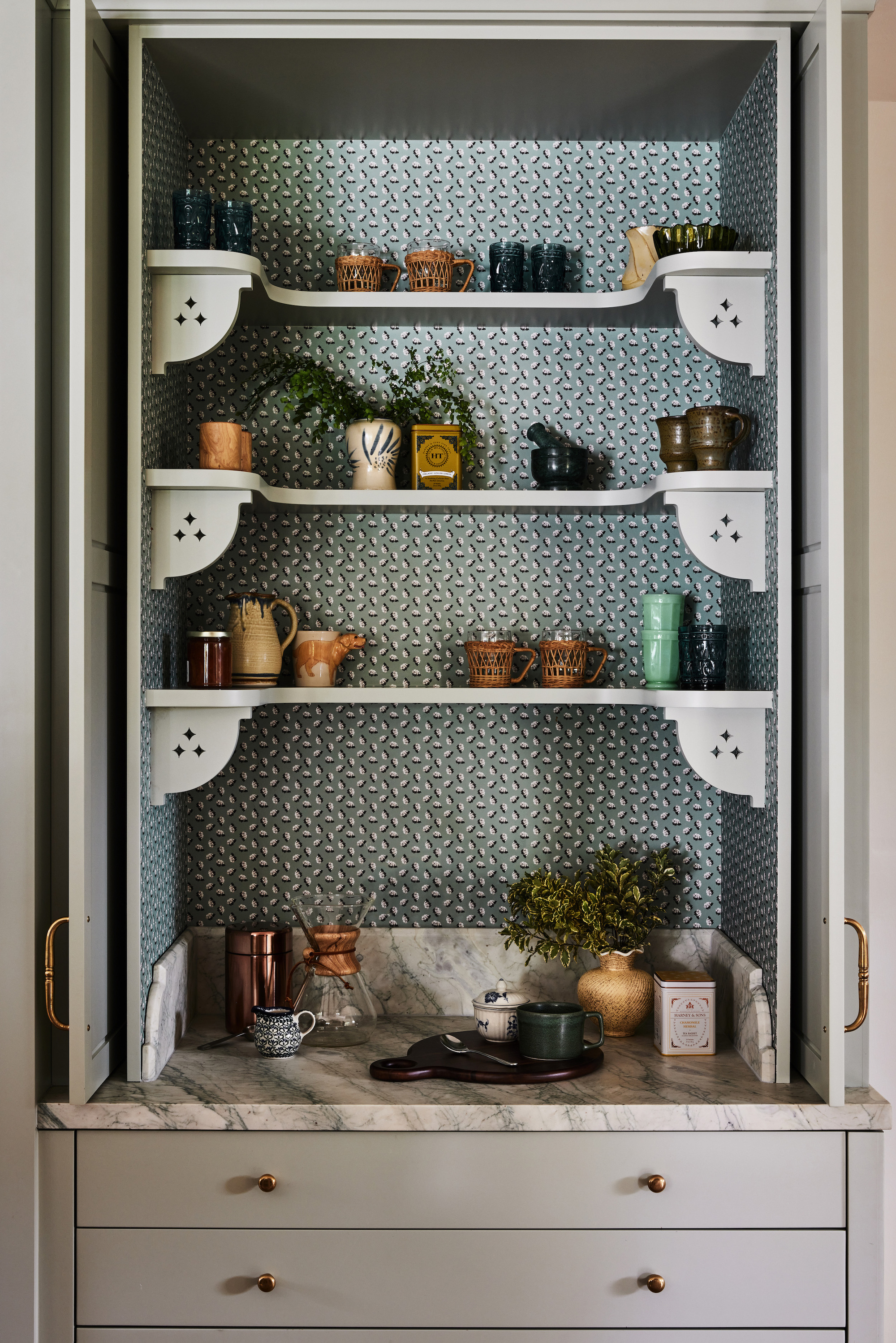
But perhaps the greatest moment of all — the wallpaper-lined appliance cabinet with a print from Stefani's own homewares collection, August Abode. It's whimsical and absolutely wonderful.
The Living Room
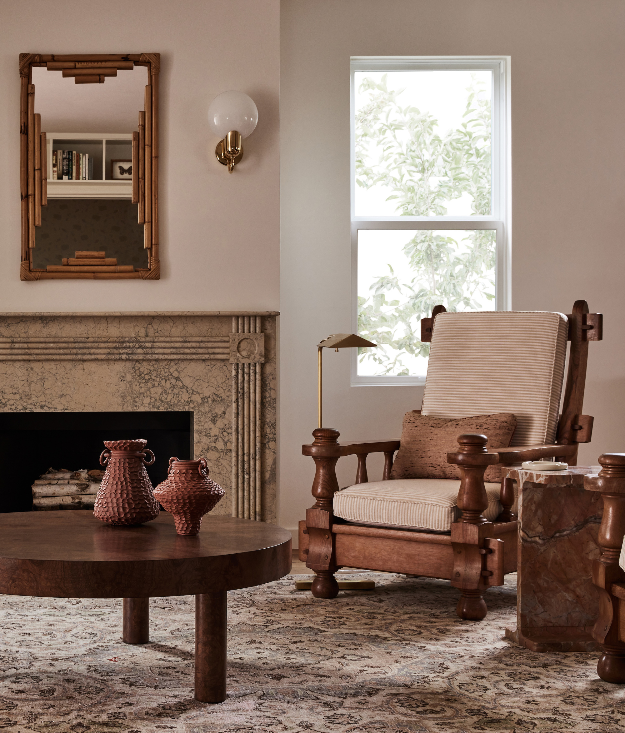
The living room also required a lot of attention from Stefani, and a significant reconfiguration to make it more liveable. 'The fireplace had a bulky wooden mantle paired with high-contrast cement tiles that protruded into the space several feet,' she explains. 'That was the first element to eliminate in the room.'
In its place, she created a custom marble mantle and a more considered seating arrangement for the space — which includes a chocolate brown corner banquette seat with a wavy backrest — that was designed to spark conversation.
'I especially love the combination of marble, plywood, burl wood and brass in the living room. The dance between the raw and refined materials brings the space to life,' she says.
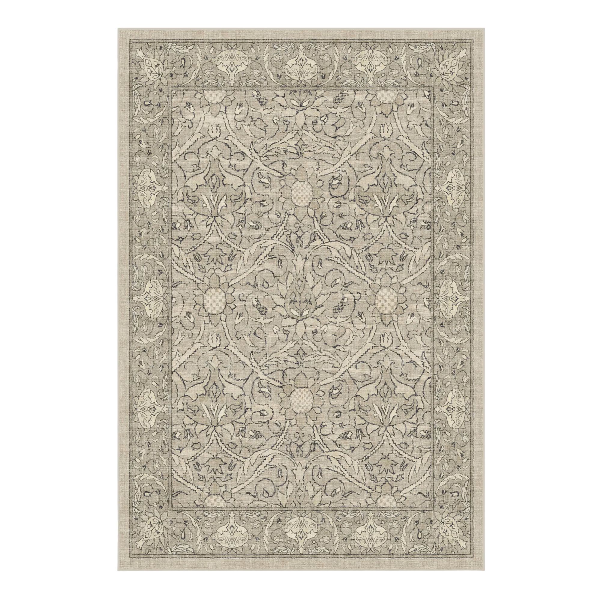
Price: $299.00
Size: 4' x 6'
Currently 20% off with code BDAY24
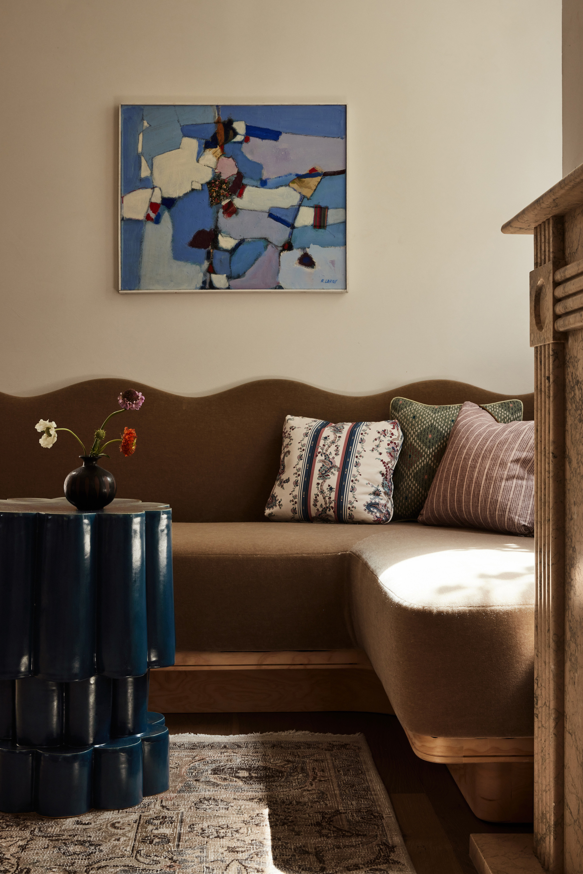
It also created a better flow and interaction between the living space and the adjacent den room, which features more oversized furniture and clashing-yet-complementary patterns that give the space an ultra cozy feel.
The olive green ottoman — part of Stefani's own line and made by local artisans in Los Angeles — is just one part of the curated edit of furniture that sees French 1970s vintage sitting alongside wicker accents, humble plywood piece, and plush mohair finishes.
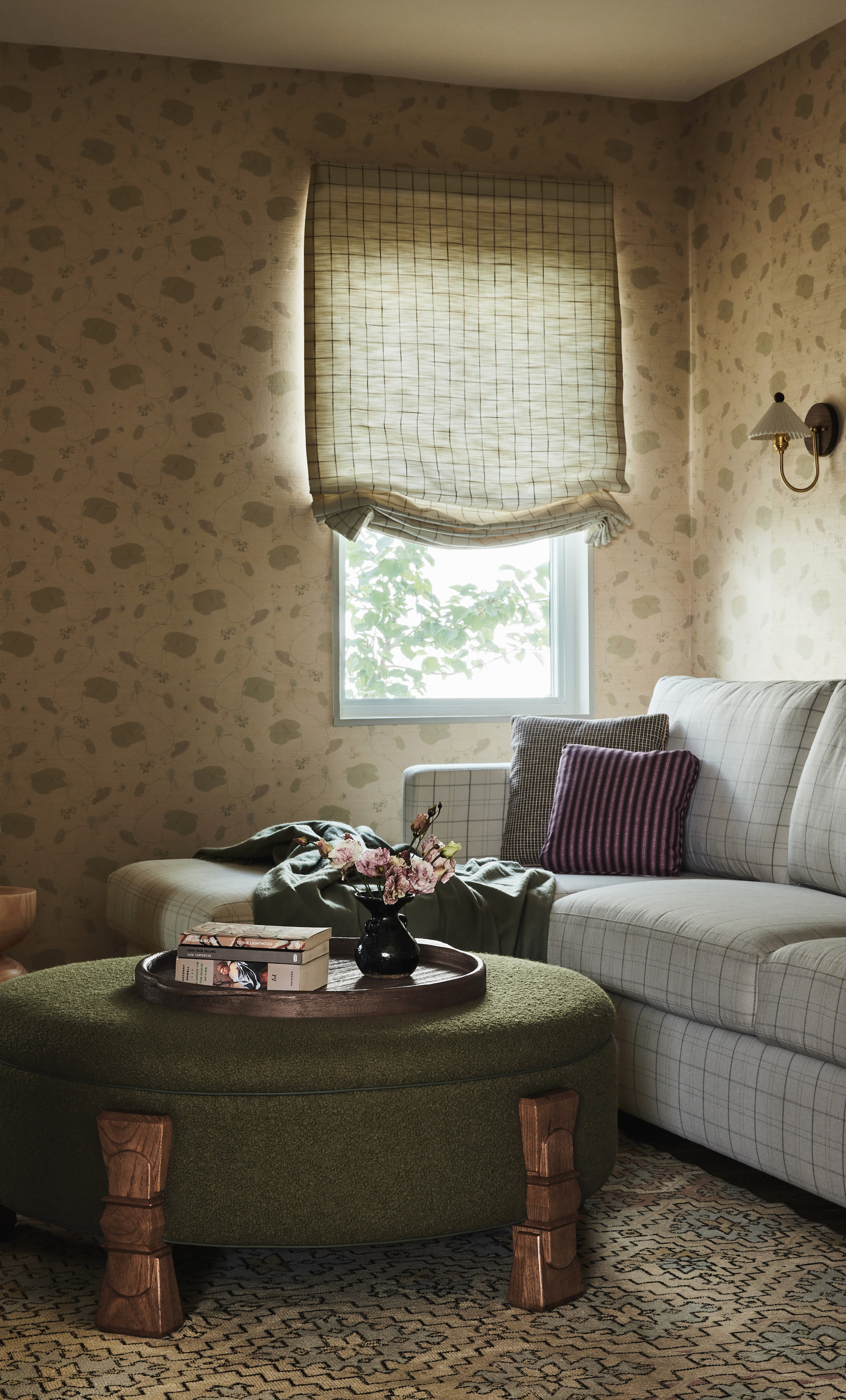
In order to achieve the family's desired aesthetic, all throughout the home Stefani found herself gravitating towards a calm color palette that 'felt muted and soft, but not drab,' she says.
Whether in the kitchen, the living space, bedrooms or den room, 'the sweet textile accents are balanced by the lime-washed walls, sophisticated marbles, and a mix of walnut, pine, oak and burl woods.'
The Dining Room
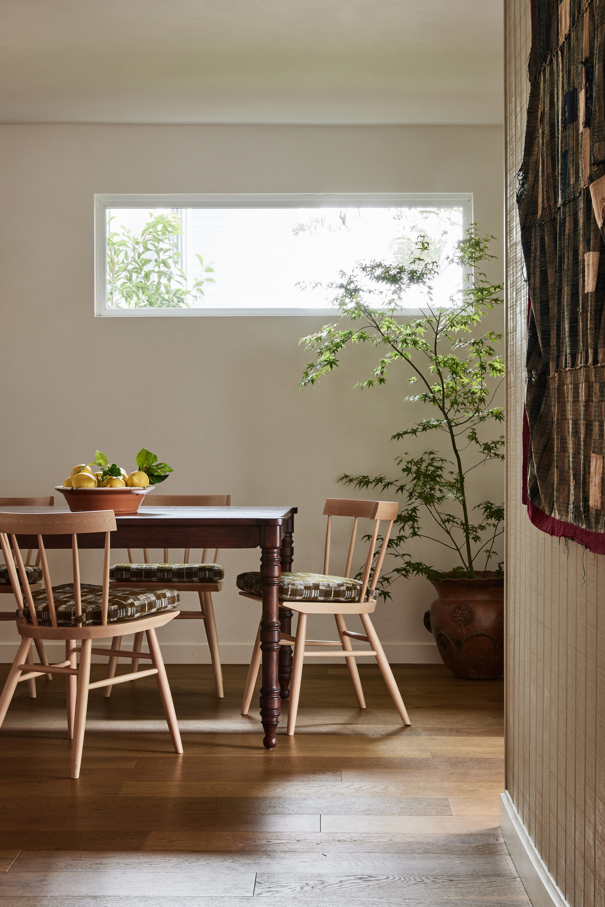
As is often the case in open-concept homes, the dining room became the central space where the living room and kitchen intersected. Not to clutter or overwhelm the space, Stefani adds: 'Here, I let the materials be the focal point.'
Mirroring the details of the kitchen island, the lathe-turned legs of the walnut dining table lend itself to a more vintage aesthetic, 'but in a larger scale better suited for contemporary living,' says Stefani.
Elsewhere, the walls have been left blank and the windows untreated, letting natural light bathe the room and add its own ever-changing sense of movement and texture to the space.
The Primary Bedroom
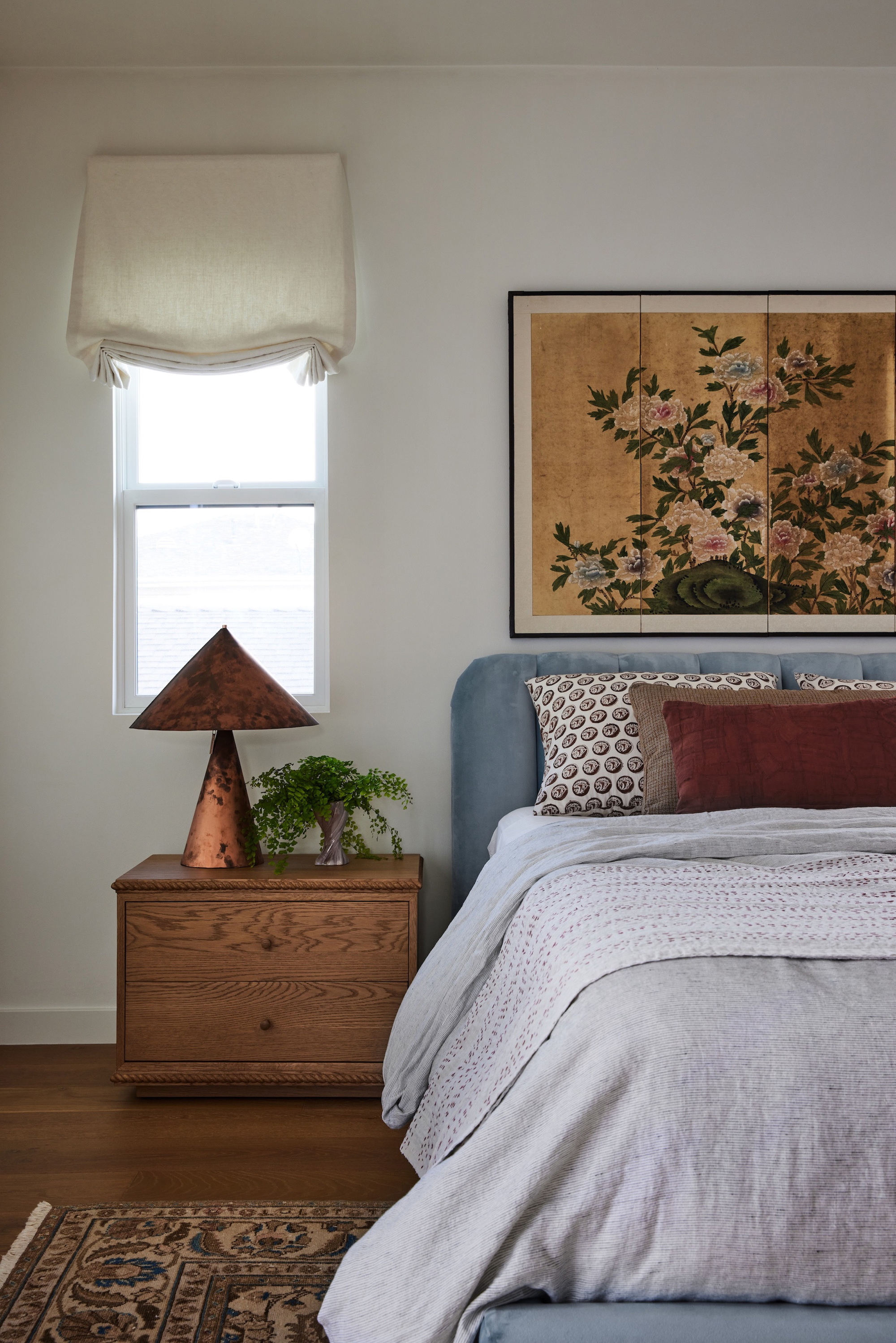
Casually layered with texture, tones and pretty patterns, there is perhaps nowhere else in the home that demonstrates Stefani's masterful eye more than the primary bedroom.
'I am consistently drawn to iterations of brown and blue and the oak grain of the bedside tables paired with the cheerful blue velvet bed speak to one another,' she says of the calming space.
The red, mustard, cream, copper and blue tones come together like a finely choreographed dance; a beguiling blend of Vermont-meets-California.

Price: from $390
Size: Twin, Queen, King

The overall design symbolizes a fresh start for this young family of four, but one that still feels like home. 'The goal of the brief was to bring cohesion and warmth,' says Stefani, 'with a preference for a muted palette, natural woods, and nods to their East Coast roots.'
In merging two seemingly conflicting styles, the home represents the story of its owners, and shows that maybe you can have your chic interiors but make them cozy too.


