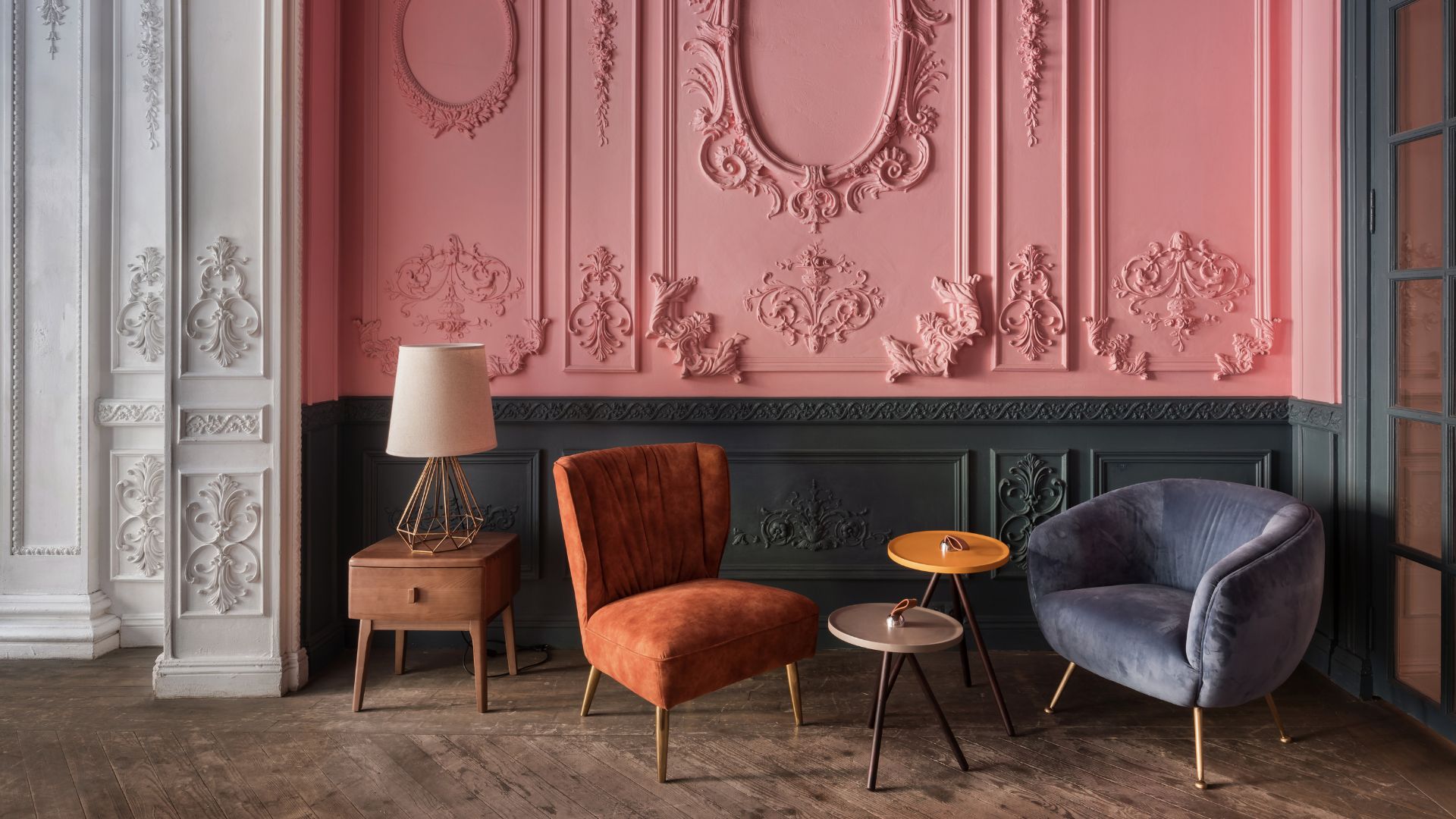
There's a fine line between trendy and tacky. We won't contest the fact that one man's treasure is another man's trash. And, of course, aesthetics can be as far and varied as you'd like but there are some basic interior design rules that are more cheap than charming.
If you ask us, the goal will forever be to make your home look expensive. Now, that doesn't necessarily mean that you'll have to shell out every step of the way. Rather, it means that you should be curating your home with intention and spending on items that deserve to be a part of your gallery-esque abode.
It can be confusing walking the style line and you might be wondering where your space is lacking charisma. To lay out the most common slip-ups that cheapen a home's atmosphere, we have put together a list of mistakes that designers swear off and you should too.
1. Overly Matching Furniture Sets
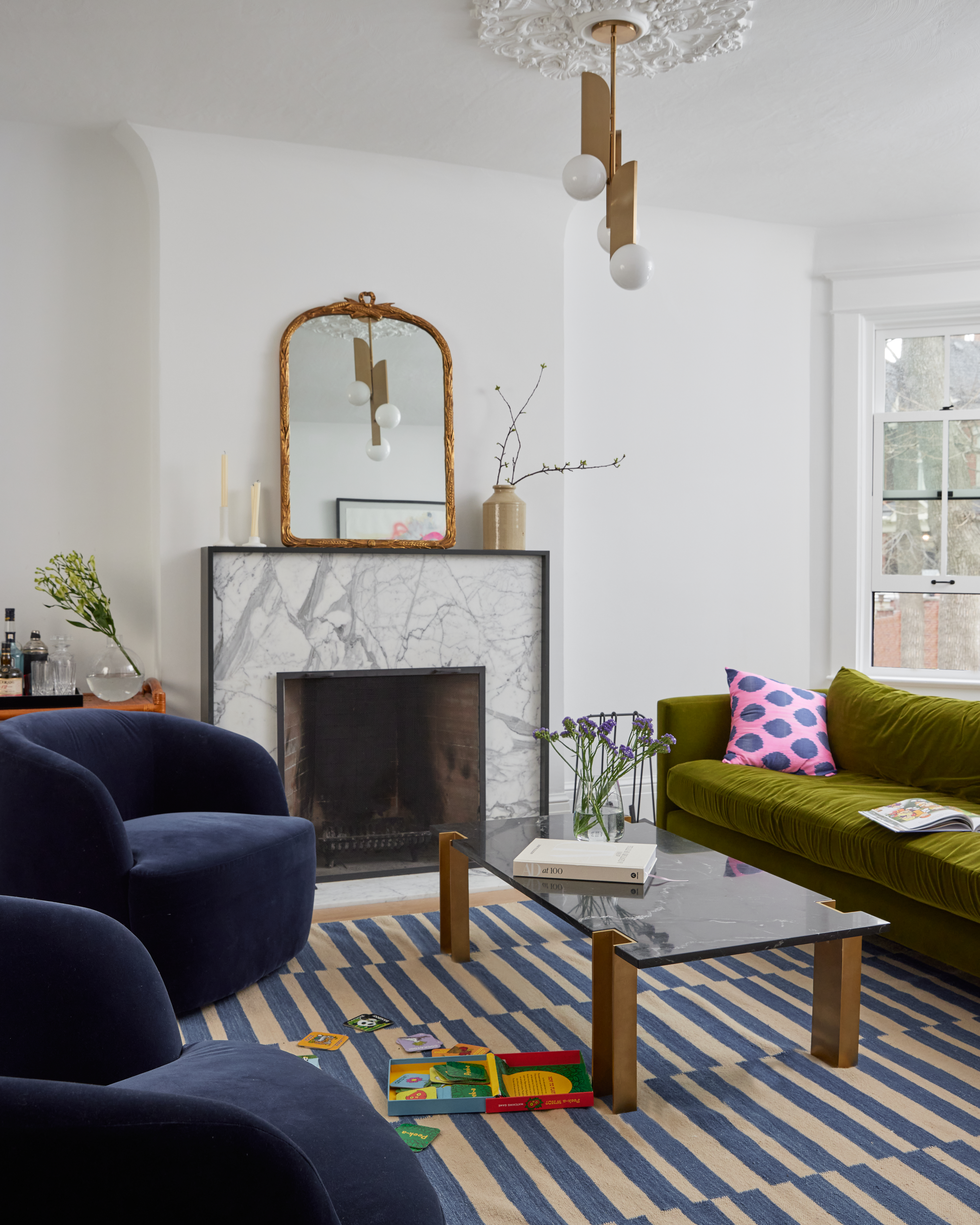
In conversation with Matthew Coates, interior designer and founder of Seattle Architects, he tells us that overly matchy furniture sets can make a home feel uninspired and flat.
"Mixing textures, finishes, and styles— even on a budget —adds personality and a sense of intention," he notes.
Jennifer Jones, principal designer at Niche Interiors, also finds matching furniture sets to be a setback. "Especially when clad in dark wood or dark leather, they can easily date a home and make it feel low-budget," she explains.
Even the best sofa colors can come across as try-hard when they match the rest of the furniture in your space. So instead, mix up your color palette and let each complimentary hue toot its own horn.
2. Harsh, Outdated Lighting
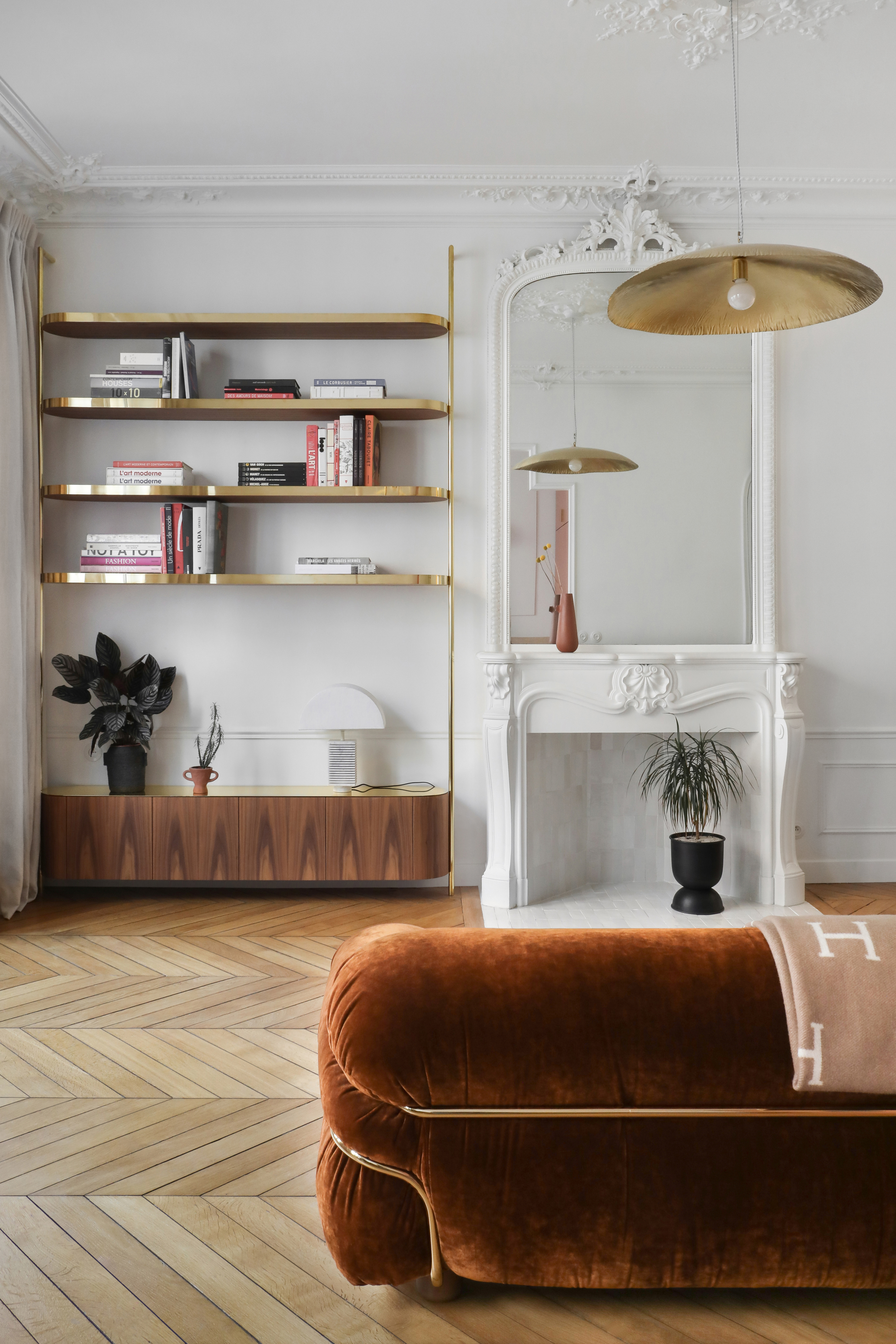
According to Matthew, lighting plays a huge role in livening or dampening the elegance of a particular room.
"Overhead lights without dimmers or the absence of layered lighting can make a home feel harsh or unfinished," he explains. "Swapping outdated light fixtures or adding table and floor lamps is a relatively affordable way to create warmth and sophistication."
The key is to balance and layer your lighting so that the space is both functional and charming without any hint of overwhelm. Keeping up with lighting trends while maintaining the design to the aesthetic of your space will help you strike a happy medium that's effortlessly glowing.
3. Intense & Overbearing Paint Hues
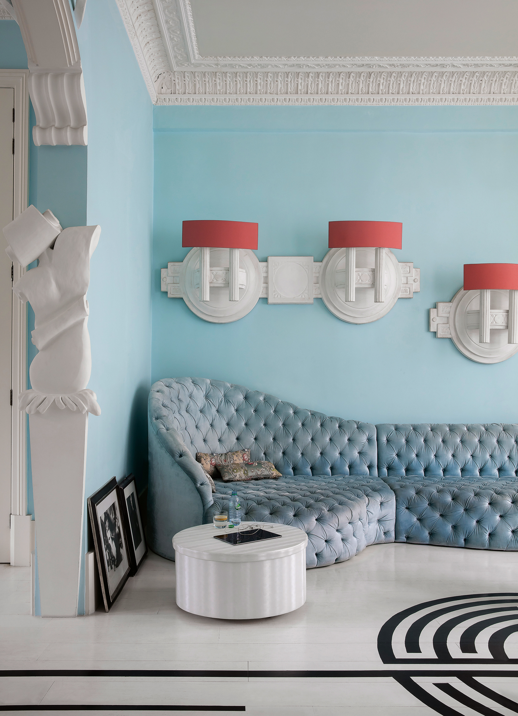
"Paint is another area where people can go wrong," says Matthew. "While it’s an affordable way to transform a space, overly bright or intense colors can most definitely cheapen the look."
He recommends sticking to neutral tones or using bold colors strategically tends to feel more timeless and refined. And while we're on the topic of paint colors, it's important to remember that finish is just as important.
When internally debating the use of satin vs flat paint or matte vs gloss, it's best to contain these finishes to the rooms they suit best so that they can shine or blend to the best of their abilities.
4. Unglamorous Plastic Furniture & Decor
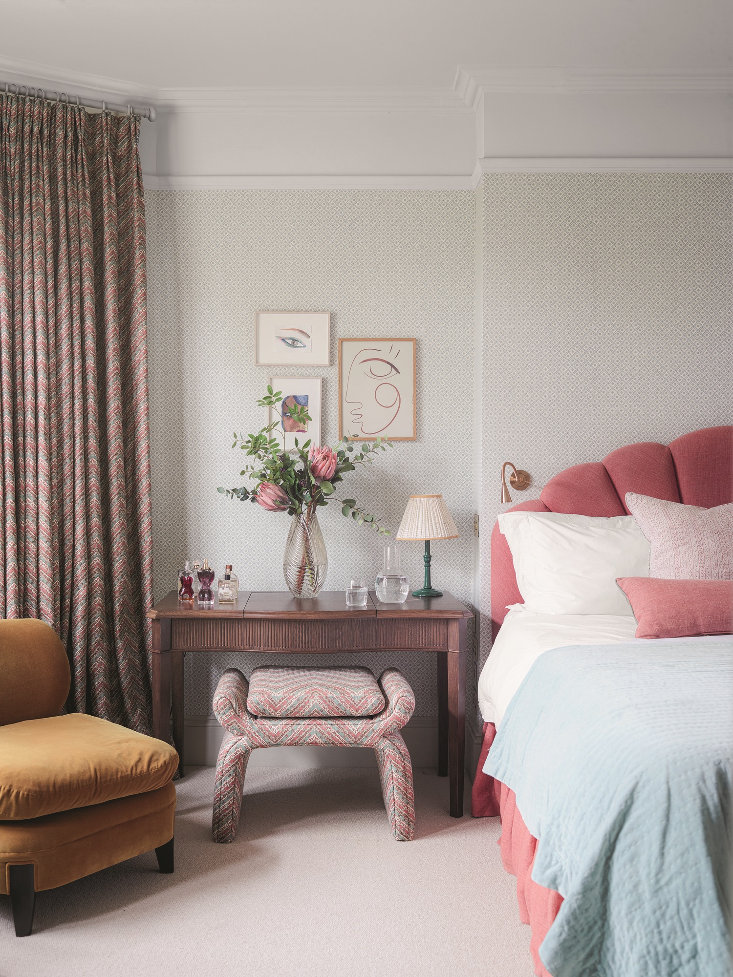
Too much plastic, whether in furniture or decor, is another one of Matthew's red flags when designing a living space. He finds that they can give a space a temporary, disposable vibe that's best avoided.
"Choosing wood, metal, or other natural materials, even in small accents, instantly elevates the look," he adds. But if you must go for plastic, why not go with acrylic instead?
Acrylic furniture has been on-trend of late and while it boasts the affordability of plastic, it's a far cry from tacky and cheap. Especially when doused in gorgeous rich colors, acrylic can make a fun replacement.
5. Exposed Electrical Chords
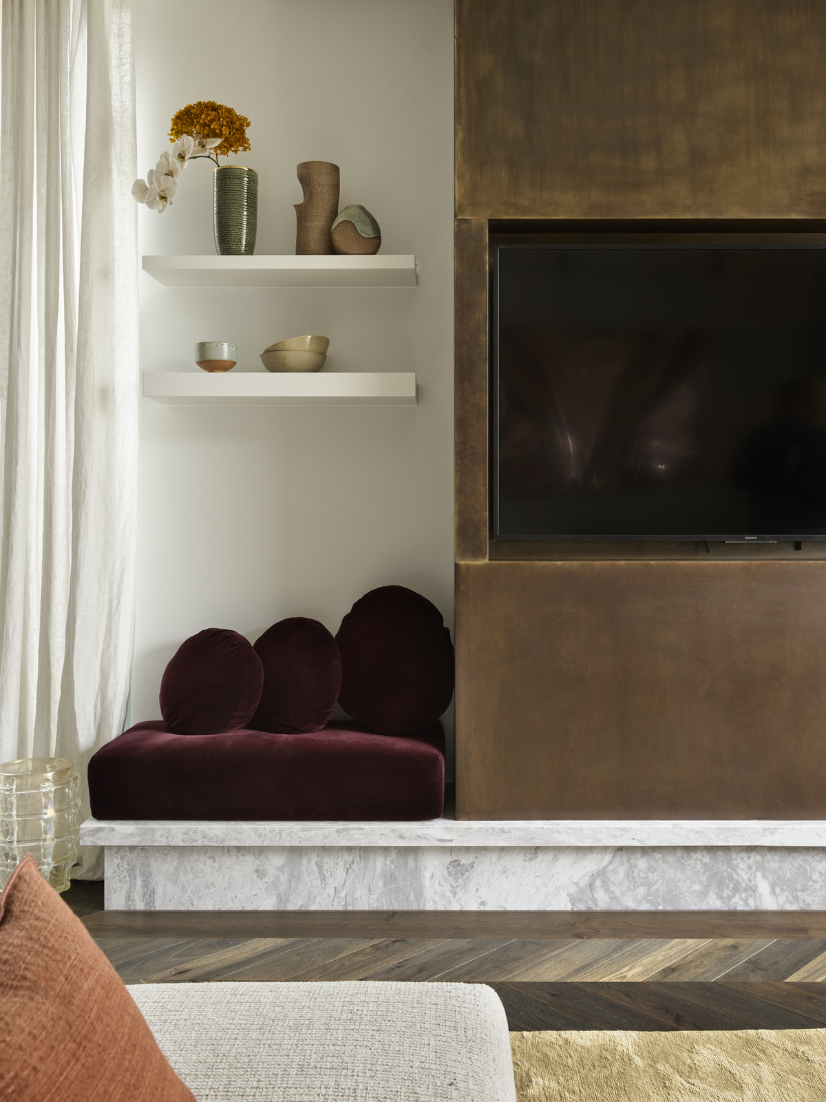
"Exposed cords are the enemy," exclaims Jennifer — and we couldn't agree more. Tangled bundles of cords peaking out from your electronics can quickly take a room from clean to catastrophic in the eyes of an interior enthusiast.
"If your TV is on a media cabinet or your computer is in plain sight, invest in a simple cord control solution to hide cords," she suggests. "Your space will feel so much tidier and put together."
There are plenty of creative ways to hide TV cords on walls and adopting these tricks in any other cord-cluttered space will do your home a world of good. We also suggest using cord holders like these Magnetic Cord Organizers from Amazon, and placing them behind tables and consoles so they're well-hidden from guest view.
6. Ill-Fitting or Flimsy Window Treatments
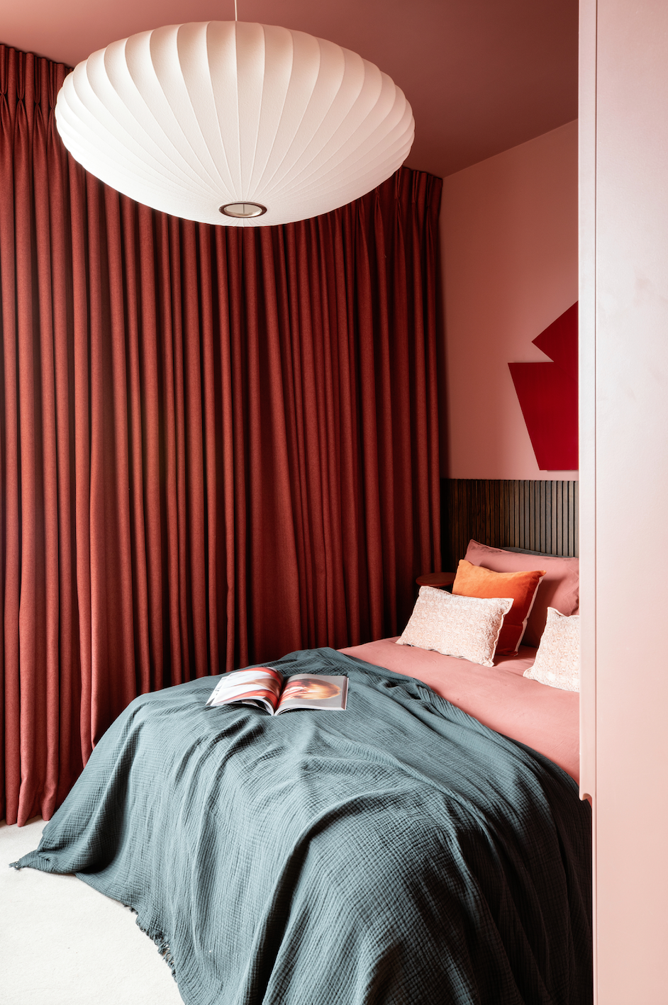
"Window treatments can also make or break a space," says Matthew. He tells us that thin, flimsy curtains or plastic blinds can cheapen a room instantly. On the other hand, he finds that simple, solid curtains in natural fabrics or sleek roller shades add polish without a hefty price tag.
7. Crowded Clutter-ful Rooms
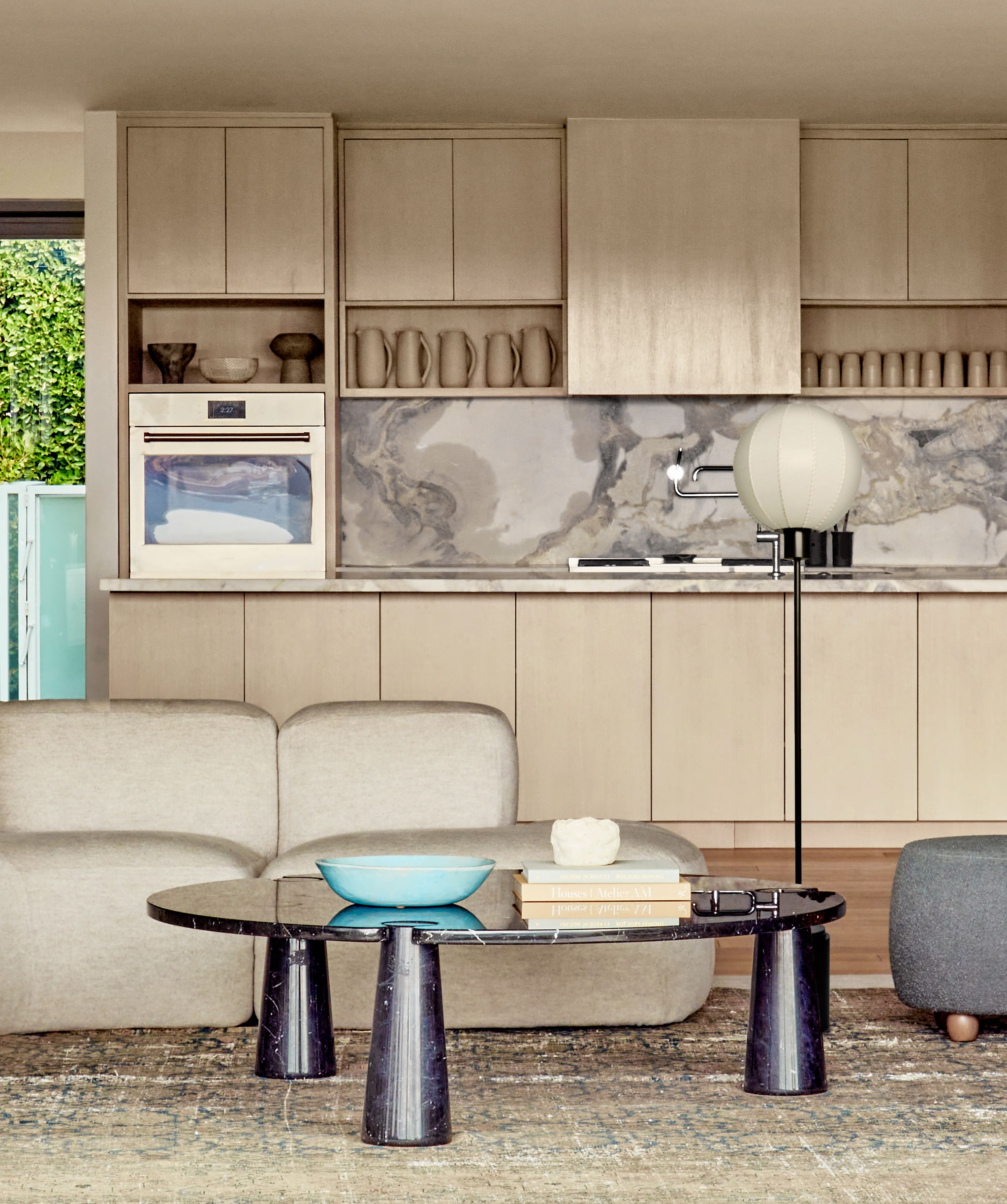
Jennifer points out that crowded rooms packed full of too much furniture and clutter scream cheap. "The best solution is to edit down and donate items that you don't use or need," she advises.
Matthew is also a big believer in the fact that clutter is a major culprit. "No matter how much you spend on decor, a cluttered space can never look elevated," he notes. "Investing in smart storage or simply paring down can make a world of difference."
In all honesty, learning how to declutter room by room is the first step to creating a home that looks regal and decorating can always come second.
8. Shiny, Synthetic Fabrics
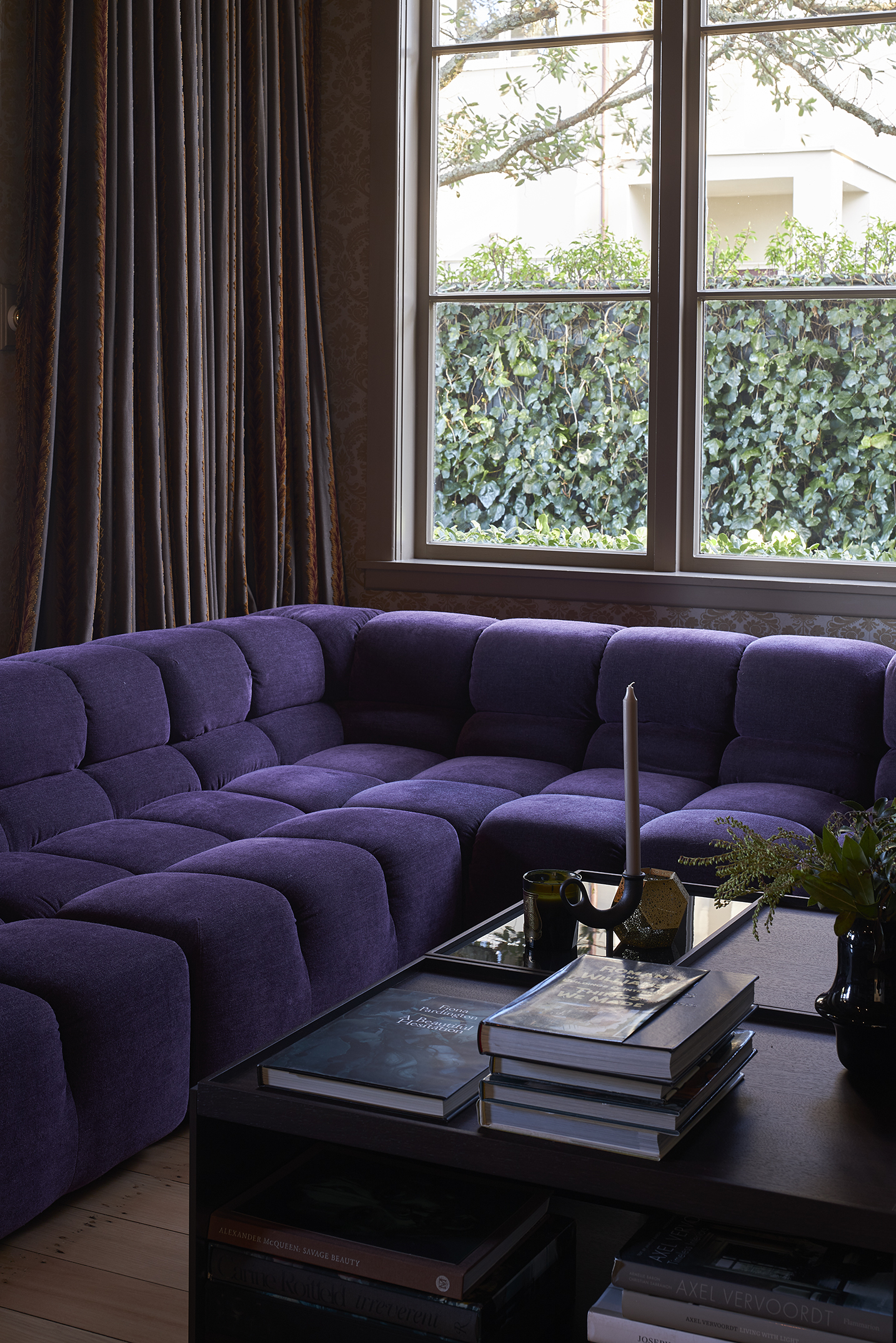
Whether you opt for the most comfortable fabrics for a sofa or the most draft-proof materials for your windows, selecting a style that looks chic is imperative. Colors, patterns, and cuts aside, the finish is just as important.
Jennifer tells us that shiny, synthetic fabrics stand out — and not in a good way. "Swap out your faux-silk drapes or accent pillows with cotton or linen blends for a more sophisticated vibe," she suggests.
Think bouclé for texture, linen for beds, and the humble cotton for couches. And if you love a sheen, then you can't go wrong with quality cushy velvet.
9. Tiny Yet Mighty Unfinished Details
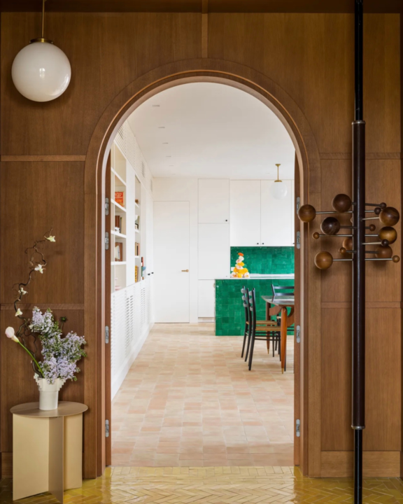
Matthew tells us that small, unfinished details like chipped paint or missing baseboards can make a home feel neglected. "These are some extremely simple fixes that truly make a big difference," he explains.
It's normal to have your home look a little more lived in as the days pass, but the aim is to always make sure it does not give off any obvious signs of wear and tear. For instance, this viral paint pen is an absolute game-changer when it comes to tiny touch-ups.
And as for missing baseboards, they can momentarily be covered up with area rugs or runners. However, your ideal next move would be to get them redone as soon as possible.
Intentional or not, you may have found yourself guilty of a few of these interior design donts. But there's always time to return your home to its best self and you can definitely tackle most of these problems on a budget.
Investing in well-made, quality paints, decor and furniture will also prove to elevate your space. And with Black Friday sales coming up, now is the best time to mark your calendars so you can get some wishlist items un-hearted and into your cart.
Price: $18
Format: Hardcover
Your Space, Made Simple: Interior Design That's Approachable, Affordable, and Sustainable by Ariel Magidson is a wonderful by if you're looking for inspiration for your next home spruce.
Price: $30
Format: Hardcover
House Rules: How to Decorate for Every Home, Style, and Budget by Myquillin Smith includes 240 pages of evergreen decorating tips that will be forever trendy and easily adaptable to any cost.
Price: $24
Format: Hardcover
The Finer Things: Timeless Furniture, Textiles, and Details by Christiane Lemieux is for lovers of all things opulent, and with its currently slashed price tag, we find that it's the ultimate steal.
FAQs
How Can You Make Your Home Look Good on a Budget?
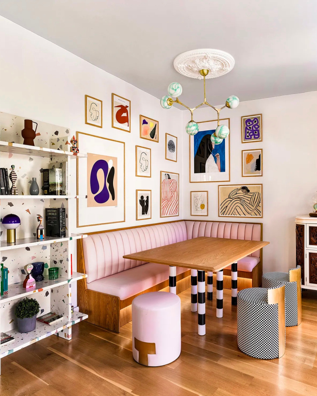
If you are designing a home on a budget, Jennifer recommends paring down the furniture in each room to the essentials and investing in the key pieces, such as a sofa or dining table. "It's better to have a lightly furnished space with higher quality pieces than a bunch of cheap furniture that doesn't coordinate," she notes.
She also tells us to consider the main focal point in each room and be intentional about what you invest in. "If you have high ceilings, invest in a statement light fixture for the room and dial back spending on smaller items such as side tables and accessories," she advises. "And if your boring bedroom desperately needs some color, consider painting the walls or applying temporary wallpaper for an instant, inexpensive refresh."


