Colors that go with tan are perhaps not as varied as you might think. You see, tan isn't quite the neutral it has become by default, used on so many leather chairs in so many different eras you think you barely notice it anymore. No, tan has very specific tones to it, and the most successful palettes built around it will share some of those pigments, too.
'Tan just needs to be balanced with colors that have a warm undertone,' says the Texan interior designer Mary Patton, who often puts it with pinks and oranges. It's a timely reminder for a year when tan seems set to be a big color trend — at the recent Salone del Mobile in Milan it was seen on sofas by Poliform, room dividers by Minotti, and dining chairs by Porada. This means it will be trickling down by the time you've finished this article.
Finding the right matches can be a bit more challenging than with colors that go with beige, but they can also be a lot more interesting, to. So take note of these 9 colors that go with tan, the gamut of shades that will allow you to build rich - and enriching - schemes.
1. Lime
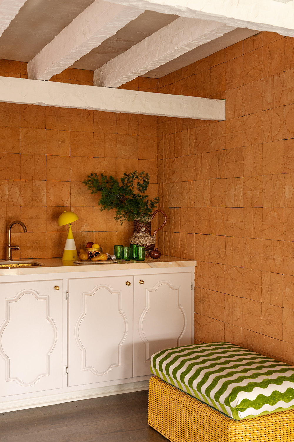
Look no further than nature when it comes to inspiration for colors that go with tan. And like the trunks in a pine forest, you'll find that green is the perfect complementary shade.
'I want to say the word that comes to mind is "cabana",' says Lia McNairy, one of the co-founders of the design studio LALA Reimagined, who created this scheme above. 'We picked out the tile first, and then the green and white stripe fabric just helps to being the exterior in. We love plants, and wanted to evoke a sense of this being a beach house, of the arid scrub of the Med and of being on vacation in Italy.'
When pairing tan with lime green, go for tans that err closer to red rather than orange. Red and green are opposites on the color wheel, and so color theory leads them to being the perfect contrasting combination.
2. Pink
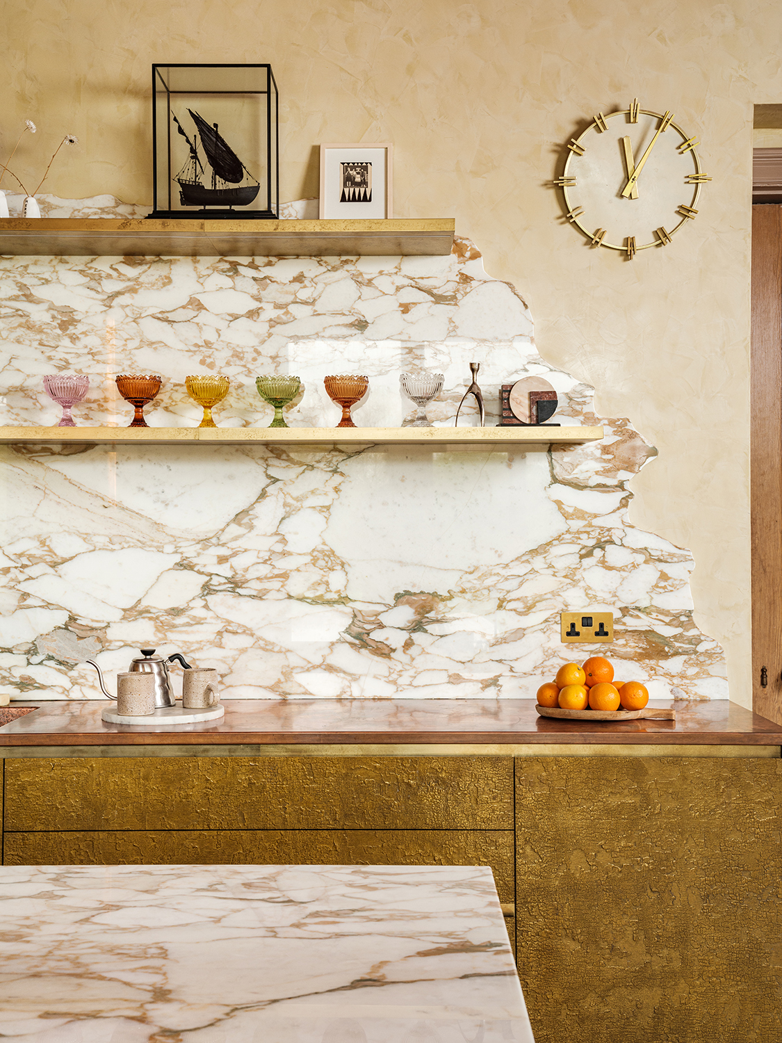
There is a warmth to tan that sets it apart from other browns - its hints of reds, pinks, and oranges within it speak to sunny climes and sun-baked surfaces.
In this kitchen, designed by Takero Shimizaki Architects in collaboration with the interior designer Jo Berryman, a tan countertop and tan ice cream bowls on display are matched cleverly with a pink ice cream bowl. This is a palette you could play with endlessly - tan is a natural color that goes with pink as they both share soft red undertones.
'Rich earthy tones were carefully selected to imbue warmth and sophistication,' Jo Berryman says. 'It's elemental but not rustic, and more just than a cooking space - it's a sanctuary.'
3. Gray-blue
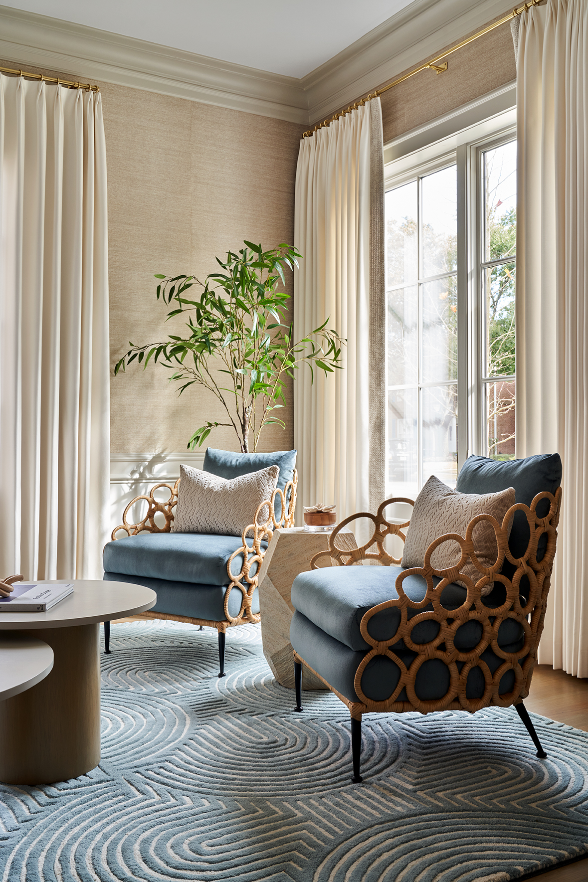
Because tan is a subtle way to add warmth - it lacks the pure heat of, say, red or orange - it pairs well with other subtle shades, too. It's one of those colors that goes with blue, but instead of going for a bright, peacock shade, look for blues with hints of gray in them, bringing them down a notch to match the low level of intensity designers love tan for.
'This is a very neutral blue — it has a grey undertone,' says Laura Umansky of the Houston-based studio Laura U Design Collective, having created the space seen above. 'It allows this space to be serene and soft, while still with a pop of color.'
This approach is best when the gray-blue is an accent color rather than the walls - the creamy beige seagrass wallpaper chosen here serves to create an almost coastal color palette.
4. Off-white
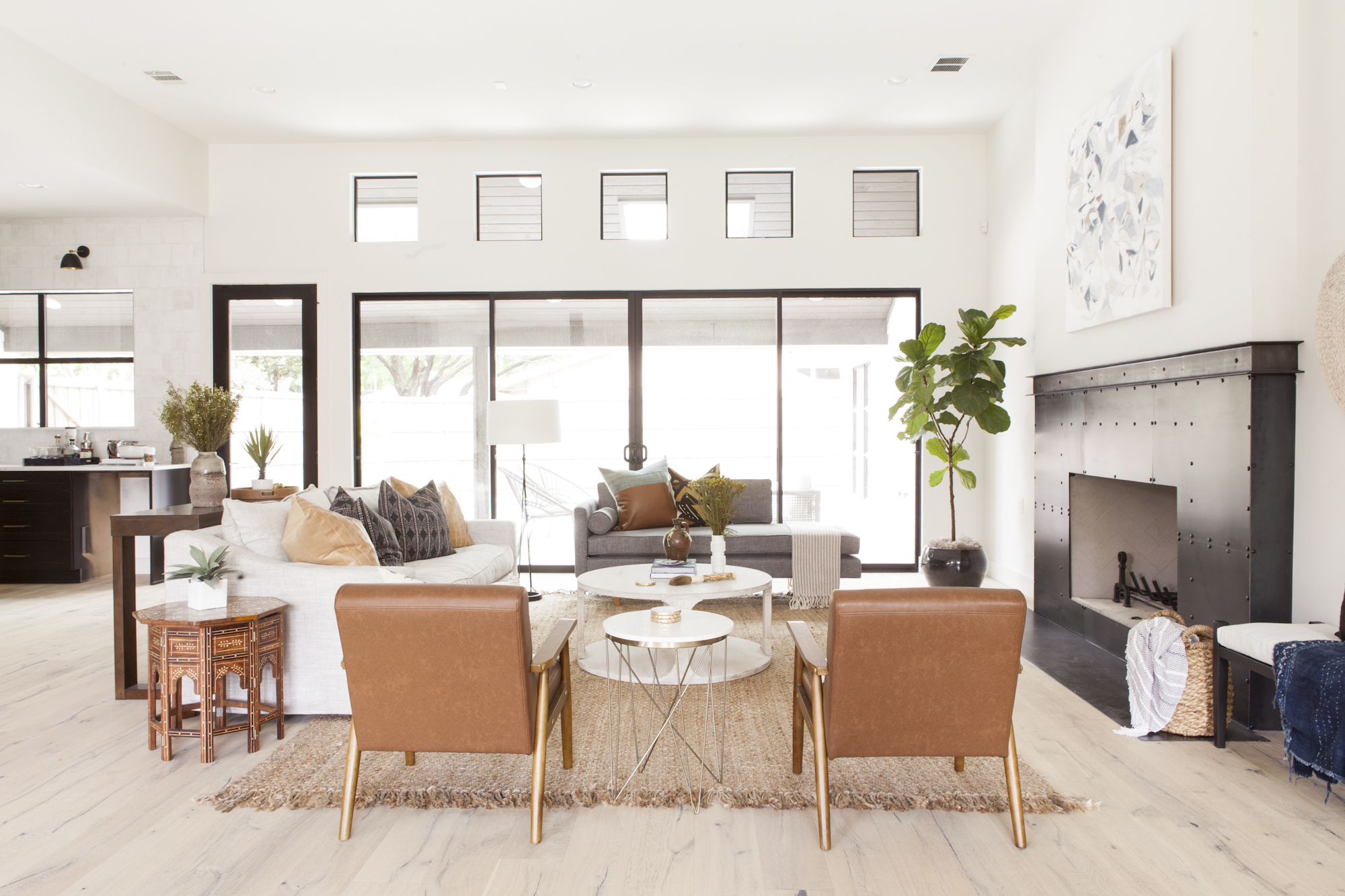
When tan is the accent color in an otherwise neutral space then its terracotta tones truly stand out. It has the sophistication of a private members club, and the heat of a clay pot found in a roadside stall in Greece. A beguiling combination.
Better than that, because it's a shade that will never go out of style you can gradually update schemes that use it without ever having to have a full overhaul. 'Tan is a timeless neutral that allows a room to evolve over time without constantly updating significant pieces of furniture,' says Angeline Guido Hall, founder of Angeline Guido Design, the vision behind this neutral living room, above. 'When your spaces are built around versatile pieces in neutral colors, simply updating accessories and throw pillows can give the area a brand-new look without a major hit to a budget.'
5. Sage
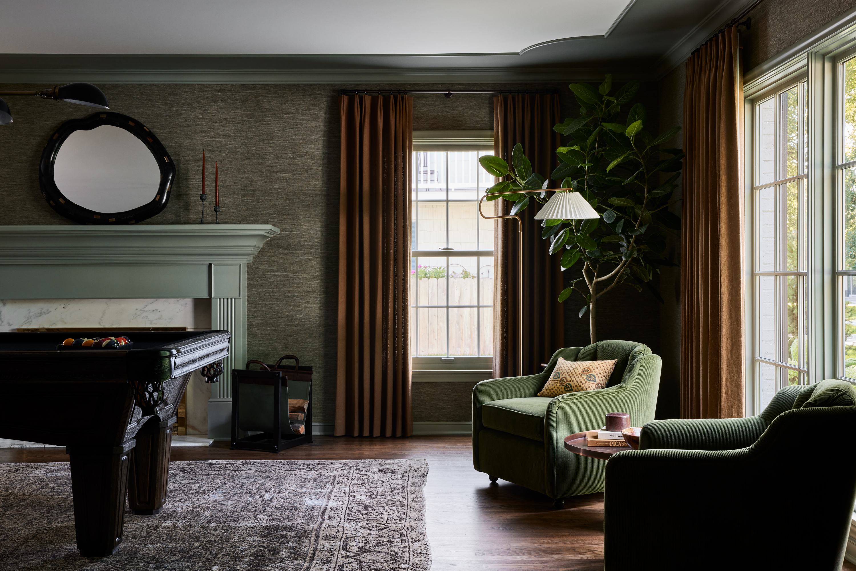
Grown-up neutrals - all with a hint of gray in them - come together as a masterclass in colors that go with tan. Seen here on the living room curtains, they seem to glow against the sage greens used elsewhere in this living room by Prospect Refuge Studio.
'Brown and green are of the earth!' says Victoria Sass, the studio's founder. 'They make us feel good and grounded. Also, the shades of the wallcovering and window treatments are roughly the same value - which I think gives a sort of unifying effect of the materials together.'
By the term "same value" Victoria means that they have the same tones - they're both equally as grayed-out as each other. Use this approach when building a dark yet not moody scheme around tan.
6. Yellow
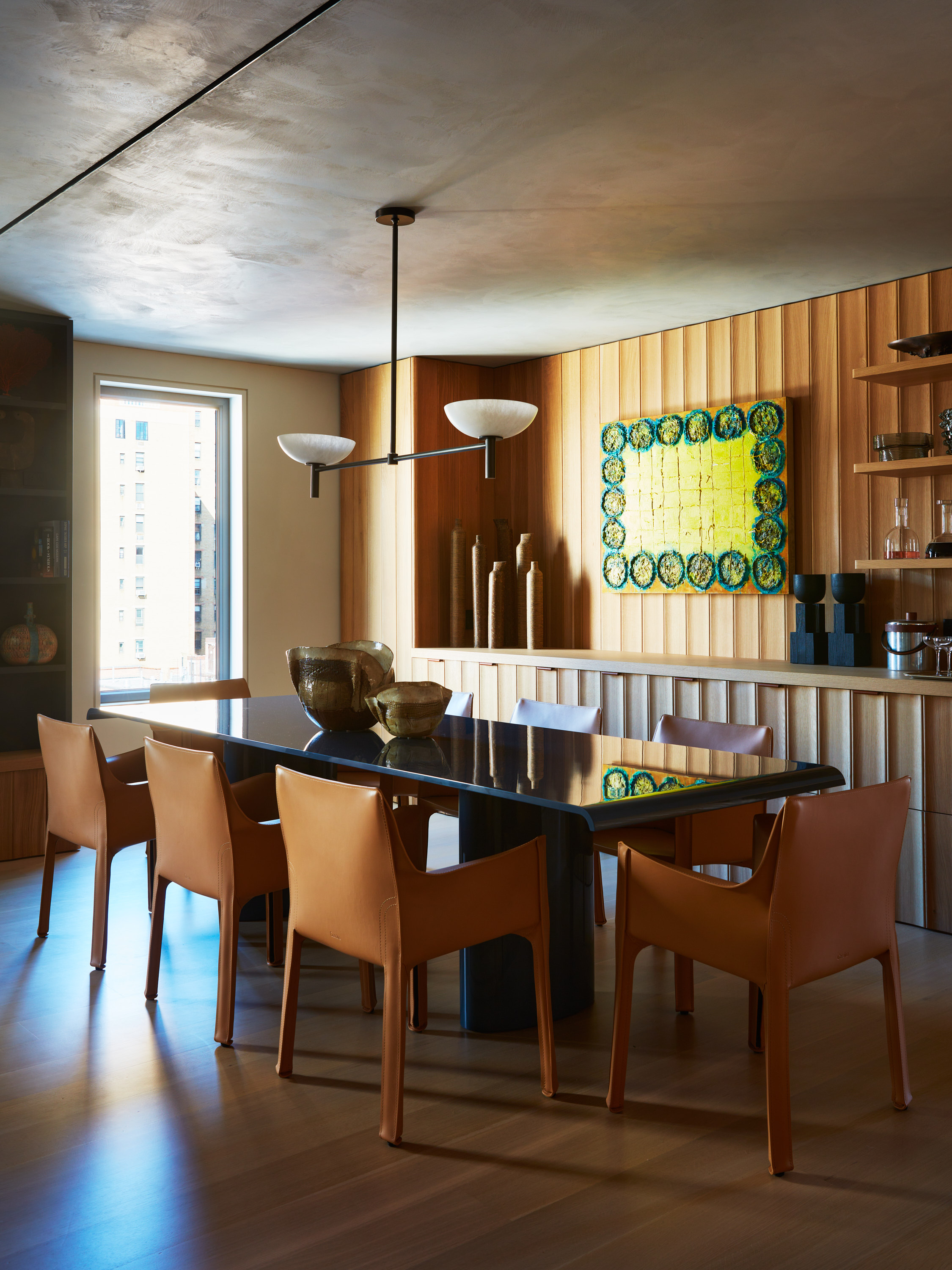
The chairs and walls of this dining room by MK Workshop are a caramel-tinged tan, making it the perfect color to go with yellow. The artwork highlights the orange tones in the tan, allowing a sunny sense of carefree welcome in this otherwise pretty sophisticated space in New York.
'The dining room was enriched with a variety of textures and materials, creating a sophisticated layered effect,' says Jonah Kilday, one of the studio's co-founders. 'Successfully layering any space involves diversifying materials and textures, as well as incorporating distinctive pieces with enough character to complement their surroundings. This approach ensures that no single element dominates the room, allowing the eye to wander and appreciate each aspect of the space fully.' By relying on honeyed tones - tans, yellows, soft browns - there is no visual disruption as each color relates exactly to everything else in the room.
7. Olive
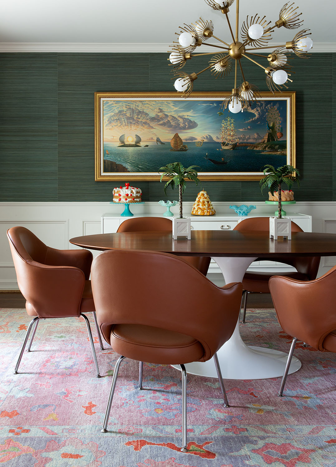
You may be getting the impression now that tan is a perfect color that goes with green as here's another shade it works with - olive. The Houston-based designer Mary Patton chose an olive wallpaper as a counterpoint to the tan leather dining chairs, which act as a sort of visual bridge between the heavy wallcovering and lighter shades used elsewhere.
'Tan just needs to be balanced with colors that have a warm undertone,' Mary says. 'The green grasscloth is warm as well as the main colors in the rug - you can then sprinkle in whatever colors you want and it will somehow all make sense.'
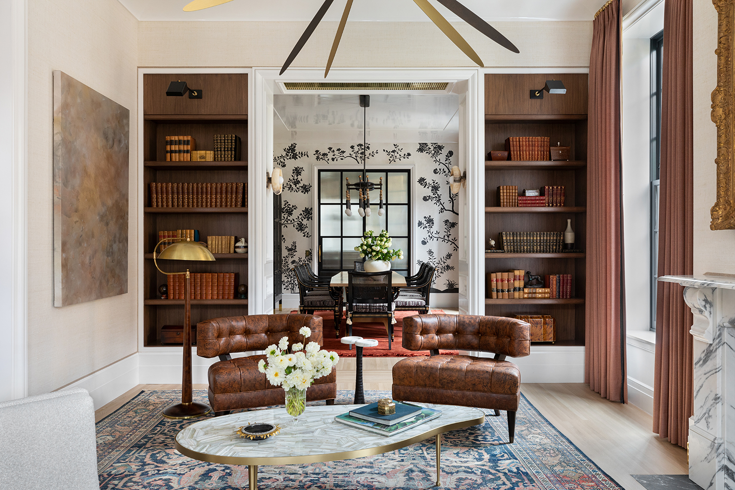
8. Gold
Tan is used to brilliant effect here in this grand living room, proportioned by the architecture studio En Masse Architecture and Design. Picked out on the chairs, the books on the bookshelves, and even the base of the floor lamp, it has a richness to it whose cognac tones speak of Mad Men-era smoking rooms and other spaces that are made for relaxing in with decadence.
The highlight shade here, though, is gold. What it does is add a reflective gleam to all the tan which could otherwise have become heavy, picking up the light on the lampshade and coffee table edge to bounce it across the room. Both have a natural heat to it, so tan makes a great color to go with gold.
9. Dark blue
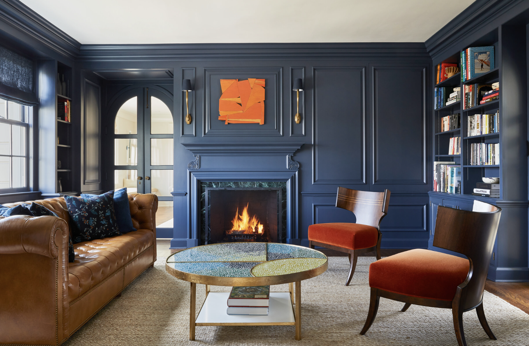
The classic tan Chesterfield sofa gets a contemporary update in this bold blue living room with its orange accents by Chango. The tan works to bridge the fire tones of the orange with the deeper shades in the blue.
'Warm tans and dark blues are a classic pairing that work together well in a lot of different spaces and in different ways,' says Susana Simonpietri, Creative Director of Chango. 'Breaking up neutrals in a room with a primary or bold color makes it feel more modern. We love achieving this through art pieces, soft accessories like throw pillows and blankets, and accessories.'