Fall is an emotive season. It brings to mind warming candles and cinnamon-dusted scents as well as cozy textured surfaces and crackling fires. It’s a season that unapologetically indulges in the essence of home, allowing us to enjoy these spaces just that bit more.
If you’re still contemplating how you bring the best of the season into your home, begin by taking a look at our fall décor ideas. For those of you who want to fall that much further down the rabbit hole, we are exploring the fall color palettes that define this moment best.
While many of us may at first be drawn to the obvious but enticing tones of browns mixed with forest greens and lustrous gold accents, there is more to the story as we discovered. Having spoken to celebrated interior designers across the globe, we found that a fall color palette can be as cool and contemporary as it can be warming and traditional. The key of course, is to make your palette personal — reflect the landscape around you and carefully consider what emotion you want to create with this mix of colors. Here are some worth trying.
1. TAKE A FRESH APPROACH TO FALL WITH SKY BLUE, OFF-WHITE AND RED
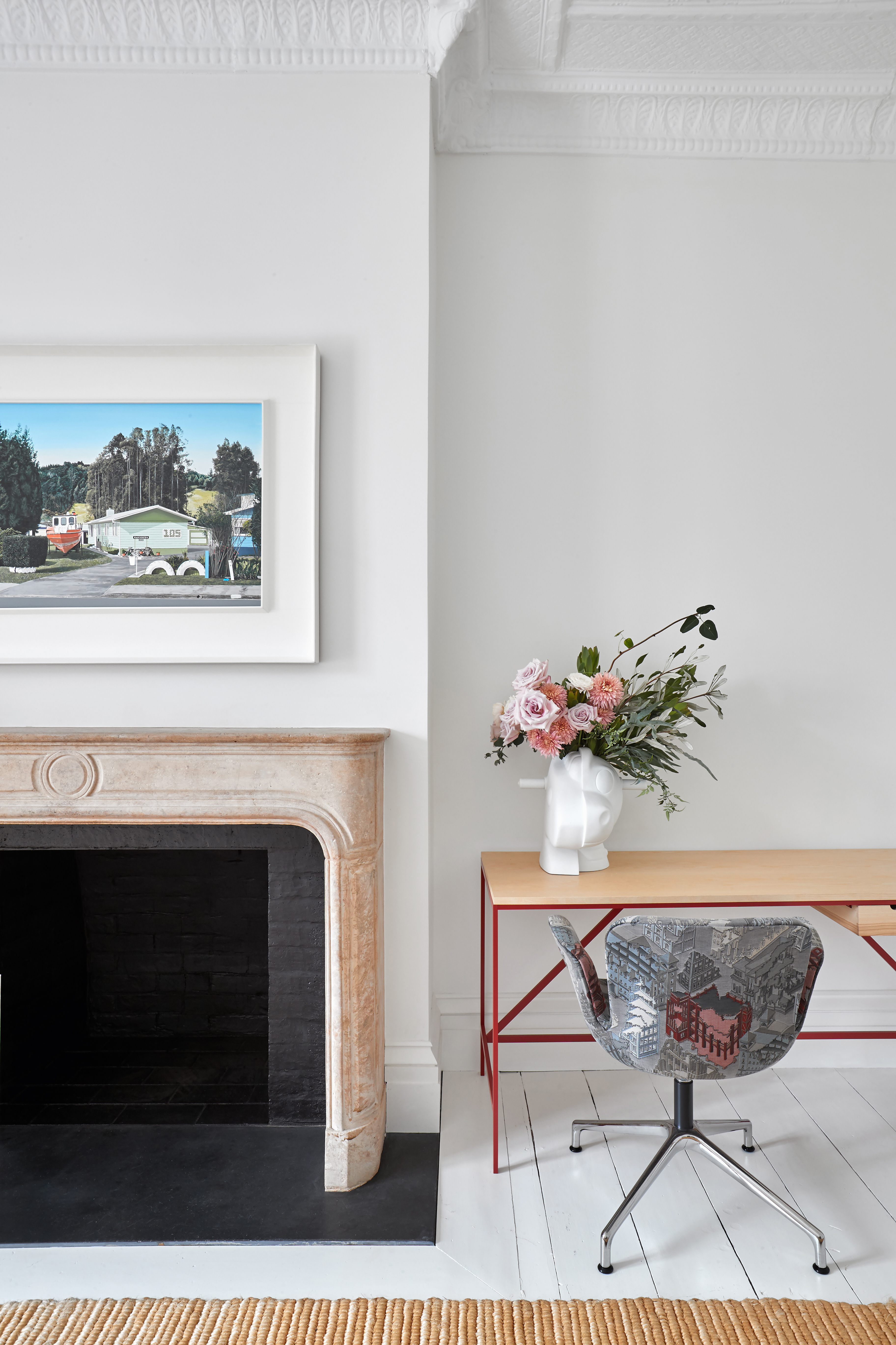
The cool soothing combination of colors in this space designed by interior designer Ghislaine Viñas reminds us that fall is a season of change. Remnants of summer are fused with promises of winter and skies are still blue, but we see autumnal tones come to life too. The choice of an off-white canvas is a perfect foundation for the soft beech brown tones alongside the vibrant accents of red and blue.
“Fall colors traditionally include shades of yellow, green, red, orange, purple, brown, and chartreuse, but blue often gets overlooked in the typical autumn palette," she explains. "I consider blue a neutral, as it reflects the vastness of the sky and ocean, and I see it as just as fitting for fall."
Ghislaine encourages you to look to unexpected fall colors and find inspiration in the incredible array of color combinations the season offers. "Nature is captivating, especially as leaves change, revealing shades you might never have imagined,” she adds. “If you pay close attention, you'll start noticing complex, tertiary colors that are hard to define, with their intriguing, muted tones."
2. EMBRACE DECADENCE WITH GOLD, GREEN & RED
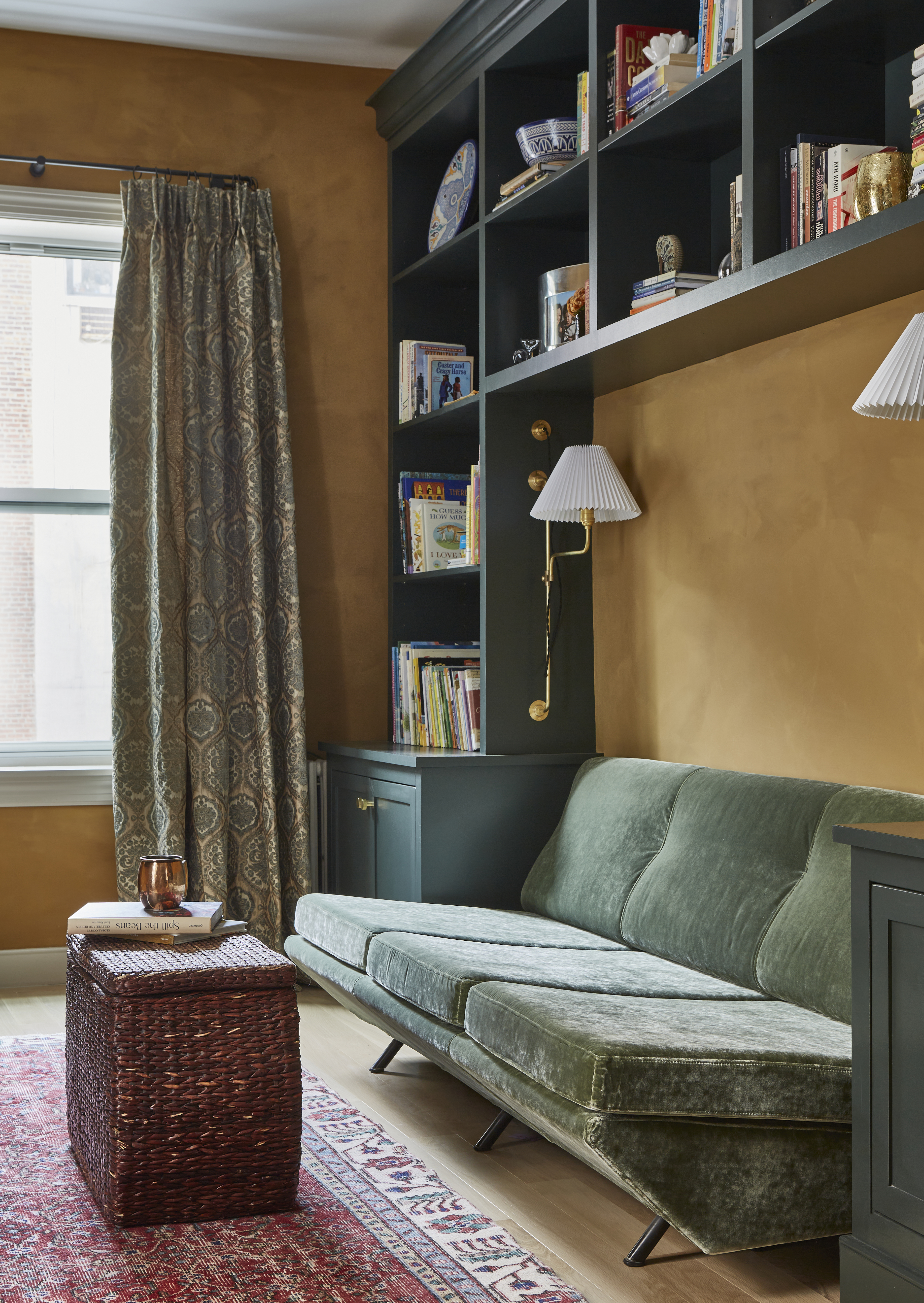
New York City-based architecture and interior design firm Sugarhouse dives right into the warmth of the fall season with this inviting interior. The walls are painted in a wonderful gold hue that feels like the perfect earthy pairing for the emerald joinery and velvet upholstery. Red accents (a current color trend) add energy and vibrancy to this elegant pairing. The result is a scheme that feels firmly fall but also joyous and welcoming.
“We find that people’s design decisions fluctuate depending on season," shares Jess Nahon, co-principal of Sugarhouse. "As we enter fall, our clients are drawn to golden tones more and more. Who wouldn’t want to be surrounded by these comforting hues."
Price: $82.76
Rating: 4.5/5-stars (28 reviews)
Size: 7'10" x 10" (more available)
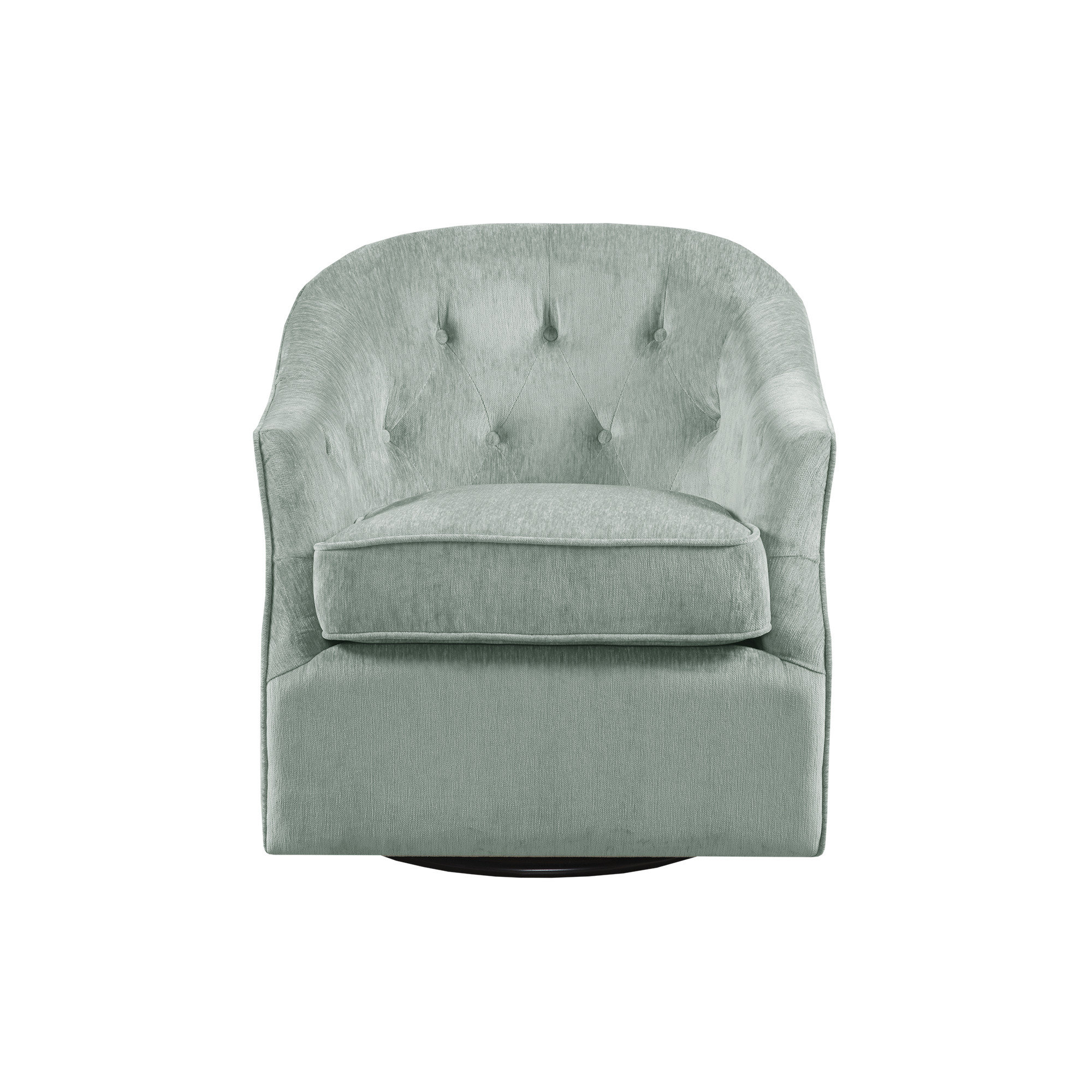
Price: $449.99, Was: $579.99
Rating: 4.7/5-stars (204 reviews)
Colors: Light green velvet, Natural velvet
3. GROUND YOUR FALL COLOR PALETTE WITH CEDAR, CLAY AND GRAY

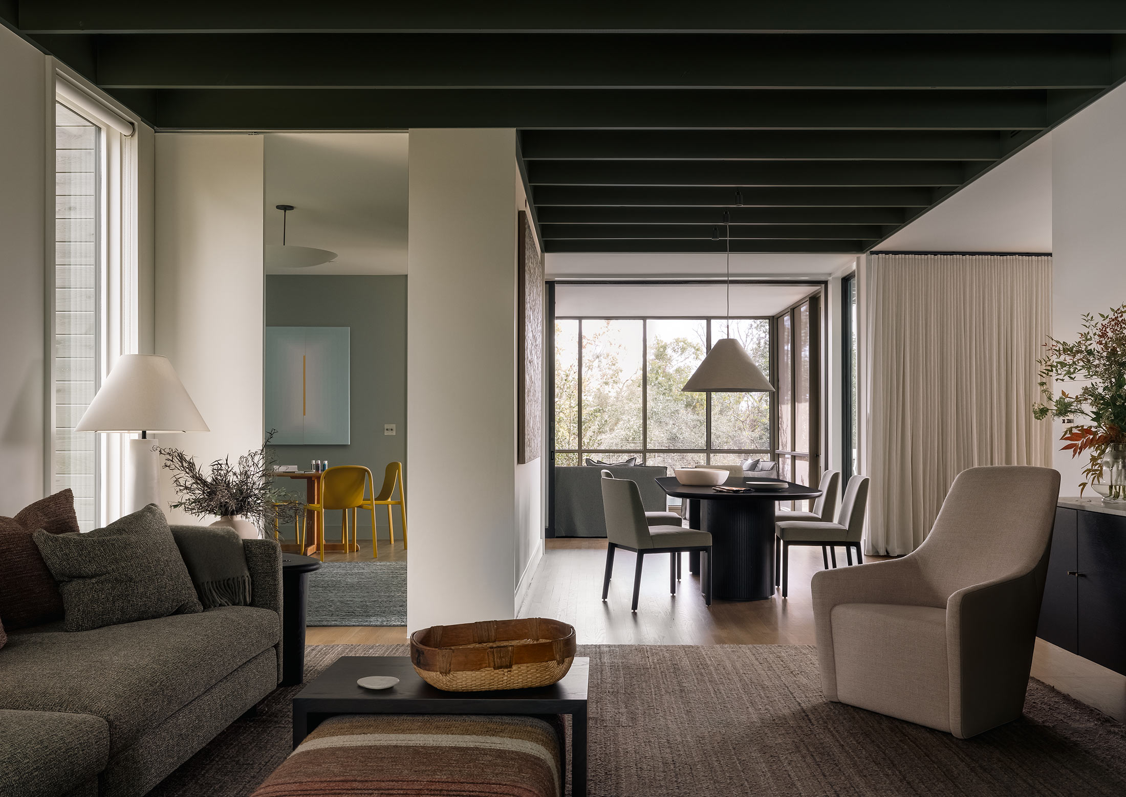
For their Rolling Wood project, Austin-based firm, Cuppett Kilpatrick opted for a more muted color palette that feels meticulously layered and timeless in its appeal. “The colors in this project were selected for their connection to a “nature” palette, specifically fall,” shares Tim Cuppett, founder of Cuppett Kilpatrick Architecture + Interior Design.
The proof of this connection to the season is evident in the celebration of muddy hues throughout this scheme — browns and grays work in unison to create a room that feels contemporary yet classic. The choice of a dark ceiling heightens the cocoon-like effect while the off-white walls work to reflect light and create a sense of calm.
This is an ideal choice for those looking to create an interior that holds a special connection to the season but feels just as enticing all year round. The final touches of orange and ochre play into the warmth of the brown and gray tones but don’t take away from this clever combination.
4. MARRY BEIGE GRAY, OCHRE AND IVORY
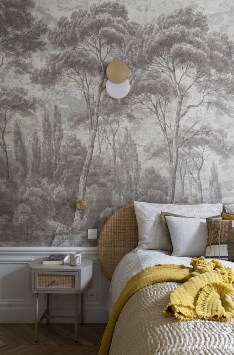
“For this project, I wanted sober colors, beige-gray with slightly lighter shades," explains Camille Hermand, architect and founder of Camille Hermand Architectures. "We wanted to keep a tone-on-tone with the sepia wallpaper with 18th-century patina. It created a soft atmosphere and suggested the passage of time. The panoramic wallpaper adds depth to the room and a patina effect.”
This beautiful bedroom created by the French studio wonderfully highlights the romance of the fall season with its color palette. The beige-grey, ochre, and ivory all work together to create a scheme that feels cozy but still calm and serene. By opting for the weathered effect wallpaper, they were able to further play into the fantasy of fall as Camille suggests.
When creating your own fall color palette, consider not just the colors that you want to marry together but the forms they will take. The same color can feel very different when found in a fabric versus paint or paper.
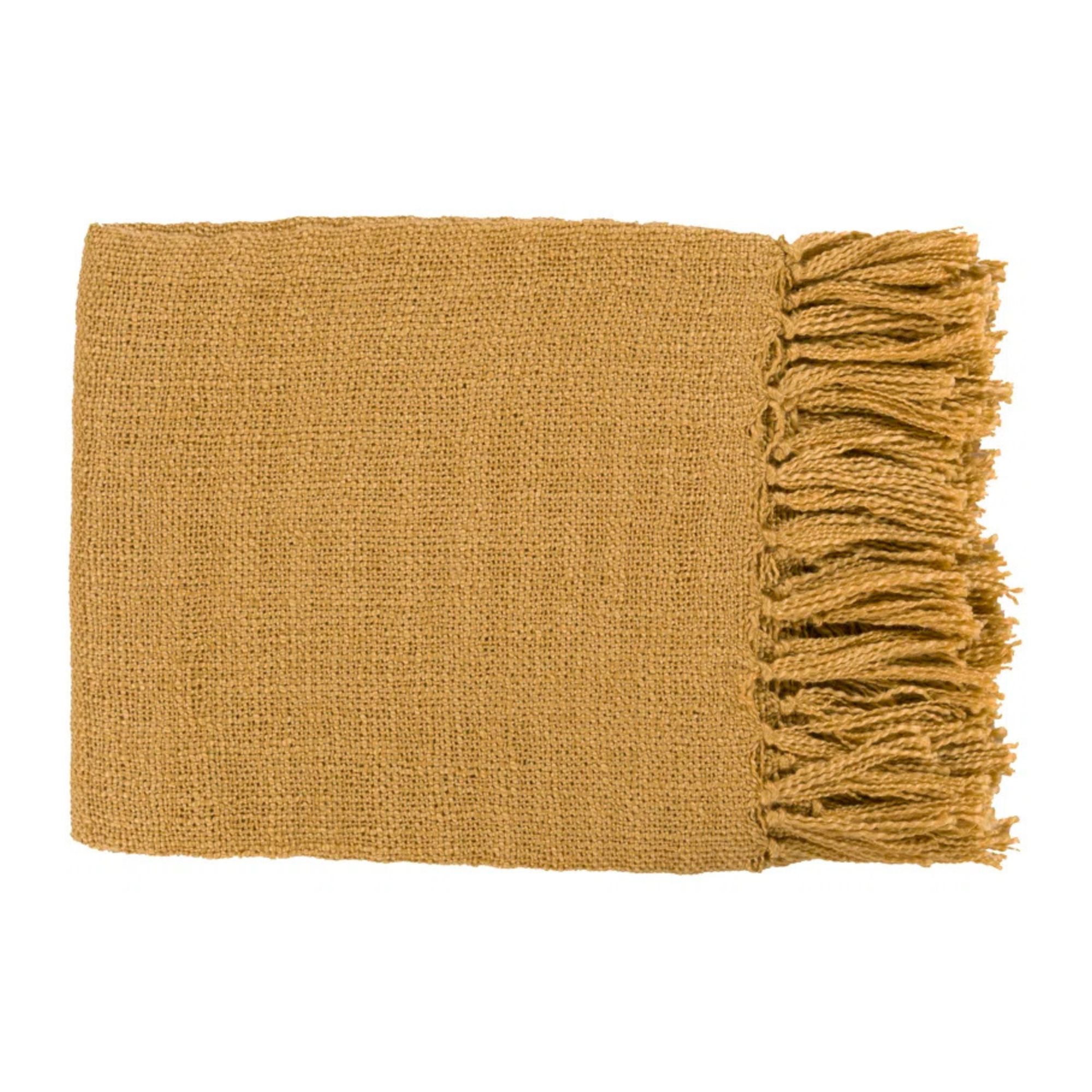
Price: $42, Was: $100
Rating: 4.5/5-stars (2760 reviews)
Color: Mustard (more available)
5. CELEBRATE FALL WITH RUSSET, OLIVE AND BLUE

Price: $259.99, Was: $293.99
Rating: 4.7/5-stars (112 reviews)
Color: Caramel polyester blend (others available)
This autumnal and cozy living room interior captures the fall season in an instant with this warming color palette of russet, olive, and blue. The Australian and British design studio behind this richly colored space, The Stylesmiths, have leaned into the traditional tones of fall but have expressed their vision through contemporary art, furniture, and accessories.
"Rich, earthy tones, such as a rust-colored sofa paired with olive green pillows, create an inviting ambiance perfect for relaxation and social gatherings. The earthy hues effortlessly complement a diverse array of materials and textures, from the timber wall panels to the elegant stone fireplace and the organically shaped furniture,” reveals the team.
The use of natural material is a great way to add a layer of authenticity to your fall color palette. Furthermore, the designers encourage you to consider the role that texture plays in your color palette, adding “soft velvet cushions juxtaposed against a smooth wooden coffee table, introduce depth to the color scheme. This dynamic interplay prevents the palette from feeling flat or monotonous, enhancing the overall aesthetic and inviting a sense of warmth that resonates throughout the space".
6. CHOOSE PURPLE, GRAY AND TAN TONES FOR A MODERN FALL PALETTE
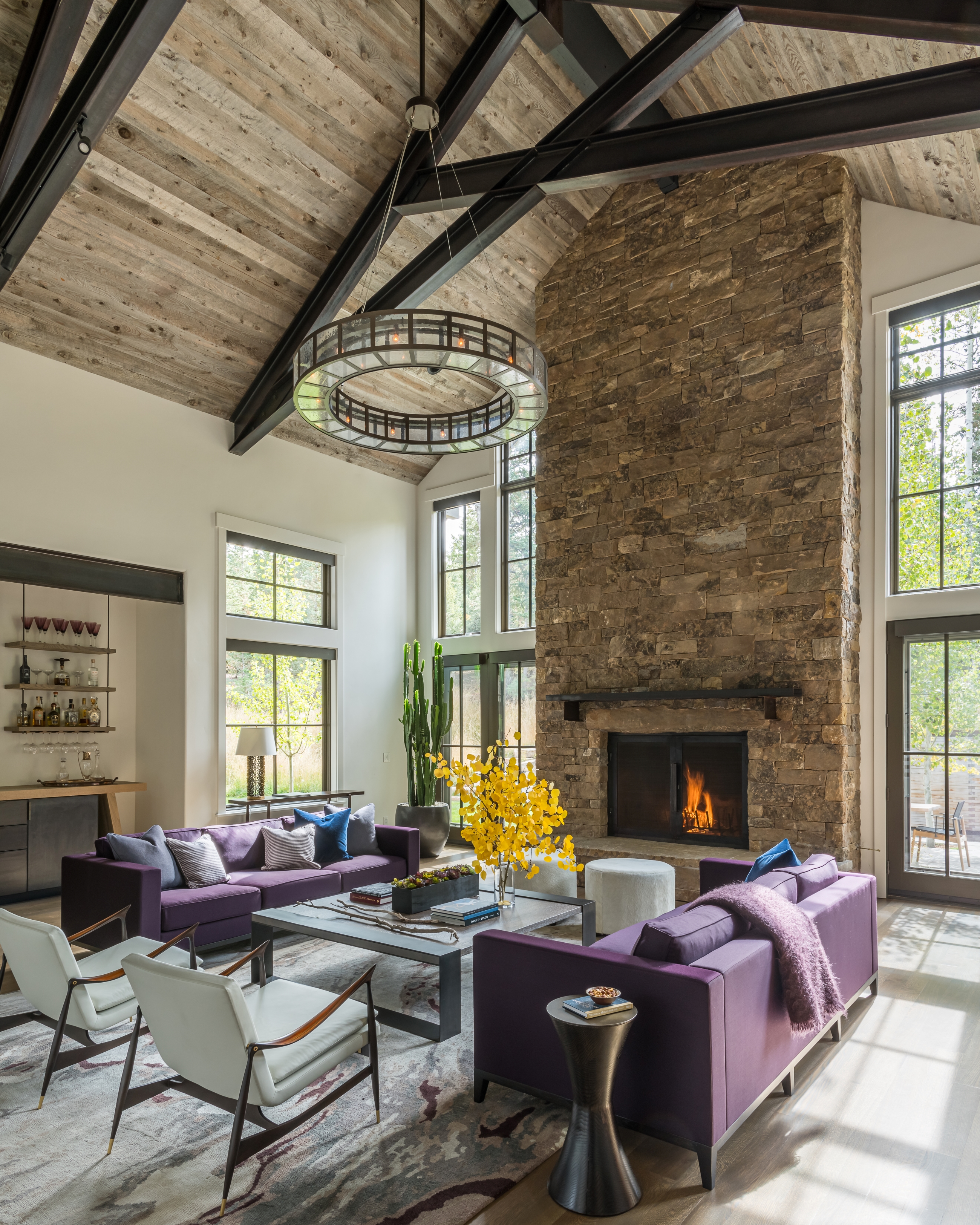
For their Mountain West project, Montana and Jackon-based firm, JLF Architects, understood the importance of being in balance with nature as they designed this charming purple living room with their clients.
“The soft tan and gray tones of wood and stone suit a fall color palette as a backdrop to vivid colors outside," explains Jake Scott, Principal, JLF Architects. "The homeowner took the interior designer role on this project, choosing the rich purple of the dual Christian Liaigre sofas as a complement to the yellows and oranges traditionally associated with fall and reminiscent of the dusky color of an autumn evening sky, while the cool whites and light grays of chairs, rug, and ottoman suggest an early skiff of snow that often covers colorful leaves in the mountains,”
Purple might seem an unusual choice for your fall palette, but the rich depth of color in this royal hue makes it an ideal choice for a scheme that complements one of fall's biggest signatures: yellow. This clever use of color theory makes a convincing case for this enticing shade as well as its soothing counterparts, gray and tan.
7. CREATE A CALM FALL ESCAPE WITH SAGE, WALNUT AND TAUPE
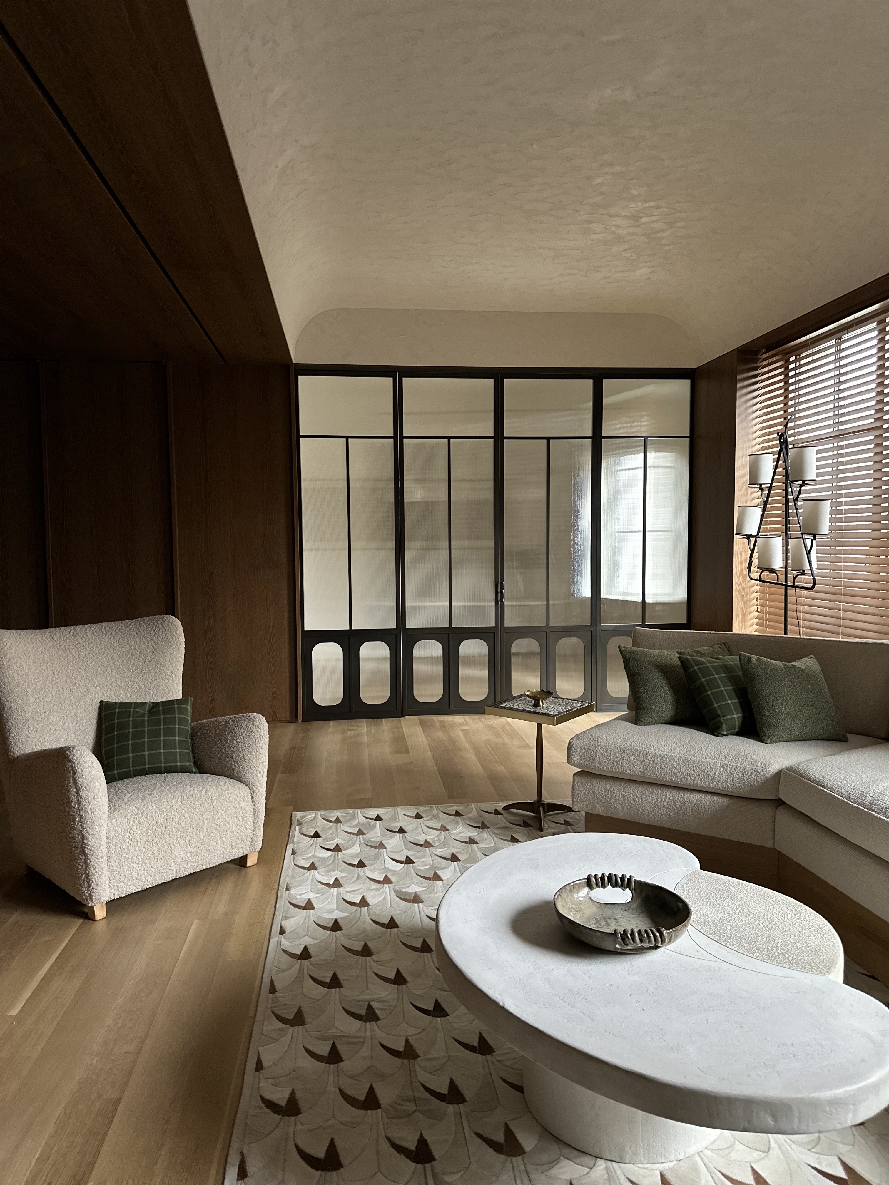
Fall color palettes don’t always have to be warm in tone and temperature, as this example from Nannette Brown proves with its soothing mix of sage green, walnut, and taupe. Not only do these three hues work across textures, but they also lend light, energy, and depth to this interior.
“Rich wood tones and textured, hand-troweled plaster were key elements very early on for our clients," reveals New York-based interior designer, Nannette Brown. "Creating a sense of depth while still allowing a certain serenity was very important to them. The most fabulous thing about the room is that it’s a treasure trove of storage and purpose — it serves as the husband’s dressing room in addition to being the central library/den.”
Take inspiration from Nanette's fall palette and consider more muted and cool versions of your favorite colors when creating your autumnal color combination.
8. ENJOY AN INVITING FALL PALETTE WITH RED, BROWN & BLUE
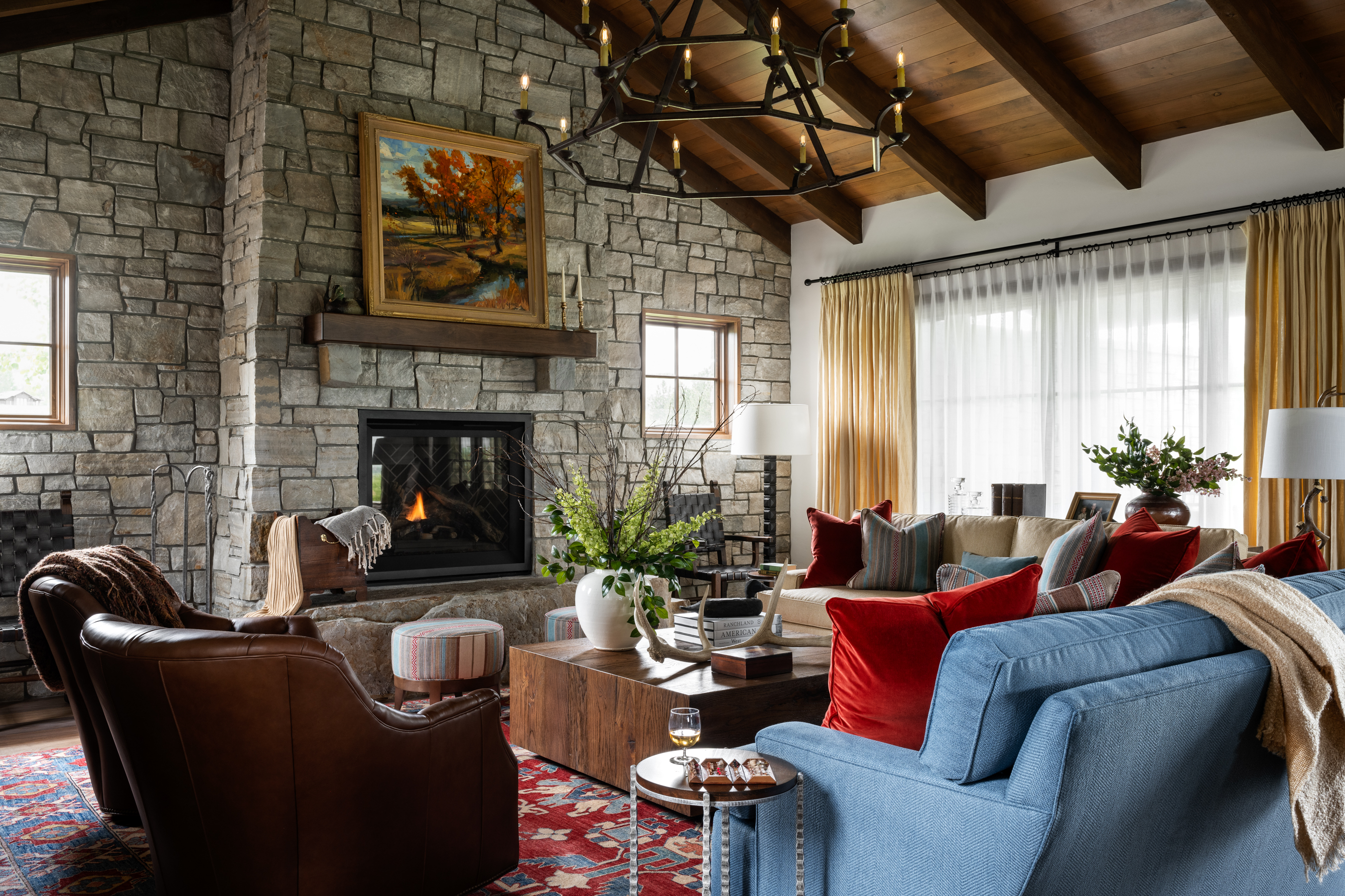
Red and blue might seem more like fourth of July-inspired rather than fall but in reality, the fall season favors these two shades. Blues are found as the backdrop to leaves changing color and red inevitably paints the leaves themselves as we see nature change around us.
Montana-based design firm Kibler & Kirch celebrates the vibrancy and energy these hues bring to this living room design, perfectly grounded with the warmth and elegance of brown. The designer behind the scheme speaks to the versatility of this color palette, emphasizing that although it resonates with fall, it can flourish all year round.
“I find that the more colors I start with in a rug — in this case, an entire spectrum that includes red, blues, oranges, yellows, creams — that it allows a room to speak to all the seasons," says Jeremiah Young, owner and design director, Kibler & Kirch. "Everything in this room was taken from the rug. The suggestion of Fall with a painting on the mantel is all that was needed!”
Price: $179.99
Rating: 4.8/5-stars (238 reviews)
Color: Deep brown (others available)
What are the colors of a fall palette?
The best way to identify a fall color palette is to start by looking out the window. Your landscape offers a series of color combinations to choose from, whether it’s a picturesque autumn scene with leaves falling or cold crisp cityscapes. By taking the time to identify the fall palette that best speaks to your locality and surroundings, your interior in turn feels more balanced with its exterior.
“As the autumn arrives, the shifting temperature and light inspire us to embrace warmer, more muted color palettes in our designs," says David Ries, principal of Ries Hayes Interiors. "Select materials and muted colors that harmonize in tone, creating a warmly grounded and soothing atmosphere. The result is a rich and inviting space."
Muted tones work well to convey the transition to winter, but equally rich tones evoke the warmth of the fall. “The ideal autumn decorating palette is inspired by nature, with rich, enveloping colors that evoke warmth and the harvest season," adds Mathilde Abeel and France Lepoutre, founders of Studio Castille. "This includes olive green, which is still a must-have, as well as ochre and yellow. These sunny colors add light to spaces and are reminiscent of changing nature. As for red and burgundy, opt for autumnal reds which are more subdued and slightly desaturated."


