Nostalgia is a popular buzzword in the interior design world. Whether it's a shade of faded yellow paint that reminds you of your mom's kitchen cabinets or a retro green sofa that takes you back to a holiday house, these kinds of nostalgic designs are the pillars of a cozy and personalized home. However, this wistful theme doesn't have to be limited to the memories of your own life, it extends to past interiors in general — nostalgia-inspired designs have an undeniable retro edge. Color evokes emotion and memories, and none so much as the shades of a 70s color palette.
But before you can claim a 70s comeback for your space, there are a few different ways you can ponder. So, what is a 70s color palette? The first step is to close your eyes and call to mind the colors of the disco decade. Livingetc's color expert, Amy Moorea Wong, says, "When you think of the visual vibes of the 70s, olive-y, avocado greens, rusty oranges, gold-ish yellows, and chocolate browns swirl around the mind in distinctly far-out curves and waves. Add in splashes of magenta and a deep purple if you’re feeling Saturday night fever, and the odd electric blue and acid lime for a hard hit of psychedelia." The palettes are colorful, but they're defined and distinct.
To better understand this color trend, I talked to interior designers and color experts about the different definitions of a 70s color palette and how to use them in the home. Are you feeling more in tune with the grounding greens or the deep, disco purples? Whatever allure of the 70s speaks to you, there is probably a color palette to match.
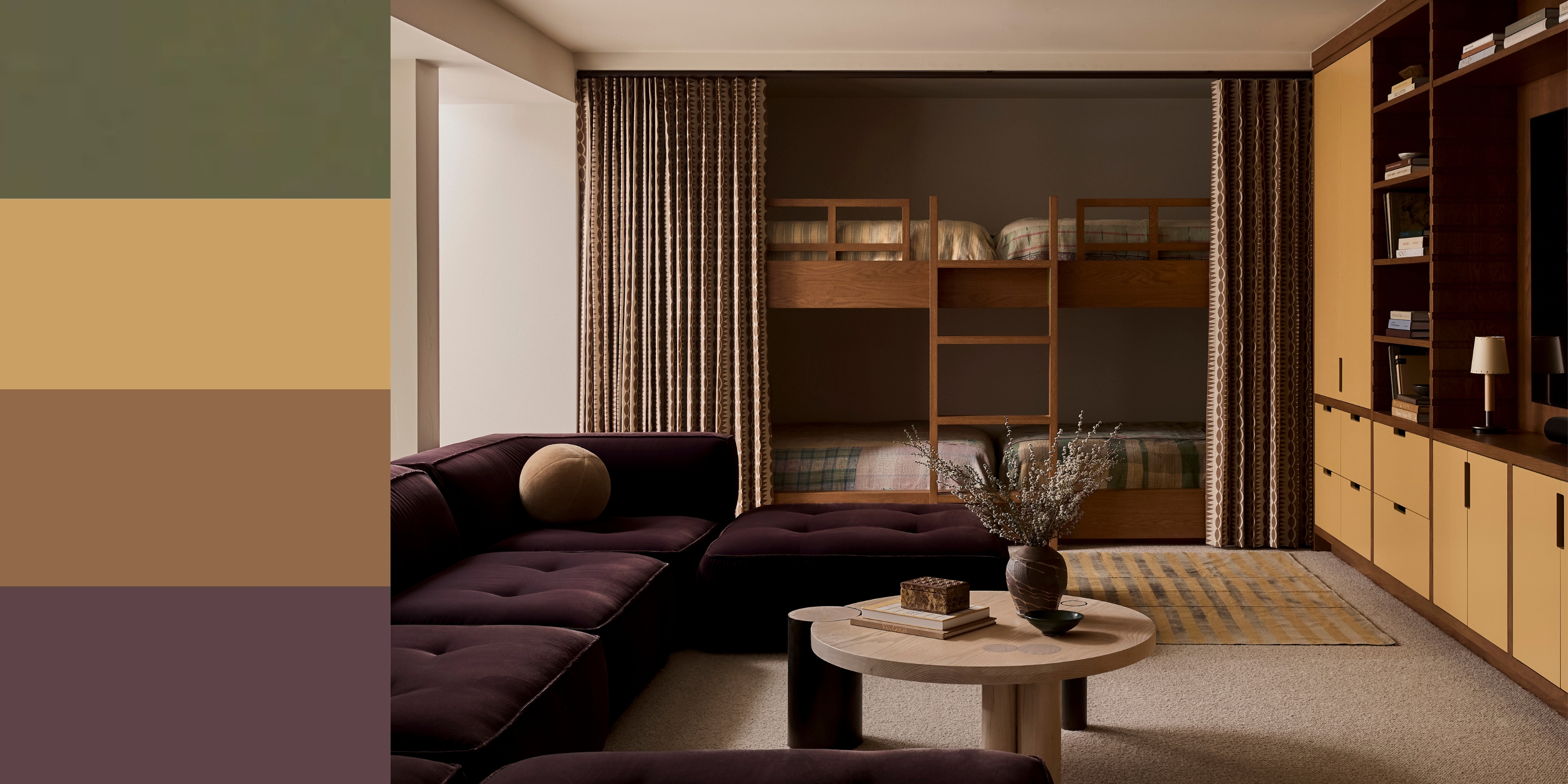
1. Grounding Green Earth Tones
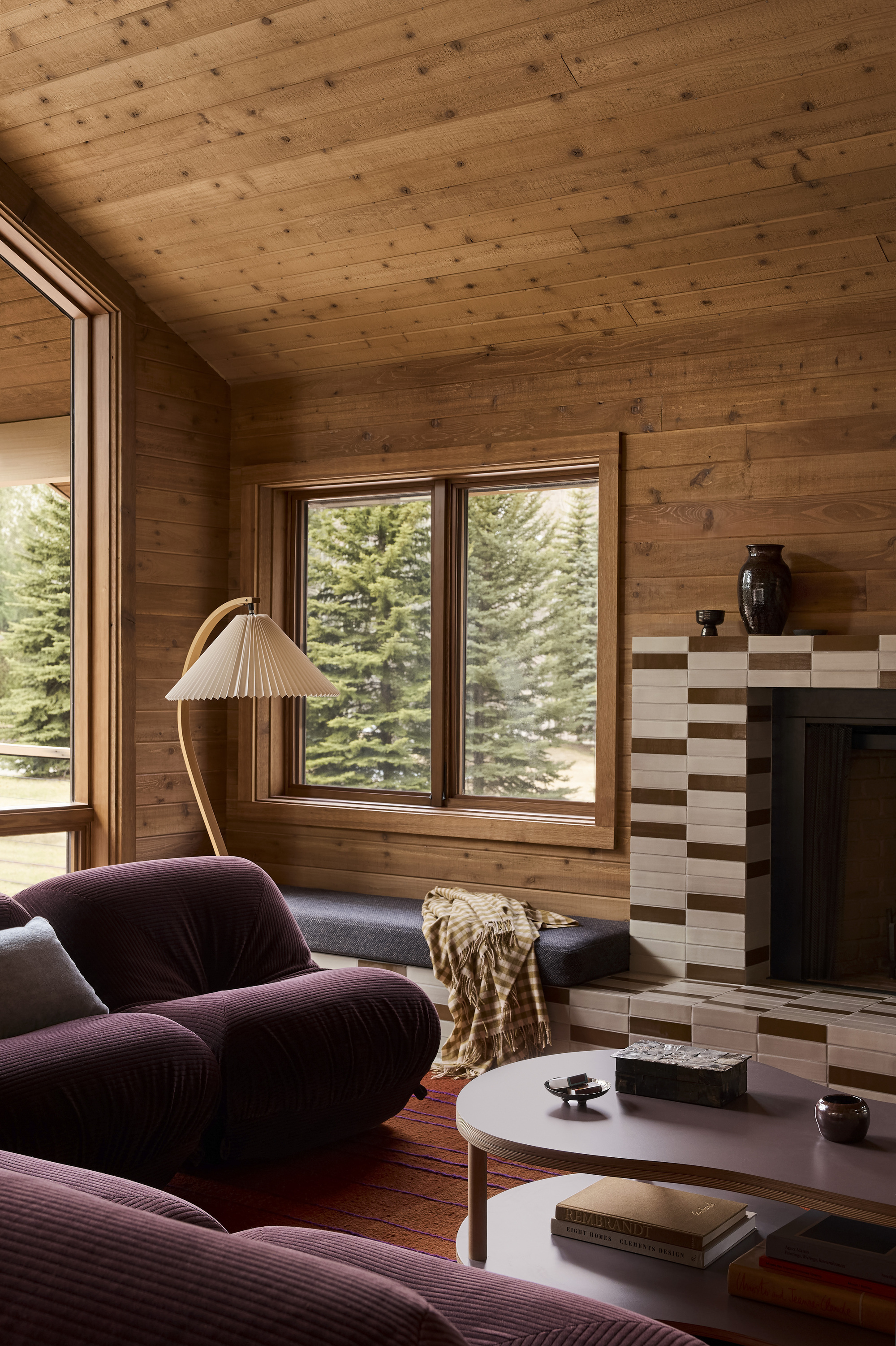
You can't talk about 70s color palettes without talking about the soothing Earth tones at the core of the design movement. Julia Miller, interior designer and creative director at Minneapolis-based Yond Interiors, says, "The hallmark of the 70's are ultra-earthy tones like goldens, browns, avocado and moss greens, and burnt oranges." The 70s palette is a connection to nature and a departure from the ultra-bright colors seen in the 1960s Space Age interiors.
Amy Moorea Wong says, "The earthy, organic tones are the most archetypal, and what we tend to reach for when 70s revivals come around." It feels warm, inviting, and outdoorsy, as well as nostalgic and playfully retro. Focusing on the green and brown hues is the perfect way to call to the colors of the past while still maintaining a timeless look.
Green goes with just about anything, and the colors that go with green are rather limitless as well. I like to think of dark greens as almost neutral colors. To use these shades in a 70s-inspired way, Amy says, "Lean into the nature-inspired coziness with olives and avocado greens either as your base wall color or in textile accents like curtains or rugs." Then, a wooden side table or accent chair will subtly bring that beloved brown and orange into your palette.
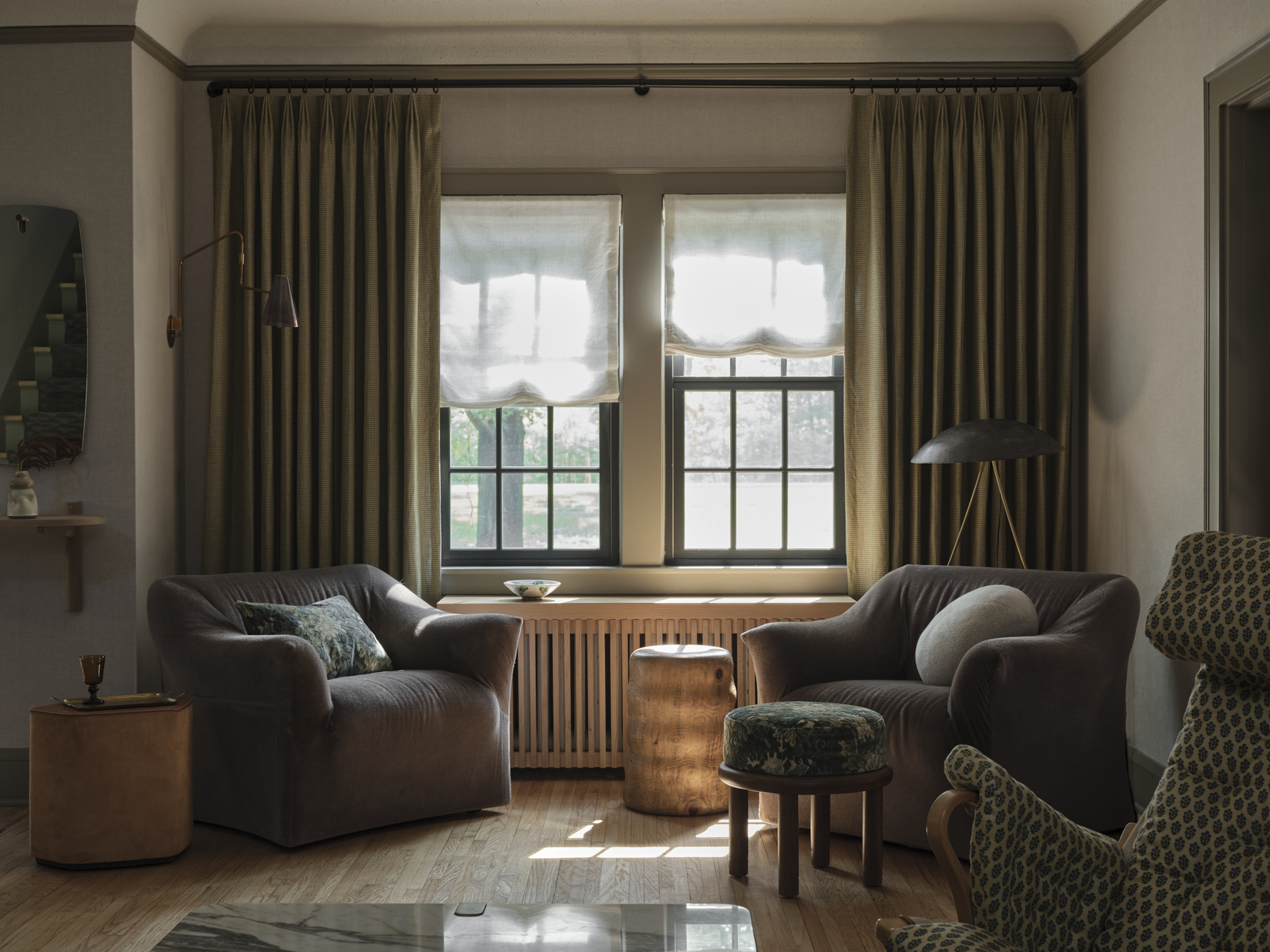
2. Deeply Saturated, Warm Shades
Dark color schemes bring so much drama to a space; incorporating a deep pop of purple or rich chocolate brown is quickly becoming my favorite interior design trend. To make this look feel 70s, it's all about bringing a touch of warmth. Plum purples, brick reds, and orangey-browns will be the defining shades of this style palette.
As for styling with a contemporary take, Amy says, "Keep the walls and floor neutral and have some fun with everything else; [for] large pieces of furniture go purple, a rich magenta or a more modern navy (you can push this to the walls if you’re really feeling it)." Once you have your base pieces down, cushions and accessories can go various brighter shades of hotter pinks and purples. Amy says, "add subtle flashes of vivid blue/green/yellow, and sleek silver lighting and metal accents for a bit of jazz."
Remember, you can always tone this up or down at your leisure. Just "don’t forget to include lots of mid-toned wood to tie it all together," says Amy. As wood is so warm and welcoming, it works really well in soft, comforting spaces, "such as living rooms and bedrooms, as well as the kitchen — think colorful cabinetry, and making the most of the timber element in shelving, countertops, or tables."
3. Bright Blues Paired With Cozy Oranges

"For a youthful, don’t-wait-up-mom feel, we’re going bright and electric," says Amy. Think bright blues and dark teals, next to bold oranges and sunshine yellows.
The best thing about 70s color palettes is that they are very complimentary towards each other — "all of the colors can be mixed and matched which makes it an easy decade to work within," says Julia. Orange and warm yellows are an undeniable staple and can surprisingly work as a solid base color when you lean into their more neutral tones. For instance, dark teals and bright but soft blues make a harmonious pairing in an orange and brown-forward palette, as they are complimentary colors on the color wheel in interior design.
Or you can play up the vibrant, cosmic color palette side and go for combos that will be even more visually striking. Amy says, "The more disco-y palette is vibrant and glam; hot pinks, vivid blues, and even playful prints or flashes of silver that speak of donning your best platforms and hot pants hitting the town."
4. Classic Avocado Green and Harvest Gold
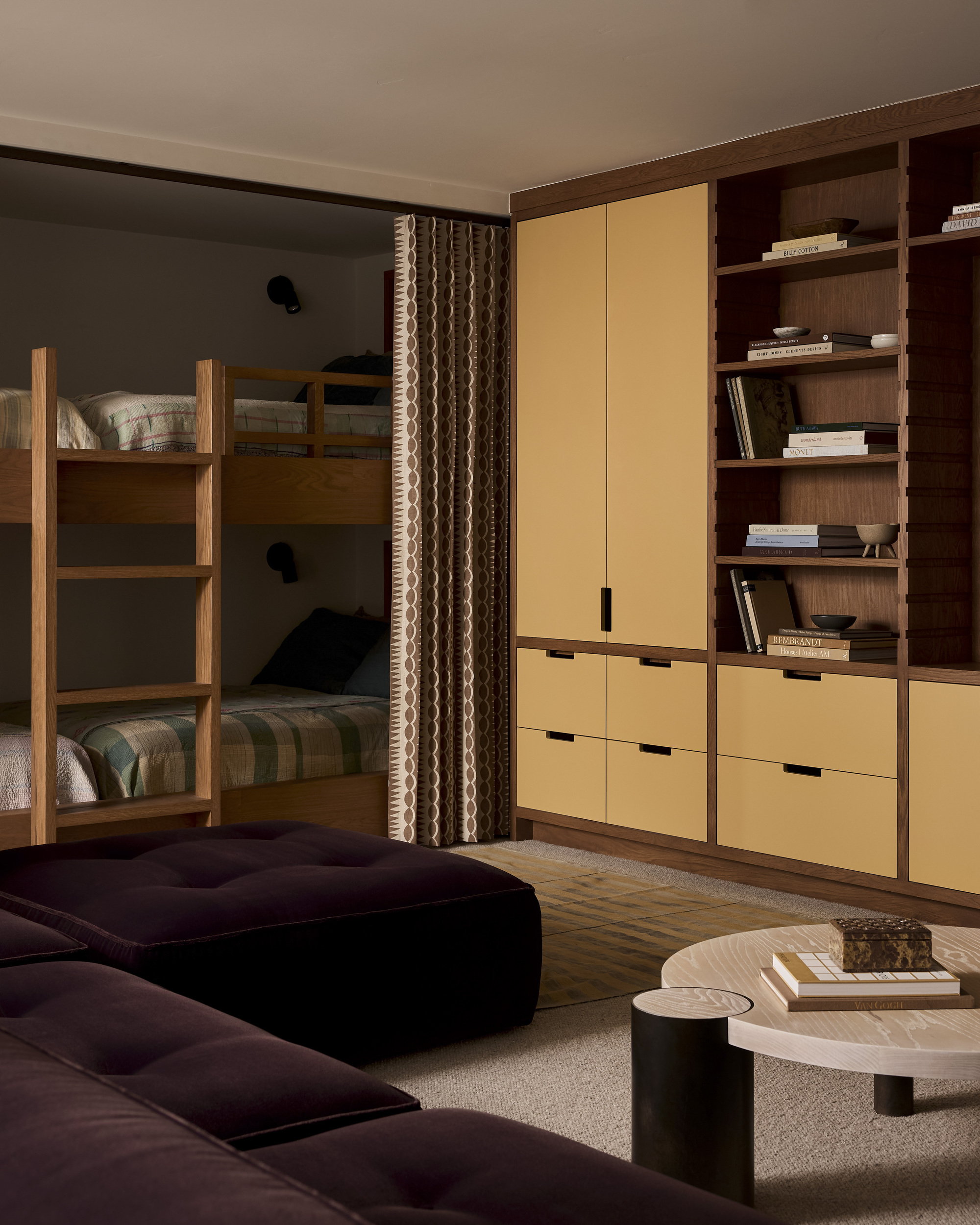
I had to save the classics for last, of course. When truly embracing a 70s color palette, you can't go without the famous combination of avocado or olive green and golden yellow. "Harvest golds and avocado greens are synonymous with the 70s, as is a chocolate brown and burnt orange pairing," says Julia.
To make it simple, start with wooden furniture or a natural wood base. For wall color, green will be a timeless choice that will live with you throughout the seasons; or you can decorate with earth tones through large furniture items or with a rug. Basically, you can never go wrong with a green base.
"Then bring in mustard and that dappled muted orange as secondary colors — on upholstery or curtains," says Amy. She adds that "more vivid colors such as purple, pink and brighter greens/yellows can play supporting roles on smaller pieces of furniture, artwork, or objects."
Where do these 70s color palettes work best? "Well, in the secret nightclub room, obviously," jokes Amy. But the truth is that the sultry and saturated yet grounding and comforting colors of the disco decade work beautifully all around the home.
Let these vintage-inspired paint colors further fuel your nostalgic journey.