If you want to discern the mood of an interiors scheme, the living room is the first place you should look. As one of the rooms people are likely to spend the most time in (except the kitchen), they're often the best reflection of an owner's tastes – as well as that of their designer.
As such, this means that designers often throw everything they have at a living room, using them to introduce key color palettes or celebrate trending pieces (daybeds, anyone?) – and in the process, these design-forward living room ideas act as a waypost for the way we'll be decorating.
Without further ado, here are 7 living rooms by designers that set the tone for the year ahead.
1. A living room with a grown-up approach to primary colors
We're seeing a definite swing away from neutral schemes towards a way of decorating that's more about celebrating color. That's not to say we're over neutrals – more that we're looking for new and interesting ways to use them with other colors, textures and materials for spaces that feel more layered.
It's something California design studio Electric Bowery have nailed in their recent Los Angeles project, where a neutral backdrop paves the way for individual furniture pieces to shine. 'Balancing the natural tones of the architectural framework with the more vibrant highlights in the furniture creates a palette reminiscent of the Spanish countryside,' explains principal designer Lucia Bartholomew.
The velvet sofa is a clever point of difference here, too. 'The material adds an unexpected touch, making the couch a focal point of the space while the soft curves and earth tones add an organic element that ensures a cohesive look amongst the rest of the living room furniture,' Lucia adds.
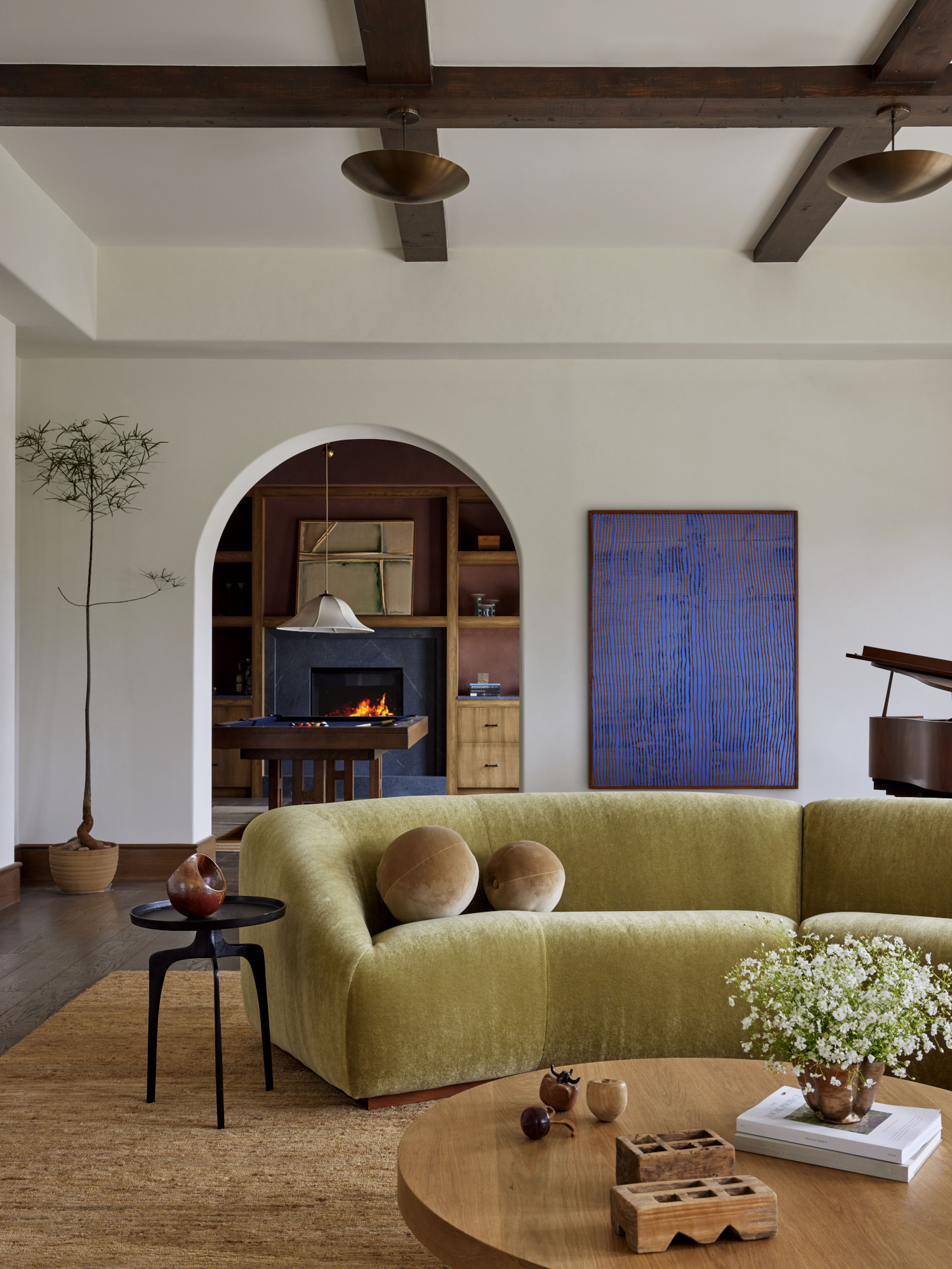
2. A space that embraces the eclectic mix
It's been years since matchy-matchy living room furniture was on trend, but designers are tired of one-note schemes – think spaces with all curved pieces and no points of difference. Instead, it's time to embrace the idea of the eclectic mix – an edit of furniture and other items that don't conform to one style or time period.
'I always balance more standard shapes with more interesting shapes,' says California interior designer Michael Hilal, who created the scheme above. 'It becomes a little jokey when, for example, every piece of furniture is a sculptural piece – it almost diminishes the value of them. If I had some beautiful seventies pieces, more of my other seating would be a standard format, because I want those pieces to sing more than the others.'
3. A scheme that makes the case for bold wallpaper
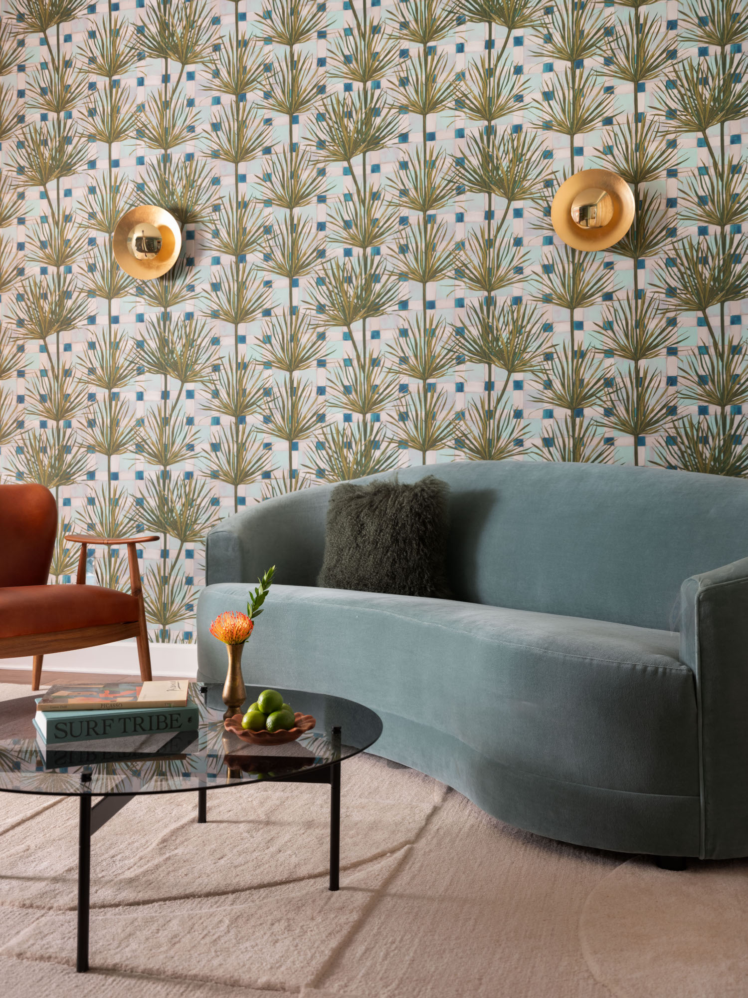
2024 is the year of big, bold wallpaper, from murals to large-scale pattern – and there's no better way to use this than in a living room. This scheme by Florida studio Chinotto House demonstrates just how well it works in a relaxing scheme.
'The idea behind this beautiful Pierre Frey wallpaper was to have a tropical-inspired pattern because our clients were from Key West and wanted a little bit of that vibe in their home,' explain the studio's founders, Chelsey Cox and Rachel Rector. 'The boldness of it works because this lounge is a smaller area of the home and a pass through connecting spaces. Because we've used this in a measured way, it's just enough to be impactful without being overwhelming.'
In this case, the wallpaper was the starting point for the rest of the scheme. 'We fell in love with the wallpaper in the initial design stage and then worked to find furniture that worked cohesively with it. 'We always tell our clients, find the thing you love most first – it could be a couch, a paint color, a vintage rug – and calibrate the design from there.'
4. A color palette that encourages a bold, playful approach
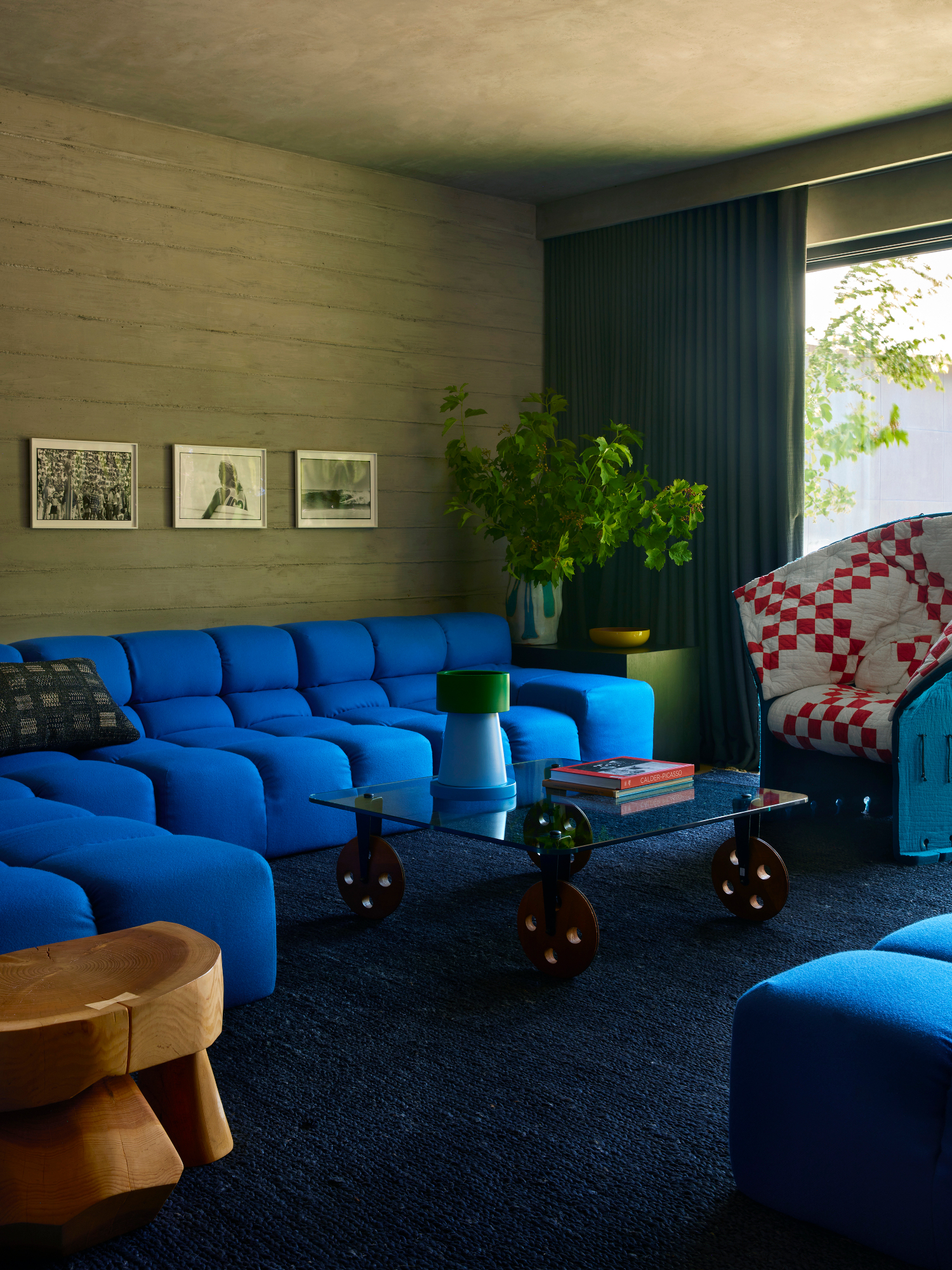
Here's another example of the move towards colorful living rooms – Los Angeles practice Jamie Bush + Co introduced a vibrant palette into this scheme. The space feels moody and cocooning, despite the electric blue sofa, because the backdrop is soft and muted – a textured ceiling carries the beige of the walls over the top of the space, and a subdued deep blue carpet grounds the space.
'The space is located in the bottom floor of the home, which is made of board-formed concrete on the exterior,' explains founder Jamie Bush. 'We decided to expose this finish on the interior [and] reinforce the cocoon-like feeling by plastering the ceilings in the same gray-colored plaster.
'Now that we had a darker, serious vibe, we wanted continue the spirit of the home with strong doses of intense primary color. The key is to use it in mass so it feels as important and impactful as the concrete. By implementing color into your home in a bold architectural way, it becomes playful yet feels significant – a big idea. I call it "serious play".
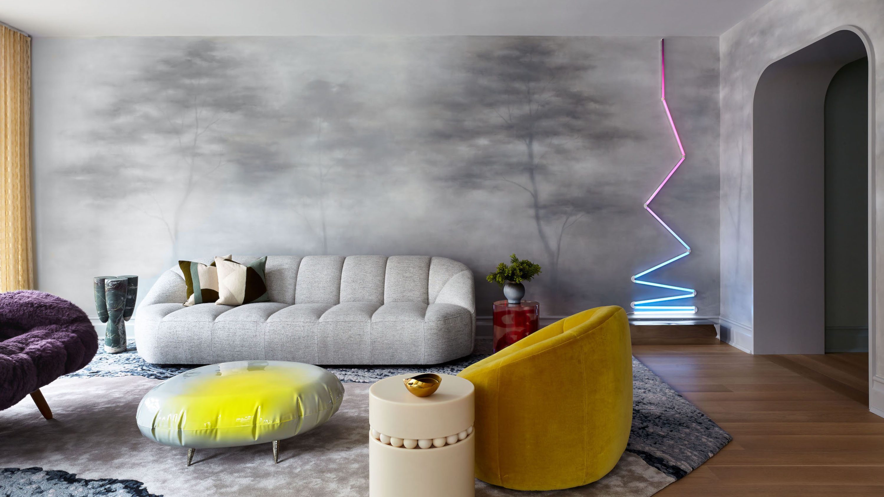
5. A space that revels in the unexpected
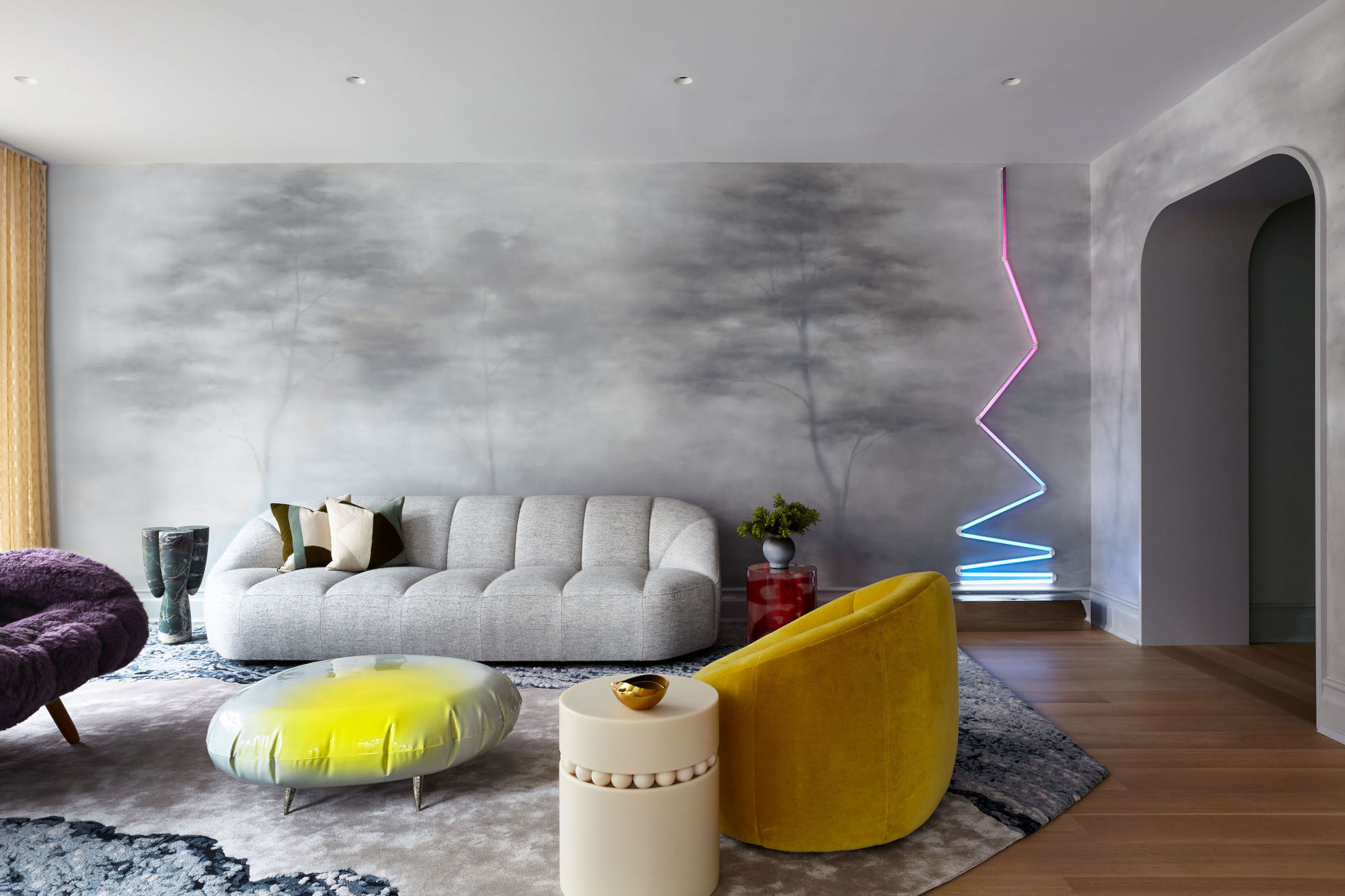
There might be a shift away from cool gray right now, but this living room makes the case for using it as a backdrop for vibrant, futuristic pieces – to create a space that feels high-end and ahead of the curve. 'My interest lies in creating beauty through layers of contrast and an element of the unexpected, a sort of surprising tension,' says Elena Frampton, principal of Frampton Co, based in NYC and the Hamptons. 'By placing playful, vibrant works of art and design against a classically inspired wall mural with a contemporary flavor [by artist Caroline Lizarraga], we maintained youthful energy and excitement within the subtle, sophisticated scheme.'
This room also embraces a curatorial approach to interiors that designers are using to create far more personal spaces. 'Each furniture element is a work of design that, placed together, forms my unique composition for our client,' Elena explains. 'For this room, layering warmer hues [of] red and yellow was essential to balance with the strong gray envelope. We arrived at the purple chair last – it just felt right!'
6. A scheme that demonstrates a new way with gray
Another living room making the case for a gray comeback, this space uses a shade with warm undertones to cover the walls and joinery. It's the perfect inspiration if you are looking for more muted living room paint color ideas. 'This room gets a green light filtering through because of the trees in the garden square outside, so we used earthy shades to balance it,' explains Isabelle Dubern-Mallevays, co-founder of Invisible Collection and owner of this home.
The key to avoiding a flat scheme when using gray is to lean into texture – something Isabelle does to perfection with the curved velvet sofa at the heart of this space. The way the fabric reacts to the light, creating light and shaded spots, adds an extra dimension to the color scheme.
7. A lounge that celebrates the joy of yellow hues
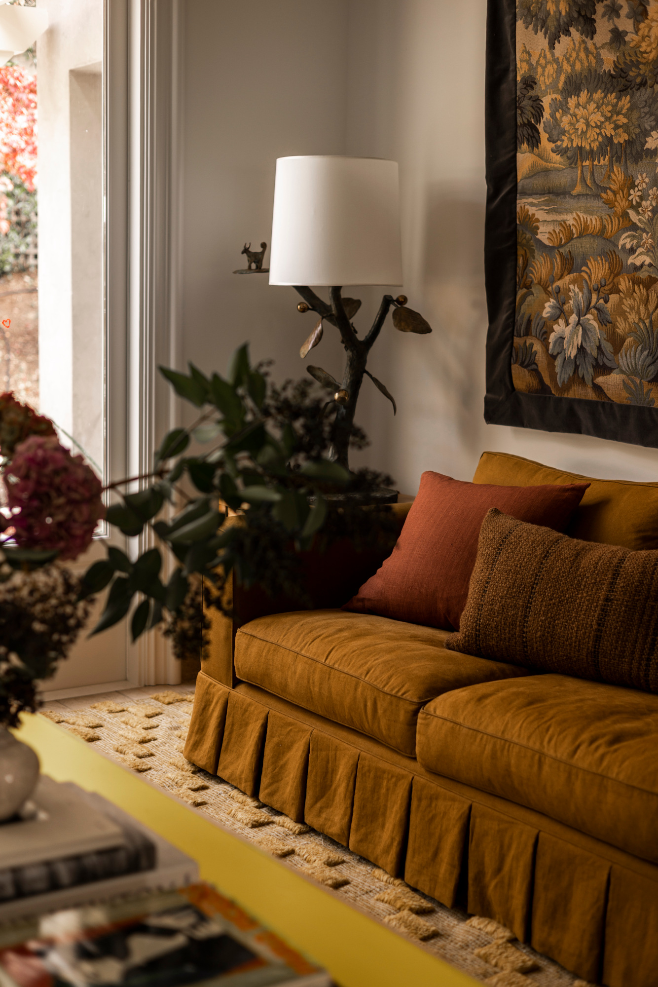
So many of the designers we've spoken to recently have waxed lyrical about the power of yellow – and as this scheme by San Francisco-based Studio Montemayor shows, this sunshine hue is perfectly suited to living rooms.
Taking a tonal approach, the brighter shade of the coffee table is tempered by a deep, almost amber sofa and a natural rug that picks up the shade too. Will we be seeing more yellow living room schemes this year? If they look as good as this, let's hope so.