
I have said it before, and I will say it again, we need to pay more attention to our entryways. It does seem that we are finally acknowledging this space as a proper room in our homes and treating it as such, but because it's such a transitional space, it does still tend to get overlooked in terms of decor. Let's change that please.
Entryways also tend to be on the small side too, or the awkwardly shaped side. Adding in lots of furniture and decor often isn't an option, hence why you're entryway color combinations are so key. Color and paint are one of the few ways to create impact in this space.
But what are the best pairings to try in this key area? You want to make a statement, but you also don't want it to feel jarring with the rest of your home. We asked designers and color experts for their top tips on choosing entryway colors, and what shades work best together.
1. Neutrals and colors from adjoining rooms
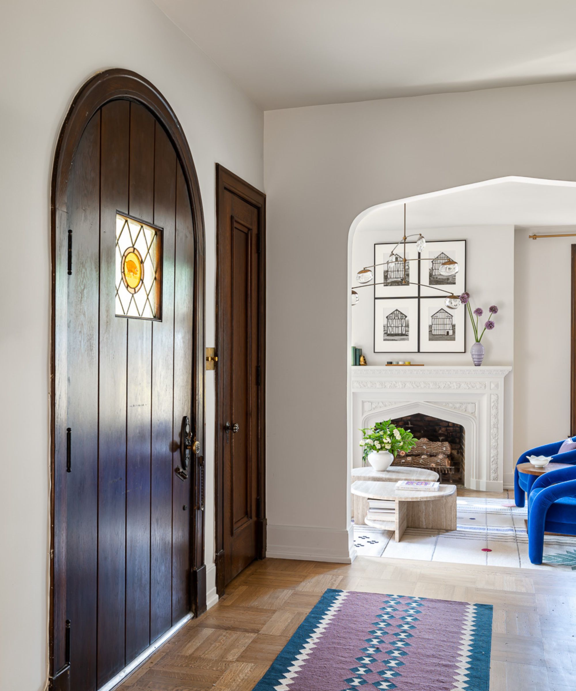
Let's start with the key entryway color pairing, the colors going on in the adjoining rooms. This is key to creating a cohesive color scheme that runs through out your entire home. When deciding on the colors for your entryway, also look to how they will pair with other colors you get a glimpse of from the space.
As designer Bethany Adams explains, 'Entryways set the tone for the rest of the home. Depending on whether or not they are contiguous with other spaces or set apart as jewel boxes really determines the colors I use. More often than not, entryways are part of a larger space that connects every other room in the home and as such, I'll keep the walls neutral – Benjamin Moore's White Dove OC-17 is a favorite – and add excitement with a patterned floor and artwork that reflects the color palette of the rooms just beyond.'
'If I'm lucky enough to have a jewel box space, I will go bolder, but I generally do still use neutrals like Farrow and Ball's Down Pipe paired with this antique Zuber wallcovering. It's so much easier to update your entryway with seasonal decor and florals, new accessories, and accents when the walls are neutral, and it also invites guests to quickly pass through into the more exciting spaces in your home.'
2. White and warm earthy tones
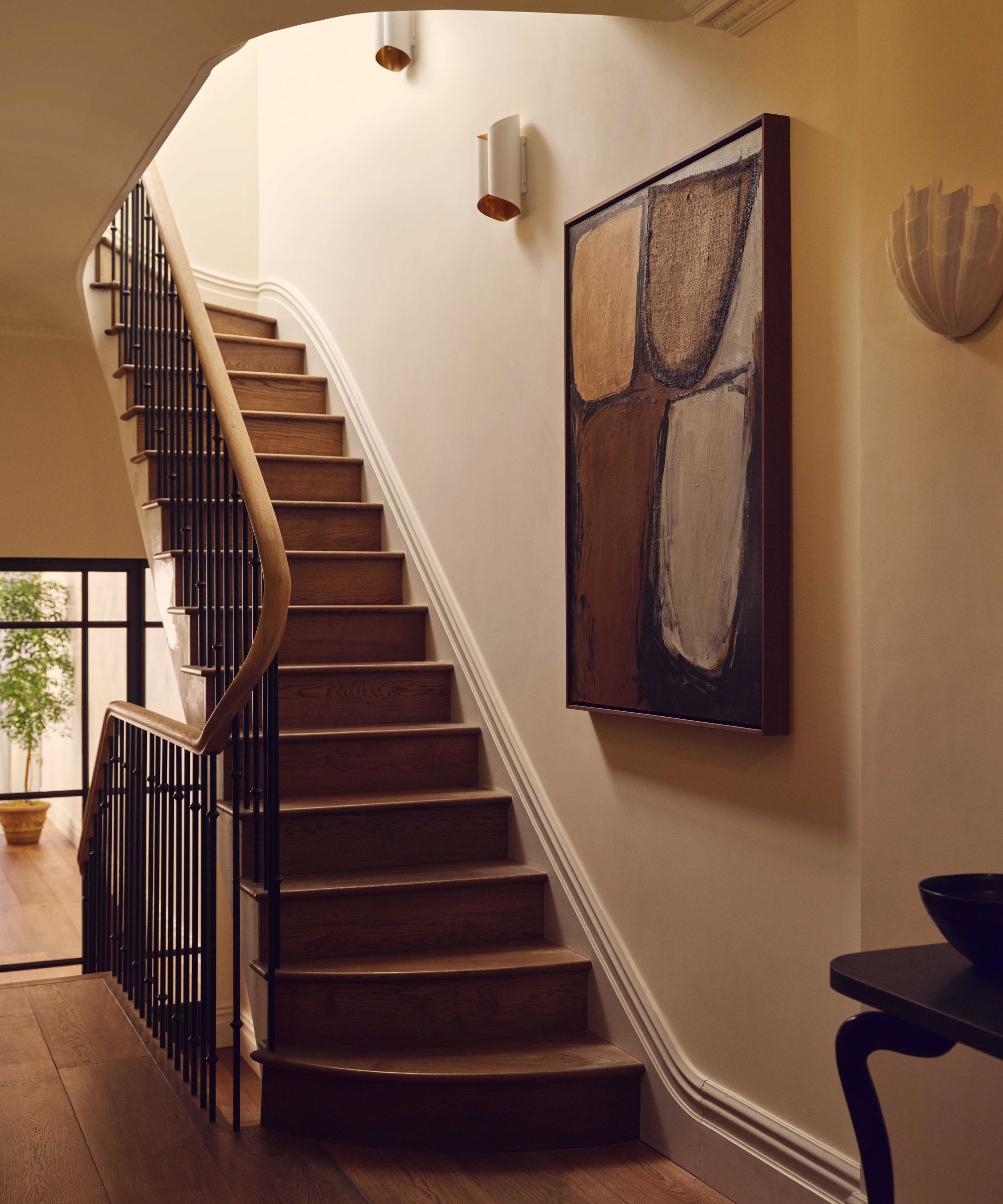
Earthy tones are a nice way to stick with a neutral scheme, but go slightly darker and richer. They are a huge color trend for 2024, but totally timeless too. The key to keeping them fresh and not becoming too muddy is to pair them with a crisp white – the perfect entryway color combination.
Murude Katipoglu, Founder of MURUDÉ comments: 'As a studio, we like our entrances to be light, serene, and welcoming spaces. We find that a neutral color palette is a great way to achieve this calm aesthetic, as it allows architectural details, artwork, and decorative light fittings to become focal points.'
'One of our favorite shades is Edward Bulmer’s Silver White, which has a hint of light grey and works well when layered with other off-whites and earthy tones. We paint the woodwork in Edward Bulmer's Whiting, which complements the wall color and the wood tones used for the flooring. Ceilings are painted in Farrow and Ball's Pointing, our go-to ceiling color, as it has just the right tone of off-white with warm undertones, neither too white nor too yellow.'
3. Light blue and cream
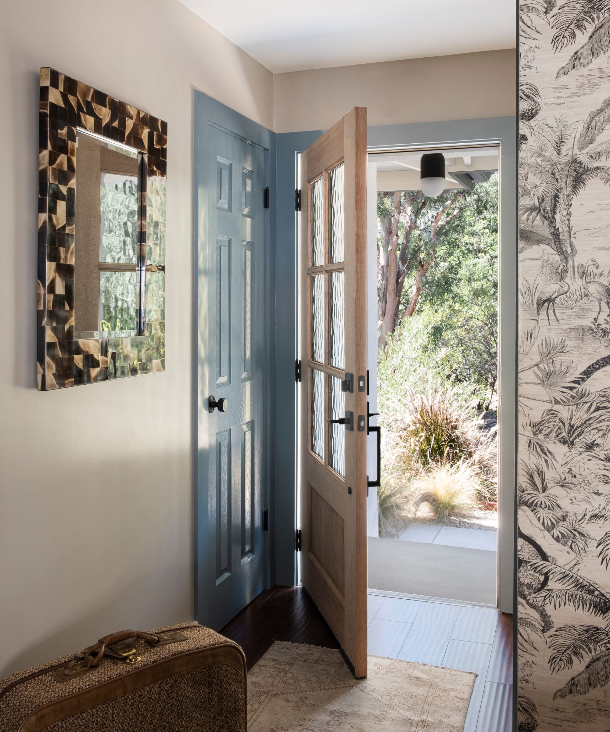
Decorating with blue can be like using a neutral, especially if you use it in its lightest form like in this entryway designer by Victoria Holly. Layer it up with other neutrals, and ground it with brown tones and you get a gorgeous balanced entryway color combination that feels fresh and light but classic too.
Victoria explains the key to this space: 'With a smaller entryway, make an impact with textures. We added a horn mirror in here to add design through a new and unexpected material and swapped out the entryway door for a split door with textured glass windows. We also utilized paint where it mattered - on doors and molding. And of course a great runner rug.'
4. White and dark green
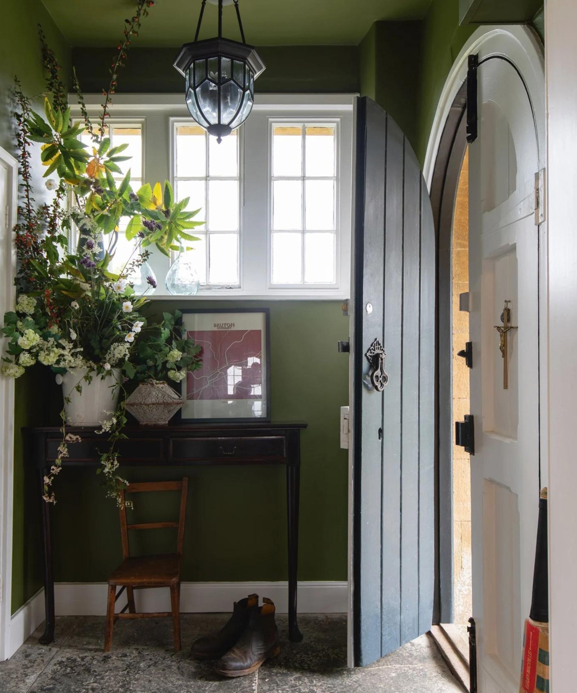
A lot of the best entryway color combinations involve white, understandably because these spaces can often lack natural light. It's interior design 101 that white can make small spaces feel bigger and brighter, but that doesn't mean you always have to play it safe by using just white, choosing darker hues, and pairing them with white to give a lift works so well in entryways.
Dark green and white is a combo that came up a lot, and as Emily Kantz, Color Marketing Manager at Sherwin Williams explains, 'If homeowners are looking to add some color into their all-white entryways, I recommend the combination of white and a deep green like Basque Green SW 6426 to create an effortless yet bold vibe –combine with wooden accents to really bring the look together!'
Tash Bradley, Lick's Director of Interior Design & Colour Psychologist, agrees, "If you’re going for a sophisticated feel in your hallway but want it to also feel welcoming, try a dusky and earthy olive. Green has an energizing quality that will make your space feel restorative and uplifting. Pair it with natural wooden tones and black detailing in your stairs for an elegant look.'
'And if you’re lacking space and natural light in your hallway, did you know that both color drenching and painting your space in a darker color can actually make your space feel larger by creating a sense of depth?' she adds.
5. Blue and red

If you want a color combination with some high contrast, so many designers are pairing red with blue. It sounds bold but it really works. The key is to avoid a 50/50 split, you want one color to dominate and another to be the accent. In this entryway designed by Studio Vero blue is perfectly balanced with pops of different red tones and white is used to give the scheme a lift. 'Intense colors work well in a small space and are great to hang art on, really helping it pop,' explains partner at the studio Venetia Rudebeck.
'I also love pairing unexpected colors for entryways to give the space some personality like blue and red!' adds Emily Kantz. 'A great way to achieve this is by painting your door in the brightest of the two and the walls in the darker color you’ve chosen. I recommend using a dark blue, like Naval SW 6244 and gentle red, like Coral Clay SW 9005.'
6. Black and White

Black and white is the perfect color combination for a really timeless entryway. 'One of my favorite fool-proof color combinations for an elegant but never boring entryway is black and white,' says Emily Kantz. 'The classic contrast between the two turns the space from bland to bold by just adding a true-black paint, such as Tricorn Black SW 6258, on trims or staircases.'
In this entryway, designer Bethany Adams has softened the classic scheme, going for a soft black on the walls and a crisp white on the ceiling but then an off-white mural to tone down the contrast. A purely black and white scheme does risk looking stark, and even cold, particularly in an entryway that lacks natural light. Introduce some in-between colors like creams or grays to create a more tonal scheme.
7. Blue and blue
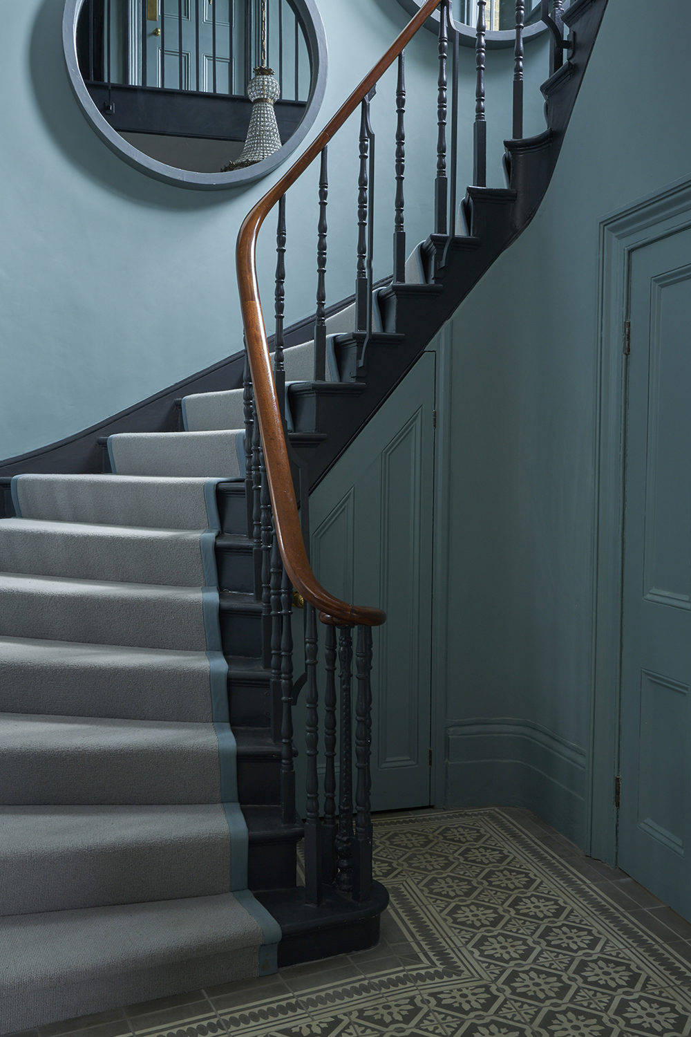
Speaking of tonal palettes, opting for a pairing of the same color in lighter and darker hues works wonderfully in an entryway. Monochromatic schemes can look quite intense in larger rooms, but they are a winner in smaller spaces and can work to blur the edges of the space as you don't have any of that high contrast, making it appear larger. You can opt for bolder pairings like a dark blue and a light blue, or dial it down and pair colors that are only a few shades different.
Helen Shaw, Director of Marketing at Benjamin Moore suggests, 'Entryways create a first impression when you enter a home. They benefit from being decorated with a concise palette to create a calm space. Monochromatic schemes are smart and classic. We would recommend using a paler shade of one and a darker hue of another such as Polar Sky 1674 and Blue Nova 825. The contrast offers a fantastic opportunity to highlight architectural features such as architraves, cornicing and staircases.'
7. Gray and white
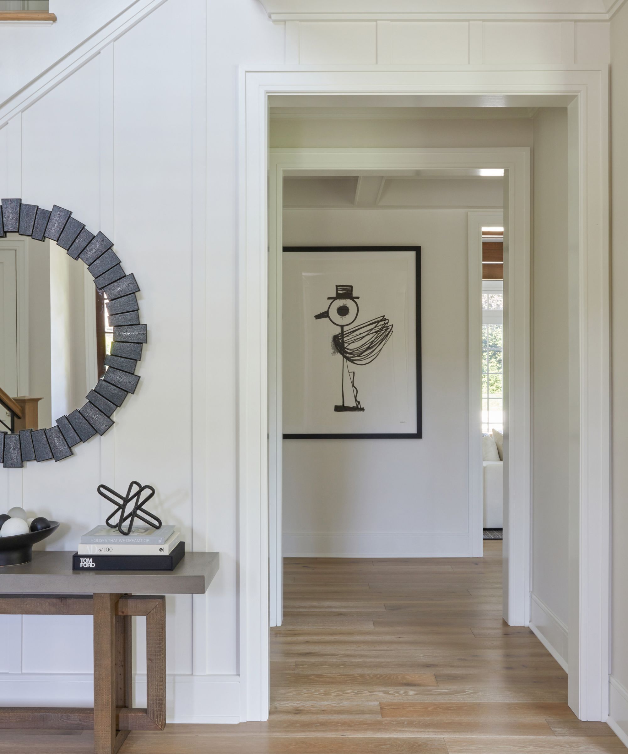
Gray and white is a classic combo, great for entryways no matter what the level of natural light. This space designed by K+Co Living gives an almost all-white scheme more of a layered look, by introducing gray and black accents. The coolness of the scheme is then balanced by the warmth of the wooden floor.
The overall look is cool, yet welcoming and as the studio's founder Karen Wolf explains, 'Entryways set the tone for the home. They immediately tell you the story of the family and also serve to balance spaces. The whimsical but minimal art by Jody Morlock welcomes guests with a casual smile.'
'Gray harmonizes well with almost every other hue, this versatility gives good reason for its popularity. A barely-there grey with a crisp white will create a timeless look and keep an entryway feeling bright and airy. However, not all white shades are going to work with any grey shade, as a rule of thumb pair warmer whites with warmer greys, and cool-toned greys with purer whites.' explains Helen Shaw.
Entryway color combinations are a really important part of your entire house scheme, the shades you choose set the tone for the rest of the home. All these combos are designer-approved, but as always be sure to order swatches and test everything in your space because we all know how much colors can change in different lights and when paired with different shades.


