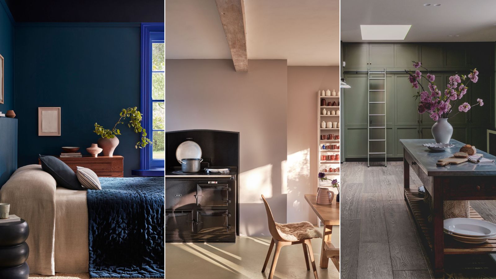
Anti-trend colours stand the test of time because above all they are livable, practical and versatile colors.
Much like a little black dress, a room painted in an anti-trend color can withstand every season, every change of decor and be dressed up and down depending on your evolving tastes and style.
Whilst color trends are great, offering us fresh perspectives, bold design choices and a serious revamp of your space, there is a reason so many appear to ‘play it safe’ with a trusted palette of colors. And it isn’t coming from a place of lack of imagination.
As Emily Kantz, color marketing manager at Sherwin Williams reminds us ‘anti-trend colors stand the test of time, they are tried and true and are considered good basics in design’.
With this in mind, we’ve asked a panel of interior designers and paint experts just why they keep coming back to these key seven anti-trend colors project after project and give us their expert insight into why these colors are enduring favorites.
1. Sage Green
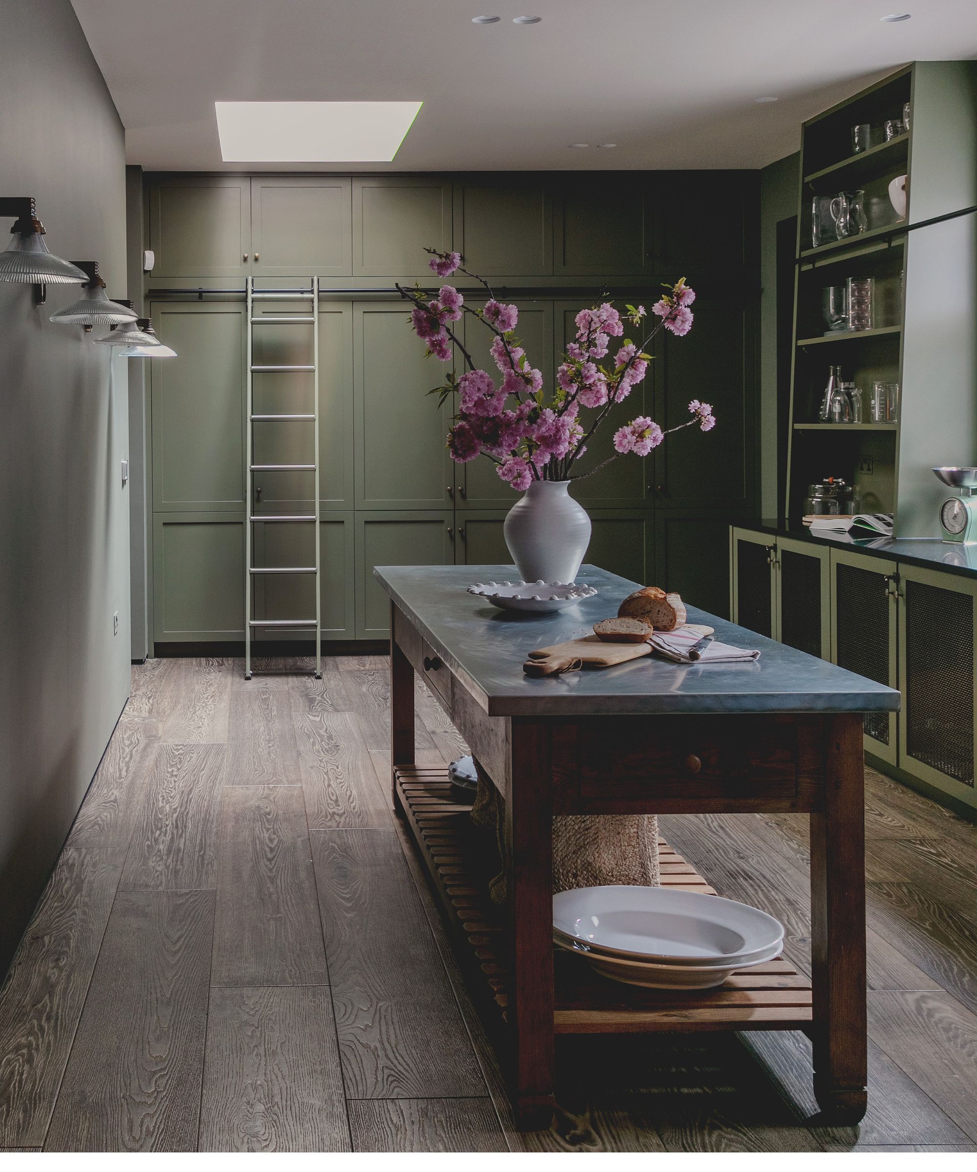
If you’re drawn to sage green, you’re in good company. This soft, muted hue has become a design staple for a reason.
Sage green has been used in design for centuries, from traditional English cottages to stately homes. It’s also a favorite in modern and minimalist interiors for its ability to soften sleek lines and hard edges.
It's an easy to live with, gentle color that works season on season, year on year and sage green provides a hint of color without overpowering a room. This makes it easy to incorporate with other hues, patterns, and materials. Which is one of the key components when we think of timeless colours for using in interior design.
Its understated charm adds a connection to nature as well, and, as interior designer Nina Lichenstein reminds us, ‘Sage continues to lead the charge in creating serene, nature-inspired interiors. This muted green has moved beyond trend status to become a design staple, beloved for its soothing, organic quality.’
2. Plaster Pink
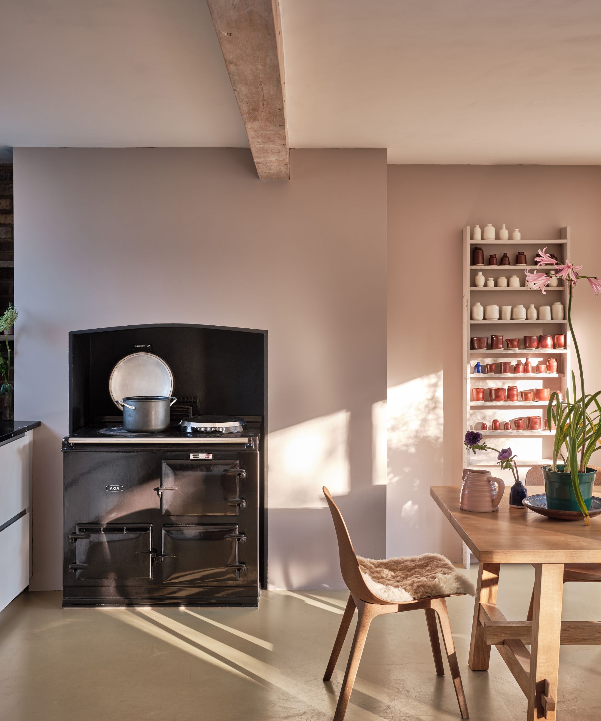
Often dubbed ‘plaster pink’ this soft, nuanced hue strikes a perfect balance between pink and beige. It’s no wonder this color is a staple in the world of interior design, effortlessly complementing everything from farmhouse kitchens to the clean lines of a modern minimalist space.
Gentle enough to bring a calming atmosphere yet distinctive enough to add personality, plaster pink works beautifully in every room. Decorating with pink has had long associations with femininity but this understated hue sheds that reputation and allows this versatile colour to a main staple of interior design. Its muted, dusty tone pairs seamlessly with natural textures, wood tones, and various color schemes.
The secret to a good pink is its underlying tonality giving it warmth and delicacy but avoids it becoming a fragrant pink. As interior designer Laetitia Laurent , founder of Laure Nell Interiors says, ‘Plaster pink is subdued yet distinctive. It’s not the typical ‘pink’ we think of – it has a softness and earthiness that brings warmth without feeling overly feminine.'
3. Cream
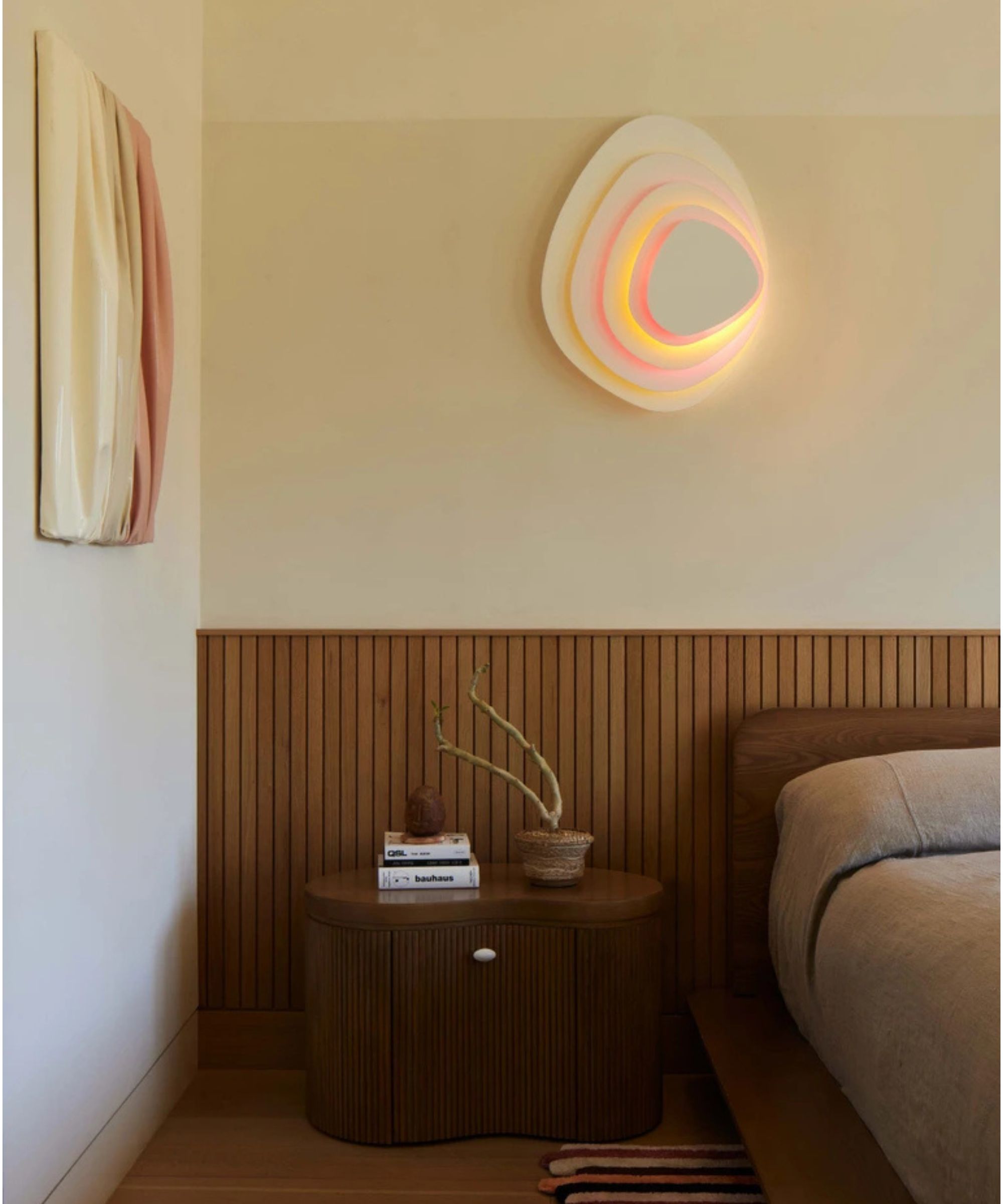
If bright white feels too harsh, say hello to the soft warmth of cream. Cream tones are perfect for spaces needing warmth without overpowering other decor. It sits in the 'white family' but softer than cooler, brilliant whites.
Cream paint has never truly gone out of style and as Patrick O'Donnell, Brand Ambassador at Farrow and Ball says, ’We all seem to have preconceptions of cream as a hangover from the 80s and 90s. But remember, when used as a woodwork color, it creates softness over generic whites and can deliver gentle warmth as a wall color'.
It's a staple in interior design and when designing this room, Kristina Khersonsky, founder of Studio Keeta chose a pared-back milky tone, explaining, 'The color used in this scheme is Benjamin Moore’s ‘Putnam Ivory.’ It has a tinge of peach undertone to the naturally pale beige color. We created a layered effect: the upper third of the room was lighter to lift the space, while the lower two-thirds featured Putnam Ivory, adding subtle depth.'
Selecting the ideal cream depends on natural light, architectural details and the over all aesthetic of the room. In a Scandinavian style room, warmer creams compliment light wood, while cooler creams bring balance to modern decor.
4. Black
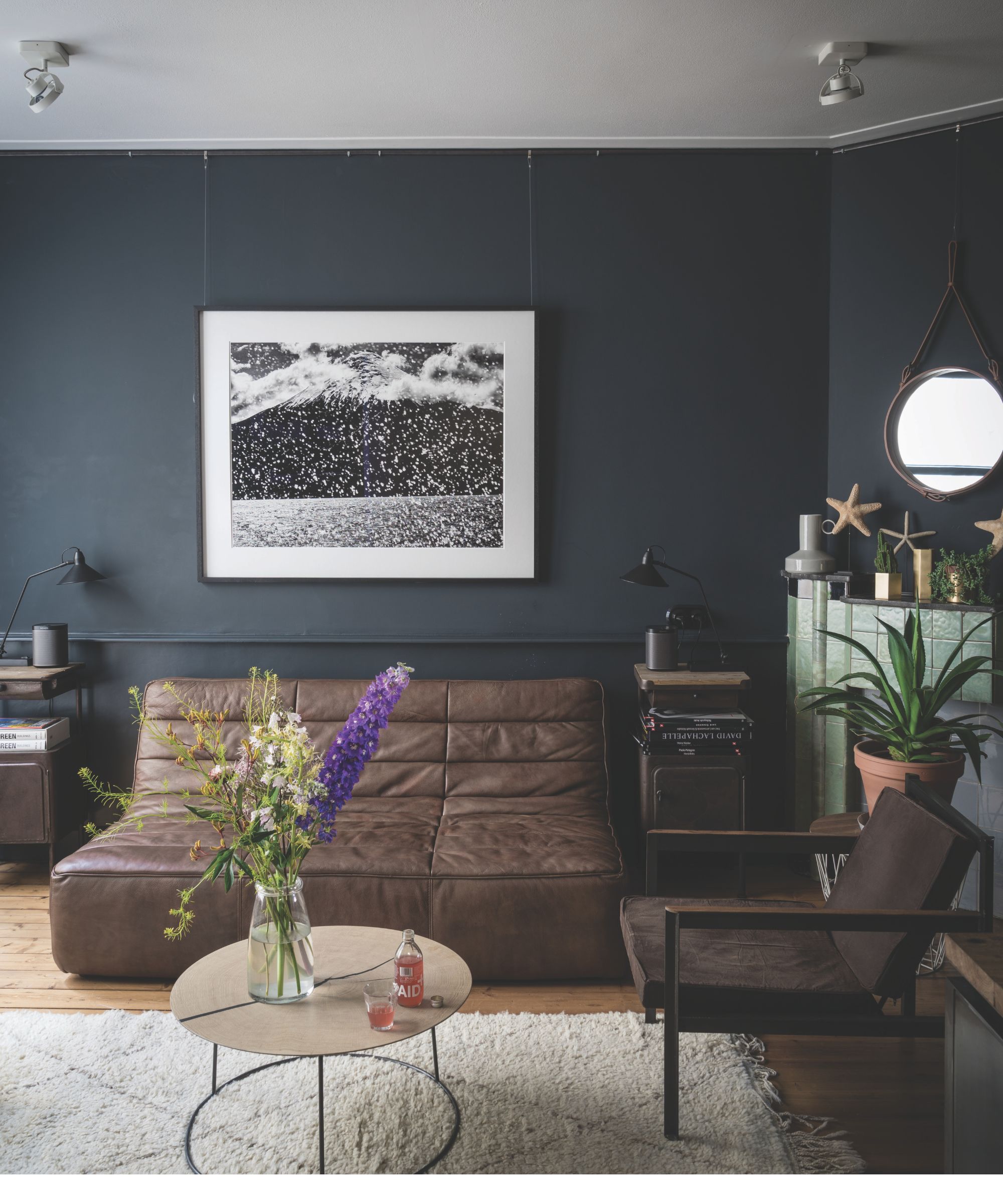
When we think of a wardrobe staple, the little black dress comes to mind. It goes with everything, it’s undeniably elegant and it stands the test of time.
The same can be said for decorating with black. As interior designer Laetitia Laurent , founder of Laure Nell Interiors puts it, 'Black is elegant and grounding. It can be dramatic but also adds a sense of restraint and sophistication. Used strategically, it provides contrast and brings clarity to a room’s composition, making other elements feel more intentional and defined.'
Much like its opposite, white, black serves as the ultimate backdrop for showcasing other colors, materials, and textures in a room. Against black walls, metallic finishes, natural wood, and even vibrant artwork stand out beautifully without competing for attention or needing to choose something that ‘goes’ with the color. This versatility makes black a favorite in interior design.
Black also has deep roots in traditional interiors. Think black-painted doors, wrought-iron fixtures, and classic wood paneling. While white brightens and opens up spaces, black has a unique ability to absorb ambient light, black does the opposite, creating a warm, cozy atmosphere. It’s the ideal understated neutral for rooms where you want a sense of intimacy.
5. Taupe
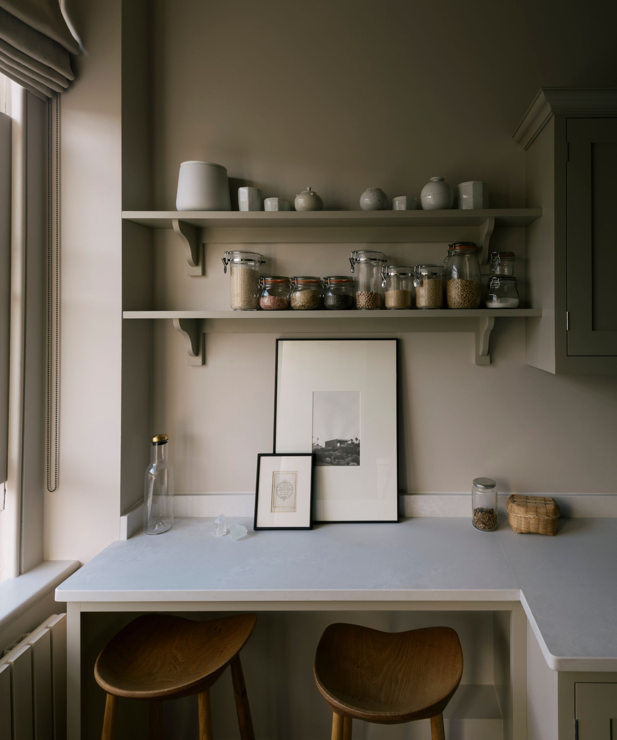
If you’re after a soft, sophisticated neutral, taupe might just be your match. Positioned between white, gray, and brown, taupe offers a cooler, understated vibe compared to cream’s warm yellow undertones.
In the age of 'quiet luxury', taupe doesn’t demand attention and for interior designer Laetitia Laurent, this shade is an obvious choice ‘Taupe is a refined, earth-toned neutral that doesn’t scream for attention but adds a layer of depth to any space. Its slightly warm, grayish-brown hue feels rich and works beautifully in spaces that lean toward a natural, understated elegance.’
With undertones ranging from warm, dusty pink to cool stone gray, I have seen some paint brands offer over twenty shades of taupe, which shows you just how many options there are when decorating with this color.
South and west-facing rooms, with their warm, golden light, work beautifully with deeper taupe shades. In contrast, cooler rooms, like north-facing ones, may benefit from lighter taupes to avoid a shadowy gray cast.
6. Navy
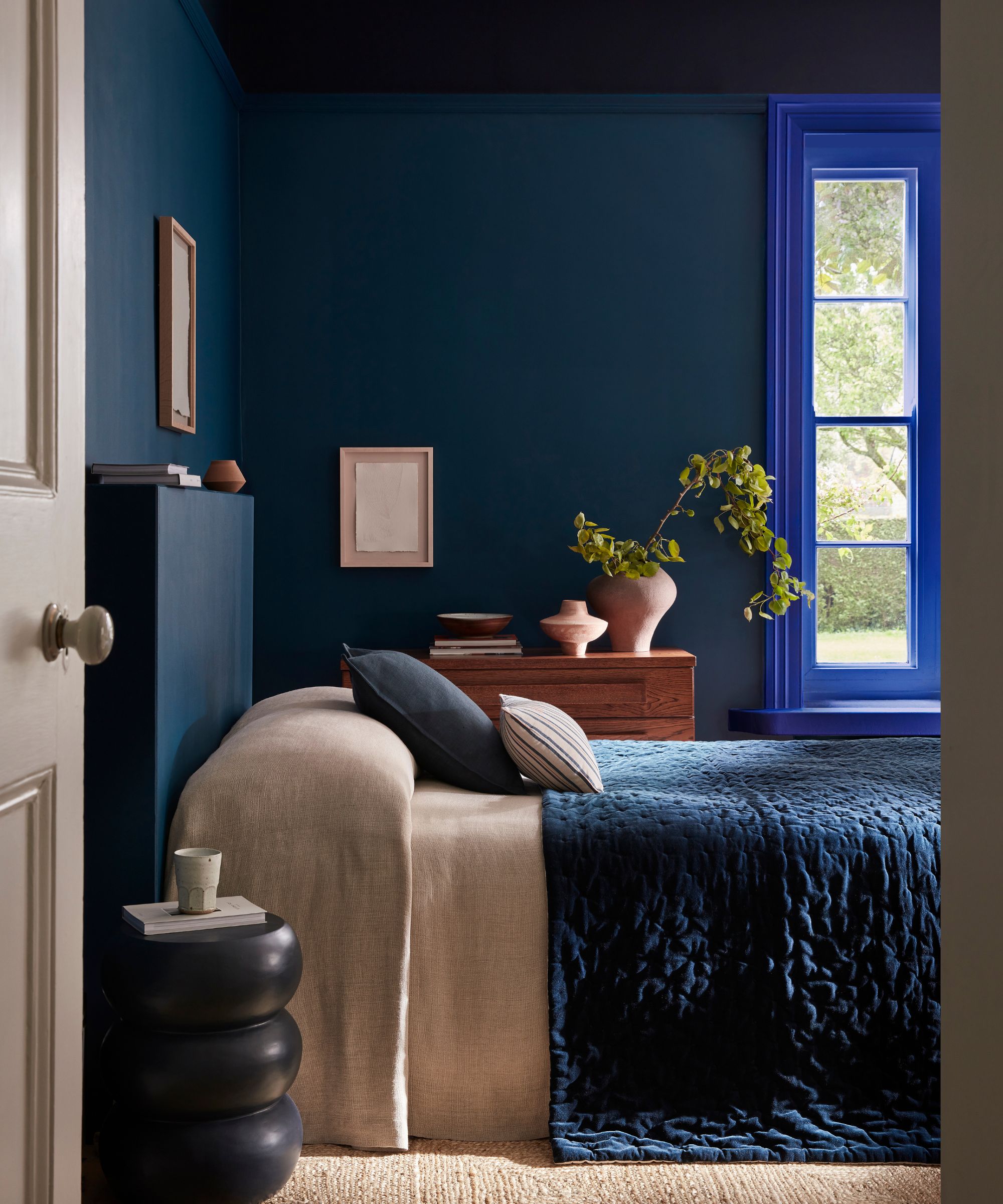
When we think of classic, timeless shades, our minds often gravitate toward lighter colors. However, some spaces call for deeper, more dramatic tones, and a few select colors have become mainstays in interior design.
Navy, for instance, has a distinguished history, appearing in uniforms, royal settings, and stately homes, which gives it an undeniable sense of dignity and timeless appeal. It’s a subtle enough color to act as a versatile alternative neutral to the more common choices of grays and blacks.
For a touch of regal luxury, a navy room works brilliantly accessorized with gold or brass accents or for a modern Scandinavian feel, this versatile shade works just as as well paired against light woods and pale pinks.
Despite its moody allure, navy truly shines when used in color drenching. And if full color drenching feels too intense, try highlighting architectural details by contrasting navy walls with crisp white trim.
As Ruth Mottershead, Creative Director at Little Greene, points out, 'Using different blue hues on various elements with a ‘Double Drenching’ approach brings design interest, drawing the eye to architectural details whilst remaining calming and harmonious. Pair the rich ‘Royal Navy’ on walls with a related blue such as deep indigo ‘Dock Blue’ on the ceiling.'
7. White
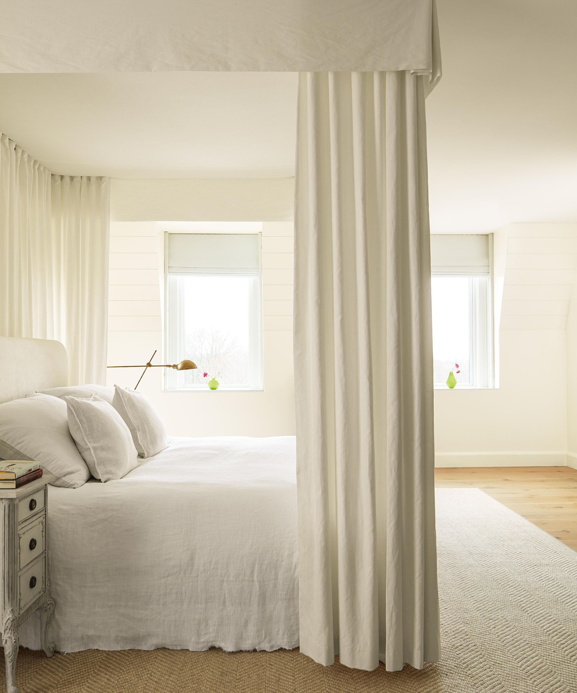
Pure, simple, and undeniably timeless, white is the classic that never fades from fashion. It’s the ultimate blank canvas, offering endless versatility in any room.
Whether you go for a cool, bright white or a warmer, softer shade, white remains the ideal backdrop to showcase your style, accommodating any color, furniture, or decor you throw at it.
Or, if minimalism is your style, white is the obvious choice, being clean, calm and simple, it’s the least challenging color to work with. And nothing says minimalism quite like white does.
Patrick O'Donnell says ‘The color (or non-color) white offers us peace and calm in a room. The color of purity, it is the very essence of projecting a clean and ordered environment and easy to layer many other elements in a space such as artwork and well curated pieces of furniture’.
But decorating with white isn’t as straightforward as it seems. Far from being plain, this firm favorite comes in a whole spectrum of shades from warm creams to cool whites. The hundreds of shades available mean you’ll be spoiled for choice when choosing the perfect shade.


