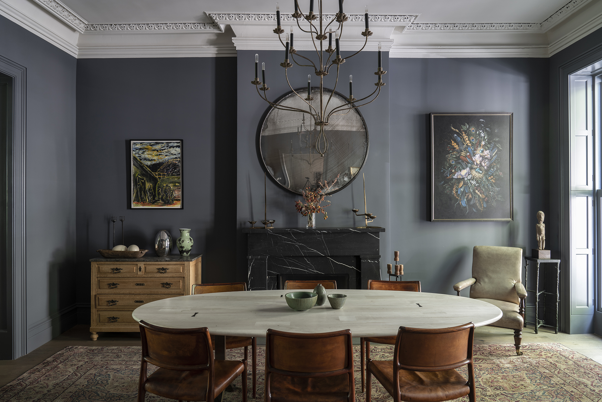
Farrow & Ball's Down Pipe might be dramatic, but it's becoming a classic paint and is one of the brand's best sellers. Described as a 'dark lead grey' it has blue undertones which makes it such a special color to use. As a result, this means it looks fabulous with most colors. Patrick O'Donnell, brand ambassador at Farrow & Ball explains:
'Downpipe is a versatile grey and pairs with many colors from soft muted pinks such as Setting Plaster and ochre yellows like India Yellow but sits perfectly with muted neutrals that have underlying green notes.' It leans into a lot of color trends for 2024 too as we move away from light neutrals, towards bolder, moodier shades.
But how can you bring this bold black paint into your home in a way that feels liveable? We asked interior designers who have experience with the shade for their top tips on decorating with Down Pipe.
What color is Down Pipe?
Down Pipe is described by Farrow & Ball as 'a dark lead grey, that has definite blue undertones to it which deepen the complexity of the finish. Originally inspired by the color used to paint downpipes and guttering, it has been embraced for use inside the home with fanatical zeal! This daringly dark hue is fabulous as a background to art, and extremely effective for use in halls to create a deeply dramatic entrance to the home.'
How to decorate with Farrow & Ball's Down Pipe
If you are looking for one of the best dark paints Down Pipe is up there. It's dark yes, but it's also soft and being a super dark gray rather than a true black it has plenty of depth to it too, making it a surprisingly usable paint.
However, like any bold paint, there are ways it works best and these tips from the experts will help you decide how to bring this shade into your home.
1. Create a moody entryway with Down Pipe

Due to the nature of its undertones, Down Pipe offers a striking background to art and is ideal for creating a daringly dramatic entryway. 'The most perfect, timeless scheme would be Down Pipe on walls, Bone on your woodwork and Slipper Satin on the ceiling – modern yet elegant and restrained. Bring in warm elements such as shades of tobacco & caramel and wall sconces in burnished brass,' says Patrick.
We love the hint of pink that your eye flows to at the end of this entryway – another color that works really well with Down Pipe.
2. Use it to highlight a statement window
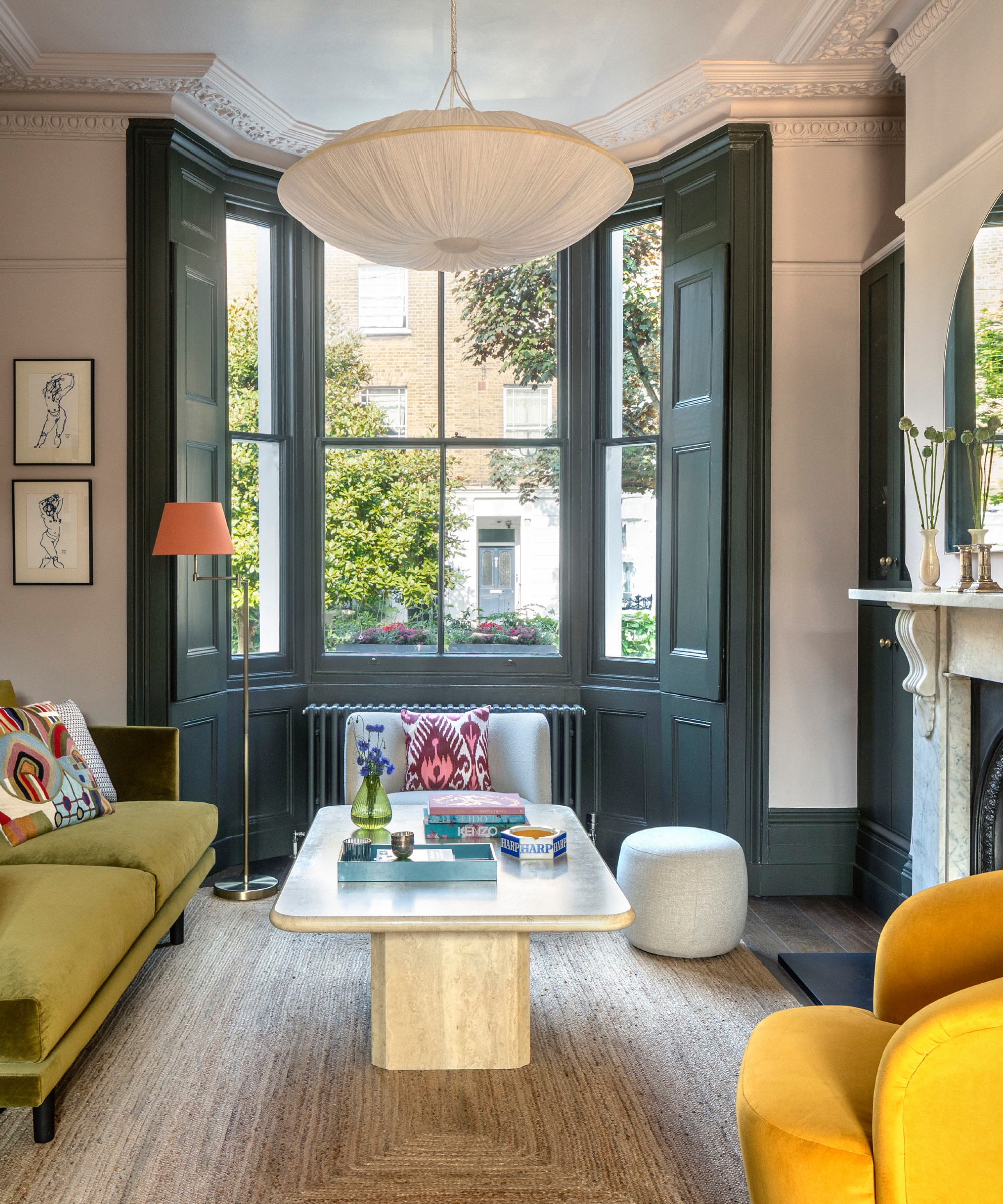
Down Pipe can be used sparingly if you feel it would be too much on your walls. It is an intense shade after all. With the interior design trend of painting your woodwork on the rise, it's a good opportunity to try this stylish paint effect with a color like Down Pipe especially if you have a statement bay window that's the highlight of your room.
Team it with bold furniture to add an eclectic feel and one that grounds the rest of the scheme.
3. Team with tan dining chairs in a retro dining room
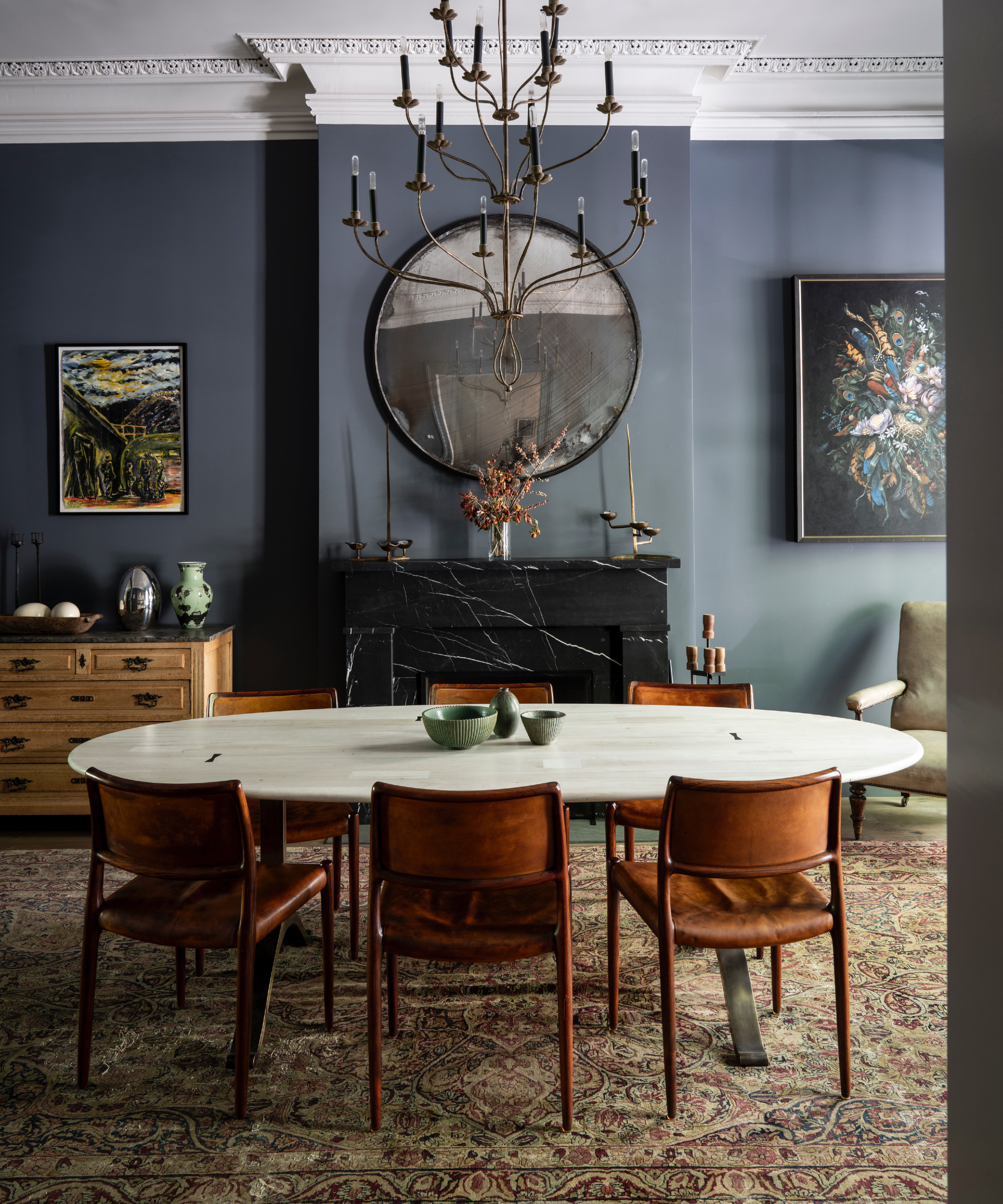
'As most gray shades are considered modern and clean, the richness of Down Pipe happily transitions between modern and traditional elements due to its saturation and subtle warmth coming through from an underlying green note,' says Patrick.
'It creates a cohesion in this dining room by allowing the architectural detail to juxtapose happily against the marble dining table and caramel leather mid-century chairs but also pulls on the discreet coloring of the Persian rug.'
This is a great example of how Down Pipe can work with homes from different eras. The crisp white ceiling and architectural detailing is highlighted and contrast beautifully against the depth of this iconic grey and the caramel chairs as Patrick mentions, add warmth.
4. Add depth to a white kitchen with Down Pipe

'Farrow & Ball's Downpipe is a rich dusky hue, perfect if you want to integrate color into your home without using anything too bright or bold. It works great as a color thread when used in a few different rooms to create visual synergy and flow throughout your home,' says international interior designer, Laura Hammett.
'I especially love it in a moody guest bathroom or powder room alongside darker natural stones or marbles to bring out the mood of the space, without it being too overpowering. It also works beautifully as a kitchen cabinet color for a strong, striking look.'
We love the look Laura's created using Down Pipe in this kitchen, the color grounds the cabinetry whilst the marble countertops and sink add contrast. Warmth is added with the brass faucet and handles.
5. Cocoon a home office by painting the ceiling too
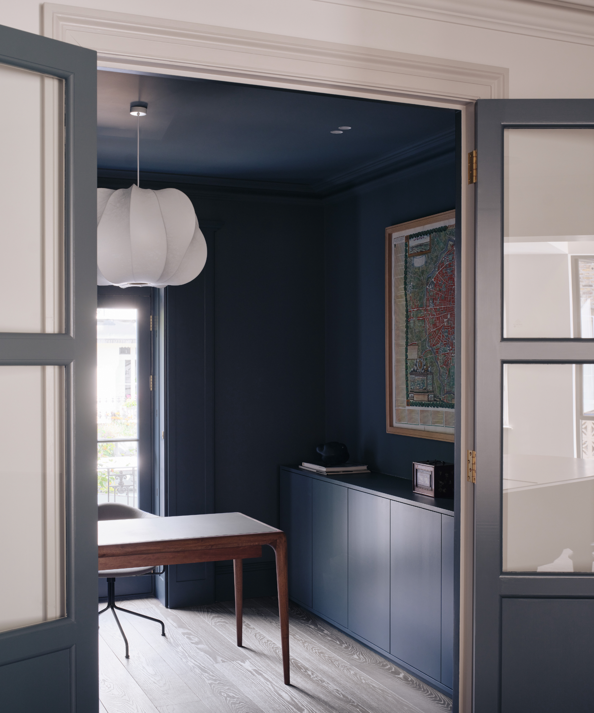
'I really love Down Pipe by Farrow & Ball,' enthuses Tom Rutt, founder and director, TR Studio.
'We used it in a recent project in a home office and it’s just a great, characterful shade full of impact. It was painted on the ceiling, walls and on woodwork to create a cocooning and creative space. A deep, dark shade like this can be intimidating but don’t be afraid to use it in this way. It’s an elegant and timeless color that works so well in traditional or contemporary spaces.'
As Tom mentions, the idea of using such a dark color in a smaller space can be concerning, but if you break it up with artwork, a pale wood floor and a large sculptural pendant light the result will be a stylish, balanced room.
6. Match it to a showcase wallpaper
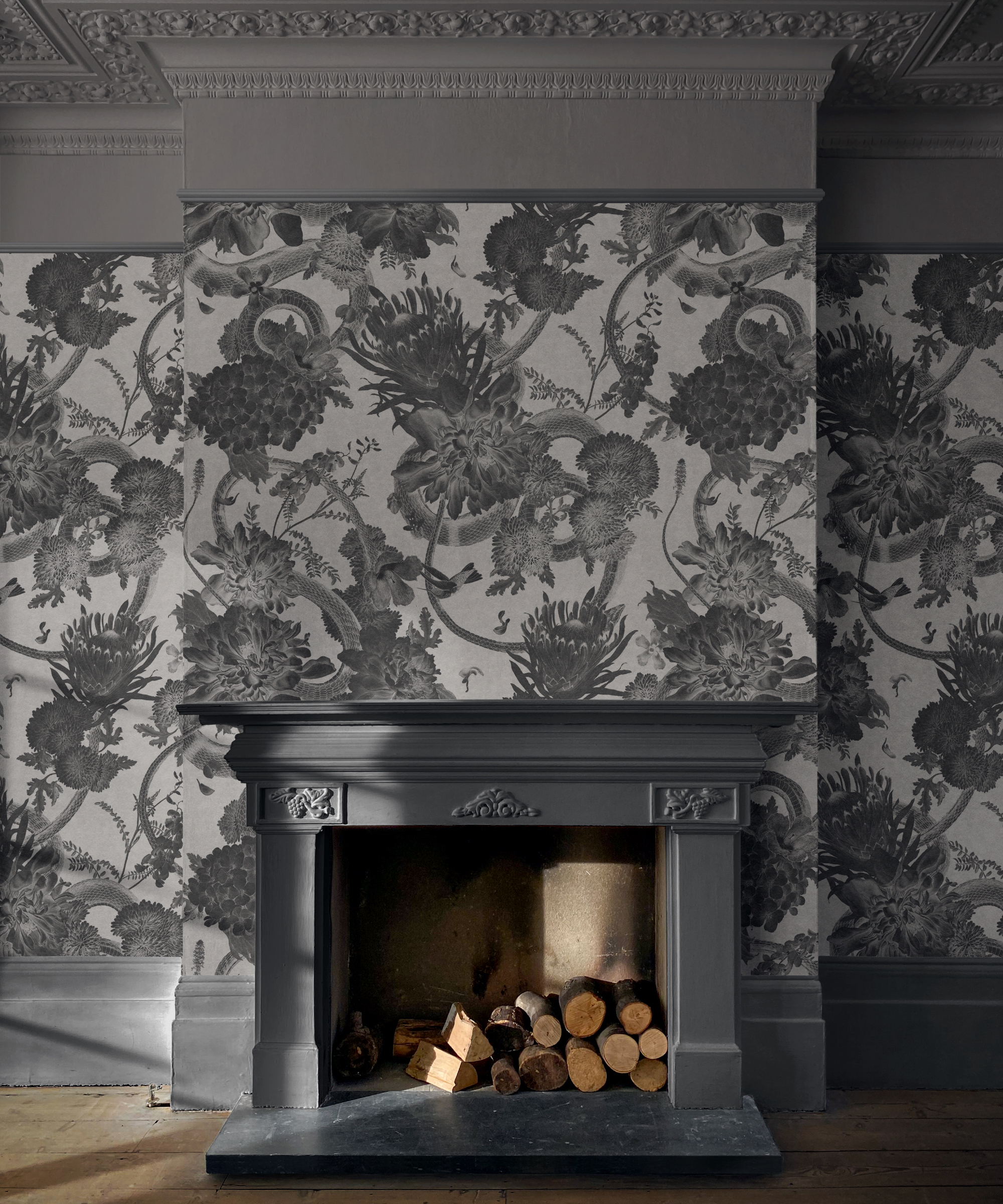
'Down Pipe is a wonderful ‘neutral’ to use on wood and metalwork when set against a striking pattern of a similar color. The closer the match to the wallpaper, the stronger the impact,' say Jamie Watkins and Tom Kennedy, founders of Divine Savages.
It's also worth considering what paint finishes to use when teaming a color like this with wallpaper. Jamie explains:
'It’s actually a very tactile faux suede and it’s this element of texture next to the flat paint that brings depth and interest to the room with subtle differences that change depending on the lighting throughout the day. The walls and the paint across the fireplace, skirting and cornicing work together to really bring the pattern alive in this bold living room which shows that grey can be anything but dull!'
Down Pipe is a Farrow & Ball classic. If you feel a little nervous about using such a dark shade, don't be. Start incrementally with woodwork for example, or a fire surround. The beauty of it is that it looks wonderful in both contemporary and traditional settings and can be used sparingly, or all-encompassing to great effect.

