Apple is known for its sleek hardware design (see our piece on how Apple changed design), but its UI design is no less sharp. Part of the strength of the Apple brand is how its software often reflects the same traits as its physical products: fun but sleek, sophisticated and beautifully executed.
Social media is full of posts from users, including UI designers, admiring Apple UI, from satisfying animations that confirm actions to small but useful design details that make the user experience smoother. Here's our pick of six times when Apple got UI right (we'll forget about those AI news alerts for now).
01. Distraction control in Safari
RIP Ad Blockers! 😳Apple’s new “Distraction Control” feature in iOS 18 is amazing! It allows you to block elements you don’t want to see in Safari & even adds a slick animation. pic.twitter.com/Er0hH0uIyxAugust 5, 2024
Apple’s Distraction Control feature in Safari not only allows users to remove clutter like ads from websites; it even has a fun disintegration animation that recalls Thanos's finger snap in the Avengers. Available on Mac, iPhone and iPad, it makes busting annoying adverts that bit more satisfying. Just go to the Smart Search field in Safari, tap the Page Menu button, then tap Hide Distracting Items.
02. Tap to Cash Apple Pay Animation
The new Tap to Cash Apple Pay animation in iOS 18 😍 pic.twitter.com/j09UhelMjjJune 11, 2024
Apple Cash (US only) boasts a bunch of nice visual design touches, including a neat card parallax animation, emulating the shininess of a real card. And when users send or receive money via Tap to Cash by holding two iPhone or Apple Watches together, the confirmation animation as delightful as the one for sharing contacts.
Animations like this might seem unnecessary, but they help confirm to the user that the action has worked and reinforce branding in the process. Although seeing our cash disintegrate can be a bit disheartening.
03. Priority notifications bounce
3) ShimmerWhen you trigger apple intelligence, the full screen bounces.Feels soooo smooth. pic.twitter.com/wNS2fwCPZhMarch 13, 2025
The liquid bounce effect when a priority notification arrives on iOS is another touch that seems purely superficial but adds to the general smoothness and sleekness of the user experience, showing that software design is as important as hardware design for smartphones.
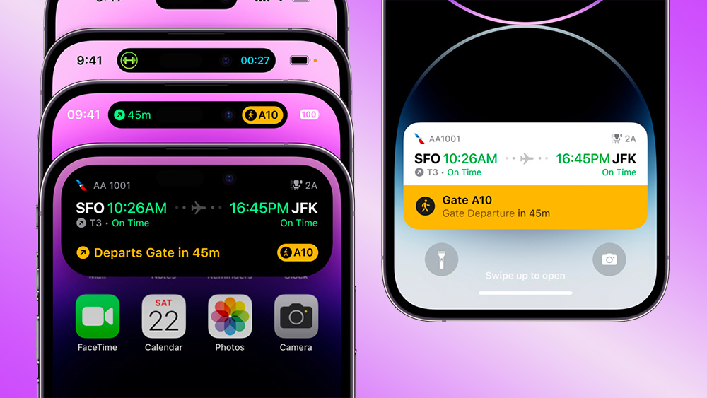
04. Dynamic Island
Do you often INTERACT with the dynamic island on your iPhone ? 📲I think it's the most innovative Apple UI in years 😍 ! pic.twitter.com/yl4THbs1jOMarch 13, 2025
The amusingly named Dynamic Island made its debut with iPhone 14 Pro and has since expanded to all new iPhone models. It might have seemed like a gimmick at first, but it's proved to be genuinely useful for multi tasking, providing quick access to information and controls and allowing us to see things like timers, music and estimated delivery times while doing other things. Again, there are plenty of subtle details like animated buttons.
05. Text animations
Text animations in iMessage 📱https://t.co/hTvlOAAbUU pic.twitter.com/7IhkzemLDcDecember 5, 2024
Apple's text animations in iMessage add a new way to express emotion in messaging without having to search for and interpret the appropriate emoji. You tap the "i" button above the keyboard, and choose from styles including shake, nod, explode, ripple and jitter. Sure, the infantilisation is all a bit Lumon Industries (see our piece on Severance prop design), but we love it anyway.
06. Apple Fitness UIs
11) TranslationsThe bounce & shimmer is subtle but also soo gratifying. pic.twitter.com/TtHZ34rHWZMarch 13, 2025
Maybe it's not so good from a product design standpoint that some people feel they need to wear their Apple Watch on their ankle to get reliable health stats, but we have to admit that the UI design of Apple's fitness widgets is gorgeous.
Apple UI design continues to evolve, and rumours suggest that the iPhone homescreen could get a big revamp in iOS 19.