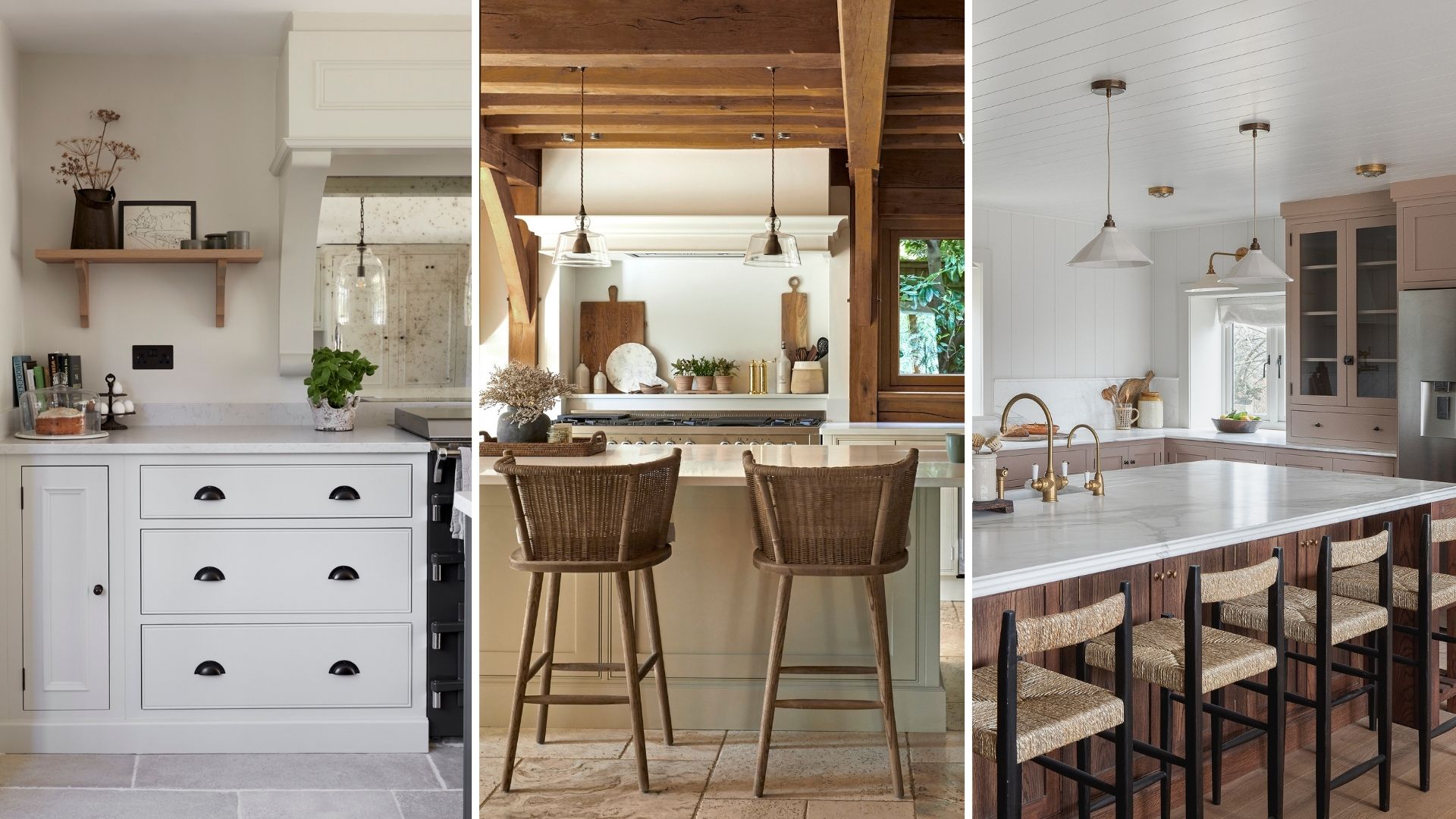
We all want a kitchen that's both practical and sociable, whilst still reflecting our style and tastes. But when making big renovation decisions, such as which cabinet colour, layout and hardware to choose, we tend to play it safe.
Kitchen trends are great for getting inspiration, but it's also important to think about who is using the space, and what they're doing in it (forgetting what might work for your neighbour or friend).
To give you the confidence to create a kitchen that truly suits your personal style and daily routines, we have asked the experts for the design rules worth breaking. By breaking the rules or trying something different, you'll create a more characterful space.
Here's how to throw out the rule book, ignore typical 'kitchen design mistakes' and go with your heart rather than your head.
Kitchen design rules worth breaking, according to experts
Here is what the experts suggest for a homely kitchen full of character. "Think of a kitchen as a theatre stage," begins Ady Heaton, head of design at Howdens.
"When you use it with others, you put on a performance and therefore you don’t want your back to people. A good example is having your cooking space on an island to make your cooking experience more inclusive."
1. Stick to one style
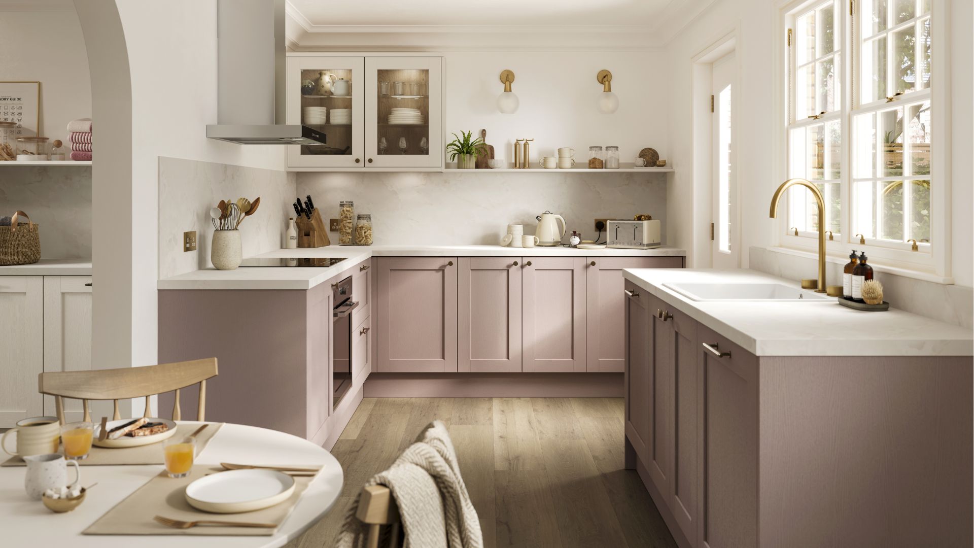
Ady Heaton from Howdens tells us that a characterful kitchen is one that has your personality on show – and this in turn allows for a few kitchen rules to be bent and, in some cases, broken.
"One thing to consider when designing a characterful kitchen is not being fixed on a particular style. For example, you can try being more eclectic and mixing cabinet styles. For example, shakers can be mixed with a modern slab or handless doors," Ady says. "Mixing and matching materials and playing with your design should still be done in a meaningful way to not make your kitchen appear disorganised or chaotic."
You could use subtly different cabinets to mark out different zones, with more modern cabinetry around your pantry, utility area, or kitchen island to contrast with more traditional cabinets around the rest of the kitchen space.
Alternatively, you can mix handle styles or combine a rustic timber breakfast bar with clean and light quartz on the rest of the worktops.
2. Don't mix metals
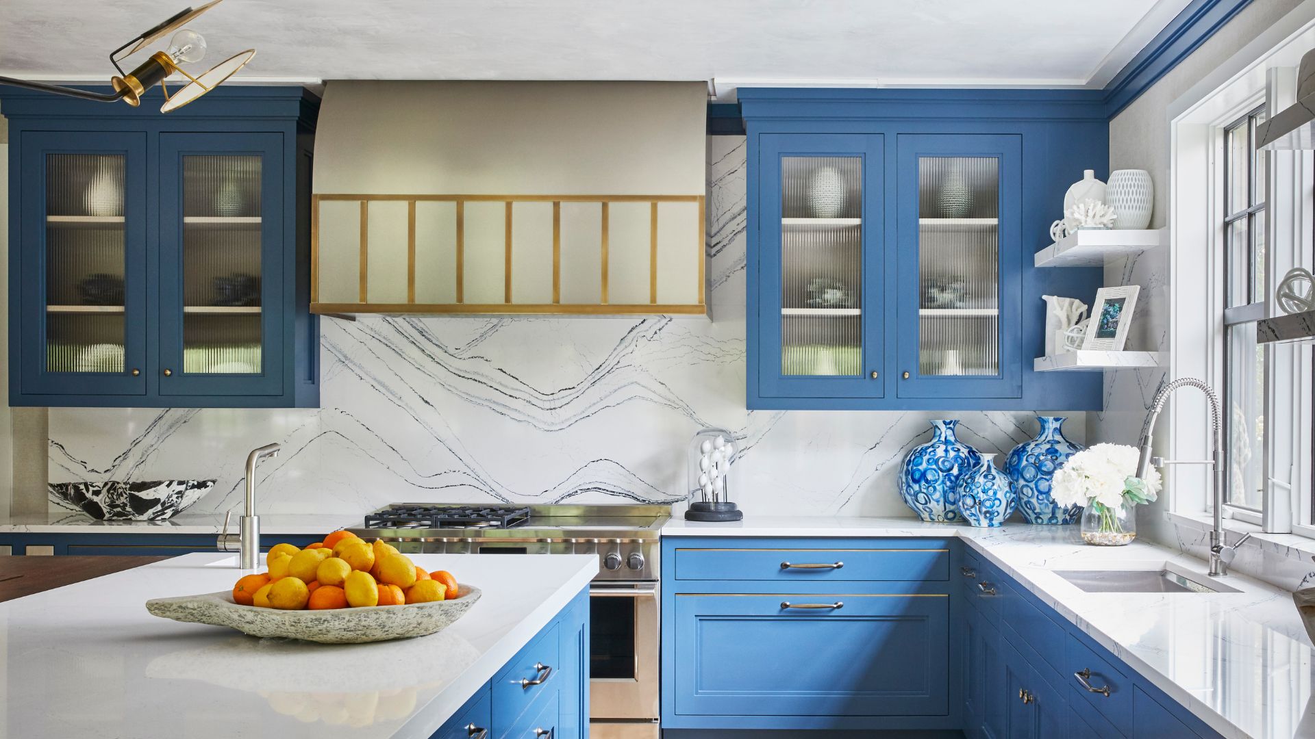
We're often cautious about mixing metals, whether it be in the kitchen or the bathroom. But by being confident enough to blend some brass with polished nickel or black with silver, you can unlock a more visually interesting space with lots of layers and texture. Just make sure you have one dominant metal and one accent metal.
These brass, hexagonal handles, at Amazon, would work nicely as an accent, acting as an easy way to make a kitchen look more expensive.
Bob Bakes, head of design at Bakes & Kropp, says that it is no longer considered the standard to have matching metals.
"A clever and thoughtful balance of some different looks can pull a space together – we have incorporated mixed metals into many of our projects over the past few years and the effect is fantastic.”
We're big fans of the stainless steel kitchen trend thanks to steel's durability and industrial edge. Blend a stainless steel worktop with natural wooden open shelving, green subway tiles and perhaps a wicker or rattan lampshade to infuse your kitchen with personality.
3. Built-in is best
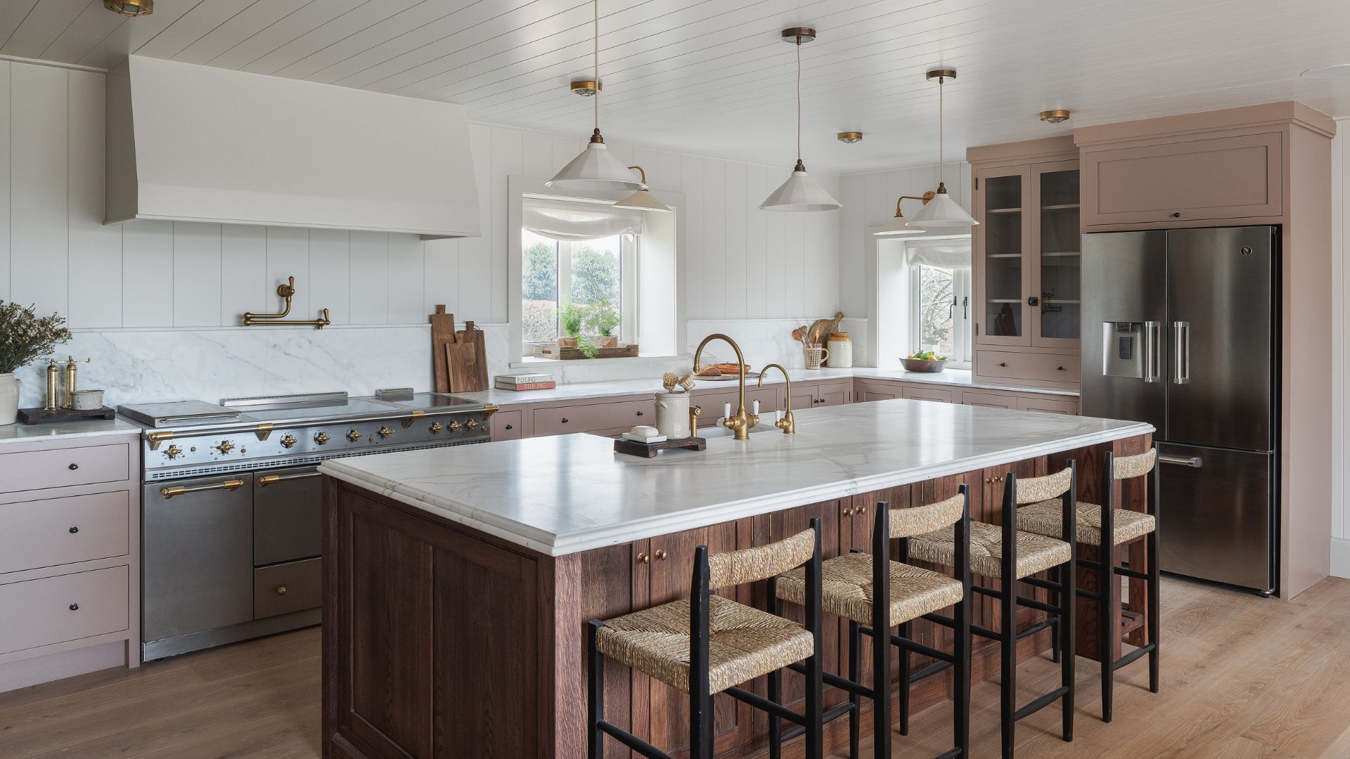
Built-in fridges, appliance garages and concealed washing machines have been among the many popular kitchen appliance trends in recent years. And while it can help to create cohesion, it's not the only way to go.
Paul Dore, managing director at County Stone Ltd, says, "Freestanding appliances, such as fridge freezers, don’t have to be boring and white; they now come in a range of colours and styles that can add a touch of character and flexibility to your design and become a real focal point."
"What’s more, freestanding appliances also give you more scope to alter your design, if needed, in the future. Breaking free from design myths allows homeowners to create spaces that truly reflect their personal style and functionality needs."
Follow our tips on organising a fridge so it looks just as good on the inside as it does on the outside.
4. Go big with the kitchen island
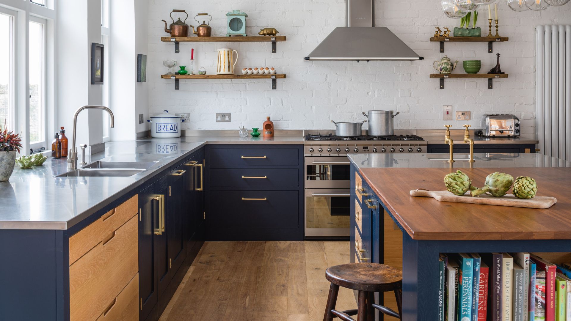
Kitchen islands are renowned for being a popular interior design feature that adds value to a home. And if you're going for a kitchen island, you want it to be as big as possible, right? Wrong.
"A kitchen island can be beautiful and works great in an open plan room, but you need to be careful with the size of the island you choose," comments Sophie Clemson, interior designer at The Living House. "You don’t want to go too large with your kitchen island, as it will create a barrier in the room.
"If you opt for an island, you could use this as a seating area, or the hob or sink could be on the island." Think about flow and movement, and other ways to make a home look expensive that don't include a huge island.
5. Avoid open shelves
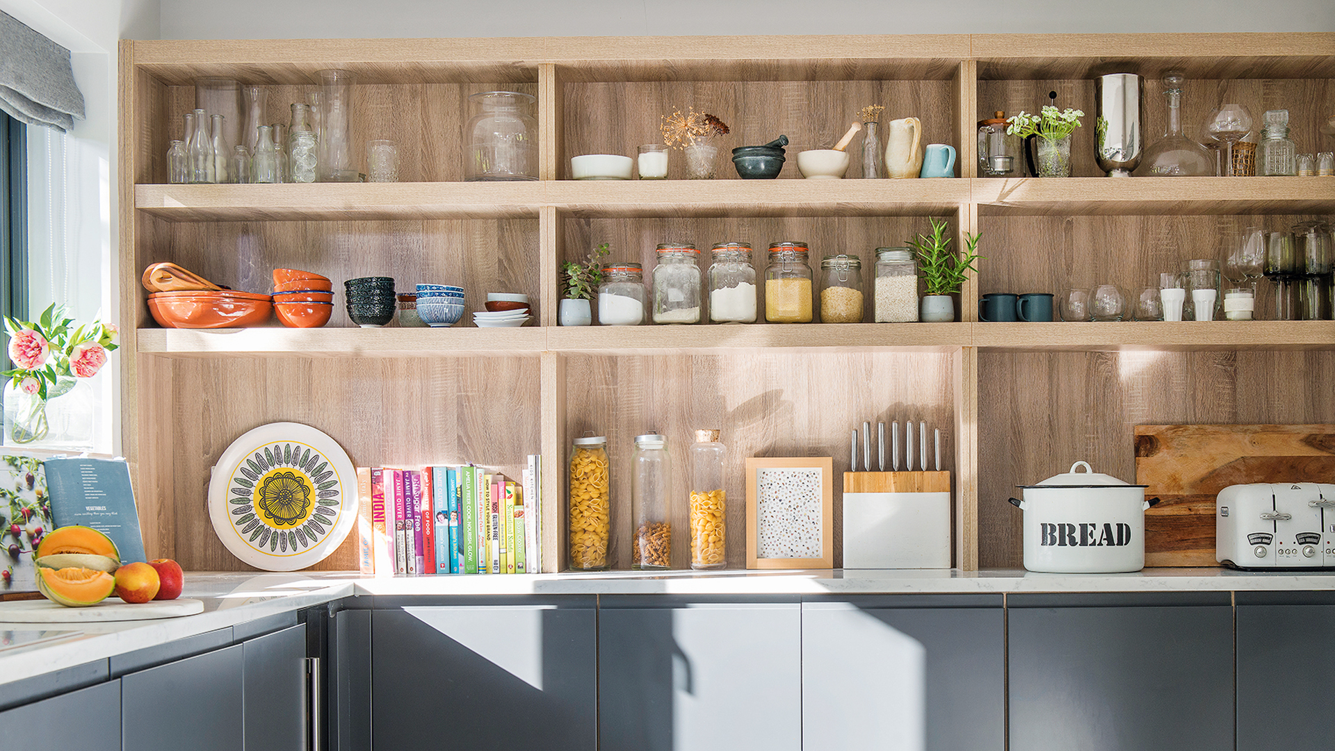
Open shelves are often considered one of the kitchen trends to avoid, and while it's a personal choice, they shouldn't be ruled out. Shelving can be a great way to display useful, well-loved kitchenware and make the space feel more homely.
"Open shelves are often dismissed as impractical and high-maintenance. However, when executed thoughtfully, they can offer both style and functionality," argues Paul Dore from County Stone Ltd.
"They provide easy access to everyday items and allow you to showcase your favourite kitchenware. The key is to keep them organised, avoid clutter, and place frequently used items on them to avoid dust and dirt building up." For kitchen organising tips, you can head to our guide. Note the kitchen organisation mistakes to avoid, too.
RRP: £25.99 | These shelf organisers are a great way to make the most of vertical space, and they help to keep various jars and tins visible. They are stackable and have a modern design that will go with your kitchen, whatever your home's aesthetic.
RRP: £14.94 | Glass Kilner jars like these square 2L jars are durable and practical, and they look great. With an airtight clip top, the jars are suitable for preserving jams, chutneys and storing dry foodstuff.
RRP: £65 | Add some fiery colour to your kitchen sleves and joy to morning coffee preparation with a 1L cafetière in Le Creuset's volcanic colourway.
6. Symmetry is key
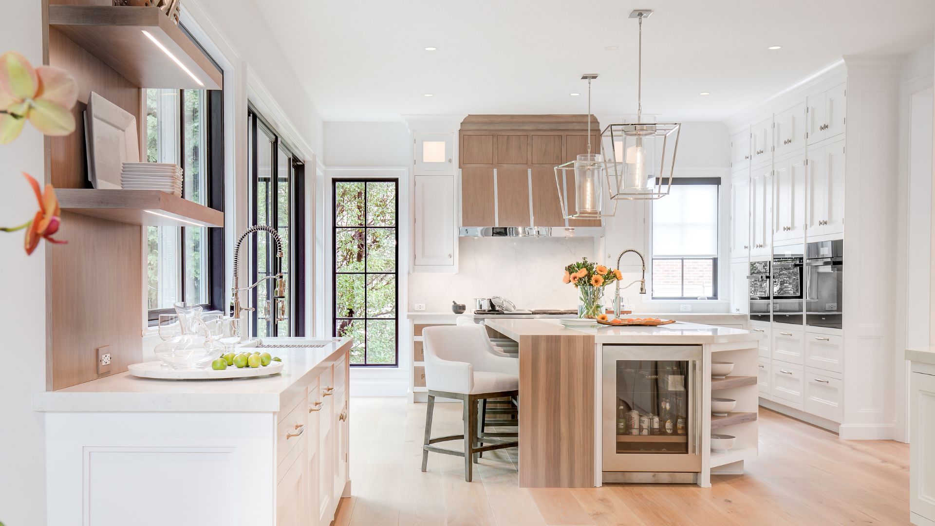
Symmetry may be a key bedroom layout rule designers always follow but in a kitchen, the design rule is made to be broken. “Balance is one thing, but symmetry down the middle of your kitchen can feel a bit contrived," says kitchen expert Bob Bakes.
"We’re seeing more homeowners leaning toward asymmetry for a bit more visual interest. Aspects of implied symmetry are also a nice touch that feels a bit more natural. Pair elements that speak but not necessarily mirror one another to strike the right balance.”
"I often break the rule of strict symmetry," agrees Interior designer Carolyn Cerminara. "Adding some asymmetry, like open shelving on one side of a range hood and closed cabinets on the other, can give a kitchen more character and personalized storage solutions."
RRP: £22.09 | “You spend a lot of time in this room. Shouldn’t it feel more like you?” Now it can. In Uncommon Kitchens, Sophie Donelson revolutionises traditional kitchen design with inventive ideas for makeovers both large and small.
FAQs
Should I stick to the kitchen work triangle?
"Not always, I would always advise people to think about how they use their kitchen, what do they do in it and need from it," says Ady. "When laying out a space consider other key areas, one of the most important for me is the bin, every kitchen needs one and all too often it's an afterthought.
"Other areas to consider are space for dining or entertaining. A kitchen is the most functionally intense space in most homes and often the heart of the home. With more open plan kitchens venturing into the living space, the basic working triangle is becoming less relevant."
What are some rules of thumb for kitchen layouts?
The layout depends on the shape of your kitchen, much like bathroom layout rules. In a U-shaped kitchen, Carolyn Cerminara places the sink in the centre for an efficient workflow between the fridge and stove. This layout keeps everything within easy reach and provides ample counter space.
For a galley kitchen, she puts the sink and stove on one side and the fridge on the other to streamline the workflow. In corner kitchens, she uses corner spaces by placing the sink there, with the stove and fridge on adjacent walls.
For corner kitchens with an island, Carolyn recommends placing the sink on the island, creating a central workspace that allows easy interaction with guests while keeping the main area clear.


