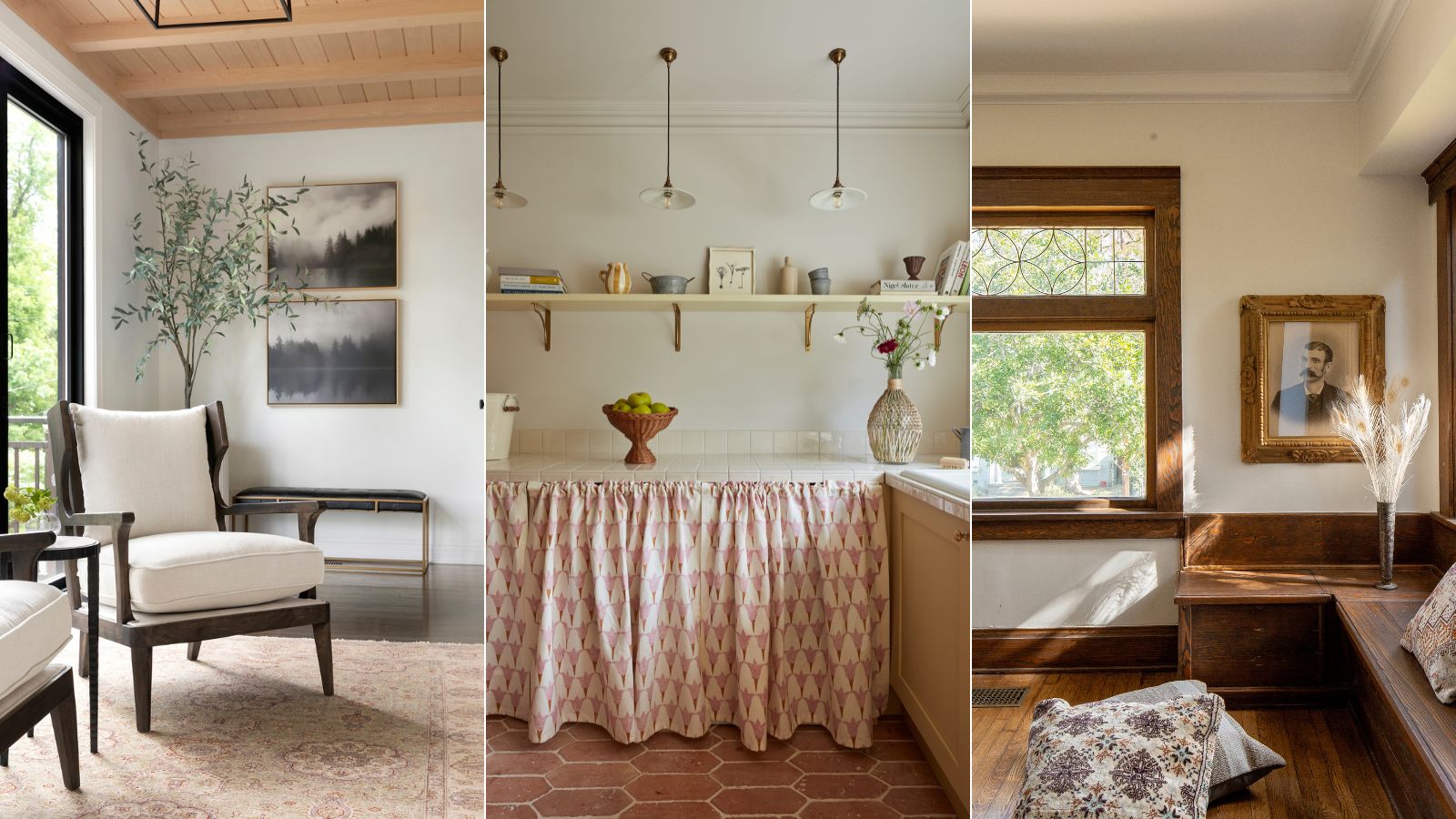
While decorating with neutrals might not sound groundbreaking, its timeless appeal cannot be overlooked as a design classic. Having captured the hearts of interiors enthusiasts aplenty (it was named the brand’s Color of the Year back in 2016), Alabaster from Sherwin-Williams strikes the perfect balance of style and warmth.
Color trends come and go, but the one color that remains a stalwart for its timeless elegance and versatility in interior design is the perfect off-white. Something that leans away from the gray undertones of a bright white, and more towards the yellow-toned end of the scale (but decidedly not cream), Alabaster is a timeless, versatile shade.
Renowned for its soft warmth and ability to transform spaces, Alabaster has become a go-to choice for interior designers seeking to create a sophisticated and inviting home. So, how do we use it to its fullest potential? Let's find out.
What color is Alabaster by Sherwin-Williams?
'Alabaster SW 7008 is a shade that creates the perfect balance between the brightness of a white without sacrificing a warm and cozy feel,' says Sue Wadden, Director of Color Marketing at Sherwin-Williams. 'What I love about this hue is its versatility - whether your style leans modern, minimal, or a blend of both, Alabaster can be the backdrop for everything.'
Named after the milky-white stone of the same name, Alabaster is a delicate and soft shade that boasts the perfect amount of greige undertones. Neither too warm nor too cool, it provides a neutral backdrop to complement a plethora of design styles.
'One of the best ways to use this shade is on bedroom walls to create the most peaceful space,' adds Sue. 'You can also create an organic modern space in a communal room like a dining room painted in Alabaster by including pastel trims and modern fixtures'.
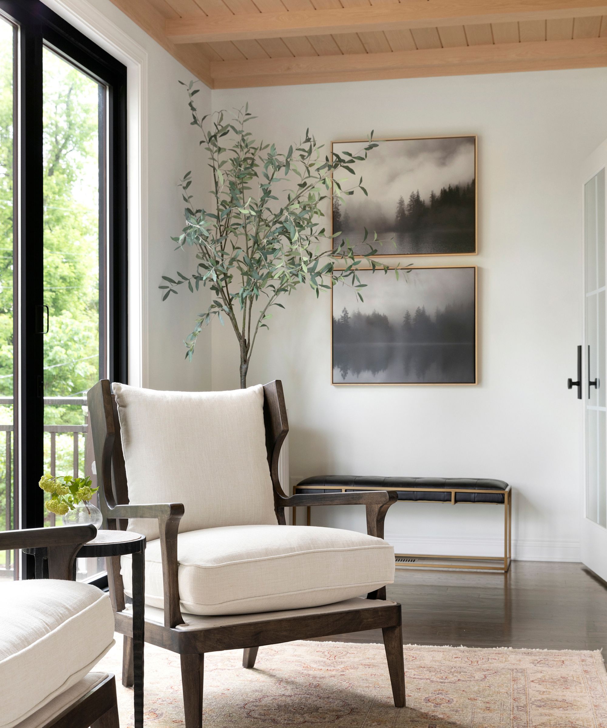
When you want the brightness of a white without sacrificing a warm coziness, try this soft, warm but balanced white by Sherwin-Williams.
How To Decorate With Alabaster By Sherwin-Williams
A popular choice for creating an inviting atmosphere, this warm white can transform any space - whether you’re redesigning your living room, entryway, or kitchen - into a sanctuary of serenity. So why is it an interior designer’s go-to shade of white? We’ve asked them.
'Alabaster paint, with its creamy and soft hue, offers a versatile and elegant touch to home decor, suitable for walls, millwork, and cabinets,' says Jennifer Davis of Davis Interiors. 'When applied to walls, alabaster's reflective properties create a warm ambiance, particularly when complemented by natural light sources.'
'Alabaster is our preferred white because it beautifully maintains a warm, clean tone without picking up undertones that might distort its intended color,' she adds.
Whether you're going for a minimalist look or a more eclectic vibe, Alabaster serves as the perfect foundation.
1. Pair with wood tones
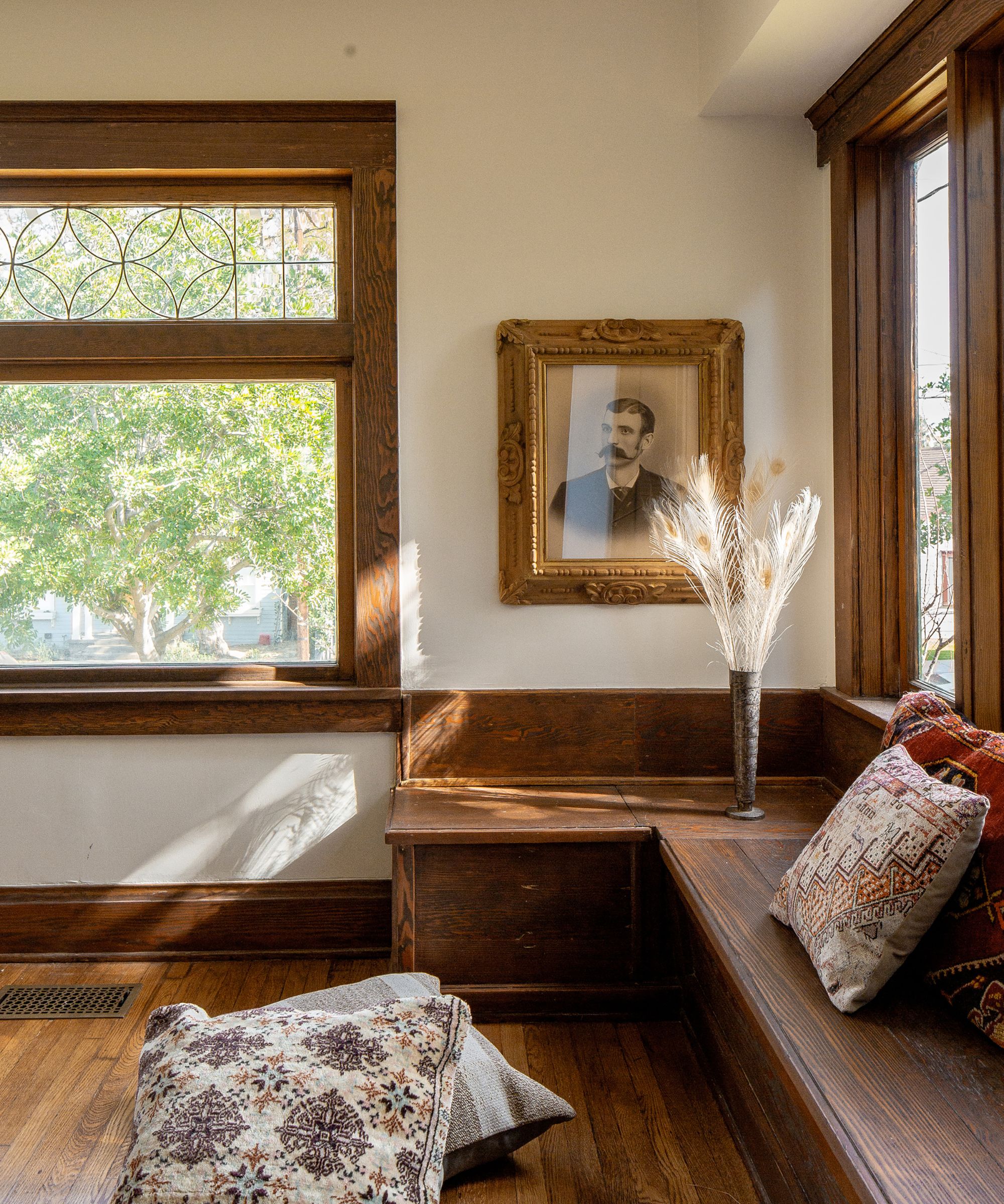
The beauty of Alabaster lies in its ability to play well with others - it's a canvas waiting to be personalized. Try layering it with bold accents and contrasting textures to create a dynamic and visually appealing space.
'Pair Alabaster with natural substances like wood, leather, or linen. These textures work with the smoothness of the paint and its warm temperature,' advises Artem Kropovinsky, founder of Arsight. 'Introduce diffused contracts through the use of darker or more vibrant colors in your accessories. Think throw polly, indoor plants, or richly colored artwork.'
Jennifer Davis, agrees. 'Pairing Alabaster on the walls with darker millwork creates a striking contrast, adding depth to the room,' she observes. This combination not only makes the space feel larger but also provides a neutral backdrop for seasonal decor changes.
'When taken down onto the millwork, alabaster emphasizes clean lines and details, enhancing the craftsmanship while providing a crisp, polished appearance. Consistency in the shade across different millwork elements gives a cohesive look,' Jennifer adds.
2. Brighten a small space
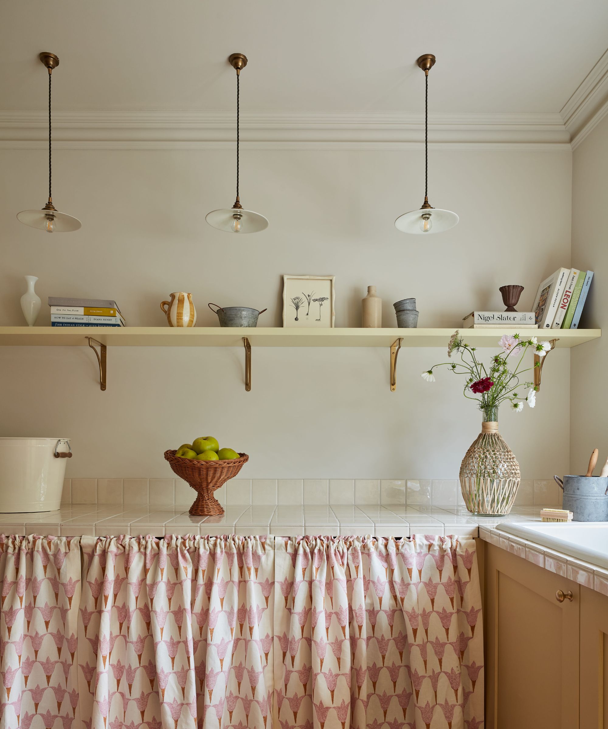
Alabaster has a unique ability to enhance natural light. Use it strategically in rooms lacking in ample sunlight, like a boot room, larder or small entryway to create a bright and uplifting atmosphere.
'Alabaster is a versatile warm white that makes for a lovely backdrop to any number of design styles, lending itself nicely to styles like coastal beach, French country, and modern farmhouse,' says renowned designer Kathy Kuo. 'It helps bring brightness into a room without feeling stark and is a great way to make a smaller space feel larger.'
The color truly comes alive when bathed in sunlight, so maximize this by placing mirrors in your space to bounce light around and amplify Alabaster's luminosity.
3. Paint built-ins and cabinetry
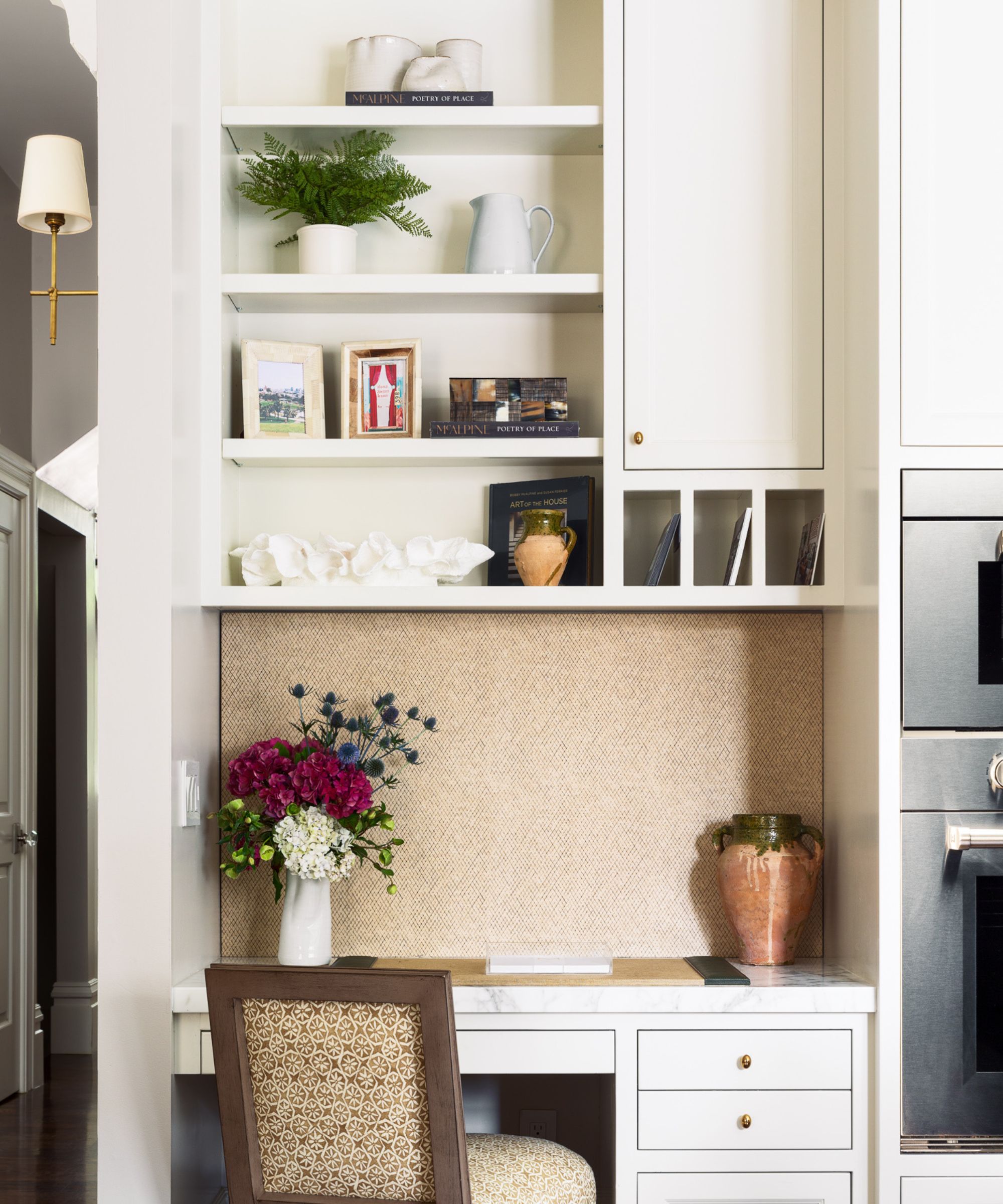
Alabaster is a great choice for built-in cabinetry like your kitchen cabinets, home office, and bookshelves for a fresh and bright look. Introduce warmth with wooden, marble or grainte accents for warmth and a touch of luxury.
'When decorating with this color keep three things in mind: layering, practicality, and climate,' says Carola Pimentel, founder of Assure Interiors. 'We like to layer texture and interest via tactile materials as part of a laidback and refined scheme suitable in functional spaces for large families.'
'Utilize Alabaster as a base color to create a serene and easy backdrop. This coloration works superbly to focus on architectural features or as a canvas for bolder accents,' adds Artem Kropovinsky.
4. Create a cozy bathroom retreat
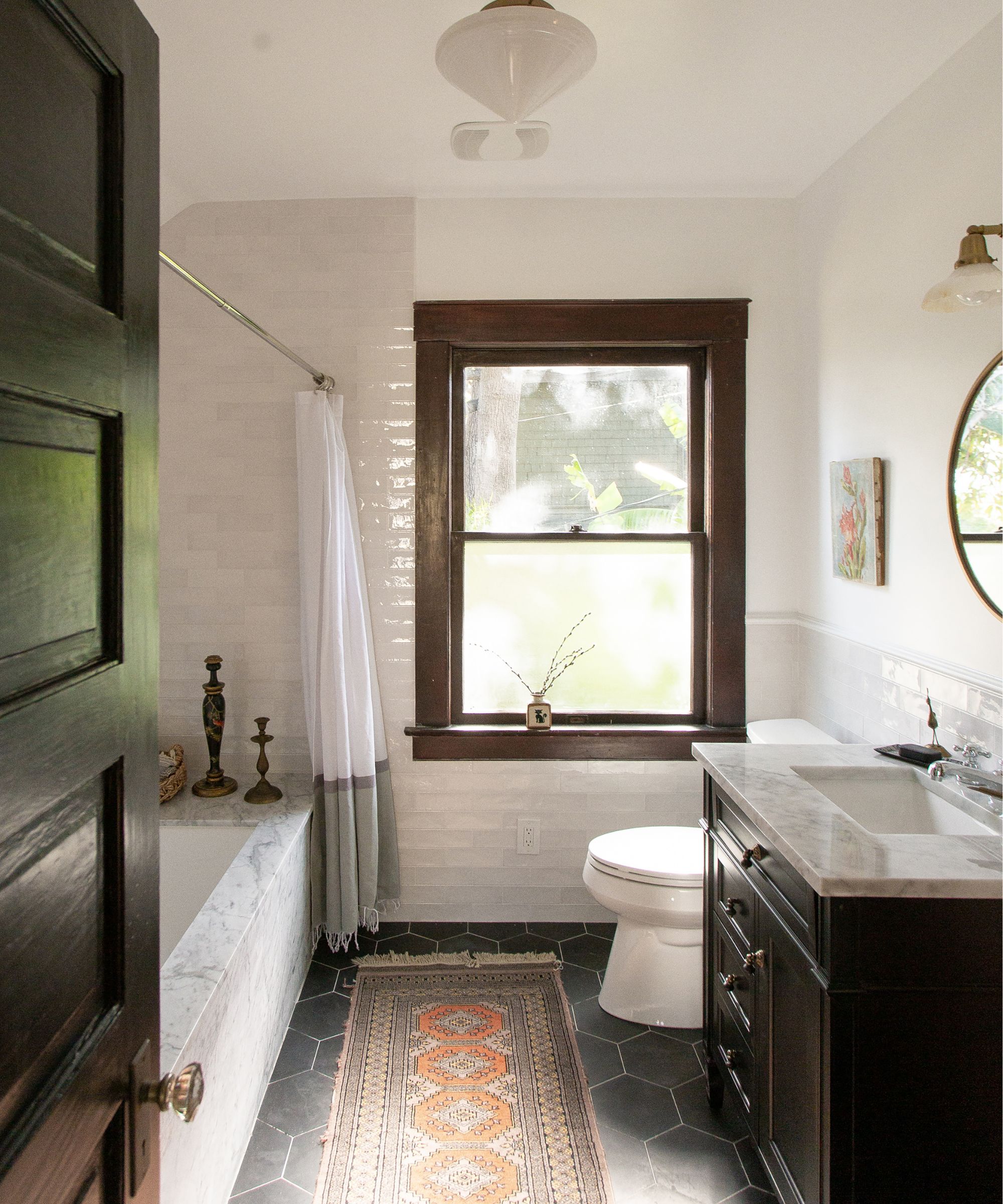
The subtle warmth in Alabaster adds a touch of coziness to any room, making it a versatile choice for those seeking a timeless and inviting ambiance in their bathroom - as a space you want to amp up the serenity.
Take the opportunity to enhance neutral walls by pairing with tiles, wall paneling or, as founder of Studio Itaca, Gianna Pagliarulo advises, a textured finish.
'You don’t want a neutral like alabaster to look flat and lifeless on your walls so I would consider adding texture,' she advises. 'A limewash or plaster finish in alabaster will create a very contemporary finish for walls in any room of your home.'
5. Color drench - including the ceiling
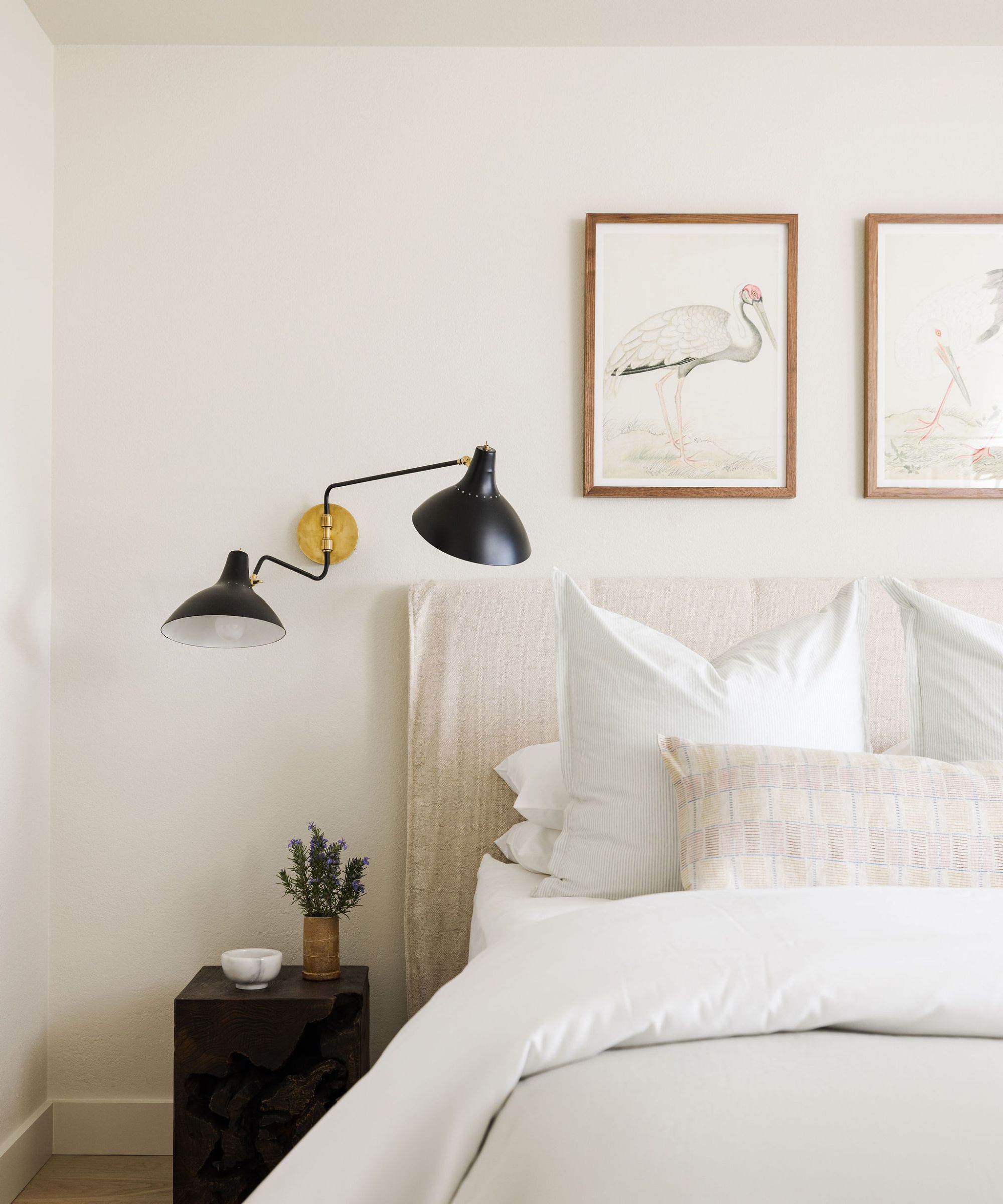
This gentle hue promotes relaxation and pairs beautifully with natural textures like soft linens. Add warmth with subtle brass and wood accents, creating a sophisticated and calming atmosphere for a restful night's sleep. In order to dial up the enveloping nature, try taking your color drenching your paint everywhere - from walls to woodwork and even the ceiling.
When searching for the perfect off-white for this coastal home, designer Tama Bell, founder of Tama Bella Design, 'wanted to use a warm shade that was clean and fresh but also had enough warmth to envelop the room in comfort,' and Alabaster was the perfect choice.
Contrary to popular belief, a room that purely mixes neutral tones will not automatically appear stark and cold. Texture, when used in flooring, finishes and textiles, will add a depth of comfort - with it even being reported that color drenching can help to improve your sleep.
Alabaster's adaptability to various design styles and its compatibility with natural light and organic elements make it a go-to choice for interior designers seeking a palette that transcends trends. It's clear that since its heyday in 2016, designers are still looking to Alabaster for decorating in a myriad of ways - so we predict it will be a failsafe option for using at home in 2024.
Ultimately you need to love the wall paint colors you choose for your own home, which is why we recommend purchasing a sample and testing the color on your walls in different lighting and times of the day to make sure you're completely set in your choice - before picking up the paintbrush.


