While gray has long been a go-to neutral, it's not always the right choice, and there are many instances you should, in fact, not paint a room gray. Yes, it can be a timeless shade, and there's a reason it's a 'safe choice', so when you’re considering different room color ideas, it's easy to fall foul of the ubiquitous gray.
For many years, it was the stalwart of interior design, but gray has fallen from grace rather dramatically in recent years. ‘For many, gray, often associated with uncertainty and indecisiveness, has become the default color when decorating, ‘ explains designer Fiona Duke. ‘Although gray can be very versatile, this new go-to neutral needs to be chosen carefully as the wrong shade of gray can sometimes feel quite cold and uninspiring.’
Many still remain firm devotees of gray; if this rings true of you, I say it’s wise to err on the side of caution when decorating with gray. Used in certain contexts, gray can be more of a misstep than a masterpiece, and can be one of the worst colors to decorate a room.
Here, I uncover the worst rooms to paint gray, and what other paint ideas would be much more complementary and maximise the room’s potential, helping you feel happier at home.
1. In north facing rooms
One of the first things, if not the very first thing, you should consider when looking for paint ideas is the orientation of the room that you are painting. If you are painting a north-facing room, bear in mind that northern light brings out the cooler tones in a color, so if it is a lighter-toned paint you have your heart set on, you will want to avoid grays and blues at all costs.
‘North-facing rooms that don't have much natural light would be better suited to a vibrant, intense color. A color with a higher pigment content will feel more striking and more exciting' explains interior designer Fiona Duke.
Because the cooler tones in gray will be exaggerated by the northern light, the room will feel unerringly cold and bleak. The grayer the color, the more icy and drab it will feel. Instead, don’t attempt to fight nature, and embrace the cooler light in the north facing room with darker, moody color palette, which will dramatically alter the room’s atmosphere, creating a cosy, inviting and comfortable feeling.
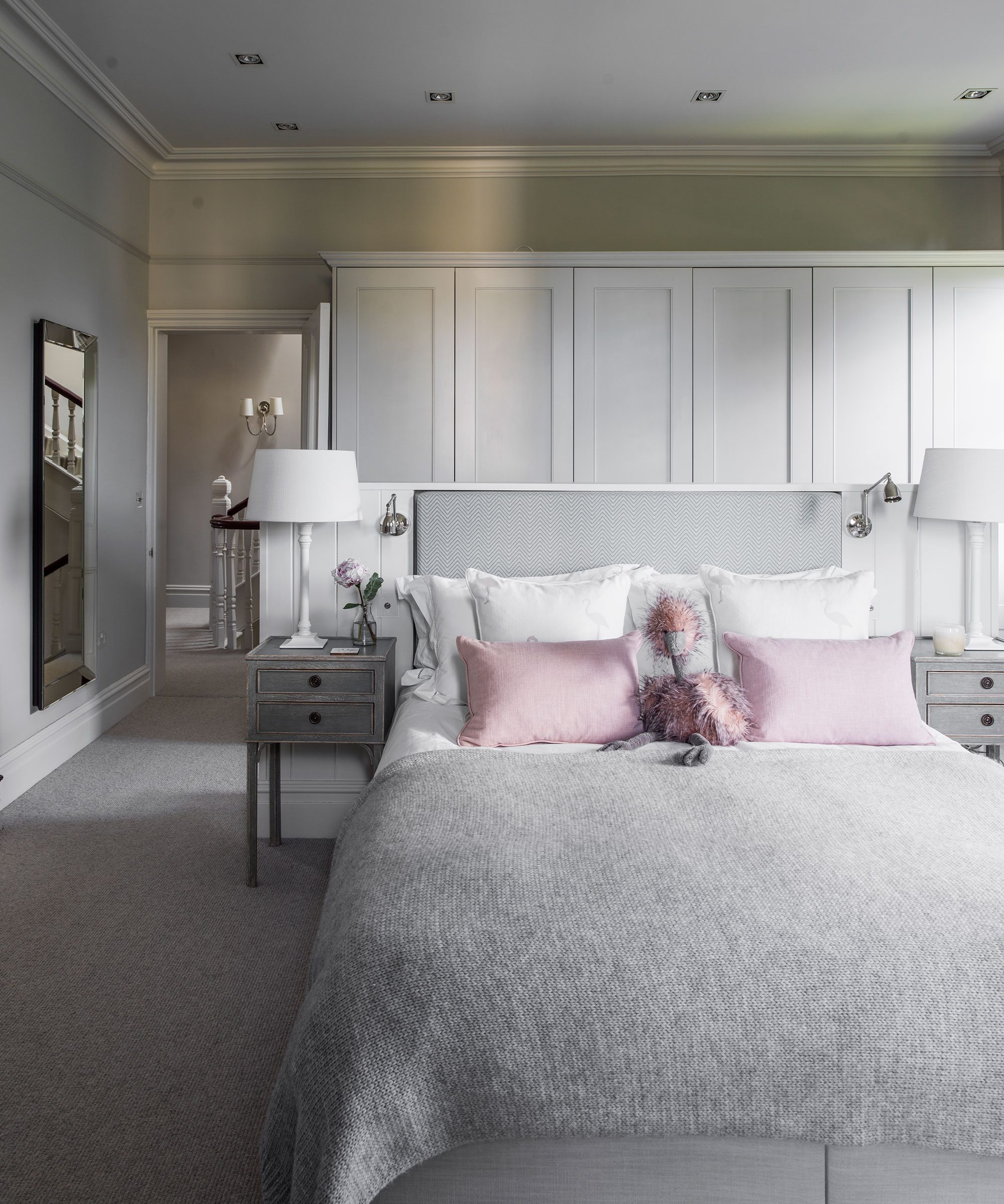
2. In a bedroom
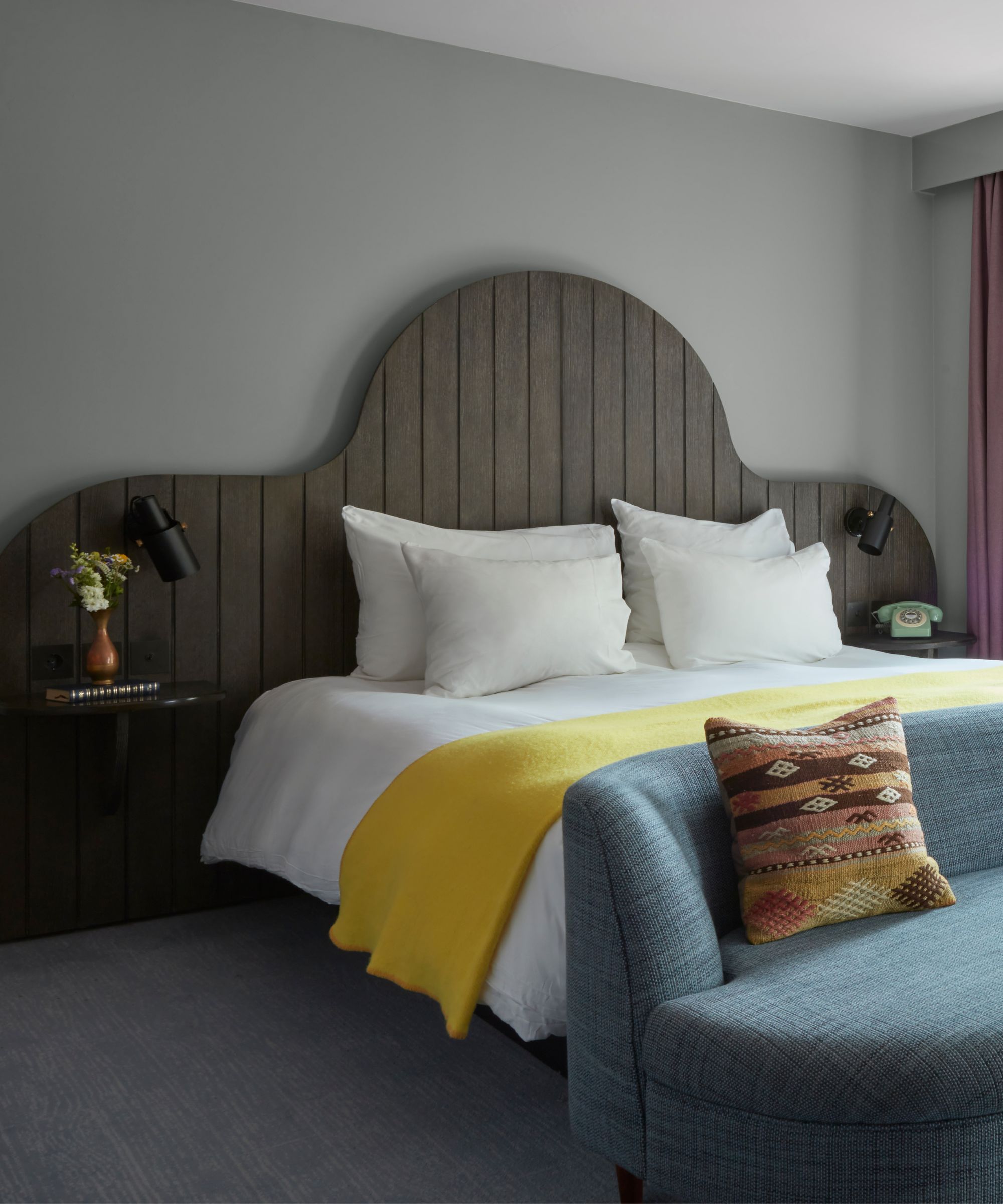
When decorating a bedroom, a useful place to start is to think about using the most relaxing colors. If we look to color psychology, cool colors can evoke feelings of calmness, tranquility, and introspection.
So, with this in mind, gray would be a sound choice for a tranquil bedroom, surely? The distinction is that the cool-toned colors that achieve this wonderfully restful feeling tend to have a blue or a green undertone, or a creamy neutral tone. Gray, on the other hand, with its steely, cold presence, can threaten to make a room feel stark, inhospitable, and even, in many cases, saddening.
‘Bedrooms should be serene, warm spaces, so gentle greens or warm neutrals will create a more tranquil environment than gray,’ advises Fiona. In fact, gentle blues, greens and cool neutral tones will make a room feel fresh, balanced and calm, which is infinitely more desirable than gray’s often sullen presence.
3. In rooms with harsh artificial light
After assessing your room’s orientation and the natural light available or unavailable to a room, the second consideration should be the artificial lighting in the room.
Halogen and incandescent bulbs emit yellow light, which makes colors appear warmer, but white bulbs emit a blue light, which gives paint a cooler cast. In this scenario, the worst paint color to choose is a gray paint, as the end result will be an ice-cold and severe space.
The same is true for overhead spotlights, which many homes have installed in hardworking spaces like kitchens, utilities, and entryways. The light from spotlights, whilst bright and useful, is often deemed unflattering. Overhead lighting, particularly spotlights, can create shadows and exaggerate the coolness of gray paint, making it look very harsh and oppressive. So, what would be the better choice?
‘We have seen a real shift away from the cool, blue-toned grays that were popular in recent years.’ Ruth Mottershead, Creative Director at Little Greene. ‘A clear transition to warmer, natural neutrals has taken place with consumers opting for earthier colors that have an inherent warmth to them.’ Even with unsympathetic lighting, earthier, neutral tones like stone, light taupe, or even a soft mid-tone off white would be the wiser choice.
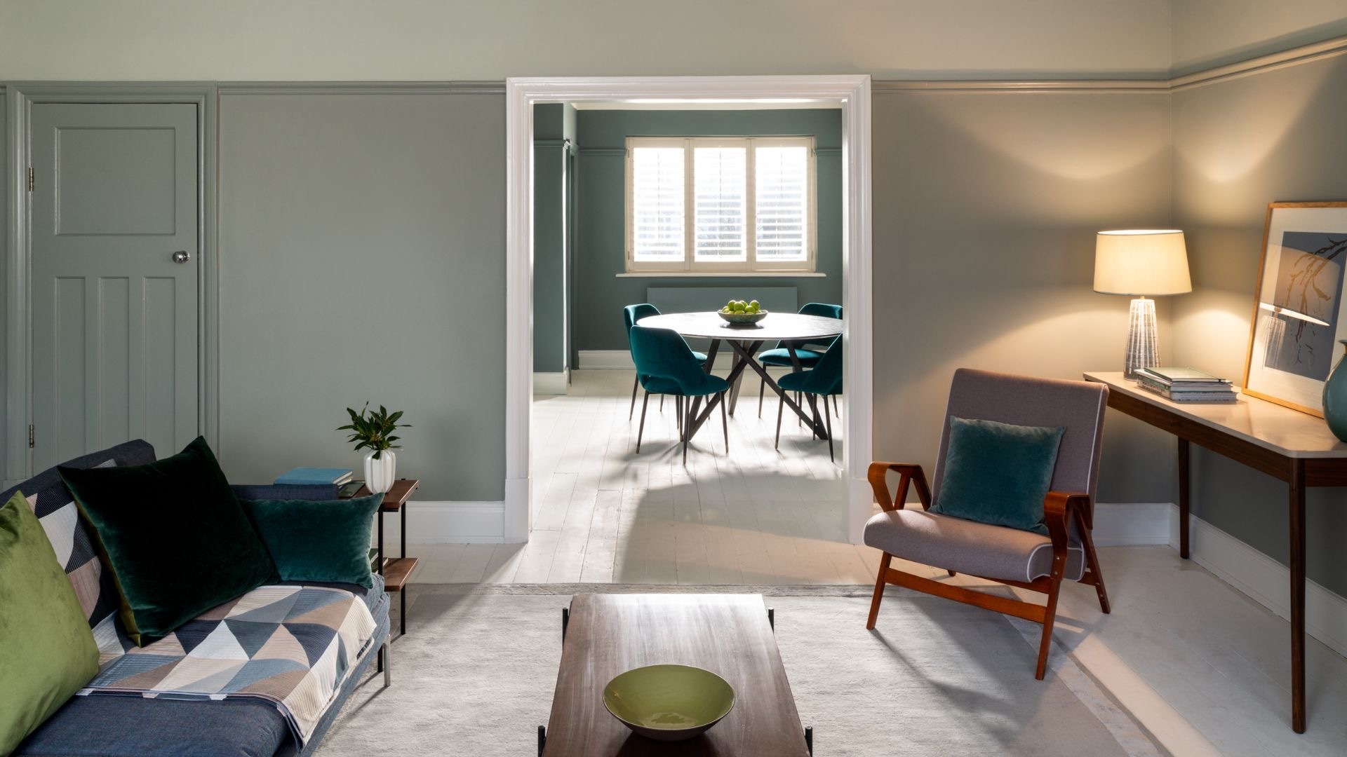
4. In dining rooms
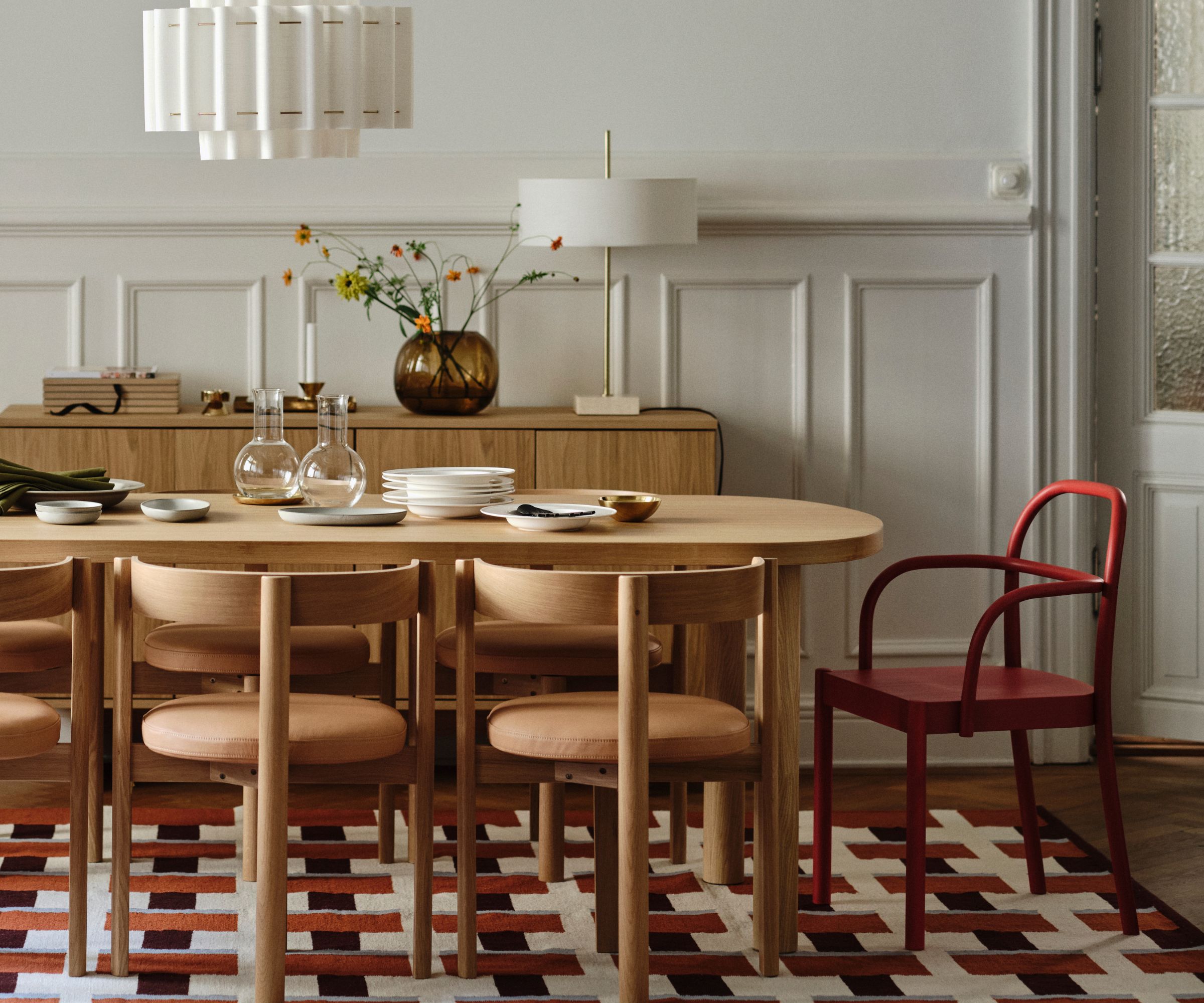
There are lots of wonderful dining room ideas you can implement to make a space feel fun, welcoming, and social. Painting it gray, though, is certainly not one.
‘Gray is a cold, gloomy color,’ explains the interior designer, Lolita Colenso. 'As such dining room should not be gray. When looking for authenticity, look to bold and bright dining room colors, which are central to art deco design and lift the mood.’
Rooms that are aimed at socialisation, interaction, in which you hope to foster a sense of ease, comfort, and fun, especially for things like cocktail parties, dinner parties, and games nights, using gray can be something of a mood killer.
‘Dining rooms or open plan kitchen dining areas want to be welcoming and full of positivity as these are the spaces we love to socialise in and catch up with family and friends,’ explains Fiona. When gray is used, it can sometimes feel a little bit flat and uninspiring, which isn't the best foundation for happy, lively gatherings. Statement, cocooning vibrant colors can help promote engagement and discussion as they feel more creative and give more energy.’
5. On kitchen cabinets
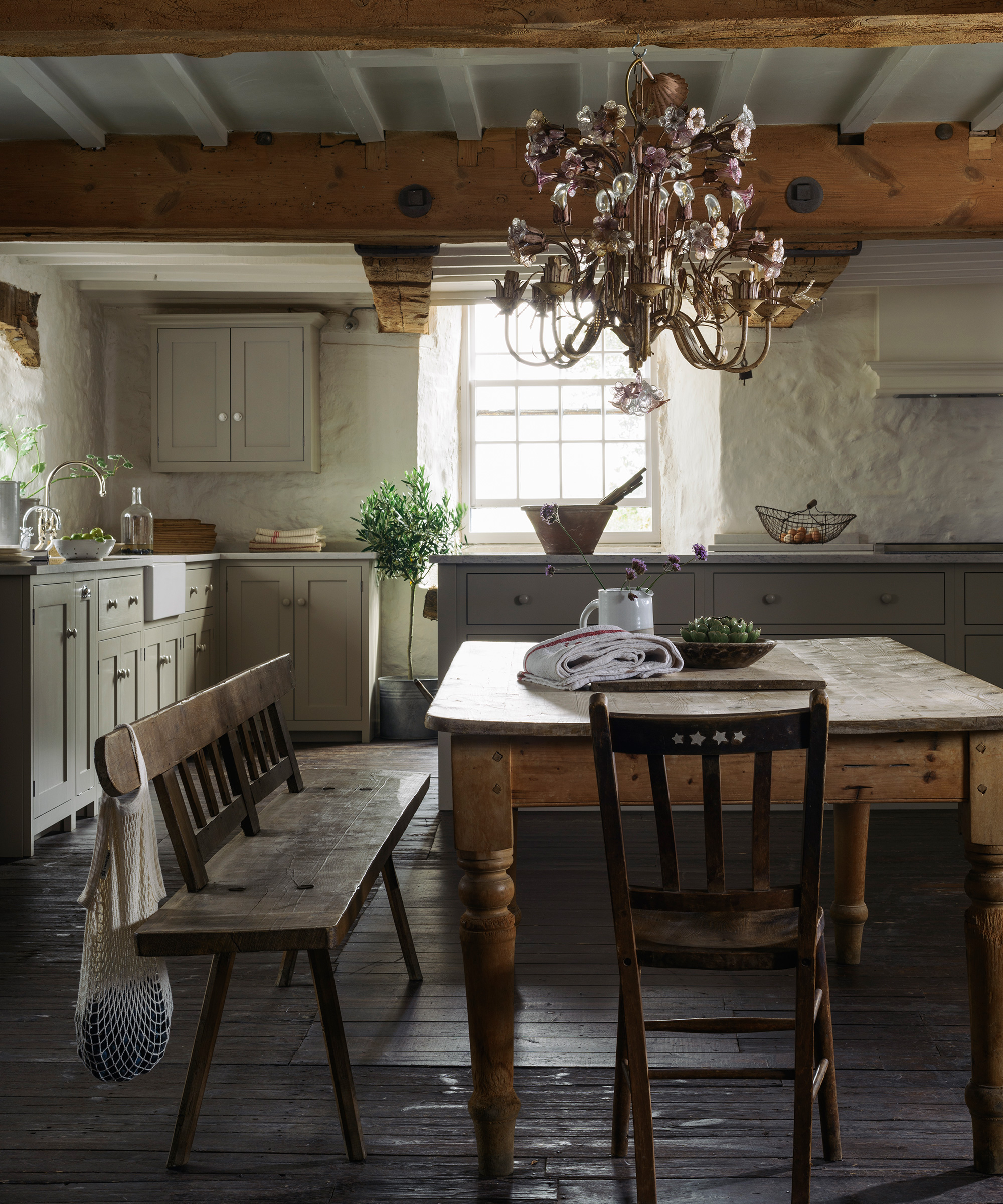
Despite being the popular choice for new-build developments, gray kitchens have well and truly fallen out of favour. Using a corporate gray color in this key part of the home strikes me as both uninspiring and dispiriting. If you are thinking of bathing your kitchen cabinets in gray paint, be wary of the kitchen feeling clinical and overly sterile, like an operating theatre, as a result.
If it is the unobtrusive, calmness of cool gray you love, consider instead a neutral paint more akin to stone or sand, rather than gloomy, rainy skies. If you love deep graphite grays, try swatching a few navy or petrol blue paints alongside the gray, as this serves as a great alternative. If it is the barely there, whisper soft gray you adore, swatch it alongside a creamier off white paint, which will appear perkier and more optimistic.
If you still love this color, and are wondering how to use gray appropriately, and to maximize its potential, rest assured are shades of gray that look fresh and contemporary. Those gray paints with green undertones, like French Gray by Farrow and Ball, with a noticeably green hue, or Grays Inn by Mylands, which is an unusually warm and soft iteration of gray, are refreshingly easy to use. Gray does have its uses, and it does not always have depressing effects. In south-facing rooms, gray can have wonderfully calming effects, and in smaller accents like on woodwork, banisters, and doors, it can be a subtle and tasteful addition.