If you're planning on giving your living room a fresh lick of paint, you want your chosen color to withstand the test of time. To pick a perfect shade that has real longevity, you want to think beyond trends. 'I guess timelessness in color is sort of the opposite of the Color of the Year,' says Peter Mitsakos of West Edge Architects. In this sense, think beyond the fads and pick shades that have featured in living rooms for decades, the reliable shades that call to nature.
'I think timelessness has to do with colors that are subtle and more closely related to color and materials that you find in the landscape,' says Peter. 'And probably not the brighter colors, but the ones that might shift slightly depending on the color of the light, time of day, time of year and the weather.' To help you figure out the difference between what's in vogue, and what is timeless, we speak to the designers for their tips on a classic living room palette.
1. Gentle neutrals
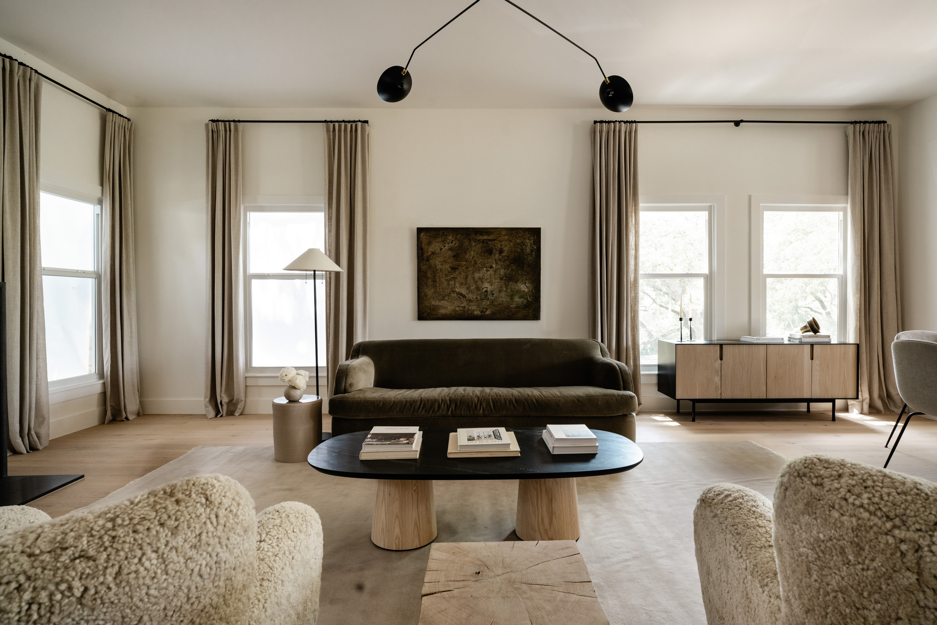
Sandy beiges, light browns and earthy neutrals are always a winning living room color idea, bringing warmth to north-facing rooms that need a little warming up. With roots firmly in nature, undertones of red and brown keep things cozy in the living room and it's a look that goes with any style of decor, from minimalist to a more maximalist aesthetic.
'Timeless living room colors feature a balanced neutral palette,' says Los Angeles-based designer Julia Dempster. Just remember to accessorize with other shades, warns Julia. 'Consider pairing a classic white with accents of muted gold or subtle grey for a harmonious and enduring aesthetic.
'Embrace the elegance of neutral tones like soft beige and warm ivory, creating a serene ambiance that stands the test of trends. Try monochromatic color schemes in neutral - it's one of my favored looks.'
2. Green undertones

One rule I've heard time and time again from the designers is to never go for pure white. It might work in a kitchen or bathroom, rooms where function demands a clean and pristine aesthetic, but in the living room, it can feel stark and cold. Instead, we suggest going for off-white, with an undertone that brings depth.
Green can always be relied upon. Either go for a muted, earthy sage green paint on the walls or pick a white with green undertones that only glimmer in certain lights.
'For a classic paint color in your living room, I'd opt for a color with green undertones,' says Emily Brown of Emily Lauren Interiors.
'Green undertones create a neutral balance, neither too warm nor too cool, making it versatile to complement any style. We love Portland Stone by Little Greene Paint Company, Shaded White by Farrow and Ball, or for an off-white option, School House White by Farrow and Ball or White Dove by Benjamin Moore.'
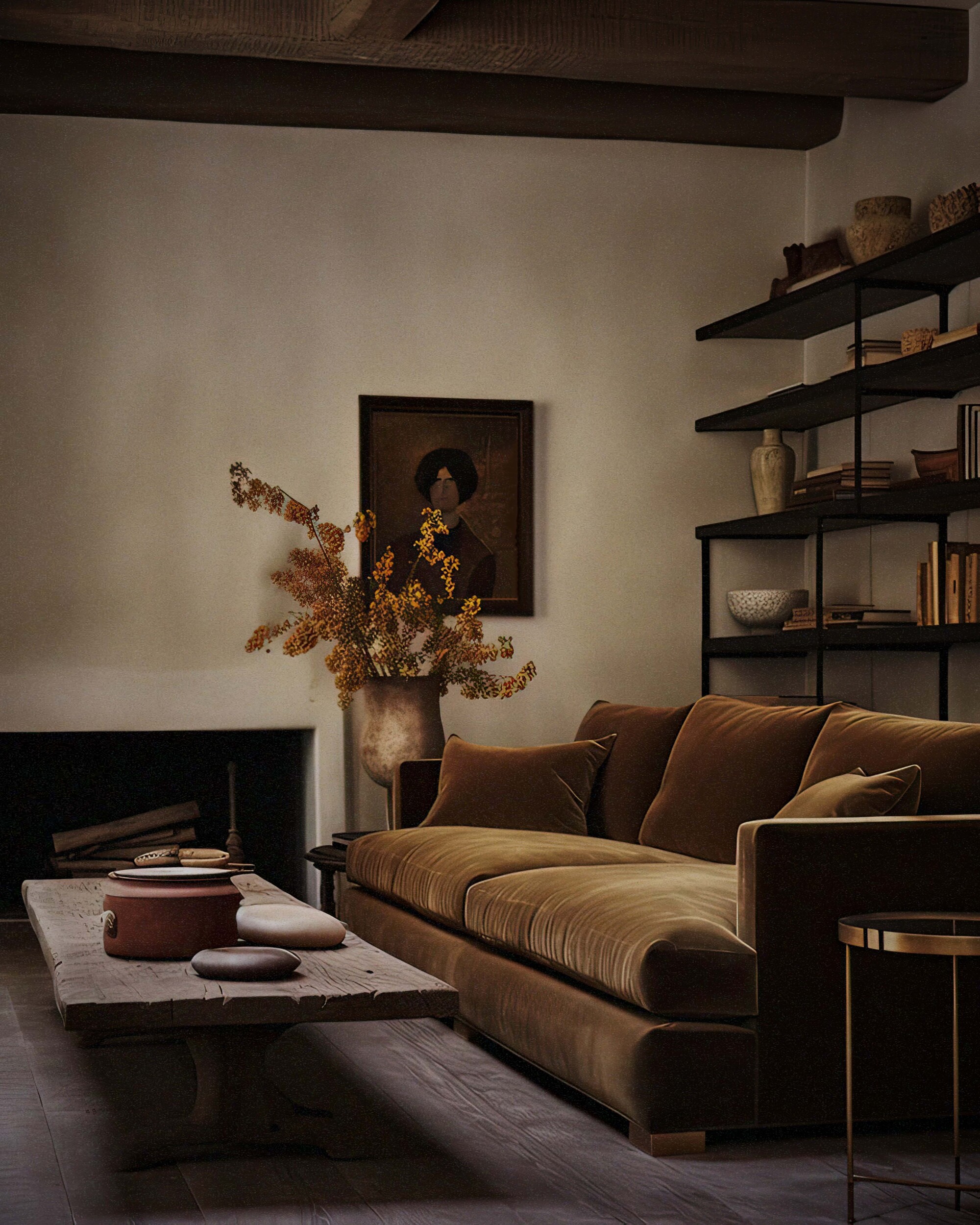
3. Earthy grey
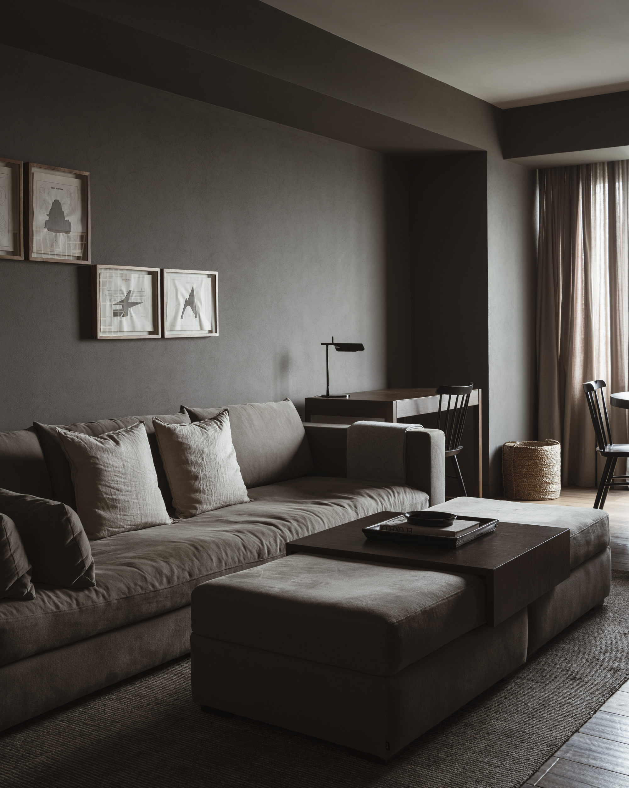
Grey has long been popular in the living room, but we're moving away from the inherent coolness of grey, instead favoring a warmer grey with undertones of brown.
Mushroom is a grey-brown blend that brings warmth with its underlying brown tones. It's perfect for minimalist living rooms or bedrooms as it doesn't bring too much saturated color, and has a cozy feel.
‘Mushroom brown is a color that we feel very comfortable with as minimalists,’ agrees Alberto Reiriz Paz, architect and designer of Spanish firm, Nan Arquitectos. ‘It transmits comfort and warmth in addition to being a color base that combines perfectly with other minimalist elements that can be introduced in the project.’
'I often opt for earthy tones to bring nature indoors, fostering a calming environment that transcends fleeting design fads,' says Julia.
4. Jewel tones
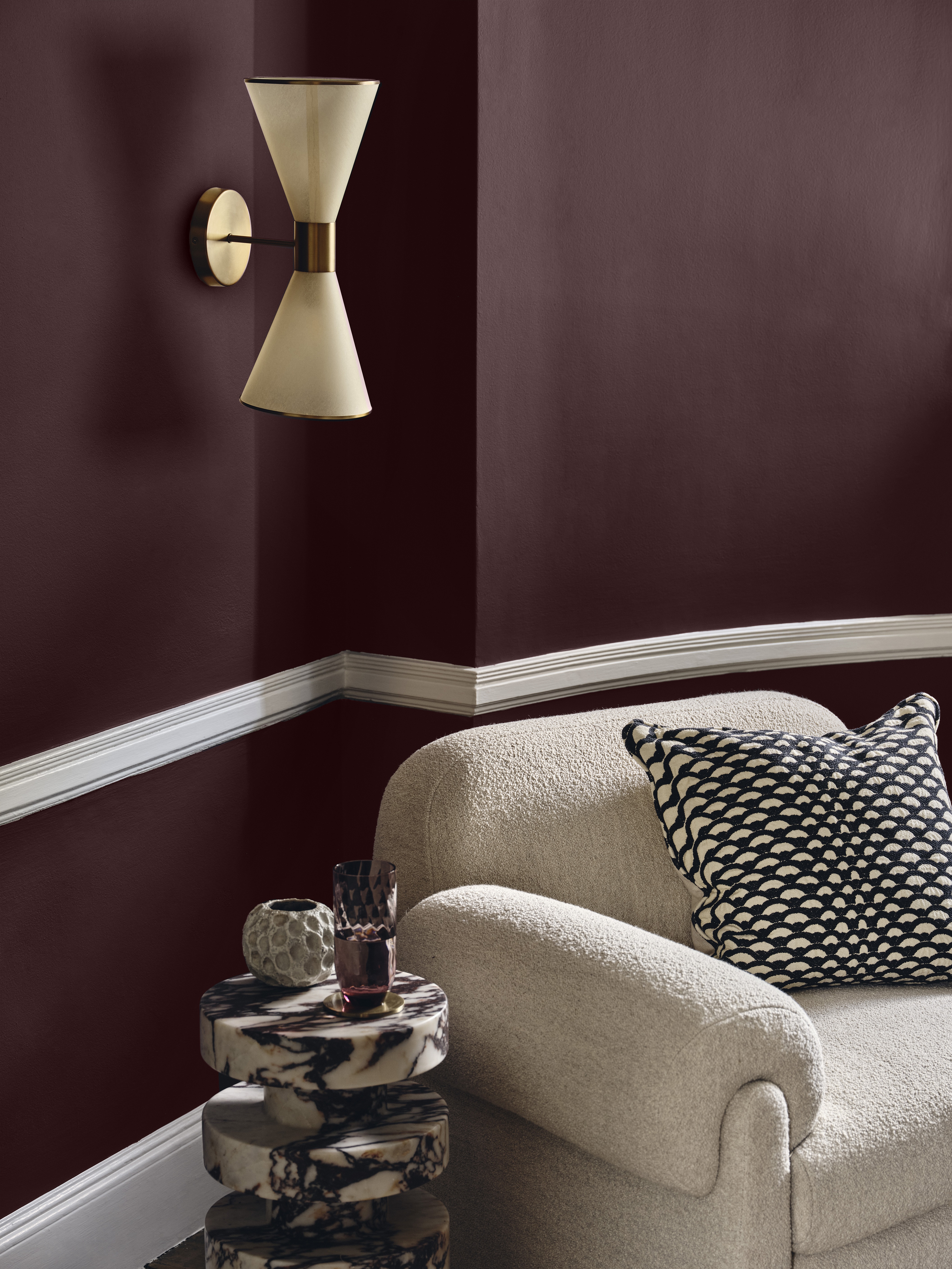
If you want to go for something a little bolder, then jewel tones can be relied on to bring a timeless and classic look to your home. They are dark, indulgent, moody and create a cozy, snug feel.
'I like to create a sense of opulence in the projects I work on with deep burgundy or rich emerald,' says Julia. 'These colors infuse the space with regal warmth that defies the ebb and flow of fashion. These classic hues will never go out of style,' she says.
For inspiration, look to Lick x Soho House's Dumbo, Farrow & Ball's Brinjal, or Benjamin Moore's Jade Green.
5. Inky blues
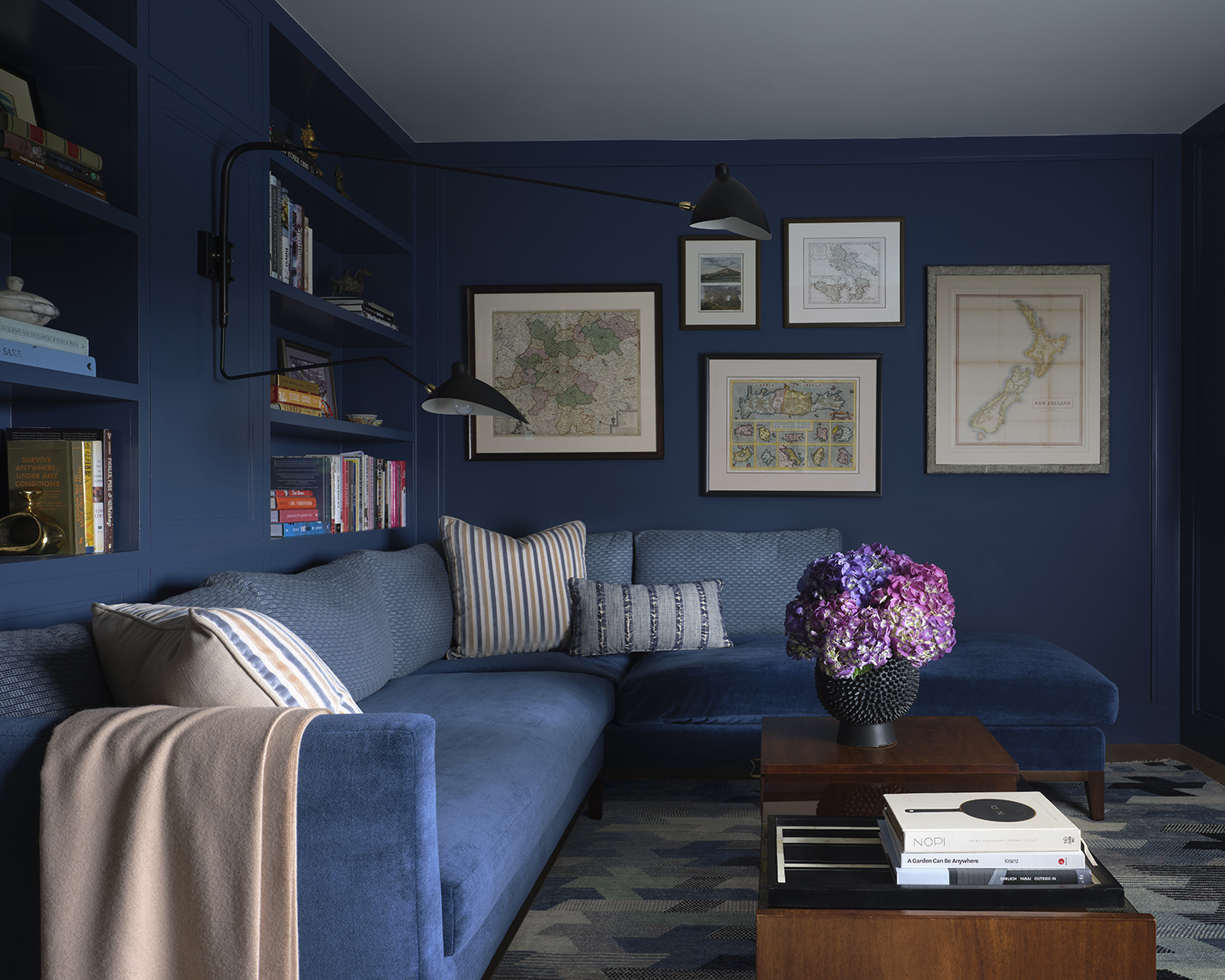
Blue is another household color. While it might feel cold, it can also feel refined and elegant. Light blue refreshing shades like Farrow & Ball's Yonder are having a moment in the living room, with a light blue living room feeling uplifting and cheery, but darker shades of blue offer a more timeless look.
Dark inky blues and navies are shades that carry real depth. 'Classic navy and deep bluey charcoal are two more favorites and can add a touch of sophistication, grounding the space and providing a versatile backdrop for various decor styles,' says Julia.